import matplotlib.pyplot as plt
import seaborn as sns
import pandas as pd
import numpy as npViolin Plot (Python)
A violin plot combines a box plot and a kernel density estimation to show the distribution of continuous data across categories. In biomedical research, violin plots are ideal for comparing gene expression distributions, drug response measurements, or clinical biomarker levels across patient groups. Python’s seaborn library makes it simple to create beautiful violin plots.
Example

Setup
- System Requirements: Cross-platform (Linux/MacOS/Windows)
- Programming Language: Python
- Dependencies:
matplotlib,seaborn,pandas,numpy
Data Preparation
iris = sns.load_dataset("iris")

np.random.seed(42)
n_per_group = 80
groups = ['Tumor', 'Normal', 'Adjacent']
gene_expr = pd.DataFrame({
    'Expression': np.concatenate([
        np.random.normal(8, 1.5, n_per_group),
        np.random.normal(5, 1.2, n_per_group),
        np.random.normal(6.5, 1.8, n_per_group)
    ]),
    'Group': np.repeat(groups, n_per_group),
    'Gene': np.tile(np.repeat(['TP53', 'BRCA1'], n_per_group // 2), 3)
})
Visualization
Basic Violin Plot
fig, ax = plt.subplots(figsize=(8, 6))
sns.violinplot(data=iris, x='species', y='sepal_length', palette='Set2',
               inner='box', ax=ax)
ax.set_xlabel('Species')
ax.set_ylabel('Sepal Length (cm)')
ax.set_title('Distribution of Sepal Length by Species')
ax.spines[['top', 'right']].set_visible(False)
plt.tight_layout()
plt.show()
/mnt/TMP/ipykernel_118872/2407574281.py:2: FutureWarning:
Passing `palette` without assigning `hue` is deprecated and will be removed in v0.14.0. Assign the `x` variable to `hue` and set `legend=False` for the same effect.
sns.violinplot(data=iris, x='species', y='sepal_length', palette='Set2',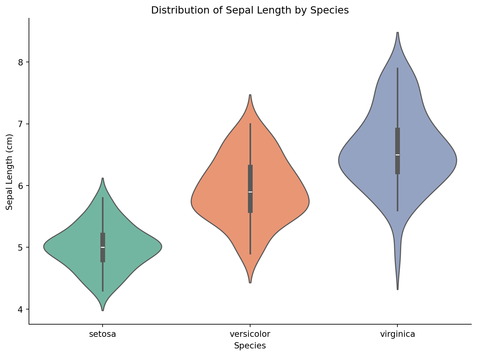
Split Violin Plot
fig, ax = plt.subplots(figsize=(8, 6))
tumor_normal = gene_expr[gene_expr['Group'].isin(['Tumor', 'Normal'])]
sns.violinplot(data=tumor_normal, x='Gene', y='Expression', hue='Group',
               split=True, palette={'Tumor': '#e63946', 'Normal': '#457b9d'},
               inner='quart', ax=ax)
ax.set_title('Gene Expression: Tumor vs Normal')
ax.set_ylabel('Expression Level')
ax.spines[['top', 'right']].set_visible(False)
plt.tight_layout()
plt.show()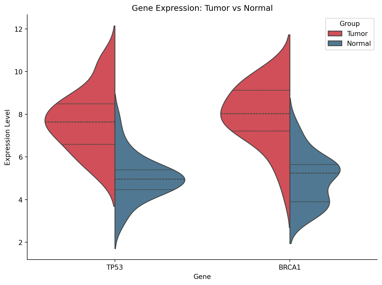
Violin with Strip Plot Overlay
fig, ax = plt.subplots(figsize=(9, 6))
sns.violinplot(data=gene_expr, x='Group', y='Expression', palette='pastel',
               inner=None, alpha=0.7, ax=ax)
sns.stripplot(data=gene_expr, x='Group', y='Expression', color='black',
              size=3, alpha=0.4, jitter=True, ax=ax)
ax.set_title('Gene Expression Distribution with Individual Points')
ax.set_ylabel('Expression Level')
ax.spines[['top', 'right']].set_visible(False)
plt.tight_layout()
plt.show()
/mnt/TMP/ipykernel_118872/1230588679.py:2: FutureWarning:
Passing `palette` without assigning `hue` is deprecated and will be removed in v0.14.0. Assign the `x` variable to `hue` and set `legend=False` for the same effect.
sns.violinplot(data=gene_expr, x='Group', y='Expression', palette='pastel',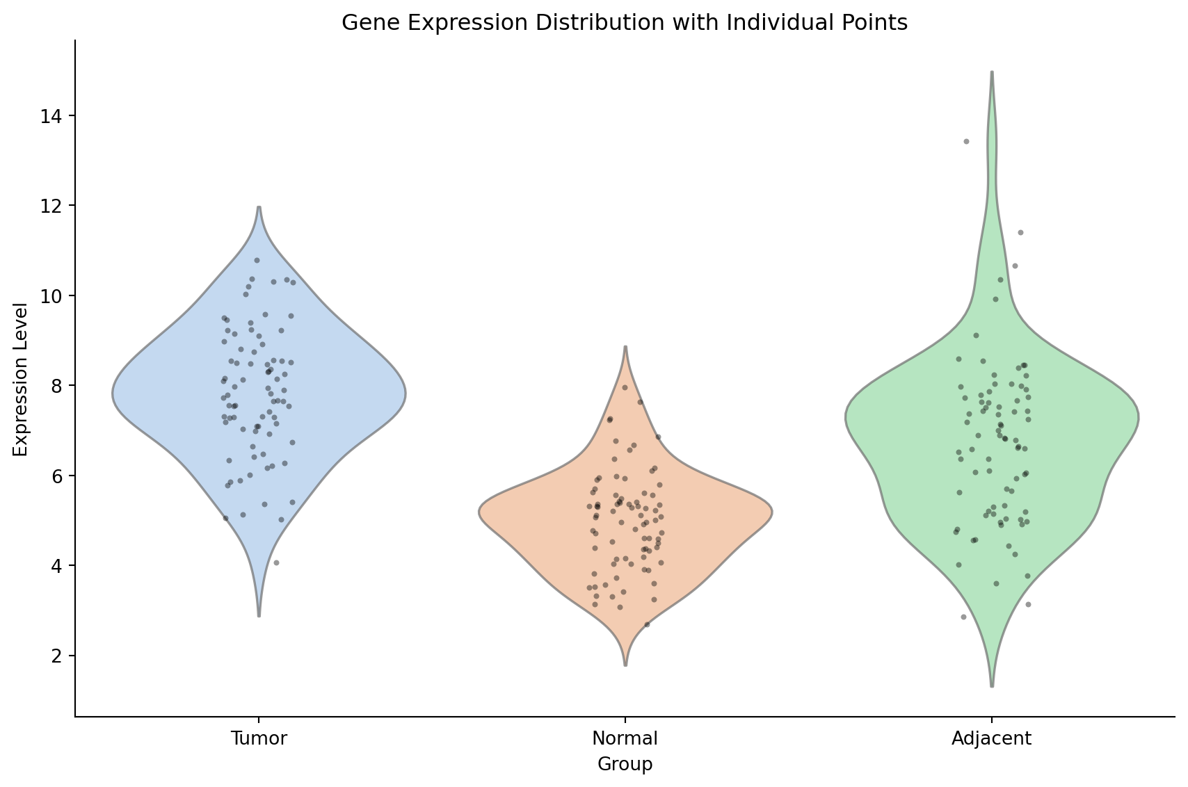
References
- Hintze, J. L., & Nelson, R. D. (1998). Violin plots: a box plot-density trace synergism. The American Statistician, 52(2), 181-184.
- Waskom, M. L. (2021). seaborn: statistical data visualization. JOSS, 6(60), 3021.