# Install packages
if (!requireNamespace("data.table", quietly = TRUE)) {
  install.packages("data.table")
}
if (!requireNamespace("jsonlite", quietly = TRUE)) {
  install.packages("jsonlite")
}
if (!requireNamespace("survival", quietly = TRUE)) {
  install.packages("survival")
}
if (!requireNamespace("rms", quietly = TRUE)) {
  install.packages("rms")
}
if (!requireNamespace("ggplotify", quietly = TRUE)) {
  install.packages("ggplotify")
}

# Load packages
library(data.table)
library(jsonlite)
library(survival)
library(rms)
library(ggplotify)Calibration Curve
Note
Hiplot website
This page is the tutorial for source code version of the Hiplot Calibration Curve plugin. You can also use the Hiplot website to achieve no code ploting. For more information please see the following link:
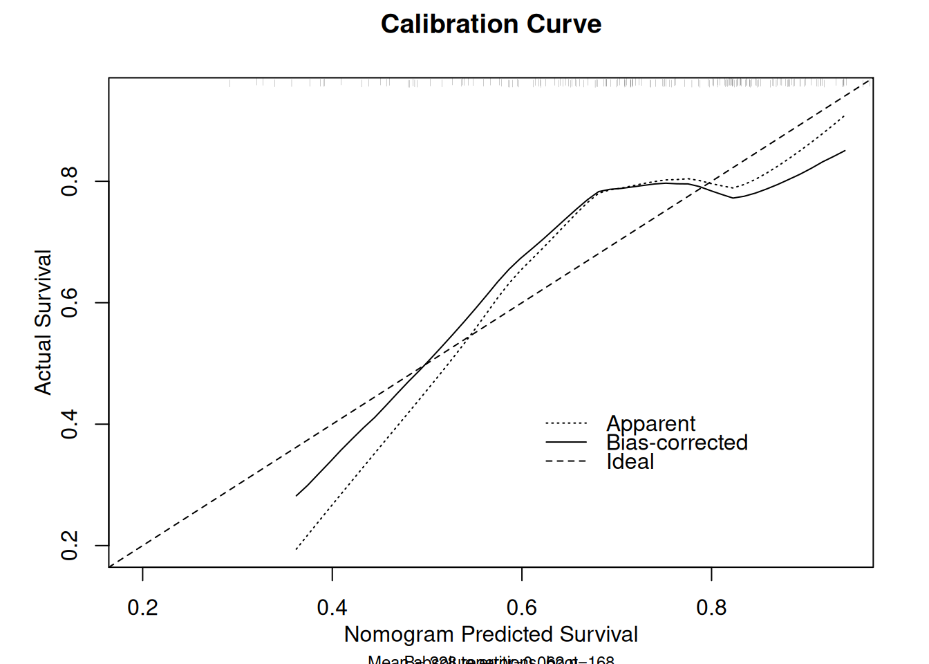
The calibration curve is used to evaluate the consistency / calibration, i.e. the difference between the predicted value and the real value.
Setup
System Requirements: Cross-platform (Linux/MacOS/Windows)
Programming language: R
Dependent packages:
data.table;jsonlite;survival;rms;ggplotify
sessioninfo::session_info("attached")─ Session info ───────────────────────────────────────────────────────────────
setting value
version R version 4.6.0 (2026-04-24)
os Ubuntu 24.04.4 LTS
system x86_64, linux-gnu
ui X11
language (EN)
collate C.UTF-8
ctype C.UTF-8
tz UTC
date 2026-05-09
pandoc 3.1.3 @ /usr/bin/ (via rmarkdown)
quarto 1.9.37 @ /usr/local/bin/quarto
─ Packages ───────────────────────────────────────────────────────────────────
package * version date (UTC) lib source
data.table * 1.18.4 2026-05-06 [1] RSPM
ggplotify * 0.1.3 2025-09-20 [1] RSPM
Hmisc * 5.2-5 2026-01-09 [1] RSPM
jsonlite * 2.0.0 2025-03-27 [1] RSPM
rms * 8.1-1 2026-02-18 [1] RSPM
survival * 3.8-6 2026-01-16 [3] CRAN (R 4.6.0)
[1] /home/runner/work/_temp/Library
[2] /opt/R/4.6.0/lib/R/site-library
[3] /opt/R/4.6.0/lib/R/library
* ── Packages attached to the search path.
──────────────────────────────────────────────────────────────────────────────Data Preparation
Data frame of multi columns data (Numeric allow NA). i.e the survival data (status with 0 and 1).
# Load data
data <- data.table::fread(jsonlite::read_json("https://hiplot.cn/ui/basic/calibration-curve/data.json")$exampleData$textarea[[1]])
data <- as.data.frame(data)

# convert data structure
res.lrm <- lrm(as.formula(paste(
  "status ~ ",
  paste(colnames(data)[3:length(colnames(data))], collapse = "+"))),
  data = data, x = TRUE, y = TRUE)

lrm.cal <- calibrate(res.lrm, method = "boot", B = length(rownames(data)))

# View data
head(data)
time status age sex ph.ecog ph.karno pat.karno meal.cal wt.loss
1 306 2 74 1 1 90 100 1175 NA
2 455 2 68 1 0 90 90 1225 15
3 1010 1 56 1 0 90 90 NA 15
4 210 2 57 1 1 90 60 1150 11
5 883 2 60 1 0 100 90 NA 0
6 1022 1 74 1 1 50 80 513 0Visualization
# Calibration Curve
p <- as.ggplot(function() {
  plot(lrm.cal,
       xlab = "Nomogram Predicted Survival",
       ylab = "Actual Survival",
       main = "Calibration Curve"
       )
})
n=168   Mean absolute error=0.066   Mean squared error=0.00513
0.9 Quantile of absolute error=0.096
p