# Install packages
if (!requireNamespace("ggplot2", quietly = TRUE)) {
  install.packages("ggplot2")
}
if (!requireNamespace("dplyr", quietly = TRUE)) {
  install.packages("dplyr")
}
if (!requireNamespace("plotrix", quietly = TRUE)) {
  install.packages("plotrix")
}
if (!requireNamespace("ggforce", quietly = TRUE)) {
  install.packages("ggforce")
}
if (!requireNamespace("ggpubr", quietly = TRUE)) {
  install.packages("ggpubr")
}
if (!requireNamespace("patchwork", quietly = TRUE)) {
  install.packages("patchwork")
}

# Load packages
library(ggplot2)
library(dplyr)
library(plotrix)
library(ggforce)
library(ggpubr)
library(patchwork)Part highlights the pie chart
Example
(Image by Amy Shamblen on Unsplash)
Pie charts are a common type of chart used in data visualization, allowing you to intuitively display the proportions of various components of a data set. By making certain parts of the pie chart appear raised, you can better highlight specific data points.
Setup
System Requirements: Cross-platform (Linux/MacOS/Windows)
Programming language: R
Dependent packages:
ggplot2,dplyr,plotrix,ggforce,ggpubr,patchwork
sessioninfo::session_info("attached")─ Session info ───────────────────────────────────────────────────────────────
setting value
version R version 4.6.0 (2026-04-24)
os Ubuntu 24.04.4 LTS
system x86_64, linux-gnu
ui X11
language (EN)
collate C.UTF-8
ctype C.UTF-8
tz UTC
date 2026-05-09
pandoc 3.1.3 @ /usr/bin/ (via rmarkdown)
quarto 1.9.37 @ /usr/local/bin/quarto
─ Packages ───────────────────────────────────────────────────────────────────
package * version date (UTC) lib source
dplyr * 1.2.1 2026-04-03 [1] RSPM
ggforce * 0.5.0 2025-06-18 [1] RSPM
ggplot2 * 4.0.3.9000 2026-05-04 [1] Github (tidyverse/ggplot2@6870419)
ggpubr * 0.6.3 2026-02-24 [1] RSPM
patchwork * 1.3.2 2025-08-25 [1] RSPM
plotrix * 3.8-14 2026-02-13 [1] RSPM
[1] /home/runner/work/_temp/Library
[2] /opt/R/4.6.0/lib/R/site-library
[3] /opt/R/4.6.0/lib/R/library
* ── Packages attached to the search path.
──────────────────────────────────────────────────────────────────────────────Data Preparation
# Generate simulated data
count.data <- data.frame(
  class = c("1st", "2nd", "3rd", "Crew"),
  n = c(325, 285, 706, 885),
  prop = c(14.8, 12.9, 32.1, 40.2)
)
# Add label position
count.data <- count.data %>%
  arrange(desc(class)) %>%
  mutate(lab.ypos = cumsum(prop) - 0.5*prop)
# View the final merged dataset
head(count.data)
class n prop lab.ypos
1 Crew 885 40.2 20.10
2 3rd 706 32.1 56.25
3 2nd 285 12.9 78.75
4 1st 325 14.8 92.60Visualization
1. Basic Plot
1.1 Basic pie chart
# Basic pie chart
mycols <- c("#0073C2FF", "#EFC000FF", "#868686FF", "#CD534CFF")
p <-
  ggplot(count.data, aes(x = "", y = prop, fill = class)) +
  geom_bar(width = 1, stat = "identity", color = "white") +
  coord_polar("y", start = 0)+
  geom_text(aes(y = lab.ypos, label = prop), color = "white")+
  scale_fill_manual(values = mycols) +
  theme_void()

p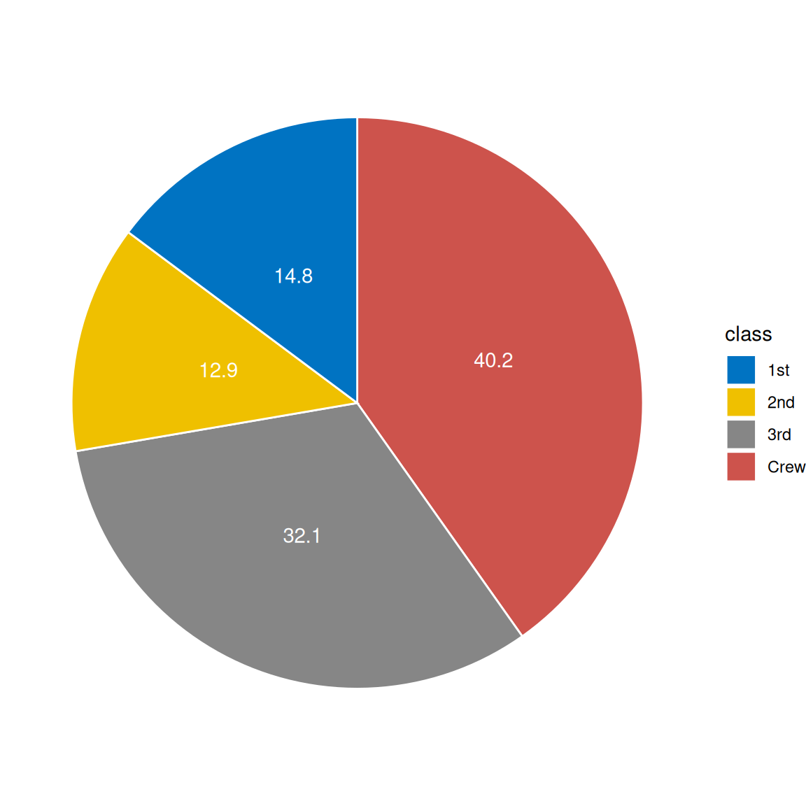
1.2 Hole-in-the-middle pie chart
# Hole-in-the-middle pie chart
p2 <-
  ggplot(count.data, aes(x = 2, y = prop, fill = class)) +
  geom_bar(stat = "identity", color = "white") +
  coord_polar(theta = "y", start = 0) +
  geom_text(aes(y = lab.ypos, label = prop), color = "white") +
  scale_fill_manual(values = mycols) +
  theme_void() +
  xlim(0.5, 2.5)

p2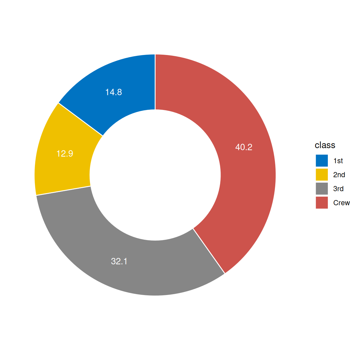
2. Advanced Plot
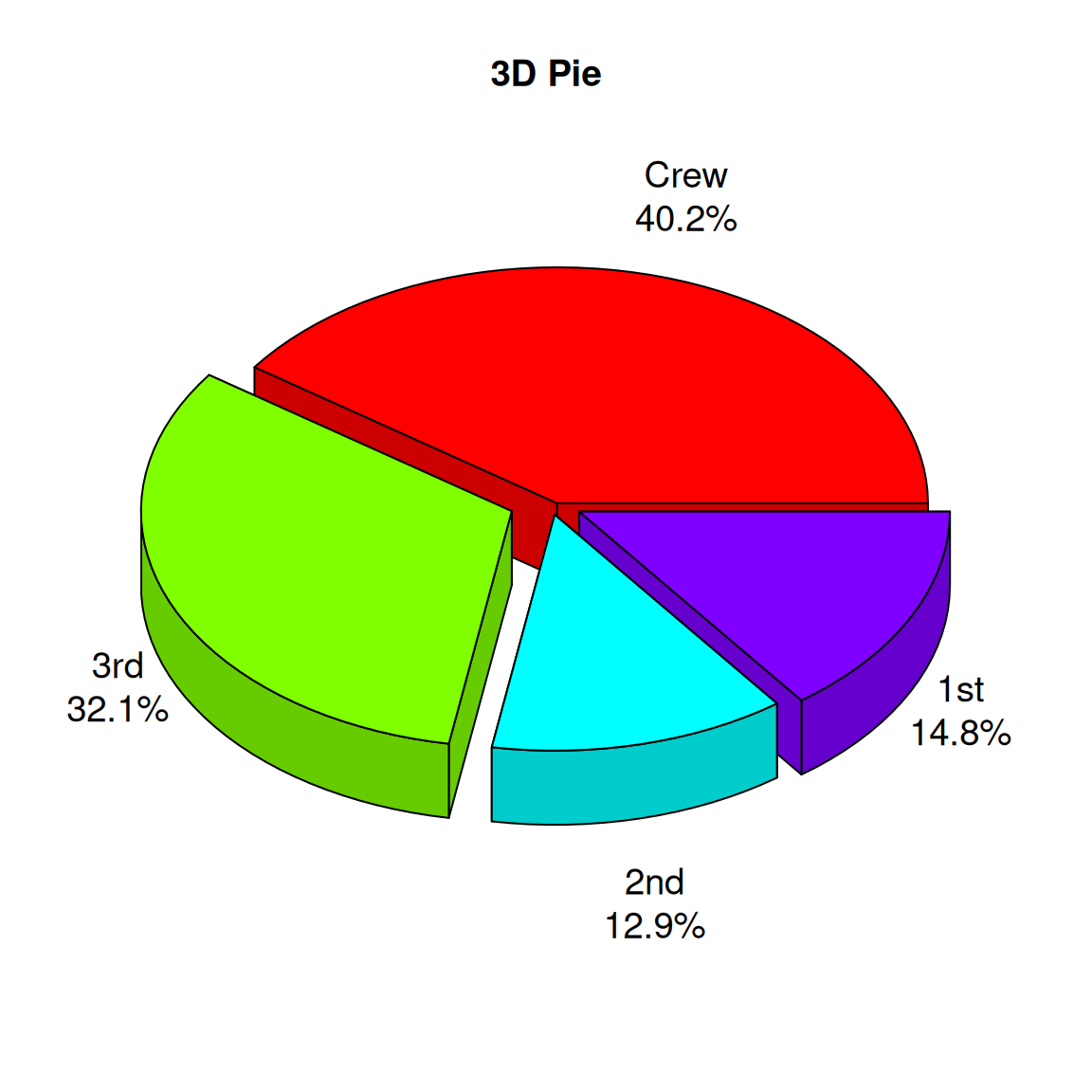
2.1 3D pie chart
# Create a data frame
# Generate labels (combined categories and percentages)
labels <- paste(count.data$class, "\n", count.data$prop, "%", sep="")

# Draw a 3D pie chart
p3 <- pie3D(
  count.data$n,                # Use quantity as value
  labels = labels,             # Custom labels
  explode = 0.1,               # Set sector interval
  main = "3D Pie",
  col = rainbow(nrow(count.data)), # Use rainbow colors
  labelcex = 1.2,              # Label font size
  theta = 1                    # Control the angle of the 3D effect
)
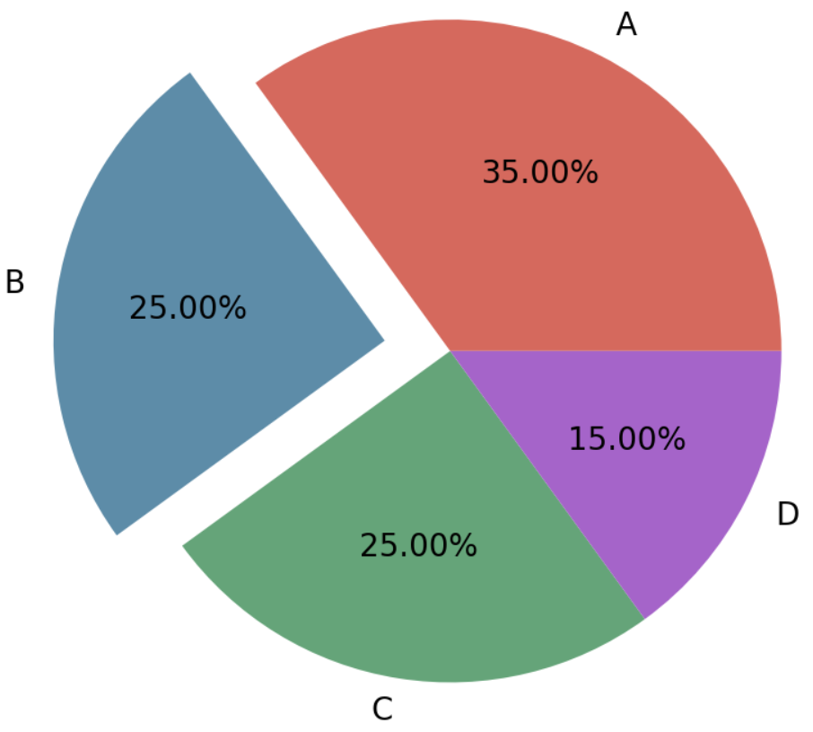
2.2 Part highlights the pie chart
# Create a data frame
data <- data.frame(
  gene = c("HRAS", "NRAS", "RET fusion", "MAP2K1", "ROS1 fusion", "ERBB2",
           "ALK fusion", "MET ex14",  "BRAF", "EGFR", "KRAS", "None", "RIT1",
           "ERBB2 amp", "MET amp", "NF1"),
  percentage = c(0.4, 0.4, 0.9, 0.9, 1.7, 1.7, 1.3, 4.3,  7.0, 11.3, 32.2, 24.4,
                 2.2, 0.9, 2.2, 8.3)
)
data$gene <- factor(data$gene,levels = data$gene)
data$focus = c(rep(0, 12), rep(0.2, 4))
data$anno <- ifelse(data$gene == "KRAS", "KRAS\n(32.2%)",
                    ifelse(data$gene == "EGFR", "EGFR\n(11.3%)",
                           ifelse(data$gene == "BRAF", "BRAF\n(7.0%)",
                                  ifelse(data$gene == "None", "None\n(24.4%)",
                                         ifelse(data$gene == "NF1", "NF1\n(8.3%)", NA)))))
data <-
  data %>%
  mutate(end_angle = 2*pi*cumsum(percentage)/100,
         start_angle = lag(end_angle, default = 0),
         mid_angle = 0.5*(start_angle + end_angle)) %>%
  mutate(legend = paste0(gene," (",percentage,"%)"))

data$legend <- factor(data$legend,levels = data$legend)

col <- c("#891619","#040503","#AF353D","#CF5057","#EE2129","#E7604D","#F58667","#F7A387","#FBC4AE","#FDE2D6","#FDF1EA","#AAD9C0","#0073AE","#069BDA","#68B0E1","#B8CBE8")

# Draw a pie chart using ggplot
pie <-
  ggplot() +
  geom_arc_bar(data=data, stat = "pie", # Draw pie charts in normal Cartesian coordinates, not polar coordinates
               aes(x0=0,y0=0,r0=0,r=2, # If you need a donut chart, just change r0 to 1.
                   amount=percentage,
                   fill=gene,color=gene,
                   explode=focus)) +
  geom_arc(data=data[1:8,], size=1,color="black",
           aes(x0=0, y0=0, r=2.1, start = start_angle, end = end_angle)) +
  geom_arc(data=data[11,], size=1,color="grey60",
           aes(x0=0, y0=0, r=2, start = start_angle-0.3, end = end_angle+0.3)) +
  geom_arc(data=data[13:15,], size = 1,color="black",
           aes(x0=0,y0=0,r=2.3,size = index,start = start_angle, end = end_angle))+
  annotate("text", x=1.3, y=0.9, label=expression(atop(italic("BRAF"),"(7.0%)")),
           size=6, angle=0, hjust=0.5) +
  annotate("text", x=1.4, y=0.08, label=expression(atop(italic("EGFR"),"(11.3%)")),
           size=6, angle=0, hjust=0.5) +
  annotate("text", x=0.2, y=-1.1, label=expression(atop(italic("KRAS"),"(32.2%)")),
           size=6, angle=0, hjust=0.5) +
  annotate("text", x=-1.2, y=0.1, label="None\n(24.4%)", size=6, angle=0,
           hjust=0.5) +
  annotate("text", x=-0.5, y=1.75, label=expression(atop(italic("NF1"),"(8.3%)")),
           size=6, angle=0, hjust=0.5) +
  coord_fixed() +
  theme_no_axes() +
  scale_fill_discrete(breaks=data$gene[c(1:8, 13:15)],
                      labels=data$legend[c(1:8, 13:15)], type=col) +
  scale_color_discrete(breaks=data$gene[c(1:8, 13:15)],
                       labels=data$legend[c(1:8, 13:15)], type=col) +
  theme(panel.border = element_blank(),
        legend.margin = margin(t = 1,r = 0,b = 0,l = 0,unit = "cm"),
        legend.title = element_blank(),
        legend.text = element_text(size=14),
        legend.key.spacing.y = unit(0.3,"cm"),
        legend.key.width = unit(0.4,"cm"),
        legend.key.height = unit(0.4,"cm"))

pie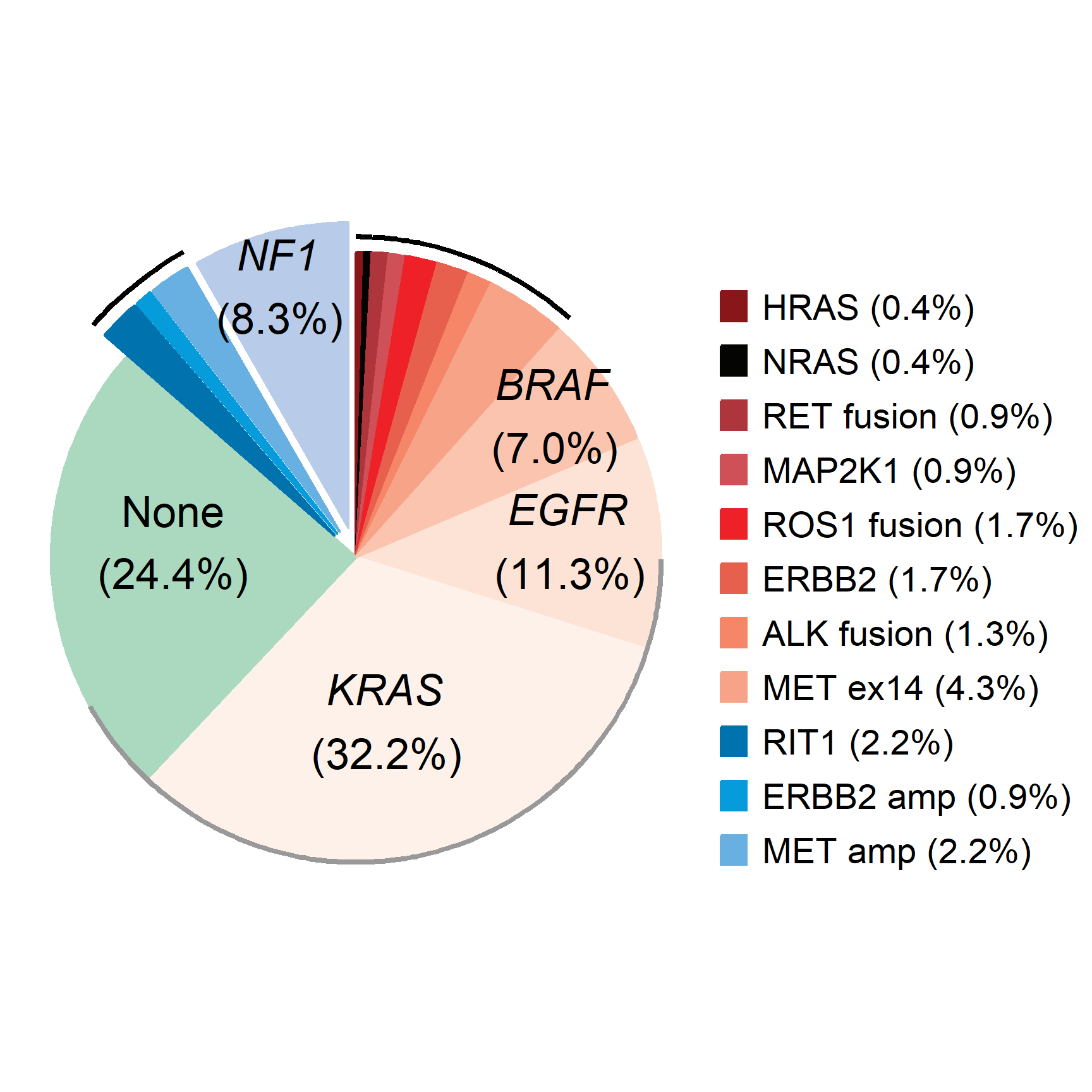
In cancer genomics research, pie charts can be used to show the distribution of different types of gene mutations (such as point mutations, insertions, deletions, etc.) in a specific sample.
Application
1. Disease distribution
In epidemiological studies, pie charts can be used to show the proportion of different diseases in a patient population, such as the distribution of different cancer types.
2. Cell ratio chart
Pie charts can be used to display the proportions of different cell types or tissue components in a tissue section.
Reference
[1] Wickham, H. (2016). “ggplot2: Elegant Graphics for Data Analysis.” Springer.
[2] Wickham, H. (2020). “ggplot2: Create Elegant Data Visualizations Using the Grammar of Graphics.” R package version 3.3.3.
[3] Pedersen, T. L. (2020). “ggforce: Accelerating ggplot2.” R package version 0.3.2.
[4] Kassambara, A. (2020). “ggpubr: ‘ggplot2’ Based Publication Ready Plots.” R package version 0.4.0.
[5] Harris, R. (2019). “export: Export ‘ggplot2’ and ‘base’ Graphics in Various Formats.” R package version 0.5.1.
[6] Rizzo, M. L. (2021). “ggplot2 for Beginners.” R Journal, 13(1), 84-91.
[7] Ma, F., & Zhang, J. (2020). “Exploring the use of R for visualizing complex data types.” Journal of Open Source Software, 5(51), 2008.