# Install packages
if (!requireNamespace("ggplot2", quietly = TRUE)) {
  install.packages("ggplot2")
}
if (!requireNamespace("ggdiceplot", quietly = TRUE)) {
  install.packages("ggdiceplot")
}
if (!requireNamespace("dplyr", quietly = TRUE)) {
  install.packages("dplyr")
}

# Load packages
library(ggplot2)
library(ggdiceplot)
library(dplyr)Dice Plot
Dice plots are a visualization technique for representing high-dimensional categorical data. The ggdiceplot package provides ggplot2 extensions for creating dice-based visualizations where each dot position on a dice represents a specific categorical variable. This allows intuitive visualization of up to 6 categorical variables simultaneously using traditional dice patterns. Each dice position (1-6) represents a different category, with dots shown only when that category is present.
Example
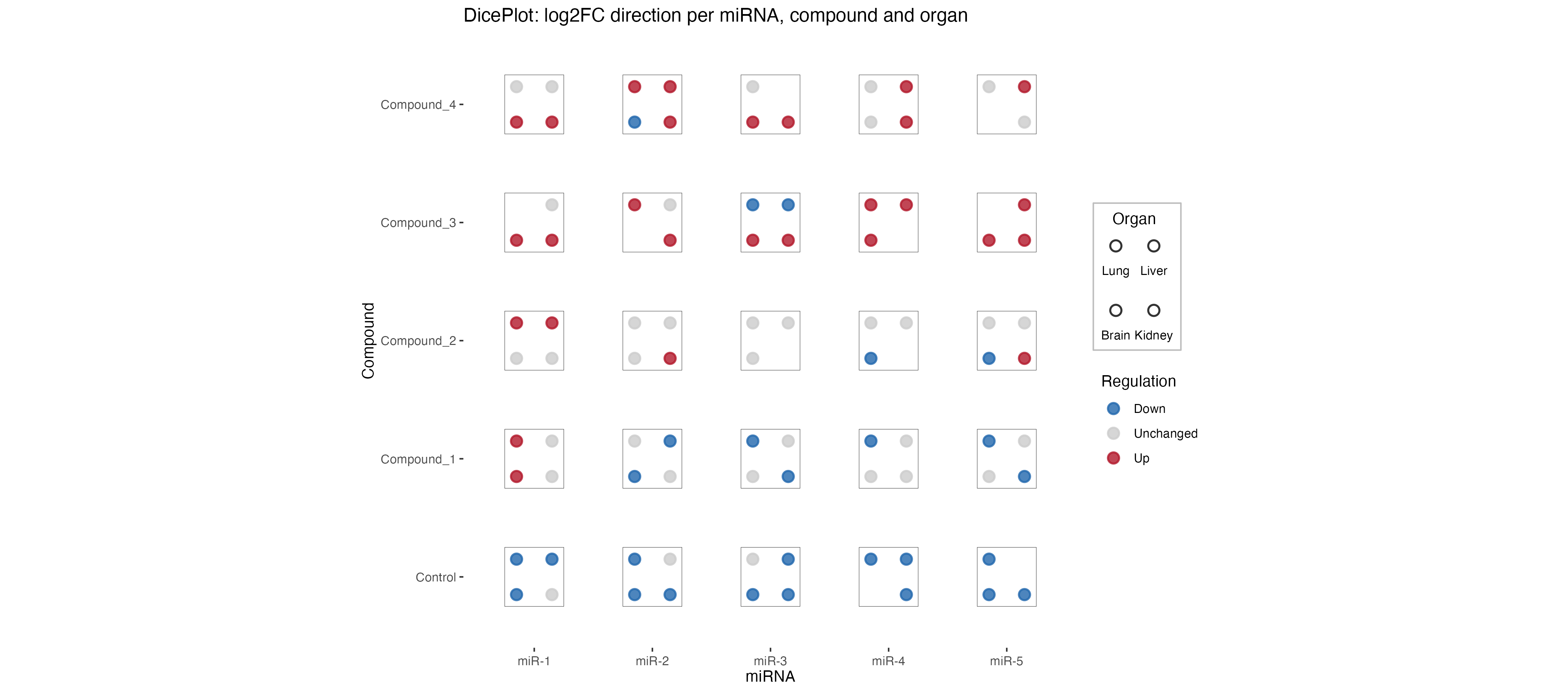
This dice plot shows miRNA expression changes across different compounds and organs. Each dice represents the presence and regulation direction of miRNA across different organs (Lung, Liver, Brain). The dots represent different organs, and the color indicates whether the miRNA is upregulated (red), downregulated (blue), or unchanged (grey).
Setup
- System Requirements: Cross-platform (Linux/MacOS/Windows)
- Programming language: R
- Dependent packages:
ggplot2;ggdiceplot;dplyr
sessioninfo::session_info("attached")─ Session info ───────────────────────────────────────────────────────────────
setting value
version R version 4.6.0 (2026-04-24)
os Ubuntu 24.04.4 LTS
system x86_64, linux-gnu
ui X11
language (EN)
collate C.UTF-8
ctype C.UTF-8
tz UTC
date 2026-05-09
pandoc 3.1.3 @ /usr/bin/ (via rmarkdown)
quarto 1.9.37 @ /usr/local/bin/quarto
─ Packages ───────────────────────────────────────────────────────────────────
package * version date (UTC) lib source
dplyr * 1.2.1 2026-04-03 [1] RSPM
ggdiceplot * 1.2.0 2026-03-27 [1] RSPM
ggplot2 * 4.0.3.9000 2026-05-04 [1] Github (tidyverse/ggplot2@6870419)
[1] /home/runner/work/_temp/Library
[2] /opt/R/4.6.0/lib/R/site-library
[3] /opt/R/4.6.0/lib/R/library
* ── Packages attached to the search path.
──────────────────────────────────────────────────────────────────────────────Data Preparation
The package includes sample data for demonstrating dice plot functionality. We’ll use the miRNA dysregulation dataset which contains information about microRNA expression changes across different compounds and organs.
# Load sample data from package
data("sample_dice_miRNA", package = "ggdiceplot")
df_dice <- sample_dice_miRNA

# View data structure
head(df_dice)
miRNA Compound Organ log2FC direction
1 miR-1 Control Lung -1.4483805 Down
2 miR-2 Control Lung -1.1841420 Down
3 miR-3 Control Lung 0.2469667 Unchanged
4 miR-4 Control Lung -0.9435933 Down
5 miR-5 Control Lung -0.8965698 Down
6 miR-1 Compound_1 Lung 0.8720520 Up# Check data dimensions
str(df_dice)'data.frame': 90 obs. of 5 variables:
$ miRNA : Factor w/ 5 levels "miR-1","miR-2",..: 1 2 3 4 5 1 2 3 4 5 ...
$ Compound : Factor w/ 5 levels "Control","Compound_1",..: 1 1 1 1 1 2 2 2 2 2 ...
$ Organ : Factor w/ 4 levels "Lung","Liver",..: 1 1 1 1 1 1 1 1 1 1 ...
$ log2FC : num -1.448 -1.184 0.247 -0.944 -0.897 ...
$ direction: Factor w/ 3 levels "Down","Unchanged",..: 1 1 2 1 1 3 2 1 1 1 ...
- attr(*, "out.attrs")=List of 2
..$ dim : Named int [1:3] 5 5 4
.. ..- attr(*, "names")= chr [1:3] "miRNA" "Compound" "Organ"
..$ dimnames:List of 3
.. ..$ miRNA : chr [1:5] "miRNA=miR-1" "miRNA=miR-2" "miRNA=miR-3" "miRNA=miR-4" ...
.. ..$ Compound: chr [1:5] "Compound=Control" "Compound=Compound_1" "Compound=Compound_2" "Compound=Compound_3" ...
.. ..$ Organ : chr [1:4] "Organ=Lung" "Organ=Liver" "Organ=Brain" "Organ=Kidney"The dataset contains columns for:
-
miRNA: microRNA identifier -
Compound: treatment compound -
Organ: tissue/organ type -
log2FC: log2 fold change in expression -
direction: regulation direction (Up/Down/Unchanged)
Visualization
1. Basic Dice Plot
The basic dice plot uses geom_dice() to represent multiple categorical variables. Each dice square can show up to 6 categories using traditional dice dot patterns.
Tip
Key Parameters:
-
dots: The variable to map to dice positions (1-6 dots) -
fill: Color mapping for the dice background -
widthandheight: Control the size of each dice square -
ndots: Number of unique categories to display
# Define colors for regulation direction
direction_colors <- c(
  Down      = "#2166ac",
  Unchanged = "grey80",
  Up        = "#b2182b"
)

# Create basic dice plot
p1 <- ggplot(df_dice, aes(x = miRNA, y = Compound)) +
  geom_dice(
    aes(
      dots   = Organ,
      fill   = direction,
      width  = 0.8,
      height = 0.8
    ),
    show.legend = TRUE,
    ndots       = length(levels(df_dice$Organ)),
    x_length    = length(levels(df_dice$miRNA)),
    y_length    = length(levels(df_dice$Compound))
  ) +
  scale_fill_manual(values = direction_colors, name = "Regulation") +
  theme_minimal() +
  theme(
    axis.text.x = element_text(angle = 0, hjust = 0.5),
    axis.text.y = element_text(hjust = 1),
    panel.grid  = element_blank()
  ) +
  labs(
    x = "miRNA",
    y = "Compound"
  )

p1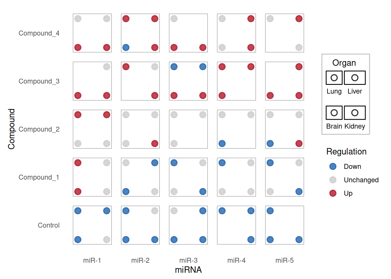
Each dice shows the presence and regulation direction of miRNA across different organs. The dots represent different organs (Lung, Liver, Brain), and the color indicates whether the miRNA is upregulated (red), downregulated (blue), or unchanged (grey).
2. Advanced Dice Plot with Continuous Variables
Dice plots can also incorporate continuous variables using size and color gradients. This is particularly useful for showing effect sizes and statistical significance.
# Load taxonomy example data
data("sample_dice_data1", package = "ggdiceplot")
toy_data <- sample_dice_data1

# View the data
head(toy_data)
taxon disease specimen lfc q
1 Campylobacter_showae Caries Saliva 4.11 0.2152
2 Porphyromonas_gingivalis Caries Saliva NA NA
3 Rothia_mucilaginosa Caries Saliva 1.09 0.0710
4 Fusobacterium_nucleatum Caries Saliva 1.90 0.1399
5 Streptococcus_mutans Caries Saliva 1.21 0.2824
6 Prevotella_intermedia Caries Saliva -0.32 0.4676
Tip
Advanced Parameters:
-
size: Map to continuous variables (e.g., -log10(q-value)) -
fill: Can use gradient scales for continuous effect sizes -
scale_fill_gradient2(): Creates diverging color scales for positive/negative effects
# Calculate scale parameters
lo <- floor(min(toy_data$lfc, na.rm = TRUE))
up <- ceiling(max(toy_data$lfc, na.rm = TRUE))
mid <- (lo + up) / 2

minsize <- floor(min(-log10(toy_data$q), na.rm = TRUE))
maxsize <- ceiling(max(-log10(toy_data$q), na.rm = TRUE))
midsize <- ceiling(quantile(-log10(toy_data$q), c(0.5), na.rm = TRUE))

# Create advanced dice plot
p2 <- ggplot(toy_data, aes(x = specimen, y = taxon)) +
  geom_dice(
    aes(
      dots   = disease,
      fill   = lfc,
      size   = -log10(q),
      width  = 0.5,
      height = 0.5
    ),
    show.legend = TRUE,
    ndots       = length(unique(toy_data$disease)),
    x_length    = length(unique(toy_data$specimen)),
    y_length    = length(unique(toy_data$taxon))
  ) +
  scale_fill_gradient2(
    low      = "#40004B",
    high     = "#00441B",
    mid      = "white",
    na.value = "white",
    limit    = c(lo, up),
    midpoint = mid,
    name     = "Log2FC"
  ) +
  scale_size_continuous(
    limits = c(minsize, maxsize),
    breaks = c(minsize, midsize, maxsize),
    labels = c(10^minsize, 10^-midsize, 10^-maxsize),
    name   = "q-value"
  ) +
  theme_minimal() +
  theme(
    axis.text.x = element_text(angle = 45, hjust = 1),
    axis.text.y = element_text(size = 10),
    legend.text = element_text(size = 10)
  ) +
  labs(
    x = "Specimen",
    y = "Taxon"
  )

p2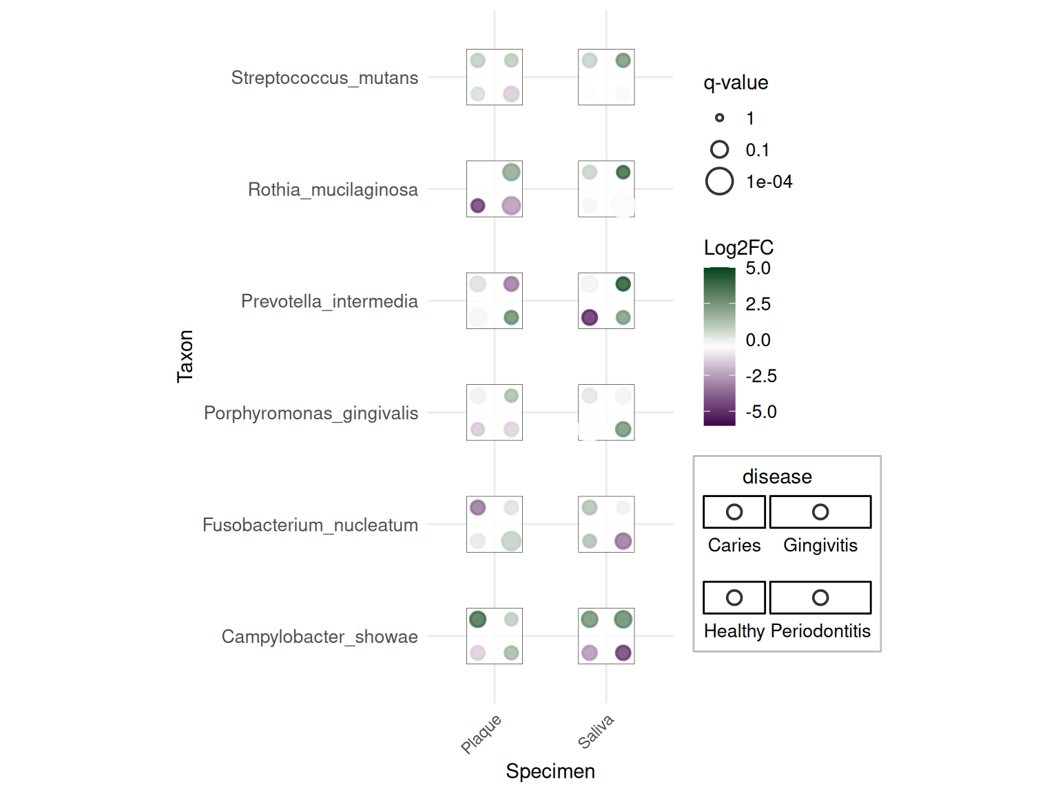
This advanced plot shows taxonomic data with: - Dots: Different diseases - Color: Log2 fold change (purple = down, green = up) - Size: Statistical significance (-log10 q-value)
3. Customized Theme
The package includes theme_dice() for cleaner visualization:
# Create dice plot with theme_dice()
p3 <- ggplot(df_dice, aes(x = miRNA, y = Compound)) +
  geom_dice(
    aes(
      dots   = Organ,
      fill   = direction,
      width  = 0.8,
      height = 0.8
    ),
    show.legend = TRUE,
    ndots       = length(levels(df_dice$Organ)),
    x_length    = length(levels(df_dice$miRNA)),
    y_length    = length(levels(df_dice$Compound))
  ) +
  scale_fill_manual(values = direction_colors, name = "Regulation") +
  theme_dice() +
  labs(
    title = "miRNA Dysregulation Across Compounds and Organs",
    x = "miRNA",
    y = "Compound"
  )

p3
The theme_dice() provides a minimal theme optimized for dice plots with clean backgrounds and appropriate spacing.
Applications
Dice plots are particularly useful in biomedical research for visualizing complex categorical relationships. They have been applied to various domains including genomics, transcriptomics, and clinical studies.
1. Gene Expression Analysis
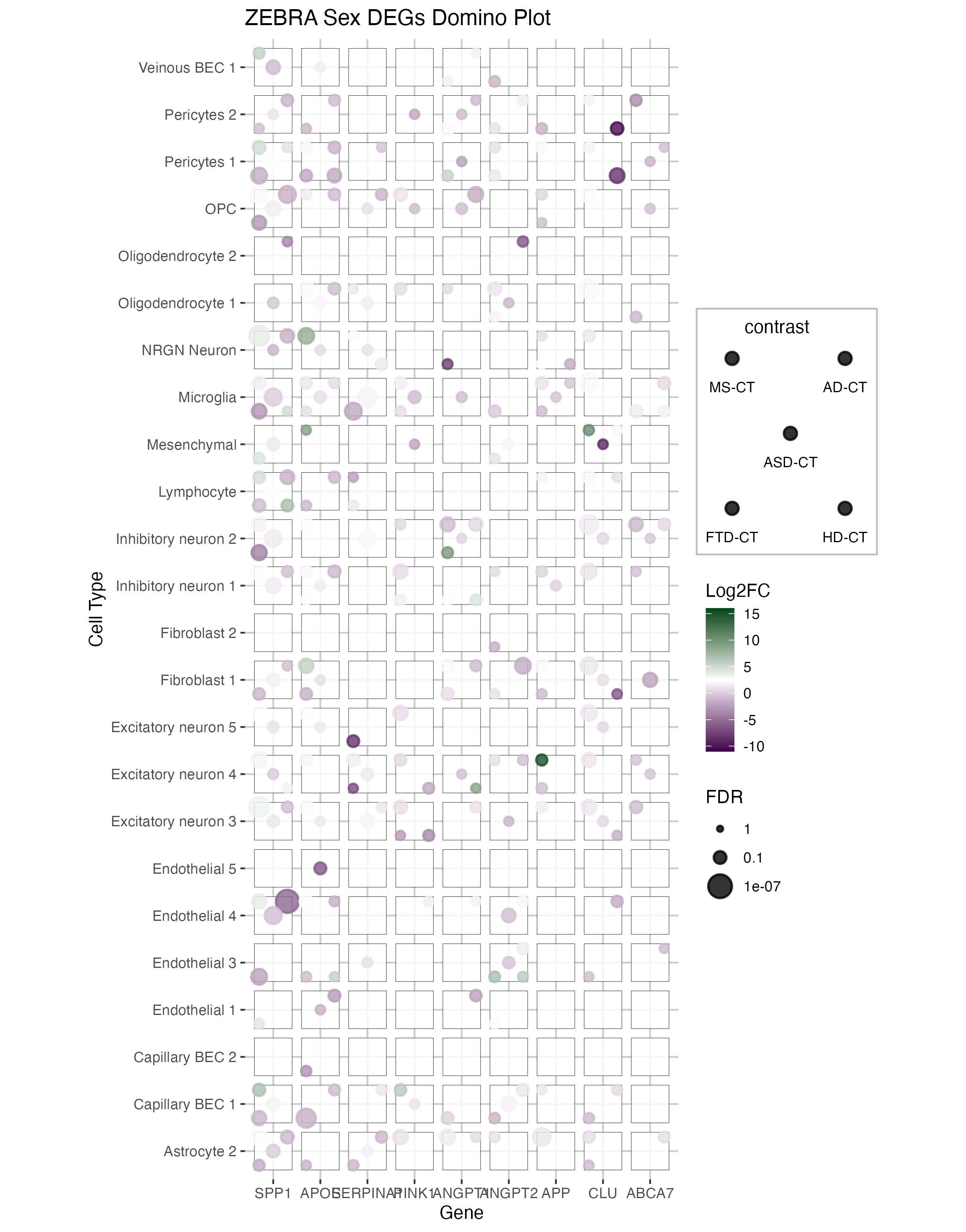
This figure shows a domino plot of differentially expressed genes across multiple diseases (MS, AD, ASD, FTD, HD) and cell types. Each dice represents:
- Dots: Different disease conditions
- Color: Log fold change (blue = downregulated, red = upregulated)
- Size: Statistical significance (FDR)
The domino plot allows visualization of gene expression patterns across multiple dimensions simultaneously, making it easy to identify disease-specific and cell-type-specific dysregulation patterns.
2. Taxonomic Analysis
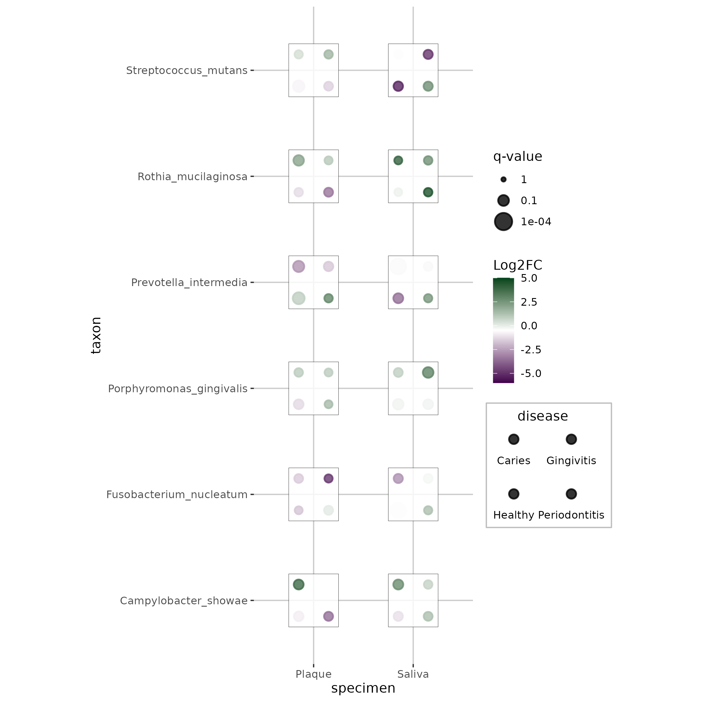
This application demonstrates how dice plots can visualize taxonomic abundance data across specimens and diseases, with each dot representing a different disease state and colors/sizes indicating effect sizes and significance levels.
3. miRNA Dysregulation Studies
This example shows miRNA expression changes across different compounds and organs, with dice dots representing organs and colors indicating regulation direction. This visualization pattern is particularly useful for pharmacological studies examining tissue-specific drug effects.
Reference
- M. Flotho, P. Flotho, A. Keller, “Diceplot: A package for high dimensional categorical data visualization,” arXiv preprint, 2024. https://doi.org/10.48550/arXiv.2410.23897
- ggdiceplot GitHub Repository: https://github.com/maflot/ggdiceplot
- ggdiceplot CRAN Package: https://CRAN.R-project.org/package=ggdiceplot
Contributors
- Editor: GitHub Copilot
- Contributors ShiXiang Wang