# Install packages
if (!requireNamespace("data.table", quietly = TRUE)) {
  install.packages("data.table")
}
if (!requireNamespace("jsonlite", quietly = TRUE)) {
  install.packages("jsonlite")
}
if (!requireNamespace("FactoMineR", quietly = TRUE)) {
  install.packages("FactoMineR")
}
if (!requireNamespace("factoextra", quietly = TRUE)) {
  install.packages("factoextra")
}

# Load packages
library(data.table)
library(jsonlite)
library(FactoMineR)
library(factoextra)PCA2
Note
Hiplot website
This page is the tutorial for source code version of the Hiplot PCA2 plugin. You can also use the Hiplot website to achieve no code ploting. For more information please see the following link:
Principal component analysis (PCA) is a data processing method with “dimension reduction” as the core, replacing multi-index data with a few comprehensive indicators (PCA), and restoring the most essential characteristics of data.
Setup
System Requirements: Cross-platform (Linux/MacOS/Windows)
Programming language: R
Dependent packages:
data.table;jsonlite;FactoMineR;factoextra
sessioninfo::session_info("attached")─ Session info ───────────────────────────────────────────────────────────────
setting value
version R version 4.6.0 (2026-04-24)
os Ubuntu 24.04.4 LTS
system x86_64, linux-gnu
ui X11
language (EN)
collate C.UTF-8
ctype C.UTF-8
tz UTC
date 2026-05-09
pandoc 3.1.3 @ /usr/bin/ (via rmarkdown)
quarto 1.9.37 @ /usr/local/bin/quarto
─ Packages ───────────────────────────────────────────────────────────────────
package * version date (UTC) lib source
data.table * 1.18.4 2026-05-06 [1] RSPM
factoextra * 2.0.0 2026-03-03 [1] RSPM
FactoMineR * 2.14 2026-04-08 [1] RSPM
ggplot2 * 4.0.3.9000 2026-05-04 [1] Github (tidyverse/ggplot2@6870419)
jsonlite * 2.0.0 2025-03-27 [1] RSPM
[1] /home/runner/work/_temp/Library
[2] /opt/R/4.6.0/lib/R/site-library
[3] /opt/R/4.6.0/lib/R/library
* ── Packages attached to the search path.
──────────────────────────────────────────────────────────────────────────────Data Preparation
The loaded data are set (gene name and corresponding gene expression value) and sample information (sample name and grouping).
# Load data
data <- data.table::fread(jsonlite::read_json("https://hiplot.cn/ui/basic/pca2/data.json")$exampleData[[1]]$textarea[[1]])
data <- as.data.frame(data)
sample_info <- data.table::fread(jsonlite::read_json("https://hiplot.cn/ui/basic/pca2/data.json")$exampleData[[1]]$textarea[[2]])
sample_info <- as.data.frame(sample_info)

# Convert data structure
row.names(sample_info) <- sample_info[,1]
sample_info <- sample_info[colnames(data)[-1],]
## tsne
rownames(data) <- data[, 1]
data <- as.matrix(data[, -1])
pca_data <- PCA(t(as.matrix(data)), scale.unit = TRUE, ncp = 5, graph = FALSE)

# View data
head(data[,1:5])
M1 M2 M3 M4 M5
GBP4 6.599344 5.226266 3.693288 3.938501 4.527193
BCAT1 5.760380 4.892783 5.448924 3.485413 3.855669
CMPK2 9.561905 4.549168 3.998655 5.614384 3.904793
STOX2 8.396409 8.717055 8.039064 7.643060 9.274649
PADI2 8.419766 8.268430 8.451181 9.200732 8.598207
SCARNA5 7.653074 5.780393 10.633550 5.913684 8.805605Visualization
# PCA2
p <- fviz_pca_ind(pca_data, geom.ind = "point", pointsize = 6, addEllipses = TRUE,
                  mean.point = F, col.ind = sample_info[,"Group"]) +
  ggtitle("Principal Component Analysis") +
  scale_fill_manual(values = c("#00468BFF","#ED0000FF")) +
  scale_color_manual(values = c("#00468BFF","#ED0000FF")) +
  theme_bw() +
  theme(text = element_text(family = "Arial"),
        plot.title = element_text(size = 12,hjust = 0.5),
        axis.title = element_text(size = 12),
        axis.text = element_text(size = 10),
        axis.text.x = element_text(angle = 0, hjust = 0.5,vjust = 1),
        legend.position = "right",
        legend.direction = "vertical",
        legend.title = element_text(size = 10),
        legend.text = element_text(size = 10))

p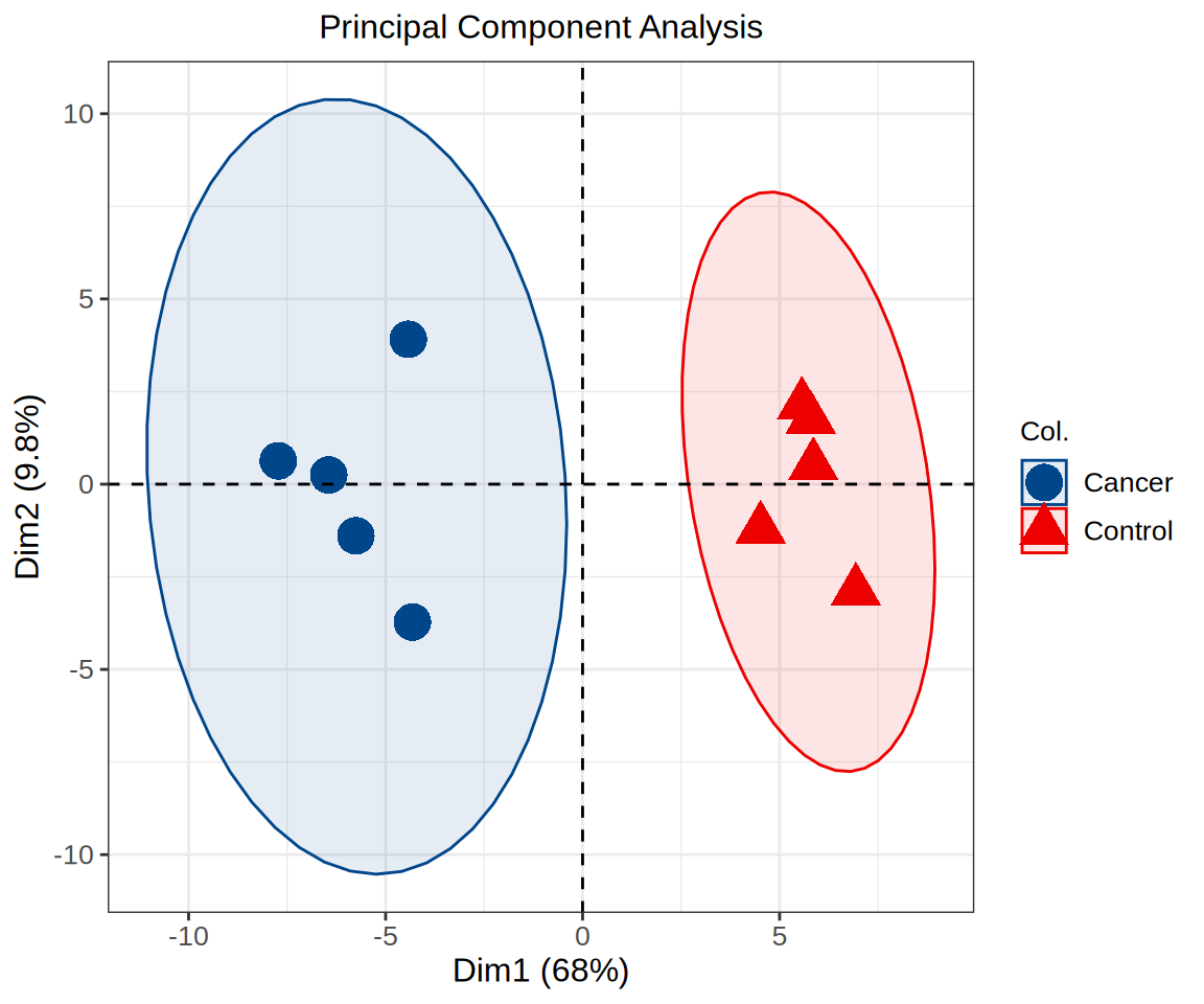
Different colors represent different samples, which can explain the relationship between principal components and original variables. For example, M1 has a greater contribution to PC1, while M8 has a greater negative correlation with PC1.