# Install packages
if (!requireNamespace("ggplot2", quietly = TRUE)) {
  install.packages("ggplot2")
}

# Load packages
library(ggplot2)Pie Chart
A pie chart is a basic chart in statistics, using sectors of different sizes to represent the magnitude of each item. A pie chart provides a visual understanding of the proportion of each data point within the overall data.
Example
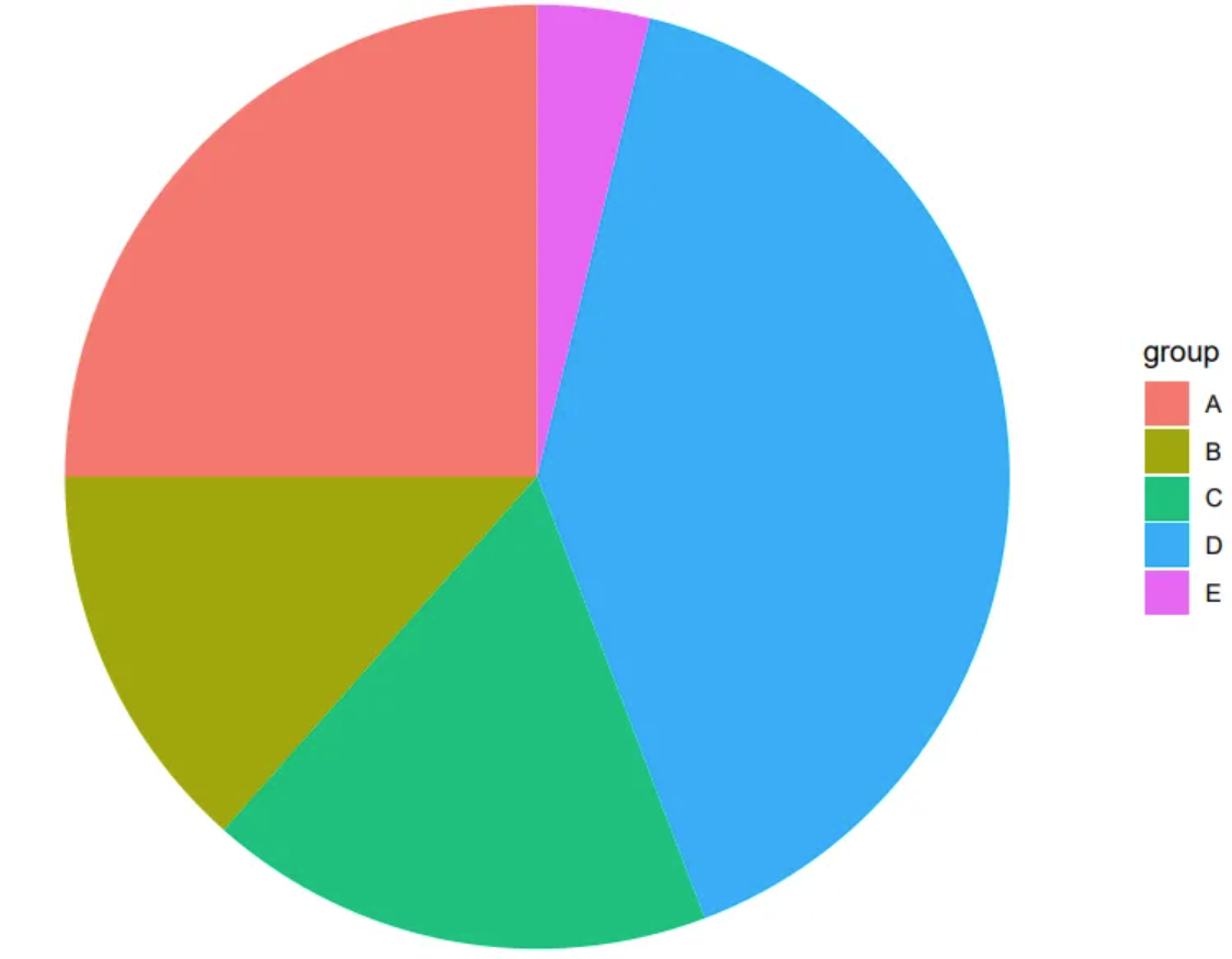
The image is a very basic pie chart. The different colored and sized sectors represent different data items, which can intuitively show the proportion of each data group in the overall data.
Setup
System Requirements: Cross-platform (Linux/MacOS/Windows)
Programming Language: R
Dependencies:
ggplot2
sessioninfo::session_info("attached")─ Session info ───────────────────────────────────────────────────────────────
setting value
version R version 4.6.0 (2026-04-24)
os Ubuntu 24.04.4 LTS
system x86_64, linux-gnu
ui X11
language (EN)
collate C.UTF-8
ctype C.UTF-8
tz UTC
date 2026-05-09
pandoc 3.1.3 @ /usr/bin/ (via rmarkdown)
quarto 1.9.37 @ /usr/local/bin/quarto
─ Packages ───────────────────────────────────────────────────────────────────
package * version date (UTC) lib source
ggplot2 * 4.0.3.9000 2026-05-04 [1] Github (tidyverse/ggplot2@6870419)
[1] /home/runner/work/_temp/Library
[2] /opt/R/4.6.0/lib/R/site-library
[3] /opt/R/4.6.0/lib/R/library
* ── Packages attached to the search path.
──────────────────────────────────────────────────────────────────────────────Data Preparation
The data comes from the PubMed paper “The epidemiology of lung cancer in Hungary based on the characteristics of patients diagnosed in 2018”[1], which includes statistics on lung cancer staging.
# Data writing: one column for grouping, one column for values.
data <- data.frame(
  group = c("I", "II", "III", "IV", "NA"),
  value = c(402, 955, 1252, 3343, 3567)
)

head(data)
group value
1 I 402
2 II 955
3 III 1252
4 IV 3343
5 NA 3567Visualization
1. Basic pie chart
# Basic drawing - bar chart
p <- ggplot(data, aes(x = "", y = value, fill = group)) +
  geom_col() # First, draw a bar chart, then transform it into a pie chart using coord_polar().

p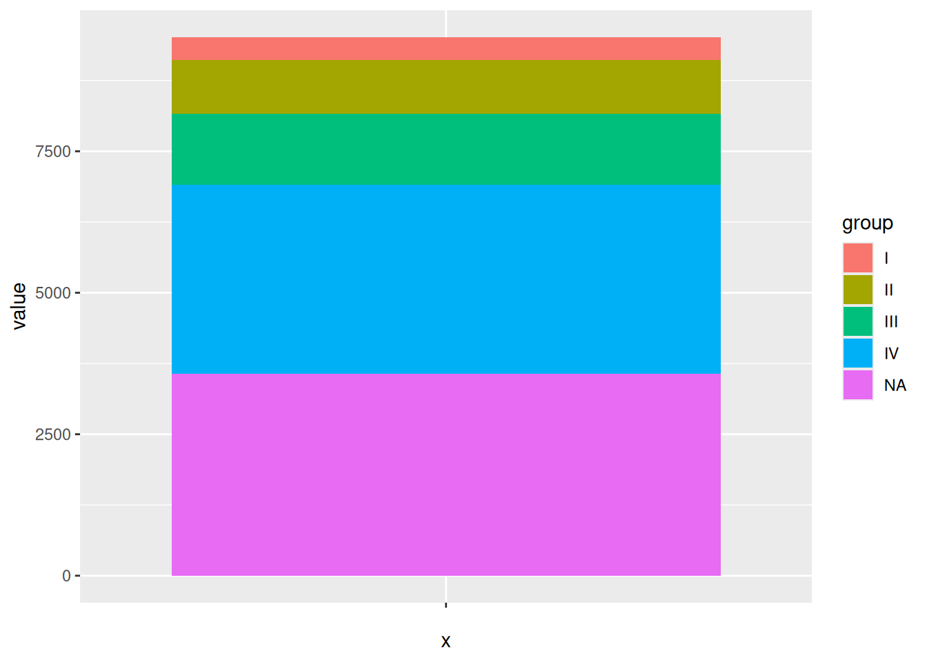
Drawing a bar chart is an intermediate step in drawing a pie chart using ggplot2. Then, by performing coordinate polarization using coord_polar(), the pie chart can be obtained.
# Basic pie chart
p <- ggplot(data, aes(x = "", y = value, fill = group)) +
  geom_col() + # First, draw a bar chart, then transform it into a pie chart using coord_polar().
  coord_polar(theta = "y") # Used for drawing pie charts

p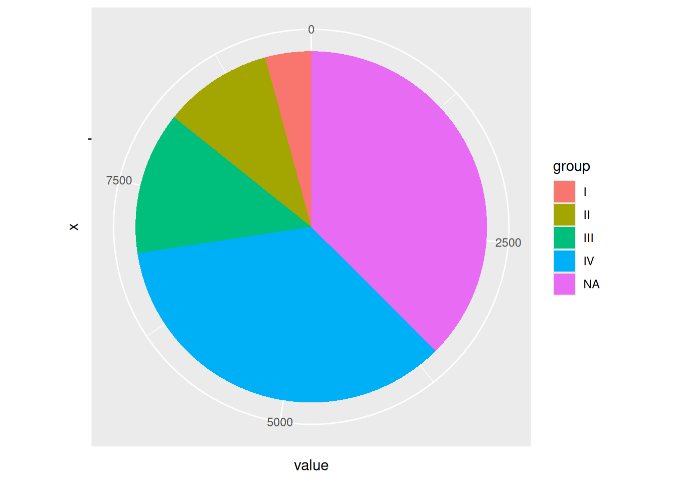
The image shows a pie chart drawn using ggplot2, but coordinate labels and scales are not necessary.
2. Simple pie chart
# Use theme_void() to remove elements such as grid, backgroundcolor, and axis.label.
p <- ggplot(data, aes(x = "", y = value, fill = group)) +
  geom_col() +
  coord_polar(theta = "y") +
  theme_void()
p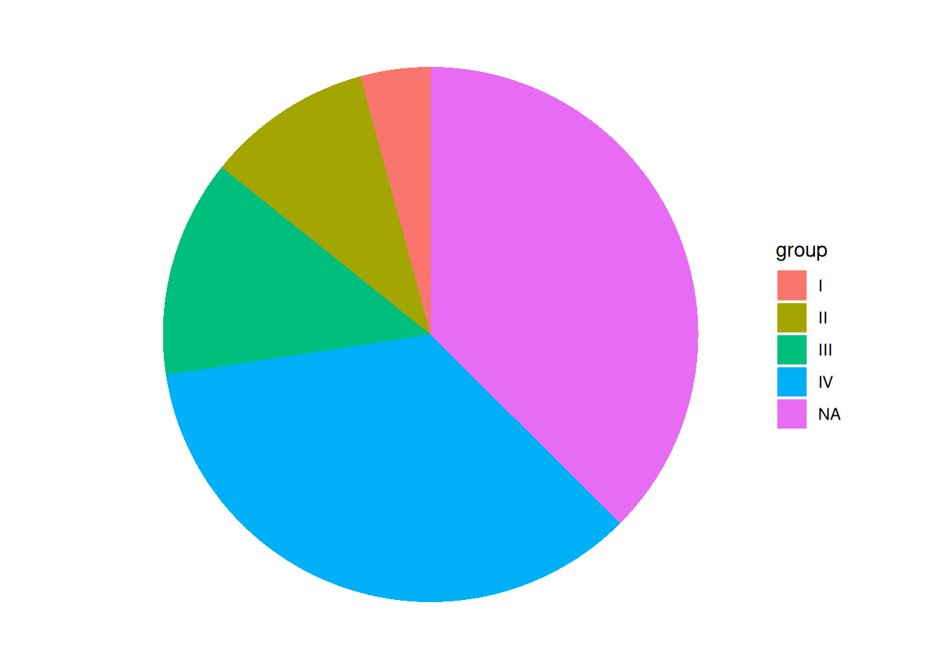
This pie chart removes elements such as grid, background color, and axis.label, making it look cleaner.
3. Custom colors
# Use scale_fill_manual() to customize colors.
p <- ggplot(data, aes(x = "", y = value, fill = group)) +
  geom_col() +
  coord_polar(theta = "y") +
  theme_void() +
  scale_fill_manual(values = c("red","blue","purple","pink","grey")) # Custom colors
p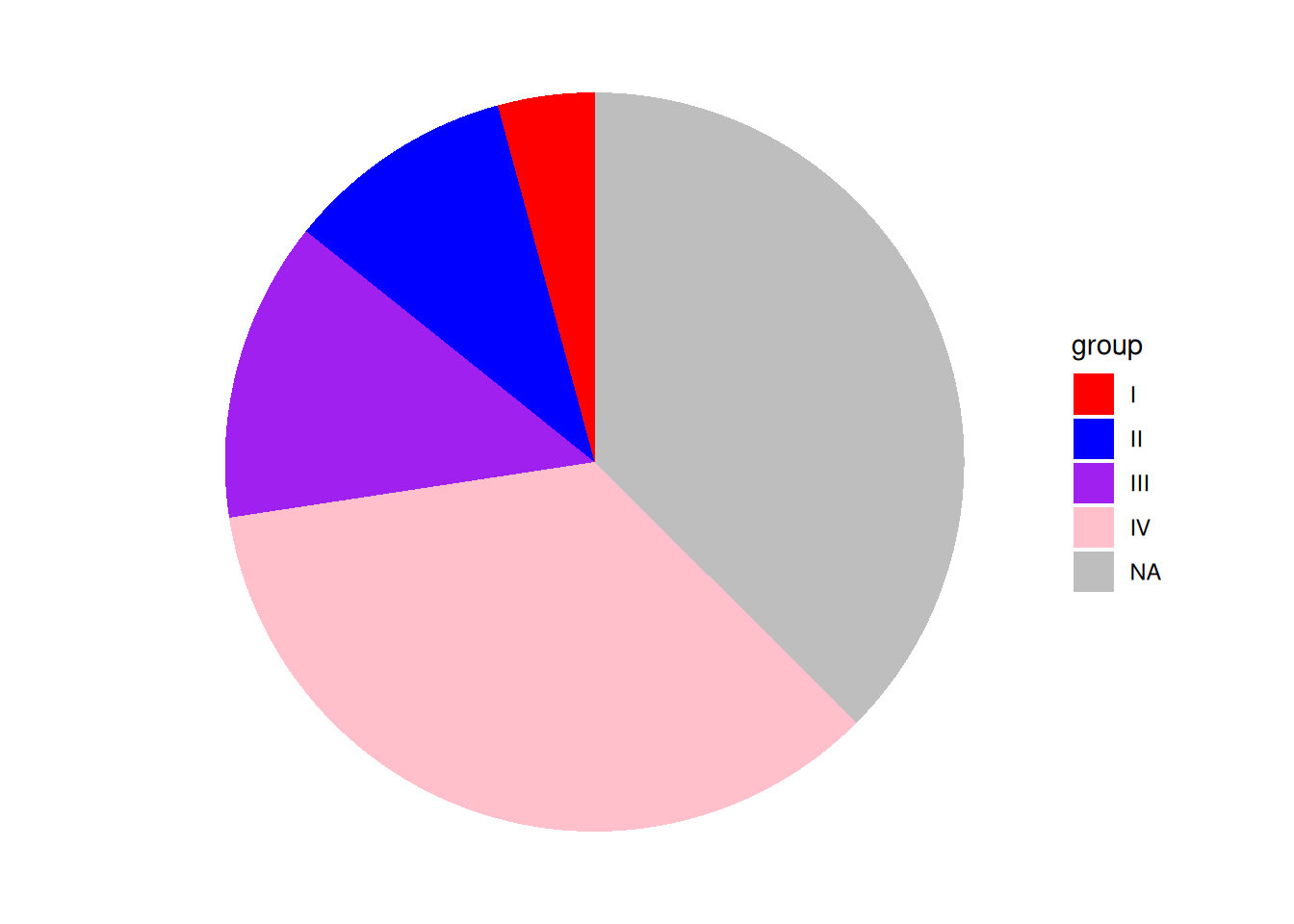
This pie chart uses scale_fill_manual() to customize the colors. Note that you should not use scale_color_manual(); the color of the sector in the chart is the fill color.
4. Add Labels
Before adding labels, you need to calculate their positions. Since only the y-axis value is used when drawing a pie chart, you only need to calculate the y-axis coordinates. A pie chart is derived from a bar chart, so you only need to calculate the center y-value of each bar. For example, if group="I", based on the position of bar group I in the bar chart, label_loc will equal the height of the four groups below plus half the height of group I.
# Calculate label position
data$label_loc <- NA # Add a column for label positions to the original data frame, initially NA.
for (i in 1:length(data$group)) { # Loop through and calculate the label position of the group.
  locate <- data$value[i] / 2 # The label position is the center of the current group plus the height of the group below it. The height of the group below it is calculated using a loop.
  if (i < length(data$group)) {
    for (j in (i + 1):length(data$group)) {
      locate <- locate + data$value[j]
    }
  }
  data$label_loc[i] <- locate # Finally, the location of this group of tags was obtained.
}

# Draw a labeled pie chart
p <- ggplot(data, aes(x = "", y = value, fill = group)) +
  geom_col() +
  coord_polar(theta = "y") +
  theme_void() +
  geom_text(aes(y = label_loc, label = group)) + # y is the y-axis position of the label, and label is the label name.
  theme(legend.position = "None") # Since the groups are used as labels, the legend is removed here.
p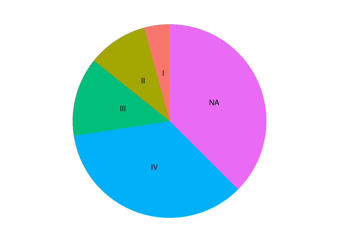
The pie chart was successfully labeled, but the code is a bit cumbersome. Using Python or R’s pie() function would be much simpler.
5. Add percentage labels
# 1.Calculate the label position (same as above).
data$label_loc <- NA
for (i in 1:length(data$group)) {
  locate <- data$value[i] / 2
if (i < length(data$group)) {
    for (j in (i + 1):length(data$group)) {
      locate <- locate + data$value[j]
    }
  }
  data$label_loc[i] <- locate
}
# 2.Calculate percentage
data$label <- NA
sum <- sum(data$value)
for (i in 1:length(data$group)) {
  data$label[i] <- paste0(round(data$value[i] / sum * 100, 1), "%")
}

# Draw a percentage label pie chart
p <- ggplot(data, aes(x = "", y = value, fill = group)) +
  geom_col() +
  coord_polar(theta = "y") +
  theme_void() +
  geom_text(aes(y = label_loc, label = label))
p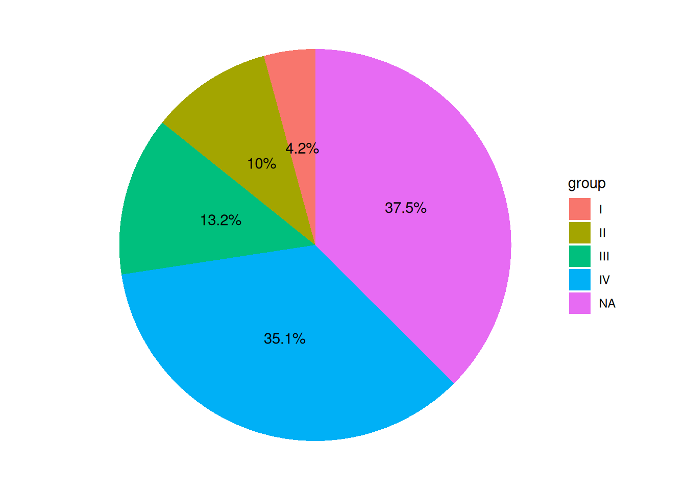
The pie chart legend shows groups, and the labels display percentages, making it more aesthetically pleasing and intuitive.
6. Place the label outside the pie chart
Sometimes there are many groups, and putting the labels inside the pie chart can make it look very crowded.
# The code for calculating percentage labels and label positions remains unchanged.
# 1.Calculate the label position (same as above).
data$label_loc <- NA
for (i in 1:length(data$group)) {
  locate <- data$value[i] / 2
if (i < length(data$group)) {
    for (j in (i + 1):length(data$group)) {
      locate <- locate + data$value[j]
    }
  }
  data$label_loc[i] <- locate
}
# 2.Calculate percentage
data$label <- NA
sum <- sum(data$value)
for (i in 1:length(data$group)) {
  data$label[i] <- paste0(round(data$value[i] / sum * 100, 1), "%")
}

# Adjusting the x-value in geom_text() will move the label inward (decreasing the x-value) or outward (increasing the x-value).
p <- ggplot(data, aes(x = "", y = value, fill = group)) +
  geom_col() +
  coord_polar(theta = "y") +
  theme_void() +
  geom_text(aes(x = rep_len(1.6, length(group)), y = label_loc, label = label))
p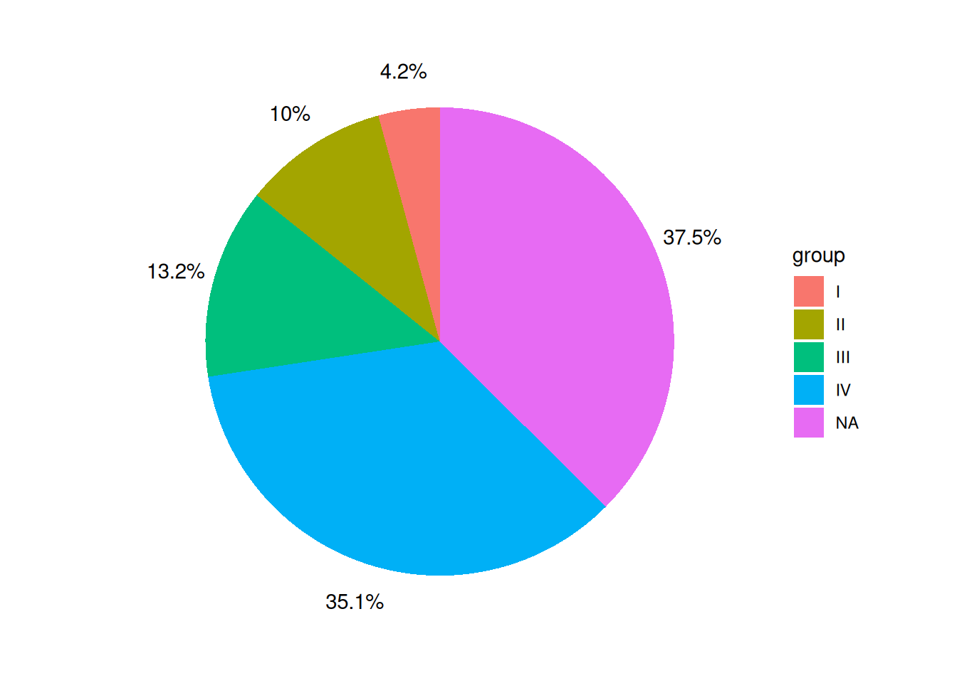
The labels on the pie chart are placed outside the pie chart itself, which makes the pie chart look more aesthetically pleasing, especially when there are many groups.
7. Add labels to the lines pointing to the pie chart
# The code for calculating percentage labels and label positions remains unchanged.
# 1.Calculate the label position (same as above).
data$label_loc <- NA
for (i in 1:length(data$group)) {
  locate <- data$value[i] / 2
if (i < length(data$group)) {
    for (j in (i + 1):length(data$group)) {
      locate <- locate + data$value[j]
    }
  }
  data$label_loc[i] <- locate
}
# 2.Calculate percentage
data$label <- NA
sum <- sum(data$value)
for (i in 1:length(data$group)) {
  data$label[i] <- paste0(round(data$value[i] / sum * 100, 1), "%")
}

# The line segment can be defined by adjusting the values of x and xend in geom_segment(), where the x value is greater than the radius of the pie chart, the xend value is slightly less than the coordinates of the label, and y and yend are still vectors representing the positions of the labels.
p <- ggplot(data, aes(x = "", y = value, fill = group)) +
  geom_col() +
  coord_polar(theta = "y") +
  theme_void() +
  geom_text(aes(x = rep_len(1.6, length(group)), y = label_loc, label = label)) +
  geom_segment(aes(
    x = rep_len(1.45, length(group)),
    xend = rep_len(1.58, length(group)),
    y = label_loc, yend = label_loc
  ))
p
The labels on the pie chart have corresponding line segments pointing to specific areas of the pie chart, preventing confusion when there are many groups.
Applications
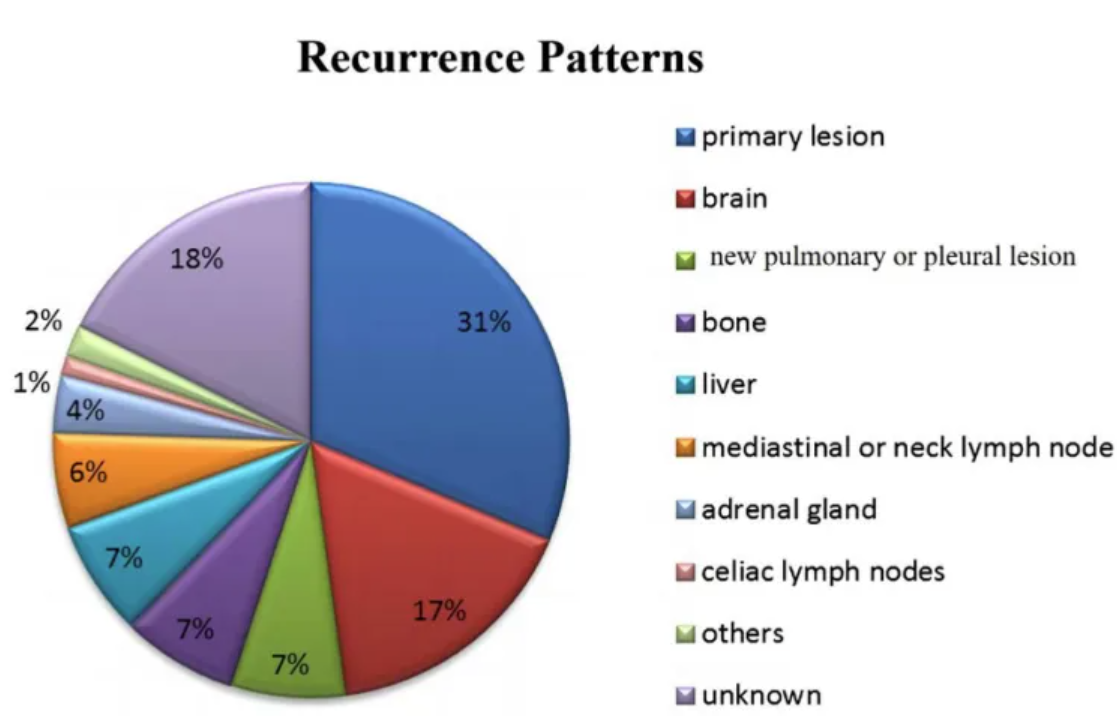
The figure shows that the recurrence pattern after failure of first-line treatment for small cell lung cancer is mainly recurrence of the primary lesion (31%), followed by brain metastasis (17%), lung or pleural metastasis (7%), bone metastasis (7%), liver metastasis (7%), mediastinal or cervical lymph node metastasis (6%), adrenal metastasis (4%), abdominal lymph node metastasis (1%), pancreatic and intestinal metastasis (2%), and unknown (18%). [1]
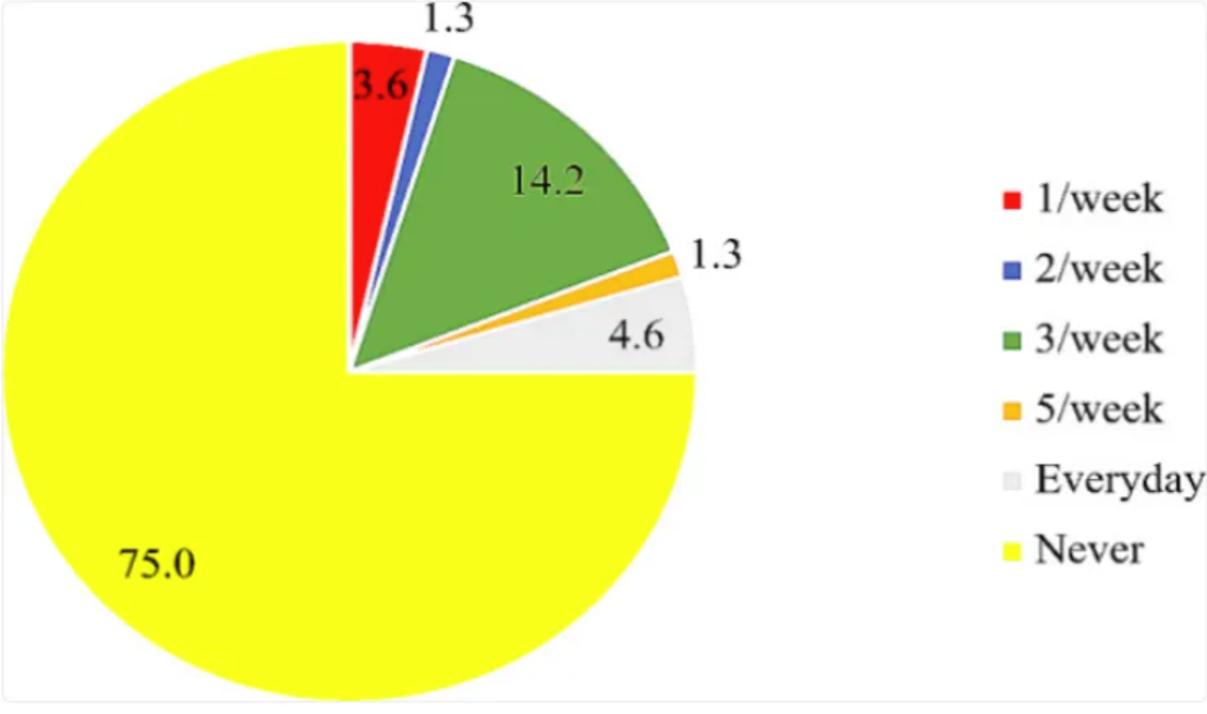
The chart shows that the use of folic acid supplements and the intake of folic acid-fortified foods are quite low, with 75% of participants reporting that they have never taken folic acid supplements. [2]
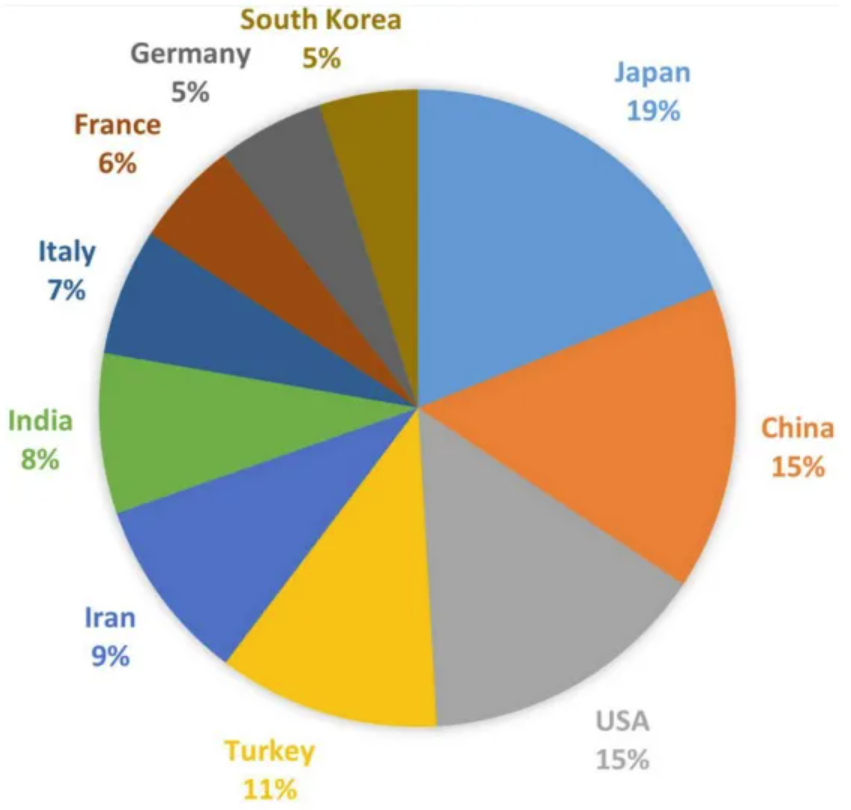
The chart shows the number of publications on TAO in each country. Japan has published the most related articles (91, 16.46%), followed by China (74, 13.38%), the United States (71, 12.84%), Turkey (54, 9.76%), Iran (45, 8.14%), and others. [3]
Reference
[1] ZHOU Y, WU Z, WANG H, et al. Evaluation of the prognosis in patients with small-cell lung cancer treated by chemotherapy using tumor shrinkage rate-based radiomics[J]. Eur J Med Res, 2024,29(1): 401.
[2] AKWAA H O, IFIE I, NKWONTA C, et al. Knowledge, awareness, and use of folic acid among women of childbearing age living in a peri-urban community in Ghana: a cross-sectional survey[J]. BMC Pregnancy Childbirth, 2024,24(1): 241.
[3] LIU Z, ZHOU C, GUO H, et al. Knowledge Mapping of Global Status and Trends for Thromboangiitis Obliterans: A Bibliometrics and Visual Analysis[J]. J Pain Res, 2023,16: 4071-4087.