import matplotlib.pyplot as plt
import seaborn as sns
import pandas as pd
import numpy as np小提琴图(Python)
小提琴图结合了箱线图和核密度估计,用于展示连续数据在不同类别中的分布。在生物医学研究中,小提琴图非常适合比较不同患者组之间的基因表达分布、药物反应测量或临床生物标志物水平。Python 的 seaborn 库可以轻松创建精美的小提琴图。
示例

环境配置
- 系统要求:跨平台(Linux/MacOS/Windows)
- 编程语言:Python
- 依赖包:
matplotlib、seaborn、pandas、numpy
数据准备
iris = sns.load_dataset("iris")

np.random.seed(42)
n_per_group = 80
groups = ['Tumor', 'Normal', 'Adjacent']
gene_expr = pd.DataFrame({
    'Expression': np.concatenate([
        np.random.normal(8, 1.5, n_per_group),
        np.random.normal(5, 1.2, n_per_group),
        np.random.normal(6.5, 1.8, n_per_group)
    ]),
    'Group': np.repeat(groups, n_per_group),
    'Gene': np.tile(np.repeat(['TP53', 'BRCA1'], n_per_group // 2), 3)
})
可视化
基础小提琴图
fig, ax = plt.subplots(figsize=(8, 6))
sns.violinplot(data=iris, x='species', y='sepal_length', palette='Set2',
               inner='box', ax=ax)
ax.set_xlabel('Species')
ax.set_ylabel('Sepal Length (cm)')
ax.set_title('Distribution of Sepal Length by Species')
ax.spines[['top', 'right']].set_visible(False)
plt.tight_layout()
plt.show()
/mnt/TMP/ipykernel_118942/2407574281.py:2: FutureWarning:
Passing `palette` without assigning `hue` is deprecated and will be removed in v0.14.0. Assign the `x` variable to `hue` and set `legend=False` for the same effect.
sns.violinplot(data=iris, x='species', y='sepal_length', palette='Set2',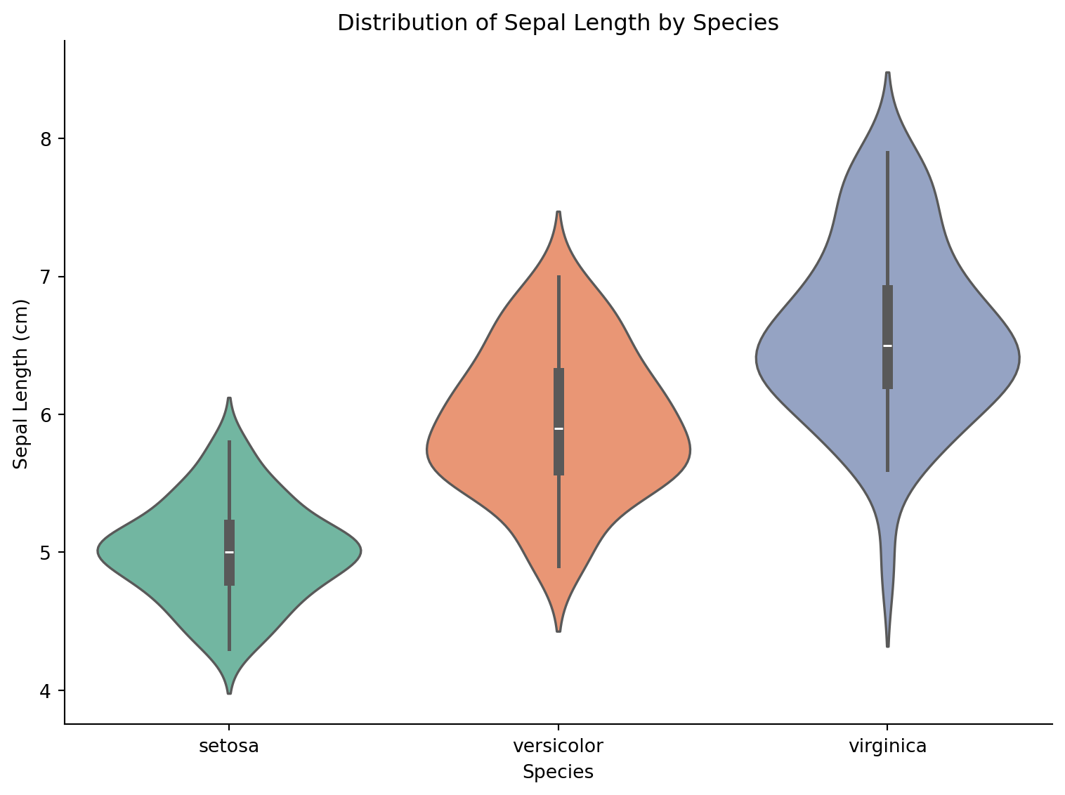
分割小提琴图
fig, ax = plt.subplots(figsize=(8, 6))
tumor_normal = gene_expr[gene_expr['Group'].isin(['Tumor', 'Normal'])]
sns.violinplot(data=tumor_normal, x='Gene', y='Expression', hue='Group',
               split=True, palette={'Tumor': '#e63946', 'Normal': '#457b9d'},
               inner='quart', ax=ax)
ax.set_title('Gene Expression: Tumor vs Normal')
ax.set_ylabel('Expression Level')
ax.spines[['top', 'right']].set_visible(False)
plt.tight_layout()
plt.show()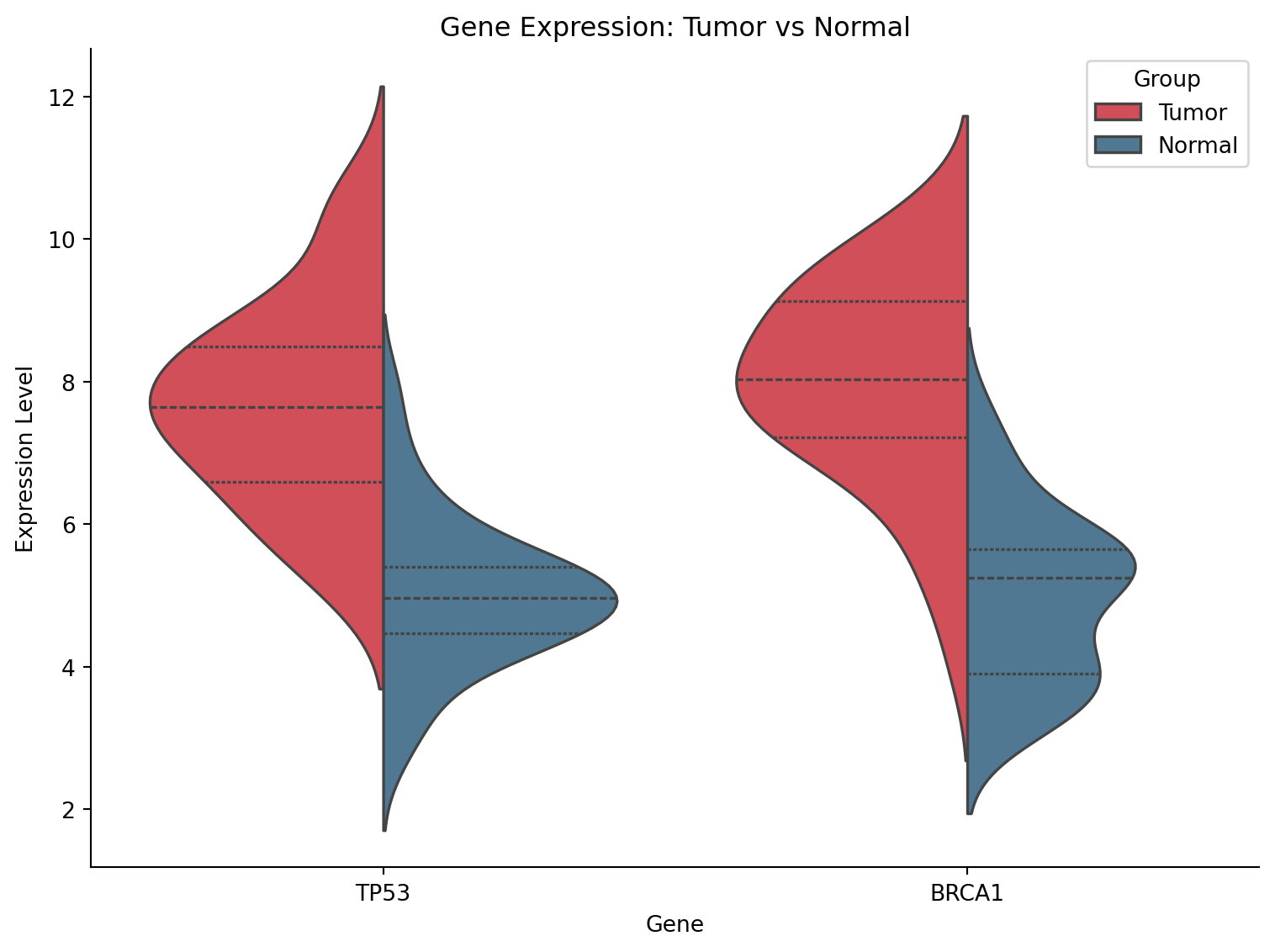
带数据点的小提琴图
fig, ax = plt.subplots(figsize=(9, 6))
sns.violinplot(data=gene_expr, x='Group', y='Expression', palette='pastel',
               inner=None, alpha=0.7, ax=ax)
sns.stripplot(data=gene_expr, x='Group', y='Expression', color='black',
              size=3, alpha=0.4, jitter=True, ax=ax)
ax.set_title('Gene Expression Distribution with Individual Points')
ax.set_ylabel('Expression Level')
ax.spines[['top', 'right']].set_visible(False)
plt.tight_layout()
plt.show()
/mnt/TMP/ipykernel_118942/1230588679.py:2: FutureWarning:
Passing `palette` without assigning `hue` is deprecated and will be removed in v0.14.0. Assign the `x` variable to `hue` and set `legend=False` for the same effect.
sns.violinplot(data=gene_expr, x='Group', y='Expression', palette='pastel',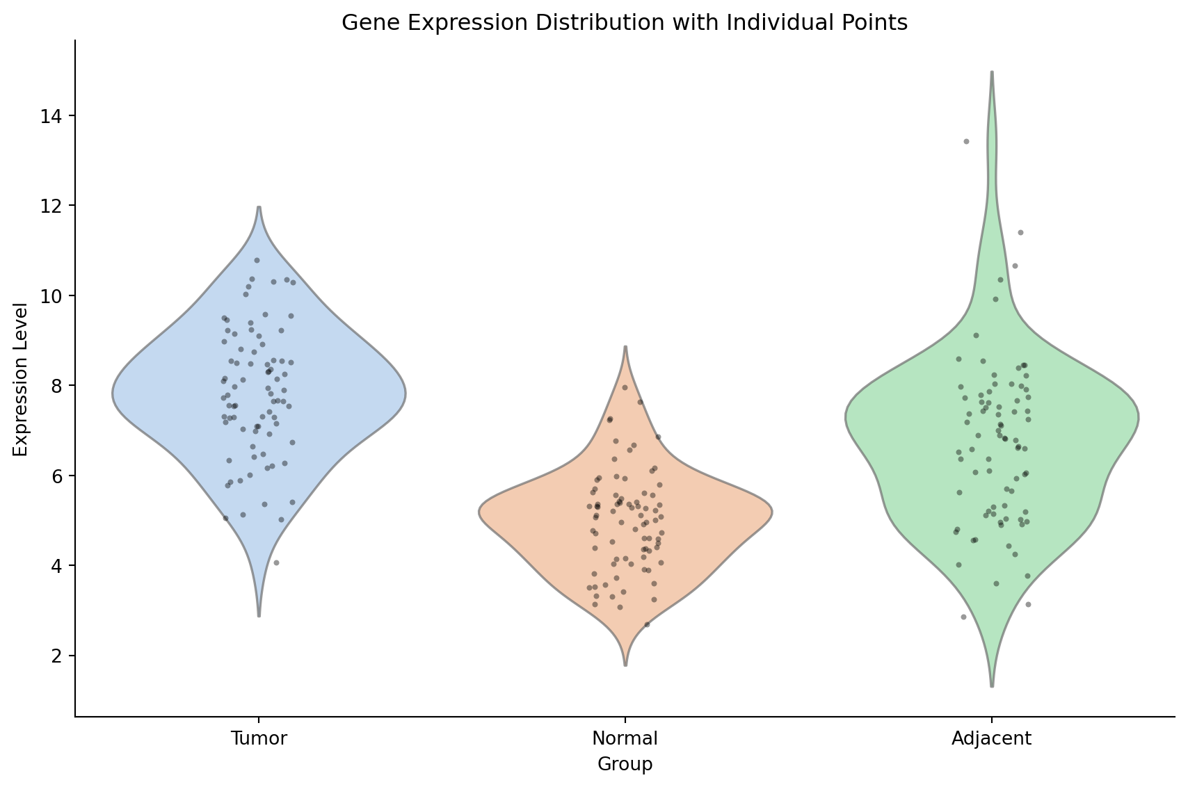
参考文献
- Hintze, J. L., & Nelson, R. D. (1998). Violin plots: a box plot-density trace synergism. The American Statistician, 52(2), 181-184.
- Waskom, M. L. (2021). seaborn: statistical data visualization. JOSS, 6(60), 3021.