# Install packages
if (!requireNamespace("sf", quietly = TRUE)) {
  install.packages("sf")
}
if (!requireNamespace("rnaturalearth", quietly = TRUE)) {
  install.packages("rnaturalearth")
}
if (!requireNamespace("rnaturalearthdata", quietly = TRUE)) {
  install.packages("rnaturalearthdata")
}
if (!requireNamespace("gstat", quietly = TRUE)) {
  install.packages("gstat")
}
if (!requireNamespace("dplyr", quietly = TRUE)) {
  install.packages("dplyr")
}
if (!requireNamespace("ggplot2", quietly = TRUE)) {
  install.packages("ggplot2")
}
if (!requireNamespace("ggspatial", quietly = TRUE)) {
  install.packages("ggspatial")
}
if (!requireNamespace("ggnewscale", quietly = TRUE)) {
  install.packages("ggnewscale")
}
if (!requireNamespace("ggrepel", quietly = TRUE)) {
  install.packages("ggrepel")
}
if (!requireNamespace("ggfx", quietly = TRUE)) {
  install.packages("ggfx")
}
if (!requireNamespace("doParallel", quietly = TRUE)) {
  install.packages("doParallel")
}
if (!requireNamespace("viridis", quietly = TRUE)) {
  install.packages("viridis")
}

# Load packages
library(sf)
library(rnaturalearth)
library(rnaturalearthdata)
library(gstat)
library(dplyr)
library(ggplot2)
library(ggspatial)
library(ggnewscale)
library(ggrepel)
library(ggfx)
library(doParallel)
library(viridis)Population Map Plot
Example
Shows the geographical distribution of disease incidence, with light and dark colors indicating higher and lower incidence rates, and map boundaries representing administrative divisions.
Setup
System Requirements: Cross-platform (Linux/MacOS/Windows)
Programming language: R
Dependent packages:
sf;rnaturalearth;rnaturalearthdata;gstat;dplyr;ggplot2;ggspatial;ggnewscale;ggrepel;ggfx;doParallel;viridis
sessioninfo::session_info("attached")─ Session info ───────────────────────────────────────────────────────────────
setting value
version R version 4.6.0 (2026-04-24)
os Ubuntu 24.04.4 LTS
system x86_64, linux-gnu
ui X11
language (EN)
collate C.UTF-8
ctype C.UTF-8
tz UTC
date 2026-05-09
pandoc 3.1.3 @ /usr/bin/ (via rmarkdown)
quarto 1.9.37 @ /usr/local/bin/quarto
─ Packages ───────────────────────────────────────────────────────────────────
package * version date (UTC) lib source
doParallel * 1.0.17 2022-02-07 [1] RSPM
dplyr * 1.2.1 2026-04-03 [1] RSPM
foreach * 1.5.2 2022-02-02 [1] RSPM
ggfx * 1.0.3 2025-09-03 [1] RSPM
ggnewscale * 0.5.2 2025-06-20 [1] RSPM
ggplot2 * 4.0.3.9000 2026-05-04 [1] Github (tidyverse/ggplot2@6870419)
ggrepel * 0.9.8 2026-03-17 [1] RSPM
ggspatial * 1.1.10 2025-08-24 [1] RSPM
gstat * 2.1-6 2026-03-30 [1] RSPM
iterators * 1.0.14 2022-02-05 [1] RSPM
rnaturalearth * 1.2.0 2026-01-19 [1] RSPM
rnaturalearthdata * 1.0.0 2024-02-09 [1] RSPM
sf * 1.1-1 2026-05-06 [1] RSPM
viridis * 0.6.5 2024-01-29 [1] RSPM
viridisLite * 0.4.3 2026-02-04 [1] RSPM
[1] /home/runner/work/_temp/Library
[2] /opt/R/4.6.0/lib/R/site-library
[3] /opt/R/4.6.0/lib/R/library
* ── Packages attached to the search path.
──────────────────────────────────────────────────────────────────────────────Data Preparation
# Global geographic data
world <- ne_countries(scale = "medium", returnclass = "sf")
# Simulating epidemiological data
set.seed(123)
world$incidence <- runif(nrow(world), 0, 100)  # Randomly generate incidence data
Visualization
1. Basic Plot
# Basic map of global disease incidence distribution
p1 <- ggplot(data = world) +
  geom_sf(aes(fill = incidence)) +
  scale_fill_viridis(option = "C") +
  labs(title = "Global Disease Incidence",
       fill = "Incidence Rate\n(per 100k)")

p1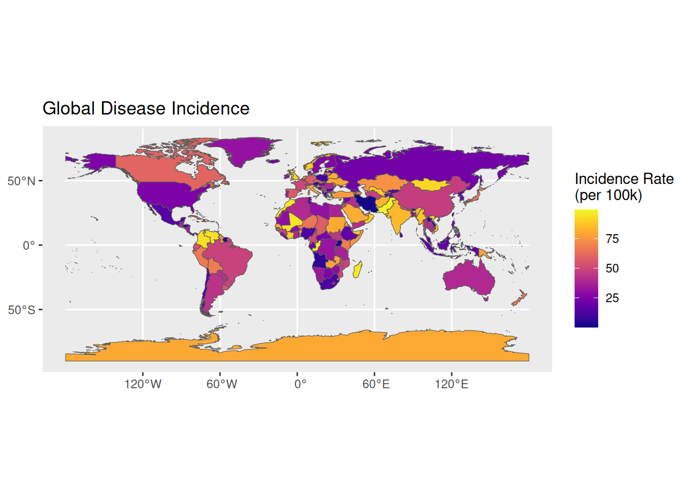
Tip
Key parameter analysis: binwidth / bins aes(fill): Define color maps for epidemiological indicators
scale_fill_viridis(): Use accessible color gradients
ne_countries(): The scale parameter controls the map’s level of detail.(small/medium/large)
# Customized epidemiological maps
p2 <- ggplot(data = world) +
  geom_sf(aes(fill = incidence), color = "white", size = 0.2) +
  scale_fill_gradientn(colors = c("#2c7bb6", "#abd9e9", "#ffffbf", "#fdae61", "#d7191c"),
                       breaks = c(20, 40, 60, 80)) +
  # scale
  annotation_scale(
    location = "bl",
    plot_unit = "km",
    style = "ticks",
    width_hint = 0.1
  ) +
  # Compass (after restoration)
  annotation_north_arrow(
    location = "tr",
    which_north = "grid",  # Use Grid North
    style = north_arrow_minimal(
      line_width = 1,
      text_size = 10
    ),
    pad_x = unit(1.2, "cm"),
    pad_y = unit(1.2, "cm")
  ) +
  coord_sf(crs =  "+proj=robin",
           xlim = c(-1.6e7, 1.6e7),
           ylim = c(-7.5e6, 8.5e6),
           expand = FALSE) +  # Use Robinson projection
  theme_void() +
  guides(fill = guide_colorbar(barwidth = 1)) +
  labs(fill = "Incidence Rate")+
  theme(
    legend.position = c(0.1, 0.3)  # Relative position coordinates (the lower left corner is 0,0)
  )

p2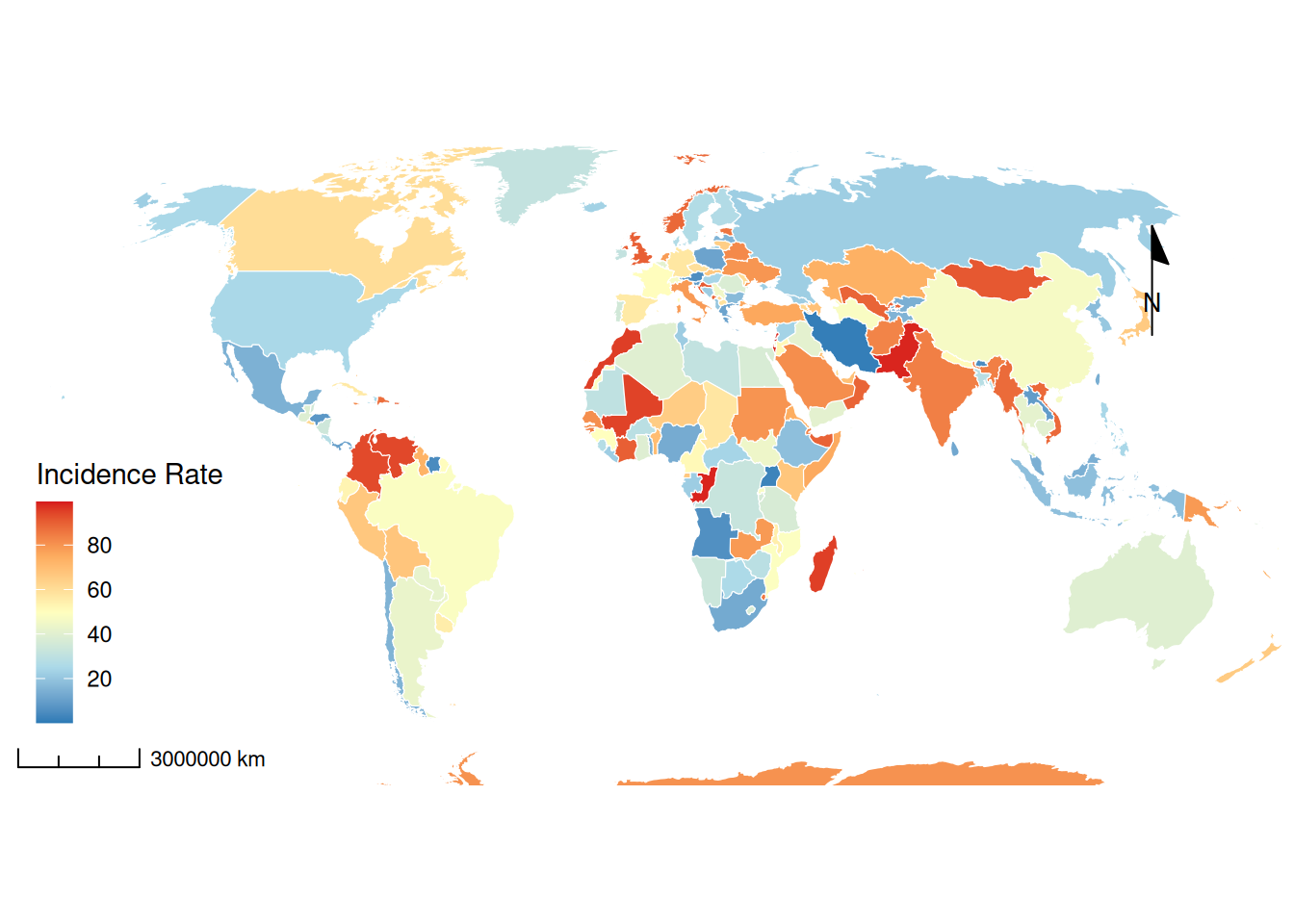
2. Advanced plot
# Advanced plot
# Further process the data and use spatial points to infer the situation of nearby surfaces
# Reduce calculation time, the fewer points below, the closer the estimated distance, the higher the resolution, and the more accurate it is
# Parallel initialization
registerDoParallel(cores = 4)

# Data Preparation
world_proj <- st_transform(world, "+proj=eqc +units=m")
centroids <- st_centroid(world_proj) %>%
  dplyr::select(incidence)

# Create a low-resolution grid (100x100)
grid <- st_make_grid(world_proj, n = c(100,100)) %>%
  st_as_sf() %>%
  st_join(world_proj, join = st_intersects)

# Variogram model optimization
variogram_model <- vgm(
  psill = 30,
  model = "Exp",  # Switch to an exponential model
  range = 2e6,    # 2000 km related range
  nugget = 5
)

# Block parallel computing
grid_chunks <- split(grid, cut(st_coordinates(st_centroid(grid))[,1], 4))

krige_result <- foreach(i=1:4, .combine=rbind) %dopar% {
  krige(incidence ~ 1,
        locations = centroids,
        newdata = grid_chunks[[i]],
        model = variogram_model,
        nmax = 30)
} %>% st_as_sf()

# Convert back to WGS84 coordinate system
krige_result <- st_transform(krige_result, 4326)


advanced_map <- ggplot() +
  # Spatially interpolated surfaces
  geom_sf(data = krige_result,
          aes(fill = var1.pred, color = var1.pred),
          alpha = 0.6) +
  scale_fill_gradientn(
    colors = c("#2c7bb6", "#abd9e9", "#ffffbf", "#fdae61", "#d7191c"),
    name = "Interpolated\nIncidence"
  ) +
  scale_color_gradientn(
    colors = c("#2c7bb6", "#abd9e9", "#ffffbf", "#fdae61", "#d7191c"),
    guide = "none"
  ) +
  ggnewscale::new_scale_fill() +

  # Original national borders
  geom_sf(data = world,
          aes(fill = incidence),
          color = "white",
          size = 0.1,
          alpha = 0.5) +
  scale_fill_gradientn(
    colors = c("#2c7bb6", "#abd9e9", "#ffffbf", "#fdae61", "#d7191c"),
    name = "Country\nIncidence",
    breaks = seq(0, 100, 20)
  ) +

  # 3D relief effect
  ggfx::with_shadow(
    geom_sf(data = world,
            aes(geometry = geometry),
            color = "grey30",
            fill = NA,
            size = 0.2),
    sigma = 5,
    x_offset = 3,
    y_offset = 3
  ) +

  # Hotspot annotation
  geom_sf(data = world %>% filter(incidence > quantile(incidence, 0.9)),
          color = "red",
          fill = NA,
          size = 0.5) +
  ggrepel::geom_label_repel(
    data = world %>% filter(incidence > quantile(incidence, 0.9)),
    aes(label = name, geometry = geometry),
    stat = "sf_coordinates",
    size = 2.5,
    box.padding = 0.2,
    min.segment.length = 0,
    fill = alpha("white", 0.8)
  ) +

  # Map elements
  annotation_north_arrow(
    location = "tr",
    width = unit(1.2, "cm"),   # New width parameter
    height = unit(1.2, "cm"),  # Added height parameter
    style = north_arrow_minimal()  # Remove size parameters
  ) +

  # Coordinate projection
  coord_sf(crs = "+proj=robin") +

  # Theme Settings
  theme_void() +
  theme(
    legend.position = c(0.12, 0.3),
    legend.background = element_rect(fill = alpha("white", 0.8), color = NA),
    plot.title = element_text(hjust = 0.5, face = "bold", size = 16),
    panel.background = element_rect(fill = "#F0F8FF")
  ) +
  labs(title = "Advanced Spatial Distribution of Disease Incidence")

advanced_map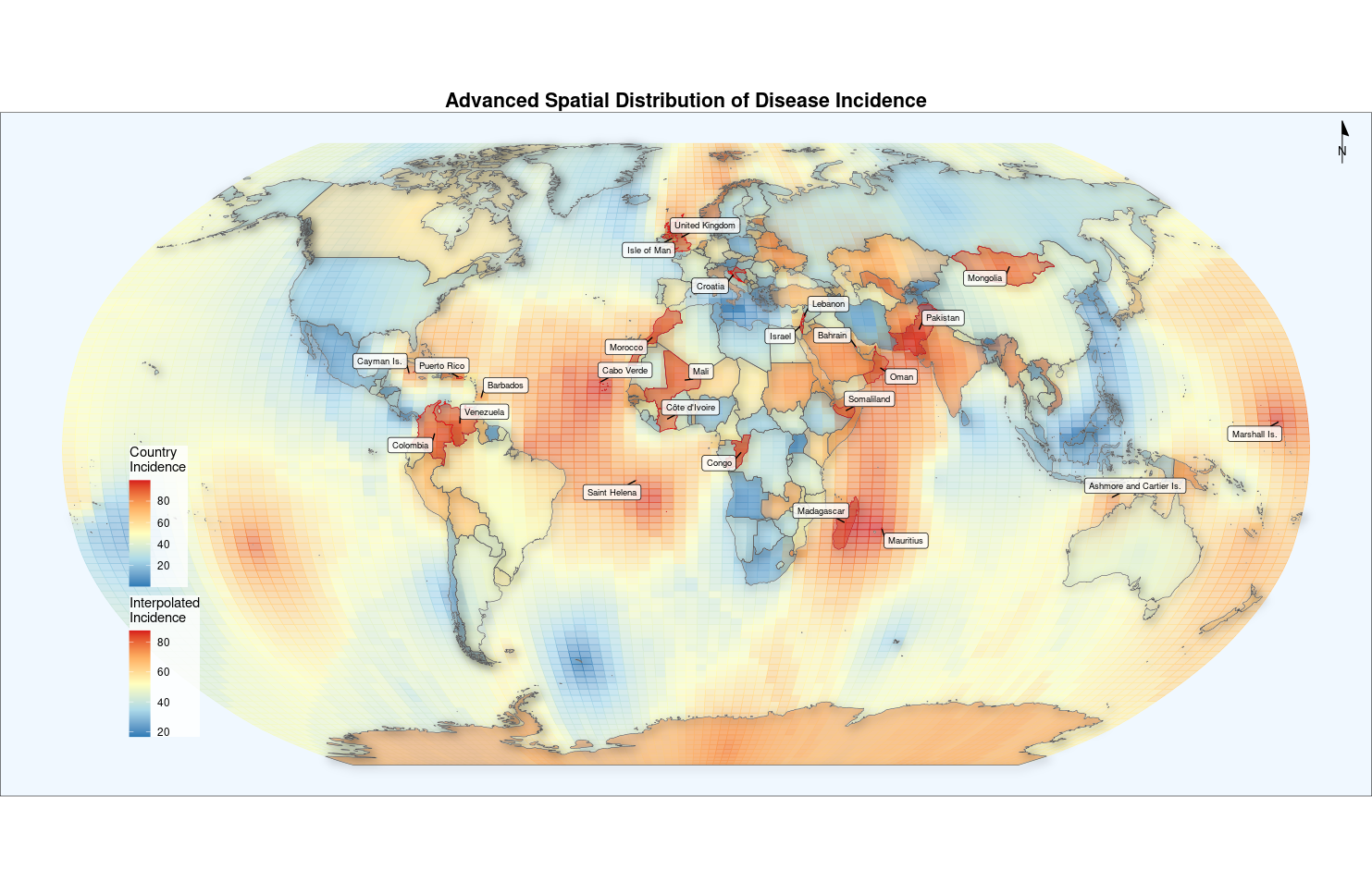
Optionally, you can use callout-tip to add a detailed description of the parameter if needed.
Application
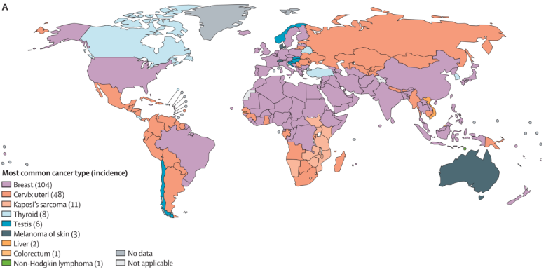
Population Map Application
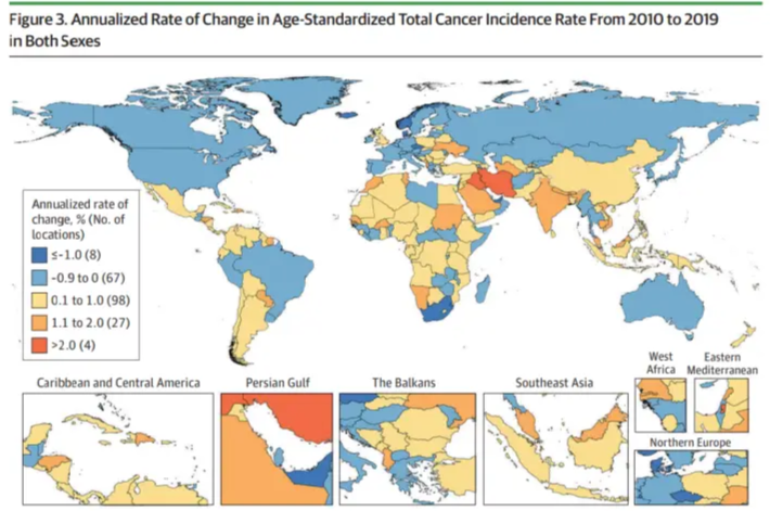
This chart shows how common cancers vary across countries around the world. [1]
Reference
[1] Global Burden of Disease 2019 Cancer Collaboration; Kocarnik JM, Compton K, Dean FE, et al. Cancer Incidence, Mortality, Years of Life Lost, Years Lived With Disability, and Disability-Adjusted Life Years for 29 Cancer Groups From 2010 to 2019: A Systematic Analysis for the Global Burden of Disease Study 2019. JAMA Oncol. 2022;8(3):420-444. https://doi.org/10.1001/jamaoncol.2021.6987
[2] Fidler MM, Gupta S, Soerjomataram I, Ferlay J, Steliarova-Foucher E, Bray F. Cancer incidence and mortality among young adults aged 20-39 years worldwide in 2012: a population-based study. Lancet Oncol. 2017;18(12):1579-1589. https://doi.org/10.1016/S1470-2045(17)30677-0
[3] Wickham H, Chang W, Henry L, et al. ggplot2: Create Elegant Data Visualisations Using the Grammar of Graphics [Computer software]. (Version 3.4.0). 2022. https://ggplot2.tidyverse.org/reference/ggsf.html