# Install packages
if (!requireNamespace("tidyverse", quietly = TRUE)){
  install.packages("tidyverse")
}
if (!requireNamespace("ggprism", quietly = TRUE)){
  install.packages("ggprism")
}
if (!requireNamespace("gground", quietly = TRUE)) {
  remotes::install_github("dxsbiocc/gground")
}
# Load packages
library(tidyverse)
library(ggprism)
library(gground)Text-Overlaid Enrichment Barplot
The Text-Overlaid Enrichment Barplot is a visualization tool designed for the high-density display of functional enrichment analysis results (e.g., GO, KEGG). It typically maps enrichment significance (adjusted p-value) to the length of rounded bars and utilizes the internal space of the graphics to directly overlay annotations of pathway names and core gene lists. Additionally, it uses colored blocks and bubbles on the left side to distinguish functional categories and gene counts.
This chart form alters the traditional layout where text and graphics are separated. It is particularly suitable for displaying functional annotations of marker genes in single-cell subpopulations, as well as other research scenarios requiring the simultaneous presentation of “pathway significance” and “specific driver genes.” Its visual effect not only optimizes the utilization of drawing space but also facilitates researchers in quickly locking onto key gene characteristics leading to pathway enrichment while overviewing biological functions.
Example
Setup
System Requirements: Cross-platform (Linux/MacOS/Windows)
Programming Language: R
Dependencies:
tidyverse,ggprism,gground
Data Preparation
1. Upstream Enrichment Analysis Workflow (Reference)
In actual bioinformatics analysis, we typically use clusterProfiler for enrichment analysis.
Note
The following code is for demonstration of the upstream analysis workflow (obtaining raw data) only. This tutorial will directly use the example data provided below for plotting.
# 1. Environment Preparation
library(clusterProfiler)
library(org.Hs.eg.db)

# 2. Run Enrichment Analysis
# Assume gene_list is a vector of Entrez IDs for differentially expressed genes

# 2.1 GO Enrichment Analysis (Get BP/CC/MF simultaneously)
ego <- enrichGO(
  gene     = gene_list,
  OrgDb    = org.Hs.eg.db,
  ont      = "ALL",
  readable = TRUE  # Automatically convert IDs in results to Symbols
)

# 2.2 KEGG Enrichment Analysis
ekegg <- enrichKEGG(
  gene     = gene_list,
  organism = 'hsa'
)
# KEGG results default to Entrez ID; manually convert to Symbol to match plotting data format
ekegg <- setReadable(ekegg, OrgDb = org.Hs.eg.db, keyType = "ENTREZID")

# 3. Data Cleaning and Merging
# Extract GO results (Rename ONTOLOGY to Category)
df_go <- as.data.frame(ego) %>%
  select(Category = ONTOLOGY, Description, p.adjust, Count, geneID)

# Extract KEGG results (Manually add Category column and assign as "KEGG")
df_kegg <- as.data.frame(ekegg) %>%
  mutate(Category = "KEGG") %>%
  select(Category, Description, p.adjust, Count, geneID)

# Merge all results -> Get raw_data for plotting
raw_data <- rbind(df_go, df_kegg)
2. Loading and Cleaning Example Data
To facilitate the tutorial, we import pathway enrichment data from network pharmacology annotation analysis using DAVID. This data includes enrichment results for GO (BP/CC/MF) and KEGG.
# 1. Read Data
raw_data <- read_tsv("https://bizard-1301043367.cos.ap-guangzhou.myqcloud.com/DAVID.txt")

# 2. Data Cleaning
# Convert DAVID format to the standard format required for plotting
raw_data <- raw_data %>%
  # 2.1 Extract Category Labels
  mutate(Category = case_when(
    grepl("BP_DIRECT", Category) ~ "BP",
    grepl("CC_DIRECT", Category) ~ "CC",
    grepl("MF_DIRECT", Category) ~ "MF",
    grepl("KEGG_PATHWAY", Category) ~ "KEGG",
    TRUE ~ "Other"
  )) %>%
  # Keep only GO and KEGG results
  filter(Category %in% c("BP", "CC", "MF", "KEGG")) %>%

  # 2.2 Clean Pathway Names (Remove IDs, e.g., "GO:001~Name" -> "Name")
  mutate(Description = sub("^.*~|.*:", "", Term)) %>%

  # 2.3 Rename Columns (Unified variable names for plotting code)
  # FDR -> p.adjust (Significance)
  # Genes -> geneID (Gene List)
  rename(
    p.adjust = FDR,
    geneID = Genes
  ) %>%

  # 2.4 Format Gene Lists (Replace commas with slashes)
  mutate(geneID = gsub(", ", "/", geneID))
3. Creating Plotting Data
# 1. Select the Top 5 most significant pathways for each category
use_pathway <- raw_data %>%
  arrange(p.adjust) %>%
  group_by(Category) %>%
  slice_head(n = 5) %>%
  ungroup()

# 2. Construct Auxiliary Plotting Columns
use_pathway <- use_pathway %>%
  # Set factor levels: determines the vertical order of legend and plot (BP -> CC -> MF -> KEGG)
  mutate(Category = factor(Category, levels = rev(c('BP', 'CC', 'MF', 'KEGG')))) %>%
  # Secondary sorting
  arrange(Category, p.adjust) %>%
  # Fix Y-axis order
  mutate(Description = factor(Description, levels = Description)) %>%
  # Add index column as Y-axis coordinates
  tibble::rowid_to_column('index')

# 3. Construct Data for Left Category Blocks (rect.data)
# Layout parameters
width <- 0.5
# Calculate max X-axis length for drawing the bottom line
xaxis_max <- max(-log10(use_pathway$p.adjust)) + 1

rect.data <- use_pathway %>%
  arrange(Category) %>%
  group_by(Category) %>%
  summarize(n = n(), .groups = "drop") %>%
  mutate(
    xmin = -3 * width,          # Block left boundary
    xmax = -2 * width,          # Block right boundary
    ymax = cumsum(n),           # Block top boundary (based on cumulative count)
    ymin = lag(ymax, default = 0) + 0.6, # Block bottom boundary (leave a small gap)
    ymax = ymax + 0.4           # Adjust top boundary
  )

# Check data structure
head(use_pathway)
# A tibble: 6 × 15
index Category Term Count `%` PValue geneID `List Total` `Pop Hits`
<int> <fct> <chr> <dbl> <dbl> <dbl> <chr> <dbl> <dbl>
1 1 KEGG hsa04080:N… 15 36.6 2.07e-10 GABRB… 40 368
2 2 KEGG hsa04726:S… 10 24.4 1.16e- 9 GABRB… 40 115
3 3 KEGG hsa05022:P… 11 26.8 3.19e- 5 IL1A/… 40 483
4 4 KEGG hsa05321:I… 5 12.2 1.89e- 4 IL10/… 40 66
5 5 KEGG hsa04728:D… 6 14.6 2.6 e- 4 GSK3B… 40 132
6 6 MF GO:0051378… 6 14.6 2.37e-11 HTR1A… 41 12
# ℹ 6 more variables: `Pop Total` <dbl>, FoldEnrichment <dbl>,
# Bonferroni <dbl>, Benjamini <dbl>, p.adjust <dbl>, Description <fct>Visualization
1. Basic Plotting (Simplified Version)
This version mainly displays the core rounded bar chart and the left-side category blocks, removing excessive text information like gene lists. It is suitable for scenarios requiring a concise display.
# Define color palette
pal <- c('#eaa052', '#b74147', '#90ad5b', '#23929c')

# Other recommended palettes
#pal <- c('#c3e1e6', '#f3dfb7', '#dcc6dc', '#96c38e')
#pal <- c('#7bc4e2', '#acd372', '#fbb05b', '#ed6ca4')

# Adjust position parameters for left blocks in the simplified version
rect.data.simple <- rect.data %>%
  mutate(
    xmin = -1.5 * width,
    xmax = -0.5 * width
  )

p1 <- ggplot(use_pathway, aes(-log10(p.adjust), y = index, fill = Category)) +
  # 1. Rounded Bar Chart Body
  geom_round_col(aes(y = Description), width = 0.6, alpha = 0.8) +

  # 2. Pathway Name Text
  geom_text(aes(x = 0.05, label = Description), hjust = 0, size = 4) +

  # 3. Left Category Blocks
  geom_round_rect(
    aes(xmin = xmin, xmax = xmax, ymin = ymin, ymax = ymax, fill = Category),
    data = rect.data.simple,
    radius = unit(2, 'mm'),
    inherit.aes = FALSE
  ) +

  # 4. Left Category Text
  geom_text(
    aes(x = (xmin + xmax) / 2, y = (ymin + ymax) / 2, label = Category),
    data = rect.data.simple,
    size = 3,
    inherit.aes = FALSE
  ) +

  # 5. Bottom Decorative Line
  geom_segment(
    aes(x = 0, y = 0, xend = xaxis_max, yend = 0),
    linewidth = 1,
    inherit.aes = FALSE
  ) +

  # 6. Style Adjustments
  labs(y = NULL, x = "-log10(p.adjust)") +
  scale_fill_manual(name = 'Category', values = pal) +
  scale_x_continuous(breaks = seq(0, xaxis_max, 2), expand = expansion(c(0, 0.1))) +
  theme_prism() +
  theme(
    axis.text.y = element_blank(),
    axis.line.y = element_blank(),
    axis.ticks.y = element_blank(),
    axis.line.x = element_blank(), # Hide default X-axis line, keeping only the one drawn by geom_segment
    legend.title = element_text(),
    legend.position = "right"
  )

p1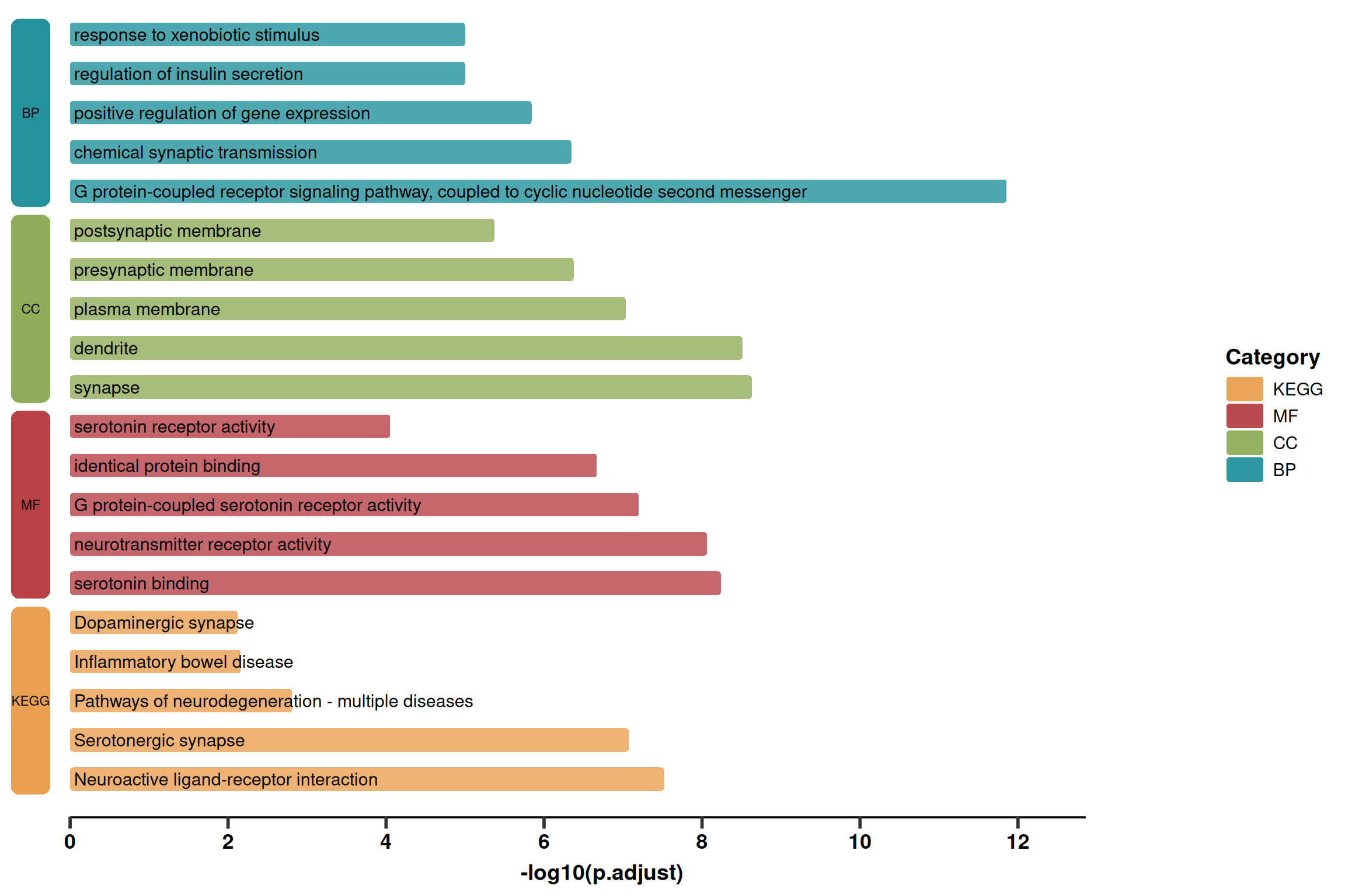
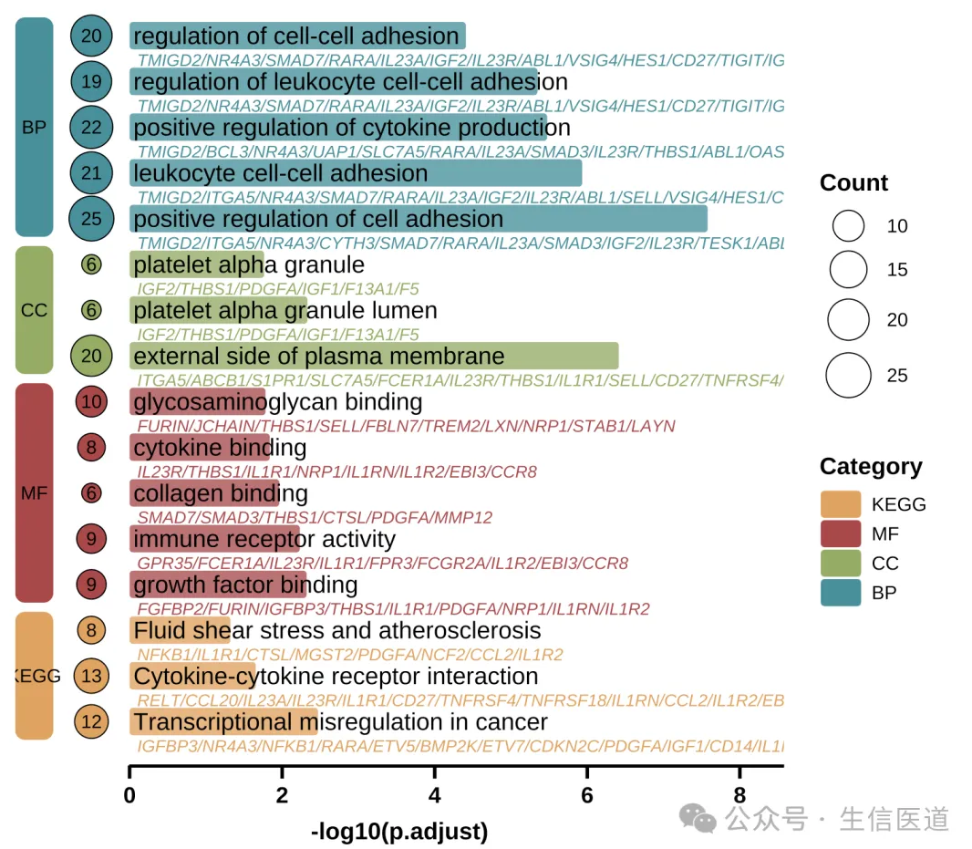
2. Advanced Plotting (Detailed Version)
Based on the simplified version, this version adds:
Gene List: Displays the gene list below the pathway name (grey italics).
Count Bubbles: Displays the number of enriched genes on the left (bubble size).
Layout: Adjusts the position of the left blocks to make space for bubbles.
p2 <- ggplot(use_pathway, aes(-log10(p.adjust), y = index, fill = Category)) +
  # 1. Main Rounded Bars
  geom_round_col(aes(y = Description), width = 0.6, alpha = 0.8) +

  # 2. Pathway Name (Main Title)
  geom_text(aes(x = 0.05, label = Description), hjust = 0, size = 5) +

  # 3. Gene List (Subtitle) - Grey Italics
  geom_text(
    aes(x = 0.1, label = geneID, colour = Category),
    hjust = 0, vjust = 2.6, size = 3, fontface = 'italic',
    show.legend = FALSE
  ) +

  # 4. Left Gene Count Bubbles (Count)
  geom_point(aes(x = -width, size = Count, fill = Category), shape = 21, stroke = 1) +
  geom_text(aes(x = -width, label = Count), size = 3) +

  # 5. Left Category Blocks (Category Label)
  geom_round_rect(
    aes(xmin = xmin, xmax = xmax, ymin = ymin, ymax = ymax, fill = Category),
    data = rect.data,
    radius = unit(2, 'mm'),
    inherit.aes = FALSE
  ) +
  geom_text(
    aes(x = (xmin + xmax) / 2, y = (ymin + ymax) / 2, label = Category),
    data = rect.data,
    inherit.aes = FALSE,
    color = "black", fontface = "bold"
  ) +

  # 6. Bottom Line
  geom_segment(
    aes(x = 0, y = 0, xend = xaxis_max, yend = 0),
    linewidth = 1.5,
    inherit.aes = FALSE
  ) +

  # 7. Scales and Colors
  labs(y = NULL, x = "-log10(p.adjust)") +
  scale_fill_manual(name = 'Category', values = pal) +
  scale_colour_manual(values = pal) +
  scale_size_continuous(name = 'Count', range = c(4, 10)) +
  scale_x_continuous(breaks = seq(0, xaxis_max, 2), expand = expansion(c(0, 0))) +

  # 8. Theme Customization
  theme_prism() +
  theme(
    axis.text.y = element_blank(),
    axis.line = element_blank(),
    axis.ticks.y = element_blank(),
    legend.title = element_text(),
    plot.margin = margin(l = 10, r = 10)
  )

p2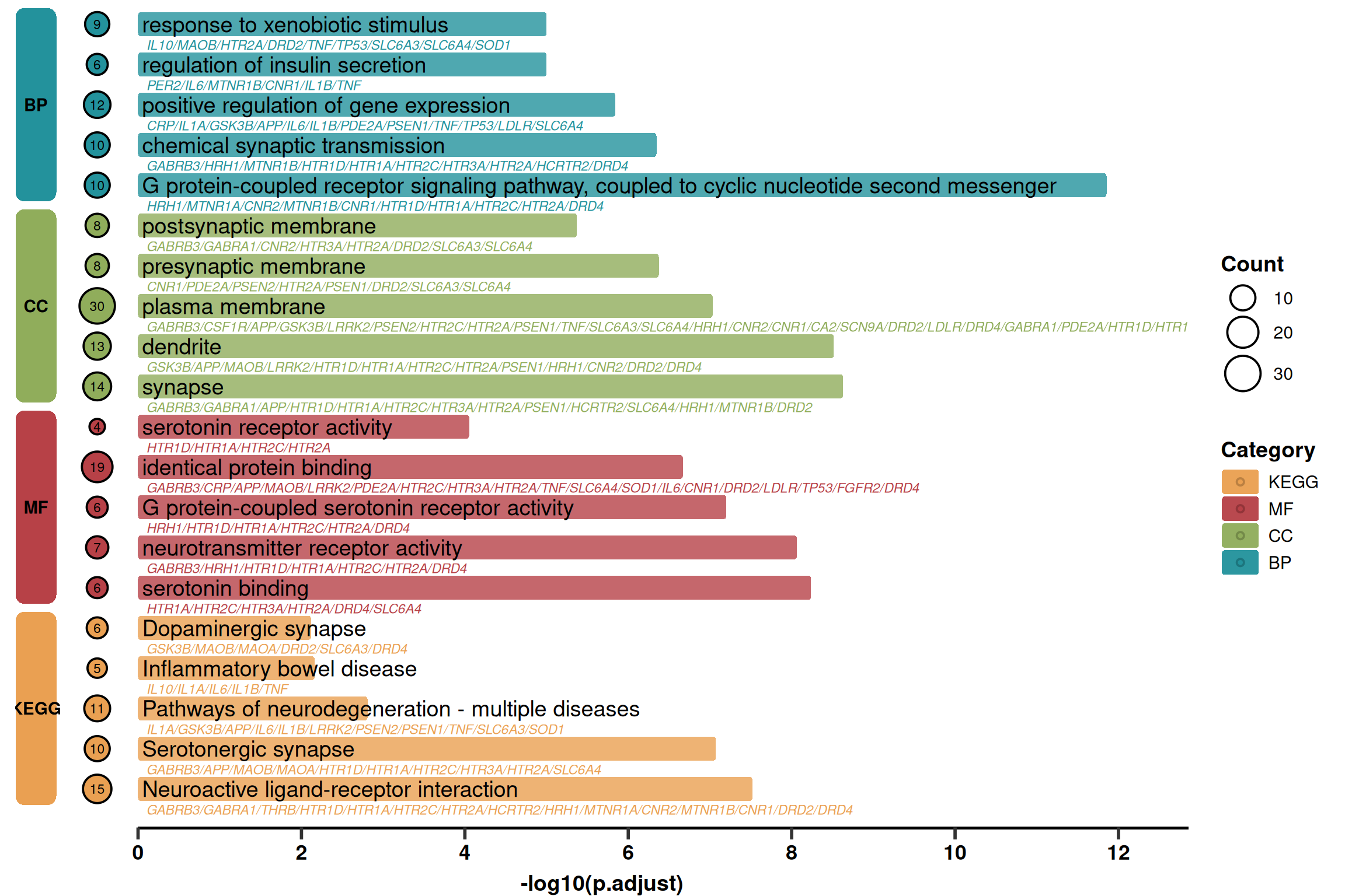
References
[1] 生信医道. 超好看的单细胞GO,KEGG富集分析图!确定不来看看吗? [Internet]. 微信公众号: 生信医道. 2025 [cited 2025 Dec 30]. Available from: https://mp.weixin.qq.com/s/pY1S0EJQAhdezvxeNt-SzA