# Install packages
if (!requireNamespace("ggplot2", quietly = TRUE)) {
  install.packages("ggplot2")
}
if (!requireNamespace("tidyr", quietly = TRUE)) {
  install.packages("tidyr")
}
if (!requireNamespace("palmerpenguins", quietly = TRUE)) {
  install.packages("palmerpenguins")
}
if (!requireNamespace("cowplot", quietly = TRUE)) {
  install.packages("cowplot")
}
if (!requireNamespace("hrbrthemes", quietly = TRUE)) {
  install.packages("hrbrthemes")
}
if (!requireNamespace("ggalt", quietly = TRUE)) {
  install.packages("ggalt")
}
if (!requireNamespace("rstatix", quietly = TRUE)) {
  install.packages("rstatix")
}
if (!requireNamespace("ggpubr", quietly = TRUE)) {
  install.packages("ggpubr")
}

# Load packages
library(ggplot2)
library(tidyr)
library(palmerpenguins)
library(cowplot)
library(hrbrthemes)
library(ggalt)
library(rstatix)
library(ggpubr)Lollipop Plot
A lollipop plot is a variation of a bar chart and a scatter plot. It consists of a line segment and a point, which can clearly display data while reducing the amount of graphics. At the same time, the lollipop plot can help align values with categories and is very suitable for comparing the differences between values of multiple categories.
Example
Setup
System Requirements: Cross-platform (Linux/MacOS/Windows)
Programming Language: R
Dependencies:
ggplot2;tidyr;palmerpenguins;cowplot;hrbrthemes;ggalt;rstatix;ggpubr
sessioninfo::session_info("attached")─ Session info ───────────────────────────────────────────────────────────────
setting value
version R version 4.6.0 (2026-04-24)
os Ubuntu 24.04.4 LTS
system x86_64, linux-gnu
ui X11
language (EN)
collate C.UTF-8
ctype C.UTF-8
tz UTC
date 2026-05-09
pandoc 3.1.3 @ /usr/bin/ (via rmarkdown)
quarto 1.9.37 @ /usr/local/bin/quarto
─ Packages ───────────────────────────────────────────────────────────────────
package * version date (UTC) lib source
cowplot * 1.2.0 2025-07-07 [1] RSPM
ggalt * 0.6.1 2026-05-04 [1] Github (hrbrmstr/ggalt@8941f8c)
ggplot2 * 4.0.3.9000 2026-05-04 [1] Github (tidyverse/ggplot2@6870419)
ggpubr * 0.6.3 2026-02-24 [1] RSPM
hrbrthemes * 0.9.2 2026-05-04 [1] Github (hrbrmstr/hrbrthemes@45ac19c)
palmerpenguins * 0.1.1 2022-08-15 [1] RSPM
rstatix * 0.7.3 2025-10-18 [1] RSPM
tidyr * 1.3.2 2025-12-19 [1] RSPM
[1] /home/runner/work/_temp/Library
[2] /opt/R/4.6.0/lib/R/site-library
[3] /opt/R/4.6.0/lib/R/library
* ── Packages attached to the search path.
──────────────────────────────────────────────────────────────────────────────Data Preparation
Mainly use R’s own data set and the data in the TCGA database for drawing.
data_TCGA <- read.csv("https://bizard-1301043367.cos.ap-guangzhou.myqcloud.com/TCGA-BRCA.htseq_counts_processed.csv")

data_TCGA1 <- data_TCGA[1:25,] %>%
  gather(key = "sample",value = "gene_expression",3:1219)

data_tcga_mean <- aggregate(data_TCGA1$gene_expression,
                            by=list(data_TCGA1$gene_name), mean) # mean
colnames(data_tcga_mean) <- c("gene","expression")

data_tcga_sd <- aggregate(data_TCGA1$gene_expression,
                          by=list(data_TCGA1$gene_name), sd)
colnames(data_tcga_sd) <- c("gene","sd")

data_tcga <- merge(data_tcga_mean, data_tcga_sd, by="gene")

data_penguins <- penguins

data_penguins_mean <- aggregate(data_penguins$flipper_length_mm,
                                by=list(data_penguins$species,data_penguins$sex),
                                mean)
colnames(data_penguins_mean) <- c("species","sex","flipper_length")

# Convert long format data to wide format
data_penguins_mean <- spread(data_penguins_mean, key="sex", value="flipper_length")

row_mean = apply(data_penguins_mean[,2:3],1,mean)

data_penguins_mean$mean <- row_mean
Visualization
1. Basic Lollipop Chart
A lollipop chart consists of points and lines. It can be used to plot data for both bar charts and scatter plots.
Using TCGA data as an example (similar to a bar chart):
# `TCGA` data
p <- ggplot(data_tcga, aes(x=gene, y=expression)) +
  geom_point() +
  geom_segment( aes(x=gene, xend=gene, y=0, yend=expression)) +
  theme(axis.text.x = element_text(angle = 30,vjust = 0.85,hjust = 0.85))

p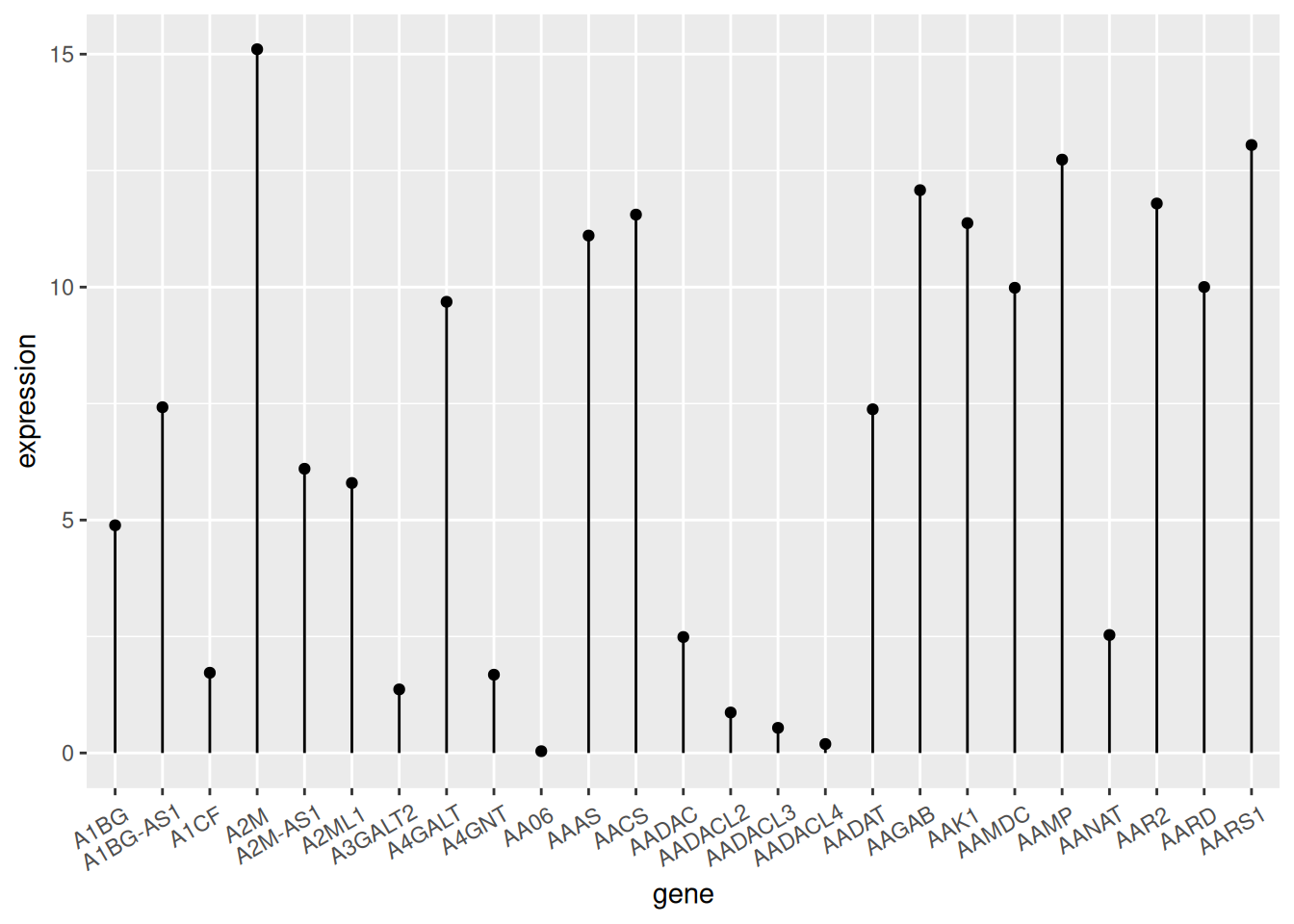
TCGA data
The figure above shows the expression of different genes.
Using the penguin dataset as an example (similar to a scatter plot).
# `penguin` dataset
p <- ggplot(data_penguins, aes(x=bill_length_mm, y=bill_depth_mm)) +
  geom_point() +
  geom_segment( aes(x=0, xend=bill_length_mm, y=bill_depth_mm, yend=bill_depth_mm))
  # x=0, the line starts from the y-axis; y=0, the line starts from the x-axis; both equal to 0, the line starts from the origin

p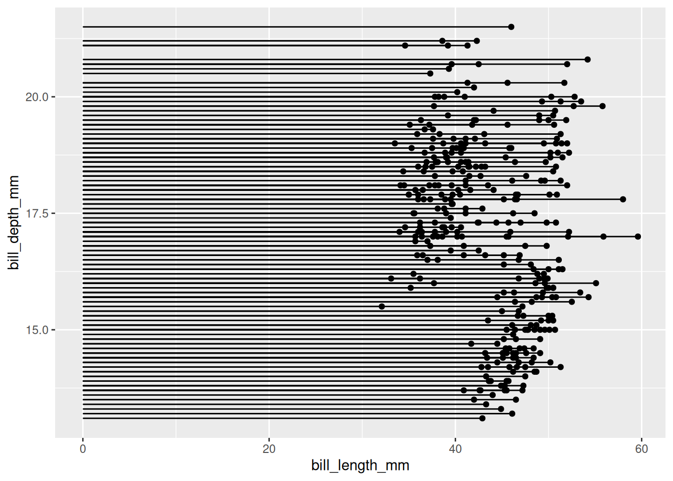
penguin dataset
The figure above shows the distribution relationship between penguin beak length and depth.
2. Customize appearance
Color and Style
# point
p1 <- ggplot(data_tcga, aes(x=gene, y=expression)) +
  geom_segment( aes(x=gene, xend=gene, y=0, yend=expression)) +
  geom_point(size=5, color="red",  # circle
             fill=alpha("orange"), # fill
             alpha=0.7, shape=21, stroke=2) +
  labs(title = "point appearance")+
  theme(plot.title = element_text(hjust = 0.5),
        axis.text.x = element_text(angle = 60,vjust = 0.85,hjust = 0.75))

# segment
p2 <- ggplot(data_tcga, aes(x=gene, y=expression)) +
  geom_point() +
  geom_segment( aes(x=gene, xend=gene, y=0, yend=expression),
                size=1, color="blue", linetype="dotdash" )+
  labs(title = "segment appearance")+
  theme(plot.title = element_text(hjust = 0.5),
        axis.text.x = element_text(angle = 60,vjust = 0.85,hjust = 0.75))

# theme
p3 <- ggplot(data_tcga, aes(x=gene, y=expression)) +
  geom_point(color="orange", size=4) +
  geom_segment( aes(x=gene, xend=gene, y=0, yend=expression),color="grey") +
  theme_light() +
  theme(
    panel.grid.major.x = element_blank(),
    panel.border = element_blank(),
    axis.ticks.x = element_blank(),
    plot.title = element_text(hjust = 0.5),
    axis.text.x = element_text(angle = 60,vjust = 0.85,hjust = 0.75)#标题居中
  ) +
  xlab("gene") +
  ylab("expression")+
  labs(title = "theme")

plot_grid(p1,p2,p3, labels = LETTERS[1:3], ncol = 2)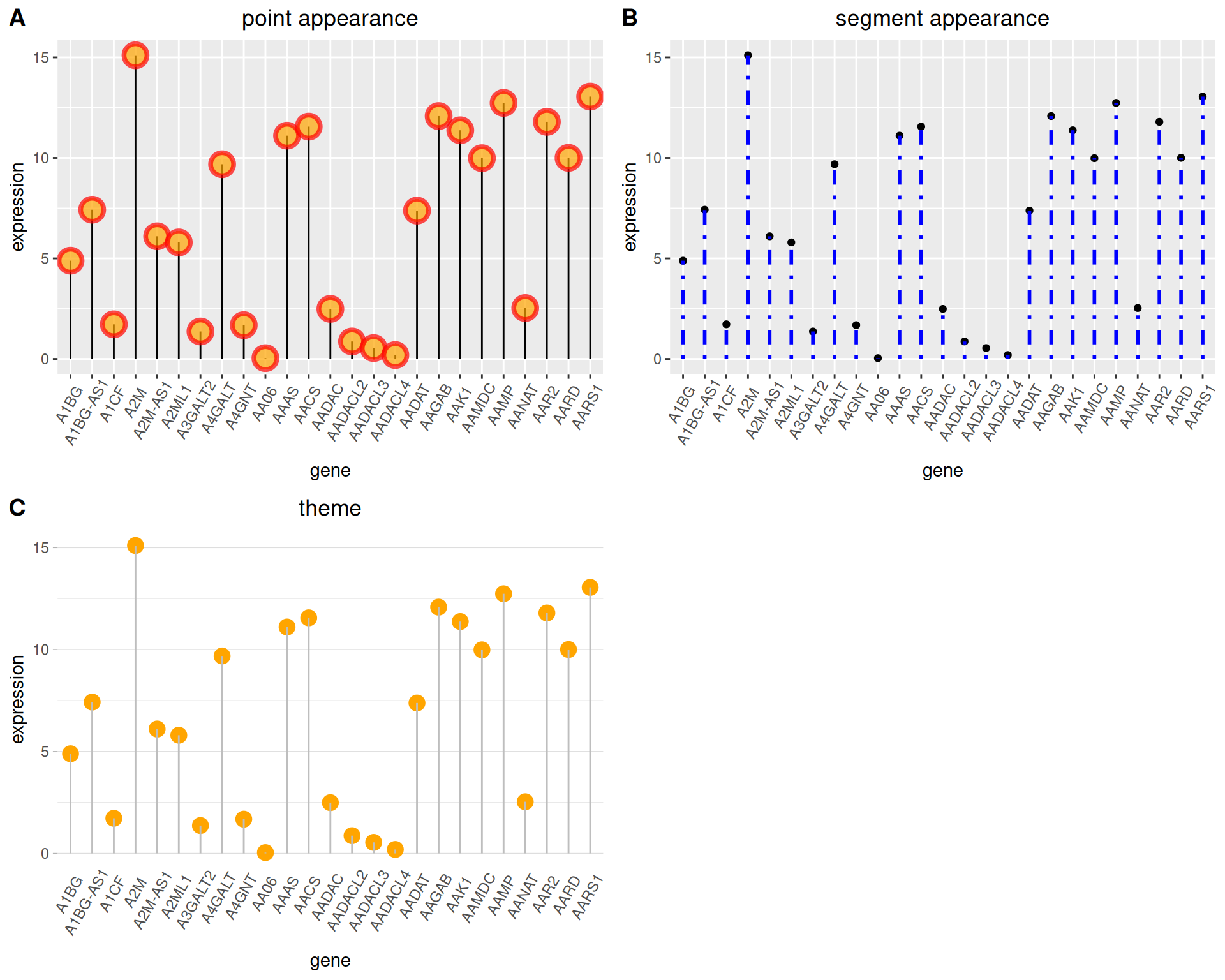
Flip and Baseline
# Flip
p4 <- ggplot(data_tcga, aes(x=gene, y=expression)) +
  geom_point(color="orange", size=4) +
  geom_segment( aes(x=gene, xend=gene, y=0, yend=expression),color="grey") +
  theme_light() +
  labs(title = "Flip Lollipop")+
  theme(
    plot.title = element_text(hjust = 0.5), # Center the title
    panel.grid.major.x = element_blank(),
    panel.border = element_blank(),
    axis.ticks.x = element_blank()
  ) +
  xlab("gene") +
  ylab("expression") +
  coord_flip() # flip

# Change baseline
p5 <- ggplot(data_tcga, aes(x=gene, y=expression)) +
  geom_point(color="orange", size=4) +
  geom_segment( aes(x=gene, xend=gene, y=5, # The value is the baseline position
                    yend=expression),color="grey") +
  theme_light() +
  theme(
    panel.grid.major.x = element_blank(),
    panel.border = element_blank(),
    axis.ticks.x = element_blank(),
    plot.title = element_text(hjust = 0.5), # Center the title
    axis.text.x = element_text(angle = 60,vjust = 0.85,hjust = 0.75)
  ) +
  xlab("gene") +
  ylab("expression")+
  labs(title = "Change baseline")

plot_grid(p4,p5, labels = LETTERS[1:2], ncol = 2)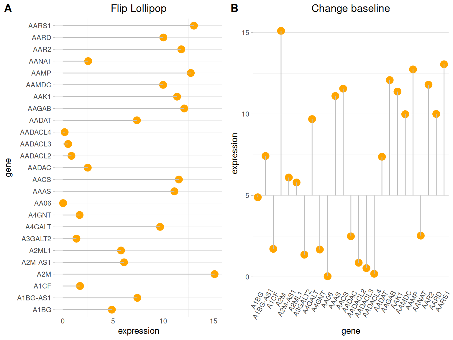
3. Highlight
When you need to highlight certain data, you can use the ifelse function to filter the highlighted data.
Using TCGA data as an example.
# Highlight----
p6 <-
# Drawing + Highlighting
  ggplot(data_tcga, aes(x=gene, y=expression)) +
  geom_segment(
    aes(x=gene, xend=gene, y=0, yend=expression),
    color=ifelse(data_tcga$gene %in% c("A4GALT","A1CF"), "orange", "grey"),
    size=ifelse(data_tcga$gene %in% c("A4GALT","A1CF"), 1.3, 0.7)
     # Filter highlight groups using ifelse statements
  ) +
  geom_point(
    color=ifelse(data_tcga$gene %in% c("A4GALT","A1CF"), "orange", "grey"),
    size=ifelse(data_tcga$gene %in% c("A4GALT","A1CF"), 5, 2)
  ) +
  theme_ipsum() +
  coord_flip() +
  theme(
    legend.position="none"
  ) +
  xlab("gene") +
  ylab("expression") +

# Setting the label
  annotate("text", x=grep("A4GALT", data_tcga$gene), # Add text labels
           y=data_tcga$expression[which(data_tcga$gene=="A4GALT")]*1.05, # Determine label position
           label=data_tcga$expression[which(data_tcga$gene=="A4GALT")] %>% round(2),
           color="orange", size=4 , angle=0, fontface="bold", hjust=0) +
  annotate("text", x=grep("A1CF", data_tcga$gene), # Add text labels
           y=data_tcga$expression[which(data_tcga$gene=="A1CF")]*1.2, # Determine label position
           label=data_tcga$expression[which(data_tcga$gene=="A1CF")] %>% round(2),
           color="orange", size=4 , angle=0, fontface="bold", hjust=0)

p6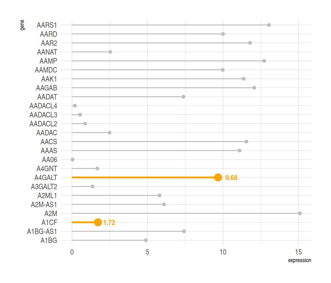
Highlight the specified data and add labels using the annotate() function.
4. Color differentiation
Similarly, you can use the ifelse function to categorize data, using different colors to represent data from different sources.
Using the penguin dataset as an example
data_penguins1 <- na.omit(data_penguins)
data_penguins1$number <- c(1:333)
data_penguins1$number <- as.character(data_penguins1$number)
data_penguins1 <- data_penguins1[1:20,]

p <- ggplot(data_penguins1, aes(x=number, y=flipper_length_mm)) +
  geom_segment(
    aes(x=number, xend=number, y=0, yend=flipper_length_mm),
    color=ifelse(data_penguins1$sex == "female","#FFB6C1", "#4169E1"),alpha=0.5 ,
    size=ifelse(data_penguins1$sex == "female", 1.3, 1.3))+
  geom_point(
    color=ifelse(data_penguins1$sex == "female", "#FFB6C1", "#4169E1"),
    size=ifelse(data_penguins1$sex == "female", 5, 5)
  ) +
  theme_ipsum() +
  theme(
    legend.position="none"
  ) +
  xlab("") +
  ylab("flipper length")
p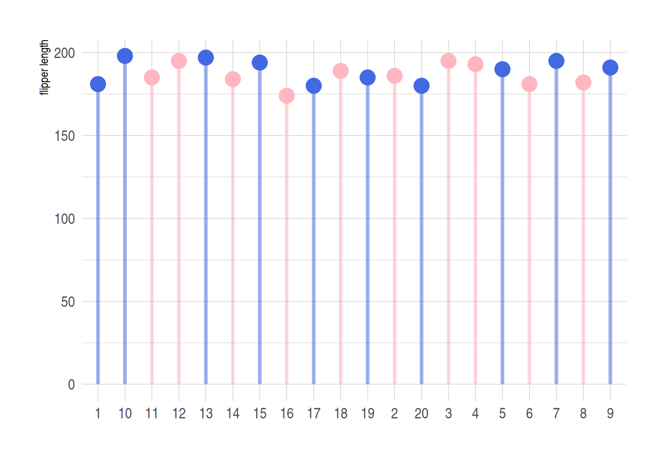
Use the ifelse function to implement classification processing of different data. In the figure above, blue represents male and pink represents female.
5. Dumbbell Chart (Cleveland Dot Chart)
Unlike regular lollipop charts, dumbbell charts are suitable for comparing multiple sets of data. You can also add medians, means, and other data.
Using the pinguin dataset as an example:
p <- ggplot(aes(x=female,xend=male,y=species),data=data_penguins_mean) +
  geom_dumbbell(colour_x = "#FFB6C1",
                colour_xend = "#4169E1",
                size_x = 2,size_xend = 1,
                size=1,color="gray",
                dot_guide = T)+ # Add a dashed line
  geom_point(aes(x=female,y=species,size=female), # size=female The outer ring size indicates the data size
             alpha=0.5,color="#FFB6C1")+
  geom_point(aes(x=male,y=species,size=male),
             alpha=0.5,color="#4169E1")+
  theme_light()+
  theme(panel.grid.minor.x =element_blank(),
        panel.grid = element_blank(),
        legend.title = element_blank()
  ) +
  xlab("flipper length") +
  annotate("text", x=200, y=3.5, label="female",color="#FFB6C1",size=7) +
  annotate("text", x=205, y=3.5, label="VS",color="black") +
  annotate("text", x=210, y=3.5, label="male",color="#4169E1",size=7)

p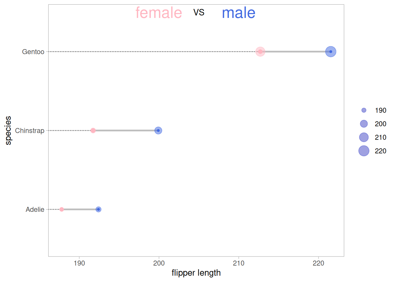
The figure above shows a comparison of the mean wing lengths of three different species of penguins of different sexes, where the size of the outer circle represents the size of the data.
5.1 Add Mean
Use geom_point to add mean points based on the original image.
# Add Mean
p <- ggplot(aes(x=female,xend=male,y=species),data=data_penguins_mean)+
  geom_dumbbell(colour_x = "#FFB6C1",
                colour_xend = "#4169E1",
                size_x = 2,size_xend = 2,
                size=1,color="gray")+
  geom_point(aes(x=female,y=species,size=female), # size=female The outer ring size indicates the data size
             alpha=0.7,color="#FFB6C1")+
  geom_point(aes(x=male,y=species,size=male),
             alpha=0.7,color="#4169E1")+
  geom_point(aes(x=mean,y=species,size=mean),
             alpha=0.5,color="orange")+ # Add Mean
  theme_light()+
  theme(panel.grid.minor.x =element_blank(),
        panel.grid = element_blank(),
        legend.title = element_blank()
  ) +
  xlab("flipper length") +
  annotate("text", x=200, y=3.5, label="female",color="#FFB6C1",size=7) +
  annotate("text", x=205, y=3.5, label="VS",color="black") +
  annotate("text", x=210, y=3.5, label="male",color="#4169E1",size=7)

p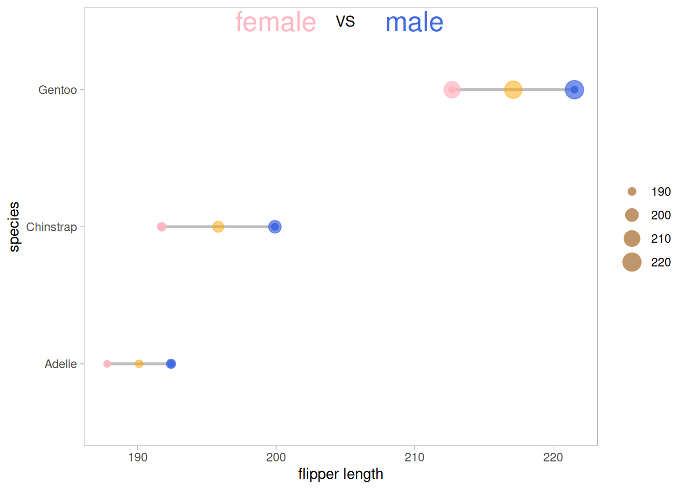
Add mean points based on the original data (you can also add median, range, data volume, etc. as needed).
5.2 Add difference analysis
# Add difference analysis
p_val1_sex <- data_penguins %>%
  group_by(species) %>%
  wilcox_test(formula = flipper_length_mm~sex)%>%
  add_significance(p.col = 'p',cutpoints = c(0,0.001,0.01,0.05,1),symbols = c('***','**','*','ns'))

p_val1_species <- data_penguins %>%
  wilcox_test(formula = flipper_length_mm~species) %>%
  add_significance(p.col = 'p',cutpoints = c(0,0.001,0.01,0.05,1),symbols = c('***','**','*','ns'))

p <- ggplot(aes(x=female,xend=male,y=species),data=data_penguins_mean)+
  geom_dumbbell(colour_x = "#FFB6C1",
                colour_xend = "#4169E1",
                size_x = 2,size_xend = 2,
                size=1,color="gray")+
  geom_point(aes(x=female,y=species,size=female), # size=female The outer ring size indicates the data size
             alpha=0.7,color="#FFB6C1")+
  geom_point(aes(x=male,y=species,size=male),
             alpha=0.7,color="#4169E1")+
  geom_point(aes(x=mean,y=species,size=mean),
             alpha=0.5,color="orange")+ # Add Mean
  theme_light()+
  theme(panel.grid.minor.x =element_blank(),
        panel.grid = element_blank(),
        legend.title = element_blank()
  )+
  xlab("flipper length") +
  annotate("text", x=201.5, y=3.5, label="female",color="#FFB6C1") +
  annotate("text", x=205, y=3.5, label="VS",color="black") +
  annotate("text", x=208, y=3.5, label="male",color="#4169E1") +
# Difference Tags
# species
  annotate("text", y=1,x=216,
           label=paste("Adelie&Chinstra p=",
                       p_val1_species$p[which(p_val1_species$group1=="Adelie"& p_val1_species$group2=="Chinstrap")],
                       " ",
                       p_val1_species$p.signif[which(p_val1_species$group1=="Adelie"& p_val1_species$group2=="Chinstrap")])) +
  annotate("text", y=0.8,x=216,
           label=paste("Adelie&Gentoo p=",
                       p_val1_species$p[which(p_val1_species$group1=="Adelie"& p_val1_species$group2=="Gentoo")],
                       " ",
                       p_val1_species$p.signif[which(p_val1_species$group1=="Adelie"& p_val1_species$group2=="Gentoo")])) +
  annotate("text", y=0.6,x=216,
           label=paste("Chinstrap&Gentoo p=",
                       p_val1_species$p[which(p_val1_species$group1=="Chinstrap"& p_val1_species$group2=="Gentoo")],
                       " ",
                       p_val1_species$p.signif[which(p_val1_species$group1=="Chinstrap"& p_val1_species$group2=="Gentoo")])) +

# sex
  annotate("text", y=grep("Gentoo", data_penguins_mean$species)+0.15, # Add text labels
           x=data_penguins_mean$mean[which(data_penguins_mean$species=="Gentoo")],
           # Determine label position
           label=p_val1_sex$p.adj.signif[which(p_val1_sex$species=="Gentoo")]) +
  annotate("text", y=grep("Chinstrap", data_penguins_mean$species)+0.15, # Add text labels
           x=data_penguins_mean$mean[which(data_penguins_mean$species=="Chinstrap")],
           # Determine label position
           label=p_val1_sex$p.adj.signif[which(p_val1_sex$species=="Chinstrap")]) +
  annotate("text", y=grep("Adelie", data_penguins_mean$species)+0.15, # Add text labels
           x=data_penguins_mean$mean[which(data_penguins_mean$species=="Adelie")],
           # Determine label position
           label=p_val1_sex$p.adj.signif[which(p_val1_sex$species=="Adelie")])

p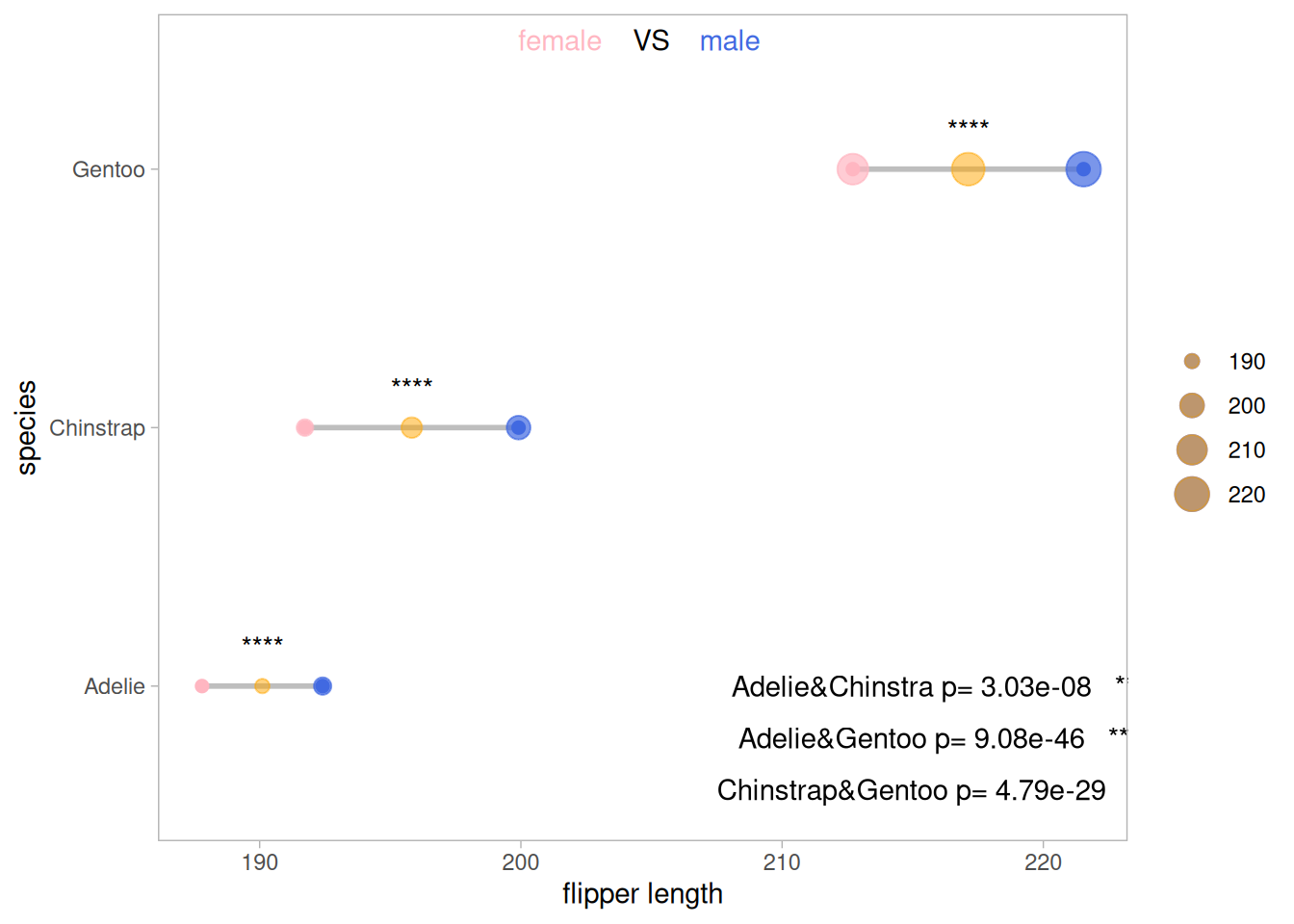
The results of the difference analysis on the effects of penguin species and penguin gender on wing length in the original data were significant.
Applications
1. Lollipop plot
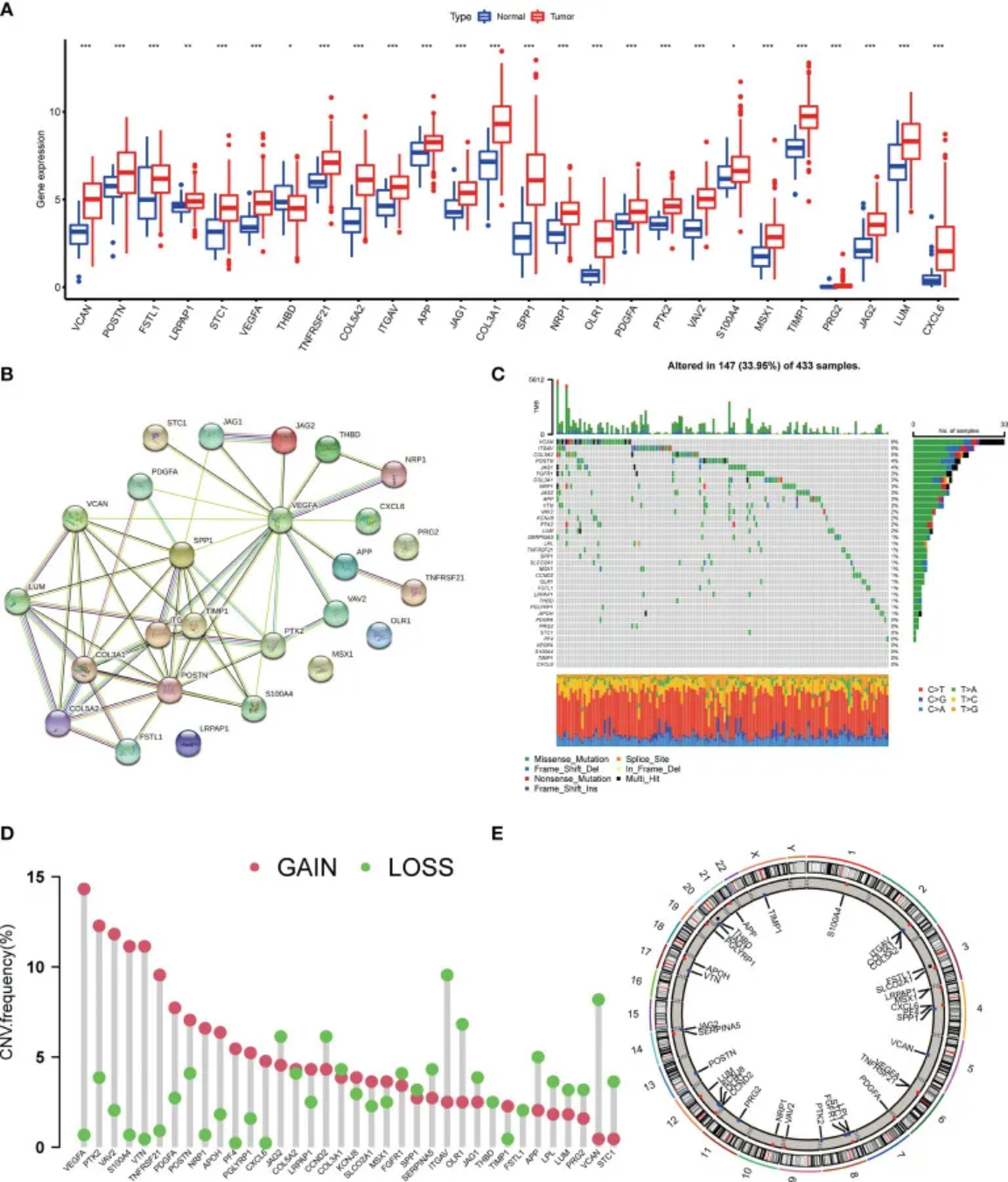
Panel D shows the frequencies of deletion, gain, and absence of copy number variants in AAGs (angiogenesis-related genes). [1]
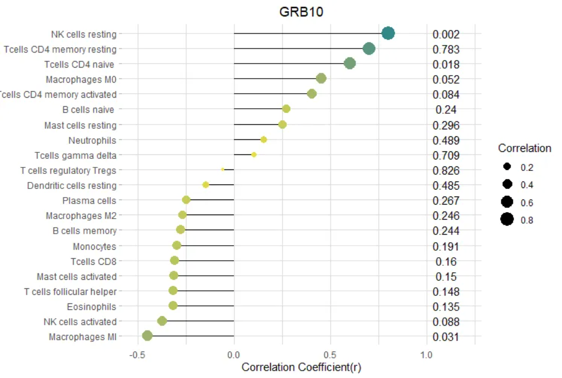
2. Dumbbell plot
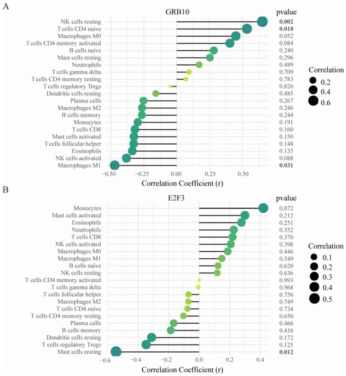
- Correlation between GRB10 and infiltrating immune cells; (B) Correlation between E2F3 and infiltrating immune cells.
The size of the dot represents the strength of the correlation between the gene and immune cells; larger dots indicate stronger correlations, while smaller dots indicate weaker correlations. The color of the dot represents the p-value; greener dots indicate lower p-values, while yellower dots indicate higher p-values. [2]
Reference
[1] Qing X, Xu W, Liu S, Chen Z, Ye C, Zhang Y. Molecular Characteristics, Clinical Significance, and Cancer Immune Interactions of Angiogenesis-Associated Genes in Gastric Cancer. Front Immunol. 2022 Feb 22;13:843077. doi: 10.3389/fimmu.2022.843077. PMID: 35273618; PMCID: PMC8901990.
[2] Deng YJ, Ren EH, Yuan WH, Zhang GZ, Wu ZL, Xie QQ. GRB10 and E2F3 as Diagnostic Markers of Osteoarthritis and Their Correlation with Immune Infiltration. Diagnostics (Basel). 2020 Mar 22;10(3):171. doi: 10.3390/diagnostics10030171. PMID: 32235747; PMCID: PMC7151213.
[3] H. Wickham. ggplot2: Elegant Graphics for Data Analysis. Springer-Verlag New York, 2016.
[4] Wickham H, Vaughan D, Girlich M (2024). tidyr: Tidy Messy Data. R package version 1.3.1, https://CRAN.R-project.org/package=tidyr.
[5] Horst AM, Hill AP, Gorman KB (2020). palmerpenguins: Palmer Archipelago (Antarctica) penguin data. R package version
[6] Wilke C (2024). cowplot: Streamlined Plot Theme and Plot Annotations for ‘ggplot2’. R package version 1.1.3, https://CRAN.R-project.org/package=cowplot.
[7] Rudis B (2024). hrbrthemes: Additional Themes, Theme Components and Utilities for ‘ggplot2’. R package version 0.8.7, https://CRAN.R-project.org/package=hrbrthemes.
[8] Rudis B, Bolker B, Schulz J (2017). ggalt: Extra Coordinate Systems, ‘Geoms’, Statistical Transformations, Scales and Fonts for ‘ggplot2’. R package version 0.4.0, https://CRAN.R-project.org/package=ggalt.
[9] Kassambara A (2023). rstatix: Pipe-Friendly Framework for Basic Statistical Tests. R package version 0.7.2, https://CRAN.R-project.org/package=rstatix.
[10] Kassambara A (2023). ggpubr: ‘ggplot2’ Based Publication Ready Plots. R package version 0.6.0, https://CRAN.R-project.org/package=ggpubr.