# Install packages
if (!requireNamespace("data.table", quietly = TRUE)) {
  install.packages("data.table")
}
if (!requireNamespace("jsonlite", quietly = TRUE)) {
  install.packages("jsonlite")
}
if (!requireNamespace("grafify", quietly = TRUE)) {
  install.packages("grafify")
}
if (!requireNamespace("dplyr", quietly = TRUE)) {
  install.packages("dplyr")
}

# Load packages
library(data.table)
library(jsonlite)
library(grafify)
library(dplyr)Density-Histogram
Note
Hiplot website
This page is the tutorial for source code version of the Hiplot Density-Histogram plugin. You can also use the Hiplot website to achieve no code ploting. For more information please see the following link:
Use density plots or histograms to show data distribution.
Setup
System Requirements: Cross-platform (Linux/MacOS/Windows)
Programming language: R
Dependent packages:
data.table;jsonlite;grafify;dplyr
sessioninfo::session_info("attached")─ Session info ───────────────────────────────────────────────────────────────
setting value
version R version 4.6.0 (2026-04-24)
os Ubuntu 24.04.4 LTS
system x86_64, linux-gnu
ui X11
language (EN)
collate C.UTF-8
ctype C.UTF-8
tz UTC
date 2026-05-09
pandoc 3.1.3 @ /usr/bin/ (via rmarkdown)
quarto 1.9.37 @ /usr/local/bin/quarto
─ Packages ───────────────────────────────────────────────────────────────────
package * version date (UTC) lib source
data.table * 1.18.4 2026-05-06 [1] RSPM
dplyr * 1.2.1 2026-04-03 [1] RSPM
ggplot2 * 4.0.3.9000 2026-05-04 [1] Github (tidyverse/ggplot2@6870419)
grafify * 5.1.0 2025-08-25 [1] RSPM
jsonlite * 2.0.0 2025-03-27 [1] RSPM
[1] /home/runner/work/_temp/Library
[2] /opt/R/4.6.0/lib/R/site-library
[3] /opt/R/4.6.0/lib/R/library
* ── Packages attached to the search path.
──────────────────────────────────────────────────────────────────────────────Data Preparation
# Load data
data <- data.table::fread(jsonlite::read_json("https://hiplot.cn/ui/basic/density-histogram/data.json")$exampleData[[1]]$textarea[[1]])
data <- as.data.frame(data)

# convert data structure
y <- "Doubling_time"
group <- "Student"
data[, group] <- factor(data[, group], levels = unique(data[, group]))
data <- data %>%
  mutate(median = median(get(y), na.rm = TRUE),
         mean = mean(get(y), na.rm = TRUE))

# View data
head(data)
Experiment Student Doubling_time facet median mean
1 Exp1 A 17.36765 F1 20.18114 19.91642
2 Exp1 B 18.04119 F1 20.18114 19.91642
3 Exp1 C 18.70120 F1 20.18114 19.91642
4 Exp1 D 20.06762 F1 20.18114 19.91642
5 Exp1 E 20.19807 F2 20.18114 19.91642
6 Exp1 F 22.11908 F2 20.18114 19.91642Visualization
1. Density Plot
# Density Plot
p <- plot_density(
  data = data,
  ycol = get(y),
  group = get(group),
  linethick = 0.5,
  c_alpha = 0.6) +
  ggtitle("Density Plot") +
  geom_vline(aes_string(xintercept = "median"),
        colour = 'black', linetype = 2, size = 0.5) +
  xlab(y) +
  ylab("density") +
  guides(fill = guide_legend(title = group), color = FALSE) +
  theme(text = element_text(family = "Arial"),
        plot.title = element_text(size = 12,hjust = 0.5),
        axis.title = element_text(size = 12),
        axis.text = element_text(size = 10),
        axis.text.x = element_text(angle = 0, hjust = 0.5,vjust = 1),
        legend.position = "bottom",
        legend.direction = "horizontal",
        legend.title = element_text(size = 10),
        legend.text = element_text(size = 10))

p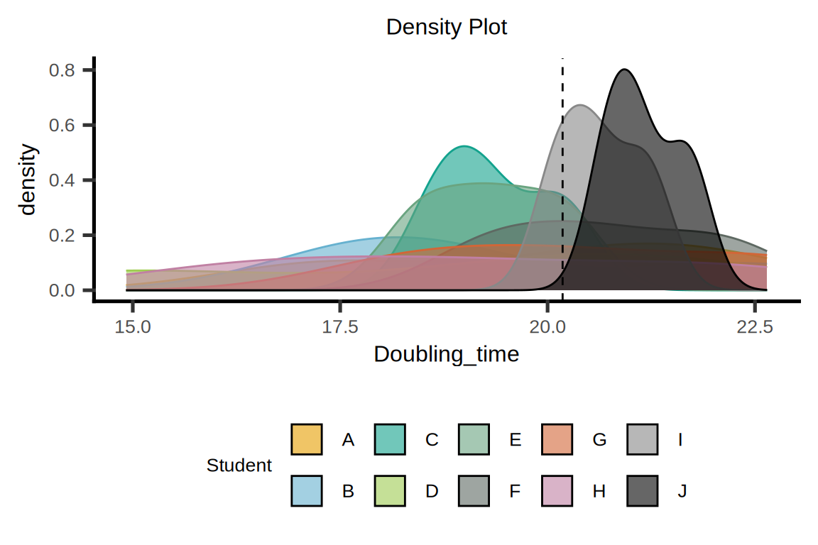
2. Histogram Plot
# Histogram Plot
p <- plot_histogram(
  data = data,
  ycol = get(y),
  group = get(group),
  linethick = 0.5,
  BinSize = 30)  +
  ggtitle("Histogram Plot") +
  geom_vline(aes_string(xintercept = "median"),
        colour = 'black', linetype = 2, size = 0.5) +
  xlab(y) +
  ylab("density") +
  guides(fill = guide_legend(title = group), color = FALSE) +
  theme(text = element_text(family = "Arial"),
        plot.title = element_text(size = 12,hjust = 0.5),
        axis.title = element_text(size = 12),
        axis.text = element_text(size = 10),
        axis.text.x = element_text(angle = 0, hjust = 0.5,vjust = 1),
        legend.position = "bottom",
        legend.direction = "horizontal",
        legend.title = element_text(size = 10),
        legend.text = element_text(size = 10))

p