# Install packages
if (!requireNamespace("igraph", quietly = TRUE)) {
  install.packages("igraph")
}
if (!requireNamespace("cowplot", quietly = TRUE)) {
  install.packages("cowplot")
}
if (!requireNamespace("RColorBrewer", quietly = TRUE)) {
  install.packages("RColorBrewer")
}
if (!requireNamespace("networkD3", quietly = TRUE)) {
  install.packages("networkD3")
}

# Load packages
library(igraph)
library(cowplot)
library(RColorBrewer)
library(networkD3)Network Graph
A network graph is a graphical model that resembles a network and consists of nodes and links, where links can be directed or undirected.
Example
Setup
System Requirements: Cross-platform (Linux/MacOS/Windows)
Programming Language: R
Dependencies:
igraph;cowplot;RColorBrewer;networkD3
sessioninfo::session_info("attached")─ Session info ───────────────────────────────────────────────────────────────
setting value
version R version 4.6.0 (2026-04-24)
os Ubuntu 24.04.4 LTS
system x86_64, linux-gnu
ui X11
language (EN)
collate C.UTF-8
ctype C.UTF-8
tz UTC
date 2026-05-09
pandoc 3.1.3 @ /usr/bin/ (via rmarkdown)
quarto 1.9.37 @ /usr/local/bin/quarto
─ Packages ───────────────────────────────────────────────────────────────────
package * version date (UTC) lib source
cowplot * 1.2.0 2025-07-07 [1] RSPM
igraph * 2.3.1 2026-05-04 [1] RSPM
networkD3 * 0.4.1 2025-04-14 [1] RSPM
RColorBrewer * 1.1-3 2022-04-03 [1] RSPM
[1] /home/runner/work/_temp/Library
[2] /opt/R/4.6.0/lib/R/site-library
[3] /opt/R/4.6.0/lib/R/library
* ── Packages attached to the search path.
──────────────────────────────────────────────────────────────────────────────Data Preparation
The plotting is mainly done using R’s built-in datasets.
# network_pmat
## Correlation analysis results of various indicators in the Matcars dataset
data_pmat_links<- readr::read_csv("https://bizard-1301043367.cos.ap-guangzhou.myqcloud.com/data_mat.csv")
data_pmat_links <- na.omit(data_pmat_links)
colnames(data_pmat_links) <- c("from", "to", "p.log")

data_pmat_node <- colnames(mtcars)
network_pmat <- graph_from_data_frame(d=data_pmat_links, vertices=data_pmat_node, directed=F)

# data_mat
## mtcars clustering analysis
## Calculate the correlation coefficient matrix
data_mat <- cor(t(mtcars[,c(1,3:6)]))
## Filtering highly relevant data
data_mat[data_mat<0.995] <- 0
Input data types for network diagrams
There are four main types of data input for network graphs: adjacency matrix, incident matrix, edge matrix, and a list of connected text.
Here we will demonstrate using random data.
## Adjacency matrix (square matrix)-----
set.seed(10)
data1 <- matrix(sample(0:2, 25, replace=TRUE), nrow=5)
colnames(data1) = rownames(data1) = LETTERS[1:5]
# Create a graph
network1 <- graph_from_adjacency_matrix(data1)

data1
A B C D E
A 2 2 1 2 2
B 0 2 2 1 1
C 1 2 1 2 1
D 2 2 1 1 0
E 1 2 0 2 0## Incident matrix (rows and columns are not necessarily equal; by default, rows are oriented to columns).-----
set.seed(1)
data2 <- matrix(sample(0:2, 15, replace=TRUE), nrow=3)
colnames(data2) <- letters[1:5] # lowercase letters
rownames(data2) <- LETTERS[1:3] # uppercase letter
# Create a graph
network2 <- graph_from_incidence_matrix(data2)Warning: `graph_from_incidence_matrix()` was deprecated in igraph 1.6.0.
ℹ Please use `graph_from_biadjacency_matrix()` instead.data2 a b c d e
A 0 1 2 2 0
B 2 0 1 2 0
C 0 2 1 0 1## Edge list (two columns represent source and destination respectively)-----
links <- data.frame(
source=c("A","A", "A", "A", "A","F", "B"),
target=c("B","B", "C", "D", "F","A","E")
)
# Create a graph
network3 <- graph_from_data_frame(d=links, directed=F)
links source target
1 A B
2 A B
3 A C
4 A D
5 A F
6 F A
7 B E## Linked text list----
network4 <- graph_from_literal( A-B-C-D, E-A-E-A, D-C-A, D-A-D-C )Four data types of drawing examples
# plot----
par(mfrow=c(2,2), mar=c(1,1,1,1))
plot(network1, main="Adjacency matrix (square matrix)")
plot(network2, main="Incident matrix")
plot(network3, main="Edge List")
plot(network4, main="Linked text list")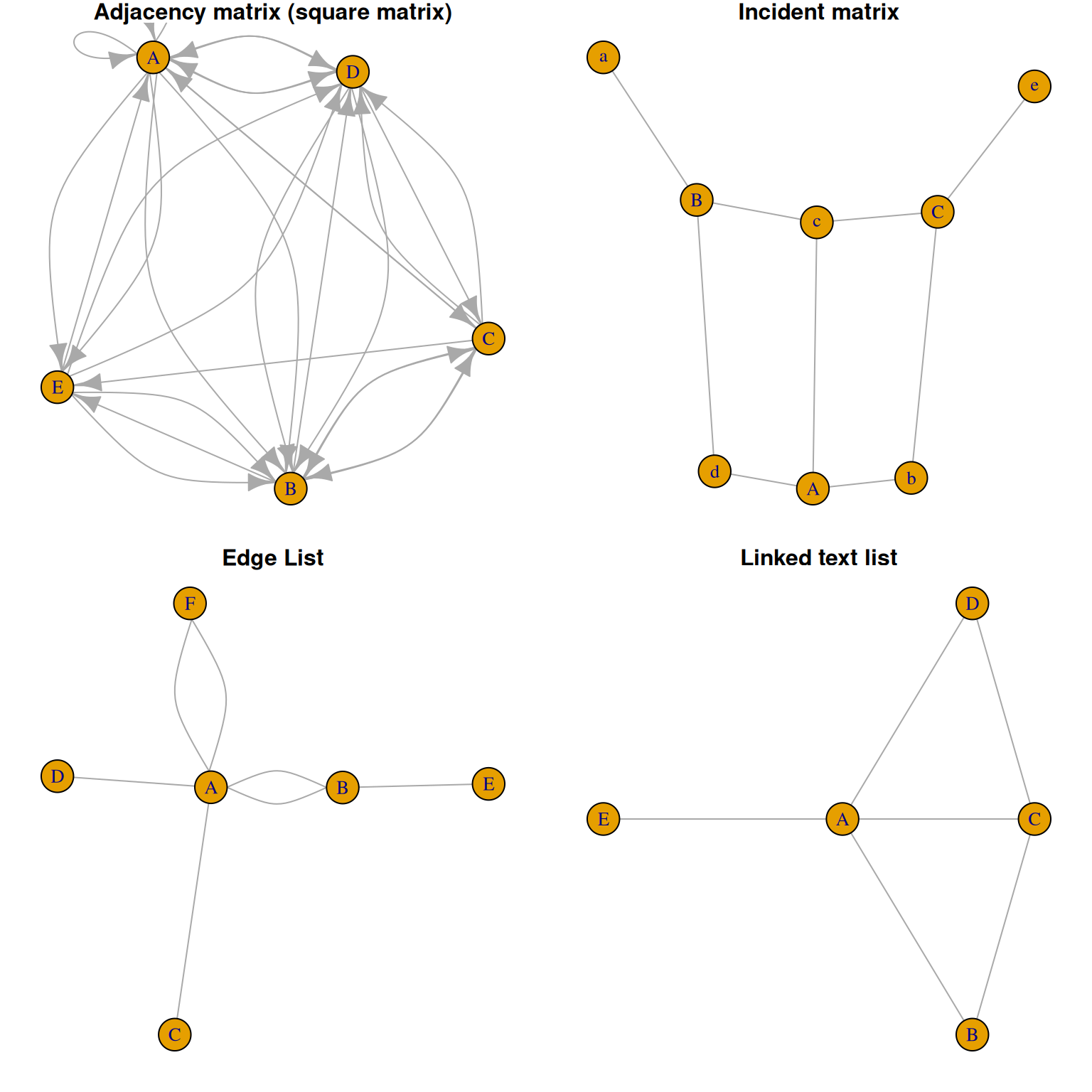
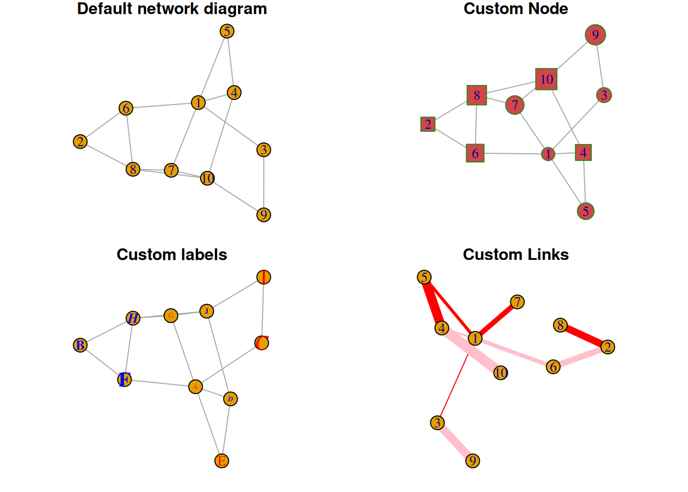
Visualization
1. Custom nodes, links, and tags
# Custom----
# Generate random data
set.seed(1)
data3 <- matrix(sample(0:1, 100, replace=TRUE, prob=c(0.8,0.2)), nc=10)
network5 <- graph_from_adjacency_matrix(data3 , mode='undirected', diag=F )

par(mfrow=c(2,2), mar=c(1,1,1,1))

# Default network diagram
plot(network5, main = "Default network diagram")
# Custom Node
plot(network5,
     vertex.color = rgb(0.8,0.2,0.2,0.9),           # color
     vertex.frame.color = "Forestgreen",            # Border color
     vertex.shape=c("circle","square"),             # Node shape, optional:“none”, “circle”, “square”, “csquare”, “rectangle” “crectangle”, “vrectangle”, “pie”, “raster”,  “sphere”
     vertex.size=c(15:24),
     main = "Custom Node"
)
# Custom labels
plot(network5,
     vertex.label=LETTERS[1:10],
     vertex.label.color=c("red","blue"),
     vertex.label.family="Times",
     vertex.label.font=c(1,2,3,4),
     vertex.label.cex=c(0.5,1,1.5),
     vertex.label.dist=0,
     vertex.label.degree=0,
     main = "Custom labels"
)
# Custom Links
plot(network5,
     edge.color=rep(c("red","pink"),5),
     edge.width=seq(1,10),
     edge.arrow.size=1,
     edge.arrow.width=1,
     edge.lty=c("solid"),
     main = "Custom Links"
)
2. Layout
Different network graph layouts can be used as needed, such as sphere, circle, random, fruchterman.reingold, etc.
# Layout ----
# Generate random data
data4 <- matrix(sample(0:1, 400, replace=TRUE, prob=c(0.8,0.2)), nrow=20)
network6 <- graph_from_adjacency_matrix(data4 , mode='undirected', diag=F )

# Different layouts
par(mfrow=c(2,2), mar=c(1,1,1,1))
plot(network6, layout=layout.sphere, main="sphere")
plot(network6, layout=layout.circle, main="circle")
plot(network6, layout=layout.random, main="random")
plot(network6, layout=layout.fruchterman.reingold, main="fruchterman.reingold")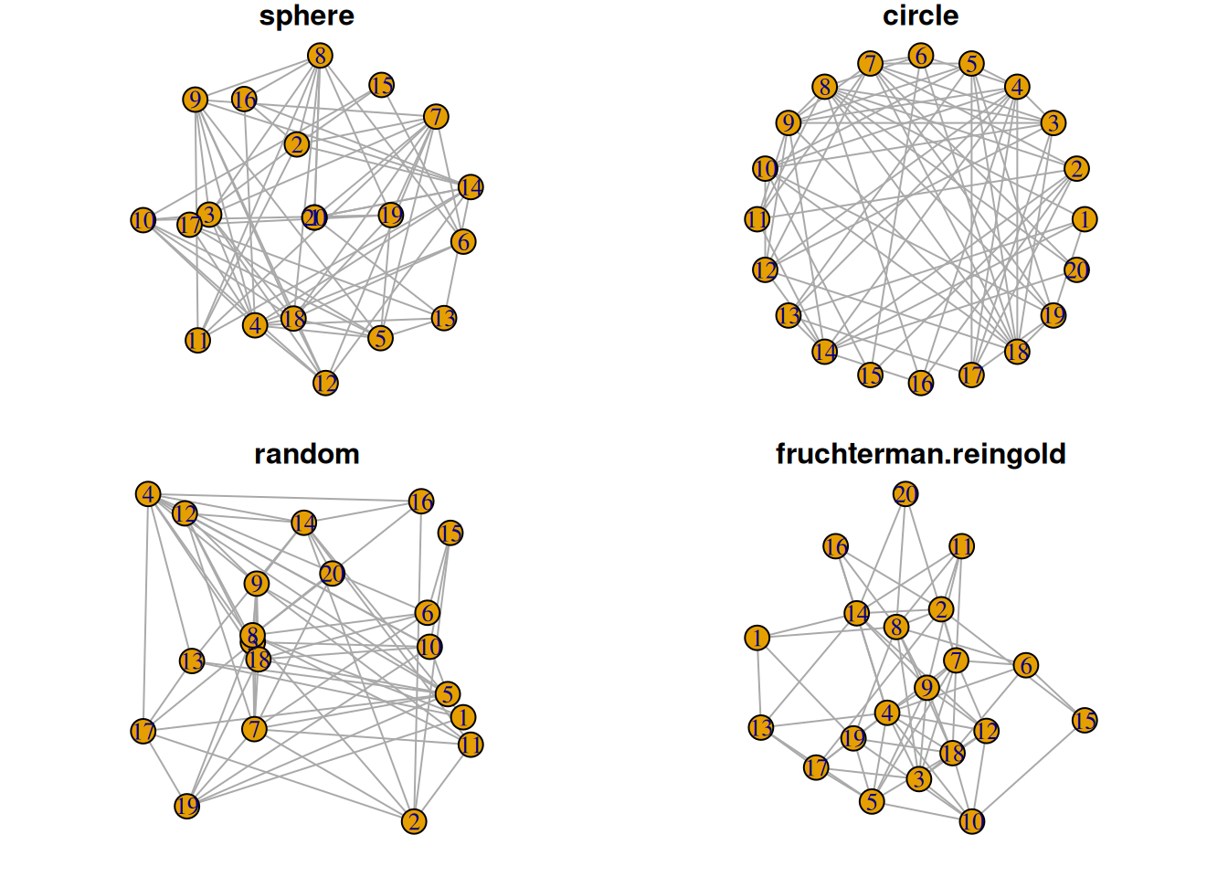
3. Variable mapping to nodes and connections
3.1 Variable classification mapping to nodes
## Mapped to node
# Generate random data
links <- data.frame(
source=c("A","A", "A", "A", "A","J", "B", "B", "C", "C", "D","I"),
  target=c("B","B", "C", "D", "J","A","E", "F", "G", "H", "I","I"),
  importance=(sample(1:4, 12, replace=T))
)
nodes <- data.frame(
  name=LETTERS[1:10],
  carac=c( rep("group1",3),rep("group2",2), rep("group3",5))
)

# igraph
network <- graph_from_data_frame(d=links, vertices=nodes, directed=F)

# color
coul  <- brewer.pal(3, "Set1")

# Color vector
my_color <- coul[as.numeric(as.factor(V(network)$carac))]

# plot
plot(network, vertex.color=my_color)

# Add labels
legend("bottomleft",
       legend=levels(as.factor(V(network)$carac))  ,
       col = coul , bty = "n", pch=20 , pt.cex = 3, cex = 1.5, text.col=coul ,
       horiz = FALSE, inset = c(0.1, 0.1))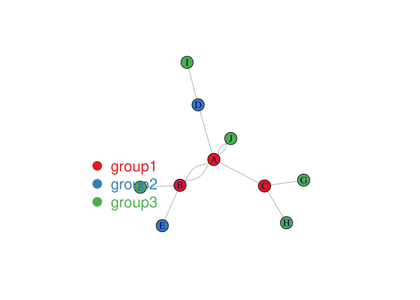
The node colors in the image above represent categories.
3.2 Variable mapping to link
## Variable mapping to link
plot(network, vertex.color=my_color, edge.width=E(network)$importance*2 )

legend("bottomleft",
       legend=levels(as.factor(V(network)$carac))  ,
       col = coul ,
       bty = "n",
       pch=20 ,
       pt.cex = 3,
       cex = 1.5,
       text.col=coul,
       horiz = FALSE,
       inset = c(0.1, 0.1))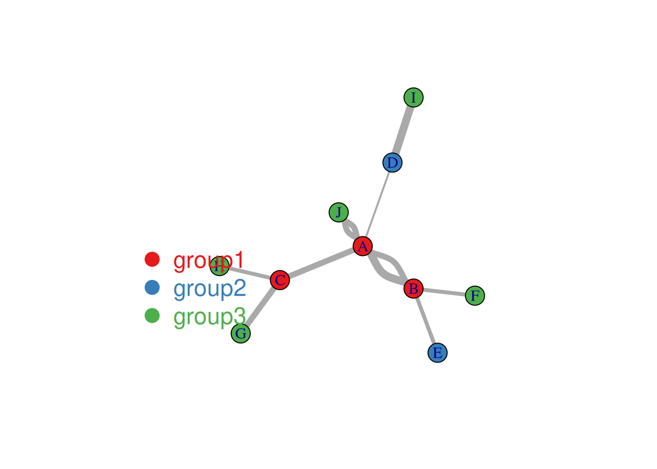
The figure above shows the correlation analysis results (α=0.01) of various indicators in the mtcars dataset, using the marginal list data input type. Links indicate a correlation between two indicators; the thickness of the link represents -log10 of the p-value, with thicker links indicating more reliable results.
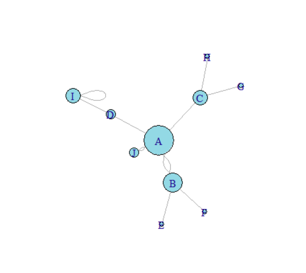
4. Node size maps to number of connections
The degree function can be used here to calculate the number of connections.
## The node size corresponds to the number of links (degree function).----
# Calculate the number of links
deg <- degree(network_pmat, mode="all")

# plot
plot(network_pmat,
     vertex.size=deg*6,
     layout=layout.circle,
     vertex.color=rgb(0.1,0.7,0.8,0.5),
     edge.width=E(network_pmat)$value*0.5)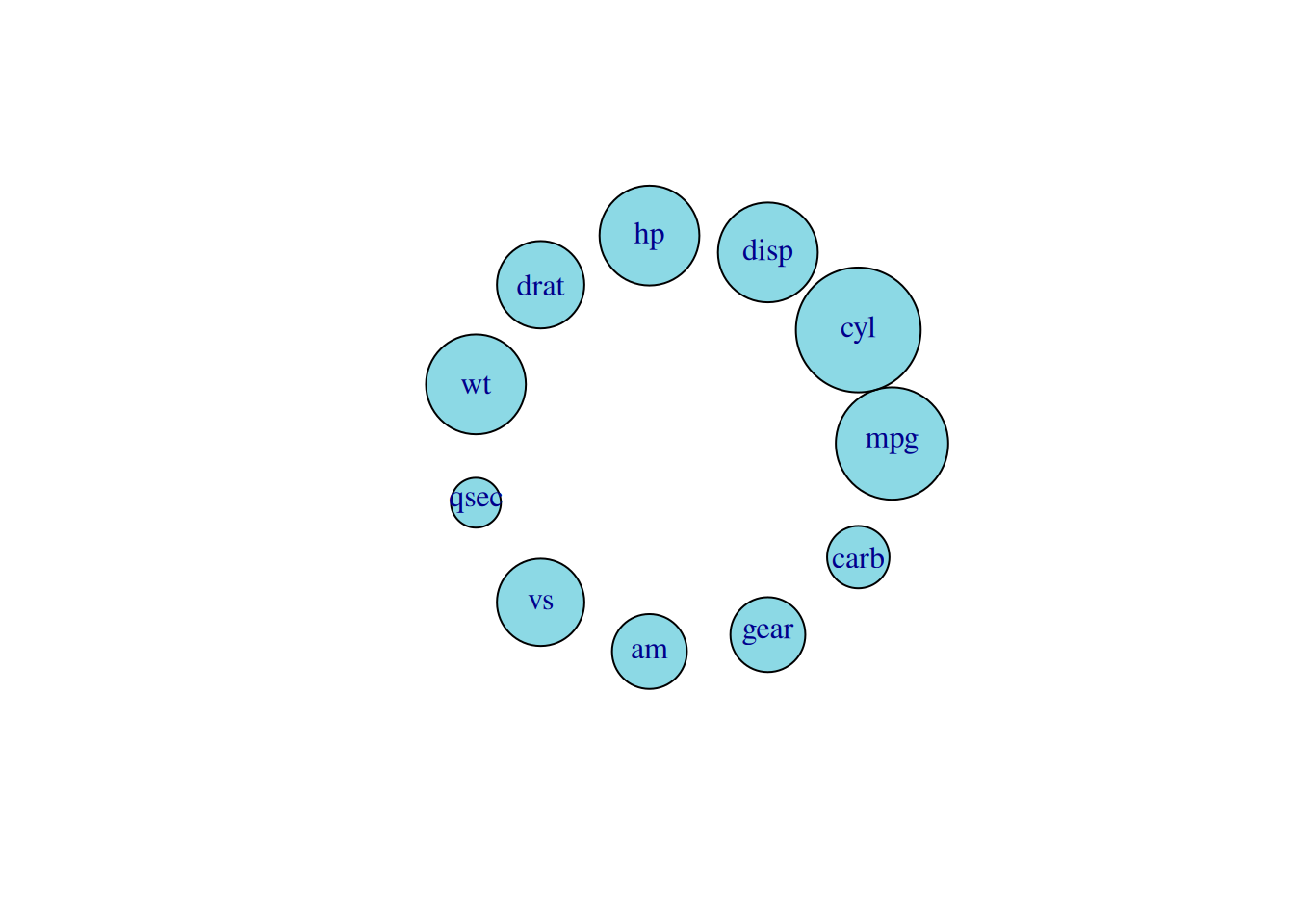
In the diagram above, the size of a node represents the number of links to that node (and the number of related metrics).
5. Clustering results visualization
Here, we take the mtcars dataset as an example for cluster analysis.
# Clustering results visualization ----
# Create igraph graph
network <- graph_from_adjacency_matrix( data_mat, weighted=T, mode="undirected", diag=F)

# Colors are used to establish a mapping, with different colors representing different cylinders.
coul <- brewer.pal(nlevels(as.factor(mtcars$cyl)), "Set2")
my_color <- coul[as.numeric(as.factor(mtcars$cyl))]

# plot
par(bg="grey13", mar=c(0,0,0,0))
set.seed(4)
plot(network,
     vertex.size=12,
     vertex.color=my_color,
     vertex.label.cex=0.7,
     vertex.label.color="white",
     vertex.frame.color="transparent",
     edge.color=rep(c("red","pink"),5),
     edge.width=seq(1,10),
     edge.arrow.size=1,
     edge.arrow.width=1,
     edge.lty=c("solid"),
     edge.curved=0.3
)

# Add title and labels
text(0,0,"mtcars network",col="white", cex=1.5)
legend(x=-0.2, y=-0.12,
       legend=paste( levels(as.factor(mtcars$cyl)), " cylinders", sep=""),
       col = coul ,
       bty = "n", pch=20 , pt.cex = 2, cex = 1,
       text.col="white" , horiz = F)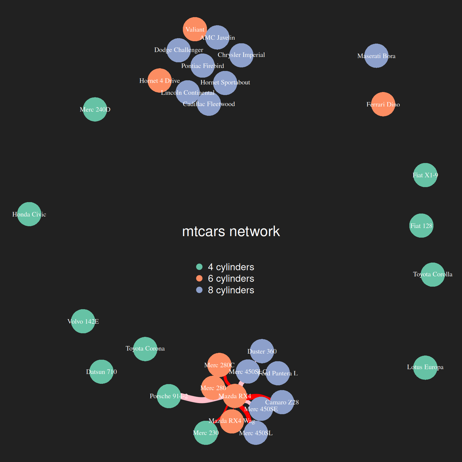
The image above shows the results of cluster analysis on the mtcars dataset based on mpg, disp, gp, and drat. Different colors represent different cyl clusters.
6. 3D Interactive Network Diagram
The networkD3 package can be used to enable 3D interaction of network graphs.
## Interaction (networkD3)----
p <- simpleNetwork(data_pmat_links, height="100px", width="100px")
p
3D Interactive Network Diagram
Interactive elements can be used to achieve functions such as highlighting and dragging (the image above shows dragging a carb node).
Applications
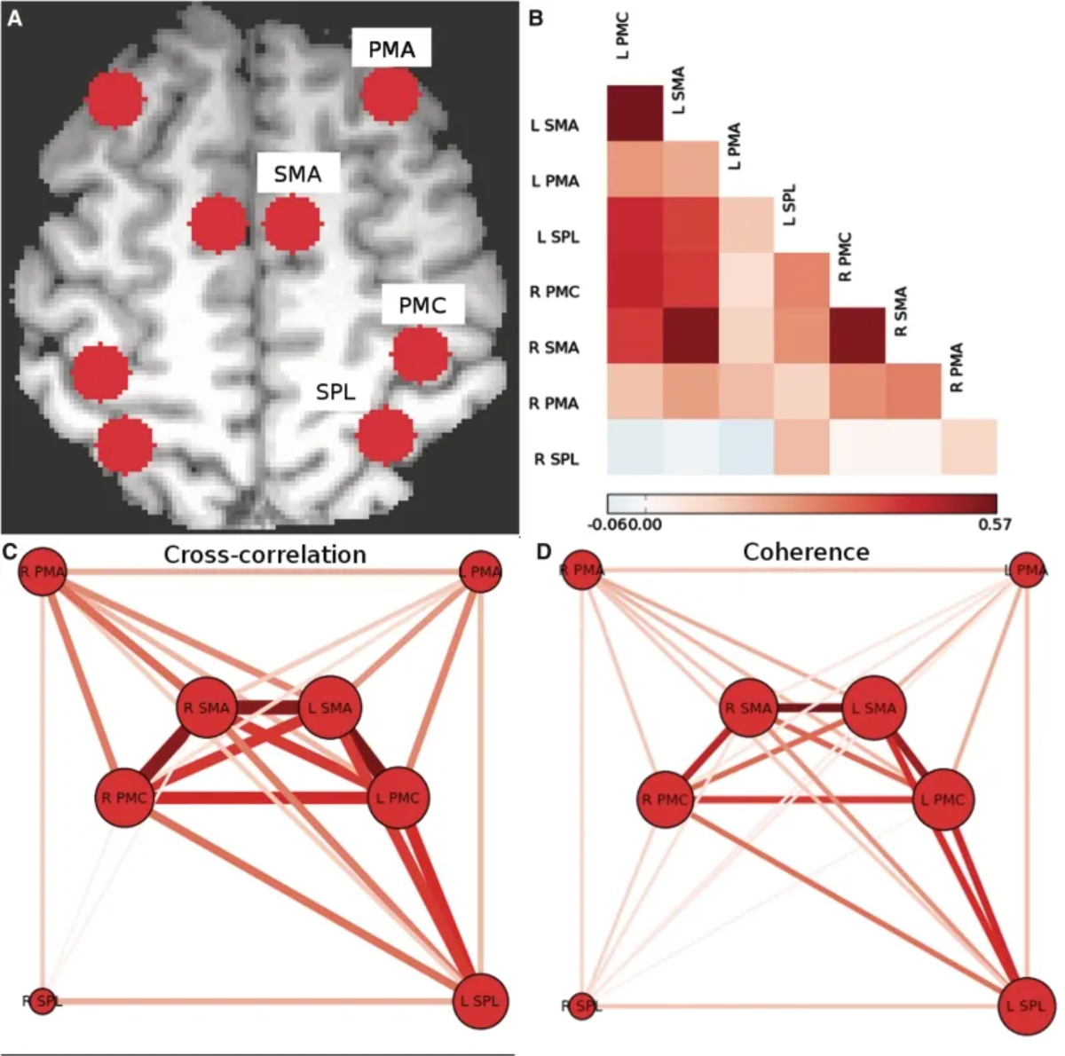
The above figure shows the motor network of the subjects in the experimental control group. (A) Individual voxels of the centroids of the regions corresponding to PMC, SMA, PMA, and SPL are identified bilaterally in each hemisphere. (B) Pairwise Pearson cross-correlation coefficients between each region are calculated, and an adjacency matrix is constructed. (C) A weighted undirected network graph is constructed from the cross-correlation adjacency matrix. (D) An adjacency matrix is constructed using the consistency of the 0.08–0.15 Hz frequency band, and a weighted undirected network graph is constructed, similar to the graph obtained from the cross-correlation. [1]
Reference
[1] Otten ML, Mikell CB, Youngerman BE, Liston C, Sisti MB, Bruce JN, Small SA, McKhann GM 2nd. Motor deficits correlate with resting state motor network connectivity in patients with brain tumours. Brain. 2012 Apr;135(Pt 4):1017-26. doi: 10.1093/brain/aws041. Epub 2012 Mar 8. PMID: 22408270; PMCID: PMC3326259.
[2] Csardi G, Nepusz T (2006). “The igraph software package for complex network research.” InterJournal, Complex Systems, 1695. https://igraph.org.
[3] Wilke C (2024). cowplot: Streamlined Plot Theme and Plot Annotations for ‘ggplot2’. R package version 1.1.3, https://CRAN.R-project.org/package=cowplot.
[4] Neuwirth E (2022). RColorBrewer: ColorBrewer Palettes. R package version 1.1-3, https://CRAN.R-project.org/package=RColorBrewer.
[5] Allaire J, Gandrud C, Russell K, Yetman C (2017). networkD3: D3 JavaScript Network Graphs from R. R package version 0.4, https://CRAN.R-project.org/package=networkD3.