# Install packages
if (!requireNamespace("plotly", quietly = TRUE)) {
  install.packages("plotly")
}
if (!requireNamespace("gapminder", quietly = TRUE)) {
  install.packages("gapminder")
}
if (!requireNamespace("ggiraph", quietly = TRUE)) {
  install.packages("ggiraph")
}
if (!requireNamespace("webshot", quietly = TRUE)) {
  install.packages("webshot")
}
if (!requireNamespace("tidyverse", quietly = TRUE)) {
  install.packages("tidyverse")
}
if (!requireNamespace("chorddiag", quietly = TRUE)) {
  remotes::install_github("mattflor/chorddiag")
}
if (!requireNamespace("streamgraph", quietly = TRUE)) {
  remotes::install_github("hrbrmstr/streamgraph")
}
if (!requireNamespace("htmlwidgets", quietly = TRUE)) {
  install.packages("htmlwidgets")
}
if (!requireNamespace("dygraphs", quietly = TRUE)) {
  install.packages("dygraphs")
}
if (!requireNamespace("xts", quietly = TRUE)) {
  install.packages("xts")
}
if (!requireNamespace("d3heatmap", quietly = TRUE)) {
  install.packages("d3heatmap")
}
if (!requireNamespace("patchwork", quietly = TRUE)) {
  install.packages("patchwork")
}

# Load packages
library(plotly)
library(gapminder)
library(ggiraph)
library(webshot)
library(tidyverse)
library(chorddiag)
library(streamgraph)
library(htmlwidgets)
library(dygraphs)
library(xts)
library(d3heatmap)
library(patchwork)Interactivity
Interactive charts allow users to perform actions: zoom, hover the mouse over markers for tooltips, select variables to display, and so on. R provides a set of packages called HTML widgets: these allow you to build interactive data visualizations directly from R.
Example
The basic scatter plot above can intuitively represent a general trend of the dependent variable y changing with the independent variable x. It can be seen that y increases roughly as x increases.
Setup
System Requirements: Cross-platform (Linux/MacOS/Windows)
Programming Language: R
Dependencies:
plotly,gapminder,ggiraph,webshot,tidyverse,chorddiag,streamgraph,htmlwidgets,dygraphs,xts,d3heatmap,patchwork
sessioninfo::session_info("attached")─ Session info ───────────────────────────────────────────────────────────────
setting value
version R version 4.6.0 (2026-04-24)
os Ubuntu 24.04.4 LTS
system x86_64, linux-gnu
ui X11
language (EN)
collate C.UTF-8
ctype C.UTF-8
tz UTC
date 2026-05-09
pandoc 3.1.3 @ /usr/bin/ (via rmarkdown)
quarto 1.9.37 @ /usr/local/bin/quarto
─ Packages ───────────────────────────────────────────────────────────────────
package * version date (UTC) lib source
chorddiag * 0.1.3 2026-05-04 [1] Github (mattflor/chorddiag@1688d72)
d3heatmap * 0.9.0 2026-05-04 [1] Github (talgalili/d3heatmap@0ff4b83)
dplyr * 1.2.1 2026-04-03 [1] RSPM
dygraphs * 1.1.1.6 2018-07-11 [1] RSPM
forcats * 1.0.1 2025-09-25 [1] RSPM
gapminder * 1.0.1 2025-06-12 [1] RSPM
ggiraph * 0.9.6 2026-02-21 [1] RSPM
ggplot2 * 4.0.3.9000 2026-05-04 [1] Github (tidyverse/ggplot2@6870419)
htmlwidgets * 1.6.4 2023-12-06 [1] RSPM
lubridate * 1.9.5 2026-02-04 [1] RSPM
patchwork * 1.3.2 2025-08-25 [1] RSPM
plotly * 4.12.0 2026-01-24 [1] RSPM
purrr * 1.2.2 2026-04-10 [1] RSPM
readr * 2.2.0 2026-02-19 [1] RSPM
streamgraph * 0.9.0 2026-05-04 [1] Github (hrbrmstr/streamgraph@76f7173)
stringr * 1.6.0 2025-11-04 [1] RSPM
tibble * 3.3.1 2026-01-11 [1] RSPM
tidyr * 1.3.2 2025-12-19 [1] RSPM
tidyverse * 2.0.0 2023-02-22 [1] RSPM
webshot * 0.5.5 2023-06-26 [1] RSPM
xts * 0.14.2 2026-02-28 [1] RSPM
zoo * 1.8-15 2025-12-15 [1] RSPM
[1] /home/runner/work/_temp/Library
[2] /opt/R/4.6.0/lib/R/site-library
[3] /opt/R/4.6.0/lib/R/library
* ── Packages attached to the search path.
──────────────────────────────────────────────────────────────────────────────Data Preparation
It primarily utilizes gapminder, TCGA dataset, GISAID database, and built-in R datasets.
1. gapminder dataset
The gapminder package is an R language package that provides an excerpt from a dataset from the Gapminder.org website. This dataset contains population, life expectancy, and GDP data for 142 countries, updated every five years from 1952 to 2007.
head(gapminder)# A tibble: 6 × 6
country continent year lifeExp pop gdpPercap
<fct> <fct> <int> <dbl> <int> <dbl>
1 Afghanistan Asia 1952 28.8 8425333 779.
2 Afghanistan Asia 1957 30.3 9240934 821.
3 Afghanistan Asia 1962 32.0 10267083 853.
4 Afghanistan Asia 1967 34.0 11537966 836.
5 Afghanistan Asia 1972 36.1 13079460 740.
6 Afghanistan Asia 1977 38.4 14880372 786.2. TCGA dataset
DNA methylation data were selected from the TCGA Bile Duct Cancer (CHOL) dataset.
data <- readr::read_csv(
"https://bizard-1301043367.cos.ap-guangzhou.myqcloud.com/data.csv")
head(data)
# A tibble: 6 × 5
...1 Composite Sample Methylation_Level Standardized_Level
<dbl> <dbl> <chr> <dbl> <dbl>
1 1 1 AA30 0.0276 -0.450
2 2 1 AA0S 0.654 2.32
3 3 1 AAV9 0.0356 -0.415
4 4 1 AA2X 0.0198 -0.485
5 5 1 AA2U 0.0182 -0.492
6 6 1 A8Y8 0.0323 -0.4293. Data on COVID-19 infections in 2020 (data source: GISAID database)
covid_all <- readr::read_csv(
"https://bizard-1301043367.cos.ap-guangzhou.myqcloud.com/covid_all.csv")
covid_China <- readr::read_csv(
"https://bizard-1301043367.cos.ap-guangzhou.myqcloud.com/covid_China.csv")
head(covid_all)
# A tibble: 6 × 6
...1 X.1 X location time count
<dbl> <dbl> <dbl> <chr> <date> <dbl>
1 1 1 1 Africa 2020-01-01 17
2 2 2 2 Asia 2020-01-01 787
3 3 3 3 Europe 2020-01-01 119
4 4 4 4 North America 2020-01-01 78
5 5 5 5 South America 2020-01-01 2
6 6 6 6 Africa 2020-02-01 14head(covid_China)# A tibble: 6 × 3
...1 time count
<dbl> <date> <dbl>
1 1 2020-01-01 34
2 2 2020-01-02 2
3 3 2020-01-03 1
4 4 2020-01-05 1
5 5 2020-01-08 2
6 6 2020-01-10 24. R Built-in Dataset - mtcars
mtcars_db <- rownames_to_column(mtcars, var = "carname")
head(mtcars_db)
carname mpg cyl disp hp drat wt qsec vs am gear carb
1 Mazda RX4 21.0 6 160 110 3.90 2.620 16.46 0 1 4 4
2 Mazda RX4 Wag 21.0 6 160 110 3.90 2.875 17.02 0 1 4 4
3 Datsun 710 22.8 4 108 93 3.85 2.320 18.61 1 1 4 1
4 Hornet 4 Drive 21.4 6 258 110 3.08 3.215 19.44 1 0 3 1
5 Hornet Sportabout 18.7 8 360 175 3.15 3.440 17.02 0 0 3 2
6 Valiant 18.1 6 225 105 2.76 3.460 20.22 1 0 3 1Visualization
1. Bubble chart (using plotly)
Using the gapminder dataset
plot1 <- gapminder %>%
filter(year==1977) %>%
ggplot(aes(gdpPercap, lifeExp, size = pop, color=continent))+
geom_point() +
theme_bw()
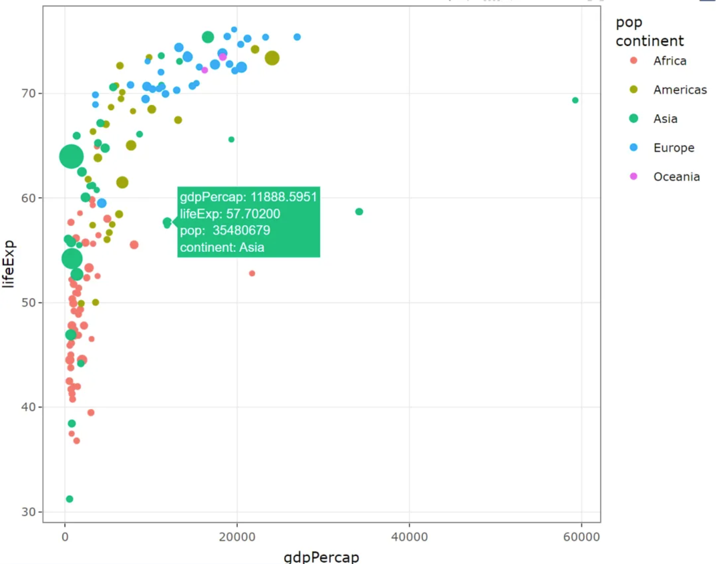
ggplotly(plot1)Bubble chart (using plotly)
This bubble chart illustrates the relationship between GDP per capita and life expectancy at birth in different regions, with the size of the circles representing population size.
2. Heatmap (using plotly and d3heatmap)
There are two options for building interactive heatmaps from R:
Plotly: As mentioned above,Plotlyallows you to convert any heatmap created usingggplot2into an interactive version.D3heatmap: A package that uses the same syntax as the basic R heatmap functionheatmap()for creating interactive versions.
2.1 plotly
Taking the TCGA database as an example
plot2 <- ggplot(data, aes(x = Sample, y = Composite, fill= Standardized_Level)) +
  geom_tile()

ggplotly(plot2)
plotly
This heatmap depicts the distribution of standardized methylation levels among different samples and composites in the TCGA-CHOL dataset, reflecting the differences in methylation status among the samples.
2.2 d3heatmap
Taking the mtcars database as an example
d3heatmap(mtcars, scale="column")d3heatmap
This heatmap describes the different attributes of different car models in the mtcars database.
3. Streamline diagram (using streamgraph)
Taking the GISAID database as an example
The streamgraph package allows you to build interactive flow graphs, and hovering over a group will give you its name and its exact value. This is also the only way to build flow graphs from R.
streamgraph(covid_all,key = "location",
            value = "count",date = "time",
            height="300px", width="1000px")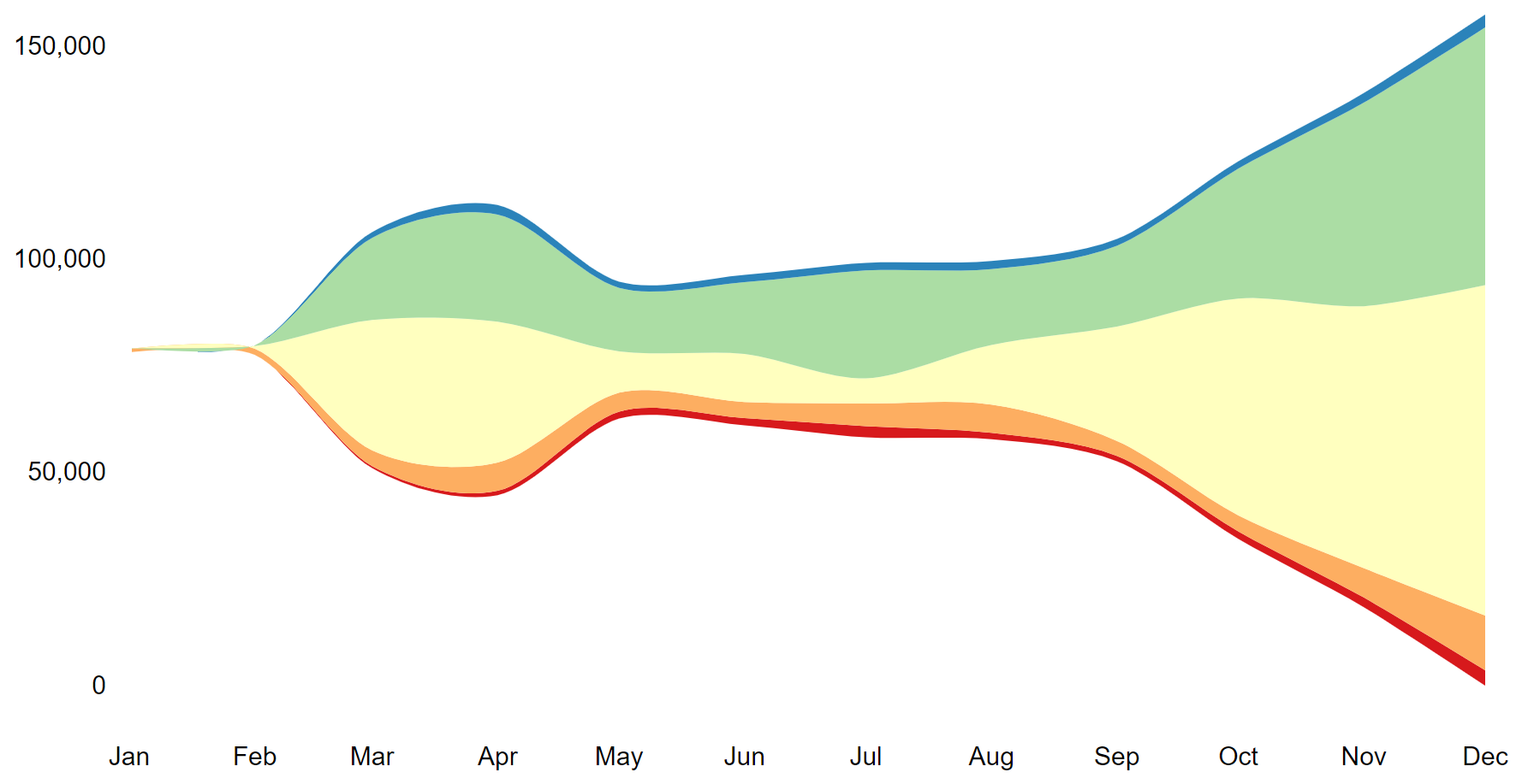
This line graph illustrates the changing trends in the number of COVID-19 infections in different regions of the world in 2020.
4. Chord diagram (using the chorddiag package)
The chorddiag package allows you to build interactive chord diagrams using R. It takes a square matrix as input, providing the flow intensity between each pair of nodes that will be displayed around the circle. Once the data is correctly formatted, the chorddiag() function will automatically build the diagram for you.
# Create a dataset
m <- matrix(
  c(
    11975, 5871, 8916, 2868,
    1951, 10048, 2060, 6171,
    8010, 16145, 8090, 8045,
    1013, 990, 940, 6907
  ),
  byrow = TRUE,
  nrow = 4, ncol = 4
)
haircolors <- c("black", "blonde", "brown", "red")
dimnames(m) <- list(
  have = haircolors,
  prefer = haircolors
)
groupColors <- c("#000000", "#FFDD89", "#957244", "#F26223")

# plot
p <- chorddiag(m, groupColors = groupColors, groupnamePadding = 60)
p

# Save the image as HTML
# saveWidget(p, file=paste0( getwd(), "./chord_interactive.html")) 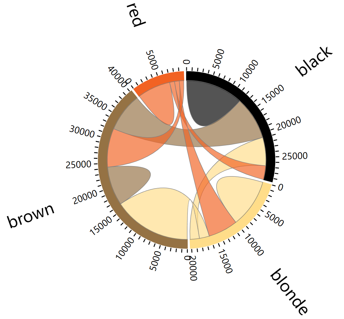
5. Time series plots (using the dygraphs package)
# When processing data, it's important to convert the time data into XTS time series data.
covid_China$time <- as.Date(covid_China$time, format = "%Y-%m-%d")
don <- xts(x = covid_China$count, order.by = covid_China$time)

# plot
p <- dygraph(don) %>%
  dyOptions(labelsUTC = TRUE, fillGraph=TRUE,
            fillAlpha=0.1, drawGrid = FALSE, colors="#D8AE5A") %>%
  dyRangeSelector() %>%
  dyCrosshair(direction = "vertical") %>%
  dyHighlight(highlightCircleSize = 5,
              highlightSeriesBackgroundAlpha = 0.2,
              hideOnMouseOut = FALSE)  %>%
  dyRoller(rollPeriod = 1)

p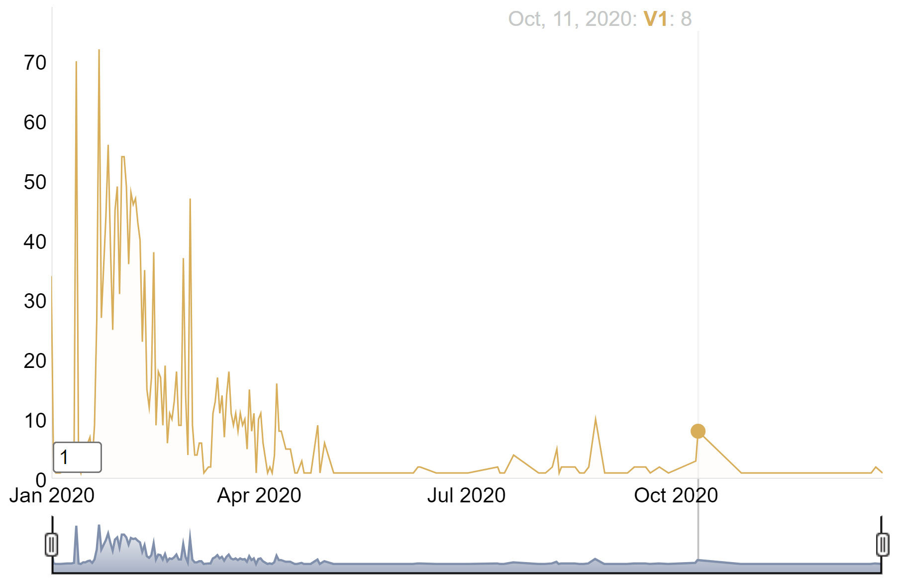
This time series plot depicts the growth of the number of COVID-19 cases in China in 2020.
6. ggiraph package
The ggiraph package in R is an extension of the ggplot2 package, designed to simplify the process of creating interactive and dynamic plots. It is an HTML widget, meaning it is highly compatible with R Markdown/Quarto documents and the Shiny application.
6.1 Basic usage
This is an example using the geom_point_interactive() function, which “replaces” the original geom_point() function in ggplot2. It will also draw circles on the plot, but these circles will be interactive. This geometry has some new parameters, such as hover_nearest = TRUE, which ensures that we always consider the nearest point being hovered over.
Taking mtcars data as an example
# plot
myplot <- ggplot(
  data = mtcars_db,
  mapping = aes(
    x = disp, y = qsec,
    tooltip = carname, data_id = carname
  )
) +
  geom_point_interactive(
    size = 3, hover_nearest = TRUE
  )

# Convert images into interactive formats
interactive_plot <- girafe(ggobj = myplot)
interactive_plot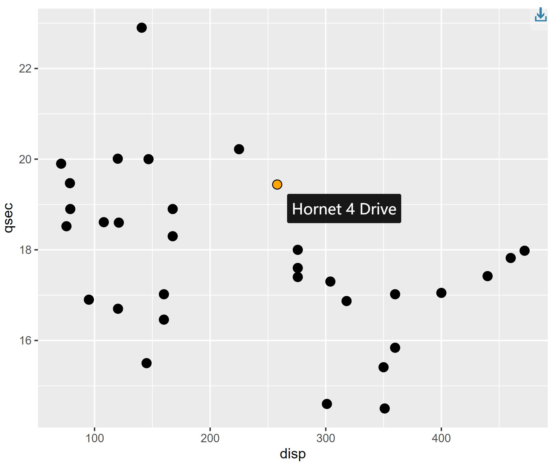
This scatter plot shows the relationship between quarter-mile time and engine displacement for different cars in the mtcars dataset. Hovering the mouse over the origin will display the name of each car.
6.2 Merge charts
# plot1
scatter <- ggplot(
  data = mtcars_db,
  mapping = aes(
    x = disp, y = qsec,
    tooltip = carname, data_id = carname
  )
) +
  geom_point_interactive(
    size = 3, hover_nearest = TRUE
  ) +
  labs(
    title = "Displacement vs Quarter Mile",
    x = "Displacement", y = "Quarter Mile"
  ) +
  theme_bw()

# plot2
bar <- ggplot(
  data = mtcars_db,
  mapping = aes(
    x = reorder(carname, mpg), y = mpg,
    tooltip = paste("Car:", carname, "<br>MPG:", mpg),
    data_id = carname
  )
) +
  geom_col_interactive(fill = "skyblue") +
  coord_flip() +
  labs(
    title = "Miles per Gallon by Car",
    x = "Car", y = "Miles per Gallon"
  ) +
  theme_bw()

# Merge two charts
combined_plot <- scatter + bar +
  plot_layout(ncol = 2)

# Convert images into interactive formats
interactive_plot_match <- girafe(ggobj = combined_plot)

# Options for setting interactive charts
interactive_plot_match <- girafe_options(
  interactive_plot_match,
  opts_hover(css = "fill:cyan;stroke:black;cursor:pointer;"),
  opts_selection(type = "single", css = "fill:red;stroke:black;")
)

interactive_plot_match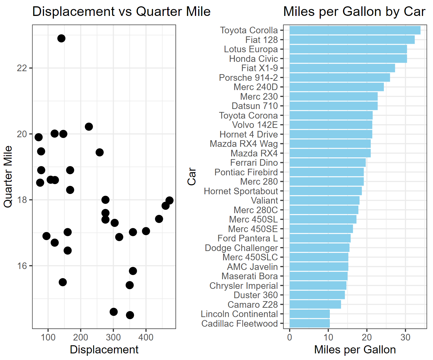
The left image shows the relationship between quarter-mile travel time and engine displacement for different cars in the mtcars dataset, while the right image shows the relationship between miles per gallon for different cars. By interactively merging the two images, the performance of each car can be quickly and intuitively obtained.
6.3 Customize interactive charts using CSS
While CSS is primarily used for web design, it can also be used to customize visual effects in R, making it convenient for handling web-based outputs such as interactive charts or Shiny applications.
Basic Graphics (using a line chart as an example)
# plot
plot <- covid_all %>%
  ggplot(mapping = aes(
    x = time,
    y = count,
    color = location,
    tooltip = location,
    data_id = location
  )) +
  geom_line_interactive(hover_nearest = TRUE) +
  theme_classic()

# Convert images into interactive formats
interactive_plot_line <- girafe(ggobj = plot)

interactive_plot_line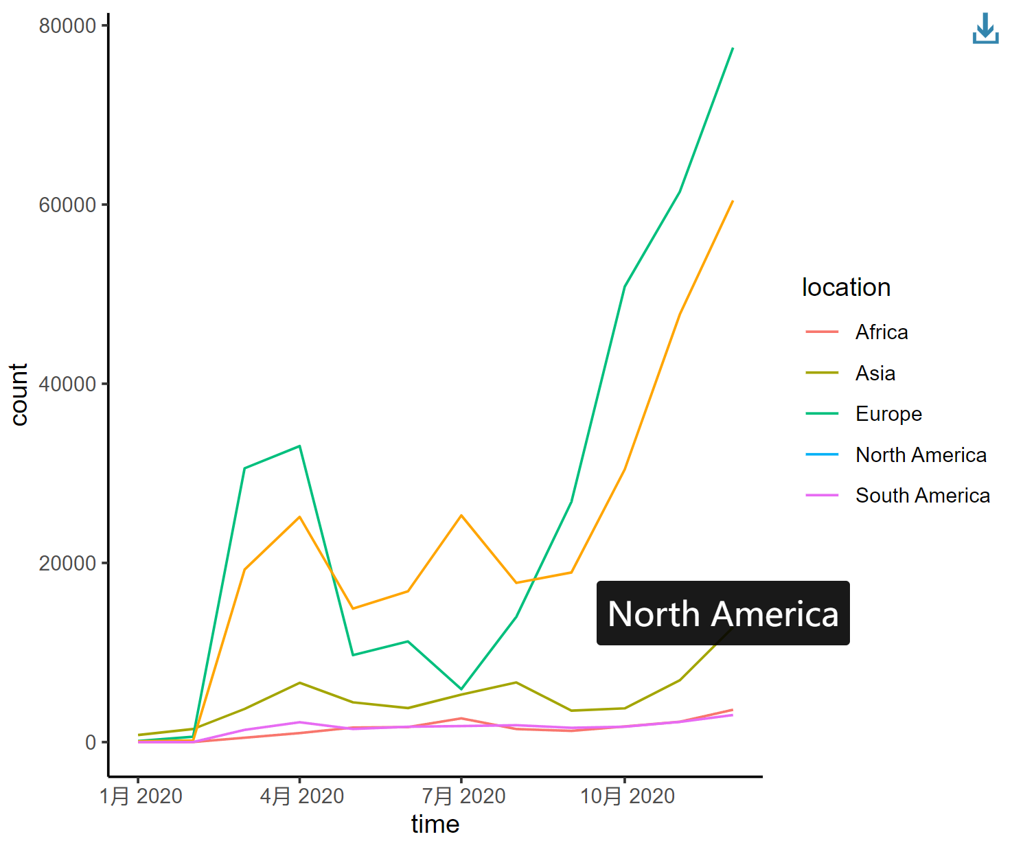
This line graph depicts the changing trends in the number of COVID-19 infections in different regions of the world in 2020, with each curve representing a different continent.
6.4 Add CSS
1. Add fill effect
The simplest way to add CSS to ggiraph is to use the girafe_options() function.
interactive_plot_line <- girafe_options(
  interactive_plot_line,
  opts_hover(css = "fill:#ffe7a6;stroke:black;cursor:pointer;"),
  opts_selection(type = "single", css = "fill:red;stroke:black;"),
  opts_toolbar(saveaspng = FALSE)
)
interactive_plot_line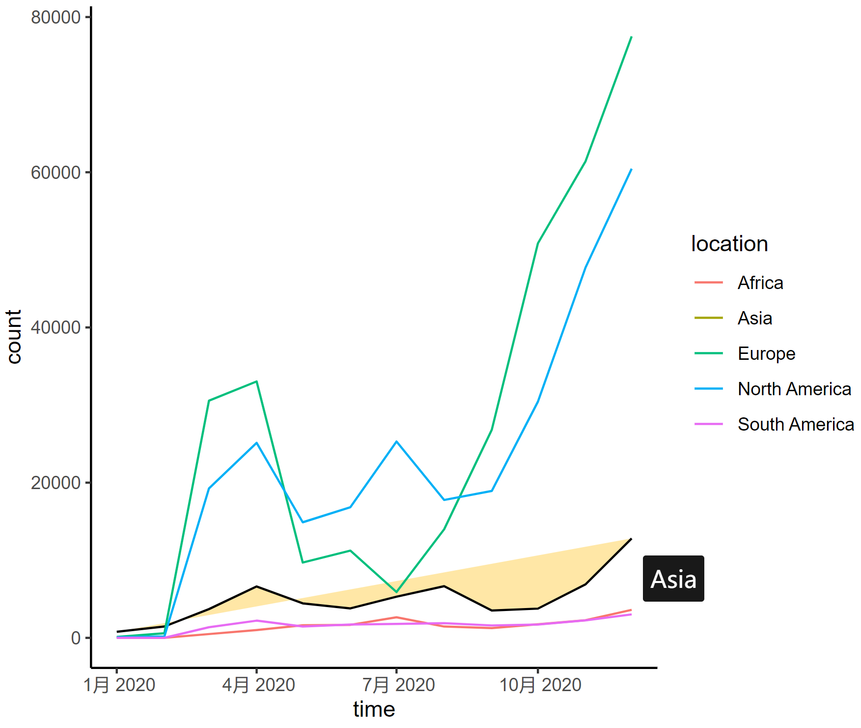
This line graph depicts the changing trends in the number of COVID-19 infections in different regions of the world in 2020, with each curve representing a different continent.
2. Highlight a curve
When one line is selected, the other lines automatically fade in color.
Here are some parameters for adjusting the curve:
-
stroke: Changes the color of the hover line (e.g.,stroke: #69B3A2;) -
stroke-width: Increases the width of the hover line for emphasis. -
transition: Adds a smooth transition effect (e.g.,transition: all 0.3s ease;) -
opacity: Reduces the opacity of non-hover lines (e.g.,opacity: 0.5;) -
filter: Applies a grayscale effect to non-hover lines (e.g.,filter: grayscale(90%);)
interactive_plot_line2 <- girafe_options(
  interactive_plot_line,
  opts_hover(css = "stroke:#69B3A2; stroke-width: 3px; transition: all 0.3s ease;"),
  opts_hover_inv("opacity:0.5;filter:saturate(10%);"),
  opts_toolbar(saveaspng = FALSE)
)
interactive_plot_line2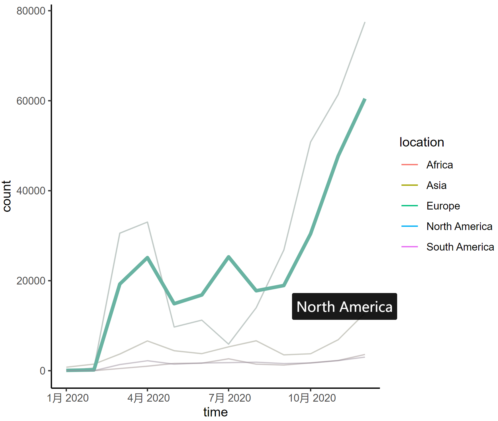
This line graph depicts the changing trends in the number of COVID-19 infections in different regions of the world in 2020, with each curve representing a different continent.
7. Save interactive charts to .PNG and .HTML formats.
Interactive charts can be saved as .html and two .png formats. To do this, you must rely on the htmlwidget and webshot packages respectively. You can then embed your visual iframe-like img in any webpage using the <img> tag.
# Save as HTML
saveWidget(p, file="myFile.html")

# Save as PNG
webshot::install_phantomjs()
webshot("paste_your_html_here" , "output.png", delay = 0.2 , cliprect = c(440, 0, 1000, 10))
Applications
Interactive charts can make research data more intuitive.
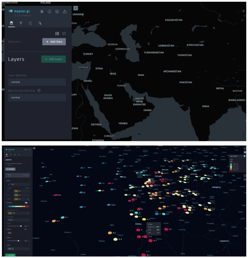
Kepler.gl is a powerful geospatial data visualization tool developed and open-sourced by Uber. It is designed to help users quickly and intuitively explore and visualize large-scale geospatial datasets. [1]
After importing basic data, interactive scatter plots, bar charts, and heat maps can be automatically generated, which helps to better present research data based on different geographical locations.
Reference
[1] https://zhuanlan.zhihu.com/p/365767977
[2] Wickham, H., & François, R. (2019). dplyr: A Grammar of Data Manipulation (Version 1.0.0). https://CRAN.R-project.org/package=dplyr
[3] Gohel, D., & Skintzos, P. (2024). ggiraph: Make ‘ggplot2’ Graphics Interactive. https://CRAN.R-project.org/package=ggiraph
[4] Wickham, H., Hester, J., Chang, W., & Bryan, J. (2024). devtools: Tools to Make Developing R Packages Easier. R package version 2.4.5.9000. https://github.com/r-lib/devtools.
[5] Allaire, J. J., & Xie, Y. (2018). webshot: Save Web Content as an Image File [Computer software]. Retrieved from https://CRAN.R-project.org/package=webshot
[6] Wickham, H., Averick, M., Bryan, J., Chang, W., McGowan, L. D., François, R., … Yutani, H. (2019). tidyverse: Easily Install and Load the ‘Tidyverse’ (Version 1.2.1) [Computer software]. Retrieved from https://CRAN.R-project.org/package=tidyverse
[7] Wickham, H., & Chang, W. (2016). ggplot2: Elegant Graphics for Data Visualization. Springer-Verlag New York.
[8] Sievert, C. (2020). Interactive Web-Based Data Visualization with R, plotly, and shiny. Chapman and Hall/CRC. https://plotly-r.com
[9] Bryan J (2023). gapminder: Data from Gapminder. https://github.com/jennybc/gapminder, https://www.gapminder.org/data/, https://doi.org/10.5281/zenodo.594018, https://jennybc.github.io/gapminder/.
[11] Flor, M. (2018). chorddiag: Create a D3 Chord Diagram. https://rdrr.io/github/mattflor/chorddiag/
[12] Hart, E., & Wickham, H. (2017). streamgraph: Create Streamgraph in R. https://CRAN.R-project.org/package=streamgraph
[13] Vaidyanathan, R., Cheng, J., Allaire, J. J., Xie, Y., & Russell, K. (2018). htmlwidgets: HTML Widgets for R. https://github.com/ramnathv/htmlwidgets
[14] anderkam, D., Shevtsov, P., Allaire, J. J., Owen, J., Gromer, D., & Thieurmel, B. (2011). dygraphs: Interface to ‘Dygraphs’ Interactive Time Series Charting Library. R package version 1.1.1.7. https://CRAN.R-project.org/package=dygraphs
[15] Ryan, J. A., & Ulrich, J. M. (2024). xts: eXtensible Time Series. R package version 0.14.1. https://CRAN.R-project.org/package=xts
[16] Grolemund, G., & Wickham, H. (2011). Dates and Times Made Easy with lubridate. Journal of Statistical Software, 40(3), 1–25. https://www.jstatsoft.org/v40/i03/
[17] Cheng, J., Galili, T., RStudio, Inc., Bostock, M., & Palmer, J. (2019). d3heatmap: Interactive Heat Maps Using ‘htmlwidgets’ and ‘D3.js’. https://rdrr.io/cran/d3heatmap/