# Install packages
if (!requireNamespace("data.table", quietly = TRUE)) {
  install.packages("data.table")
}
if (!requireNamespace("jsonlite", quietly = TRUE)) {
  install.packages("jsonlite")
}
if (!requireNamespace("waterfalls", quietly = TRUE)) {
  install.packages("waterfalls")
}
if (!requireNamespace("ggplot2", quietly = TRUE)) {
  install.packages("ggplot2")
}

# Load packages
library(data.table)
library(jsonlite)
library(waterfalls)
library(ggplot2)Waterfalls
Note
Hiplot website
This page is the tutorial for source code version of the Hiplot Waterfalls plugin. You can also use the Hiplot website to achieve no code ploting. For more information please see the following link:
The waterfall chart is used to display the cumulative effect of sequentially introduced positive or negative values . These intermediate values can either be time based or category based.
Setup
System Requirements: Cross-platform (Linux/MacOS/Windows)
Programming language: R
Dependent packages:
data.table;jsonlite;waterfalls;ggplot2
sessioninfo::session_info("attached")─ Session info ───────────────────────────────────────────────────────────────
setting value
version R version 4.6.0 (2026-04-24)
os Ubuntu 24.04.4 LTS
system x86_64, linux-gnu
ui X11
language (EN)
collate C.UTF-8
ctype C.UTF-8
tz UTC
date 2026-05-09
pandoc 3.1.3 @ /usr/bin/ (via rmarkdown)
quarto 1.9.37 @ /usr/local/bin/quarto
─ Packages ───────────────────────────────────────────────────────────────────
package * version date (UTC) lib source
data.table * 1.18.4 2026-05-06 [1] RSPM
ggplot2 * 4.0.3.9000 2026-05-04 [1] Github (tidyverse/ggplot2@6870419)
jsonlite * 2.0.0 2025-03-27 [1] RSPM
waterfalls * 1.0.0 2022-11-20 [1] RSPM
[1] /home/runner/work/_temp/Library
[2] /opt/R/4.6.0/lib/R/site-library
[3] /opt/R/4.6.0/lib/R/library
* ── Packages attached to the search path.
──────────────────────────────────────────────────────────────────────────────Data Preparation
The loaded data have two columns, with the first for category based items and the second for their corresponding values.
# Load data
data <- data.table::fread(jsonlite::read_json("https://hiplot.cn/ui/basic/waterfalls/data.json")$exampleData$textarea[[1]])
data <- as.data.frame(data)

# View data
head(data)
label value
1 a 100
2 b -20
3 c 10
4 d 20
5 e 110Visualization
# Waterfalls
p <- waterfall(data, rect_text_labels = data$value, rect_text_size = 1,
    rect_text_labels_anchor = "centre", calc_total = T,
    total_axis_text = "Total", total_rect_text = sum(data$value),
    total_rect_color = "steelblue", total_rect_text_color = "black",
    rect_width = 0.7, rect_border = "black", draw_lines = TRUE,
    linetype = 2, fill_by_sign = F,
    fill_colours = c("#E64B35FF","#4DBBD5FF","#00A087FF","#3C5488FF","#F39B7FFF",
                     "#8491B4FF"),
    scale_y_to_waterfall = T) +
  theme_bw() +
  theme(axis.text = element_text(size = 12),
        plot.title = element_text(hjust = 0.5)) +
  labs(title = "Waterfalls Plot")

p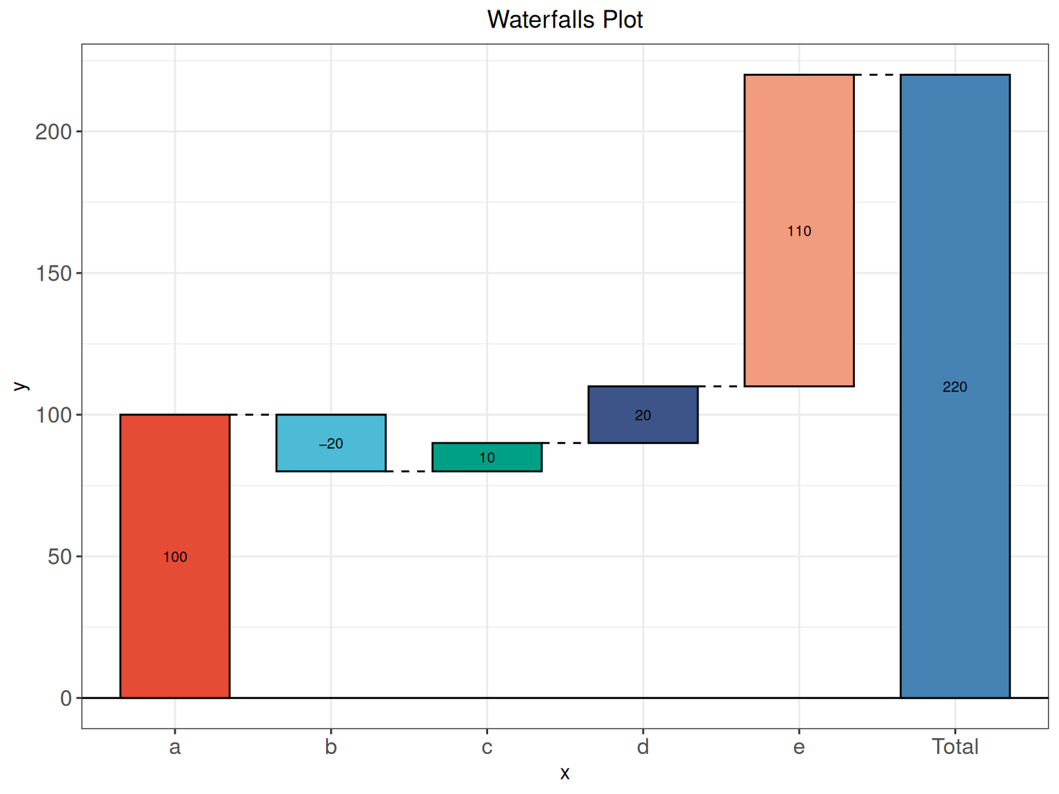
As shown in the example figure, the x-axis represent each category based items, the y-axis showing their cumulative values. Increments and decrements that are sufficiently extreme can cause the cumulative total to fall above and below the axis at various points.