# Install packages
if (!requireNamespace("ggplot2", quietly = TRUE)) {
  install.packages("ggplot2")
}
if (!requireNamespace("patchwork", quietly = TRUE)) {
  install.packages("patchwork")
}
if (!requireNamespace("dplyr", quietly = TRUE)) {
  install.packages("dplyr")
}

# Load packages
library(ggplot2)
library(patchwork)
library(dplyr)Timeseries
A time series graph is a statistical chart with time on the horizontal axis and the observed variable on the vertical axis, reflecting the trend of the observed variable over time.
Example
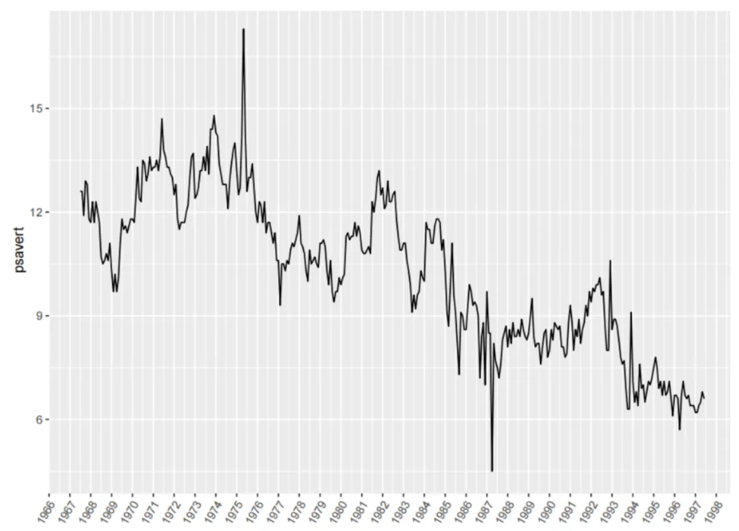
The figure shows a time series graph. The horizontal axis represents the date, and the vertical axis represents the observed variable psavert. It can be seen that psavert generally shows a decreasing trend over time.
Setup
System Requirements: Cross-platform (Linux/MacOS/Windows)
Programming Language: R
Dependencies:
ggplot2,patchwork,dplyr
sessioninfo::session_info("attached")─ Session info ───────────────────────────────────────────────────────────────
setting value
version R version 4.6.0 (2026-04-24)
os Ubuntu 24.04.4 LTS
system x86_64, linux-gnu
ui X11
language (EN)
collate C.UTF-8
ctype C.UTF-8
tz UTC
date 2026-05-09
pandoc 3.1.3 @ /usr/bin/ (via rmarkdown)
quarto 1.9.37 @ /usr/local/bin/quarto
─ Packages ───────────────────────────────────────────────────────────────────
package * version date (UTC) lib source
dplyr * 1.2.1 2026-04-03 [1] RSPM
ggplot2 * 4.0.3.9000 2026-05-04 [1] Github (tidyverse/ggplot2@6870419)
patchwork * 1.3.2 2025-08-25 [1] RSPM
[1] /home/runner/work/_temp/Library
[2] /opt/R/4.6.0/lib/R/site-library
[3] /opt/R/4.6.0/lib/R/library
* ── Packages attached to the search path.
──────────────────────────────────────────────────────────────────────────────Data Preparation
The subjects’ quantitative dehydration estimation data were obtained using the economics dataset that comes with R and the PhysioNet database [1].
# 1.economics dataset
data <- economics[1:60, c(1, 4)]

head(data)
# A tibble: 6 × 2
date psavert
<date> <dbl>
1 1967-07-01 12.6
2 1967-08-01 12.6
3 1967-09-01 11.9
4 1967-10-01 12.9
5 1967-11-01 12.8
6 1967-12-01 11.8data_double <- economics[1:60, c(1, 4, 5)] # This data is used for subplot merging and dual y-axis.
head(data_double)# A tibble: 6 × 3
date psavert uempmed
<date> <dbl> <dbl>
1 1967-07-01 12.6 4.5
2 1967-08-01 12.6 4.7
3 1967-09-01 11.9 4.6
4 1967-10-01 12.9 4.9
5 1967-11-01 12.8 4.7
6 1967-12-01 11.8 4.8# 2.Quantitative dehydration estimation data
data_water <- read.csv("https://bizard-1301043367.cos.ap-guangzhou.myqcloud.com/dehydration_estimation.csv", header = T)
axis_name <- colnames(data_water)[c(5, 8)] # Record column names
data_water <- data_water %>% # Select 2 sets of data
slice(c(19:27, 46:54)) %>%
select(c(1, 5, 8)) %>%
setNames(c("V1", "V2", "V3")) %>% # Change column name
mutate(V4 = case_when(V1 == 3 ~ "people1", # Column V4 serves as category labels.
V1 == 6 ~ "people2"))
head(data_water) V1 V2 V3 V4
1 3 0 53.0 people1
2 3 1 53.2 people1
3 3 2 53.6 people1
4 3 3 53.2 people1
5 3 4 53.3 people1
6 3 5 53.1 people1Visualization
1. Basic plot
# Basic plot
p <- ggplot(data, aes(x = date, y = psavert)) +
  geom_line() +
  xlab("")

p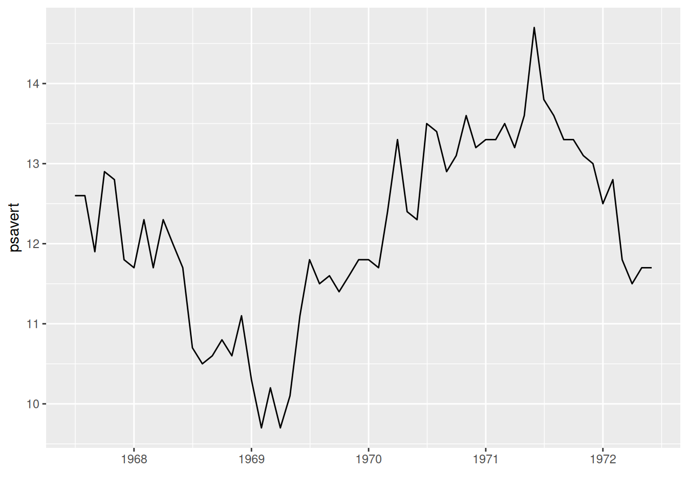
The above graph uses the date as the x-axis and the observed variable as the y-axis. By drawing line segments using geom_line(), a basic time series graph can be obtained.
2. Display observation point
# geom_point() display observation point
p <- ggplot(data, aes(x = date, y = psavert)) +
  geom_line() +
  xlab("") +
  geom_point()

p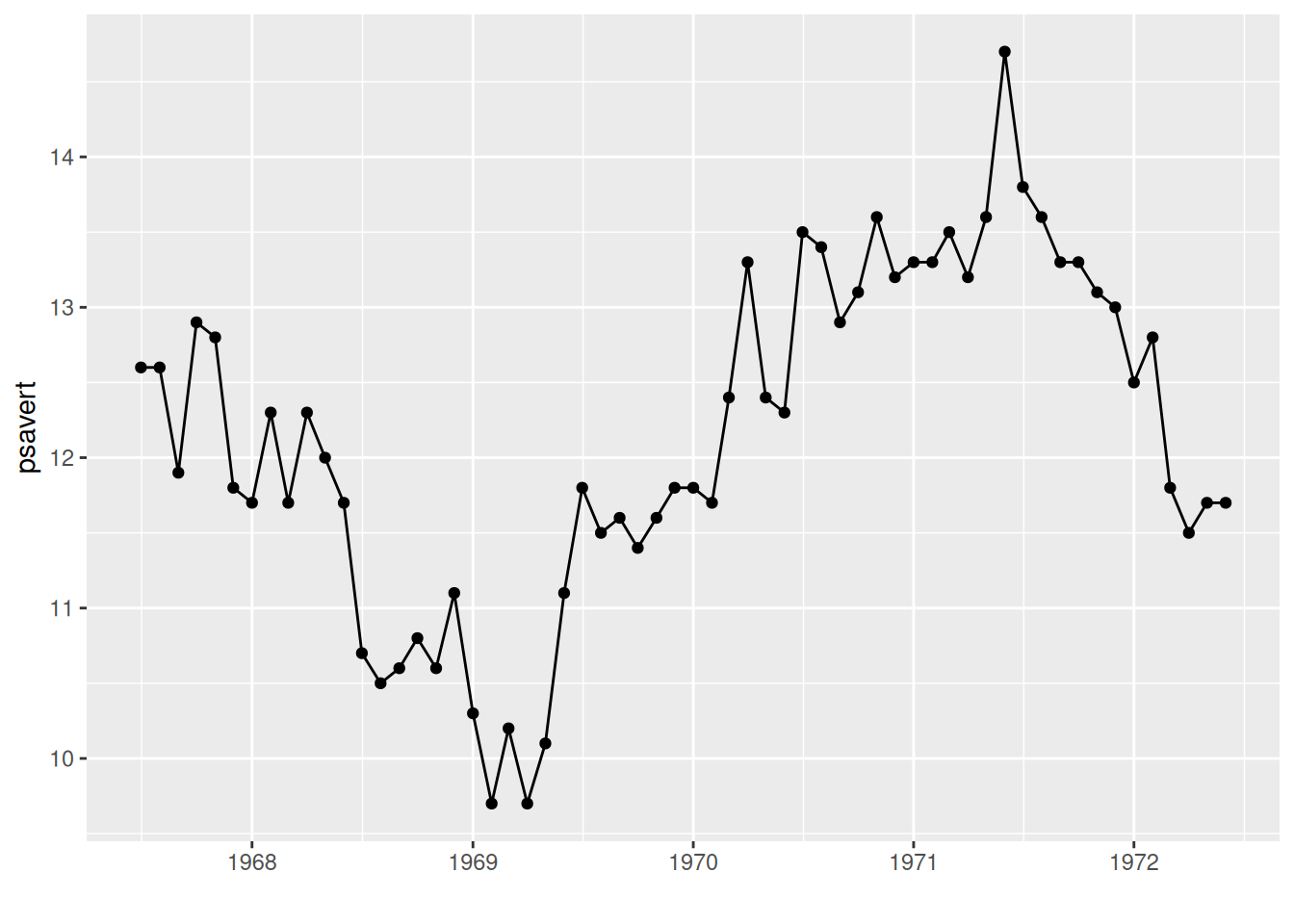
The observation point is displayed using geom_point() in the graph.
3. Multi-class data plotting
# Multi-class data plotting
p <- ggplot(data_water, aes(x = V2, y = V3, group = V4)) +     # V4 category labels are mapped to grouping and color features.
  geom_line(aes(color = V4)) +
  geom_point(aes(color = V4)) +
  ylab(axis_name[2]) +                      # Add axis labels
  xlab(axis_name[1]) +
  # Change the legend position
  theme(legend.position = "inside", legend.position.inside = c(0.85, 0.85))

p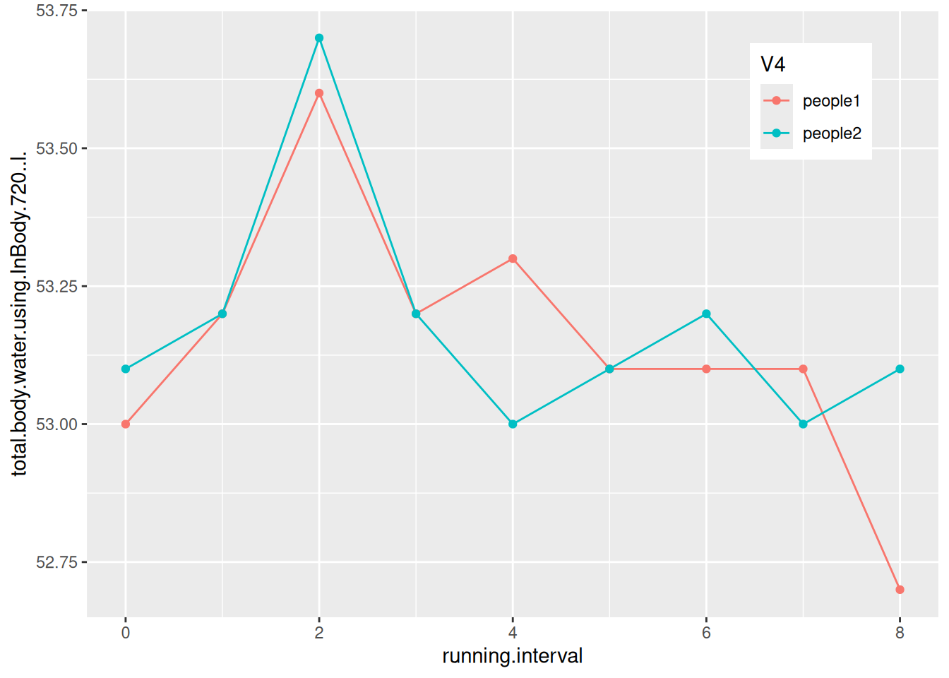
The figure shows the changes in body water content of two subjects during their run.
4. Change x-axis date labels
4.1 Format the date labels
# Set the date using scale_x_date()
p <- ggplot(data, aes(x = date, y = psavert)) +
  geom_line() +
  xlab("") +
  geom_point() +
  scale_x_date(date_labels = "%Y-%m")

p
The x-axis labels in the graph have been changed to year-month format.
Tip
Key parameter: date_labels
The parameter date_labels in scale_x_date determines the format of the date text on the x-axis, where
- “%Y”: Year with century (e.g., 2024)
- “%y”: Year without century (e.g., 24)
- “%m”: Month (range 00-12)
- “%d”: Day of the month (range 01-31)
These can be used individually or in combination as desired. More details can be found in the strftime section of the R help menu.
4.2 Set the display interval for date labels
# Use scale_x_date() to set the display interval of date labels
p <- ggplot(data, aes(x = date, y = psavert)) +
  geom_line() +
  xlab("") +
  geom_point() +
  scale_x_date(date_labels = "%Y/%m",date_breaks = "9 month")

p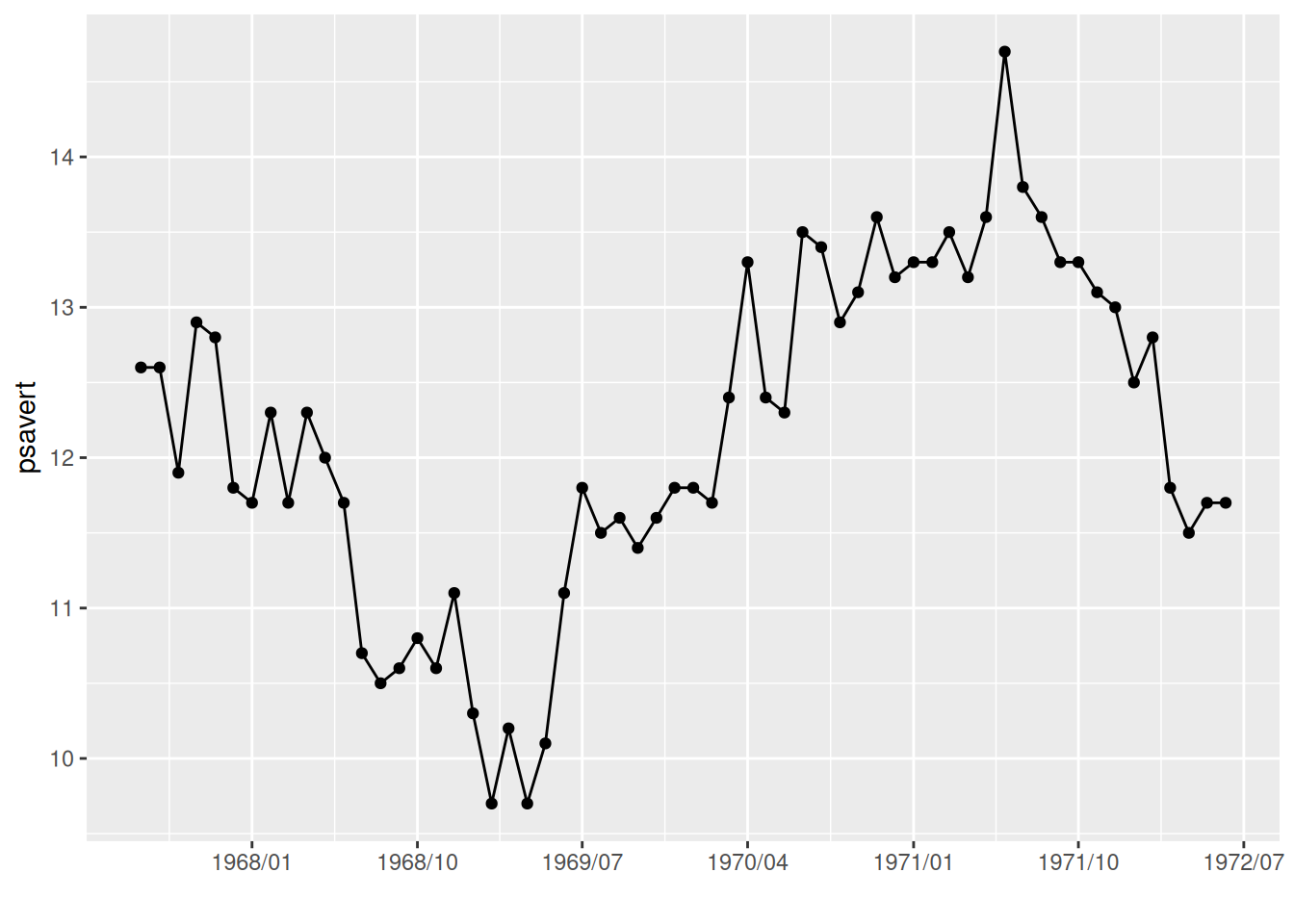
The date_breaks parameter in scale_x_date is used in the graph to change the display interval of the date labels.
Tip
Key parameter: date_breaks
shape specifies the shape of the point, with a possible value from 0 to 25. See the image below for examples.
The parameter date_breaks in scale_x_date determines the date label interval, in the form of:
“2 years”, “1 month”, “2 weeks” are expressions with units of ‘sec’ (seconds), ‘min’ (minutes), ‘hour’ (hours), ‘day’ (days), ‘week’ (weeks), ‘month’ (months), or ‘year’ (years). The ‘s’ is optional for plural forms.
5. Adjust label angle
# Adjust the label angle using theme()
p <- ggplot(data, aes(x = date, y = psavert)) +
  geom_line() +
  xlab("") +
  geom_point() +
  scale_x_date(date_labels = "%Y/%m",date_breaks = "3 month")+
  theme(axis.text.x = element_text(angle = 60, hjust = 1))     # The `angle` parameter adjusts the label angle; `hjust=1` aligns the rightmost horizontal edge of the label name with the label tick mark.

p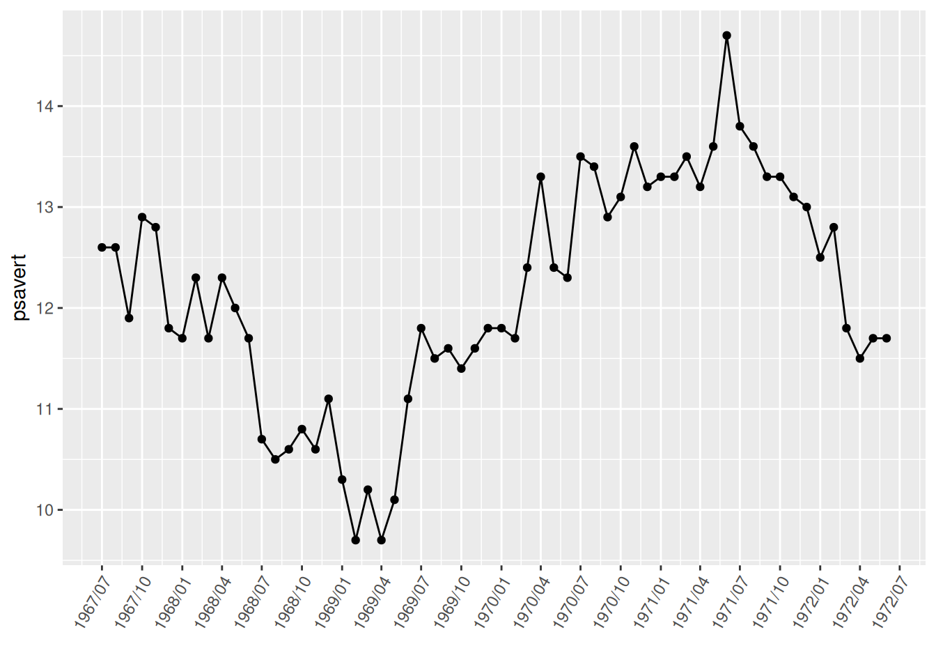
Adjusting the label angle in the image effectively prevents label overlap.
6. Time limit
# Extracting a time-limited image using the limit parameter of scale_x_date()
p <- ggplot(data, aes(x = date, y = psavert)) +
  geom_line() +
  xlab("") +
  geom_point() +
  scale_x_date(date_labels = "%Y/%m",date_breaks = "3 month",
               limit = c(as.Date("1968-01-01"), as.Date("1969-12-01")))+
  theme(axis.text.x = element_text(angle = 60, hjust = 1))

p
The graph uses the limit parameter in scale_x_date to only extract data from January 1, 1968 to December 1, 1969.
7. Notes and separators
# Notes and separators
p <- ggplot(data, aes(x = date, y = psavert)) +
  geom_line() +
  xlab("") +
  geom_point() +
  scale_x_date(date_labels = "%Y/%m",date_breaks = "3 month")+
  theme(axis.text.x = element_text(angle = 60, hjust = 1))+
# Comment text
  annotate(geom="text",x=as.Date("1971-06-01"),y=14.7,label="MAX of pasavert")+
# Comment points
  annotate(geom="point",x=as.Date("1971-06-01"),y=14.7,color="red")+
# Add horizontal line
  geom_hline(yintercept=13.5,color="blue")

p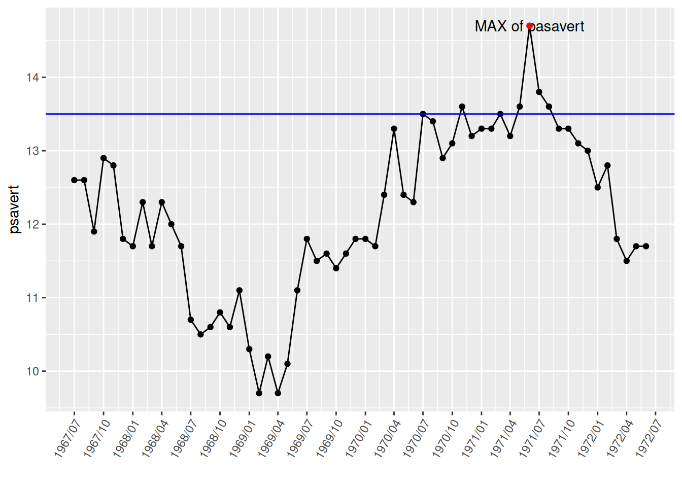
The highest point was marked and labeled using annotate(), and a horizontal dividing line was drawn using geom_hline().
8. Subgraph merging
# To display subgraphs on a single graph, the patchwork needs to be loaded.
p <- ggplot(data_double, aes(x = date, y = psavert)) +
  geom_line() +
  xlab("")

p1 <- ggplot(data_double, aes(x = date, y = uempmed)) +
  geom_line() +
  xlab("")

p + p1          # Subgraph merging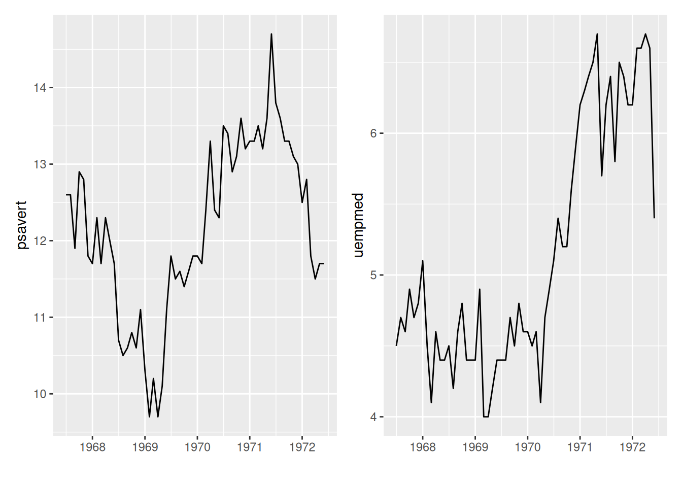
The patchwork package can be used to place subgraphs on a graph.
9. Dual y-axis
# For dual y-axis setup, use sec.axis to set the second y-axis.
p <- ggplot(data_double, aes(x = date)) +
  geom_line(aes(y = psavert),color = "red") +
  geom_line(aes(y = uempmed * 3),color = "blue") +      # The scales are inconsistent, so a multiplier is needed.
  xlab("")+
  scale_y_continuous(
    name = "psavert",
# `transform` divides the left y-axis coordinate by the multiple above, and `name` sets the name.
    sec.axis = sec_axis(transform = ~ . / 3, name = "uempmed")
  ) +
# Set the title for the dual y-axis to the same color as the corresponding line segment for easy differentiation.
  theme(
    axis.title.y = element_text(color = "red", size = 13),
    axis.title.y.right = element_text(color = "blue", size = 13),
    legend.position = "none"
  )

p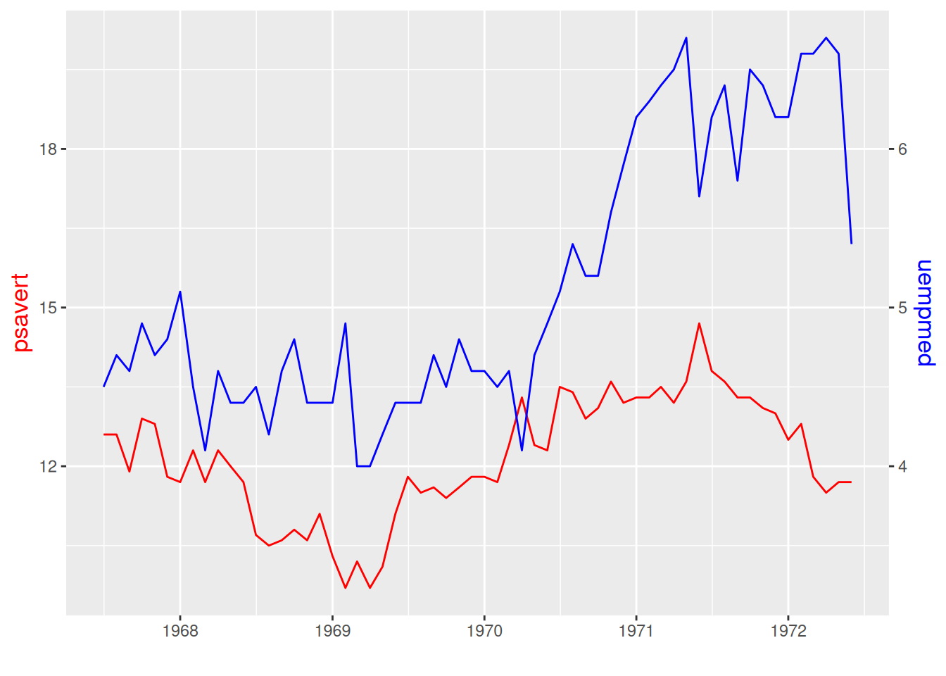
The two y-axis in the image have different scales, and the line color corresponds to the y-label color.
Applications
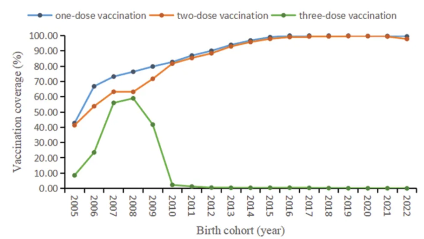
The figure shows the coverage of different doses of mumps-containing vaccine in the birth cohorts from 2005 to 2022. [1]
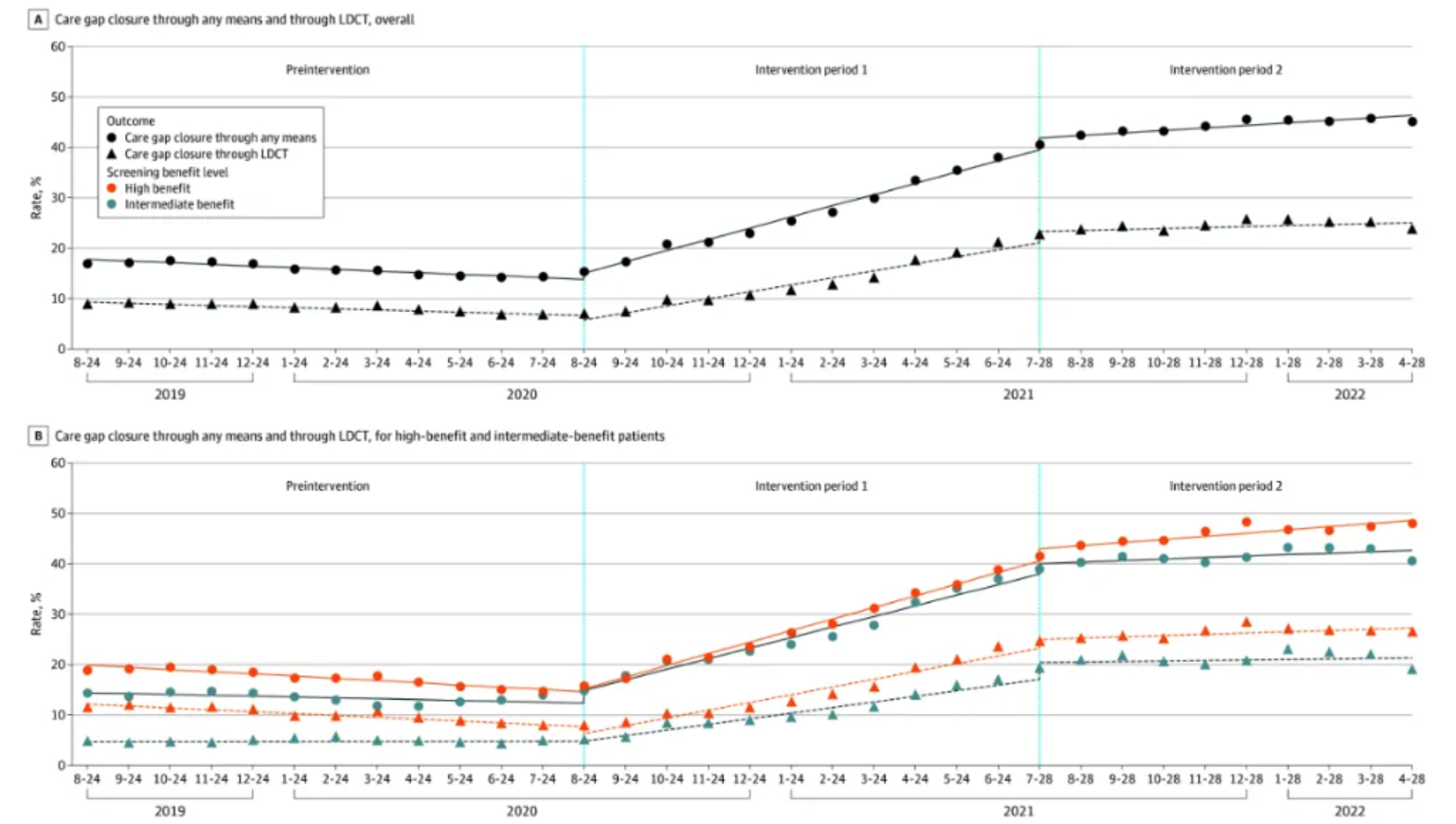
Overall benefit level (Figure A) and patient benefit level (Figure B) of lung cancer screening healthcare gaps using any method and low-dose computed tomography (LDCT). [2]
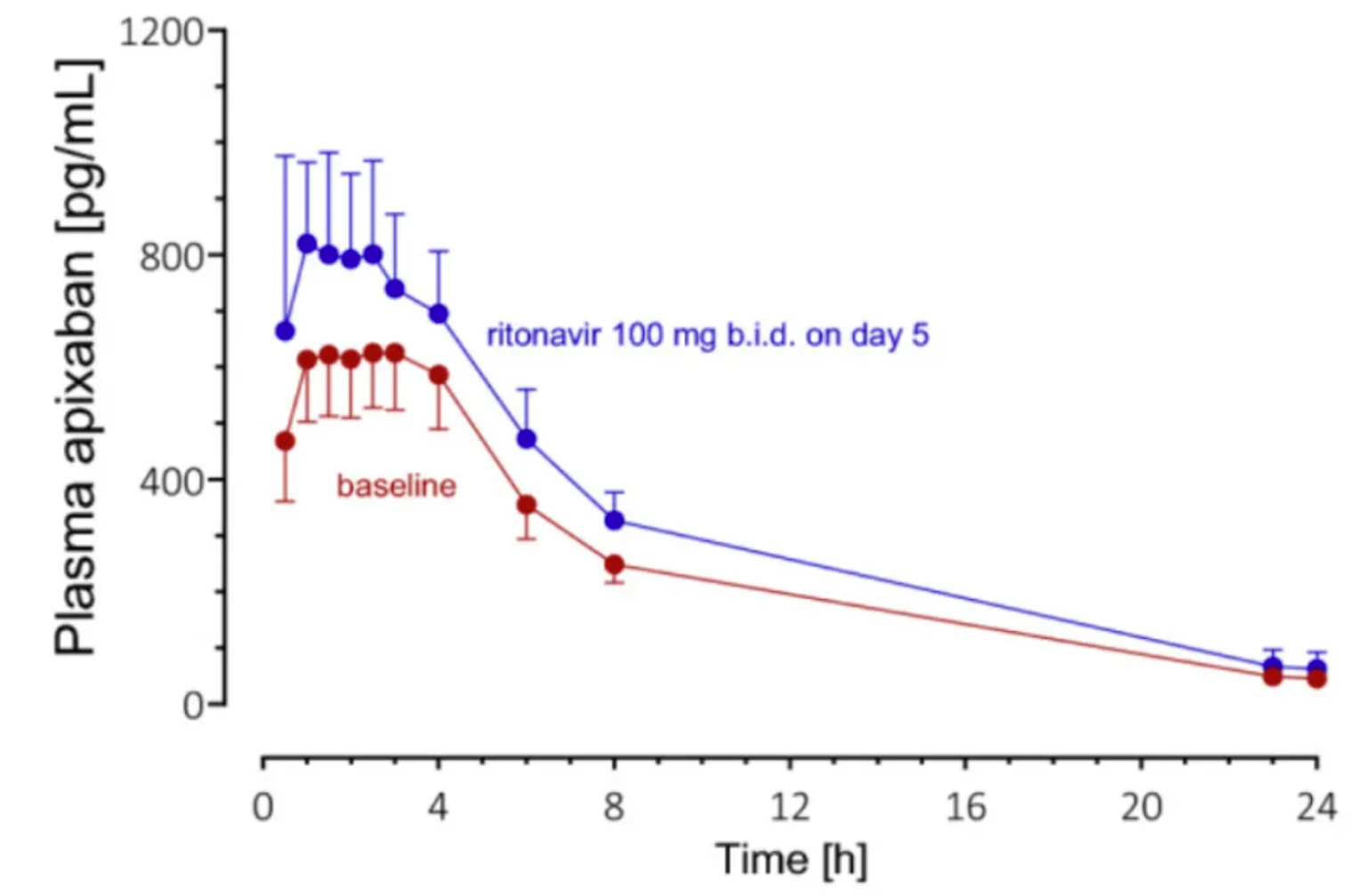
Geometric mean plasma concentration-time curves (±95% confidence interval) of apixaban 25µg alone in 8 healthy volunteers after (baseline; red symbols and lines) and on day 5 of ritonavir treatment (blue markers and lines). [3]
Reference
[1] FU C, XU W, ZHENG W, et al. Epidemiological characteristics and interrupted time series analysis of mumps in Quzhou City, 2005-2023[J]. Hum Vaccin Immunother, 2024,20(1): 2411828.
[2] KUKHAREVA P V, LI H, CAVERLY T J, et al. Lung Cancer Screening Before and After a Multifaceted Electronic Health Record Intervention: A Nonrandomized Controlled Trial[J]. JAMA Netw Open, 2024,7(6): e2415383.
[3] ROHR B S, KROHMER E, FOERSTER K I, et al. Time Course of the Interaction Between Oral Short-Term Ritonavir Therapy with Three Factor Xa Inhibitors and the Activity of CYP2D6, CYP2C19, and CYP3A4 in Healthy Volunteers[J]. Clin Pharmacokinet, 2024,63(4): 469-481.