# Install packages
if (!requireNamespace("data.table", quietly = TRUE)) {
  install.packages("data.table")
}
if (!requireNamespace("jsonlite", quietly = TRUE)) {
  install.packages("jsonlite")
}
if (!requireNamespace("ComplexHeatmap", quietly = TRUE)) {
  BiocManager::install("ComplexHeatmap")
}

# Load packages
library(data.table)
library(jsonlite)
library(ComplexHeatmap)Corrplot Big Data
Note
Hiplot website
This page is the tutorial for source code version of the Hiplot Corrplot Big Data plugin. You can also use the Hiplot website to achieve no code ploting. For more information please see the following link:
The correlation heat map is a graph that analyzes the correlation between two or more variables.
Setup
System Requirements: Cross-platform (Linux/MacOS/Windows)
Programming language: R
Dependent packages:
data.table;jsonlite;ComplexHeatmap
sessioninfo::session_info("attached")─ Session info ───────────────────────────────────────────────────────────────
setting value
version R version 4.6.0 (2026-04-24)
os Ubuntu 24.04.4 LTS
system x86_64, linux-gnu
ui X11
language (EN)
collate C.UTF-8
ctype C.UTF-8
tz UTC
date 2026-05-09
pandoc 3.1.3 @ /usr/bin/ (via rmarkdown)
quarto 1.9.37 @ /usr/local/bin/quarto
─ Packages ───────────────────────────────────────────────────────────────────
package * version date (UTC) lib source
ComplexHeatmap * 2.28.0 2026-04-28 [1] Bioconduc~
data.table * 1.18.4 2026-05-06 [1] RSPM
jsonlite * 2.0.0 2025-03-27 [1] RSPM
[1] /home/runner/work/_temp/Library
[2] /opt/R/4.6.0/lib/R/site-library
[3] /opt/R/4.6.0/lib/R/library
* ── Packages attached to the search path.
──────────────────────────────────────────────────────────────────────────────Data Preparation
The loaded data are the gene names and the expression of each sample.
# Load data
data <- data.table::fread(jsonlite::read_json("https://hiplot.cn/ui/basic/big-corrplot/data.json")$exampleData$textarea[[1]])
data <- as.data.frame(data)

# convert data structure
data <- data[!is.na(data[, 1]), ]
idx <- duplicated(data[, 1])
data[idx, 1] <- paste0(data[idx, 1], "--dup-", cumsum(idx)[idx])
rownames(data) <- data[, 1]
data <- data[, -1]
str2num_df <- function(x) {
  x[] <- lapply(x, function(l) as.numeric(l))
  x
}
tmp <- t(str2num_df(data))
corr <- round(cor(tmp, use = "na.or.complete", method = "pearson"), 3)

# View data
head(corr[,1:5])
RGL4 MPP7 UGCG CYSTM1 ANXA2
RGL4 1.000 0.914 0.929 0.936 -0.592
MPP7 0.914 1.000 0.852 0.907 -0.543
UGCG 0.929 0.852 1.000 0.956 -0.440
CYSTM1 0.936 0.907 0.956 1.000 -0.358
ANXA2 -0.592 -0.543 -0.440 -0.358 1.000
ENDOD1 -0.908 -0.862 -0.791 -0.762 0.826Visualization
# Corrplot Big Data
p <- ComplexHeatmap::Heatmap(
  corr, col = colorRampPalette(c("#4477AA","#FFFFFF","#BB4444"))(50),
  clustering_distance_rows = "euclidean",
  clustering_method_rows = "ward.D2",
  clustering_distance_columns = "euclidean",
  clustering_method_columns = "ward.D2",
  show_column_dend = FALSE, show_row_dend = FALSE,
  column_names_gp = gpar(fontsize = 8),
  row_names_gp = gpar(fontsize = 8)
)

p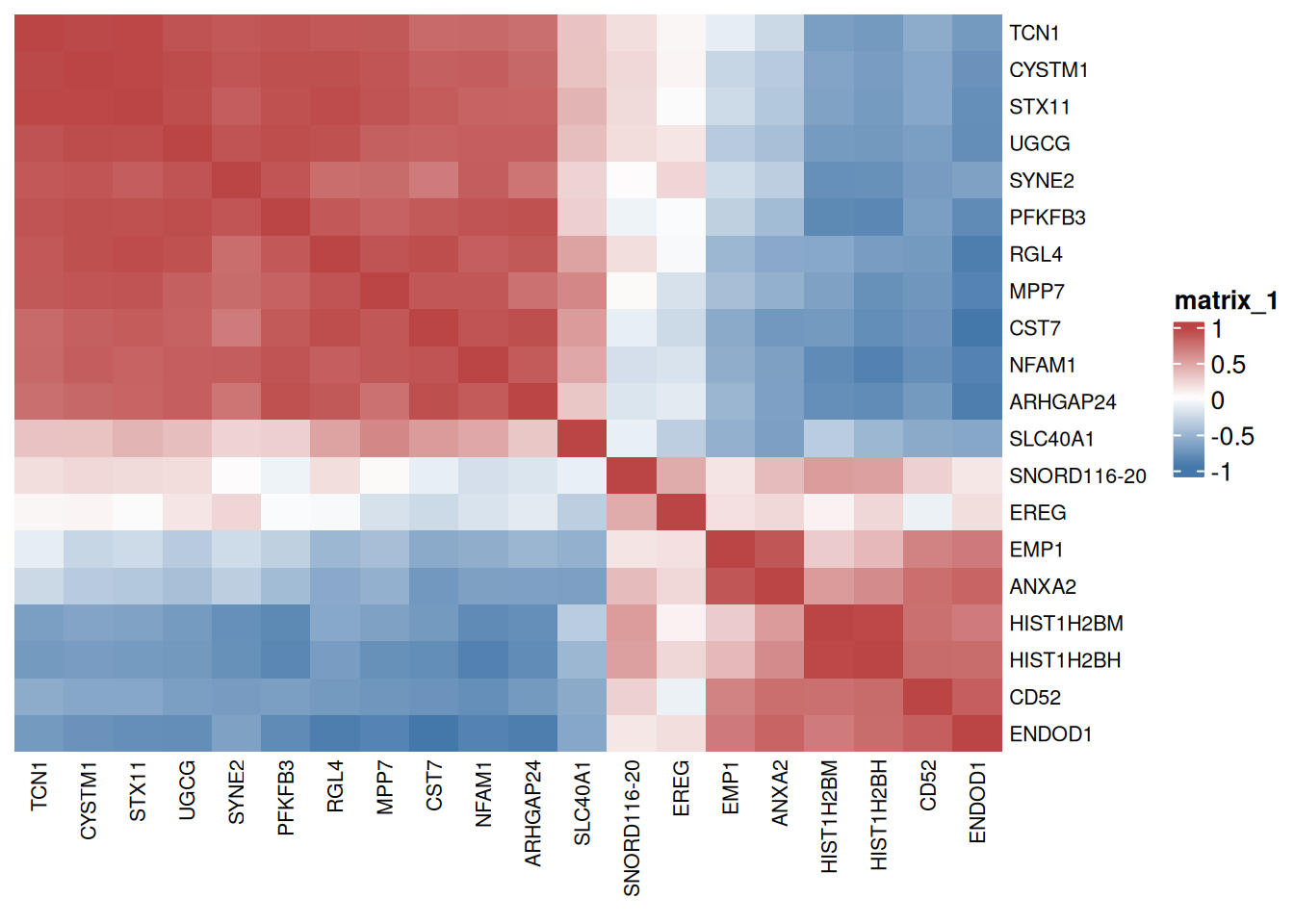
Red indicates positive correlation between two genes, blue indicates negative correlation between two genes, and the number in each cell indicates correlation coefficient.