# Install packages
if (!requireNamespace("ggplot2", quietly = TRUE)) {
  install.packages("ggplot2")
}
if (!requireNamespace("networkD3", quietly = TRUE)) {
  install.packages("networkD3")
}
if (!requireNamespace("dplyr", quietly = TRUE)) {
  install.packages("dplyr")
}
if (!requireNamespace("readxl", quietly = TRUE)) {
  install.packages("readxl")
}
if (!requireNamespace("webshot", quietly = TRUE)) {
  install.packages("webshot")
}
if (!requireNamespace("tidyverse", quietly = TRUE)) {
  install.packages("tidyverse")
}
if (!requireNamespace("openxlsx", quietly = TRUE)) {
  install.packages("openxlsx")
}
if (!requireNamespace("ggalluvial", quietly = TRUE)) {
  install.packages("ggalluvial")
}

# Load packages
library(ggplot2)
library(networkD3)
library(dplyr)
library(readxl)
library(webshot)
library(tidyverse)
library(openxlsx)
library(ggalluvial)Sankey Diagram
A Sankey diagram allows to study flows. Entities (nodes) are represented by rectangles or text. Arrows or arcs are used to show flows between them. In R, the networkD3 package is the best way to build them.
Example
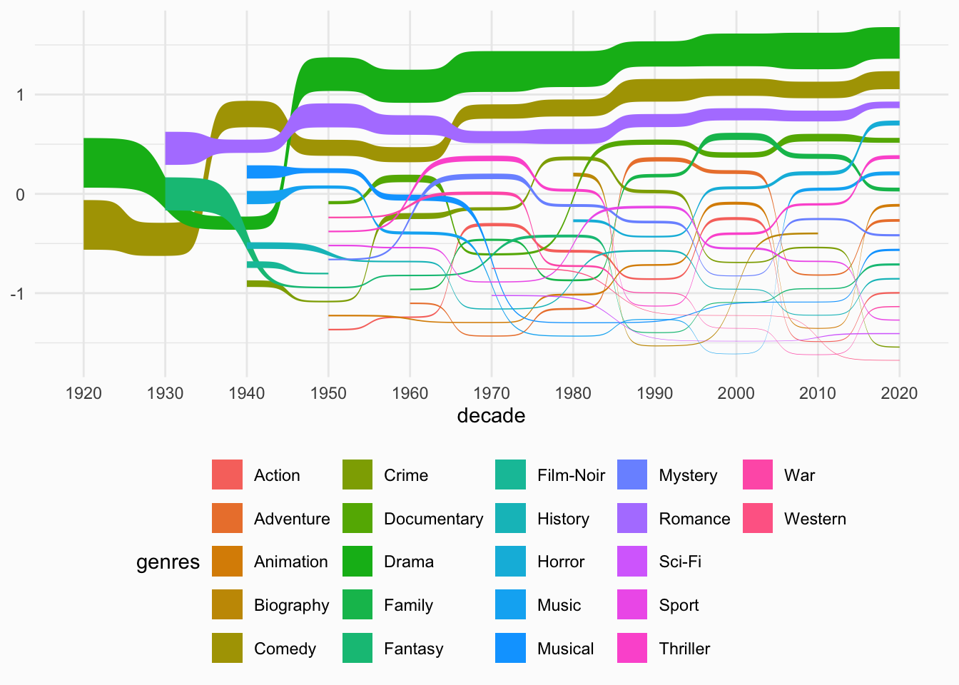
This chart visualizes the genre distribution of summer movies over decades using a Sankey bump chart. It highlights the three most common genres (Drama, Comedy, and Romance) and shows how their prevalence has changed over time.
Setup
System Requirements: Cross-platform (Linux/MacOS/Windows)
Programming Language: R
Dependencies:
ggplot2,networkD3,dplyr,readxl,webshot,tidyverse,openxlsx,ggalluvial
sessioninfo::session_info("attached")─ Session info ───────────────────────────────────────────────────────────────
setting value
version R version 4.6.0 (2026-04-24)
os Ubuntu 24.04.4 LTS
system x86_64, linux-gnu
ui X11
language (EN)
collate C.UTF-8
ctype C.UTF-8
tz UTC
date 2026-05-09
pandoc 3.1.3 @ /usr/bin/ (via rmarkdown)
quarto 1.9.37 @ /usr/local/bin/quarto
─ Packages ───────────────────────────────────────────────────────────────────
package * version date (UTC) lib source
dplyr * 1.2.1 2026-04-03 [1] RSPM
forcats * 1.0.1 2025-09-25 [1] RSPM
ggalluvial * 0.12.6 2026-02-22 [1] RSPM
ggplot2 * 4.0.3.9000 2026-05-04 [1] Github (tidyverse/ggplot2@6870419)
lubridate * 1.9.5 2026-02-04 [1] RSPM
networkD3 * 0.4.1 2025-04-14 [1] RSPM
openxlsx * 4.2.8.1 2025-10-31 [1] RSPM
purrr * 1.2.2 2026-04-10 [1] RSPM
readr * 2.2.0 2026-02-19 [1] RSPM
readxl * 1.4.5 2025-03-07 [1] RSPM
stringr * 1.6.0 2025-11-04 [1] RSPM
tibble * 3.3.1 2026-01-11 [1] RSPM
tidyr * 1.3.2 2025-12-19 [1] RSPM
tidyverse * 2.0.0 2023-02-22 [1] RSPM
webshot * 0.5.5 2023-06-26 [1] RSPM
[1] /home/runner/work/_temp/Library
[2] /opt/R/4.6.0/lib/R/site-library
[3] /opt/R/4.6.0/lib/R/library
* ── Packages attached to the search path.
──────────────────────────────────────────────────────────────────────────────Data Preparation
Here’s a brief tutorial using the clinical data of a certain drug froma clinical database. This dataset examines the impact of a drug on patients’ blood glucose levels, which are categorized into three levels: low (<3.9 mmol/L), normal (3.9-6.1 mmol/L), and high (>6.1 mmol/L). The absolute value of the change in glucose levels before and after drug administration is represented by value.This example demonstrates how to load and work with these datase.
#Read drug clinical dataset
drugs <- read.csv("https://bizard-1301043367.cos.ap-guangzhou.myqcloud.com/drugs.csv", stringsAsFactors = FALSE)
# Create a node data frame
nodes <- data.frame(
  name=c(as.character(drugs$source),
         as.character(drugs$target)) %>% unique())
# Reformat
drugs$IDsource <- match(drugs$source, nodes$name)-1
drugs$IDtarget <- match(drugs$target, nodes$name)-1


#Read drug clinical dataset
drug <- read.csv("https://bizard-1301043367.cos.ap-guangzhou.myqcloud.com/drug.csv", stringsAsFactors = FALSE)
levels(drug$`glucose(mmol/L)`) <- rev(levels(drug$`glucose(mmol/L)`))
Visualization
1. Using the networkD3 Package
1.1 Basic Sankey Diagram
Figure 1 The sankey diagram describes the changes in blood glucose levels of patients before and after the use of a certain drug.
# Basic plotting
p1 <- sankeyNetwork(Links = drugs, Nodes = nodes,
              Source = "IDsource", Target = "IDtarget",
              Value = "value", NodeID = "name")

p11.2 Customizing Colors
Using JavaScript to call
Figure 2 The sankey diagram describes the changes in blood glucose levels of patients before and after the use of a certain drug.
The first step is to create a JavaScript object for color mapping. Then, assign a color to each node. Finally, call this object in the colourScale parameter of networkD3.
# Prepare a color scale: assign a specific color to each node
my_color <- 'd3.scaleOrdinal() .domain(["before-normal", "before-high","before-low", "after-high", "after-low", "after-normal"]) .range(["steelblue", "red" , "#69b3a2", "red", "#69b3a2", "steelblue"])'

p2_1 <- sankeyNetwork(Links = drugs, Nodes = nodes,
              Source = "IDsource", Target = "IDtarget",
              Value = "value", NodeID = "name",
              colourScale=my_color,fontSize=15,nodePadding=20,nodeWidth=25)
p2_1
Figure 3 This Sankey diagram shows the changes in blood glucose levels of patients before and after the use of a certain drug. The blue group indicates a change in blood glucose levels greater than 1 mmol/L, while the green group indicates a change less than 1 mmol/L.
# Add a "group" column to each link
drugs$group <- as.factor( c("type_a","type_a","type_b","type_b","type_b","type_b","type_a","type_b","type_b","type_b","type_a","type_a","type_a","type_b","type_a","type_a","type_a","type_a"))

# Add a "group" column to each node. Here, they are all placed in the same group to make them gray
nodes$group <- as.factor(c("my_unique_group"))

# Assign colors to each group
my_color <- 'd3.scaleOrdinal() .domain(["type_a", "type_b", "my_unique_group"]) .range(["#69b3a2", "steelblue", "grey"])'

p2_3 <- sankeyNetwork(Links = drugs, Nodes = nodes,
              Source = "IDsource", Target = "IDtarget",
              Value = "value", NodeID = "name",
              colourScale=my_color,LinkGroup="group", NodeGroup="group")
p2_32. Using the ggalluvial Package
ggalluvial is an extension package of ggplot2. It follows the layered syntax of ggplot2 and is used to create alluvial plots, which are similar to Sankey diagrams but are uniquely determined by the data and a set of parameters.
2.1 Basic Sankey Diagram
Figure 4 This Sankey diagram shows the changes in blood glucose levels of patients before and after the use of a certain drug
# Basic Sankey Diagram
p4_1 <- ggplot(drug,
       aes(x = time, stratum = level, alluvium = id,
           y = value,
           fill = level, label = level)) +
  scale_x_discrete(expand = c(.1, .1)) +
  geom_flow() +
  geom_stratum(alpha = .5) +
  geom_text(stat = "stratum", size = 3) +
  theme(legend.position = "none")

p4_1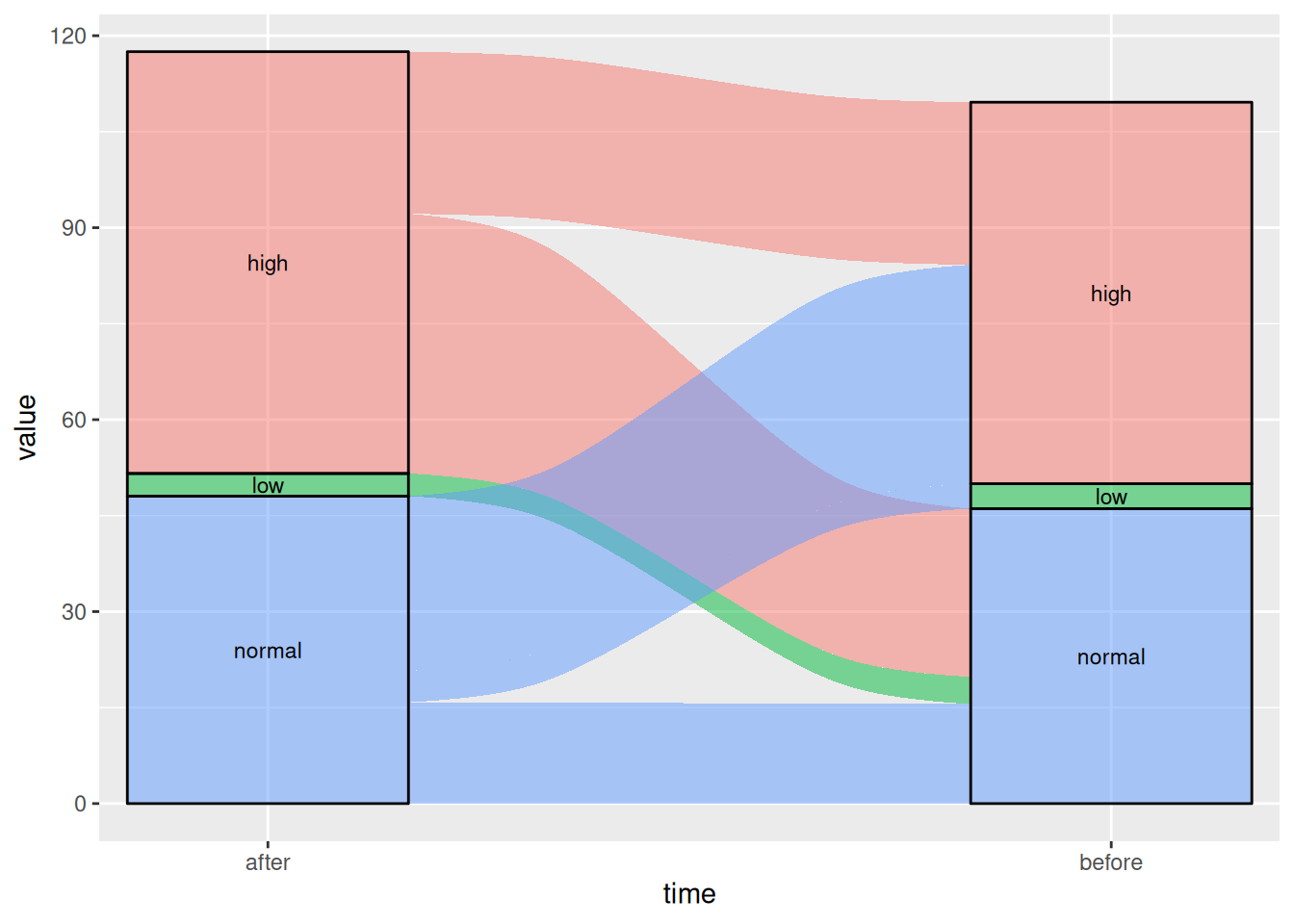
2.2 Changing Line Types
By changing the curve_type parameter, there are seven options: “linear”, “cubic”, “quintic”, “sine”, “arctangent”, “sigmoid”, and “xspline”.
Figure 5 This Sankey diagram shows the changes in blood glucose levels of patients before and after the use of a certain drug.
# Linear
p5_1 <- ggplot(drug,
       aes(x = time, stratum = level, alluvium = id,
           y = value,
           fill = level, label = level)) +
  scale_x_discrete(expand = c(.1, .1)) +
  geom_alluvium(curve_type = "linear")+
  geom_stratum(alpha = 1) +
  geom_text(stat = "stratum", aes(label = after_stat(stratum))) +
  theme(legend.position = "none")

p5_1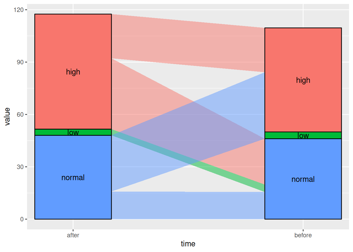
Figure 6 This Sankey diagram shows the changes in blood glucose levels of patients before and after the use of a certain drug.
# Sigmoid
p5_2 <- ggplot(drug,
       aes(x = time, stratum = level, alluvium = id,
           y = value,
           fill = level, label = level)) +
  scale_x_discrete(expand = c(.1, .1)) +
  geom_alluvium(curve_type = "sigmoid")+
  geom_stratum(alpha = 1) +
  geom_text(stat = "stratum", aes(label = after_stat(stratum))) +
  theme(legend.position = "none")

p5_2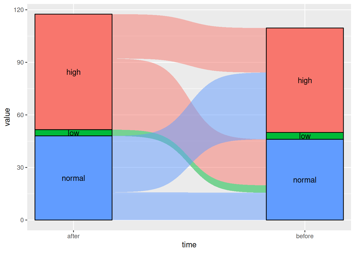
Applications
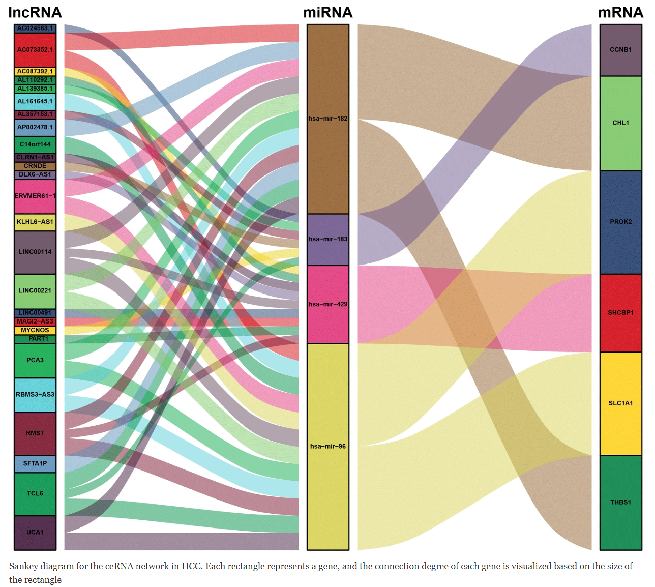
In ceRNA-related research, such as circRNA-miRNA-mRNA or lncRNA-miRNA-mRNA targeting relationship diagrams, they are generally presented using network diagrams. [1]
Reference
[1] Long J, Bai Y, Yang X, Lin J, Yang X, Wang D, He L, Zheng Y, Zhao H. Construction and comprehensive analysis of a ceRNA network to reveal potential prognostic biomarkers for hepatocellular carcinoma. Cancer Cell Int. 2019 Apr 11;19:90. doi: 10.1186/s12935-019-0817-y. PMID: 31007608; PMCID: PMC6458652.
[2] The R Graph Gallery – Help and inspiration for R charts (r-graph-gallery.com)
[3] Gandrud, Christopher, et al. networkD3: D3 JavaScript Network Graphs from R. Version 0.4, 2017. https://CRAN.R-project.org/package=networkD3.
[4] Wickham, H., & François, R. (2016). dplyr: A Grammar of Data Manipulation [Computer software]. Retrieved from https://CRAN.R-project.org/package=dplyr
[5] Wickham, H. (2009). ggplot2: Elegant Graphics for Data Analysis. Springer-Verlag New York. https://ggplot2.tidyverse.org
[6] Allaire, J. J., & Xie, Y. (2018). webshot: Save Web Content as an Image File [Computer software]. Retrieved from https://CRAN.R-project.org/package=webshot
[7] Wickham, H., Averick, M., Bryan, J., Chang, W., McGowan, L. D., François, R., … Yutani, H. (2019). tidyverse: Easily Install and Load the ‘Tidyverse’ (Version 1.2.1) [Computer software]. Retrieved from https://CRAN.R-project.org/package=tidyverse
[8] Wickham, H., Averick, M., Bryan, J., Chang, W., McGowan, L. D., François, R., … Yutani, H. (2019). tidyverse: Easily Install and Load the ‘Tidyverse’ (Version 1.2.1) [Computer software]. Retrieved from https://CRAN.R-project.org/package=tidyverse
[9] Kassambara, W. (2020). ggsankey: Create Sankey Diagrams with ‘ggplot2’ [Computer software]. Retrieved from https://CRAN.R-project.org/package=ggsankey
[10] Brunson JC, Read QD. ggalluvial: Alluvial Plots in ‘ggplot2’. R package version 0.12.5. 2023. https://CRAN.R-project.org/package=ggalluvial