# Install packages
if (!requireNamespace("data.table", quietly = TRUE)) {
  install.packages("data.table")
}
if (!requireNamespace("jsonlite", quietly = TRUE)) {
  install.packages("jsonlite")
}
if (!requireNamespace("ggplot2", quietly = TRUE)) {
  install.packages("ggplot2")
}
if (!requireNamespace("ggthemes", quietly = TRUE)) {
  install.packages("ggthemes")
}

# Load packages
library(data.table)
library(jsonlite)
library(ggplot2)
library(ggthemes)Area Plot
Note
Hiplot website
This page is the tutorial for source code version of the Hiplot Area Plot plugin. You can also use the Hiplot website to achieve no code ploting. For more information please see the following link:
The area chart displays graphically quantitative data. It is based on the line chart. The area between axis and line are commonly emphasized with colors, textures and hatchings.
Setup
System Requirements: Cross-platform (Linux/MacOS/Windows)
Programming language: R
Dependent packages:
data.table;jsonlite;ggplot2;ggthemes
sessioninfo::session_info("attached")─ Session info ───────────────────────────────────────────────────────────────
setting value
version R version 4.6.0 (2026-04-24)
os Ubuntu 24.04.4 LTS
system x86_64, linux-gnu
ui X11
language (EN)
collate C.UTF-8
ctype C.UTF-8
tz UTC
date 2026-05-09
pandoc 3.1.3 @ /usr/bin/ (via rmarkdown)
quarto 1.9.37 @ /usr/local/bin/quarto
─ Packages ───────────────────────────────────────────────────────────────────
package * version date (UTC) lib source
data.table * 1.18.4 2026-05-06 [1] RSPM
ggplot2 * 4.0.3.9000 2026-05-04 [1] Github (tidyverse/ggplot2@6870419)
ggthemes * 5.2.0 2025-11-30 [1] RSPM
jsonlite * 2.0.0 2025-03-27 [1] RSPM
[1] /home/runner/work/_temp/Library
[2] /opt/R/4.6.0/lib/R/site-library
[3] /opt/R/4.6.0/lib/R/library
* ── Packages attached to the search path.
──────────────────────────────────────────────────────────────────────────────Data Preparation
The loaded data are xaxis.value and yaxis.value.
# Load data
data <- data.table::fread(jsonlite::read_json("https://hiplot.cn/ui/basic/area/data.json")$exampleData$textarea[[1]])
data <- as.data.frame(data)

# View data
head(data)
group xaxis.value yaxis.value
1 Group1 1900 26
2 Group1 1901 27
3 Group1 1902 10
4 Group1 1903 16
5 Group1 1904 19
6 Group1 1905 18Visualization
# Area Plot
p <- ggplot(data, aes(x = xaxis.value, y = yaxis.value, fill = group)) +
  geom_area(alpha = 1) +
  ylab("yaxis.value") +
  xlab("xaxis.value") +
  ggtitle("Area Plot") +
  scale_fill_manual(values = c("#e04d39","#5bbad6","#1e9f86")) +
  theme_stata() +
  theme(text = element_text(family = "Arial"),
        plot.title = element_text(size = 12,hjust = 0.5),
        axis.title = element_text(size = 12),
        axis.text = element_text(size = 10),
        axis.text.x = element_text(angle = 0, hjust = 0.5,vjust = 1),
        legend.position = "right",
        legend.direction = "vertical",
        legend.title = element_text(size = 10),
        legend.text = element_text(size = 10))

p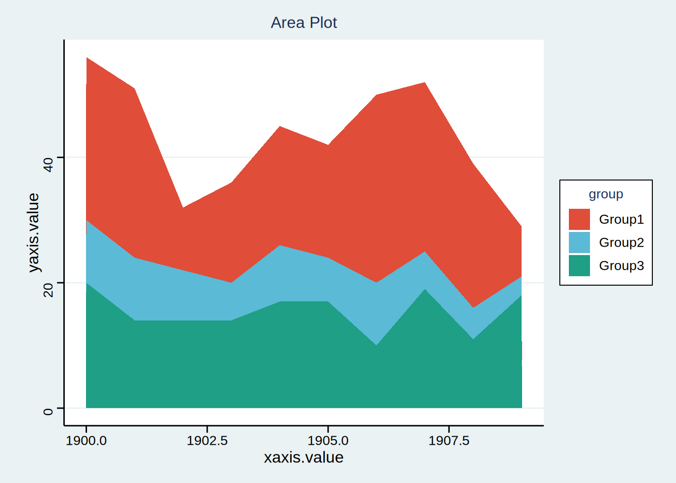
Different colors represent different groups of area charts.