# Install packages
if (!requireNamespace("data.table", quietly = TRUE)) {
  install.packages("data.table")
}
if (!requireNamespace("jsonlite", quietly = TRUE)) {
  install.packages("jsonlite")
}
if (!requireNamespace("survminer", quietly = TRUE)) {
  install.packages("survminer")
}
if (!requireNamespace("fastStat", quietly = TRUE)) {
  remotes::install_github("yikeshu0611/fastStat")
}
if (!requireNamespace("cutoff", quietly = TRUE)) {
  install.packages("cutoff")
}
if (!requireNamespace("ggplot2", quietly = TRUE)) {
  install.packages("ggplot2")
}
if (!requireNamespace("cowplot", quietly = TRUE)) {
  install.packages("cowplot")
}

# Load packages
library(data.table)
library(jsonlite)
library(survminer)
library(fastStat)
library(cutoff)
library(ggplot2)
library(cowplot)Risk Factor Analysis
Note
Hiplot website
This page is the tutorial for source code version of the Hiplot Risk Factor Analysis plugin. You can also use the Hiplot website to achieve no code ploting. For more information please see the following link:
Setup
System Requirements: Cross-platform (Linux/MacOS/Windows)
Programming language: R
Dependent packages:
data.table;jsonlite;survminer;fastStat;cutoff;ggplot2;cowplot
sessioninfo::session_info("attached")─ Session info ───────────────────────────────────────────────────────────────
setting value
version R version 4.6.0 (2026-04-24)
os Ubuntu 24.04.4 LTS
system x86_64, linux-gnu
ui X11
language (EN)
collate C.UTF-8
ctype C.UTF-8
tz UTC
date 2026-05-09
pandoc 3.1.3 @ /usr/bin/ (via rmarkdown)
quarto 1.9.37 @ /usr/local/bin/quarto
─ Packages ───────────────────────────────────────────────────────────────────
package * version date (UTC) lib source
cowplot * 1.2.0 2025-07-07 [1] RSPM
cutoff * 1.3 2019-12-20 [1] RSPM
data.table * 1.18.4 2026-05-06 [1] RSPM
fastStat * 1.3 2026-05-04 [1] Github (yikeshu0611/fastStat@9c3e263)
ggplot2 * 4.0.3.9000 2026-05-04 [1] Github (tidyverse/ggplot2@6870419)
ggpubr * 0.6.3 2026-02-24 [1] RSPM
jsonlite * 2.0.0 2025-03-27 [1] RSPM
survminer * 0.5.2 2026-02-25 [1] RSPM
[1] /home/runner/work/_temp/Library
[2] /opt/R/4.6.0/lib/R/site-library
[3] /opt/R/4.6.0/lib/R/library
* ── Packages attached to the search path.
──────────────────────────────────────────────────────────────────────────────Data Preparation
# Load data
data <- data.table::fread(jsonlite::read_json("https://hiplot.cn/ui/basic/risk-plot/data.json")$exampleData$textarea[[1]])
data <- as.data.frame(data)

# Convert data structure
data <- data[order(data[, "riskscore"], decreasing = F), ]
cutoff_point <- median(x = data$riskscore, na.rm = TRUE)
data$Group <- ifelse(data$riskscore > cutoff_point, "High", "Low")
cut.position <- (1:nrow(data))[data$riskscore == cutoff_point]
if (length(cut.position) == 0) {
  cut.position <- which.min(abs(data$riskscore - cutoff_point))
} else if (length(cut.position) > 1) {
  cut.position <- cut.position[length(cut.position)]
}
## Generate the data.frame required to draw A B graph
data2 <- data[, c("time", "event", "riskscore", "Group")]

# View data
head(data)
time event riskscore TAGLN2 PDPN TIMP1 EMP3 Group
1 1014 0 0.8206424 1.0612565 0.04879016 0.1484200 0.1906204 Low
2 246 1 1.0582599 1.2584610 0.20701417 0.3506569 0.2546422 Low
3 2283 0 1.1693457 1.2697605 0.00000000 0.2231436 0.3364722 Low
4 1757 0 1.2274565 1.7209793 0.00000000 0.5822156 0.2231436 Low
5 3107 1 1.2806984 0.5933268 0.37156356 0.1043600 0.5709795 Low
6 332 1 1.2891095 1.2892326 0.09531018 0.2070142 0.3987761 LowVisualization
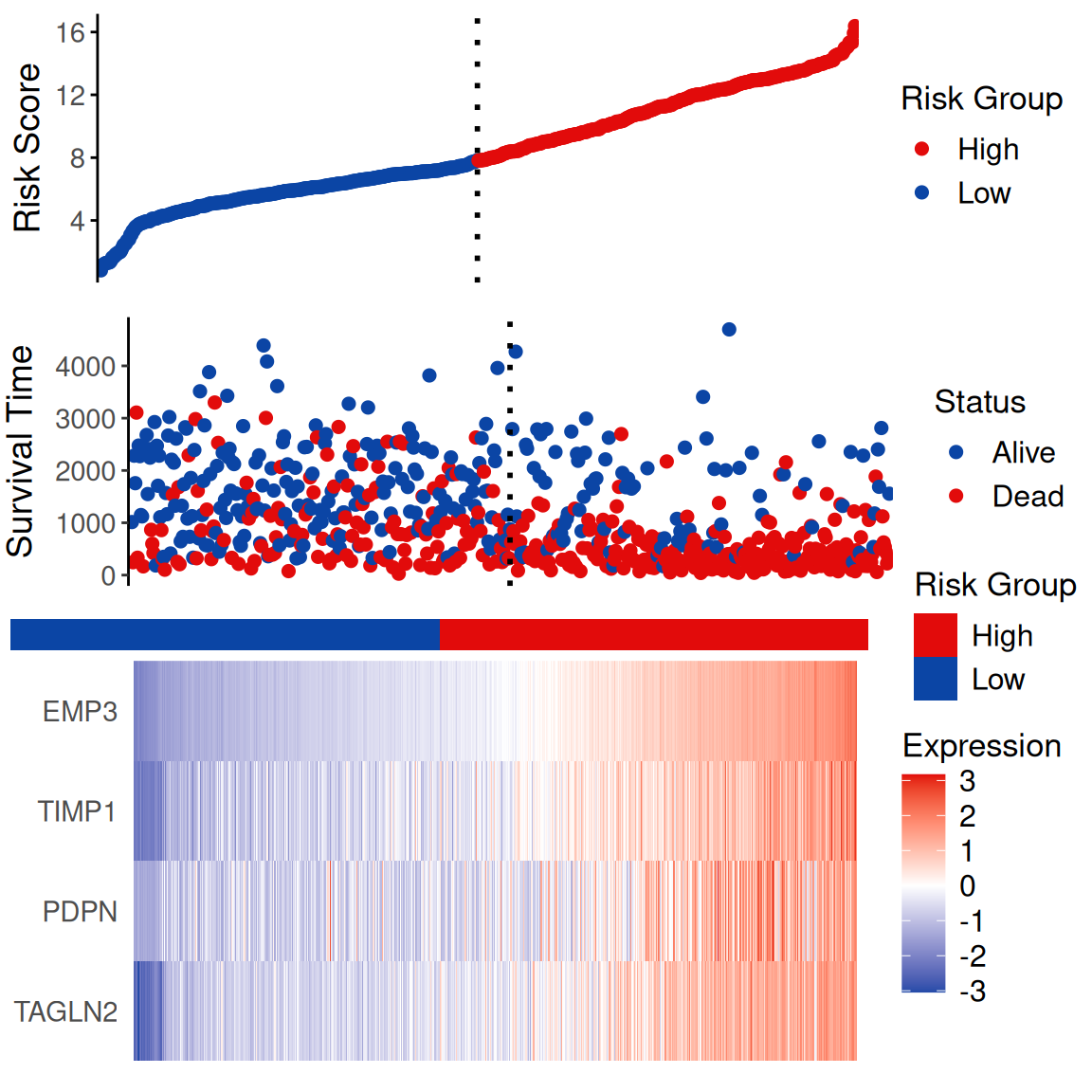
# Risk Factor Analysis
## Figure A
fA <- ggplot(data = data2, aes(x = 1:nrow(data2), y = data2$riskscore,
                               color = Group)) +
  geom_point(size = 2) +
  scale_color_manual(name = "Risk Group",
                     values = c("Low" = "#0B45A5", "High" = "#E20B0B")) +
  geom_vline(xintercept = cut.position, linetype = "dotted", size = 1) +
  theme(panel.grid = element_blank(), panel.background = element_blank(),
        axis.ticks.x = element_blank(), axis.line.x = element_blank(),
        axis.text.x = element_blank(), axis.title.x = element_blank(),
        axis.title.y = element_text(size = 14, vjust = 1, angle = 90),
        axis.text.y = element_text(size = 11),
        axis.line.y = element_line(size = 0.5, colour = "black"),
        axis.ticks.y = element_line(size = 0.5, colour = "black"),
        legend.title = element_text(size = 13),
        legend.text = element_text(size = 12)) +
  coord_trans() +
  ylab("Risk Score") +
  scale_x_continuous(expand = c(0, 3))
## Figure B
fB <- ggplot(data = data2, aes(x = 1:nrow(data2), y = data2[, "time"],
             color = factor(ifelse(data2[, "event"] == 1, "Dead", "Alive")))) +
  geom_point(size = 2) +
  scale_color_manual(name = "Status", values = c("Alive" = "#0B45A5", "Dead" = "#E20B0B")) +
  geom_vline(xintercept = cut.position, linetype = "dotted", size = 1) +
  theme(panel.grid = element_blank(), panel.background = element_blank(),
        axis.ticks.x = element_blank(), axis.line.x = element_blank(),
        axis.text.x = element_blank(), axis.title.x = element_blank(),
        axis.title.y = element_text(size = 14, vjust = 2, angle = 90),
        axis.text.y = element_text(size = 11),
        axis.ticks.y = element_line(size = 0.5),
        axis.line.y = element_line(size = 0.5, colour = "black"),
        legend.title = element_text(size = 13),
        legend.text = element_text(size = 12)) +
  ylab("Survival Time") +
  coord_trans() +
  scale_x_continuous(expand = c(0, 3))
## middle
middle <- ggplot(data2, aes(x = 1:nrow(data2), y = 1)) +
  geom_tile(aes(fill = data2$Group)) +
  scale_fill_manual(name = "Risk Group", values = c("Low" = "#0B45A5", "High" = "#E20B0B")) +
  theme(panel.grid = element_blank(), panel.background = element_blank(),
        axis.line = element_blank(), axis.ticks = element_blank(),
        axis.text = element_blank(), axis.title = element_blank(),
        plot.margin = unit(c(0.15, 0, -0.3, 0), "cm"),
        legend.title = element_text(size = 13),
        legend.text = element_text(size = 12)) +
  scale_x_continuous(expand = c(0, 3)) +
  xlab("")
## Figure C
heatmap_genes <- c("TAGLN2", "PDPN", "TIMP1", "EMP3")
data3 <- data[, heatmap_genes]
if (length(heatmap_genes) == 1) {
  data3 <- data.frame(data3)
  colnames(data3) <- heatmap_genes
}
# Normalization
for (i in 1:ncol(data3)) {
  data3[, i] <- (data3[, i] - mean(data3[, i], na.rm = TRUE)) /
  sd(data3[, i], na.rm = TRUE)
}
data4 <- cbind(id = 1:nrow(data3), data3)
data5 <- reshape2::melt(data4, id.vars = "id")
fC <- ggplot(data5, aes(x = id, y = variable, fill = value)) +
  geom_raster() +
  theme(panel.grid = element_blank(), panel.background = element_blank(),
        axis.line = element_blank(), axis.ticks = element_blank(),
        axis.text.x = element_blank(), axis.title = element_blank(),
        plot.background = element_blank()) +
  scale_fill_gradient2(name = "Expression", low = "#0B45A5", mid = "#FFFFFF",
                       high = "#E20B0B") +
  theme(axis.text = element_text(size = 11)) +
  theme(legend.title = element_text(size = 13),
        legend.text = element_text(size = 12)) +
  scale_x_continuous(expand = c(0, 3))

p <- plot_grid(fA, fB, middle, fC, ncol = 1, rel_heights = c(0.1, 0.1, 0.01, 0.15))

p