# Install packages
if (!requireNamespace("magrittr", quietly = TRUE)) {
  install.packages("magrittr")
}
if (!requireNamespace("tidyr", quietly = TRUE)) {
  install.packages("tidyr")
}
if (!requireNamespace("ggplot2", quietly = TRUE)) {
  install.packages("ggplot2")
}
if (!requireNamespace("cowplot", quietly = TRUE)) {
  install.packages("cowplot")
}
if (!requireNamespace("forcats", quietly = TRUE)) {
  install.packages("forcats")
}
if (!requireNamespace("dplyr", quietly = TRUE)) {
  install.packages("dplyr")
}
if (!requireNamespace("hrbrthemes", quietly = TRUE)) {
  install.packages("hrbrthemes")
}
if (!requireNamespace("ggpattern", quietly = TRUE)) {
  install.packages("ggpattern")
}
if (!requireNamespace("ggpubr", quietly = TRUE)) {
  install.packages("ggpubr")
}
if (!requireNamespace("rstatix", quietly = TRUE)) {
  install.packages("rstatix")
}
if (!requireNamespace("palmerpenguins", quietly = TRUE)) {
  install.packages("palmerpenguins")
}

# Load packages
library(magrittr)
library(tidyr)
library(ggplot2)
library(cowplot)
library(forcats)
library(dplyr)
library(hrbrthemes)
library(ggpattern)
library(rstatix)
library(ggpubr)
library(palmerpenguins)Bar Plot
A bar plot is a graph that uses the height or length of the bars to represent the amount of data.
Example
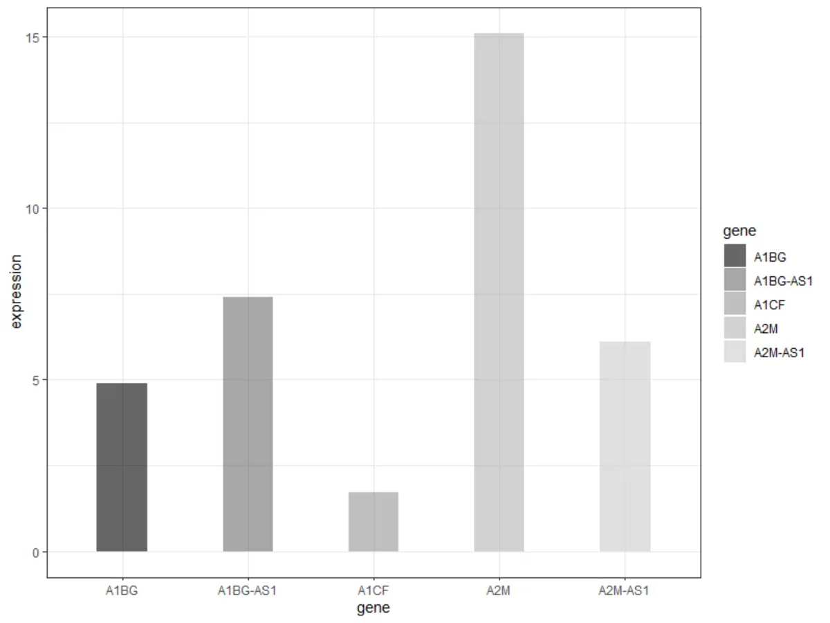
As shown in the figure above, each group of bars reflects the expression of five genes.
Setup
System Requirements: Cross-platform (Linux/MacOS/Windows)
Programming Language: R
Dependencies:
magrittr;tidyr;ggplot2;cowplot;forcats;dplyr;hrbrthemes;ggpattern;rstatix;ggpubr
sessioninfo::session_info("attached")─ Session info ───────────────────────────────────────────────────────────────
setting value
version R version 4.6.0 (2026-04-24)
os Ubuntu 24.04.4 LTS
system x86_64, linux-gnu
ui X11
language (EN)
collate C.UTF-8
ctype C.UTF-8
tz UTC
date 2026-05-09
pandoc 3.1.3 @ /usr/bin/ (via rmarkdown)
quarto 1.9.37 @ /usr/local/bin/quarto
─ Packages ───────────────────────────────────────────────────────────────────
package * version date (UTC) lib source
cowplot * 1.2.0 2025-07-07 [1] RSPM
dplyr * 1.2.1 2026-04-03 [1] RSPM
forcats * 1.0.1 2025-09-25 [1] RSPM
ggpattern * 1.3.1 2026-03-07 [1] RSPM
ggplot2 * 4.0.3.9000 2026-05-04 [1] Github (tidyverse/ggplot2@6870419)
ggpubr * 0.6.3 2026-02-24 [1] RSPM
hrbrthemes * 0.9.2 2026-05-04 [1] Github (hrbrmstr/hrbrthemes@45ac19c)
magrittr * 2.0.5 2026-04-04 [1] RSPM
palmerpenguins * 0.1.1 2022-08-15 [1] RSPM
rstatix * 0.7.3 2025-10-18 [1] RSPM
tidyr * 1.3.2 2025-12-19 [1] RSPM
[1] /home/runner/work/_temp/Library
[2] /opt/R/4.6.0/lib/R/site-library
[3] /opt/R/4.6.0/lib/R/library
* ── Packages attached to the search path.
──────────────────────────────────────────────────────────────────────────────Data Preparation
The data from TCGA and the data sets that come with R are mainly used for drawing.
data_TCGA <- readr::read_csv("https://bizard-1301043367.cos.ap-guangzhou.myqcloud.com/TCGA-BRCA.htseq_counts_processed.csv")

data_TCGA1 <- data_TCGA[1:5,] %>%
  gather(key = "sample",value = "gene_expression",3:1219)

data_tcga_mean <- aggregate(data_TCGA1$gene_expression,
                            by=list(data_TCGA1$gene_name), mean) # mean
colnames(data_tcga_mean) <- c("gene","expression")

data_tcga_sd <- aggregate(data_TCGA1$gene_expression,
                            by=list(data_TCGA1$gene_name), sd)
colnames(data_tcga_sd) <- c("gene","sd")

data_tcga <- merge(data_tcga_mean, data_tcga_sd, by="gene")

data_penguins <- penguins

data_penguins_flipper_length <- aggregate(data_penguins$flipper_length_mm,
                                by=list(data_penguins$species,data_penguins$sex),
                                mean)
colnames(data_penguins_flipper_length) <- c("species","sex","flipper_length_mm")

data_mpg <- mpg
Visualization
1. Basic plot
1.1 Basic bar plot
Here we take the TCGA database data as an example.
# Basic bar plot
p <- ggplot(data_tcga_mean, aes(x=gene, y=expression)) +
  geom_bar(stat = "identity")

p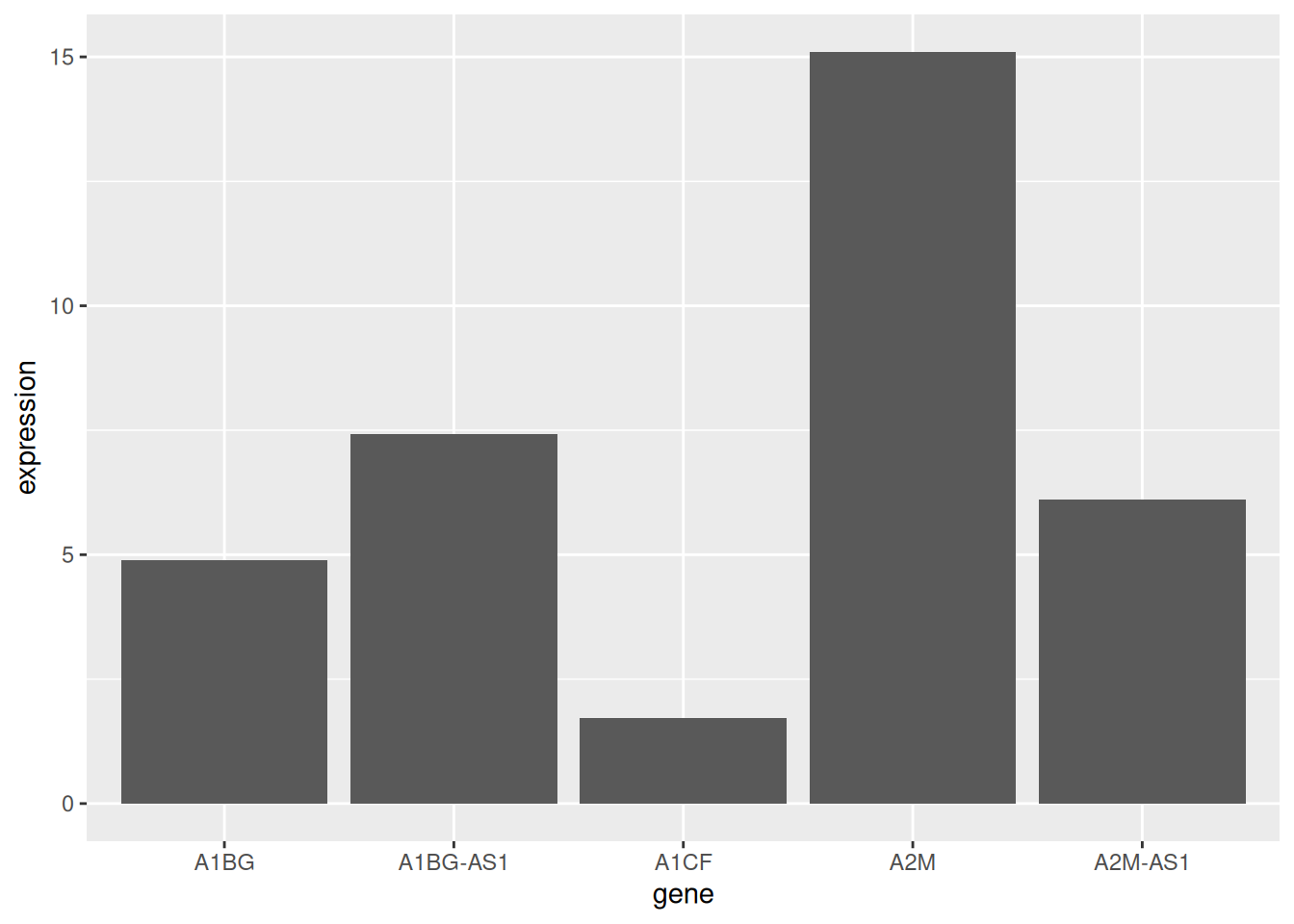
The mean expression of the five gene samples is shown.
1.2 Horizontal bar plot
Use coord_flip() to flip the coordinate axes.
# Horizontal bar plot
p <- data_tcga_mean %>%
  mutate(gene=fct_reorder(gene,expression)) %>% # fct_reorder order
  ggplot(aes(x=gene, y=expression)) +
  geom_bar(stat = "identity",width=0.5)+ # adjust width
  coord_flip() # Flip the axes

p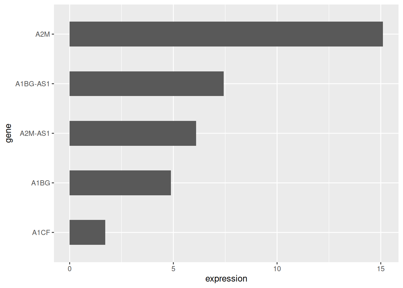
1.3 Color settings
ggplot2 can implement a variety of color settings. Here we provide six examples.
# Color settings
p1 <- ggplot(data_tcga_mean, aes(x=gene, y=expression)) +
  geom_bar(stat = "identity",color="blue", fill=rgb(0.1,0.4,0.5,0.7))+
  labs(title = "Unified Color")+
  theme(plot.title = element_text(hjust = 0.5)) +
  geom_text(aes(label=round(expression,2)),  # Add data labels
            position = position_dodge2(width = 0.9, preserve = 'single'),
    vjust = -0.2, hjust = 0.5) +
  scale_y_continuous(limits = c(0, 17),breaks = seq(0,17,5))

p2 <- ggplot(data_tcga_mean, aes(x=gene, y=expression, fill=gene)) +
  geom_bar(stat = "identity")+
  scale_fill_hue(c = 40) +
  labs(title = "Gradient Color")+
  theme(plot.title = element_text(hjust = 0.5),
        legend.position="none") +
  geom_text(aes(label=round(expression,2)),  # Add data labels
            position = position_dodge2(width = 0.9, preserve = 'single'),
            vjust = -0.2, hjust = 0.5) +
  scale_y_continuous(limits = c(0, 17),breaks = seq(0,17,5))

p3 <- ggplot(data_tcga_mean, aes(x=gene, y=expression, fill=gene)) +
  geom_bar(stat = "identity")+
  scale_fill_brewer(palette = "Set1")+
  labs(title = "RColorBrewer palette 1")+
  theme(plot.title = element_text(hjust = 0.5),
        legend.position="none") +
  geom_text(aes(label=round(expression,2)),  # Add data labels
            position = position_dodge2(width = 0.9, preserve = 'single'),
            vjust = -0.2, hjust = 0.5) +
  scale_y_continuous(limits = c(0, 17),breaks = seq(0,17,5))

p4 <- ggplot(data_tcga_mean, aes(x=gene, y=expression, fill=gene)) +
  geom_bar(stat = "identity")+
  scale_fill_brewer(palette = "Set2") +
  labs(title = "RColorBrewer palette 2")+
  theme(plot.title = element_text(hjust = 0.5),
        legend.position="none") +
  geom_text(aes(label=round(expression,2)),  # Add data labels
            position = position_dodge2(width = 0.9, preserve = 'single'),
            vjust = -0.2, hjust = 0.5) +
  scale_y_continuous(limits = c(0, 17),breaks = seq(0,17,5))

p5 <- ggplot(data_tcga_mean, aes(x=gene, y=expression, fill=gene)) +
  geom_bar(stat = "identity")+
  scale_fill_grey(start = 0.25, end = 0.75) +
  labs(title = "Grayscale")+
  theme(plot.title = element_text(hjust = 0.5),
        legend.position="none") +
  geom_text(aes(label=round(expression,2)),  # Add data labels
            position = position_dodge2(width = 0.9, preserve = 'single'),
            vjust = -0.2, hjust = 0.5) +
  scale_y_continuous(limits = c(0, 17),breaks = seq(0,17,5))


p6 <- ggplot(data_tcga_mean, aes(x=gene, y=expression, fill=gene)) +
  geom_bar(stat = "identity")+
  scale_fill_manual(values = c("red", "green", "blue","pink","yellow") ) +
  labs(title = "Manual settings")+
  theme(plot.title = element_text(hjust = 0.5),
        legend.position="none") +
  geom_text(aes(label=round(expression,2)),  # Add data labels
            position = position_dodge2(width = 0.9, preserve = 'single'),
            vjust = -0.2, hjust = 0.5) +
  scale_y_continuous(limits = c(0, 17),breaks = seq(0,17,5))

plot_grid(p1, p2, p3, p4, p5, p6, labels = LETTERS[1:6], ncol = 3)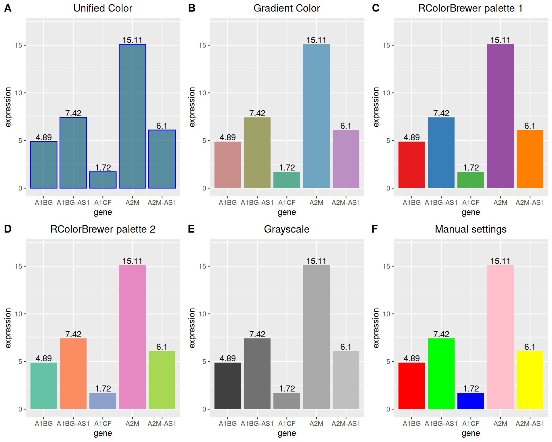
1.4 Grayscale bar plot vs. textured bar plot
Besides handling color settings, ggplot2 can also draw grayscale bar charts and textured bar charts.
# Grayscale bar plot
p <-
  ggplot(data_tcga_mean, aes(x=gene, y=expression, fill=gene)) +
  geom_bar(stat="identity", alpha=.6, width=.4) +
  scale_fill_grey(start=0, end=0.8) +  # Set the grayscale range
  theme_bw()
p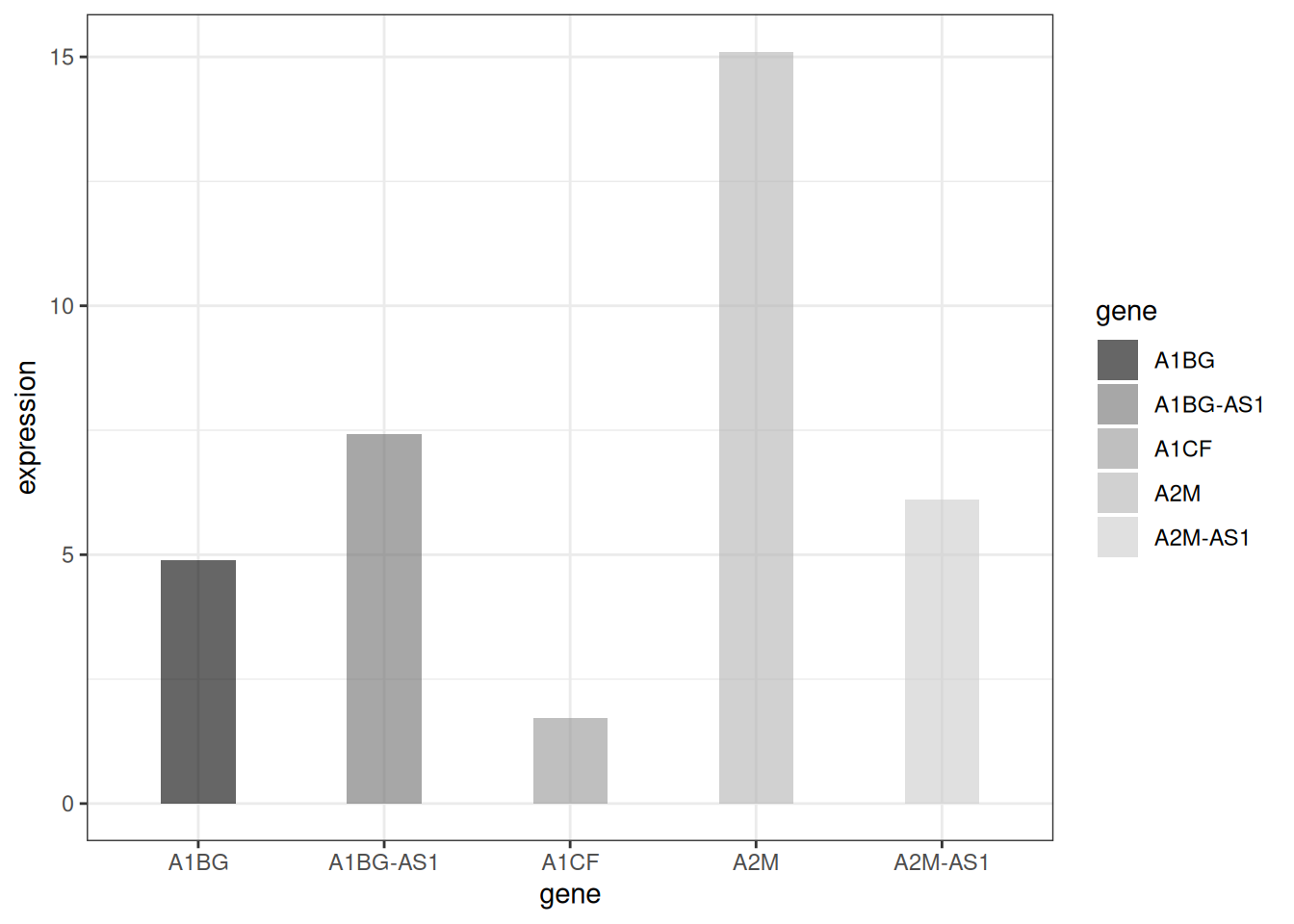
# textured bar plot
p <- ggplot(data_tcga_mean, aes(x=gene, y=expression)) +
  geom_col_pattern(
    aes(pattern=gene,
        pattern_angle=gene,
        pattern_spacing=gene
    ),
    fill            = 'white',
    colour          = 'black',
    pattern_density = 0.5,
    pattern_fill    = 'black',
    pattern_colour  = 'darkgrey'
  ) +
  theme_bw()
p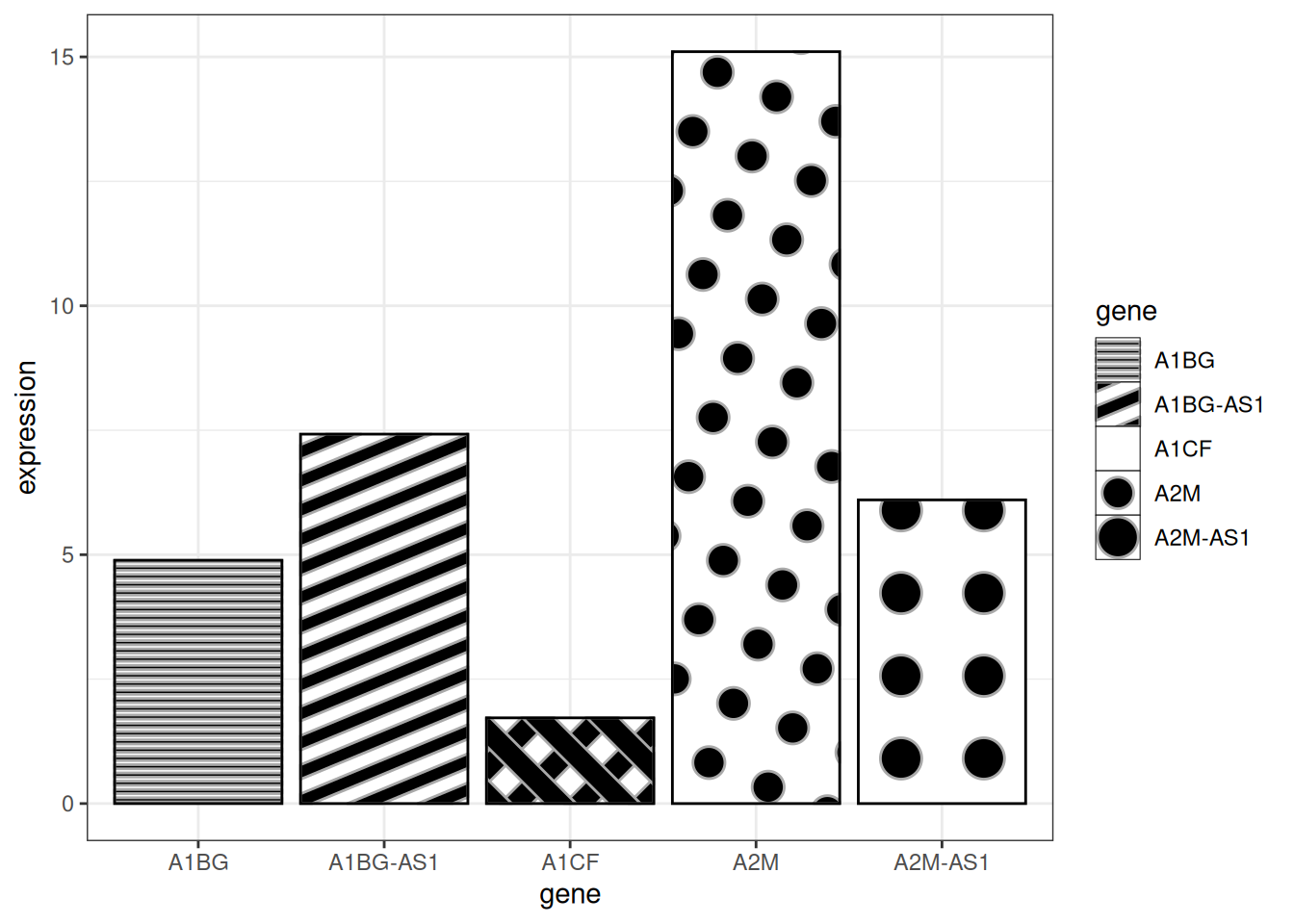
Tip
Key parameters:
-
fill:The base fill color behind the pattern -
colour:The border color of the bar -
pattern_density:Density of pattern within the bar -
pattern_fill:Pattern color -
pattern_colour:Secondary color of the pattern
2. Variable Width Bar plot
The variable width bar chart visualizes the number of samples, using the width of the bar to represent the number of samples.
# Variable Width Bar plot----
data <- data.frame(
  group=c("A ","B ","C ","D ") ,
  value=c(33,62,56,67) ,
  number_of_obs=c(100,500,459,342)
)

# Set the left and right width limits
data$right <- cumsum(data$number_of_obs) + 30*c(0:(nrow(data)-1))
data$left <- data$right - data$number_of_obs

# plot
p <-
  ggplot(data, aes(ymin = 0)) +
  geom_rect(aes(xmin = left, xmax = right, # Set upper and lower width limits
                ymax = value,
                colour = group, fill = group),alpha=0.8) +
  xlab("number of obs") +
  ylab("value") +
  theme_ipsum() +
  scale_fill_brewer(palette = "Set1") +
  theme(legend.position="none")
p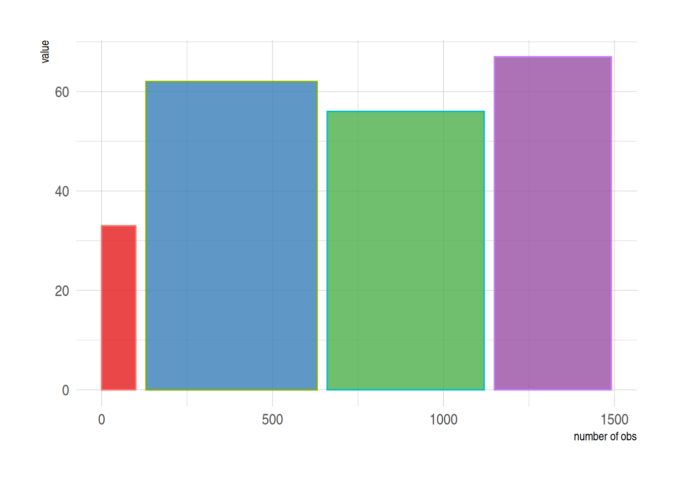
The above graph shows the sample size using bar width.
3. Error bar plot
Bar charts allow for error bars to be added, which we can do with geom_errorbar.
3.1 Basic error bar plot
# Basic error bar plot
p <-
  ggplot(data_tcga) +
  geom_bar( aes(x=gene, y=expression), stat="identity", fill="skyblue", alpha=0.7) +
  geom_errorbar(aes(x=gene,
                    ymin=expression-sd, ymax=expression+sd),
                width=0.4, colour="orange", alpha=0.9, size=1) +
  labs(title = "Basic error bar plot") +
  theme(plot.title = element_text(hjust = 0.5))
p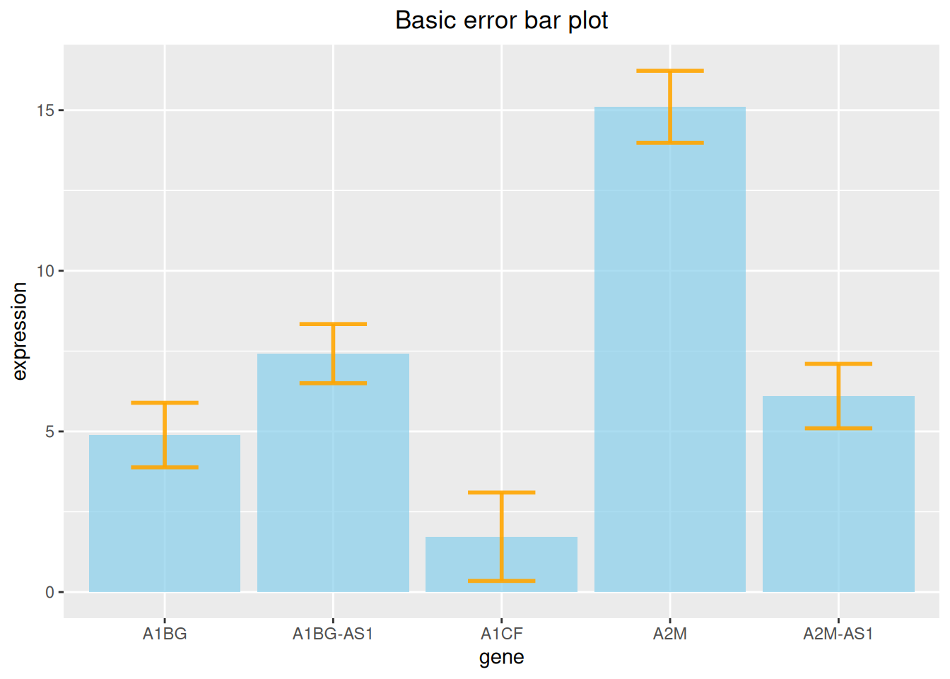
The above figure shows the expression level of each gene and adds standard deviation error bars.
3.2 Various types of error bar plot
At the same time, ggplot2 provides a variety of error bar types, here we provide four examples.
# Error bar chart (taking standard deviation as an example) ----
## Various types of error bar plot
p1 <- ggplot(data_tcga) +
  geom_bar( aes(x=gene, y=expression), stat="identity", fill="skyblue", alpha=0.7) +
  geom_crossbar( aes(x=gene, y=expression,
                     ymin=expression-sd, ymax=expression+sd),
                 width=0.4, colour="orange", alpha=0.9, size=1.3) +
  labs(title = "Box error bar plot")+
  theme(plot.title = element_text(hjust = 0.5))

p2 <- ggplot(data_tcga) +
  geom_bar( aes(x=gene, y=expression), stat="identity", fill="skyblue", alpha=0.7) +
  geom_linerange( aes(x=gene,
                      ymin=expression-sd, ymax=expression+sd),
                  colour="orange", alpha=0.9, size=1.3) +
  labs(title = "Linear error bar plot")+
  theme(plot.title = element_text(hjust = 0.5))


p3 <- ggplot(data_tcga) +
  geom_bar( aes(x=gene, y=expression), stat="identity", fill="skyblue", alpha=0.7) +
  geom_pointrange( aes(x=gene, y=expression,
                       ymin=expression-sd, ymax=expression+sd),
                   colour="orange", alpha=0.9, size=1) +
  labs(title = "Line + point error bar chart")+
  theme(plot.title = element_text(hjust = 0.5))


p4 <- ggplot(data_tcga) +
  geom_bar( aes(x=gene, y=expression), stat="identity", fill="skyblue", alpha=0.7) +
  geom_errorbar( aes(x=gene, ymin=expression-sd, ymax=expression+sd),
                 width=0.4, colour="orange", alpha=0.9, size=1.3) +
  coord_flip() +
  labs(title = "Horizontal error bar plot")+
  theme(plot.title = element_text(hjust = 0.5))

plot_grid(p1, p2, p3, p4, labels = LETTERS[1:4], ncol = 2)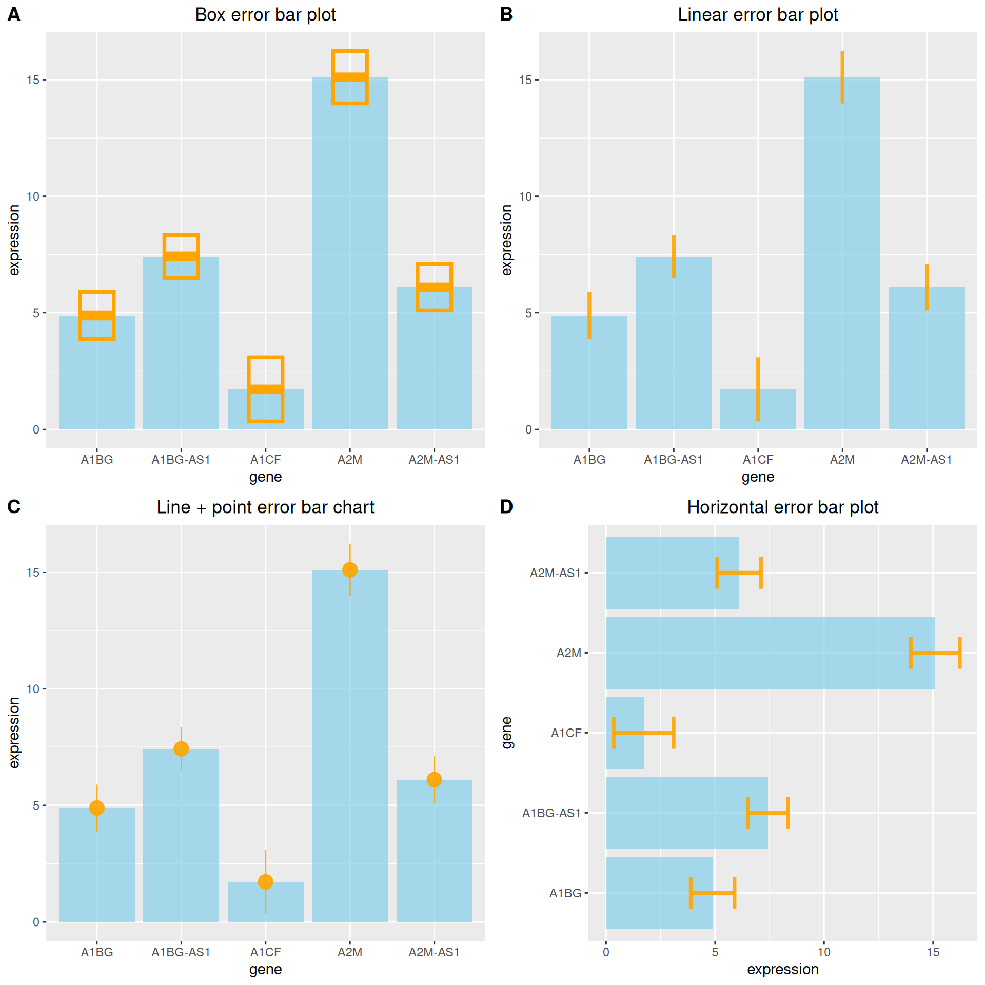
3.3 Add differential analysis
# Add differential analysis
data_tcga_p <- filter(data_TCGA1,
                      gene_name == "A1BG" | gene_name == "A1CF" | gene_name == "A2M")

data_tcga_plot <- filter(data_tcga,
                         gene == "A1BG" | gene == "A1CF" | gene == "A2M")

# Calculation of p-value between groups
df_p_val <- data_tcga_p %>%
  wilcox_test(formula = gene_expression~gene_name) %>%
  add_significance(p.col = 'p',cutpoints = c(0,0.001,0.01,0.05,1),symbols = c('***','**','*','ns')) %>%
  add_xy_position()

p <-
  ggplot(data_tcga_plot) +
  geom_bar( aes(x=gene, y=expression), stat="identity", fill="skyblue", alpha=0.7) +
  geom_errorbar( aes(x=gene,
                     ymin=expression-sd, ymax=expression+sd),
                 width=0.4, colour="orange", alpha=0.9, size=1) +
  stat_pvalue_manual(df_p_val,label = '{p.signif}', # Adding differential analysis lines
                     tip.length = 0.01,
                     y.position = c(15,17,19)) +
  labs(title = "Add differential analysis") +
  theme(plot.title = element_text(hjust = 0.5))
p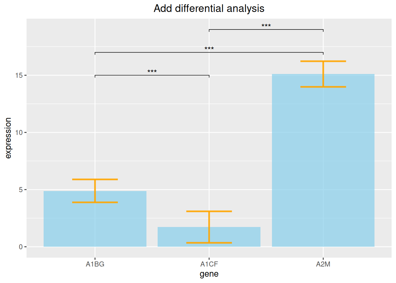
The above figure adds differential analysis lines of three gene expression data.
4. Stacked bar plot
When including within-group grouping, we can choose to plot a stacked bar chart.
Take the penguins dataset as an example.
# Stacked bar plot----
p <-
  ggplot(data_penguins_flipper_length,aes(x=species,y=flipper_length_mm,fill=sex))+
  geom_bar(stat="identity",
           position = position_stack(reverse = TRUE))+ # Change stacking order
  guides(fill=guide_legend(reverse = TRUE)) + # Change legend order
  scale_fill_manual(values = c("#87CEFA","#8DB6CD"))
p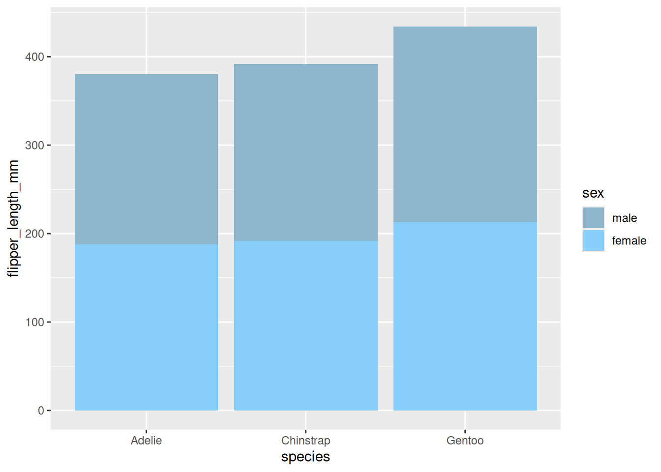
A stacked bar chart showing the wing length of penguins of different sexes.
5. Percentage bar plot
Similarly, when performing ratio analysis, you can also choose to draw a percentage bar chart.
# Percentage bar plot----
p <-
  ggplot(data_mpg,aes(class))+
  geom_bar(aes(fill = drv),
           position = 'fill') + # Draw percentage
  scale_fill_manual(values = c("#87CEFA","#8DB6CD","#84B6BD"))
p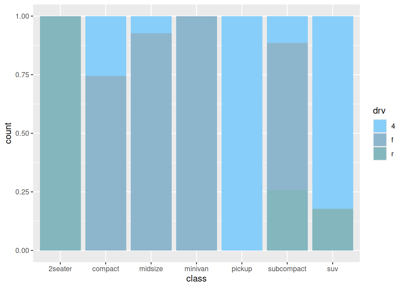
The above chart shows the percentage of drive type (four-wheel drive, front-wheel drive, rear-wheel drive) in each model.
6. Side-by-side bar plot
When including grouping within groups, we can also draw side-by-side bar plot by setting the position parameter.
# Side-by-side bar plot----
p <-
  ggplot(data_mpg,aes(class)) +
  geom_bar(aes(fill = drv),
           position = position_dodge2(preserve = 'single')) +
  scale_fill_manual(values = c("#87CEFA","#8DB6CD","#84B6BD"))
p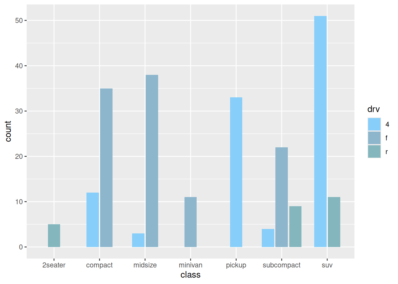
7. Deformation of bar plot
7.1 Pyramid plot
df <- tibble(
  gene = factor(paste0("gene_", rep(1:16, 2)), levels = paste0("gene_", 16:1)),
  stat = c(seq(-10, -100, -10), seq(-90, -40, 10), seq(10, 100, 10), seq(90, 40, -10)),
  direct = rep(c("down", "up"), each=16)
)

p <-
  ggplot(df, aes(gene, stat, fill = direct)) +
  geom_col() +
  coord_flip() +
  scale_y_continuous(breaks = seq(-100, 100, 20),
                     labels = c(seq(100, 0, -20), seq(20, 100, 20)))
p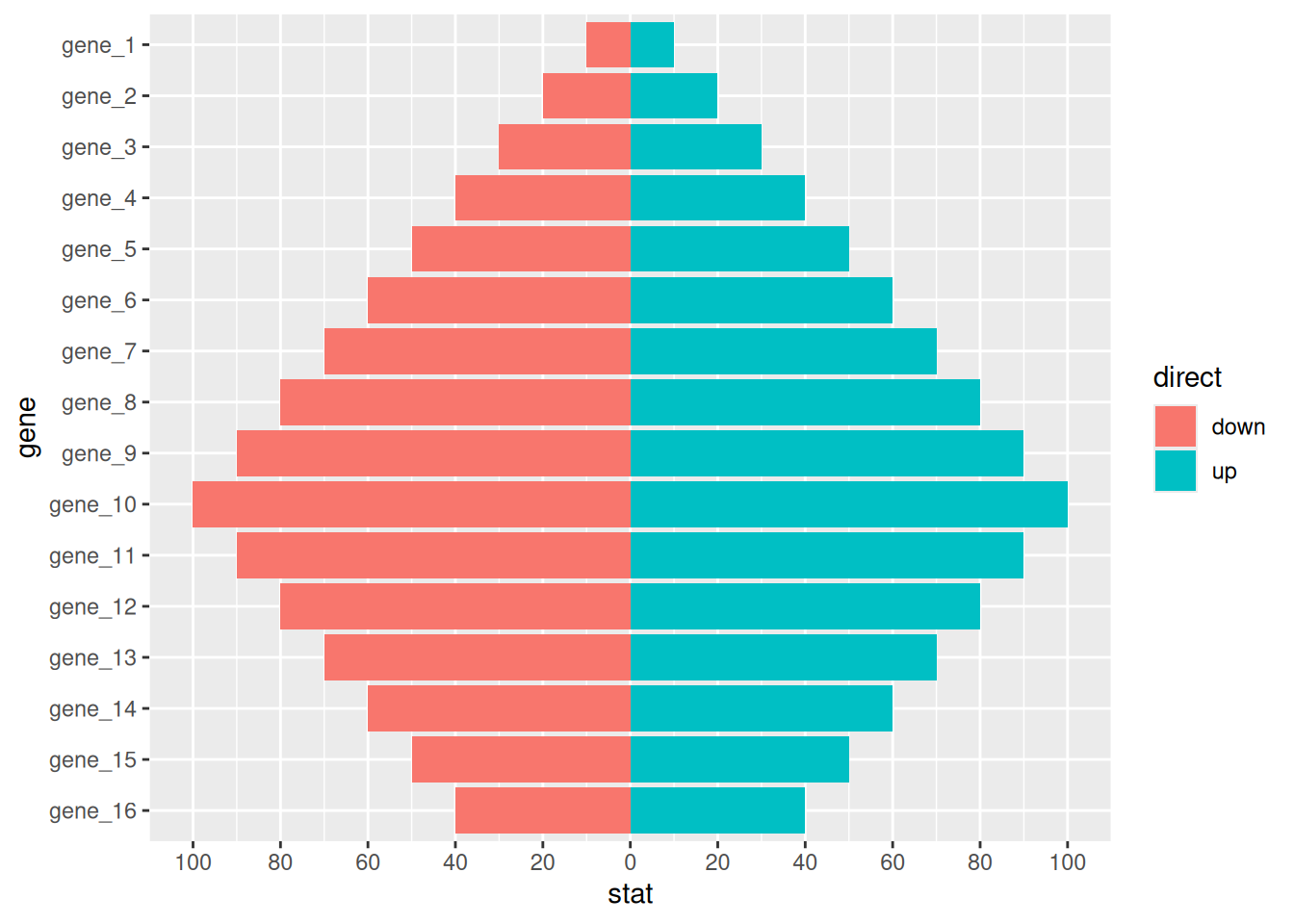
7.2 Deviation Plot
# Deviation Plot
df <- tibble(
  gene = factor(paste0("gene_", 1:20), levels = paste0("gene_", 20:1)),
  stat = c(seq(100, 10, -10), seq(-10, -100, -10)),
  direct = factor(rep(c("up", "down"), each=10), levels = c("up", "down"))
)

p <-
  ggplot(df, aes(gene, stat, fill = direct)) +
  geom_col() +
  coord_flip()
p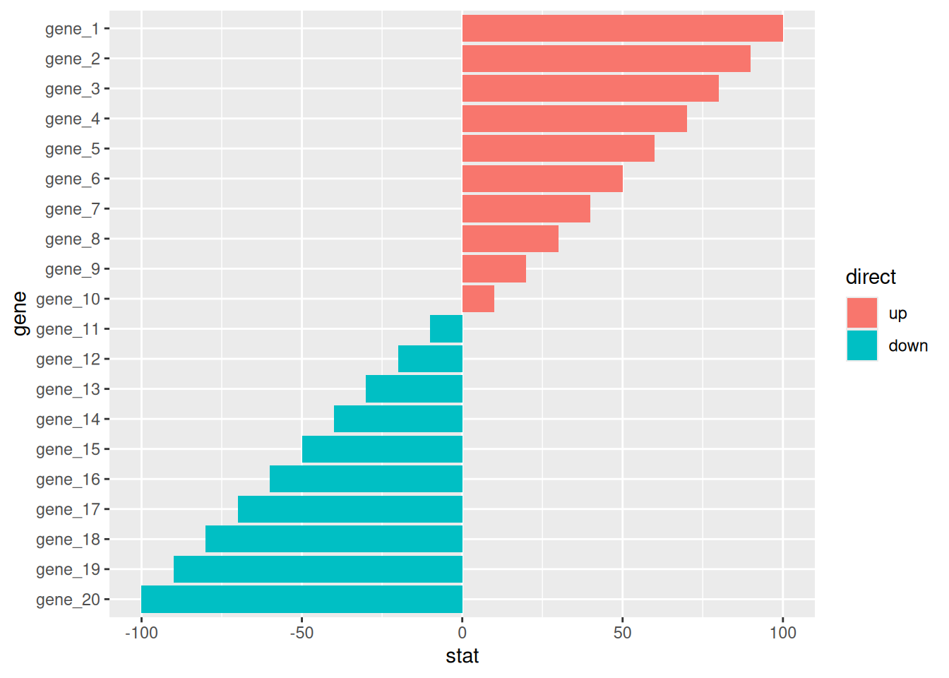
Applications
1. Basic bar plot
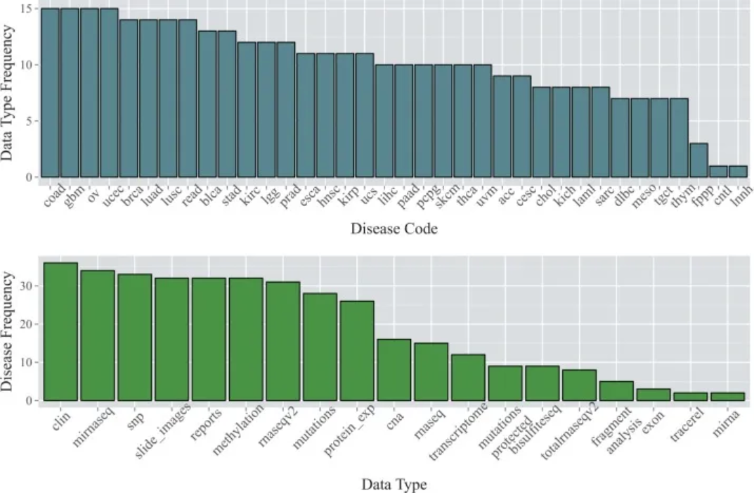
The data are from the TCGA database. The top bar chart shows the number of available data types for each of the 36 cancer types as of January 2015; the bottom bar chart shows the number of cancer types for which each data type was available. [1]
2. Error bar plot
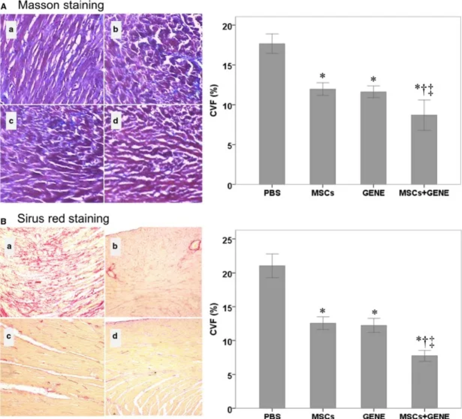
- is a bar graph showing the collagen volume fractions of the PBS, MSC, GENE, and MSC + GENE groups stained with large areas; (B) is a bar graph showing the collagen volume fractions of the PBS, MSC, GENE, and MSC + GENE groups stained with Sirius red. [2]
3. Side-by-side bar plot
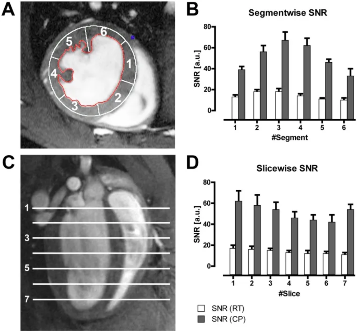
Figure B shows the average LV myocardial signal-to-noise ratio (SNR) of all mice in different segments of the six-segment model (A) acquired using a CryoProbe (CP) or room temperature coil (RT); Figure D shows the average LV myocardial SNR of all mice in different slices. [3]
Reference
[1] Kannan L, Ramos M, Re A, El-Hachem N, Safikhani Z, Gendoo DM, Davis S, Gomez-Cabrero D, Castelo R, Hansen KD, Carey VJ, Morgan M, Culhane AC, Haibe-Kains B, Waldron L. Public data and open source tools for multi-assay genomic investigation of disease. Brief Bioinform. 2016 Jul;17(4):603-15. doi: 10.1093/bib/bbv080. Epub 2015 Oct 12. PMID: 26463000; PMCID: PMC4945830.
[2] Yu Q, Fang W, Zhu N, Zheng X, Na R, Liu B, Meng L, Li Z, Li Q, Li X. Beneficial effects of intramyocardial mesenchymal stem cells and VEGF165 plasmid injection in rats with furazolidone induced dilated cardiomyopathy. J Cell Mol Med. 2015 Aug;19(8):1868-76. doi: 10.1111/jcmm.12558. Epub 2015 Mar 5. PMID: 25753859; PMCID: PMC4549037.
[3] Wagenhaus B, Pohlmann A, Dieringer MA, Els A, Waiczies H, Waiczies S, Schulz-Menger J, Niendorf T. Functional and morphological cardiac magnetic resonance imaging of mice using a cryogenic quadrature radiofrequency coil. PLoS One. 2012;7(8):e42383. doi: 10.1371/journal.pone.0042383. Epub 2012 Aug 1. PMID: 22870323; PMCID: PMC3411643.
[4] Bache S, Wickham H (2022). magrittr: A Forward-Pipe Operator for R. R package version 2.0.3, https://CRAN.R-project.org/package=magrittr.
[5] Wickham H, Vaughan D, Girlich M (2024). tidyr: Tidy Messy Data. R package version 1.3.1, https://CRAN.R-project.org/package=tidyr.
[6] H. Wickham. ggplot2: Elegant Graphics for Data Analysis. Springer-Verlag New York, 2016.
[7] Wilke C (2024). cowplot: Streamlined Plot Theme and Plot Annotations for ‘ggplot2’. R package version 1.1.3, https://CRAN.R-project.org/package=cowplot.
[8] Wickham H (2023). forcats: Tools for Working with Categorical Variables (Factors). R package version 1.0.0, https://CRAN.R-project.org/package=forcats.
[9] Wickham H, François R, Henry L, Müller K, Vaughan D (2023). dplyr: A Grammar of Data Manipulation. R package version 1.1.4, https://CRAN.R-project.org/package=dplyr.
[10] Rudis B (2024). hrbrthemes: Additional Themes, Theme Components and Utilities for ‘ggplot2’. R package version 0.8.7, https://CRAN.R-project.org/package=hrbrthemes.
[11] FC M, Davis T, ggplot2 authors (2024). ggpattern: ‘ggplot2’ Pattern Geoms. R package version 1.1.1, https://CRAN.R-project.org/package=ggpattern.
[12] Kassambara A (2023). rstatix: Pipe-Friendly Framework for Basic Statistical Tests. R package version 0.7.2, https://CRAN.R-project.org/package=rstatix.