# Install packages
if (!requireNamespace("tidyverse", quietly = TRUE)) {
  install.packages("tidyverse")
}
if (!requireNamespace("readr", quietly = TRUE)) {
  install.packages("readr")
}
if (!requireNamespace("circlize", quietly = TRUE)) {
  install.packages("circlize")
}
if (!requireNamespace("readxl", quietly = TRUE)) {
  install.packages("readxl")
}
if (!requireNamespace("dplyr", quietly = TRUE)) {
  install.packages("dplyr")
}
if (!requireNamespace("igraph", quietly = TRUE)) {
  install.packages("igraph")
}
if (!requireNamespace("ggraph", quietly = TRUE)) {
  install.packages("ggraph")
}
if (!requireNamespace("tidygraph", quietly = TRUE)) {
  install.packages("tidygraph")
}
if (!requireNamespace("tidygraph", quietly = TRUE)) {
  remotes::install_github("mattflor/chorddiag")
}
if (!requireNamespace("viridis", quietly = TRUE)) {
  install.packages("viridis")
}

# Load packages
library(tidyverse)
library(readr)
library(circlize)
library(readxl)
library(dplyr)
library(igraph)
library(ggraph)
library(tidygraph)
library(chorddiag)
library(viridis)Chord Diagram
Chord diagrams can use connecting lines or bars to represent the relationships between different objects. The connections in a chord diagram directly show the relationships between different objects; the width of the connection is proportional to the strength of the relationship, and the color of the connection can represent another mapping of the relationship, such as the type of relationship. The size of the sectors in the diagram represents the measurement of the objects.
Example
This chord graph shows the changes in blood glucose levels before and after taking a certain medication. Each arc represents a blood glucose level. The width of the chord represents the number or frequency of changes. Adjust the transparency; the chord color will be semi-transparent for clearer observation of the data flow.
Setup
System Requirements: Cross-platform (Linux/MacOS/Windows)
Programming Language: R
Dependencies:
tidyverse;readr;circlize;readxl;dplyr;igraph;ggraph;tidygraph;chorddiag;viridis
sessioninfo::session_info("attached")─ Session info ───────────────────────────────────────────────────────────────
setting value
version R version 4.6.0 (2026-04-24)
os Ubuntu 24.04.4 LTS
system x86_64, linux-gnu
ui X11
language (EN)
collate C.UTF-8
ctype C.UTF-8
tz UTC
date 2026-05-09
pandoc 3.1.3 @ /usr/bin/ (via rmarkdown)
quarto 1.9.37 @ /usr/local/bin/quarto
─ Packages ───────────────────────────────────────────────────────────────────
package * version date (UTC) lib source
chorddiag * 0.1.3 2026-05-04 [1] Github (mattflor/chorddiag@1688d72)
circlize * 0.4.18 2026-04-04 [1] RSPM
dplyr * 1.2.1 2026-04-03 [1] RSPM
forcats * 1.0.1 2025-09-25 [1] RSPM
ggplot2 * 4.0.3.9000 2026-05-04 [1] Github (tidyverse/ggplot2@6870419)
ggraph * 2.2.2 2025-08-24 [1] RSPM
igraph * 2.3.1 2026-05-04 [1] RSPM
lubridate * 1.9.5 2026-02-04 [1] RSPM
purrr * 1.2.2 2026-04-10 [1] RSPM
readr * 2.2.0 2026-02-19 [1] RSPM
readxl * 1.4.5 2025-03-07 [1] RSPM
stringr * 1.6.0 2025-11-04 [1] RSPM
tibble * 3.3.1 2026-01-11 [1] RSPM
tidygraph * 1.3.1 2024-01-30 [1] RSPM
tidyr * 1.3.2 2025-12-19 [1] RSPM
tidyverse * 2.0.0 2023-02-22 [1] RSPM
viridis * 0.6.5 2024-01-29 [1] RSPM
viridisLite * 0.4.3 2026-02-04 [1] RSPM
[1] /home/runner/work/_temp/Library
[2] /opt/R/4.6.0/lib/R/site-library
[3] /opt/R/4.6.0/lib/R/library
* ── Packages attached to the search path.
──────────────────────────────────────────────────────────────────────────────Data Preparation
This uses TCGA-BRCA.star_counts.tsv from the UCSC Xena website (UCSC Xena (xenabrowser.net)) and Berberine_new.xlsx, which shows changes in blood glucose levels in patients after using a certain drug at a hospital.
# TCGA-BRCA.star_counts.tsv
tcga_brca_star_counts <- readr::read_tsv("https://bizard-1301043367.cos.ap-guangzhou.myqcloud.com/TCGA-BRCA.star_counts.tsv")
target_ensembl_ids <- c("ENSG00000012048.23",  # BRCA1
                        "ENSG00000139618.16",  # BRCA2
                        "ENSG00000141736.14",  # ERBB2
                        "ENSG00000121879.6",  # PIK3CA
                        "ENSG00000171862.11",  # PTEN
                        "ENSG00000111537.5")  # AKT1
gene_data <- tcga_brca_star_counts[tcga_brca_star_counts$Ensembl_ID %in% target_ensembl_ids, ]
gene_data <- gene_data[,2:101]
gene_data_t <- t(gene_data)

x <- c(gene_data_t[, 1], gene_data_t[, 3], gene_data_t[, 5])
y <- c(gene_data_t[, 2], gene_data_t[, 4], gene_data_t[, 6])
factor <- rep(c("a", "b", "c"), each = 100)
plot_data <- data.frame(x = x, y = y, factor = factor)

# Berberine_new
berberine_blood_glucose <- readr::read_csv("https://bizard-1301043367.cos.ap-guangzhou.myqcloud.com/Berberine_new.csv")
berberine_blood_glucose <- berberine_blood_glucose %>% na.omit()

blood_glucose_category <- function(value) {
  if (value < 4.5) {
    return("Low")
  } else if (value >= 4.5 & value < 6.5) {
    return("Normal")
  } else if (value >= 6.5 & value <= 11.0) {
    return("Slightly High")
  } else {
    return("High")
  }
}

berberine_blood_glucose$before_category <- sapply(berberine_blood_glucose$before, blood_glucose_category)
berberine_blood_glucose$after_category <- sapply(berberine_blood_glucose$after, blood_glucose_category)

adj_matrix <- table(berberine_blood_glucose$before_category, berberine_blood_glucose$after_category) # Generate adjacency matrix
adj_matrix_df <- as.data.frame(as.table(adj_matrix))

adj_matrix_wide <- adj_matrix_df %>%
  pivot_wider(names_from = Var2, values_from = Freq, values_fill = list(Freq = 0))
adj_matrix_wide_df <- as.data.frame(adj_matrix_wide)
rownames(adj_matrix_wide_df) <- adj_matrix_wide_df$Var1
m <- as.matrix(adj_matrix_wide_df[, -1])
Visualization
1. circular plot
In R, the circlize package can be used to create circular plots. A circular plot consists of multiple regions (three in this case), each representing the level of a factor. Creating a circular plot requires the following three steps:
Step 1: Initialize the chart using circos.initialize()
This requires providing a factor vector and values for the X-axis. The pie chart will divide the chart into regions based on the number of factor levels. The length of each region will be proportional to the corresponding X-axis value.
Step 2: Construct the regions using circos.trackPlotRegion()
This requires specifying factors again, and you can also specify the range of values for the Y-axis as needed.
Step 3: Add charts to each region
You can draw charts in each region. Here, we use circos.trackPoints() to draw a scatter plot. The circlize package supports various types of pie charts; you can choose different visualization methods according to your needs.
1.1 Basic plot
# Initialize the circular plot
circos.clear()
circos.initialize(factors = plot_data$factor, x = plot_data$x)

# Plot a circular scatter plot
circos.trackPlotRegion(factors = plot_data$factor, y = plot_data$y, track.height = 0.5, panel.fun = function(x, y) {
  circos.axis()
})
circos.trackPoints(plot_data$factor, plot_data$x, plot_data$y, col = "blue", pch = 16, cex = 0.5)

# Add gene labeling
circos.text(x = 9, y = 20, labels = "BRCA1 & BRCA2",
            sector.index = "a", facing = "outside", niceFacing = TRUE,
            adj = c(0, 0.5), cex = 0.7, col = "blue")

circos.text(x = 11, y = 20, labels = "ERBB2 & PIK3CA",
            sector.index = "b", facing = "outside", niceFacing = TRUE,
            adj = c(0, 0.5), cex = 0.7, col = "blue")

circos.text(x = 17, y = 20, labels = "PTEN & AKT1",
            sector.index = "c", facing = "outside", niceFacing = TRUE,
            adj = c(0, 0.5), cex = 0.7, col = "blue")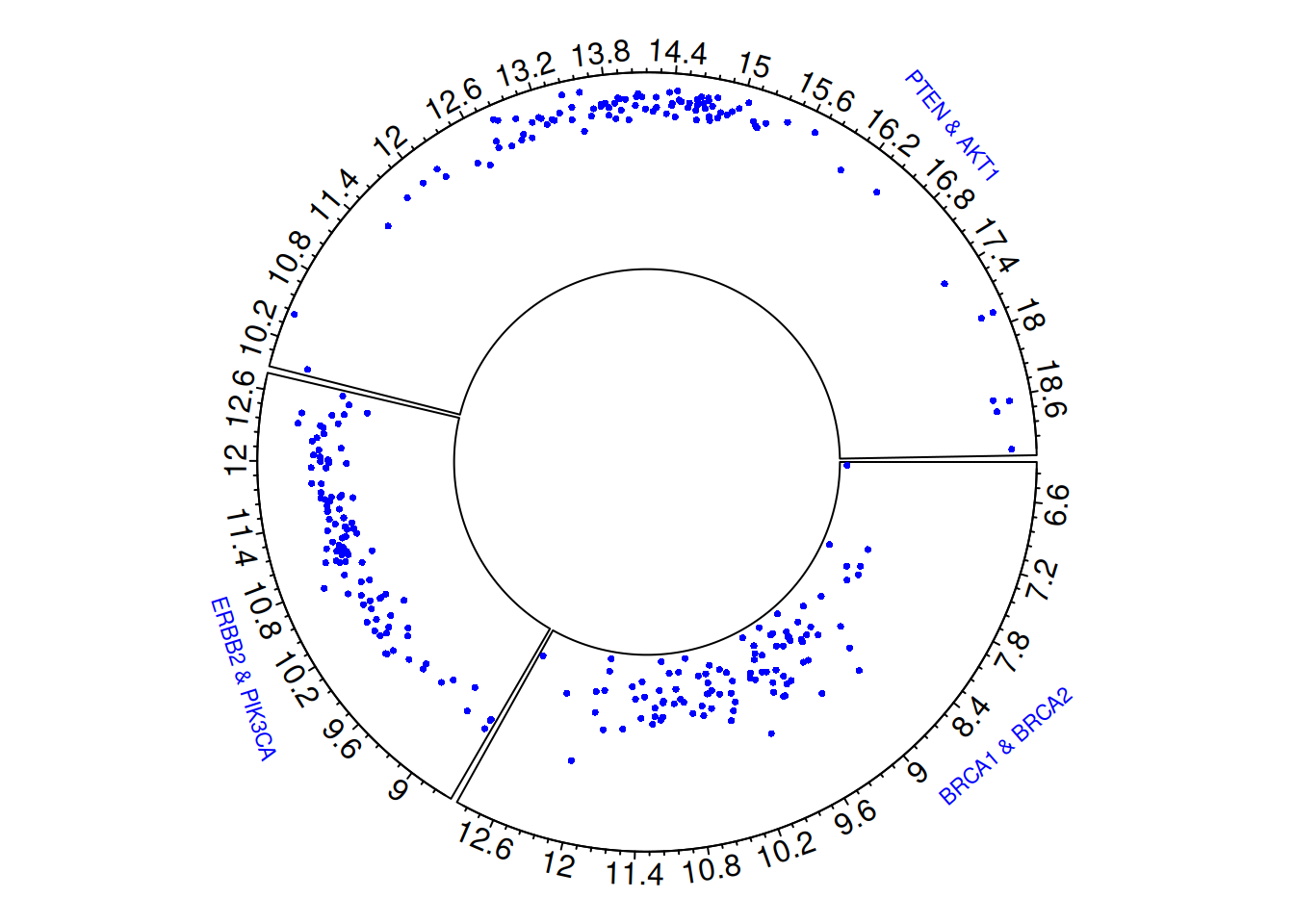
# clear circular plot
circos.clear()
The circular scatter plot visually illustrates the gene expression levels and distribution characteristics of three pairs of breast cancer-related genes (BRCA1 & BRCA2, ERBB2 & PIK3CA, PTEN & AKT1). Each point represents the gene expression value in a sample, and by observing the distribution of points in different sector regions, differences in expression levels between gene pairs can be identified.
1.2 Custom
Customization can be done at three different levels:
- Initialization phase:
Use the regular par() function and the specialized circos.par() function for overall setup.
-
circos.axis():
Used to customize the appearance and layout of axes.
-
circos.trackPoints():
Used to customize the shape of points or graphs within a plot.
Most parameters are consistent with basic R usage.
# Set the background and margins of the graphic.
par(
  mar = c(1, 1, 1, 1),           # Set the margins of the graphic
  bg = rgb(0.9, 0.9, 0.9)        # Set the background color of the graphic
)
# initialization
circos.clear()
circos.initialize(factors = plot_data$factor, x = plot_data$x)

# Plot a circular scatter plot
circos.trackPlotRegion(factors = plot_data$factor, y = plot_data$y, track.height = 0.5, panel.fun = function(x, y) {
  circos.axis(
    h = "top",                 # Place the coordinate axes inside or outside the pie chart.
    labels = TRUE,             # Display axis labels
    major.tick = TRUE,         # Display major tick
    labels.cex = 0.5,          # Set the size of the label
    labels.font = 1,           # Set the font of the label
    direction = "outside",     # The scales of the coordinate axes point outwards.
    minor.ticks = 4,           # Set the number of minor ticks
    major.tick.length = 0.08,  # Set the size of the major tick
    lwd = 2                    # Set the width of the axes and tick
  )
})

circos.trackPoints(plot_data$factor, plot_data$x, plot_data$y, col = "#69b3a2", pch = 16, cex = 0.5)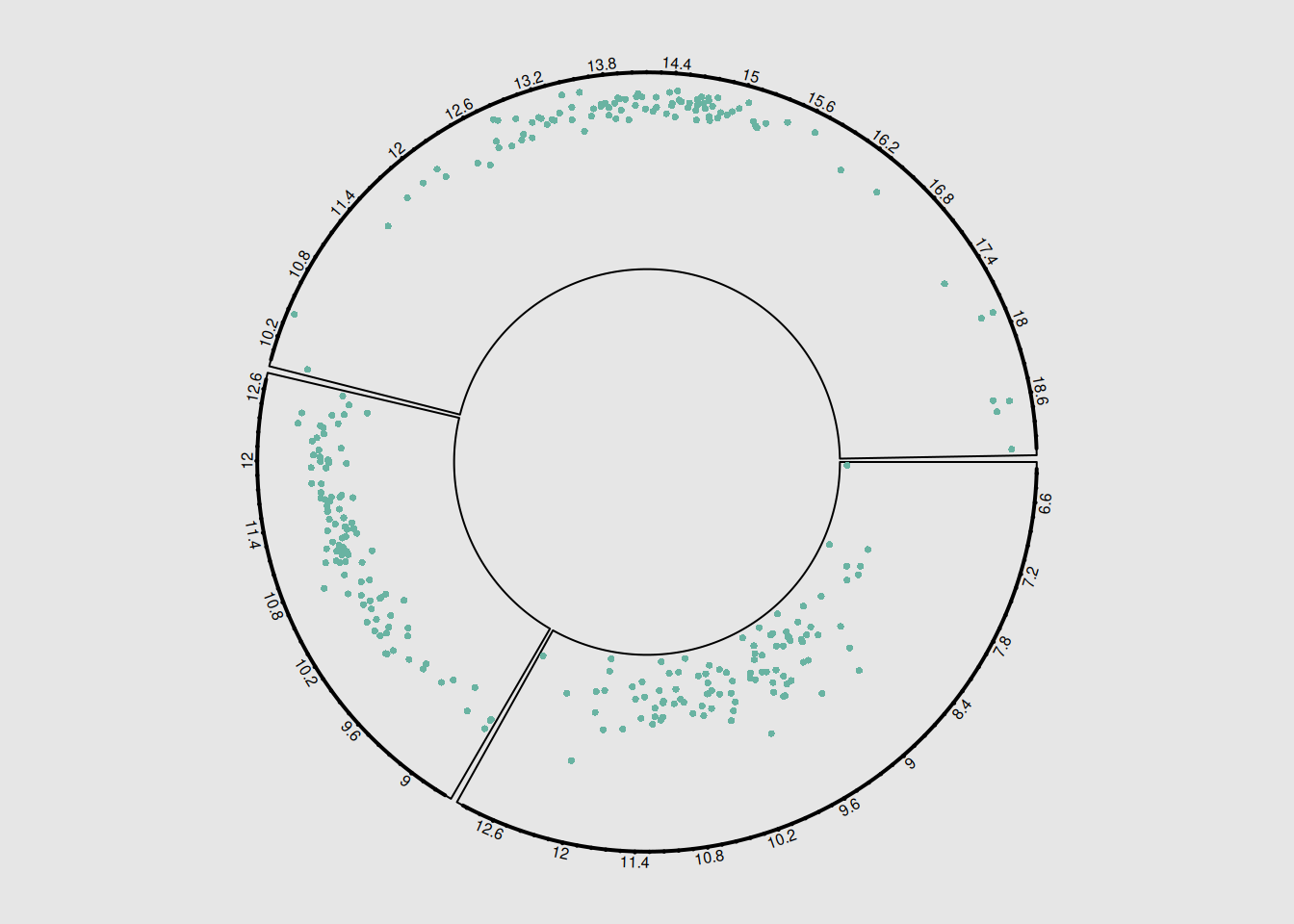
circos.clear()The pie chart illustrates the correlation between three pairs of breast cancer-related genes. Customizable layout, colors, and labels can be adjusted to meet specific needs and questions, improving the clarity and interpretability of the chart and helping to better highlight key features and trends in the data.
1.3 circular plot type
The circlize package provides various chart types: bar charts, scatter plots, line charts, vertical line charts, etc.
Circular line chart
You can use circos.trackLines() to draw line charts.
# Initialize the circular plot
circos.clear()
circos.initialize(factors = plot_data$factor, x = plot_data$x)

# Plot a circular scatter plot
circos.trackPlotRegion(factors = plot_data$factor, y = plot_data$y, track.height = 0.5, panel.fun = function(x, y) {
  circos.axis()
})
circos.trackLines(plot_data$factor, plot_data$x[order(plot_data$x)], plot_data$y[order(plot_data$x)], col = rgb(0.1,0.5,0.8,0.3), lwd=2)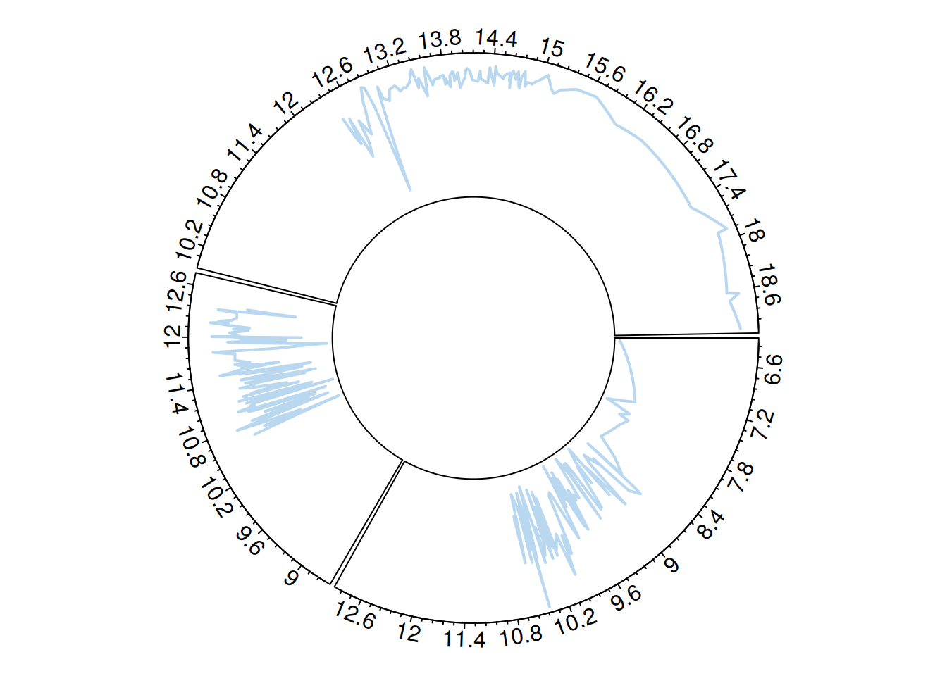
# Clean the circular plot
circos.clear()
Circular vertical line diagram
Similarly, use circos.trackLines() to draw a vertical line diagram.
# Initialize the circular plot
circos.clear()
circos.initialize(factors = plot_data$factor, x = plot_data$x)

# Plot a circular scatter plot
circos.trackPlotRegion(factors = plot_data$factor, y = plot_data$y, track.height = 0.5, panel.fun = function(x, y) {
  circos.axis()
})
circos.trackLines(plot_data$factor, plot_data$x[order(plot_data$x)], plot_data$y[order(plot_data$x)], col = rgb(0.1,0.5,0.8,0.3), lwd=2, type="h")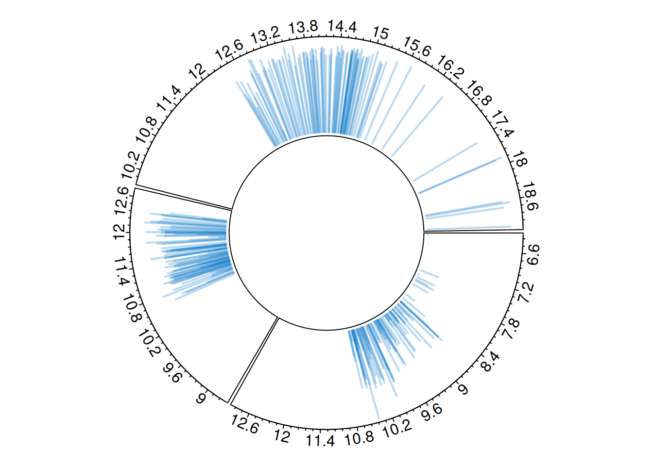
# Clean the circular plot
circos.clear()
Circular Histogram
Each chart type must be consistent with what is specified in the circos.trackPlotRegion function.
For example, for a scatter plot, the Y-axis needs to be specified, as shown previously. However, for a histogram constructed using circos.trackHist(), the Y-axis does not need to be specified.
# Initialize the circular plot
circos.clear()
circos.initialize(factors = plot_data$factor, x = plot_data$x)

# Drawing a histogram
circos.trackHist(
  plot_data$factor,
  plot_data$x,
  col = "#69b3a2",
  bg.col = "white",
  track.height = 0.4
)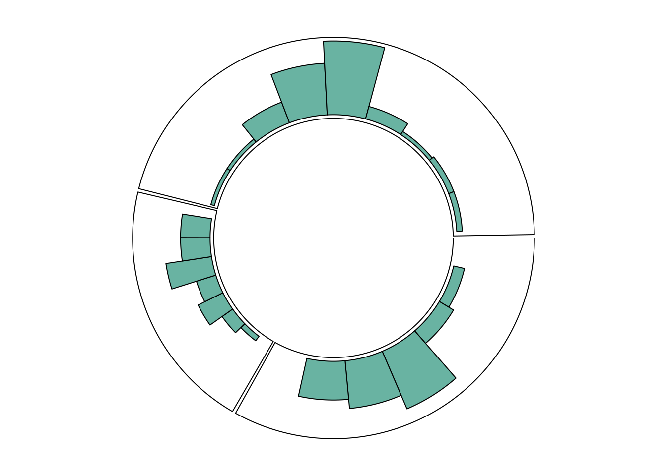
# Clean the circular plot
circos.clear()
Multi-track circular plot
The circlize package can be used to construct circular graphs with multiple tracks.
# Initialization parameters
par(mar = c(1, 1, 1, 1))
circos.clear()

# Initialize the circular plot
circos.initialize(factors = plot_data$factor, x = plot_data$x)

# Add the first track and draw a line chart
circos.trackPlotRegion(factors = plot_data$factor, y = plot_data$y, panel.fun = function(x, y) {
  circos.axis(labels.cex = 0.5, labels.font = 1, lwd = 0.8)
})
circos.trackLines(plot_data$factor, plot_data$x[order(plot_data$x)], plot_data$y[order(plot_data$x)],
                  col = rgb(0.1, 0.5, 0.8, 0.3), pch = 20, lwd = 2)

# The second track, plot the scatter plot.
circos.trackPlotRegion(factors = plot_data$factor, y = plot_data$y, panel.fun = function(x, y) {
  circos.axis(labels = FALSE, major.tick = FALSE)
})
circos.trackPoints(plot_data$factor, plot_data$x, plot_data$y,
                   col = rgb(0.9, 0.5, 0.8, 0.3), pch = 20, cex = 2)

# The third track, draw a bar chart.
circos.par("track.height" = 0.4)
circos.trackPlotRegion(factors = plot_data$factor, y = plot_data$y, panel.fun = function(x, y) {
  circos.axis(labels = FALSE, major.tick = FALSE)
})
circos.trackLines(plot_data$factor, plot_data$x, plot_data$y,
                  col = rgb(0.9, 0.5, 0.1, 0.3), type = "h", lwd = 1.5) # It can still be stacked.

# Add gene labeling
circos.text(x = 9, y = 40, labels = "BRCA1 & BRCA2",
            sector.index = "a", facing = "outside", niceFacing = TRUE,
            adj = c(0, 0.5), cex = 0.7, col = "blue")

circos.text(x = 11, y = 40, labels = "ERBB2 & PIK3CA",
            sector.index = "b", facing = "outside", niceFacing = TRUE,
            adj = c(0, 0.5), cex = 0.7, col = "blue")

circos.text(x = 17, y = 40, labels = "PTEN & AKT1",
            sector.index = "c", facing = "outside", niceFacing = TRUE,
            adj = c(0, 0.5), cex = 0.7, col = "blue")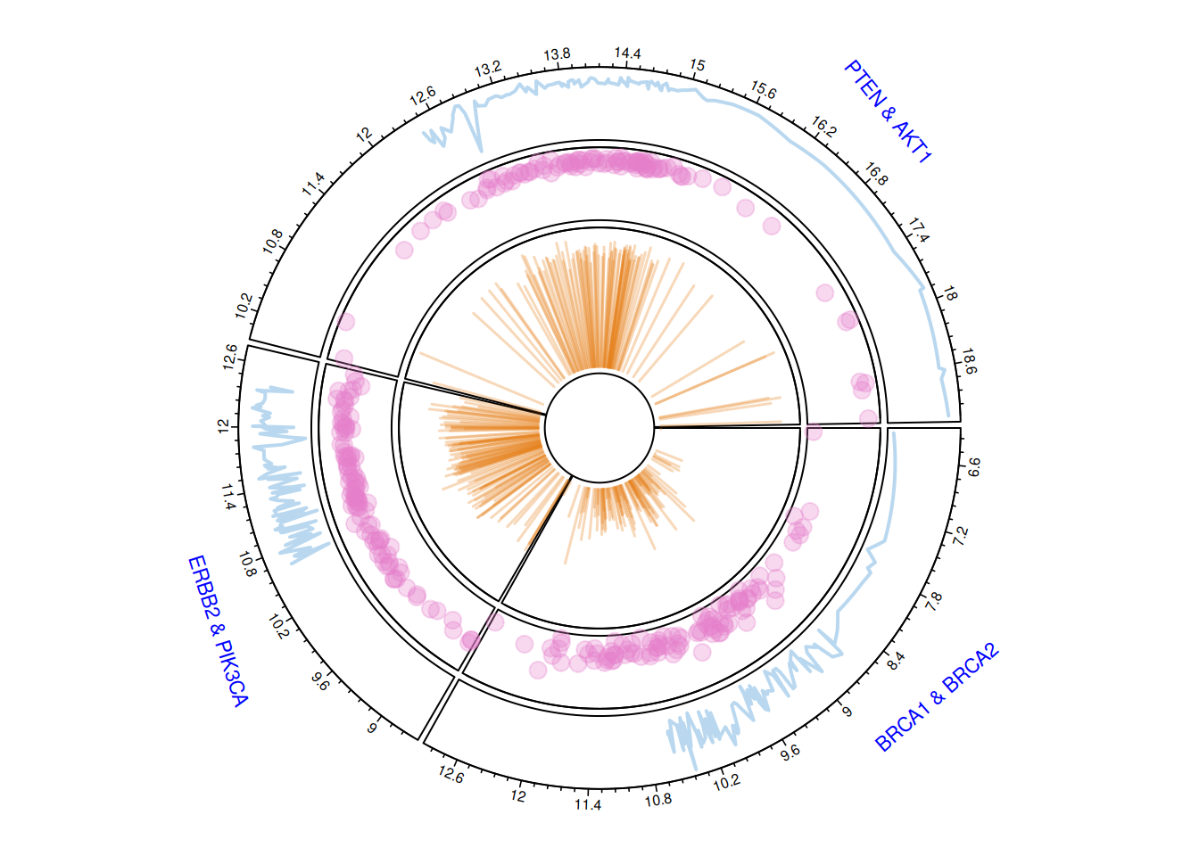
circos.clear()The multi-track circular plot displays gene expression data for three pairs of breast cancer-related genes (BRCA1 & BRCA2, ERBB2 & PIK3CA, PTEN & AKT1). Different tracks utilize line plots, scatter plots, and bar charts to show the overall trend of gene expression, the distribution of data points, and the magnitude of change. The numbers on the outer ring represent the numerical range of gene expression levels, helping to understand the expression characteristics and interrelationships of different genes.
1.4 Draw a part
The circlize package allows you to use the circos.par() function to display only a portion of the circular chart.
circos.clear()
# Adjust the pie chart parameters to narrow the view area.
par(mar = c(1, 2, 0.1, 0.1))  # Adjust margins
circos.par("track.height" = 0.7,       # Each track height
           "canvas.xlim" = c(0, 1),    # Horizontal limit range (zoom out view)
           "canvas.ylim" = c(0, 1),    # Vertical range limitation (zoom out view)
           "gap.degree" = 0,           # The angle between sectors
           "clock.wise" = FALSE)

circos.initialize(factors = plot_data$factor, xlim = c(0, 20))
circos.trackPlotRegion(factors = plot_data$factor, ylim = c(0, 20), bg.border = NA )

# Draw only the part where factor=a
circos.updatePlotRegion(sector.index = "a", bg.border = "grey" , bg.lwd=0.2)
circos.lines(plot_data$x, plot_data$y, pch = 16, cex = 0.5, type="h" , col="#69b3a2" , lwd=3)

# Add axis
circos.axis(h="bottom" , labels.cex=0.4, direction = "inside" )
circos.clear()2. Chord diagram
The circlize package also provides functionality for building chord diagrams. It allows adding arcs between nodes to show flow. The circos.links() function builds connections one by one, while the chordDiagram() function draws the entire dataset at once.
2.1 Add link
circos.clear()
par(mar = c(1, 1, 1, 1) )
circos.initialize(factors = plot_data$factor, x = plot_data$x)

circos.trackPlotRegion(factors = plot_data$factor, y = plot_data$y , bg.col = rgb(0.1,0.1,seq(0,1,0.1),0.4) , bg.border = NA)

# Add a line between two points.
circos.link("a", 3, "b", 3, h = 0.4)

# Add lines between points and regions
circos.link("b", 5, "c", c(6,8), col = "green", lwd = 2, lty = 2, border="black" )

# Add a line between the two areas.
circos.link("c", c(8.5, 9.5), "a", c(-1,0), col = "red", border = "blue", h = 0.2)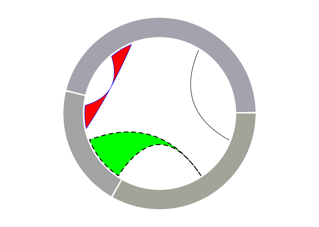
2.2 Basic Chord Diagram
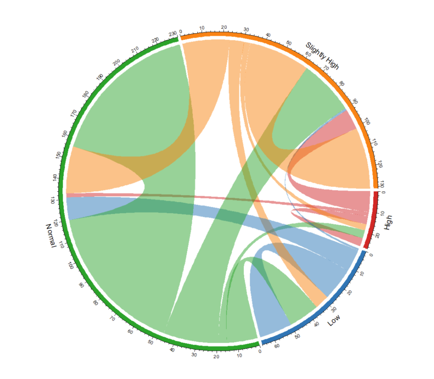
Taking Berberine_new as an example
chordDiagram(m, transparency = 0.5)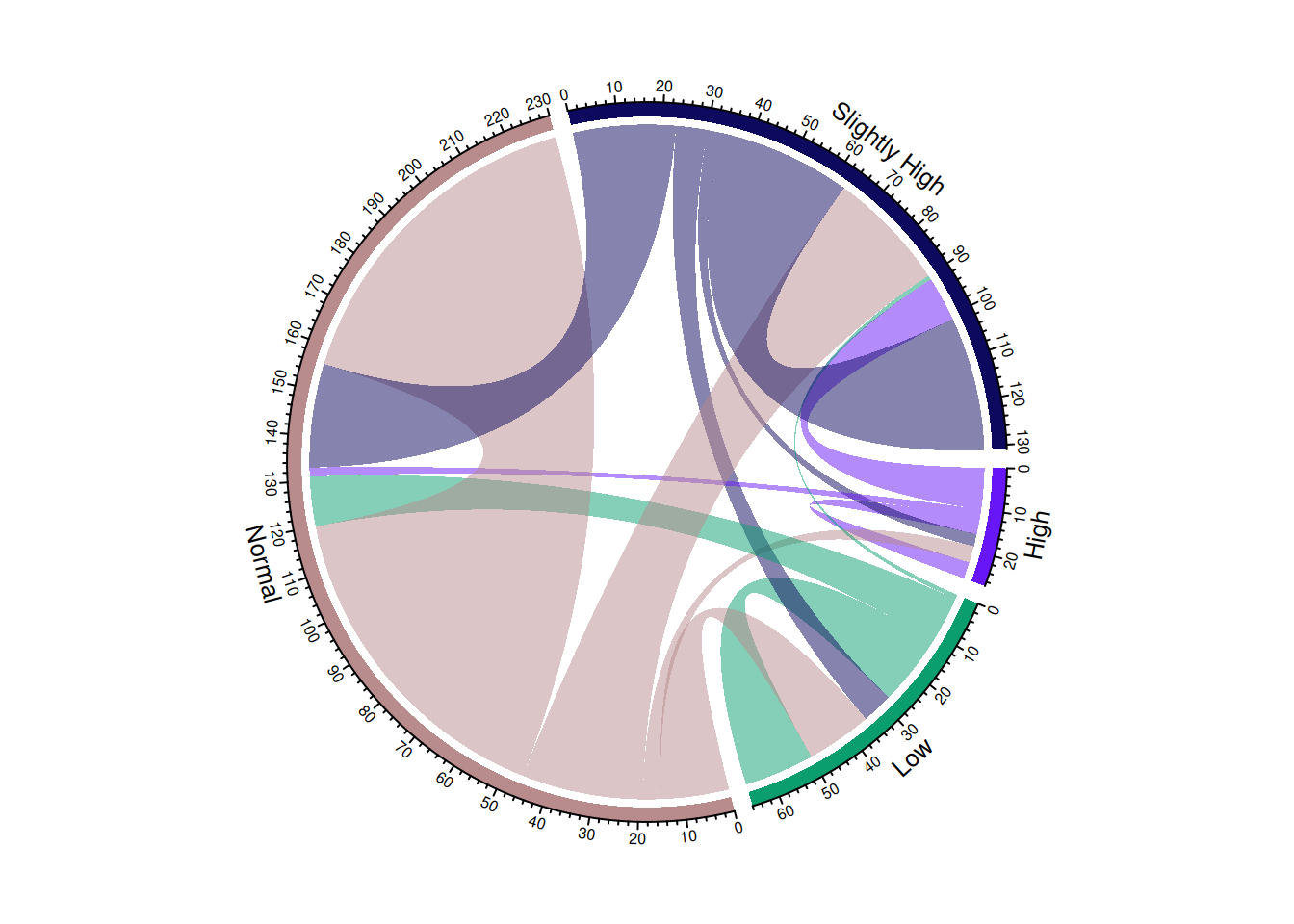
This chord diagram illustrates the change in blood sugar levels before and after taking a certain medication.
Define colors
color <- c(
  "Low" = "#1f77b4",
  "Normal" = "#2ca02c",
  "Slightly High" = "#ff7f0e",
  "High" = "#d62728"
)

chordDiagram(m, grid.col = color, transparency = 0.5)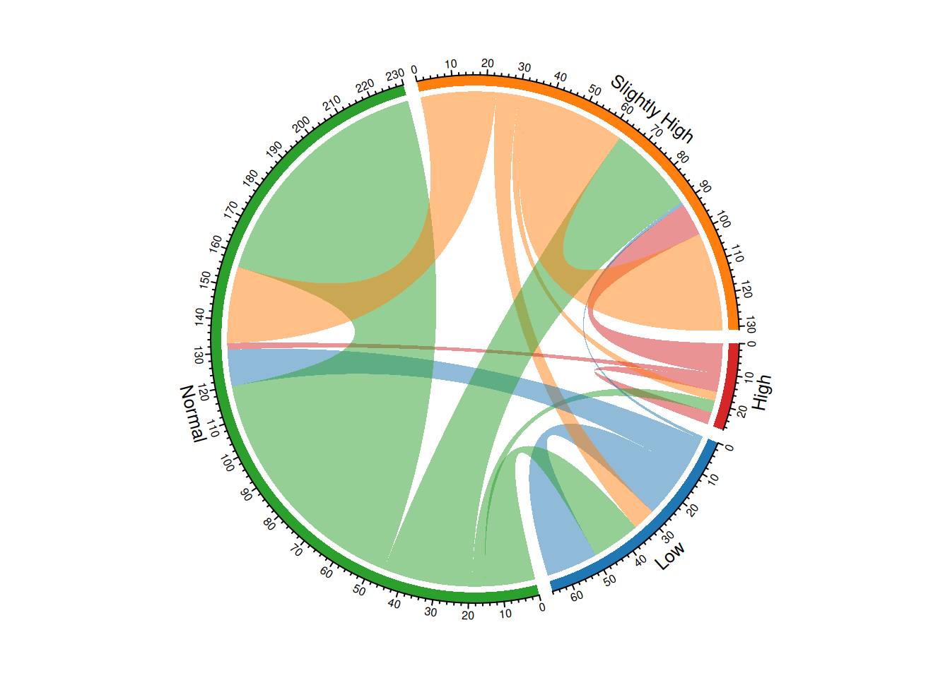
This chord diagram illustrates the change in blood sugar levels before and after taking a certain medication, and the colors are defined to better suit user reading habits.
2.3 Faceted chord diagram
Use the layout function to define the layout.
layout(matrix(c(1, 2), nrow = 1, byrow = TRUE))

chordDiagram(m, transparency = 0.5)
chordDiagram(m, transparency = 0.5) # chordDiagram() automatically assigns colors and generates two different chord diagrams.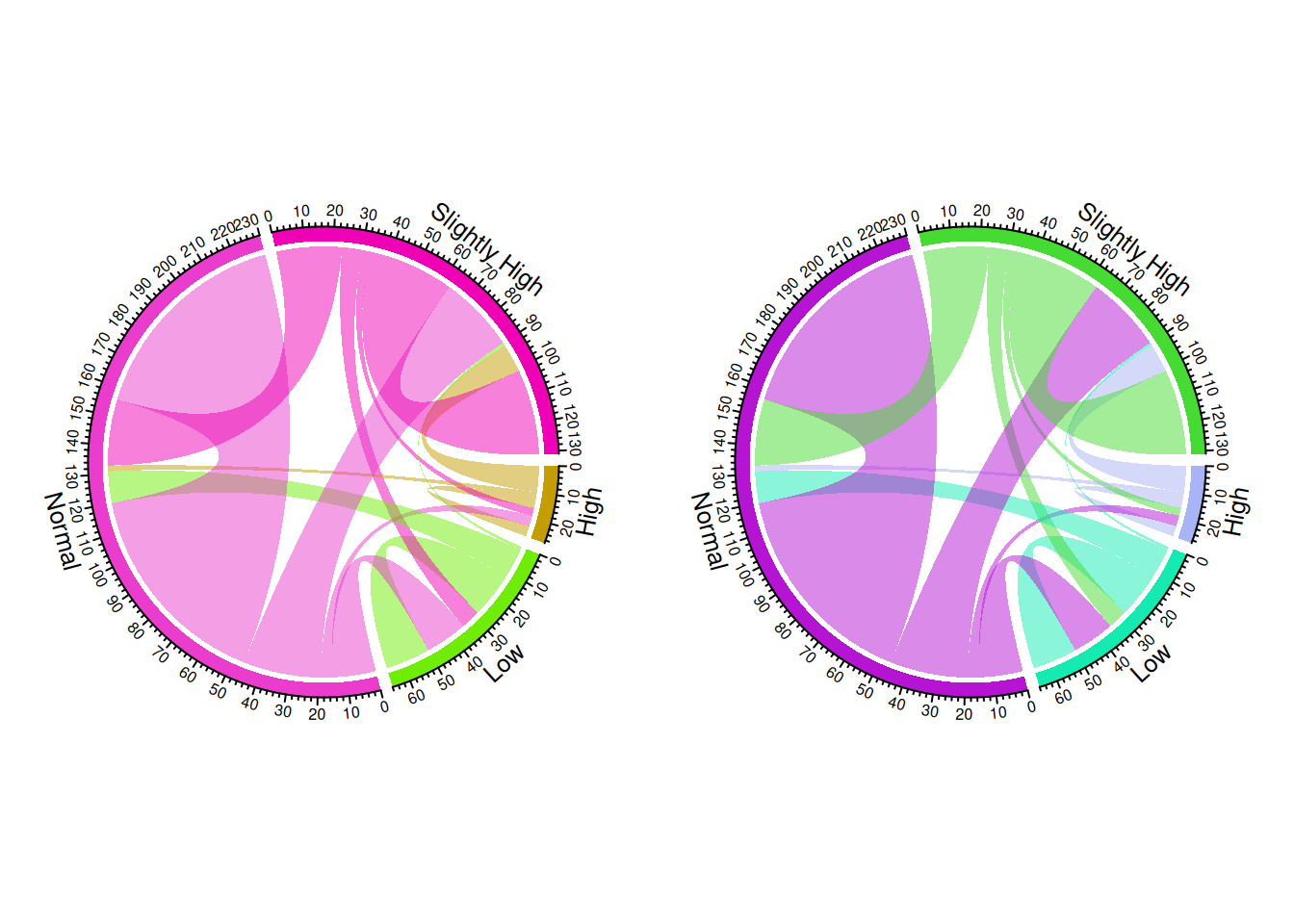
2.4 Directional layered chord diagram
In the directional layered chord diagram, the arrows clearly indicate the direction of flow, highlighting the directionality of the flow through different heights, while also increasing the visual hierarchy of the graphic.
# Convert the matrix to long format.
data_long <- as.data.frame(as.table(m)) %>%
  rename(from = Var1, to = Var2, value = Freq)

# Set color
category_colors <- viridis(4)
grid_col <- category_colors[unique(c(data_long$from, data_long$to))]

# Setting parameters for the circular plot
circos.clear()
circos.par(start.degree = 90, gap.degree = 4, track.margin = c(-0.1, 0.1), points.overflow.warning = FALSE)
par(mar = rep(0, 4))

# Draw a circular plot
chordDiagram(
  x = data_long,
  grid.col = grid_col,
  transparency = 0.25,
  directional = 1,
  direction.type = c("arrows", "diffHeight"),
  diffHeight  = -0.04,
  annotationTrack = "grid",
  annotationTrackHeight = c(0.05, 0.1),
  link.arr.type = "big.arrow",
  link.sort = TRUE,
  link.largest.ontop = TRUE
)

# Add text and axes
circos.trackPlotRegion(
  track.index = 1,
  bg.border = NA,
  panel.fun = function(x, y) {

    xlim = get.cell.meta.data("xlim")
    sector.index = get.cell.meta.data("sector.index")

    # Add a name to each sector
    circos.text(
      x = mean(xlim),
      y = 3.2,
      labels = sector.index,
      facing = "bending",
      cex = 0.8
    )
  }
)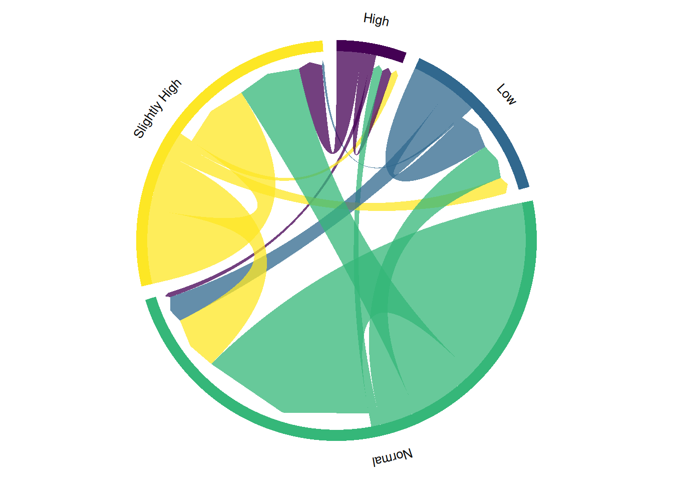
This chord diagram illustrates the change in blood glucose levels before and after taking a certain medication. Directional hierarchical chord diagrams, by adding arrows and a hierarchical structure, can more clearly show the direction and intensity of data flow, helping to identify the relationships between different categories and information transmission paths, thus enhancing data visualization and understanding.
2.5 Highly customized chord diagrams
You can manually add links using the circos.link() function to build a highly customized chord graph.
The circlize package provides the chordDiagram() function, which can automatically build the entire chord graph, but its customization is less advanced.
# Define categories and colors
categories <- rownames(m)
category_colors <- data.frame(
  category = categories,
  r = c(255, 200, 150, 100),
  g = c(100, 150, 200, 255),
  b = c(150, 100, 50, 200)
)

df1 <- category_colors
df1$xmin <- 0  # Starting point is 0
df1$xmax <- rowSums(m) + colSums(m)  # Total traffic (inflow + outflow) for each category
df1$rcol <- rgb(df1$r, df1$g, df1$b, max = 255)  # Section Color
df1$lcol <- rgb(df1$r, df1$g, df1$b, alpha = 200, max = 255)  # Link color (transparent)

library(circlize)

# circular plot initialization
par(mar = rep(0, 4))
circos.clear()
circos.par(cell.padding = c(0, 0, 0, 0), track.margin = c(0, 0.1), start.degree = 90, gap.degree = 4)

circos.initialize(factors = df1$category, xlim = cbind(df1$xmin, df1$xmax))
circos.trackPlotRegion(ylim = c(0, 1), factors = df1$category, track.height = 0.1,
                       panel.fun = function(x, y) {
                         name = get.cell.meta.data("sector.index")
                         i = get.cell.meta.data("sector.numeric.index")
                         xlim = get.cell.meta.data("xlim")
                         ylim = get.cell.meta.data("ylim")

                         # Draw labels and sections
                         circos.text(x = mean(xlim), y = 1.2, labels = name, facing = "bending.inside", cex = 0.6, adj = c(0.5, 0.5))
                         circos.rect(xleft = xlim[1], ybottom = ylim[1], xright = xlim[2], ytop = ylim[2],
                                     col = df1$rcol[i], border = df1$rcol[i])
                       })

df1$sum1 <- colSums(m)  # Cumulative outflow
df1$sum2 <- numeric(nrow(df1))  # Cumulative inflow

# Draw links by traversing the adjacency matrix
for (i in 1:nrow(m)) {
  for (j in 1:ncol(m)) {
    if (m[i, j] > 0) {  # Only draw links with values
      circos.link(sector.index1 = df1$category[i], point1 = c(df1$sum1[i], df1$sum1[i] + m[i, j]),
                  sector.index2 = df1$category[j], point2 = c(df1$sum2[j], df1$sum2[j] + m[i, j]),
                  col = df1$lcol[i])

      # Update cumulative value
      df1$sum1[i] <- df1$sum1[i] + m[i, j]
      df1$sum2[j] <- df1$sum2[j] + m[i, j]
    }
  }
}
2.6 Interactive Chord Diagram
Interactivity makes chord diagrams easier to understand. In interactive chord diagrams, you can hover over specific groups to highlight all their connections.
# Assign colors
category <- c("Low", "Normal", "Slightly High", "High")
dimnames(m) <- list(
  have = category,
  prefer = category
)
groupColors <- c("#ADD9EE", "#7B92C7", "#F7C1CF", "#FFD47F")

p <- chorddiag(m, groupColors = groupColors, groupnamePadding = 20)
p
Interactive Chord Diagram
# Save
# library(htmlwidgets)
# saveWidget(p, file=paste0( getwd(), "/HtmlWidget/chord_interactive.html"))
This chord diagram illustrates the change in blood glucose levels before and after taking a certain medication. Interactive chord diagrams allow users to dynamically explore the data, viewing more detailed information with the mouse, thus enabling more flexible analysis of complex relationships and data flows, and improving data operability and comprehension.
Applications
1. Basic chord diagram
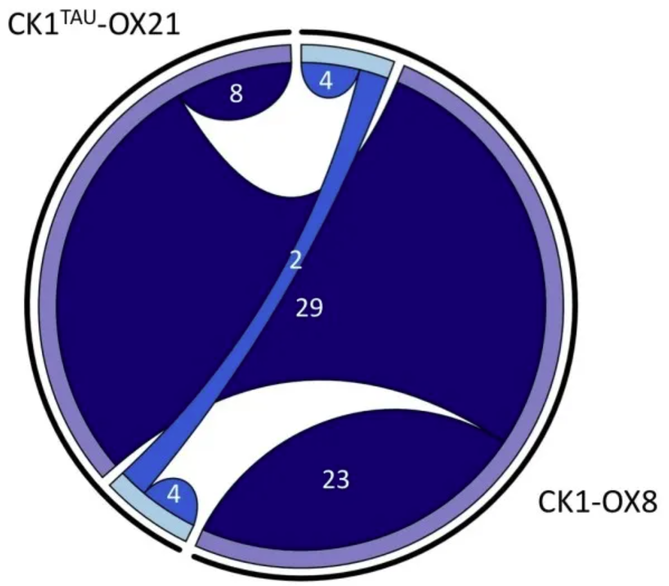
Overlap between phosphorylation site differences in CK1tau and CK1 overexpression. The chord plot shows the number of identified phosphorylation sites whose abundance differed significantly from the generatrix in the phosphorylated proteomics analysis described here (>1.5 or <0.67 fold change, p < 0.05, n = 5). Shared chords indicate overlap between the two datasets. Upregulated peptides are shown in dark blue, and downregulated peptides in light blue. [1]
2. Faceted chord diagram
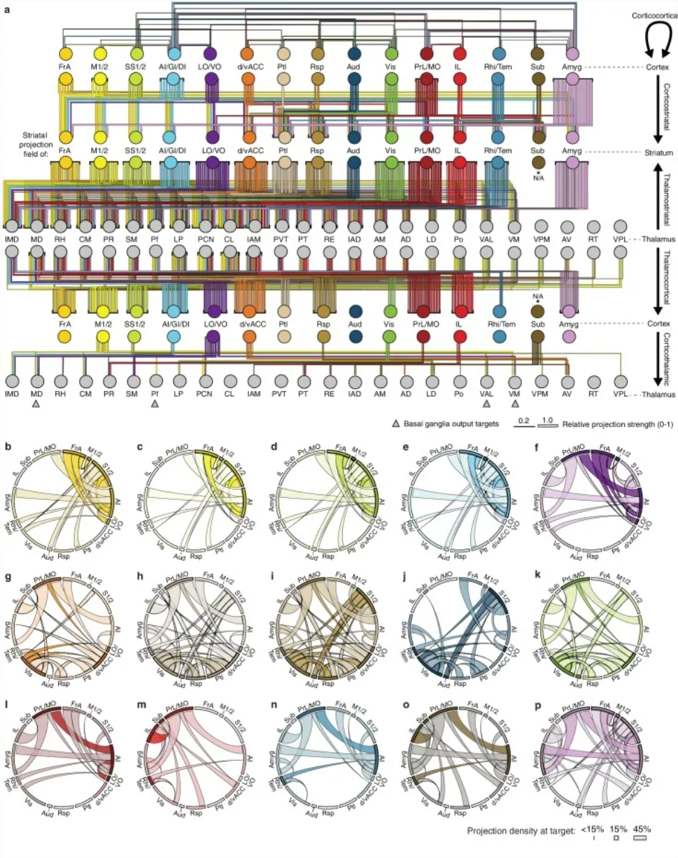
An overview of the network interactions of the entire cortico-thalamic-basal ganglia circuit, divided by subregions. [2]
3. Directional layered chord diagram
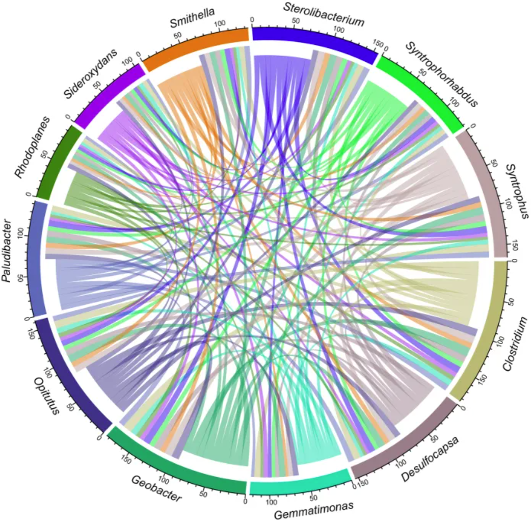
The chord diagram illustrates the network relationships of 12 specific species coexisting in an uncontaminated permafrost sample.[3]
4. Highly customized chord diagrams
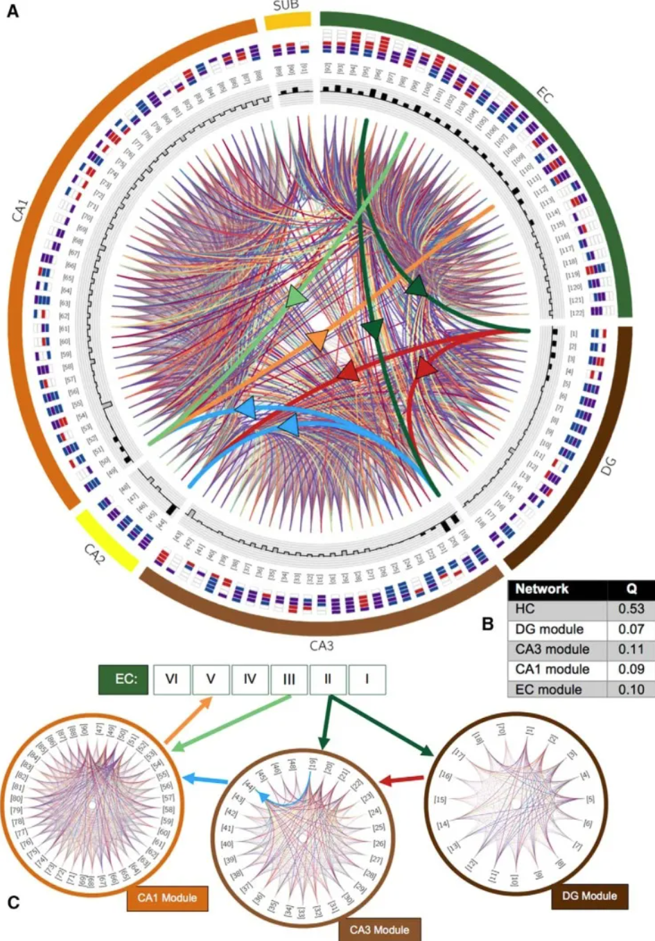
Modular structure of the potential hippocampal connectome. A, Chord diagram of potential connections between all 122 types. Thick chords with arrows emphasize trisynaptic loops (dark green, perforation pathway; light green, temporal pathway; red, moss fibers; blue, Schaffer collaterals; orange, projection from CA1 to EC layer V); other connections are randomly colored to optimize visibility. Types are indicated by numbers in brackets and axon-dendritic patterns within subregions of their cell body location (color boxes convention and layer order; CA1 layers: SLM, SR, SP, SO; sublayers: molecular layer, SP, polymorphic layer; EC: I-VI). Shaded bars in the innermost loops indicate the total number of (signed) connections established by that type; excitatory types have outward-facing black bars, and inhibitory types have inward-facing gray bars. B, Modularity score (Q) of the entire network and the four detected modules. C, the community is closely related to DG (component connection density 75.9%), CA3 (59.3%), CA1 (64.6%) and EC (70.1%; not shown). [4]
Reference
[1] van Ooijen G, Martin SF, Barrios-Llerena ME, Hindle M, Le Bihan T, O’Neill JS, Millar AJ. Functional analysis of the rodent CK1tau mutation in the circadian clock of a marine unicellular alga. BMC Cell Biol. 2013 Oct 15;14:46. doi: 10.1186/1471-2121-14-46. PMID: 24127907; PMCID: PMC3852742.
[2] Hunnicutt BJ, Jongbloets BC, Birdsong WT, Gertz KJ, Zhong H, Mao T. A comprehensive excitatory input map of the striatum reveals novel functional organization. Elife. 2016 Nov 28;5:e19103. doi: 10.7554/eLife.19103. PMID: 27892854; PMCID: PMC5207773.
[3] Yang S, Wen X, Shi Y, Liebner S, Jin H, Perfumo A. Hydrocarbon degraders establish at the costs of microbial richness, abundance and keystone taxa after crude oil contamination in permafrost environments. Sci Rep. 2016 Nov 25;6:37473. doi: 10.1038/srep37473. PMID: 27886221; PMCID: PMC5122841.
[4] Rees CL, Wheeler DW, Hamilton DJ, White CM, Komendantov AO, Ascoli GA. Graph Theoretic and Motif Analyses of the Hippocampal Neuron Type Potential Connectome. eNeuro. 2016 Nov 18;3(6):ENEURO.0205-16.2016. doi: 10.1523/ENEURO.0205-16.2016. PMID: 27896314; PMCID: PMC5114701.
[5] Gu, Z. (2020). circlize: Circular visualization in R. https://cran.r-project.org/package=circlize
[6] Wickham, H. (2021). readxl: Read Excel Files. https://cran.r-project.org/package=readxl
[7] Wickham, H. (2021). dplyr: A Grammar of Data Manipulation. https://cran.r-project.org/package=dplyr
[8] Csardi, G., & Nepusz, T. (2006). igraph: Complex network analysis. https://cran.r-project.org/package=igraph
[9] Wickham, H. (2016). ggraph: An implementation of grammar of graphics for graphs and networks. https://cran.r-project.org/package=ggraph
[10] Wickham, H., & François, R. (2021). tidygraph: A tidy API for graph manipulation. https://cran.r-project.org/package=tidygraph