# Install packages
if (!requireNamespace("ggplot2", quietly = TRUE)) {
  install.packages("ggplot2")
}
if (!requireNamespace("waffle", quietly = TRUE)) {
  install.packages("waffle")
}
if (!requireNamespace("dplyr", quietly = TRUE)) {
  install.packages("dplyr")
}

# Load packages
library(ggplot2)
library(waffle)
library(dplyr)Waffle Chart
A waffle chart visually represents categorical data using a grid of small squares that resemble waffles. Each category is assigned a unique color, and the number of squares assigned to each category corresponds to its proportion in the total data count.
Example
Setup
System Requirements: Cross-platform (Linux/MacOS/Windows)
Programming Language: R
Dependencies:
ggplot2,waffle,dplyr
sessioninfo::session_info("attached")─ Session info ───────────────────────────────────────────────────────────────
setting value
version R version 4.6.0 (2026-04-24)
os Ubuntu 24.04.4 LTS
system x86_64, linux-gnu
ui X11
language (EN)
collate C.UTF-8
ctype C.UTF-8
tz UTC
date 2026-05-09
pandoc 3.1.3 @ /usr/bin/ (via rmarkdown)
quarto 1.9.37 @ /usr/local/bin/quarto
─ Packages ───────────────────────────────────────────────────────────────────
package * version date (UTC) lib source
dplyr * 1.2.1 2026-04-03 [1] RSPM
ggplot2 * 4.0.3.9000 2026-05-04 [1] Github (tidyverse/ggplot2@6870419)
waffle * 1.0.2 2026-05-04 [1] Github (hrbrmstr/waffle@767875b)
[1] /home/runner/work/_temp/Library
[2] /opt/R/4.6.0/lib/R/site-library
[3] /opt/R/4.6.0/lib/R/library
* ── Packages attached to the search path.
──────────────────────────────────────────────────────────────────────────────Data Preparation
It primarily utilizes the TCGA database and the built-in R dataset mtcars.
# 1.TCGA database (clinical data on lung cancer in 2020)
TCGA_cli_df <- readr::read_tsv("https://bizard-1301043367.cos.ap-guangzhou.myqcloud.com/raponi2006_public_raponi2006_public_clinicalMatrix.gz")
# Data Preparation
counts <- table(TCGA_cli_df$T)
counts <- as.data.frame(counts)
names(counts)[names(counts) == "Var1"] <- "T"

# 2.R built-in data - mtcars
counts1 <- table(mtcars$cyl)
counts1 <- as.data.frame(counts1)
names(counts1)[names(counts1) == "Var1"] <- "cyl"

# 3.Self-created dataset
data <- data.frame(
  group = c("First group", "First group", "First group", "First group",
            "First group", "First group", "Second group", "Second group",
            "Second group", "Second group", "Third group", "Third group"),
  subgroup = c("A", "B", "C", "D", "E", "F", "A", "B", "C", "D", "A", "B"),
  value = c(10, 20, 30, 40, 50, 60, 70, 80, 90, 100, 110, 120)
)
Visualization
1. Basic plot (Waffle package)
1.1 Basic Code
Taking TCGA data as an example
waffle(counts)
This waffle chart illustrates the proportion of different tumor stages in the total sample.
1.2 Beautify plot
-
rows: The number of rows in the block, defaults to 10. -
xlab: Text below the chart, recommended for describing the meaning of each square, e.g., “1 sq == 1000”. -
title: Chart title. -
colors: An array of colors equal to the number of values inparts. If omitted, the Color Brewer “Set2” colors are used. -
size: Width of the separator between blocks, defaults to 2. -
flip: Flips the x and y axes. -
pad: How many blocks to use to fill the grid. -
glyph_size: Glyph size. -
legend_pos: Legend position.
waffle(counts,rows = 5,
       colors = c("#fb5607", "#8338ec","yellow", "blue"),
       size = 4,flip = F,glyph_size=3,legend_pos="bottom")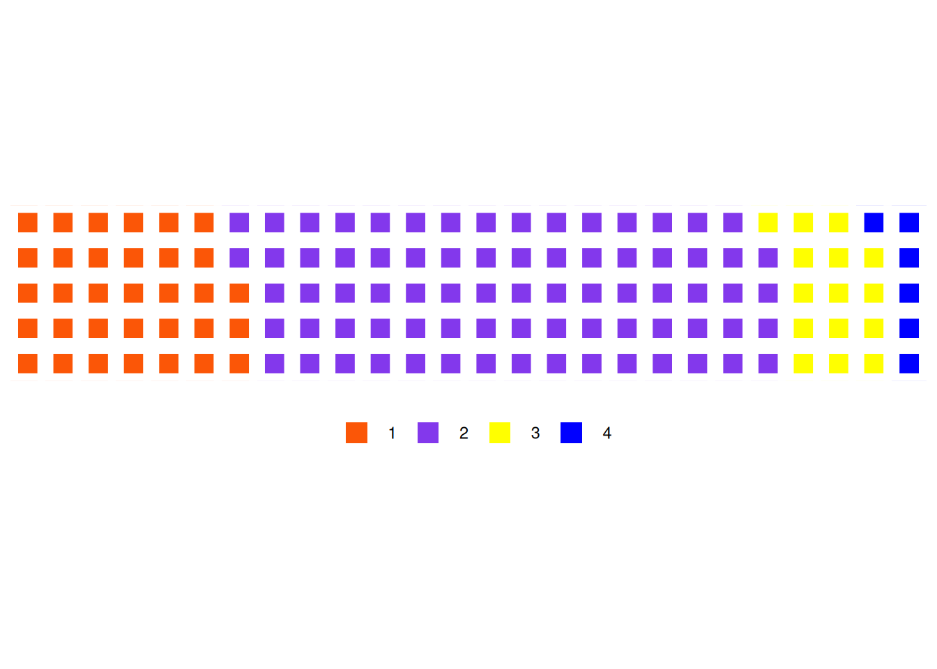
This figure illustrates the proportion of different tumor stages in the total sample.
1.3 Taking the mtcars database as an example
waffle(counts1)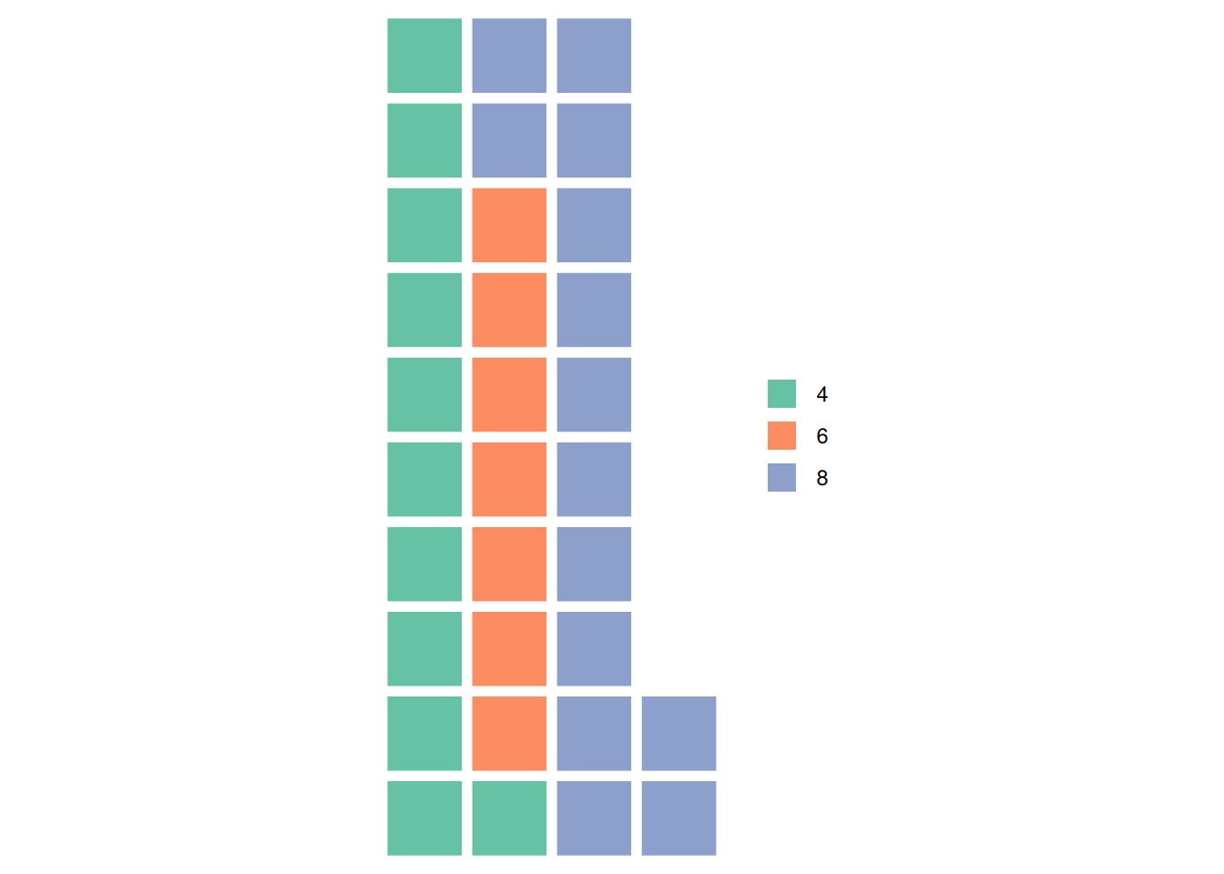
This graph illustrates the proportion of different cylinder counts in the total sample of the mtcars dataset.
2. Basic plot (ggplot2 package)
2.1 Basic Code
Taking TCGA data as an example
ggplot(counts, aes(fill=T, values=Freq)) +
  geom_waffle() +
  theme_void()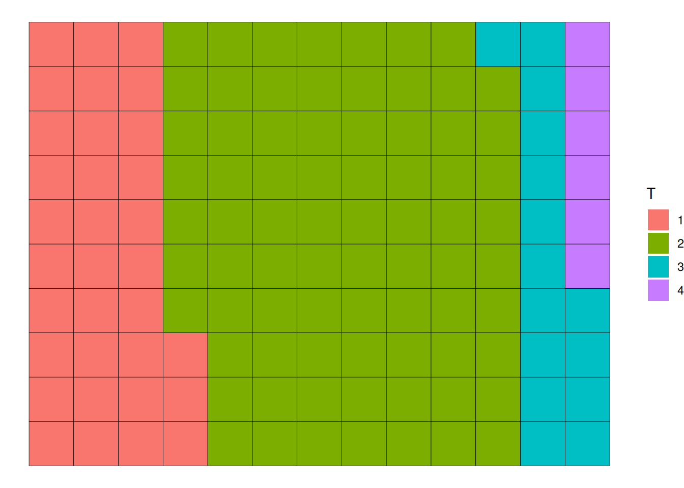
TCGA data as an exampleThis waffle chart illustrates the proportion of different tumor stages in the total sample.
2.2 Beautify plot
-
n_rows: This parameter sets the number of rows in the waffle chart. The default is 10. -
xlab: The text below the chart, recommended to describe the meaning of each square, such as “1 sq == 1000”. -
title: The chart title. -
scale_fill_manual(): Changes the color. -
labels: Changes the labels. -
size: This parameter sets the width of the separator between squares. The default is 2. -
radius: This parameter sets the corner radius of the squares. It can be controlled by specifying thegrid::unit()value. For example,radius = unit(4, "pt")adds rounded corners to the squares, changing their shape. -
flip: If set to TRUE, flips the x and y coordinates, andn_rowsbecomesn_cols, which helps achieve a waffle bar chart effect. The default is FALSE.
ggplot(counts, aes(fill=T, values=Freq)) +
  geom_waffle(color = "white",radius = unit(4, "pt")) +
  scale_fill_manual(values = c("#999999", "#E69F00", "#56B4E9","red")) +
  theme_void()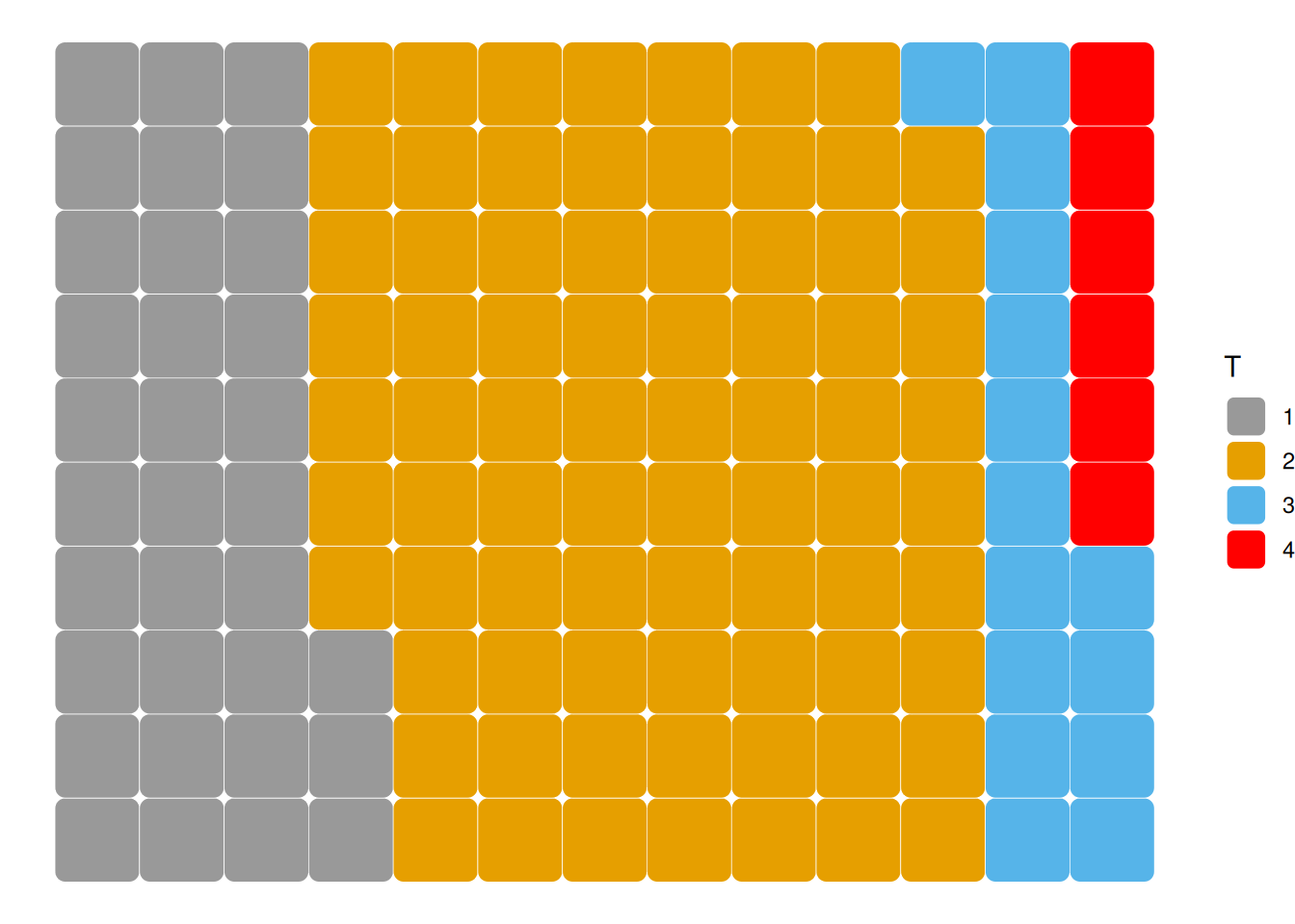
This figure illustrates the proportion of different tumor stages in the total sample.
2.3 Taking the mtcars database as an example
ggplot(counts1, aes(fill=cyl, values=Freq)) +
  geom_waffle(color = "white",row=8) +
  scale_fill_manual(values = c("#999999", "#E69F00", "#56B4E9")) +
  theme_void()+
  geom_waffle(size = 0.1)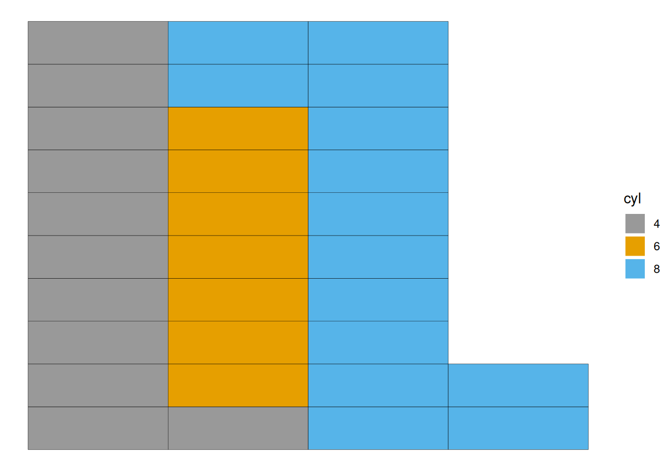
This graph illustrates the proportion of different cylinder counts in the total sample of the mtcars data.
2.4 Grouping
geom_waffle() can be used to build waffle charts with groups and subgroups.
The fill parameter is used to color the chart by group.
ggplot(data = data, aes(fill=subgroup, values=value)) +
  geom_waffle(color = "white", size = 1.125, n_rows = 6) +
  facet_wrap(~group, ncol=1) +
theme_void()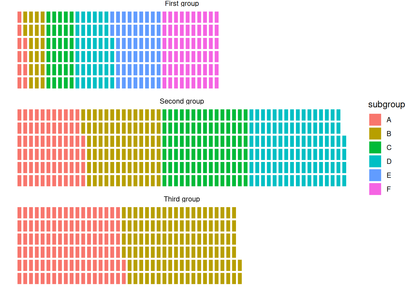
This waffle chart shows the distribution of elements within three different groups in the dataset.
Enhancing the Graphics
The colors of the waffle chart can be customized using the scale_fill_manual() function.
ggplot(data = data, aes(fill=subgroup, values=value)) +
  geom_waffle(color = "white", size = 1.125, n_rows = 6) +
  facet_wrap(~group, ncol=1) +
theme_void() +
  scale_fill_manual(values = c("#69b3a2", "#404080", "#FFA07A", "#FFD700", "#FF6347", "#4682B4"))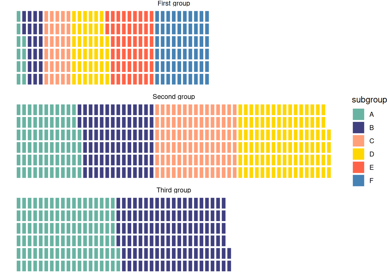
This waffle chart illustrates the distribution of elements within three different groups in the dataset.
Applications
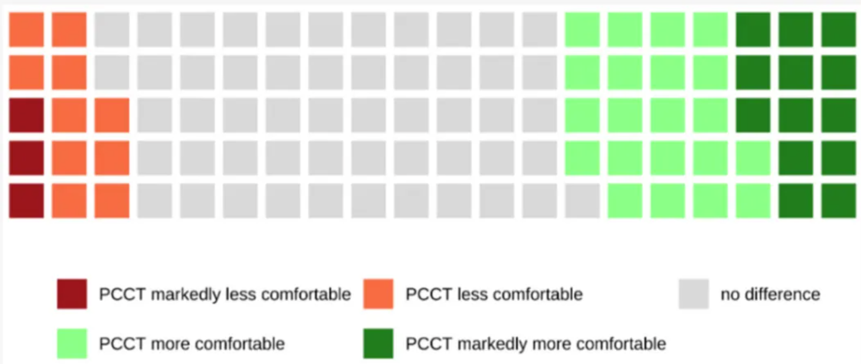
Waffle diagrams are used to illustrate the impact of different factors on patient comfort. [1]
Reference
[1] Niehoff JH, Heuser A, Michael AE, Lennartz S, Borggrefe J, Kroeger JR. Patient Comfort in Modern Computed Tomography: What Really Counts. Tomography. 2022 May 23;8(3):1401-1412. doi: 10.3390/tomography8030113. PMID: 35645399; PMCID: PMC9149918.
[2] Wickham, H. (2016). ggplot2: Elegant Graphics for Data Analysis. Springer-Verlag New York. https://ggplot2.tidyverse.org
[3] Rudis B, Gandy D (2023). waffle: Create Waffle Chart Visualizations. R package version 1.0.2,https://CRAN.R-project.org/package=waffle.
[4] Wickham H, François R, Henry L, Müller K, Vaughan D (2023).dplyr: A Grammar of Data Manipulation. R package version 1.1.4, https://CRAN.R-project.org/package=dplyr.