# Install packages
if (!requireNamespace("data.table", quietly = TRUE)) {
  install.packages("data.table")
}
if (!requireNamespace("jsonlite", quietly = TRUE)) {
  install.packages("jsonlite")
}
if (!requireNamespace("ggplot2", quietly = TRUE)) {
  install.packages("ggplot2")
}
if (!requireNamespace("ggthemes", quietly = TRUE)) {
  install.packages("ggthemes")
}

# Load packages
library(data.table)
library(jsonlite)
library(ggplot2)
library(ggthemes)Line
Note
Hiplot website
This page is the tutorial for source code version of the Hiplot Line plugin. You can also use the Hiplot website to achieve no code ploting. For more information please see the following link:
The line chart is a statistical chart that USES a linear or logarithmic scale to draw data in a two - or three-dimensional view to show the data set or track the characteristics of the data over time.
Setup
System Requirements: Cross-platform (Linux/MacOS/Windows)
Programming language: R
Dependent packages:
data.table;jsonlite;ggplot2;ggthemes
sessioninfo::session_info("attached")─ Session info ───────────────────────────────────────────────────────────────
setting value
version R version 4.6.0 (2026-04-24)
os Ubuntu 24.04.4 LTS
system x86_64, linux-gnu
ui X11
language (EN)
collate C.UTF-8
ctype C.UTF-8
tz UTC
date 2026-05-09
pandoc 3.1.3 @ /usr/bin/ (via rmarkdown)
quarto 1.9.37 @ /usr/local/bin/quarto
─ Packages ───────────────────────────────────────────────────────────────────
package * version date (UTC) lib source
data.table * 1.18.4 2026-05-06 [1] RSPM
ggplot2 * 4.0.3.9000 2026-05-04 [1] Github (tidyverse/ggplot2@6870419)
ggthemes * 5.2.0 2025-11-30 [1] RSPM
jsonlite * 2.0.0 2025-03-27 [1] RSPM
[1] /home/runner/work/_temp/Library
[2] /opt/R/4.6.0/lib/R/site-library
[3] /opt/R/4.6.0/lib/R/library
* ── Packages attached to the search path.
──────────────────────────────────────────────────────────────────────────────Data Preparation
The loaded data are the horizontal axis values and their corresponding vertical axis values and groups.
# Load data
data <- data.table::fread(jsonlite::read_json("https://hiplot.cn/ui/basic/line/data.json")$exampleData$textarea[[1]])
data <- as.data.frame(data)

# Convert data structure
data[,3] <- factor(data[,3], levels = unique(data[,3]))

# View data
head(data)
Value1 Value2 Group
1 1 1 treat1
2 2 4 treat1
3 3 9 treat1
4 4 16 treat1
5 5 25 treat1
6 6 36 treat1Visualization
# Line
p <- ggplot(data, aes(x = Value1, y = Value2)) +
  geom_line(alpha = 1, aes(color = Group, linetype = Group)) +
  geom_point(aes(color = Group, shape = Group)) +
  ggtitle("Line Regression Plot") +
  scale_fill_manual(values = c("#e04d39","#5bbad6")) +
  theme_stata() +
  theme(text = element_text(family = "Arial"),
        plot.title = element_text(size = 12,hjust = 0.5),
        axis.title = element_text(size = 12),
        axis.text = element_text(size = 10),
        axis.text.x = element_text(angle = 0, hjust = 0.5,vjust = 1),
        legend.position = "right",
        legend.direction = "vertical",
        legend.title = element_text(size = 10),
        legend.text = element_text(size = 10))

p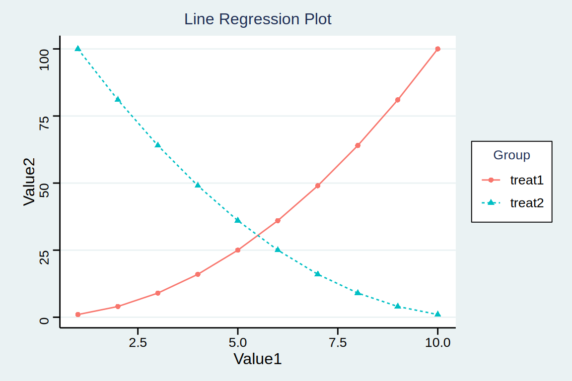
The diagram shows that value1 is positively correlated with Value2 in treatment plan 1, while Value1 is negatively correlated with Value2 in treatment plan 2.