# Install packages
if (!requireNamespace("ggplot2", quietly = TRUE)) {
  install.packages("ggplot2")
}

# Load packages
library(ggplot2)Donut Chart
A donut chart is a circular plot divided into sectors, each sector representing a part of the whole. It is very similar to a pie chart and can be constructed in ggplot2 and basic R.
Example
Setup
System Requirements: Cross-platform (Linux/MacOS/Windows)
Programming Language: R
Dependencies:
ggplot2
sessioninfo::session_info("attached")─ Session info ───────────────────────────────────────────────────────────────
setting value
version R version 4.6.0 (2026-04-24)
os Ubuntu 24.04.4 LTS
system x86_64, linux-gnu
ui X11
language (EN)
collate C.UTF-8
ctype C.UTF-8
tz UTC
date 2026-05-09
pandoc 3.1.3 @ /usr/bin/ (via rmarkdown)
quarto 1.9.37 @ /usr/local/bin/quarto
─ Packages ───────────────────────────────────────────────────────────────────
package * version date (UTC) lib source
ggplot2 * 4.0.3.9000 2026-05-04 [1] Github (tidyverse/ggplot2@6870419)
[1] /home/runner/work/_temp/Library
[2] /opt/R/4.6.0/lib/R/site-library
[3] /opt/R/4.6.0/lib/R/library
* ── Packages attached to the search path.
──────────────────────────────────────────────────────────────────────────────Data Preparation
The main use of the TCGA database and the R built-in dataset mtcars.
# 1.TCGA database (clinical data on lung cancer in 2020)
TCGA_cli_df <- readr::read_tsv("https://bizard-1301043367.cos.ap-guangzhou.myqcloud.com/raponi2006_public_raponi2006_public_clinicalMatrix.gz")

# 2.R built-in data - mtcars
head(mtcars)
mpg cyl disp hp drat wt qsec vs am gear carb
Mazda RX4 21.0 6 160 110 3.90 2.620 16.46 0 1 4 4
Mazda RX4 Wag 21.0 6 160 110 3.90 2.875 17.02 0 1 4 4
Datsun 710 22.8 4 108 93 3.85 2.320 18.61 1 1 4 1
Hornet 4 Drive 21.4 6 258 110 3.08 3.215 19.44 1 0 3 1
Hornet Sportabout 18.7 8 360 175 3.15 3.440 17.02 0 0 3 2
Valiant 18.1 6 225 105 2.76 3.460 20.22 1 0 3 1Visualization
1. Basic Plotting
1.1 Taking TCGA data as an example
# Data Preparation
counts <- table(TCGA_cli_df$T)
counts <- as.data.frame(counts)
names(counts)[names(counts) == "Var1"] <- "T"
# Calculate percentage
counts$fraction = counts$Freq / sum(counts$Freq)
# Calculate the cumulative percentage (the value at the top of each rectangle).
counts$ymax = cumsum(counts$fraction)
# Calculate the bottom of each rectangle to determine the starting position
counts$ymin = c(0, head(counts$ymax, n=-1))
# Plot
p <- ggplot(counts, aes(ymax=ymax, ymin=ymin, xmax=4, xmin=3, fill=T)) +
  geom_rect() +
  coord_polar(theta="y") +
  xlim(c(2, 4))

p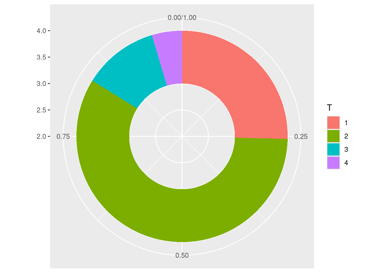
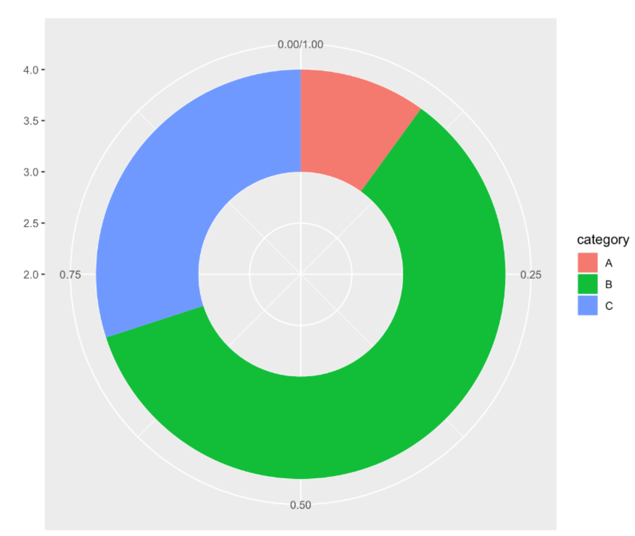
This donut chart describes the proportion of different tumor stages in the total sample.
1.2 Beautify plot
- Use
theme_void()to remove unnecessary backgrounds, axes, labels, etc. - Change the colors.
- Don’t use legends; add labels directly to the groups.
# Calculate percentage
counts$fraction = counts$Freq / sum(counts$Freq)
# Calculate the cumulative percentage (the value at the top of each rectangle).
counts$ymax = cumsum(counts$fraction)
# Calculate the bottom of each rectangle to determine the starting position
counts$ymin = c(0, head(counts$ymax, n=-1))
# Calculate label position
counts$labelPosition <- (counts$ymax + counts$ymin) / 2
# label Name
counts$label <- paste0(counts$T, "\n value: ", counts$Freq)
# Plot
p <- ggplot(counts, aes(ymax=ymax, ymin=ymin, xmax=4, xmin=3, fill=T)) +
  geom_rect() +
  geom_label( x=3.5, aes(y=labelPosition, label=label), size=6) + # This line of code controls the addition of labels to the chart, and removing it can delete labels.
  scale_fill_brewer(palette=4) +
  coord_polar(theta="y") +
  xlim(c(2, 4)) +
  theme_void() +
  theme(legend.position = "none")

p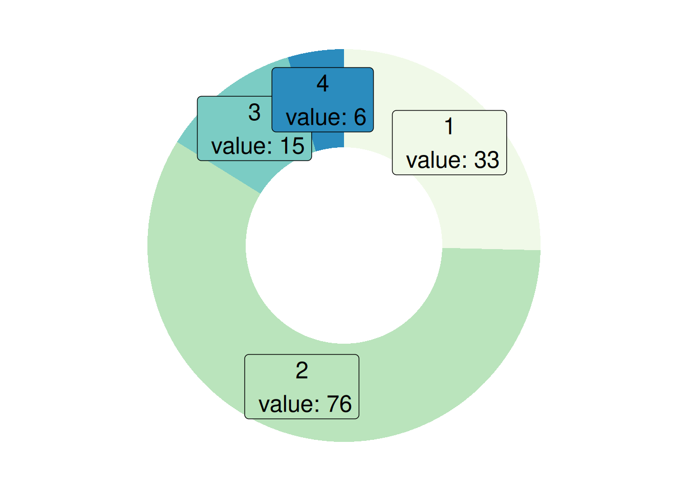
This donut chart describes the proportion of different tumor stages in the total sample.
1.3 Take mtcars data as an example
# Data Preparation
counts1 <- table(mtcars$cyl)
counts1 <- as.data.frame(counts1)
names(counts1)[names(counts1) == "Var1"] <- "cyl"
counts1$fraction = counts1$Freq / sum(counts1$Freq)
counts1$ymax = cumsum(counts1$fraction)
counts1$ymin = c(0, head(counts1$ymax, n=-1))
counts1$labelPosition <- (counts1$ymax + counts1$ymin) / 2
counts1$label <- paste0(counts1$T, "\n value: ", counts1$Freq)
p <- ggplot(counts1, aes(ymax=ymax, ymin=ymin, xmax=4, xmin=3, fill=cyl)) +
  geom_rect() +
  coord_polar(theta="y") +
  xlim(c(2, 4))

p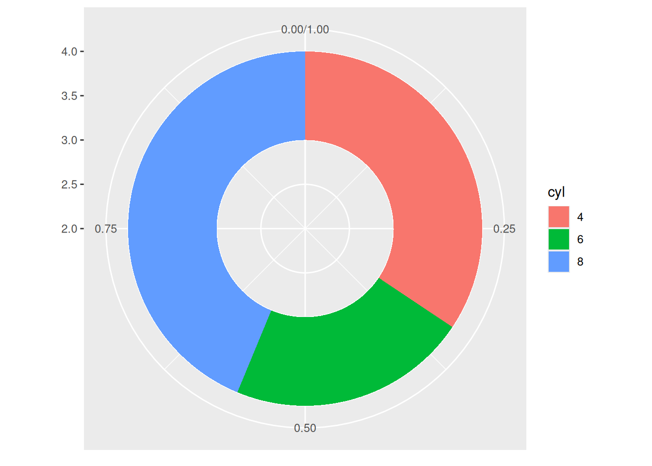
This donut chart describes the proportion of different cylinder numbers in the total sample.
2. Change the thickness of the ring
- If
xlimis set to a large left edge, there will be no empty rings. You’ll get a pie chart. - If
xlimis set to a low value, the rings will be thinner.
2.1 Taking TCGA data as an example
p <- ggplot(counts, aes(ymax=ymax, ymin=ymin, xmax=4, xmin=3, fill=T)) +
  geom_rect() +
  geom_text( x=2, aes(y=labelPosition, label=label, color=T), size=6) + # X controls the label position.
  scale_fill_brewer(palette="Set1") +
  scale_color_brewer(palette="Set1") +
  coord_polar(theta="y") +
  xlim(c(-1, 4)) +
  theme_void() +
  theme(legend.position = "none")

p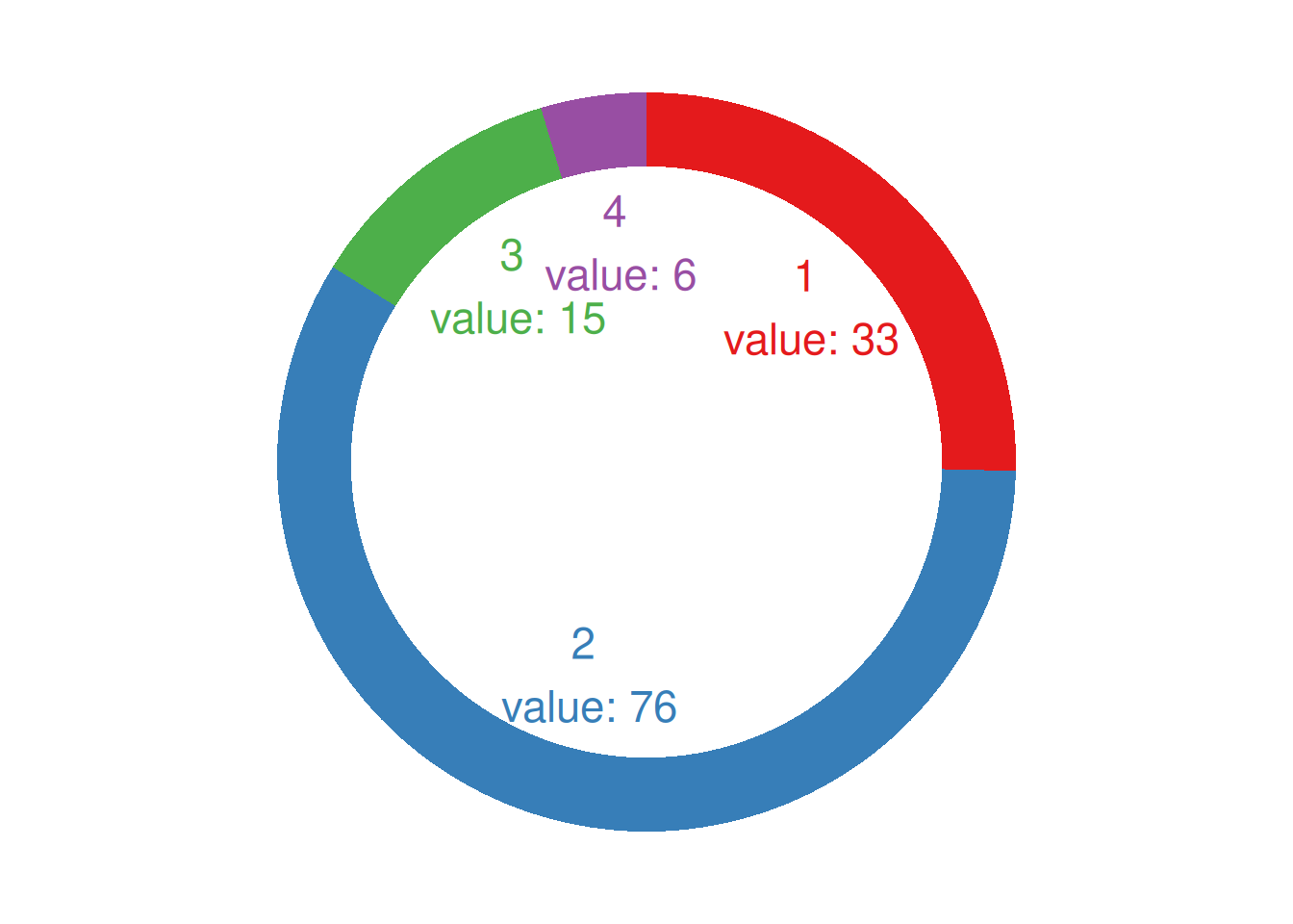
This donut chart describes the proportion of different tumor stages in the total sample.
2.2 Take mtcars data as an example
p <- ggplot(counts1, aes(ymax=ymax, ymin=ymin, xmax=4, xmin=3, fill=cyl)) +
  geom_rect() +
  geom_text( x=1.5, aes(y=labelPosition, label=label, color=cyl), size=6) + # X indicates whether the label position is inside or outside the loop.
  scale_fill_brewer(palette="Set2") +
  scale_color_brewer(palette="Set2") +
  coord_polar(theta="y") +
  xlim(c(-1, 4)) +
  theme_void() +
  theme(legend.position = "none")

p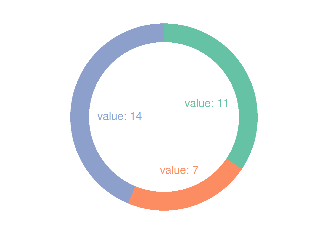
This donut chart describes the proportion of different cylinder numbers in the total sample.
Applications
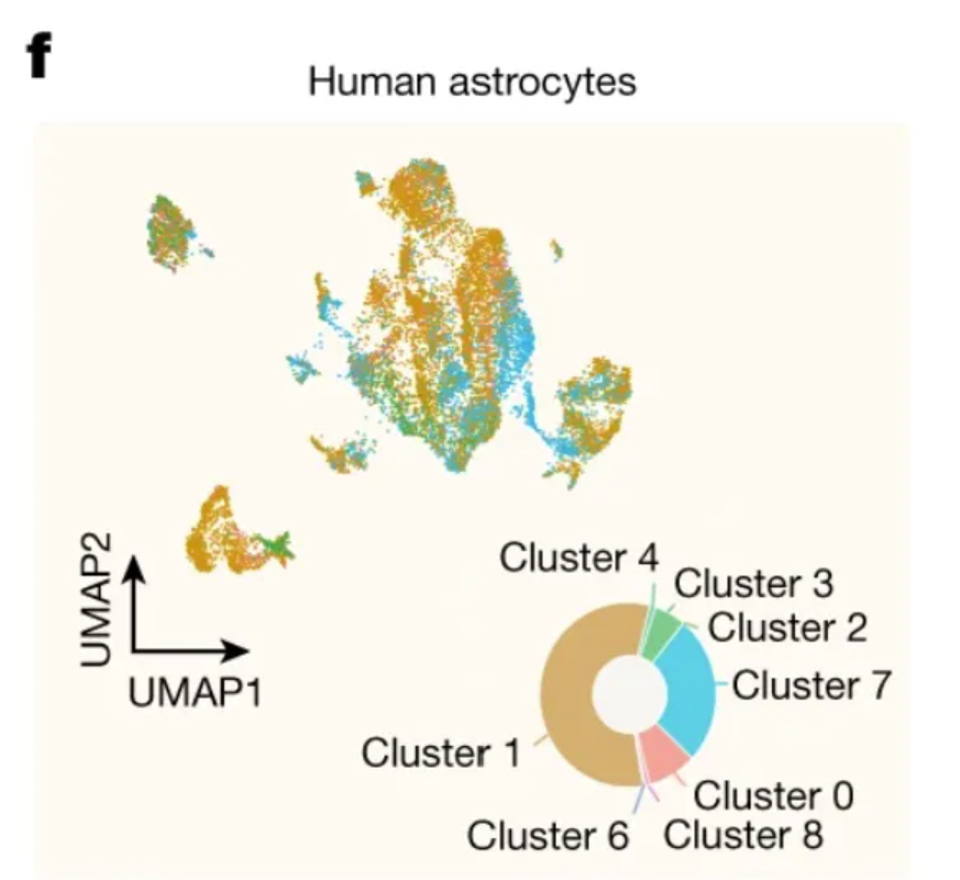
This circular plot shows the distribution among clusters of human hippocampal scRNA-seq data. [1]
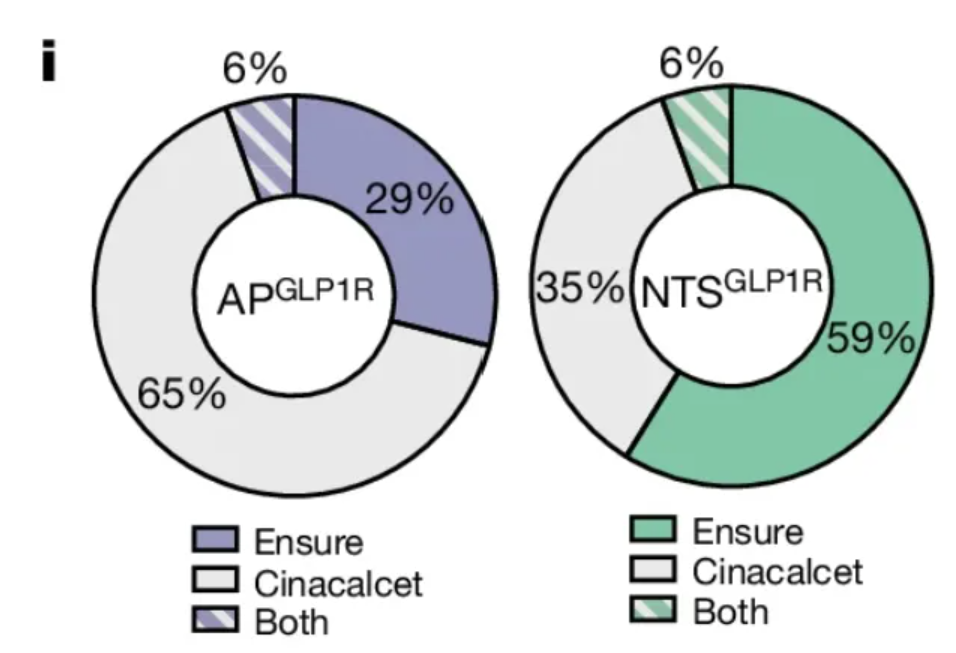
This circular diagram shows the proportion of activated APs in the two types of neurons. [1]
Reference
[1] de Ceglia R, Ledonne A, Litvin DG, Lind BL, Carriero G, Latagliata EC, Bindocci E, Di Castro MA, Savtchouk I, Vitali I, Ranjak A, Congiu M, Canonica T, Wisden W, Harris K, Mameli M, Mercuri N, Telley L, Volterra A. Specialized astrocytes mediate glutamatergic gliotransmission in the CNS. Nature. 2023 Oct;622(7981):120-129. doi: 10.1038/s41586-023-06502-w. Epub 2023 Sep 6. PMID: 37674083; PMCID: PMC10550825.
[2] Huang KP, Acosta AA, Ghidewon MY, McKnight AD, Almeida MS, Nyema NT, Hanchak ND, Patel N, Gbenou YSK, Adriaenssens AE, Bolding KA, Alhadeff AL. Dissociable hindbrain GLP1R circuits for satiety and aversion. Nature. 2024 Aug;632(8025):585-593. doi: 10.1038/s41586-024-07685-6. Epub 2024 Jul 10. PMID: 38987598.
[3] Wickham, H. (2016). ggplot2: Elegant Graphics for Data Analysis. Springer-Verlag New York. https://ggplot2.tidyverse.org