# Install packages
if (!requireNamespace("ggplot2", quietly = TRUE)) {
  install.packages("ggplot2")
}
if (!requireNamespace("RColorBrewer", quietly = TRUE)) {
  install.packages("RColorBrewer")
}
if (!requireNamespace("hexbin", quietly = TRUE)) {
  install.packages("hexbin")
}
if (!requireNamespace("MASS", quietly = TRUE)) {
  install.packages("MASS")
}
if (!requireNamespace("plotly", quietly = TRUE)) {
  install.packages("plotly")
}
if (!requireNamespace("mvtnorm", quietly = TRUE)) {
  install.packages("mvtnorm")
}
if (!requireNamespace("patchwork", quietly = TRUE)) {
  install.packages("patchwork")
}

# Load packages
library(ggplot2)
library(RColorBrewer)
library(hexbin)
library(MASS)
library(plotly)
library(mvtnorm)
library(patchwork)2D Density
A 2D density plot shows the distribution of a combination of two numerical variables, using color gradients (or contour lines) to indicate the number of observations within an area. This can be used to identify trends in a dataset and analyze relationships between two variables. Scatter plots can be difficult to interpret when displaying large datasets because the points overlap and cannot be individually distinguished. In these cases, a two-dimensional density plot is useful.
Example
This figure shows the two-dimensional kernel density distribution of TP53 and MDM2 gene expression values. The fill colors of the grid provide a visual representation of the sample density (i.e., number of samples) for different combinations of TP53 and MDM2 values. Darker colors indicate lower sample density in that area, while lighter colors indicate higher sample density. This visualization helps identify patterns in gene expression and potential correlations.
Setup
System Requirements: Cross-platform (Linux/MacOS/Windows)
Programming Language: R
Dependencies:
ggplot2,RColorBrewer,hexbin,MASS,plotly,mvtnorm,patchwork
sessioninfo::session_info("attached")─ Session info ───────────────────────────────────────────────────────────────
setting value
version R version 4.6.0 (2026-04-24)
os Ubuntu 24.04.4 LTS
system x86_64, linux-gnu
ui X11
language (EN)
collate C.UTF-8
ctype C.UTF-8
tz UTC
date 2026-05-09
pandoc 3.1.3 @ /usr/bin/ (via rmarkdown)
quarto 1.9.37 @ /usr/local/bin/quarto
─ Packages ───────────────────────────────────────────────────────────────────
package * version date (UTC) lib source
ggplot2 * 4.0.3.9000 2026-05-04 [1] Github (tidyverse/ggplot2@6870419)
hexbin * 1.28.5 2024-11-13 [1] RSPM
MASS * 7.3-65 2025-02-28 [3] CRAN (R 4.6.0)
mvtnorm * 1.3-7 2026-04-15 [1] RSPM
patchwork * 1.3.2 2025-08-25 [1] RSPM
plotly * 4.12.0 2026-01-24 [1] RSPM
RColorBrewer * 1.1-3 2022-04-03 [1] RSPM
[1] /home/runner/work/_temp/Library
[2] /opt/R/4.6.0/lib/R/site-library
[3] /opt/R/4.6.0/lib/R/library
* ── Packages attached to the search path.
──────────────────────────────────────────────────────────────────────────────Data Preparation
Use the R built-in dataset mtcars and the TCGA-BRCA.star_counts.tsv dataset from CSC Xena DATASETS.
# mtcars
data_mtcars <- mtcars[, c("mpg", "hp")]

# TCGA-BRCA.star_counts
tcga_raw <- readr::read_tsv("https://bizard-1301043367.cos.ap-guangzhou.myqcloud.com/TCGA-BRCA.star_counts.tsv")

tcga_tp53_mdm2 <- tcga_raw[tcga_raw$Ensembl_ID %in% c("ENSG00000141510.18", "ENSG00000131747.15"), ]
TP53_values <- tcga_tp53_mdm2[1, -1]
MDM2_values <- tcga_tp53_mdm2[2, -1]

data_tcga <- data.frame(TP53 = as.numeric(TP53_values),
                        MDM2 = as.numeric(MDM2_values))
Visualization
1. 2D Histogram
2D histogram are used to analyze the relationship between two variables. The plot area is divided into multiple bins. Use geom_bin_2d() to draw a 2D histogram. This function provides a bins parameter to control the number of bins to display. bins determines how much data is contained in each bin. Changing bins can significantly affect the graph and the intended message.
# 2D Histogram
p <- ggplot(data_tcga, aes(x = TP53, y = MDM2)) +
  geom_bin2d() +
  labs(fill = "Gene_expression\n(STAR_counts)") +
  theme_bw()

p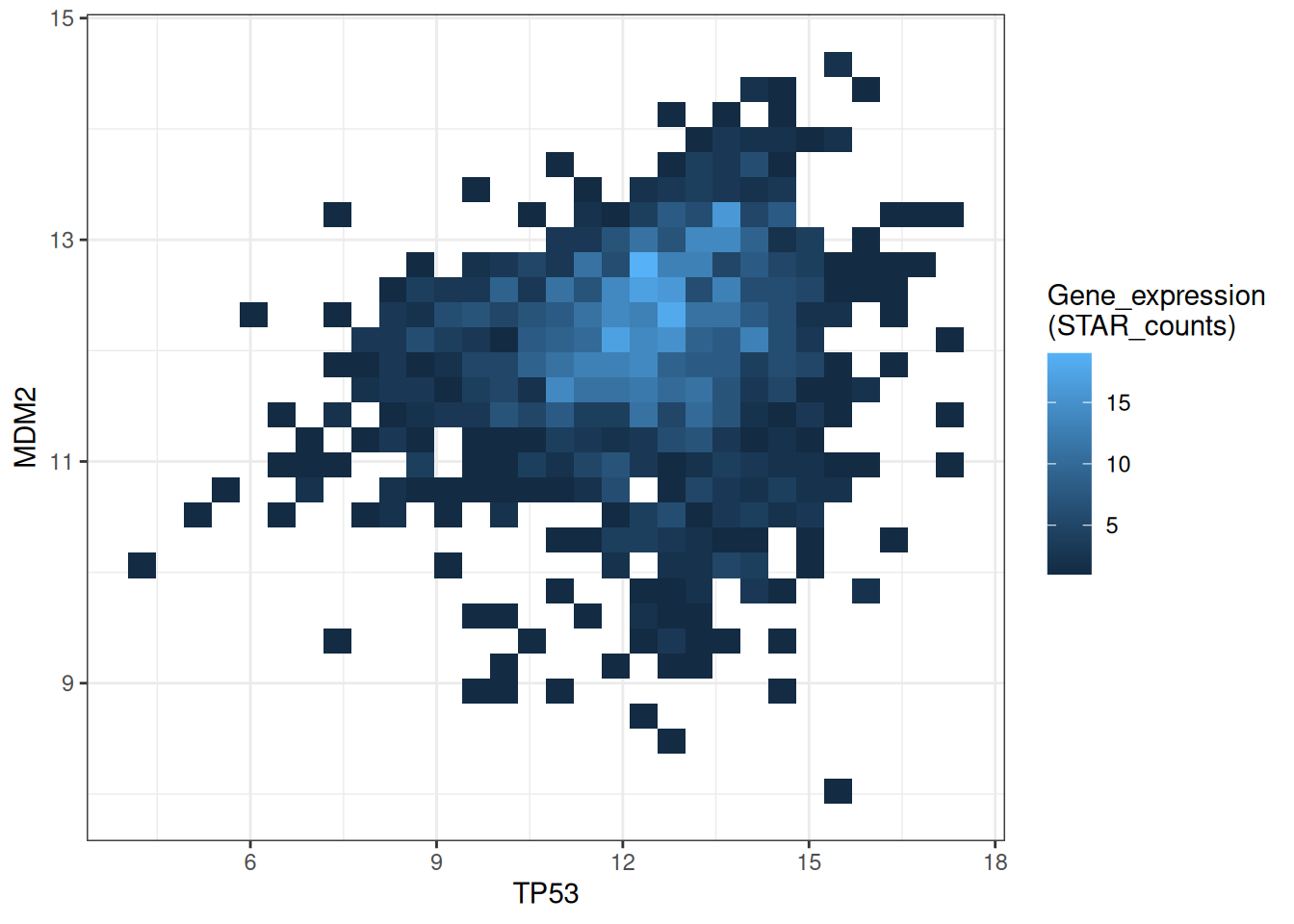
This figure shows a 2D histogram plot of TP53 and MDM2 gene expression. The color depth represents the number of data points in each region, clearly demonstrating the data distribution and density. Darker colors indicate lower sample density in that region, while lighter colors indicate higher sample density.
# Modify bins + palette
p1 <-
  ggplot(data_tcga, aes(x = TP53, y = MDM2)) +
  geom_bin2d(bins = 40) +
  scale_fill_continuous(type = "viridis") +
  labs(fill = "Gene_expression\n(STAR_counts)") +
  theme_bw()

# Remove grid lines + customize colors
p2 <-
  ggplot(data_tcga, aes(x = TP53, y = MDM2)) +
  geom_bin2d(bins = 40) +
  scale_fill_gradient(low = "blue", high = "red") +
  labs(fill = "Gene_expression\n(STAR_counts)") +
  theme_bw() +
  theme(panel.grid.major = element_blank(),
        panel.grid.minor = element_blank())
p1+p2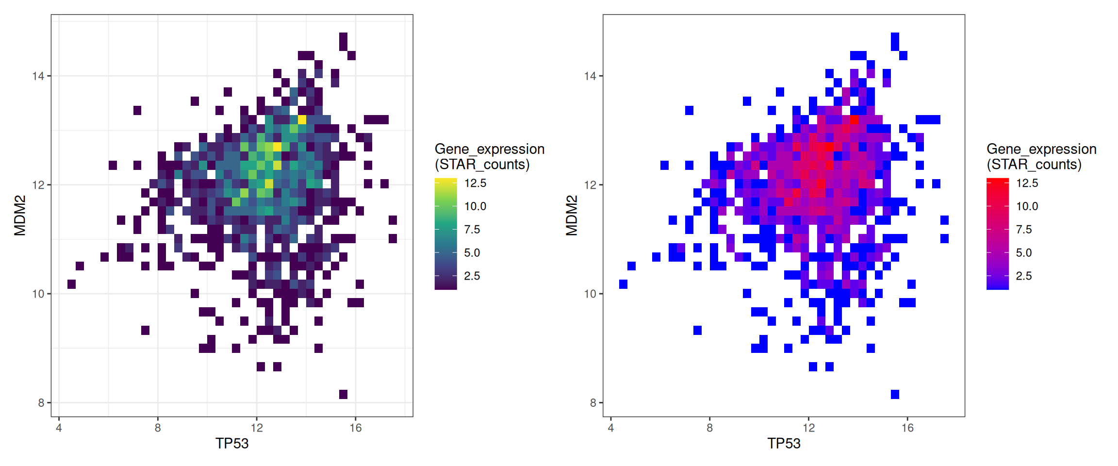
This figure shows a 2D histogram of TP53 and MDM2 gene expression. The bin parameters and colors have been modified to make the graph more aesthetically pleasing and convey more effective information. The left figure gradually changes from purple to yellow as the data increases, while the right figure gradually changes from blue to red.
2. Interactive 2D Histogram
Use the mvtnorm package and the plotly package to draw an interactive 2D histogram.
fig <- plot_ly(data_tcga, x = ~TP53, y = ~MDM2)
fig2 <- subplot(
  fig %>% add_histogram2d()
)

fig2This figure shows a 2D histogram of TP53 and MDM2. The grid changes from purple to yellow as the data increases. The interactive graph allows users to hover over different areas to view specific density values and quantities, providing more detailed information.
Use the mtcars dataset from R.
# Changing bins + palette
fig <- plot_ly(data_mtcars, x = ~mpg, y = ~hp)
fig2 <- fig %>% add_histogram2d(colorscale = "Blues", nbinsx = 5, nbinsy = 6)

fig2mtcars dataset from R
This figure plots a 2D histogram of mpg (miles per gallon) and hp (horsepower) from the mtcars dataset, with the blue color becoming lighter as the data increases. The interactive graph allows users to hover over different areas to view specific density values and quantities, making it easier to obtain more detailed information.
3. Hexagonal plot
A hexagonal plot is a chart type used to visualize the distribution of two-dimensional data. It divides the data into small hexagonal regions along the coordinate axis and colors each region differently based on the number of data points. Use the geom_hex() function to draw a hexagonal box plot.
# Hexagonal plot
p <-
  ggplot(data_tcga, aes(x = TP53, y = MDM2)) +
  geom_hex() +
  labs(fill = "Gene_expression\n(STAR_counts)") +
  theme_bw()
p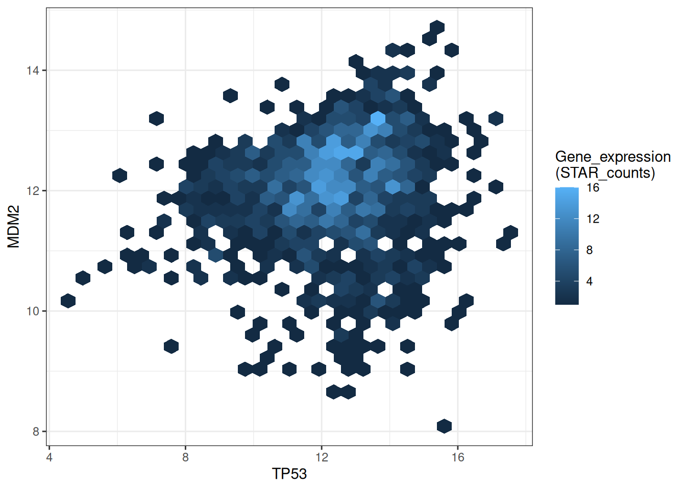
This hexagonal plot shows the relationship between TP53 and MDM2 gene expression. Darker colors indicate lower sample density in that area, while lighter colors indicate higher sample density.
# Modify bins + palette
p <-
  ggplot(data_tcga, aes(x = TP53, y = MDM2)) +
  geom_hex(bins = 40) +
  scale_fill_continuous(type = "viridis") +
  labs(fill = "Gene_expression\n(STAR_counts)") +
  theme_bw()
p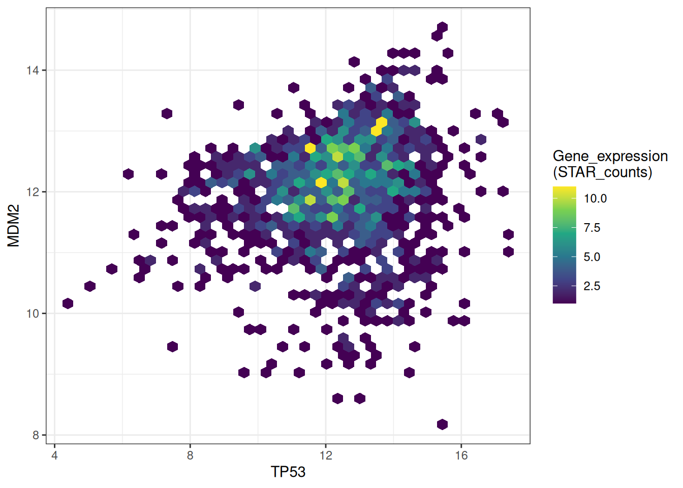
This hexagonal plot shows the relationship between TP53 and MDM2 gene expression. The bins parameters and colors have been modified to make the graph more beautiful and more effective in conveying information.
Use the hexbin package to draw hexagonal plots.
# Use the `hexbin` package to draw hexagonal plots
bin <- hexbin(TP53_values, MDM2_values, xbins=40)
my_colors = colorRampPalette(rev(brewer.pal(11,'Spectral')))
par(mar = c(0, 0, 0, 10), pty = "s")
plot(bin, main="" , colramp = my_colors , legend = FALSE)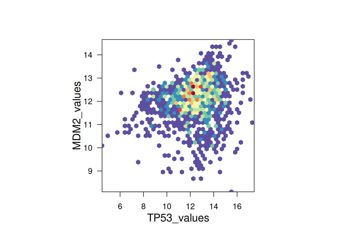
hexbin package to draw hexagonal plots
This hexagonal plot uses the hexbin package to show the relationship between TP53 and MDM2 gene expression. A color palette is used to assign different colors to different value ranges, making the plot more aesthetically pleasing.
4. 2D density plot
A 2D density plot is a type of chart used to visualize the distribution and relationship between two variables. It represents the distribution of data points by plotting density contours or filling colors on a 2D plane. Use geom_density_2d or stat_density_2d to plot a 2D density plot.
# Show outlines only
p1 <-
  ggplot(data_tcga, aes(x = TP53, y = MDM2)) +
  geom_density_2d()

# Show region colors only
p2 <-
  ggplot(data_tcga, aes(x = TP53, y = MDM2)) +
  stat_density_2d(aes(fill = ..level..), geom = "polygon")

# Outline + Area Color色
p3 <-
  ggplot(data_tcga, aes(x = TP53, y = MDM2)) +
  stat_density_2d(aes(fill = ..level..), geom = "polygon", colour="white")

p1+p2+p3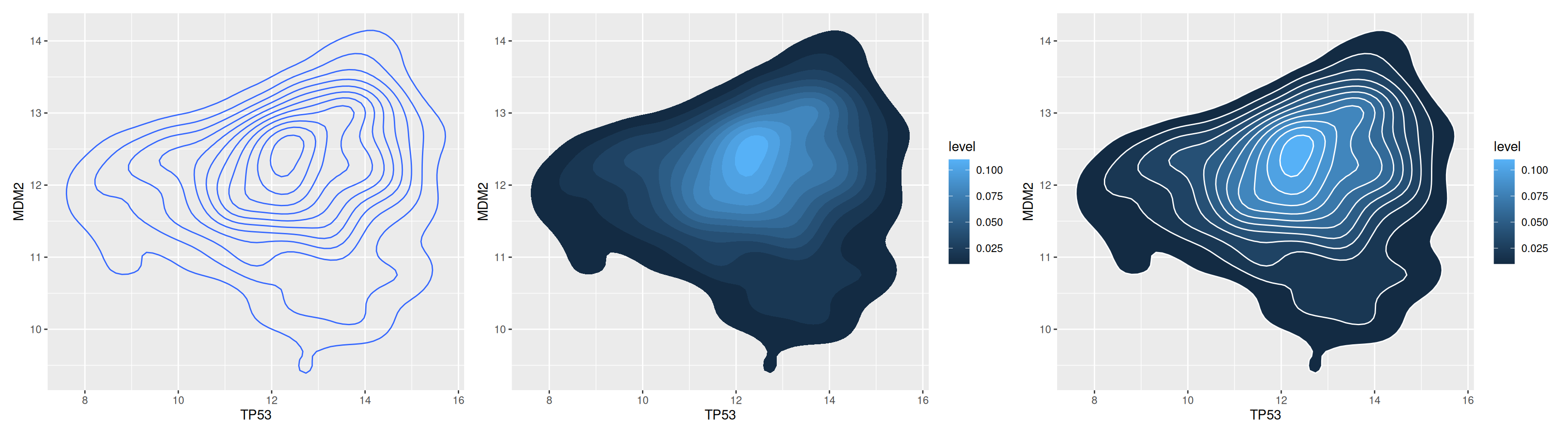
This comparison chart provides a multi-level understanding of TP53 and MDM2 gene expression values, making it easy to quickly identify patterns and trends in the data. Two-dimensional isodensity lines help identify areas of varying density. Colors represent gene expression levels, with lighter colors indicating higher density, providing a visual representation of the data distribution.
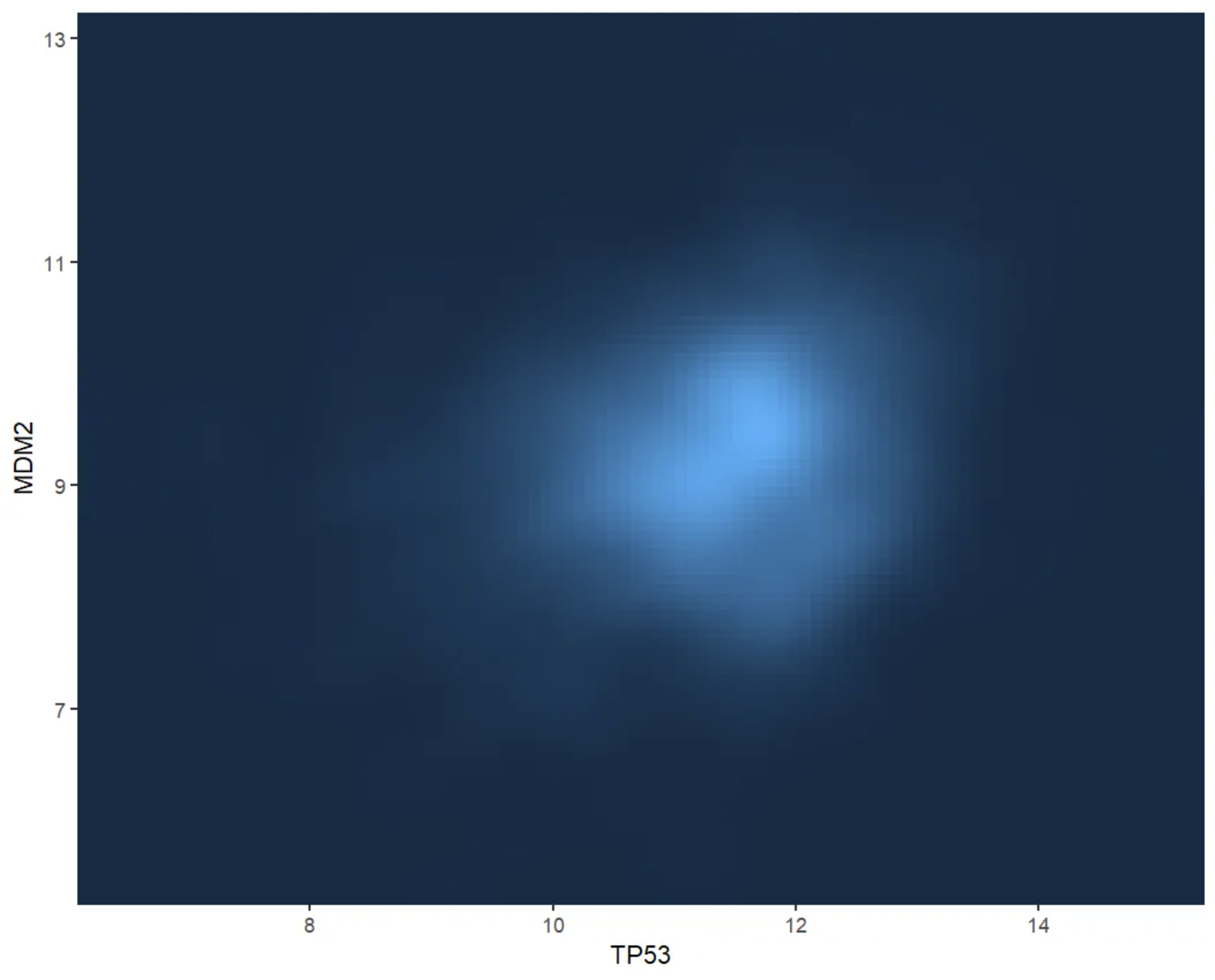
# 2D Kernel Density Plot
p <-
  ggplot(data_tcga, aes(x = TP53, y = MDM2)) +
  stat_density_2d(aes(fill = ..density..), geom = "raster", contour = FALSE) +
  scale_x_continuous(expand = c(0, 0)) +
  scale_y_continuous(expand = c(0, 0)) +
  theme(legend.position='none')
p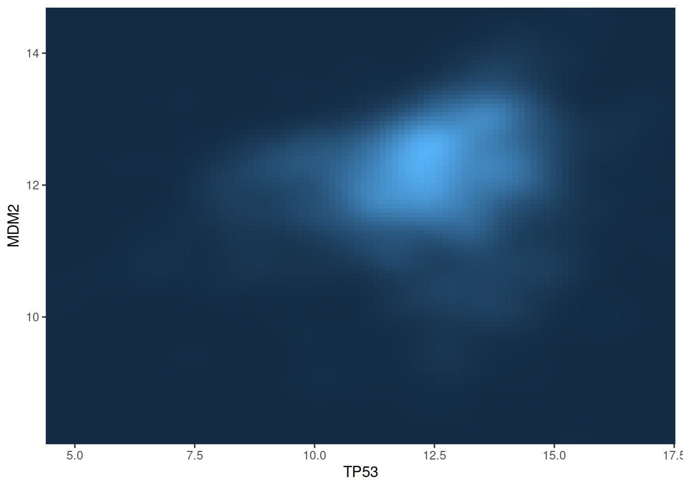
This figure shows the two-dimensional kernel density distribution between the TP53 and MDM2 gene expression values. The expression level of the gene is represented by the depth of the color, and the lighter the color, the higher the density.
5. Custom color palette
2D histograms, hexagonal plots, and 2D density plots all have customizable colors. You can use the scale_fill_distiller() function to define the colors.
# Custom color palette
p1 <-
  ggplot(data_tcga, aes(x = TP53, y = MDM2)) +
  stat_density_2d(aes(fill = ..density..), geom = "raster", contour = FALSE) +
  scale_fill_distiller(palette=4, direction=-1) +
  scale_x_continuous(expand = c(0, 0)) +
  scale_y_continuous(expand = c(0, 0)) +
  theme(legend.position='none')

p2 <-
  ggplot(data_tcga, aes(x = TP53, y = MDM2)) +
  stat_density_2d(aes(fill = ..density..), geom = "raster", contour = FALSE) +
  scale_fill_distiller(palette=4, direction=1) + # Change the direction of the palette from first to last
  scale_x_continuous(expand = c(0, 0)) +
  scale_y_continuous(expand = c(0, 0)) +
  theme(legend.position='none')

# Use a palette by its name
p3 <-
  ggplot(data_tcga, aes(x = TP53, y = MDM2)) +
  stat_density_2d(aes(fill = ..density..), geom = "raster", contour = FALSE) +
  scale_fill_distiller(palette= "Spectral", direction=1) +
  scale_x_continuous(expand = c(0, 0)) +
  scale_y_continuous(expand = c(0, 0)) +
  theme(legend.position='none')

p1+p2+p3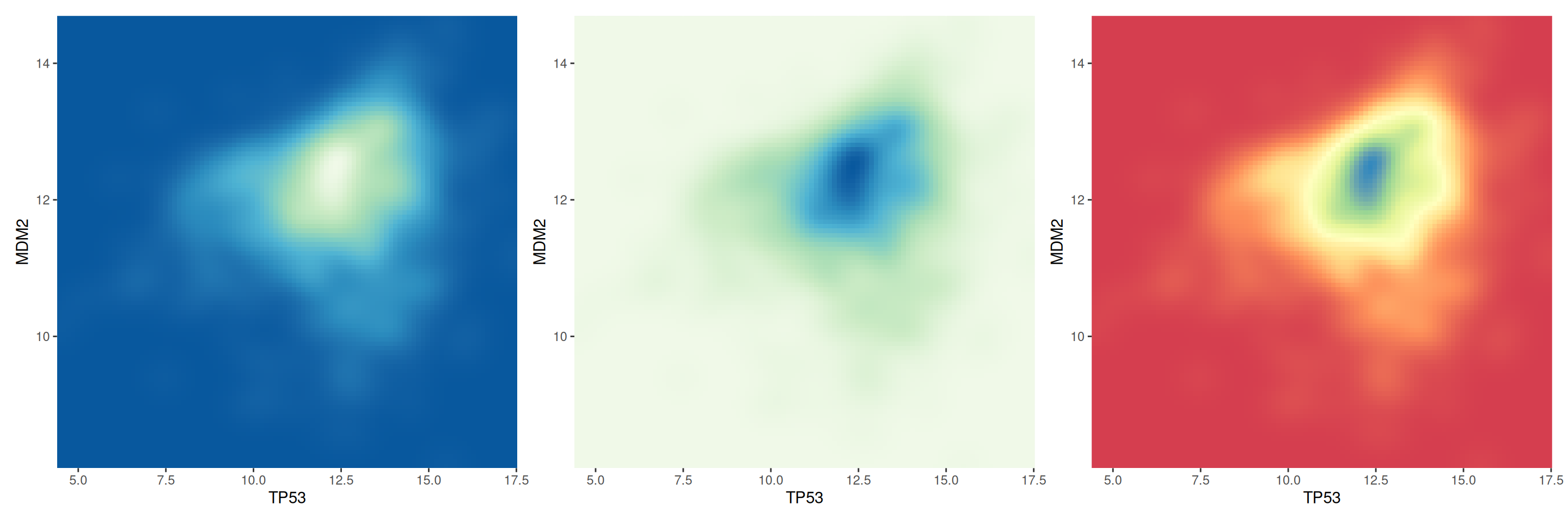
This figure compares the two-dimensional density distribution of TP53 and MDM2 gene expression under different color palette settings. By comparing different color palettes, we can observe the differences in the visual expression of density maps and help choose a color scheme that is more suitable for displaying data characteristics.
6. 3D density plot
You can transform the scatter plot data into a grid, calculate the number of data points at each position on the grid, and then instead of using gradient colors to represent this number, use a third dimension to indicate that some areas are more dense.
# Computing KDE
kd <- with(data_tcga, MASS::kde2d(TP53, MDM2, n = 50))

plot_ly(x = kd$x, y = kd$y, z = kd$z) %>%
  add_surface() %>%
  layout(scene = list(xaxis = list(title = "TP53"),
                      yaxis = list(title = "MDM2"),
zaxis = list(title = "Density")))This figure shows a 3D kernel density plot (KDE) of TP53 and MDM2 gene expression. Using the plotly package, users can interact with the plot, rotating and zooming the graph, analyzing the data in depth and gaining a more comprehensive understanding of variable relationships in complex datasets. Color and height simultaneously indicate the magnitude of the data.
Applications
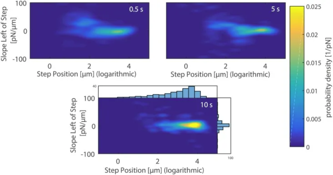
2D density plots of the slope versus the position of the last rupture event upon breaking the contact between the mannose-coated AFM cantilever and A. castellanii cell after 0.5 s (top left), 5 s (top right), and 10 s (bottom) contact times. [1]
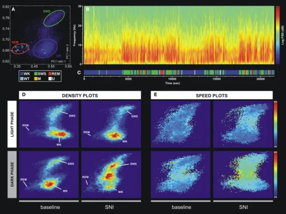
An example of a technique for statistically classifying oscillatory patterns based on principal component analysis of LFP signals. (A) Two-dimensional brain state map. The three main clusters correspond to wakefulness (WK), slow-wave sleep (SWS), and rapid eye movement (REM). (B) Power spectrogram of the SI LFP channel shows distinct patterns of signal power oscillations during brain state transitions. (C) Sleep brain state map obtained from the two-dimensional state map shown in Figure A. Six distinct brain states are encoded: WK, SWS, REM, whisker twitching (WT), M (undefined movement), and U (transition state). (D) Density map calculated from a scatter plot (e.g., (A)) shows the conserved cluster topology and relative abundance of various brain states. The scale ranges from dark blue (low density) to red (high density). (E) Velocity map represents the average of spontaneous trajectories from the two-dimensional StateMap. Stationarity (low velocity) is observed within the three main clusters (WK, SWS, and REM), while maximum velocity is achieved during transitions from one cluster to another. The velocity between onsets of WK and SWS states increased after SNI injury, also suggesting increased WK/SWS transitions during neuropathic pain. [2]
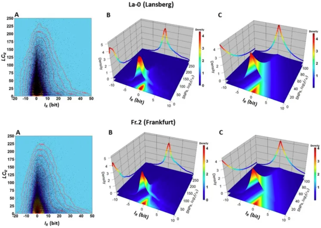
Dependence between variables 𝐼𝑅 and 𝐿𝐶𝑅 in ecotypes La-0 and Fr.2. (A) Two-dimensional kernel density plot of 𝐼𝑅 versus 𝐿𝐶𝑅 shows that most 𝐿𝐶𝑅 values are located in a narrow band around the vertical line 𝐼𝑅=0. (B) 3D kernel density plot showing, for example, that genomic regions R with values −2≤𝐼𝑅≤2 and 0≤𝐿𝐶𝑅≤25 are observed with high joint probability 𝑃(−1≤𝐼𝑅≤1,0≤𝐿𝐶𝑅≤25) (the volume of a square-based prism formed by the interval −2≤𝐼𝑅≤2 and 0≤𝐿𝐶𝑅≤25 and truncated by the surface covering the red to yellow region). For these regions, the probability of observing the SNP is low (according to equations (4) and (5), and the normalized count values of the SNPs in the support region equation (3) are low. In another example, genomic regions R with values −1≤𝐼𝑅≤1 and 150≤𝐿𝐶𝑅≤200 are observed with low joint probability 𝑃(−1≤𝐼𝑅≤1,150≤𝐿𝐶𝑅≤200) (corresponding to the volume of a prism truncated by a square base surface in the interval −1≤𝐼𝑅≤1 and 150≤𝐿𝐶𝑅≤200); (C) Farlie–Gumbel–Morgenstern copula according to 𝐿𝐶𝑅 (Weibull PDF) and Constructed from nonlinear fits of the marginal distributions of 𝐼𝑅 (Skew–Laplace PDF) estimates. The Farlie–Gumbel–Morgenstern copula distribution, which indicates structural dependence between the variables 𝐼𝑅 and 𝐿𝐶𝑅, describes the empirical behavior shown in Panel B in an acceptable manner. [3]
Reference
[1] Cardoso-Cruz H, Sameshima K, Lima D, Galhardo V. Dynamics of Circadian Thalamocortical Flow of Information during a Peripheral Neuropathic Pain Condition. Front Integr Neurosci. 2011 Aug 23;5:43. doi: 10.3389/fnint.2011.00043. PMID: 22007162; PMCID: PMC3188809.
[2] Rey SA, Smith CA, Fowler MW, Crawford F, Burden JJ, Staras K. Ultrastructural and functional fate of recycled vesicles in hippocampal synapses. Nat Commun. 2015 Aug 21;6:8043. doi: 10.1038/ncomms9043. PMID: 26292808; PMCID: PMC4560786.
[3] Sanchez R, Mackenzie SA. Genome-Wide Discriminatory Information Patterns of Cytosine DNA Methylation. Int J Mol Sci. 2016 Jun 17;17(6):938. doi: 10.3390/ijms17060938. PMID: 27322251; PMCID: PMC4926471.
[4] Rudis, B. (2020). hrbrthemes: Additional Themes and Theme Components for ‘ggplot2’. https://cran.r-project.org/package=hrbrthemes
[5] Neuwirth, E. (2014). RColorBrewer: ColorBrewer Palettes. https://cran.r-project.org/package=RColorBrewer
[6] Ellison, A. M. (2019). hexbin: Hexagonal Binning for Visualization of Two-Dimensional Data. https://cran.r-project.org/package=hexbin
[7] Venables, W. N., & Ripley, B. D. (2002). MASS: Modern Applied Statistics with S. https://cran.r-project.org/package=MASS
[8] Sievert, C. (2023). plotly: Create Interactive Web Graphics via ‘plotly.js’. https://cran.r-project.org/package=plotly
[9] Wickham, H. (2016). ggplot2: Elegant Graphics for Data Analysis. Springer. https://ggplot2.tidyverse.org
[10] Genz, A., & Bretz, F. (2009). mvtnorm: Multivariate Normal and T Distributions. https://cran.r-project.org/package=mvtnorm