# Installing necessary packages
if (!requireNamespace("ggplot2", quietly = TRUE)) {
  install.packages("ggplot2")
}
if (!requireNamespace("ggbreak", quietly = TRUE)) {
  install.packages("ggbreak")
}
if (!requireNamespace("dplyr", quietly = TRUE)) {
  install.packages("dplyr")
}
if (!requireNamespace("ggpubr", quietly = TRUE)) {
  install.packages("ggpubr")
}
if (!requireNamespace("RColorBrewer", quietly = TRUE)) {
  install.packages("RColorBrewer")
}
if (!requireNamespace("rstatix", quietly = TRUE)) {
  install.packages("rstatix")
}

# Load packages
library(ggplot2)
library(ggbreak)
library(dplyr)
library(ggpubr)
library(RColorBrewer)
library(rstatix)Break Plot
Example
Example of a combo chart with breakpoints.
Setup
System Requirements: Cross-platform (Linux/MacOS/Windows)
Programming language: R
Dependent packages:
ggplot2;ggbreak;dplyr;ggpubr;RColorBrewer;rstatix
sessioninfo::session_info("attached")─ Session info ───────────────────────────────────────────────────────────────
setting value
version R version 4.6.0 (2026-04-24)
os Ubuntu 24.04.4 LTS
system x86_64, linux-gnu
ui X11
language (EN)
collate C.UTF-8
ctype C.UTF-8
tz UTC
date 2026-05-09
pandoc 3.1.3 @ /usr/bin/ (via rmarkdown)
quarto 1.9.37 @ /usr/local/bin/quarto
─ Packages ───────────────────────────────────────────────────────────────────
package * version date (UTC) lib source
dplyr * 1.2.1 2026-04-03 [1] RSPM
ggbreak * 0.1.7 2026-03-18 [1] RSPM
ggplot2 * 4.0.3.9000 2026-05-04 [1] Github (tidyverse/ggplot2@6870419)
ggpubr * 0.6.3 2026-02-24 [1] RSPM
RColorBrewer * 1.1-3 2022-04-03 [1] RSPM
rstatix * 0.7.3 2025-10-18 [1] RSPM
[1] /home/runner/work/_temp/Library
[2] /opt/R/4.6.0/lib/R/site-library
[3] /opt/R/4.6.0/lib/R/library
* ── Packages attached to the search path.
──────────────────────────────────────────────────────────────────────────────Data Preparation
# Data Preparation
df <- ToothGrowth %>%
  group_by(supp, dose) %>%
  summarise(
    mean_len = mean(len),
    sd_len = sd(len),
    n = n(),
    se_len = sd_len/sqrt(n),
    .groups = 'drop')


# Statistical tests (key repair points)
stat.test <- ToothGrowth %>%
  group_by(dose) %>%
  t_test(len ~ supp) %>%
  add_xy_position(x = "dose", dodge = 0.8)

head(df)
# A tibble: 6 × 6
supp dose mean_len sd_len n se_len
<fct> <dbl> <dbl> <dbl> <int> <dbl>
1 OJ 0.5 13.2 4.46 10 1.41
2 OJ 1 22.7 3.91 10 1.24
3 OJ 2 26.1 2.66 10 0.840
4 VC 0.5 7.98 2.75 10 0.869
5 VC 1 16.8 2.52 10 0.795
6 VC 2 26.1 4.80 10 1.52 Visualization
1. Basic BarPlot
Use basic functions to draw the caption and description of the image.
# Basic BarPlot
p1 <- ggplot(df, aes(x=dose, y=mean_len, fill=supp)) +
  geom_col(position=position_dodge(0.4), width=0.2) +
  geom_errorbar(aes(ymin=mean_len-sd_len, ymax=mean_len+sd_len),
                width=0.1, position=position_dodge(0.4)) +
  scale_y_continuous(breaks = seq(0, 30, 5)) +
  scale_y_cut(breaks=c(15), which=1, scales=1.5) +
  labs(x="Dose (mg/day)", y="Tooth Length (mm)") +
  theme_classic()

p1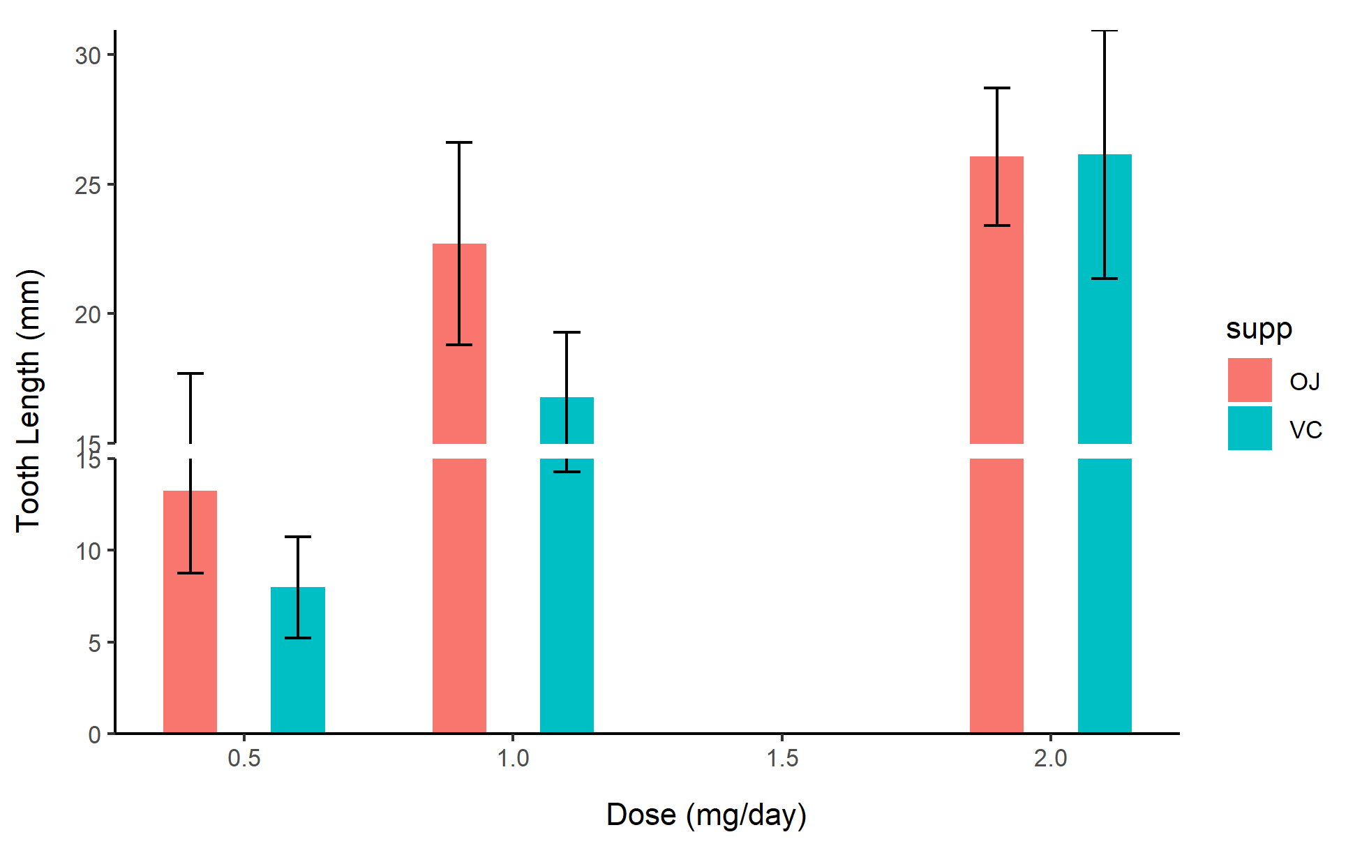
2. Grouped scatter plot
# Grouped scatter plot
p2 <- ggplot(ToothGrowth, aes(x=dose, y=len, color=supp)) +
  geom_point(position=position_jitterdodge(jitter.width=0.2)) +
  scale_y_continuous(breaks = seq(0, 40, 5)) +
  scale_y_cut(breaks=c(15, 25), which=c(1,2), scales=c(1.5, 1)) +
  labs(x="Dose (mg/day)", y="Tooth Length (mm)") +
  theme_bw()

p2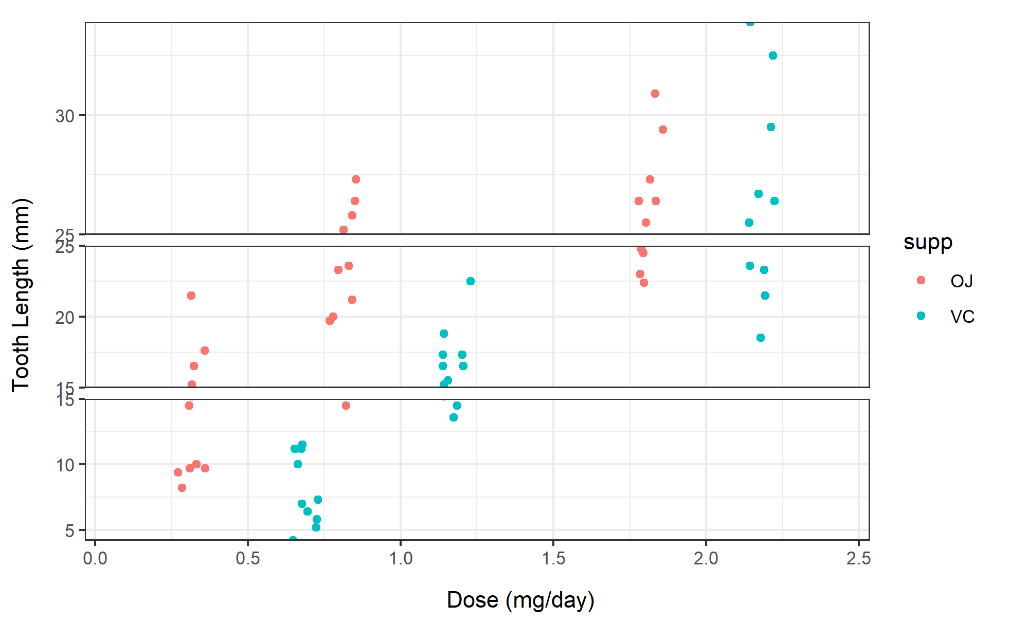
3. Line plot
# Line plot
p3 <- ggplot(df, aes(x=dose, y=mean_len, color=supp)) +
  geom_line(linewidth=1) +
  geom_point(size=3) +
  scale_y_continuous(breaks = seq(0, 30, 5)) +
  scale_y_cut(breaks=c(15), which=1, scales=1.5) +
  labs(x="Dose (mg/day)", y="Mean Tooth Length (mm)") +
  theme_minimal()

p3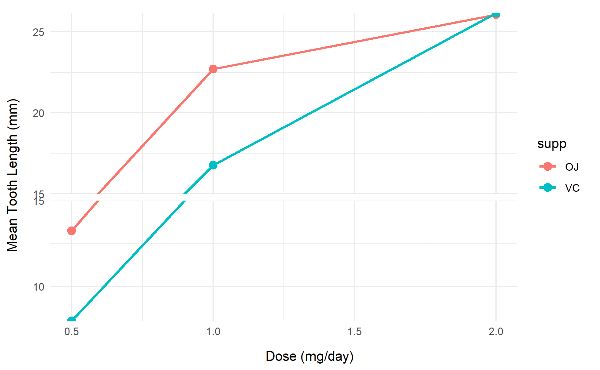
Tip
Key Parameters:
breaks: Sets the breakpoint positions
which: Specifies the breakpoint interval (counting from the bottom up)
scales: Sets the scale factor for each interval
space: Breakpoint spacing (default 0.1)
position_dodge(): Controls the spacing between grouped bars
width is recommended to match the width parameter of geom_col.
4. More advanced charts
# More advanced charts
my_colors <- c("#1B9E77", "#D95F02")  # 来自RColorBrewer的Set2调色板
p4 <- ggplot(df, aes(x = factor(dose), y = mean_len, fill = supp)) +
  geom_col(position = position_dodge(0.8), width = 0.7, alpha = 0.9) +
  geom_errorbar(
    aes(ymin = mean_len - se_len, ymax = mean_len + se_len),
    width = 0.2, position = position_dodge(0.8)
  ) +
  geom_text(
    aes(group = supp, label = sprintf("%.1f±%.1f", mean_len, se_len)),
    position = position_dodge(0.8), vjust = -1, size = 4
  ) +
  scale_y_continuous(
    breaks = seq(0, 35, 5) # 增加上方扩展空间
  ) +
  scale_y_break(c(8,12)
  ) +
  scale_fill_manual(values = my_colors) +
  labs(x = "Dose (mg/day)", y = "Tooth Length (mm)", fill = "Supplement") +
  theme_minimal(base_size = 12) +
  theme(
    legend.position = "top",
    panel.grid.major.x = element_blank()
  )

p4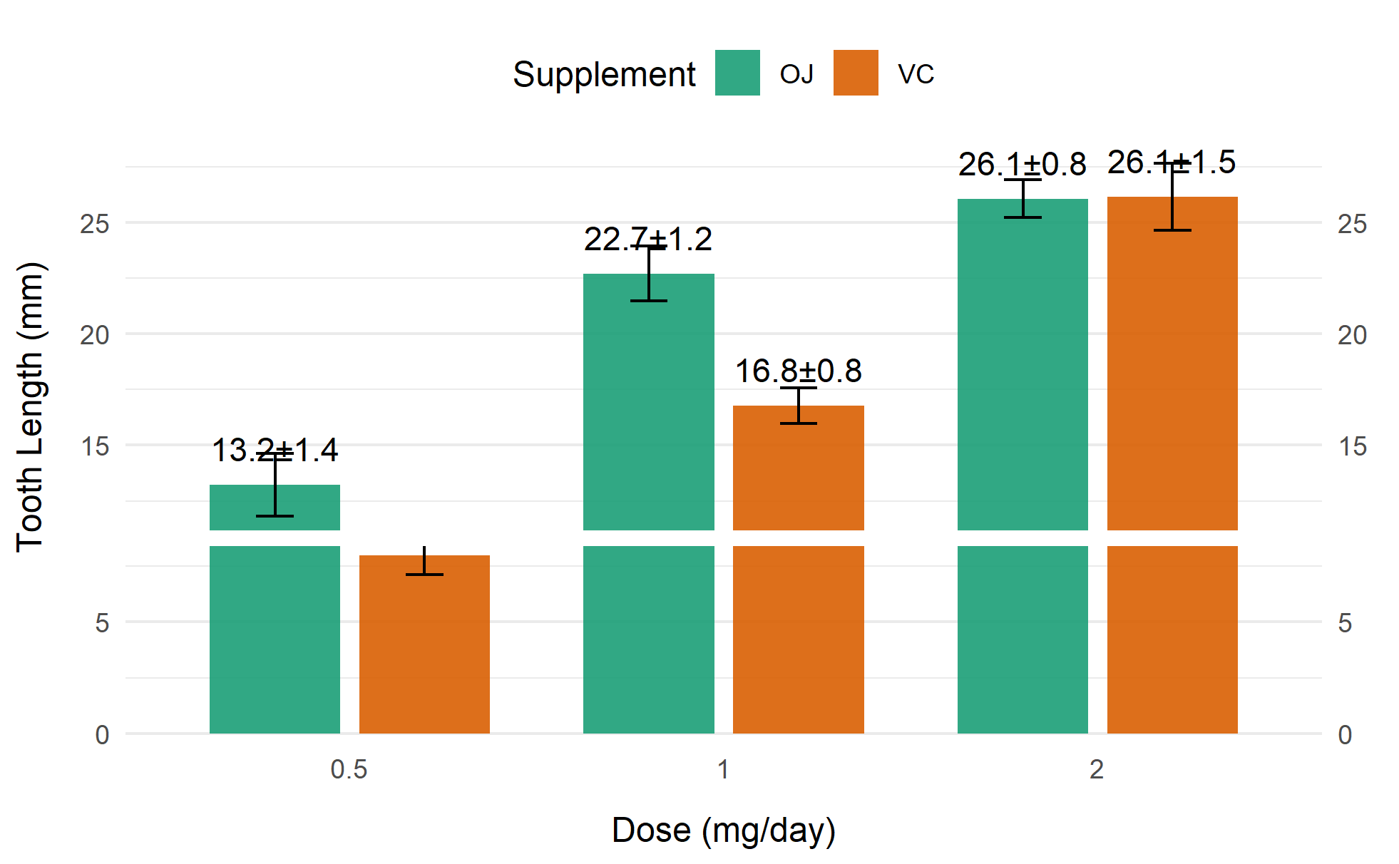
Application
Show the practical application of visualization charts in biomedical literature. If basic charts/advanced charts are widely used in various types of biomedical literature, you can choose to display them separately.
1. Gene expression visualization (handling extreme outliers)
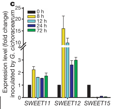
Changes in gene expression are shown. [1]
2. Clinical indicator distribution display (processing data of different dimensions)
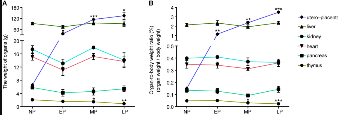
The figure shows the changes in (A) [organ weight] and (B) organ-to-body weight ratio of the uteroplacenta, liver, kidney, heart, pancreas, and thymus at different stages of maternal pregnancy. [2]
Reference
[1] Xu S, et al. (2022) ggbreak: Effective Axis Break Creation in ggplot2. Journal of Open Source Software 7(74), 4301
[2] Yu D, Wang H, Shyh-Chang N. A multi-tissue metabolome atlas of primate pregnancy. Cell. 2024 Feb 1;187(3):764-781.e14. doi: 10.1016/j.cell.2023.11.043.
[3] Chen LQ, Hou BH, Mudgett MB, Frommer WB. Sugar transporters for intercellular exchange and nutrition of pathogens. Nature. 2010 Nov 25;468(7323):527-32. doi: 10.1038/nature09606.