# Install packages
if (!requireNamespace("data.table", quietly = TRUE)) {
  install.packages("data.table")
}
if (!requireNamespace("jsonlite", quietly = TRUE)) {
  install.packages("jsonlite")
}
if (!requireNamespace("ggplot2", quietly = TRUE)) {
  install.packages("ggplot2")
}
if (!requireNamespace("ggthemes", quietly = TRUE)) {
  install.packages("ggthemes")
}

# Load packages
library(data.table)
library(jsonlite)
library(ggplot2)
library(ggthemes)Histogram
Note
Hiplot website
This page is the tutorial for source code version of the Hiplot Histogram plugin. You can also use the Hiplot website to achieve no code ploting. For more information please see the following link:
Histogram refers to the distribution of continuous variable data by a series of vertical stripes or line segments with different heights.
Setup
System Requirements: Cross-platform (Linux/MacOS/Windows)
Programming language: R
Dependent packages:
data.table;jsonlite;ggplot2;ggthemes
sessioninfo::session_info("attached")─ Session info ───────────────────────────────────────────────────────────────
setting value
version R version 4.6.0 (2026-04-24)
os Ubuntu 24.04.4 LTS
system x86_64, linux-gnu
ui X11
language (EN)
collate C.UTF-8
ctype C.UTF-8
tz UTC
date 2026-05-09
pandoc 3.1.3 @ /usr/bin/ (via rmarkdown)
quarto 1.9.37 @ /usr/local/bin/quarto
─ Packages ───────────────────────────────────────────────────────────────────
package * version date (UTC) lib source
data.table * 1.18.4 2026-05-06 [1] RSPM
ggplot2 * 4.0.3.9000 2026-05-04 [1] Github (tidyverse/ggplot2@6870419)
ggthemes * 5.2.0 2025-11-30 [1] RSPM
jsonlite * 2.0.0 2025-03-27 [1] RSPM
[1] /home/runner/work/_temp/Library
[2] /opt/R/4.6.0/lib/R/site-library
[3] /opt/R/4.6.0/lib/R/library
* ── Packages attached to the search path.
──────────────────────────────────────────────────────────────────────────────Data Preparation
The loaded data is the data set (data on treatment outcomes of different treatment regimens).
# Load data
data <- data.table::fread(jsonlite::read_json("https://hiplot.cn/ui/basic/histogram/data.json")$exampleData$textarea[[1]])
data <- as.data.frame(data)

# Convert data structure
data[, 2] <- factor(data[, 2], levels = unique(data[, 2]))

# View data
head(data)
Value Group2
1 4.2 treat1
2 11.5 treat1
3 7.3 treat1
4 5.8 treat1
5 6.4 treat1
6 10.0 treat1Visualization
# Histogram
p <- ggplot(data, aes(x=Value, fill=Group2)) +
  geom_histogram(alpha = 1, bins = 12, col = "white") +
  ggtitle("Histogram Plot") +
  scale_fill_manual(values = c("#e04d39","#5bbad6","#1e9f86")) +
  theme_stata() +
  theme(text = element_text(family = "Arial"),
        plot.title = element_text(size = 12,hjust = 0.5),
        axis.title = element_text(size = 12),
        axis.text = element_text(size = 10),
        axis.text.x = element_text(angle = 0, hjust = 0.5,vjust = 1),
        legend.position = "right",
        legend.direction = "vertical",
        legend.title = element_text(size = 10),
        legend.text = element_text(size = 10))

p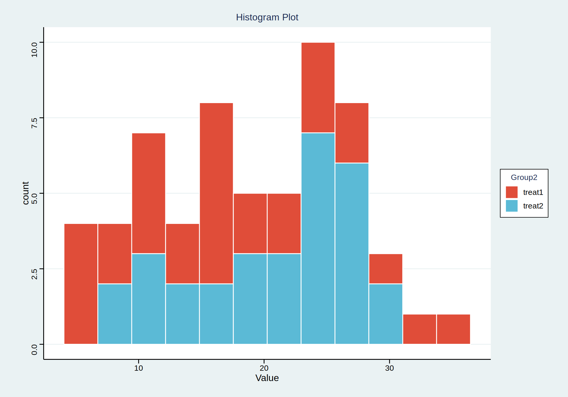
The width of the rectangle in the figure is proportional to and different from the spacing, and the vertical axis represents the frequency.