# Installing necessary packages
if (!requireNamespace("readr", quietly = TRUE)) {
  install.packages("readr")
}
if (!requireNamespace("ggplot2", quietly = TRUE)) {
  install.packages("ggplot2")
}
if (!requireNamespace("ggridges", quietly = TRUE)) {
  install.packages("ggridges")
}
if (!requireNamespace("hrbrthemes", quietly = TRUE)) {
  remotes::install_github("hrbrmstr/hrbrthemes")
}
if (!requireNamespace("viridis", quietly = TRUE)) {
  install.packages("viridis")
}

# Loading the libraries
library(readr)      # For reading TSV files
library(dplyr)      # For data manipulation
library(ggplot2)    # For creating plots
library(ggridges)   # For density ridgeline plots
library(hrbrthemes) # For enhanced ggplot2 themes
library(viridis) # For color mapsRidgeline Plot
A ridgeline plot, also known as a joyplot, visualizes the distribution of multiple numeric variables across different categories. This method is useful for comparing density distributions while preserving an overall view of trends and variations.
Example

A Ridgeline plot represents the distribution of a numeric variable across several groups. In this example, the plot displays the distribution of diamond prices across different quality categories. The x-axis represents price values, while the density curves illustrate how frequently each price occurs within each quality group.
Setup
System Requirements: Cross-platform (Linux/MacOS/Windows)
Programming Language: R
Dependencies:
readr,ggplot2,ggridges,viridis,hrbrthemes
sessioninfo::session_info("attached")─ Session info ───────────────────────────────────────────────────────────────
setting value
version R version 4.6.0 (2026-04-24)
os Ubuntu 24.04.4 LTS
system x86_64, linux-gnu
ui X11
language (EN)
collate C.UTF-8
ctype C.UTF-8
tz UTC
date 2026-05-09
pandoc 3.1.3 @ /usr/bin/ (via rmarkdown)
quarto 1.9.37 @ /usr/local/bin/quarto
─ Packages ───────────────────────────────────────────────────────────────────
package * version date (UTC) lib source
dplyr * 1.2.1 2026-04-03 [1] RSPM
ggplot2 * 4.0.3.9000 2026-05-04 [1] Github (tidyverse/ggplot2@6870419)
ggridges * 0.5.7 2025-08-27 [1] RSPM
hrbrthemes * 0.9.2 2026-05-04 [1] Github (hrbrmstr/hrbrthemes@45ac19c)
readr * 2.2.0 2026-02-19 [1] RSPM
viridis * 0.6.5 2024-01-29 [1] RSPM
viridisLite * 0.4.3 2026-02-04 [1] RSPM
[1] /home/runner/work/_temp/Library
[2] /opt/R/4.6.0/lib/R/site-library
[3] /opt/R/4.6.0/lib/R/library
* ── Packages attached to the search path.
──────────────────────────────────────────────────────────────────────────────Data Preparation
Here’s a brief tutorial using the built-in R datasets (iris) and the Lung Cancer (Raponi 2006) dataset from UCSC Xena DATASETS.
# Load iris dataset
data("iris")

# Load Lung Cancer (Raponi 2006) clinical data
TCGA_clinic <- readr::read_tsv("https://ucsc-public-main-xena-hub.s3.us-east-1.amazonaws.com/download/raponi2006_public%2Fraponi2006_public_clinicalMatrix.gz") %>%
  mutate(T = as.factor(T))
head(TCGA_clinic)
# A tibble: 6 × 16
sampleID Age Differentiation Gender Histology M N Race
<chr> <dbl> <chr> <chr> <chr> <dbl> <dbl> <chr>
1 LS-1 75 mod_poor M SCC 0 0 w
2 LS-10 61 poor F SCC 0 0 w
3 LS-100 72 mod M SCC 0 0 w
4 LS-101 75 mod M SCC 0 1 w
5 LS-102 76 mod F SCC 0 0 w
6 LS-103 58 well_mod M SCC 0 1 w
# ℹ 8 more variables: Smoking_History_Packyears <dbl>, Stage <chr>,
# OS.time <dbl>, T <fct>, OS <chr>, `_INTEGRATION` <chr>, `_PATIENT` <chr>,
# `_GENOMIC_ID_raponi2006` <chr>Visualization
1. Basic Ridgeline Plot
Figure 1 illustrates the distribution of the Sepal.Length variable across different Species.
# Basic Ridgeline plot
p1_1 <- ggplot(iris, aes(x = Sepal.Length, y = Species, fill = Species)) +
  geom_density_ridges(alpha = 0.5) +
  theme_ridges(font_size = 16, grid = TRUE) +
  theme(legend.position = "right")

p1_1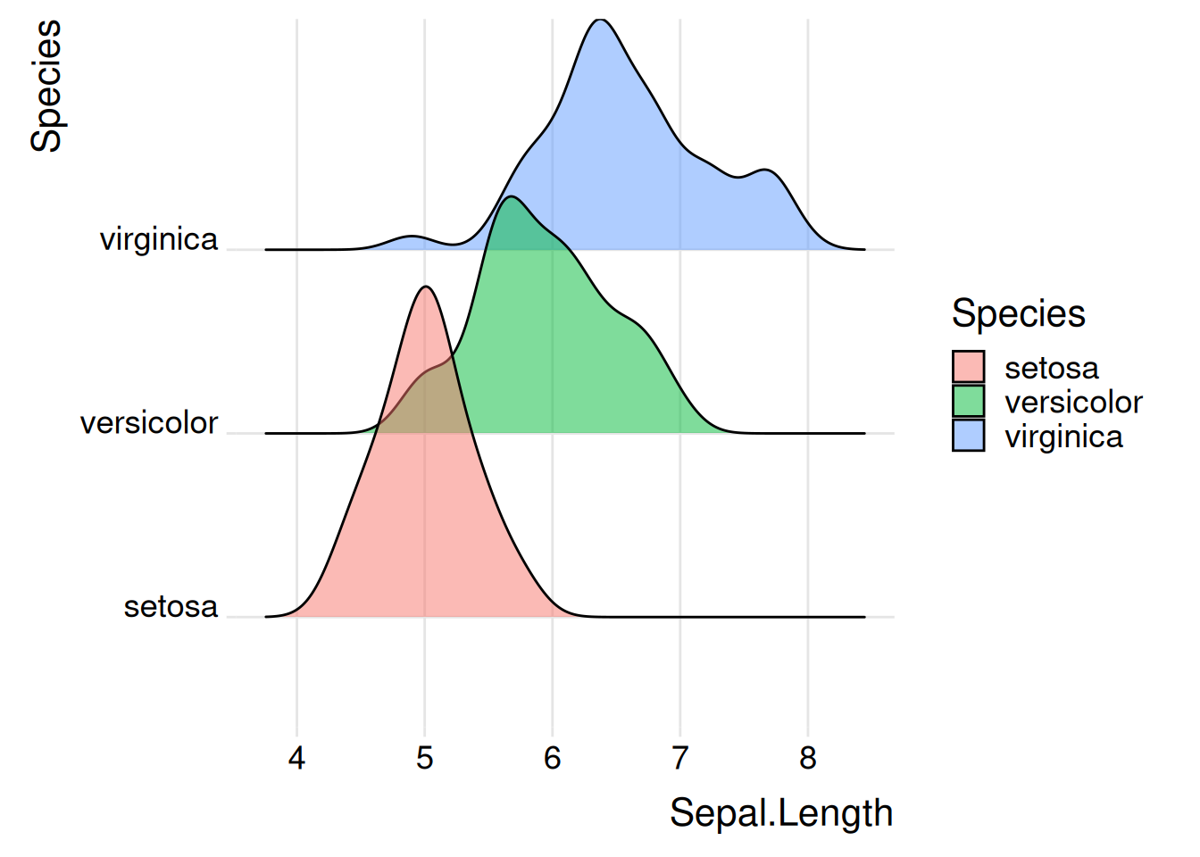
iris Dataset
Figure 2 illustrates the distribution of the OS.time variable across primary tumor conditions and survival status.
# Basic Ridgeline plot
p1_2 <- ggplot(TCGA_clinic, aes(x = OS.time, y = T, fill = T)) +
  geom_density_ridges(alpha = 0.5, scale = 2) +
  theme_ridges(font_size = 16, grid = TRUE) +
  theme(legend.position = "right")

p1_2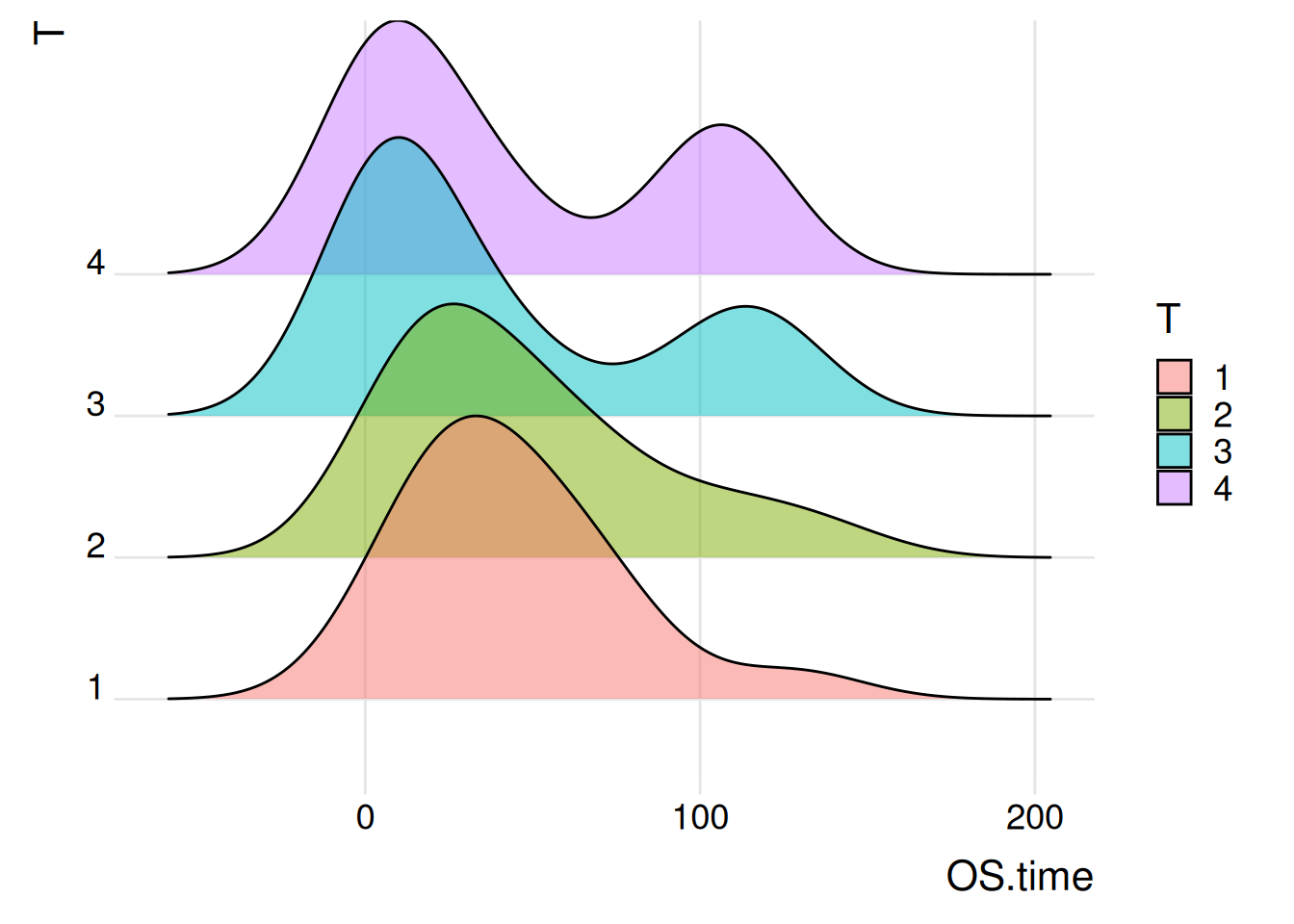
Lung Cancer (Raponi 2006) Dataset
Tip
Key function notes: geom_density_ridges() / theme_ridges()
geom_density_ridges()
geom_density_ridges is a very flexible function that can be used to create multiple styles of ridgeline plots.
Here are some commonly used parameters and options for geom_density_ridges():
alpha: Sets the transparency.colour: Sets the line color.fill: Fills colors based on categorical variables.scale: Controls the overlap between ridges.
theme_ridges()
theme_ridges is a theme function provided by the ggridges package specifically for beautifying ridge plots.
The parameters of this function include:
**
font_size**: Overall font size, default is 14.line_size: Default line size.grid: If set to TRUE (default), it will draw a background grid; if set to FALSE, the background will be blank.
2. Histogram Ridgeline Plots
Histogram ridgeline plots are ideal for displaying data distributions and counts, whereas traditional ridgeline plots are better suited for comparing distribution shapes across categories. Density can be represented in various ways; for instance, setting stat = “binline” creates a histogram-like appearance for each distribution.
Figure 3 illustrates the Sepal The distribution of the Length variable on different specifications.
p2_1 <- ggplot(iris, aes(x = Sepal.Length, y = Species, fill = Species)) +
  geom_density_ridges(alpha = 0.5, stat = "binline", bins = 10) +
  theme_ridges(font_size = 16, grid = TRUE) +
  theme(legend.position = "none")

p2_1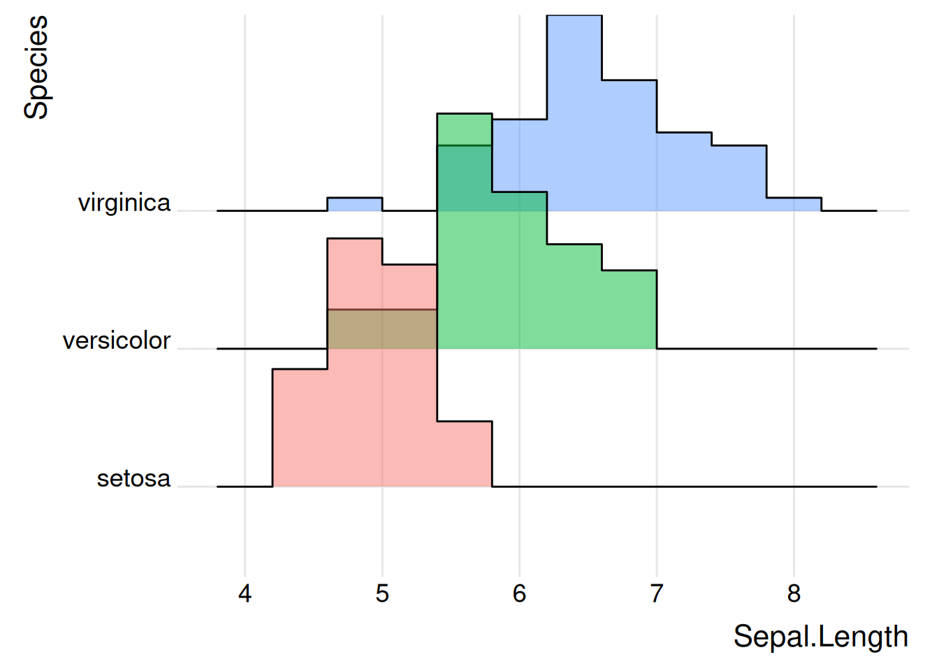
iris Dataset
Figure 4 illustrates the distribution of the OS.time variable in primary tumor conditions and survival status
p2_2 <- ggplot(TCGA_clinic, aes(x = OS.time, y = T, fill = T)) +
  geom_density_ridges(alpha = 0.5, stat = "binline", bins = 10) +
  theme_ridges(font_size = 16, grid = TRUE) +
  theme(legend.position = "none")

p2_2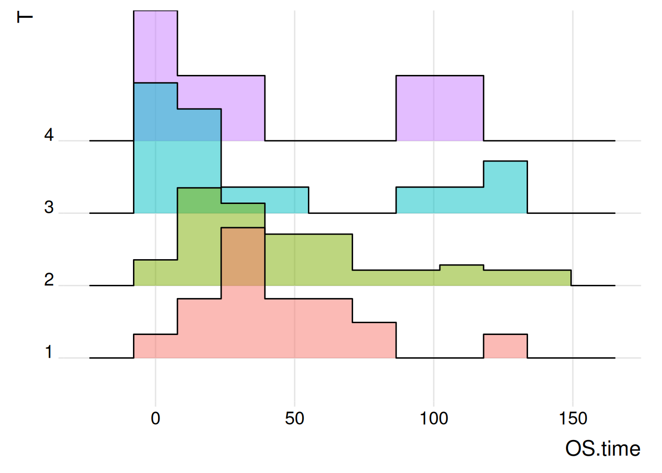
Lung Cancer (Raponi 2006) Dataset
3. Ridgeline Plot with Variable Colors
Colors can be assigned based on numerical variables instead of categorical ones, allowing for a more intuitive visualization of changes in data size.
Figure 5 illustrates the Sepal The distribution of the Length variable on different specifications.
p3_1 <- ggplot(iris, aes(x = Sepal.Length, y = Species, fill = ..x..)) +  # Create ridge plot
  geom_density_ridges_gradient(scale = 3, rel_min_height = 0.01) +  # Adjust parameters
  scale_fill_viridis(name = "Sepal.Length", option = "C") +  # Adjust color mapping
  labs(title = 'Sepal.Length in iris') +
  theme_ipsum() +   # Set image theme
  theme(legend.position = "bottom",
        panel.spacing = unit(0.1, "lines"),
        strip.text.x = element_text(size = 8))

p3_1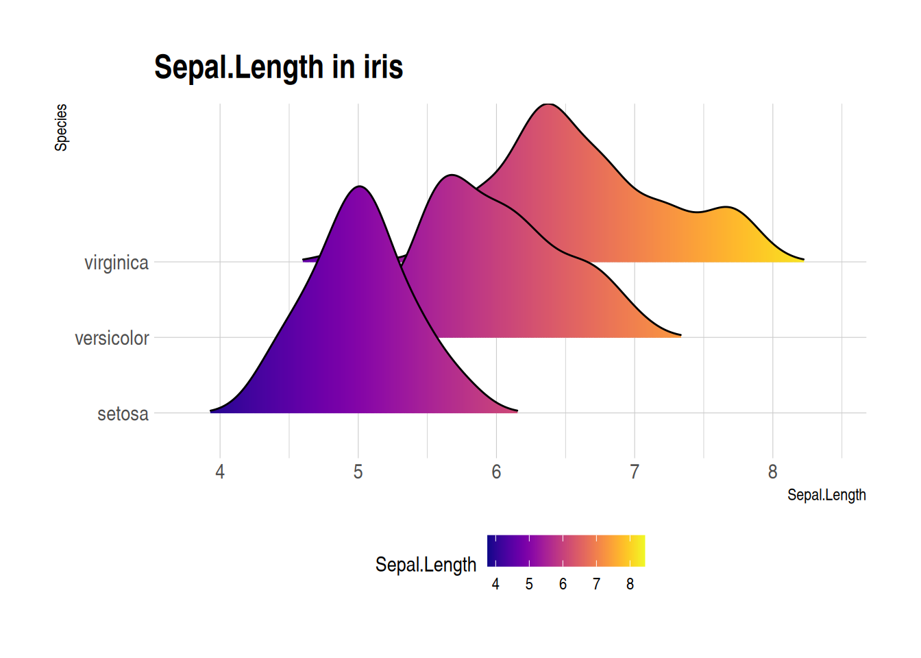
iris Dataset
Figure 6 illustrates the distribution of the OS.time variable in primary tumor conditions and survival status.
p3_2 <- ggplot(TCGA_clinic, aes(x = OS.time, y = T, fill = ..x..)) +  # Create ridge plot
  geom_density_ridges_gradient(scale = 1, rel_min_height = 0.01) +  # Adjust parameters
  scale_fill_viridis(name = "OS.time", option = "C") +  # Adjust color mapping
  labs(title = 'Distribution of OS.time in different tumor staging') +
  theme_ipsum() +   # Set image theme
  theme(legend.position = "bottom", panel.spacing = unit(0.1, "lines"),
        strip.text.x = element_text(size = 8))

p3_2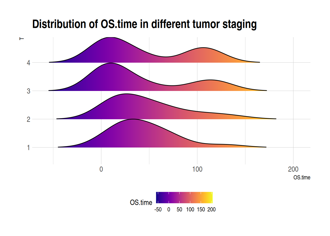
Lung Cancer (Raponi 2006) Dataset
Tip
Key function notes: scale_fill_viridis() / theme_ipsum()
scale_fill_viridis()
This function from the viridis package provides color mapping schemes for continuous data.
Commonly used parameters include:
beginandend: Control the start and end positions of the color mapping (values between 0 and 1).-
direction: Controls the color direction.- A value of
1gradually darkens the color from low to high values. - A value of
-1reverses this direction.
- A value of
option: Selects a predefined color scheme from theviridispackage (e.g., “magma”, “inferno”, or “plasma”).aesthetics: Specifies whether the color is applied to the fill (fill) or the outline (colour).
theme_ipsum()
This function from the hrbrthemes package provides a predefined theme for ggplot2.
Here are some themes available in the hrbrthemes package:
theme_ipsum(): The core theme, featuring Arial Narrow font and emphasizing good typography and readability.theme_ft_rc(): A clean and precise theme with a focus on typography.theme_ipsum_rc(): A variant oftheme_ipsum(), with possible different typography or color choices.theme_ipsum_tw(): A theme designed for Twitter branding, using Twitter’s colors and font styles.theme_ipsum_ps(): Optimized for print design with specific typography and color choices.theme_modern_rc(): A modern, minimalist theme suited for contemporary data visualization needs.
Applications
1. Ridgeline Plot for Group Comparison
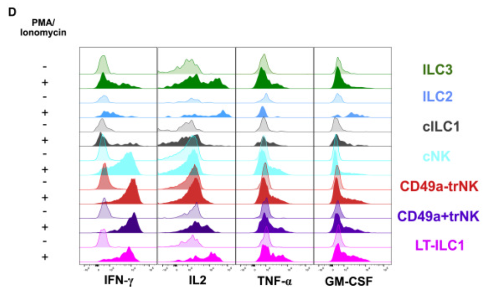
Ridgeline plots are used to visualize cytokine expression across various experimental conditions and to compare gene expression distributions in different cell populations. [1]
2. Using Ridgeline Plots to Visualize Gene Set Enrichment Analysis Results
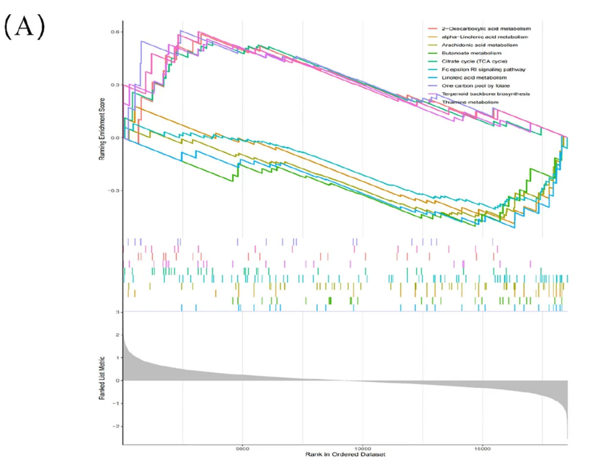
Ridgeline plots are used to visualize gene set enrichment analysis results, highlighting biomarkers associated with Moyamoya disease. [2]
Reference
- Krämer B, Nalin AP, Ma F, Eickhoff S, Lutz P, Leonardelli S, Goeser F, Finnemann C, Hack G, Raabe J, ToVinh M, Ahmad S, Hoffmeister C, Kaiser KM, Manekeller S, Branchi V, Bald T, Hölzel M, Hüneburg R, Nischalke HD, Semaan A, Langhans B, Kaczmarek DJ, Benner B, Lordo MR, Kowalski J, Gerhardt A, Timm J, Toma M, Mohr R, Türler A, Charpentier A, van Bremen T, Feldmann G, Sattler A, Kotsch K, Abdallah AT, Strassburg CP, Spengler U, Carson WE 3rd, Mundy-Bosse BL, Pellegrini M, O’Sullivan TE, Freud AG, Nattermann J. Single-cell RNA sequencing identifies a population of human liver-type ILC1s. Cell Rep. 2023 Jan 31;42(1):111937. doi: 10.1016/j.celrep.2022.111937. Epub 2023 Jan 1. PMID: 36640314; PMCID: PMC9950534.
- Xu Y, Chen B, Guo Z, Chen C, Wang C, Zhou H, Zhang C, Feng Y. Identification of diagnostic markers for moyamoya disease by combining bulk RNA-sequencing analysis and machine learning. Sci Rep. 2024 Mar 11;14(1):5931. doi: 10.1038/s41598-024-56367-w. PMID: 38467737; PMCID: PMC10928210.
- Wickham, H. (2009). ggplot2: Elegant Graphics for Data Analysis. Springer-Verlag New York. ISBN 978-0-387-98140-6 (Print) 978-0-387-98141-3 (E-Book). [DOI: 10.1007/978-0-387-98141-3] (https://doi.org/10.1007/978-0-387-98141-3)
- Scherer, C. (2019). ggridges: Ridgeline plots in ‘ggplot2’. Journal of Statistical Software, 88(1), 1-19. [DOI: 10.18637/jss.v088.i01] (https://doi.org/10.18637/jss.v088.i01)
- Garnier, S., Team, R. C., & Team, R. S. (2018). viridis: Default color maps for R. R package version 0.5.1. https://CRAN.R-project.org/package=viridis
- Fournet, H. (2016). hrbrthemes: Additional themes, scales, and geoms for ‘ggplot2’. R package version 1.7.6. https://CRAN.R-project.org/package=hrbrthemes