# Install packages
if (!requireNamespace("ggplot2", quietly = TRUE)) {
  install.packages("ggplot2")
}
if (!requireNamespace("reshape2", quietly = TRUE)) {
  install.packages("reshape2")
}
if (!requireNamespace("plyr", quietly = TRUE)) {
  install.packages("plyr")
}
if (!requireNamespace("dplyr", quietly = TRUE)) {
  install.packages("dplyr")
}
if (!requireNamespace("tidyr", quietly = TRUE)) {
  install.packages("tidyr")
}
if (!requireNamespace("vcd", quietly = TRUE)) {
  install.packages("vcd")
}
if (!requireNamespace("graphics", quietly = TRUE)) {
  install.packages("graphics")
}
if (!requireNamespace("wesanderson", quietly = TRUE)) {
  install.packages("wesanderson")
}

# Load packages
library(ggplot2)
library(reshape2)
library(plyr)
library(dplyr)
library(vcd)
library(graphics)
library(wesanderson)Mosaic Plot
Example
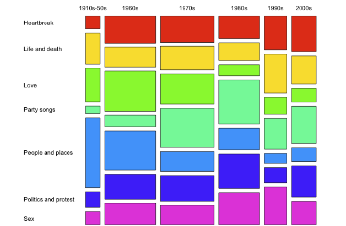
A mosaic plot shows the relationship between a pair of variables in categorical data. It works similarly to a two-way 100% stacked bar chart, but all bars have equal length on the value/scale axis and are divided into segments. You can use these two variables to examine the relationship between a category and its subcategories.
Setup
System Requirements: Cross-platform (Linux/MacOS/Windows)
Programming language: R
Dependent packages:
ggplot2,reshape2,plyr,dplyr,vcd,graphics,wesanderson
sessioninfo::session_info("attached")─ Session info ───────────────────────────────────────────────────────────────
setting value
version R version 4.6.0 (2026-04-24)
os Ubuntu 24.04.4 LTS
system x86_64, linux-gnu
ui X11
language (EN)
collate C.UTF-8
ctype C.UTF-8
tz UTC
date 2026-05-09
pandoc 3.1.3 @ /usr/bin/ (via rmarkdown)
quarto 1.9.37 @ /usr/local/bin/quarto
─ Packages ───────────────────────────────────────────────────────────────────
package * version date (UTC) lib source
dplyr * 1.2.1 2026-04-03 [1] RSPM
ggplot2 * 4.0.3.9000 2026-05-04 [1] Github (tidyverse/ggplot2@6870419)
plyr * 1.8.9 2023-10-02 [1] RSPM
reshape2 * 1.4.5 2025-11-12 [1] RSPM
vcd * 1.4-13 2024-09-16 [1] RSPM
wesanderson * 0.3.7 2023-10-31 [1] RSPM
[1] /home/runner/work/_temp/Library
[2] /opt/R/4.6.0/lib/R/site-library
[3] /opt/R/4.6.0/lib/R/library
* ── Packages attached to the search path.
──────────────────────────────────────────────────────────────────────────────Data Preparation
# Generate simulated data
df <- data.frame(segment = c("Patient1", "Patient2", "Patient3","Patient4"),
                 "Macrophage" = c(2400  ,1200,  600 ,250),
                 "Epithelial" = c(1000  ,900,   600,    250),
                 "T cells" = c(400, 600 ,400,   250),
                 "B cells" = c(200, 300 ,400,   250))

melt_df<-melt(df,id="segment")
# Convert numbers to percentages
segpct<-rowSums(df[,2:ncol(df)])
for (i in 1:nrow(df)){
  for (j in 2:ncol(df)){
    df[i,j]<-df[i,j]/segpct[i]*100
  }
}

segpct<-segpct/sum(segpct)*100
df$xmax <- cumsum(segpct)
df$xmin <- (df$xmax - segpct)

dfm <- melt(df, id = c("segment", "xmin", "xmax"),value.name="percentage")
colnames(dfm)[ncol(dfm)]<-"percentage"

# The ddply() function uses a custom statistical function to group and calculate data.frame
dfm1 <- ddply(dfm, .(segment), transform, ymax = cumsum(percentage))
dfm1 <- ddply(dfm1, .(segment), transform,ymin = ymax - percentage)
dfm1$xtext <- with(dfm1, xmin + (xmax - xmin)/2)
dfm1$ytext <- with(dfm1, ymin + (ymax - ymin)/2)

# join() function, connects two tables data.frame
dfm2<-join(melt_df, dfm1, by = c("segment", "variable"), type = "left", match = "all")

# View the final merged dataset
head(dfm2)
segment variable value xmin xmax percentage ymax ymin xtext ytext
1 Patient1 Macrophage 2400 0 40 60 60 0 20 30.0
2 Patient2 Macrophage 1200 40 70 40 40 0 55 20.0
3 Patient3 Macrophage 600 70 90 30 30 0 80 15.0
4 Patient4 Macrophage 250 90 100 25 25 0 95 12.5
5 Patient1 Epithelial 1000 0 40 25 85 60 20 72.5
6 Patient2 Epithelial 900 40 70 30 70 40 55 55.0Visualization
1. Basic Plot
Use basic functions to draw the caption and description of the image.
# Basic Plot
p <- ggplot() +
  geom_rect(aes(ymin = ymin, ymax = ymax, xmin = xmin, xmax = xmax, fill = variable),dfm2,colour = "black") +
  geom_text(aes(x = xtext, y = ytext,  label = value),dfm2 ,size = 4)+
  geom_text(aes(x = xtext, y = 103, label = paste(segment)),dfm2 ,size = 4)+
  geom_text(aes(x = 102, y = seq(12.5,100,25), label = c("Macrophage","Epithelial","T cells","B cells")), size = 4,hjust = 0)+
  scale_x_continuous(breaks=seq(0,100,25),limits=c(0,110))+
  theme(panel.background=element_rect(fill="white",colour=NA),
        panel.grid.major = element_line(colour = "grey60",size=.25,linetype ="dotted" ),
        panel.grid.minor = element_line(colour = "grey60",size=.25,linetype ="dotted" ),
        text=element_text(size=15),
        legend.position="none")

p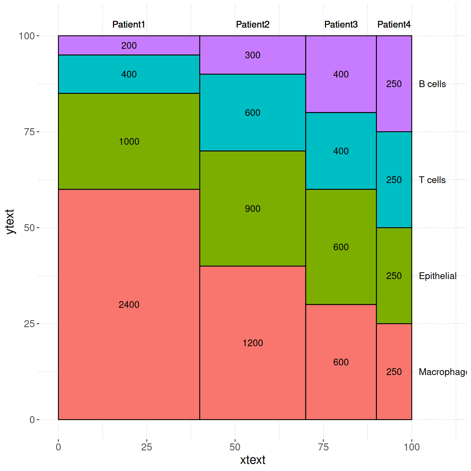
# Further beautification
# Data reprocessing
dfm1 <- ddply(dfm, .(segment), transform, ymax = cumsum(percentage))
dfm1 <- ddply(dfm1, .(segment), transform, ymin = ymax - percentage)

# Create Interval
spacing <- 1
dfm1$ymin <- dfm1$ymin + spacing * (as.numeric(factor(dfm1$variable)) - 1)
dfm1$ymax <- dfm1$ymax + spacing * (as.numeric(factor(dfm1$variable)) - 1)

# Calculate text display position
dfm1$xtext <- with(dfm1, xmin + (xmax - xmin) / 2)
dfm1$ytext <- with(dfm1, ymin + (ymax - ymin) / 2)

# Joining Data Frames
dfm2 <- join(melt_df, dfm1, by = c("segment", "variable"), type = "left", match = "all")

p2 <- ggplot() +
  geom_rect(aes(ymin = ymin, ymax = ymax,
                xmin = xmin + 5 * (as.numeric(factor(segment)) - 1),
                xmax = xmax + 5 * (as.numeric(factor(segment)) - 1),
                fill = variable),
            dfm2, colour = "black") +
  geom_text(aes(x = xtext + 5 * (as.numeric(factor(segment)) - 1),
                y = ytext, label = value),
            dfm2, size = 4) +
  geom_text(aes(x = xtext + 5 * (as.numeric(factor(segment)) - 1),
                y = max(dfm1$ymax) + spacing * 2,
                label = paste(segment)),
            dfm2, size = 4) +
  geom_text(aes(x = 116, y = seq(12.5, 100, 25) + spacing * 0.5,
                label = c("Macrophage", "Epithelial", "T cells", "B cells")),
            size = 4, hjust = 0) +
  scale_x_continuous(breaks = NULL, limits = c(0, 110 + 5 * 3), expand = c(0, 0)) +  # Remove the horizontal axis
  scale_y_continuous(breaks = NULL, limits = c(0, max(dfm1$ymax) + spacing * 3), expand = c(0, 0)) +  # Remove the vertical coordinate
  theme(panel.background = element_rect(fill = "white", colour = NA),
        panel.grid.major = element_blank(),  # Remove the grid
        panel.grid.minor = element_blank(),
        text = element_text(size = 15),
        legend.position = "none",
        axis.title.x = element_blank(),  # Remove the x-axis title
        axis.title.y = element_blank(),  # Remove the y-axis title
        axis.ticks = element_blank())  # Remove axis scale

p2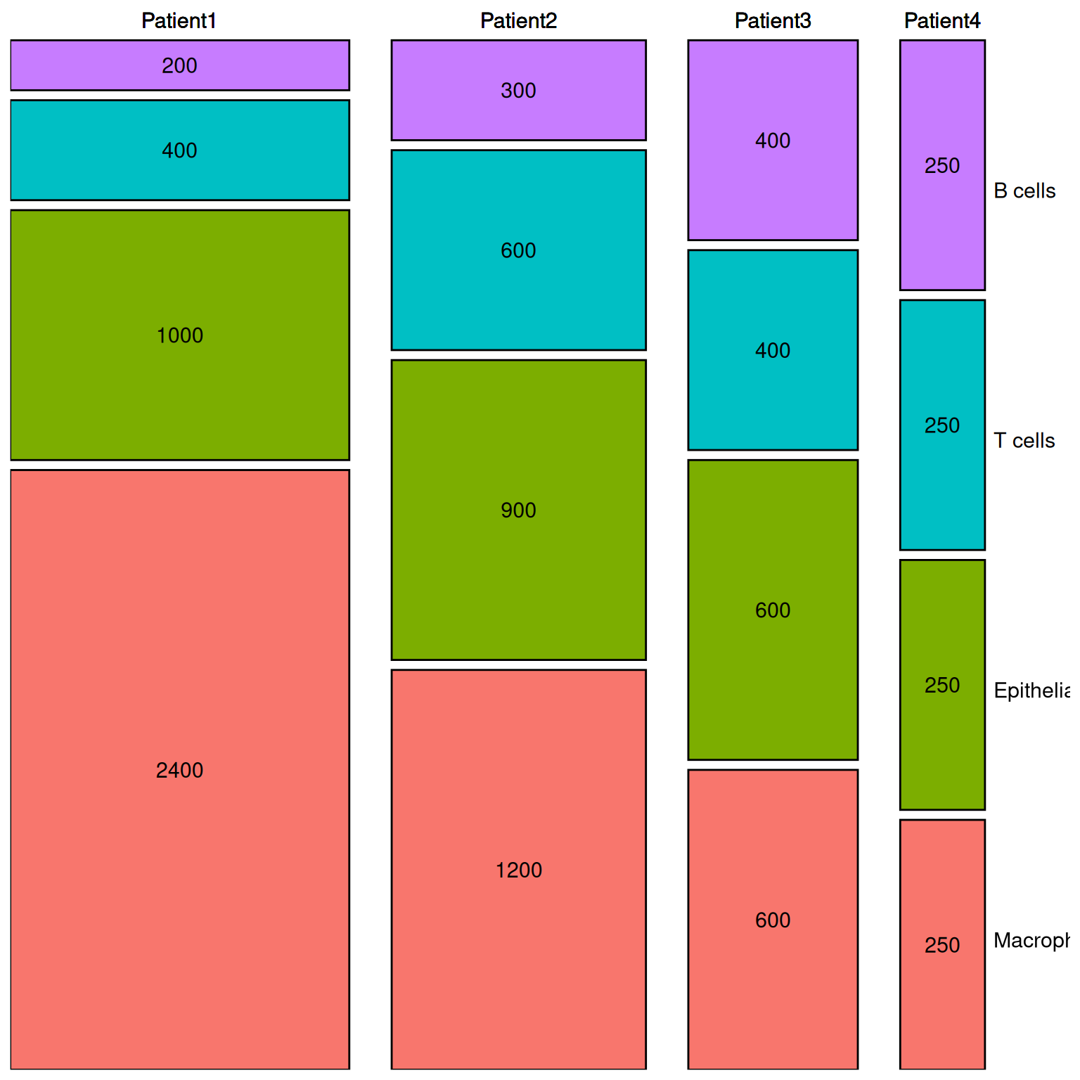
2. Advanced Plot
2.1 vcd package
# Create a table
table <- xtabs(value ~variable+segment, melt_df)

# plot
p3 <- mosaic(~segment+variable,table,shade=TRUE,legend=TRUE,color=TRUE)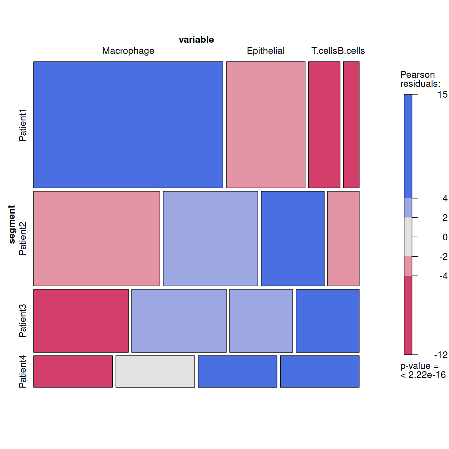
2.2 graphics package
p4 <- mosaicplot( ~segment+variable,table, color = wes_palette("FrenchDispatch"),main = '')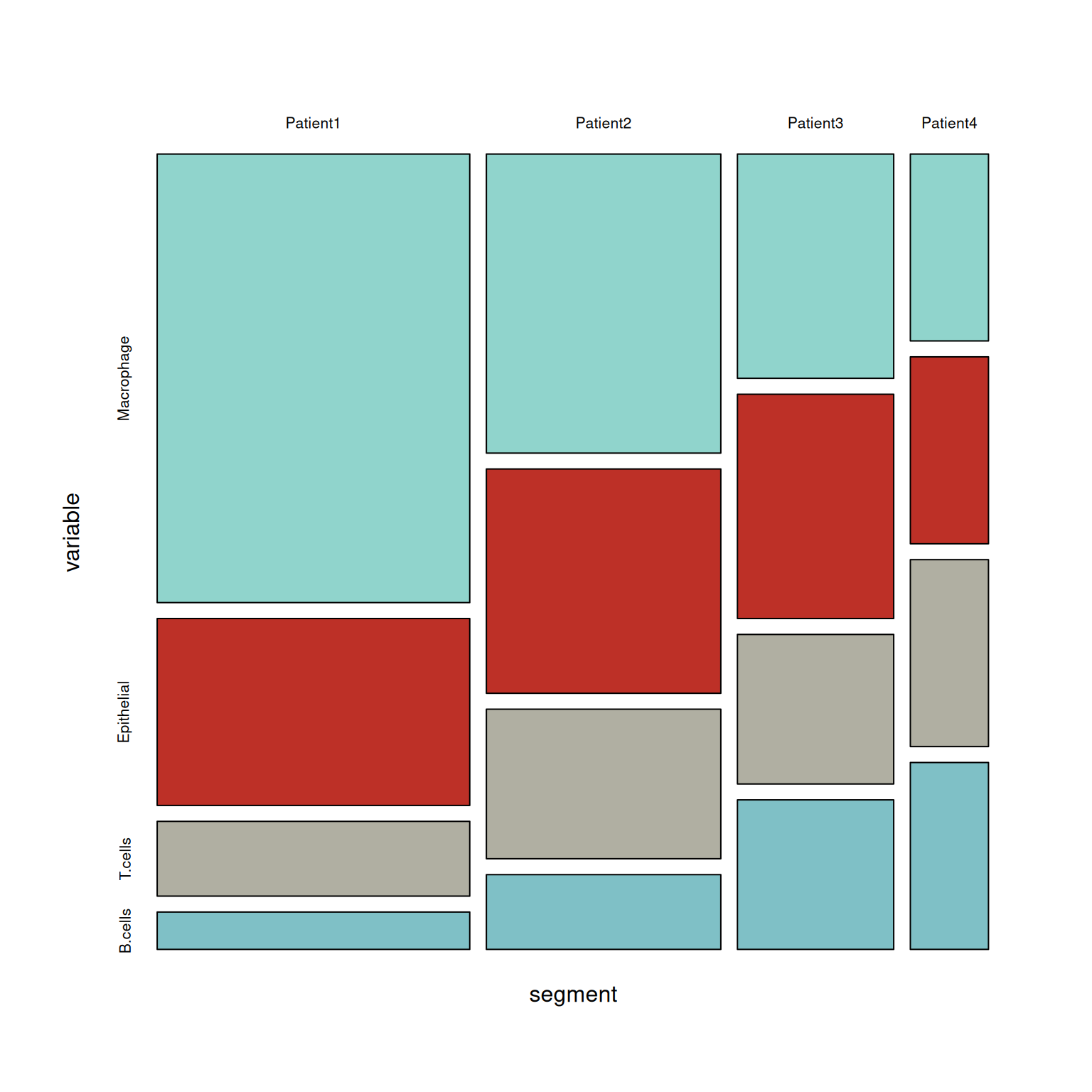
Application
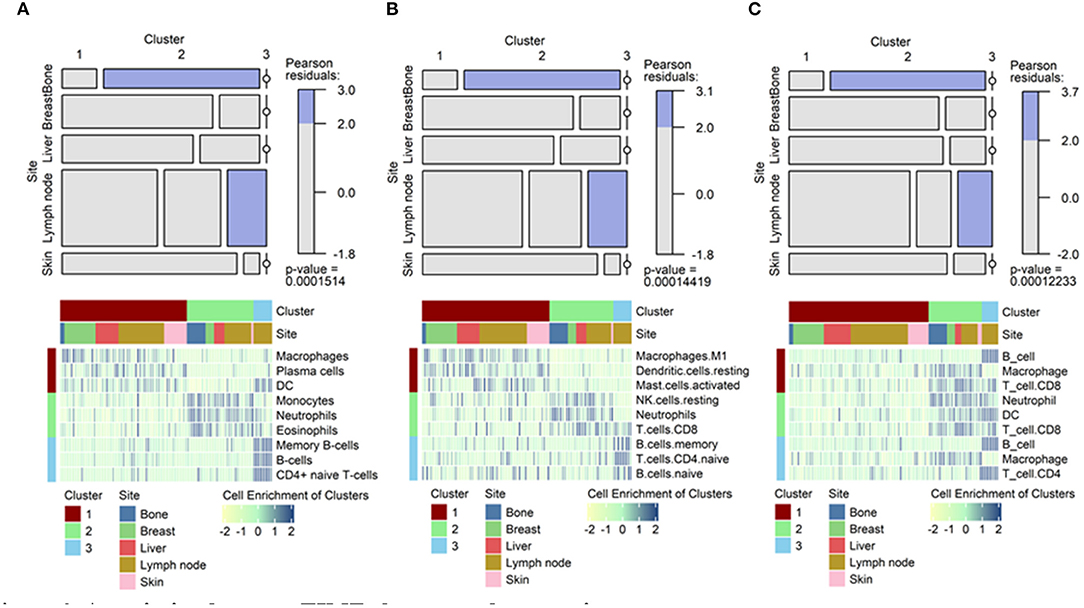
This mosaic plot shows the association of specific clusters with specific tumor metastasis sites. [1]
Reference
[1] Lee H, Na KJ, Choi H. Differences in Tumor Immune Microenvironment in Metastatic Sites of Breast Cancer. Front Oncol. 2021;11:649004. Published 2021 Mar 18. doi:10.3389/fonc.2021.649004.
[2] Friendly, M. (2002). “A Brief History of the Mosaic Display.” Journal of Computational and Graphical Statistics, 11(1), 89-107.
[3] Meyer, D., et al. (2006). “The Strucplot Framework: Visualizing Multi-Way Contingency Tables with vcd.” Journal of Statistical Software, 17(3), 1-48.
[4] Gehlenborg, N. (2014). “UpSetR: An Alternative to Mosaic Plots for Visualizing Intersecting Sets.” Nature Methods, 11(8), 769-770.
[5] Nowicka, M., et al. (2017). “CyTOF Workflow: Differential Discovery in High-Throughput High-Dimensional Cytometry Datasets.” F1000Research, 6, 748.
[6] Wilke, C.O. (2020). “Fundamentals of Data Visualization in Biomedicine.” Springer.
[7] R Core Team (2023). “R: A Language and Environment for Statistical Computing.”
[8] Slowikowski, K. (2021). “ggrepel: Automatically Position Non-Overlapping Text Labels in ggplot2.” Bioinformatics, 37(9), 1333-1334.