# Install packages
if (!requireNamespace("fmsb", quietly = TRUE)) {
  install.packages("fmsb")
}

# Load packages
library(fmsb)Radar/Spider Plot
A radar chart, spider chart, or web chart is a two-dimensional chart type used to plot a series of values over one or more quantitative variables. The fmsb library is an excellent tool for building this type of chart in R.
Example
Setup
System Requirements: Cross-platform (Linux/MacOS/Windows)
Programming Language: R
Dependencies:
fmsb
sessioninfo::session_info("attached")─ Session info ───────────────────────────────────────────────────────────────
setting value
version R version 4.6.0 (2026-04-24)
os Ubuntu 24.04.4 LTS
system x86_64, linux-gnu
ui X11
language (EN)
collate C.UTF-8
ctype C.UTF-8
tz UTC
date 2026-05-09
pandoc 3.1.3 @ /usr/bin/ (via rmarkdown)
quarto 1.9.37 @ /usr/local/bin/quarto
─ Packages ───────────────────────────────────────────────────────────────────
package * version date (UTC) lib source
fmsb * 0.7.6 2024-01-19 [1] RSPM
[1] /home/runner/work/_temp/Library
[2] /opt/R/4.6.0/lib/R/site-library
[3] /opt/R/4.6.0/lib/R/library
* ── Packages attached to the search path.
──────────────────────────────────────────────────────────────────────────────Data Preparation
This paper primarily uses the built-in iris dataset in R, custom datasets, and the TCGA database.
The input data format must be very specific. Each row must contain a single entity. Each column is a quantitative variable. The first two rows provide the minimum and maximum values to be used for each variable.
# 1.R built-in data - iris
head(iris)
Sepal.Length Sepal.Width Petal.Length Petal.Width Species
1 5.1 3.5 1.4 0.2 setosa
2 4.9 3.0 1.4 0.2 setosa
3 4.7 3.2 1.3 0.2 setosa
4 4.6 3.1 1.5 0.2 setosa
5 5.0 3.6 1.4 0.2 setosa
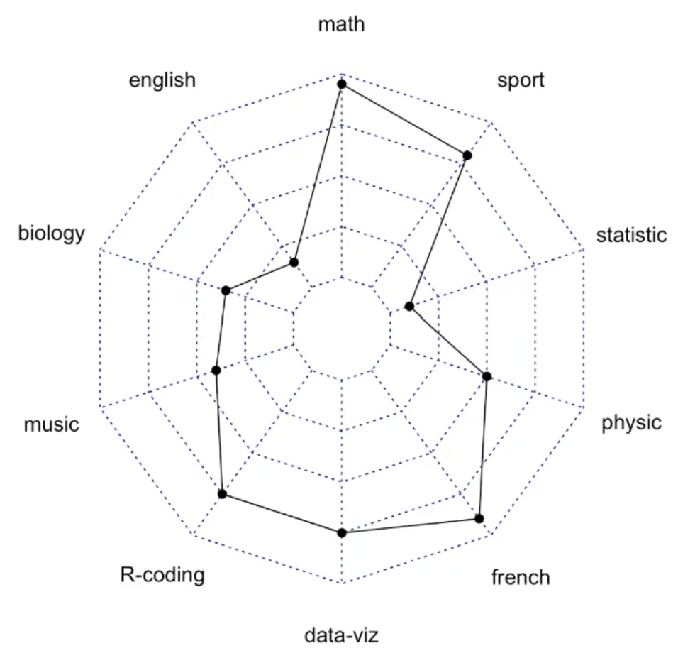
6 5.4 3.9 1.7 0.4 setosa# 2.Self-built dataset
## Here we create a data set about the performance of three students in different subjects
set.seed(99)
data <- as.data.frame(matrix( sample( 0:20 , 15 , replace=F) , ncol=5))
colnames(data) <- c("math" , "english" , "biology" , "music" , "R-coding" )
rownames(data) <- paste("mister" , letters[1:3] , sep="-")
data <- rbind(rep(20,5) , rep(0,5) , data)
# 3.TCGA database (gene expression data of liver cancer)
tcga_group_radar <- readr::read_csv(
"https://bizard-1301043367.cos.ap-guangzhou.myqcloud.com/tcga_group_radar.csv")
tcga_simple_bar <- data.frame(tcga_group_radar[3,])Visualization
1. Basic Plot
Take iris data as an example
# Data collation
iris_setosa <- iris[c(1:50),]
iris_setosa <- iris_setosa[,-5]
iris_setosa_radar <- rbind(rep(6,4),rep(0,4),iris_setosa)
# plot
par(mar = c(1, 1, 1, 1))
radarchart(iris_setosa_radar)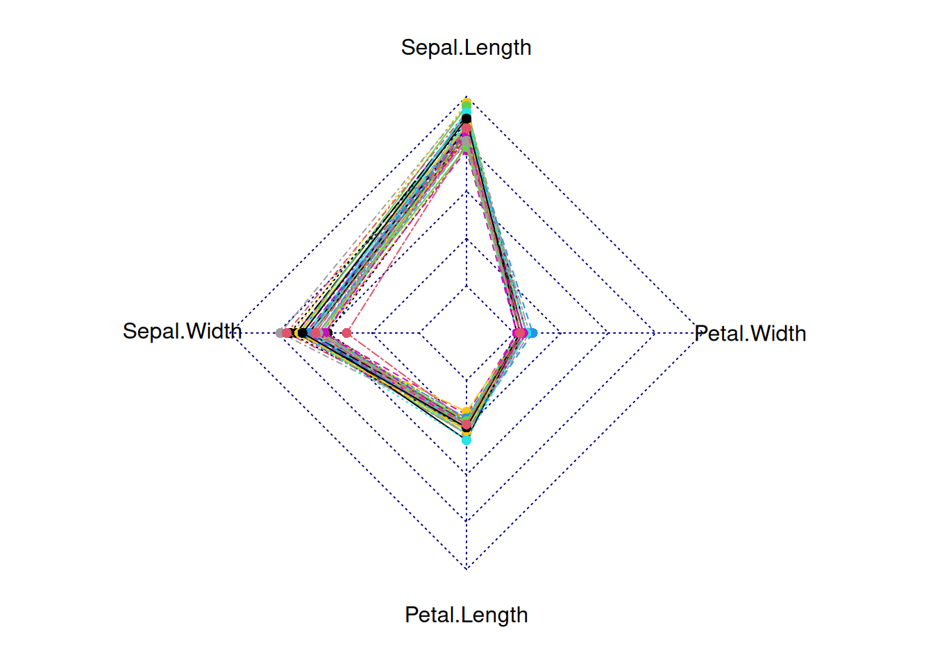
This radar chart depicts the distribution of four basic properties for a sample from the genus setosa.
Using the TCGA database as an example
par(mar = c(1, 1, 1, 1))
tcga_simple_bar <- rbind(rep(2.5,3),rep(0,3),tcga_simple_bar)
radarchart(tcga_simple_bar)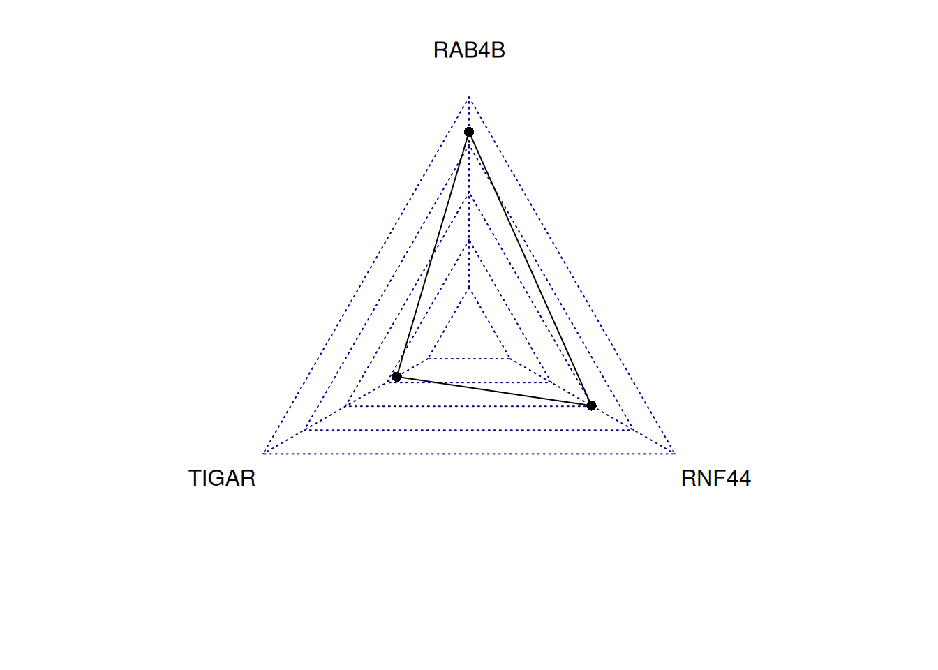
This radar chart describes the expression levels of TIGAR, RNF44, and RAB4B genes in a sample.
Tip
Key parameters:
Polygonal features: - pcol:Line color - pfcol:Fill color - plwd:Line width
Grid features: - cglcol:Grid color - cglty:Grid line type - axislabcol:Axis line color - caxislabels:Axis labels to display - cglwd:Grid width
Group Label: - vlcex:Group label size
radarchart(iris_setosa_radar,
           axistype=1 ,
           pcol=rgb(0.2,0.5,0.5,0.9),
           pfcol=rgb(0.2,0.5,0.5,0.1),
           plwd=4,
           cglcol="grey",cglty=1,axislabcol="grey",
           caxislabels=seq(0,20,5), cglwd=0.8, vlcex=0.8)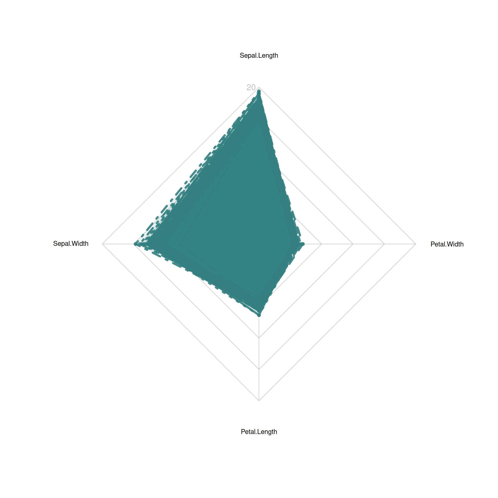
This radar chart describes the distribution of four basic properties of a sample from the setosa species.
2. Multi-group radar chart
Take self-built dataset as an example
radarchart(data)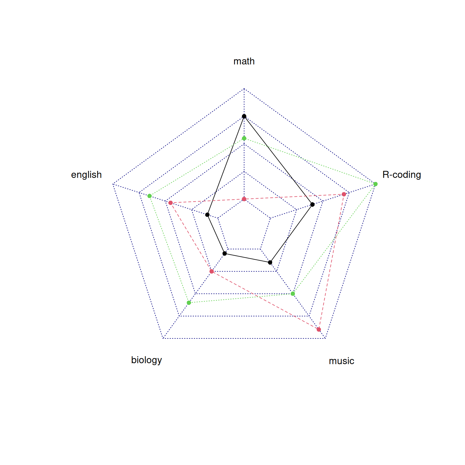
This radar chart describes the distribution of scores of three students in various subjects.
Adjust parameters
# Set color parameters
colors_border=c(rgb(0.2,0.5,0.5,0.9),rgb(0.8,0.2,0.5,0.9),rgb(0.7,0.5,0.1,0.9) )
colors_in=c(rgb(0.2,0.5,0.5,0.4),rgb(0.8,0.2,0.5,0.4) ,rgb(0.7,0.5,0.1,0.4) )

# plot
radarchart(data,
           axistype=1 ,
           pcol=colors_border , pfcol=colors_in , plwd=4 , plty=1,
           cglcol="grey", cglty=1,
           axislabcol="grey", caxislabels=seq(0,20,5),
           cglwd=0.8,
           vlcex=0.8
)

# Add a legend
legend(x=0.7, y=1,
       legend = rownames(data[-c(1,2),]), bty = "n",
       pch=20,col=colors_in , text.col = "grey",
       cex=1.2, pt.cex=3)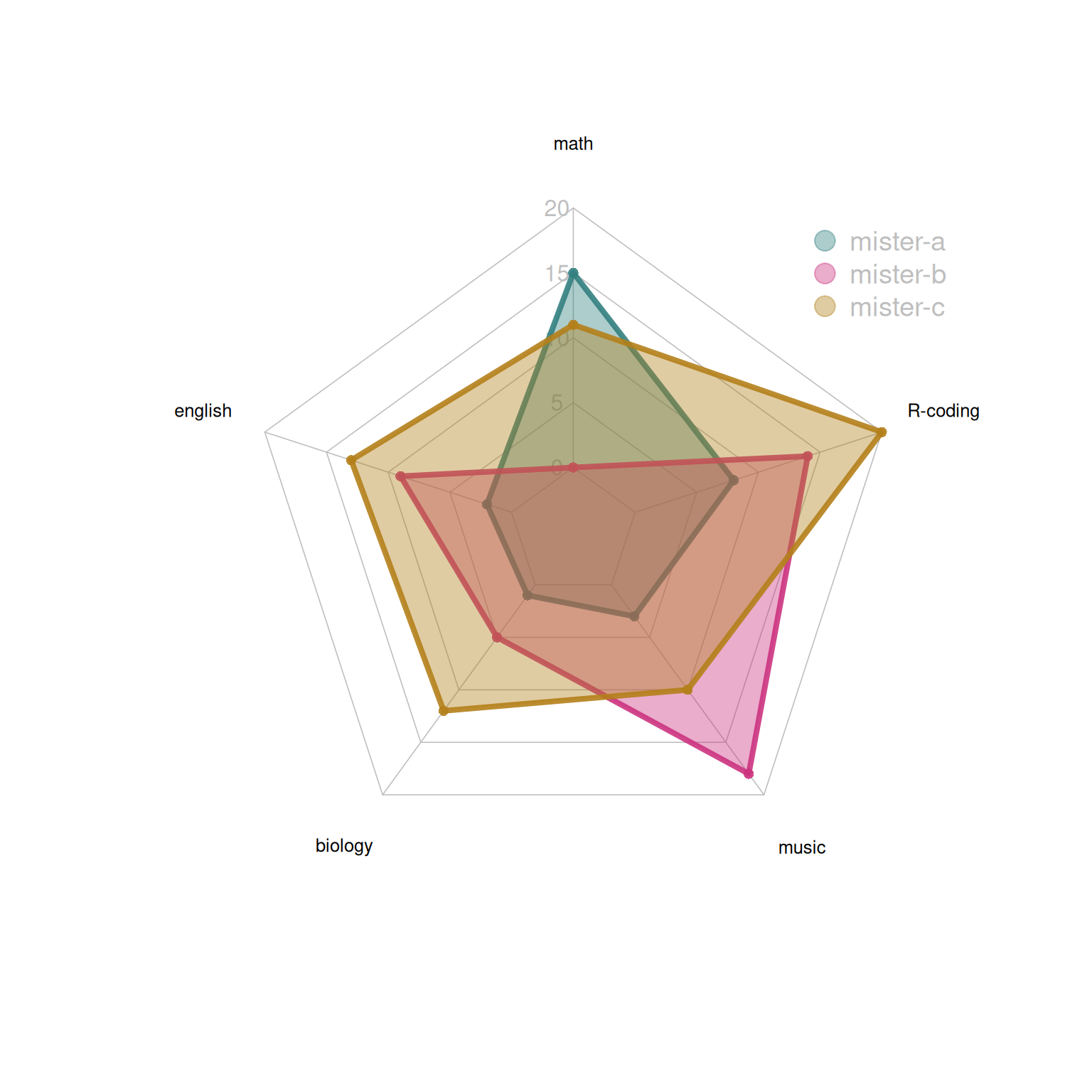
This radar chart describes the distribution of scores of three students in various subjects.
Taking the TCGA database as an example
par(mar = c(1, 1, 1, 1))
tcga_group_radar <- rbind(rep(3,3),rep(0,3),tcga_group_radar)
tcga_group_radar <- as.data.frame(tcga_group_radar) # It must be converted into a data frame before it can be drawn.
radarchart(tcga_group_radar)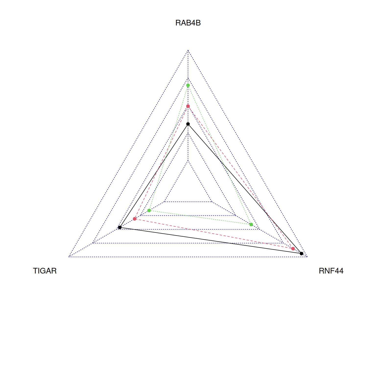
This radar chart describes the expression levels of TIGAR, RNF44, and RAB4B genes in a sample.
Applications
1. Comprehensive comparison of multivariate data
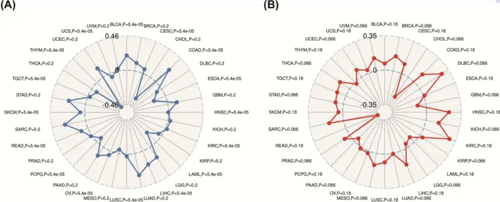
This study used radar charts to analyze the role and prognostic value of the YIF1B gene in pan-cancer. [1]
2. Applicable to comprehensive evaluation of multiple indicators
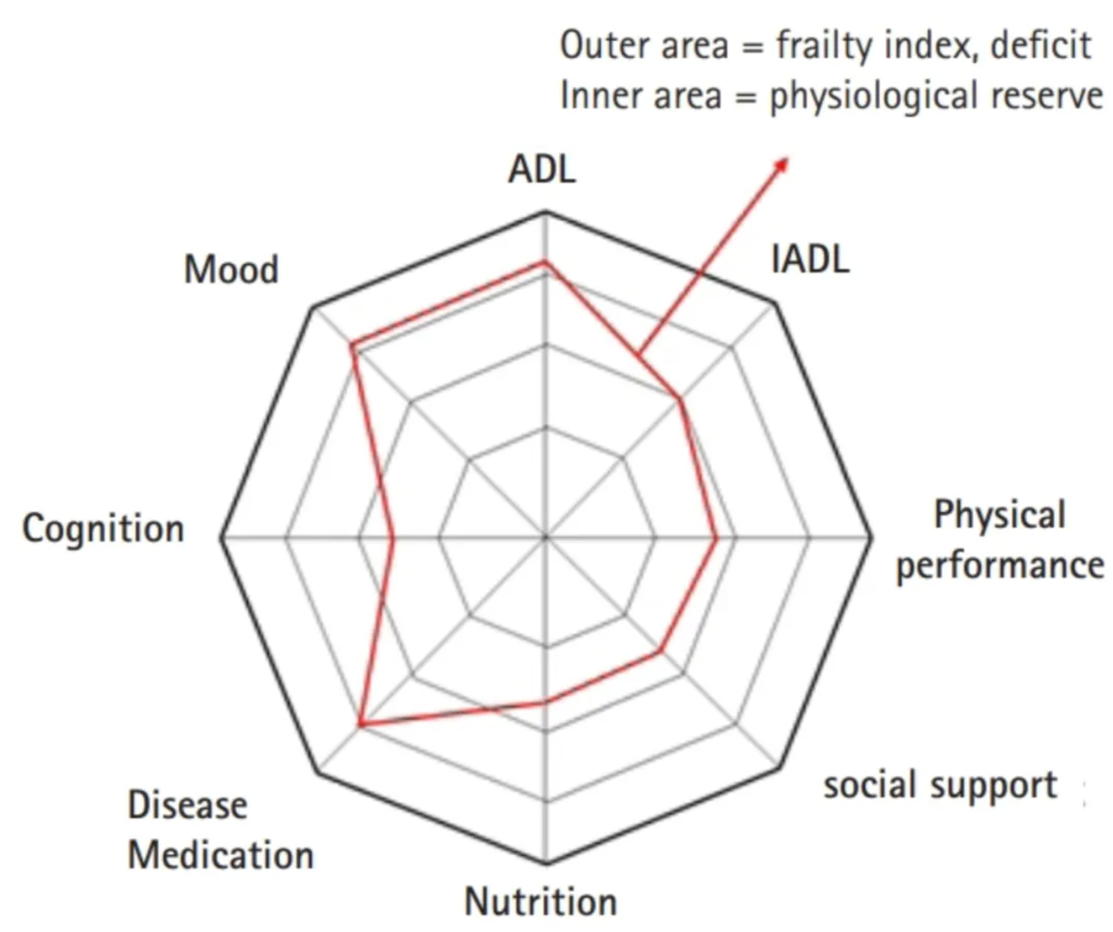
The study used radar charts to present various areas of frailty assessment in older adults. [2]
Reference
[1] Liu J, Chen Z, Zhao P, Li W. Prognostic and immune regulating roles of YIF1B in Pan-Cancer: a potential target for both survival and therapy response evaluation. Biosci Rep. 2020 Jul 31;40(7):BSR20201384. doi: 10.1042/BSR20201384. PMID: 32648580; PMCID: PMC7378310.
[2] Jung HW. Visualizing Domains of Comprehensive Geriatric Assessments to Grasp Frailty Spectrum in Older Adults with a Radar Chart. Ann Geriatr Med Res. 2020 Mar;24(1):55-56. doi: 10.4235/agmr.20.0013. Epub 2020 Mar 27. PMID: 32743323; PMCID: PMC7370779.
[3] Nakazawa M (2024). fmsb: Functions for Medical Statistics Book with some Demographic Data. R package version 0.7.6, https://CRAN.R-project.org/package=fmsb.