# Install packages
if (!requireNamespace("data.table", quietly = TRUE)) {
  install.packages("data.table")
}
if (!requireNamespace("jsonlite", quietly = TRUE)) {
  install.packages("jsonlite")
}
if (!requireNamespace("grafify", quietly = TRUE)) {
  install.packages("grafify")
}

# Load packages
library(data.table)
library(jsonlite)
library(grafify)Line (Color Dot)
Note
Hiplot website
This page is the tutorial for source code version of the Hiplot Line (Color Dot) plugin. You can also use the Hiplot website to achieve no code ploting. For more information please see the following link:
Setup
System Requirements: Cross-platform (Linux/MacOS/Windows)
Programming language: R
Dependent packages:
data.table;jsonlite;grafify
sessioninfo::session_info("attached")─ Session info ───────────────────────────────────────────────────────────────
setting value
version R version 4.6.0 (2026-04-24)
os Ubuntu 24.04.4 LTS
system x86_64, linux-gnu
ui X11
language (EN)
collate C.UTF-8
ctype C.UTF-8
tz UTC
date 2026-05-09
pandoc 3.1.3 @ /usr/bin/ (via rmarkdown)
quarto 1.9.37 @ /usr/local/bin/quarto
─ Packages ───────────────────────────────────────────────────────────────────
package * version date (UTC) lib source
data.table * 1.18.4 2026-05-06 [1] RSPM
ggplot2 * 4.0.3.9000 2026-05-04 [1] Github (tidyverse/ggplot2@6870419)
grafify * 5.1.0 2025-08-25 [1] RSPM
jsonlite * 2.0.0 2025-03-27 [1] RSPM
[1] /home/runner/work/_temp/Library
[2] /opt/R/4.6.0/lib/R/site-library
[3] /opt/R/4.6.0/lib/R/library
* ── Packages attached to the search path.
──────────────────────────────────────────────────────────────────────────────Data Preparation
# Load data
data <- data.table::fread(jsonlite::read_json("https://hiplot.cn/ui/basic/line-color-dot/data.json")$exampleData[[1]]$textarea[[1]])
data <- as.data.frame(data)

# Convert data structure
x <- "Time"
y <- "PI"
group <- "Experiment"
facet <- "Genotype"
data[, x] <- factor(data[, x], levels = unique(data[, x]))
data[, group] <- factor(data[, group], levels = unique(data[, group]))
data[, facet] <- factor(data[, facet], levels = unique(data[, facet]))

# View data
head(data)
Experiment Time Subject Genotype PI Time2
1 e1 t100 s1 WT 20.47120 100
2 e2 t100 s2 WT 28.88967 100
3 e3 t100 s3 WT 11.55061 100
4 e4 t100 s4 WT 23.24516 100
5 e5 t100 s5 WT 30.20904 100
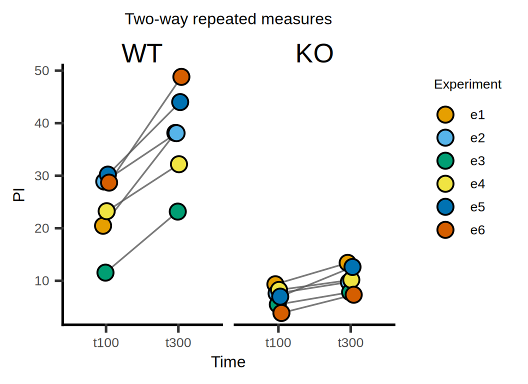
6 e6 t100 s6 WT 28.68300 100Visualization
# Line (Color Dot)
p <- plot_befafter_colours(
  data = data, xcol = get(x), ycol = get(y), match = get(group),
  symsize = 5, symthick = 1, s_alpha = 1) +
  facet_wrap(facet) +
  guides(fill = guide_legend(title = group)) +
  scale_fill_grafify() +
  xlab(x) + ylab(y) +
  ggtitle("Two-way repeated measures") +
  theme(text = element_text(family = "Arial"),
        plot.title = element_text(size = 12, hjust = 0.5),
        axis.title = element_text(size = 12),
        axis.text = element_text(size = 10),
        axis.text.x = element_text(angle = 0, hjust = 0.5,vjust = 1),
        legend.position = "right",
        legend.direction = "vertical",
        legend.title = element_text(size = 10),
        legend.text = element_text(size = 10))

p