# Install packages
if (!requireNamespace("data.table", quietly = TRUE)) {
  install.packages("data.table")
}
if (!requireNamespace("jsonlite", quietly = TRUE)) {
  install.packages("jsonlite")
}
if (!requireNamespace("ggplot2", quietly = TRUE)) {
  install.packages("ggplot2")
}

# Load packages
library(data.table)
library(jsonlite)
library(ggplot2)Pareto Chart
Note
Hiplot website
This page is the tutorial for source code version of the Hiplot Pareto Chart plugin. You can also use the Hiplot website to achieve no code ploting. For more information please see the following link:
Setup
System Requirements: Cross-platform (Linux/MacOS/Windows)
Programming language: R
Dependent packages:
data.table;jsonlite;ggplot2
sessioninfo::session_info("attached")─ Session info ───────────────────────────────────────────────────────────────
setting value
version R version 4.6.0 (2026-04-24)
os Ubuntu 24.04.4 LTS
system x86_64, linux-gnu
ui X11
language (EN)
collate C.UTF-8
ctype C.UTF-8
tz UTC
date 2026-05-09
pandoc 3.1.3 @ /usr/bin/ (via rmarkdown)
quarto 1.9.37 @ /usr/local/bin/quarto
─ Packages ───────────────────────────────────────────────────────────────────
package * version date (UTC) lib source
data.table * 1.18.4 2026-05-06 [1] RSPM
ggplot2 * 4.0.3.9000 2026-05-04 [1] Github (tidyverse/ggplot2@6870419)
jsonlite * 2.0.0 2025-03-27 [1] RSPM
[1] /home/runner/work/_temp/Library
[2] /opt/R/4.6.0/lib/R/site-library
[3] /opt/R/4.6.0/lib/R/library
* ── Packages attached to the search path.
──────────────────────────────────────────────────────────────────────────────Data Preparation
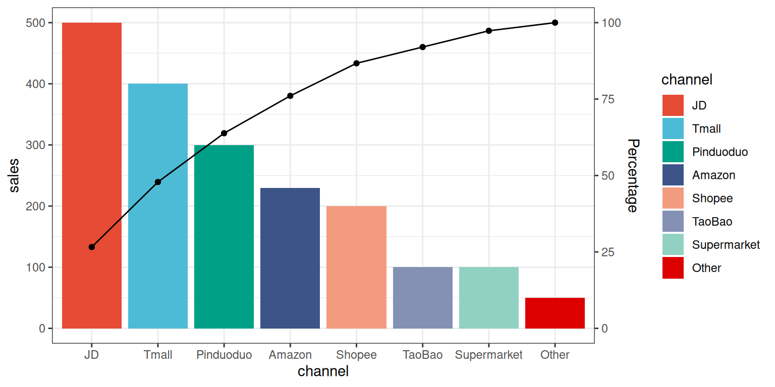
The case data represents the sales data of a product on multiple platforms. The plugin will automatically plot a bar chart with sales data in descending order and simultaneously calculate the cumulative sales to draw the cumulative line chart.
# Load data
data <- data.table::fread(jsonlite::read_json("https://hiplot.cn/ui/basic/pareto-chart/data.json")$exampleData$textarea[[1]])
data <- as.data.frame(data)

# Convert data structure
data <- data[order(-data[["sales"]]), ]
data[["channel"]] <- factor(data[["channel"]], levels = data[["channel"]])
## Calculate percentage number
data$accumulating <- cumsum(data[["sales"]])
max_y <- max(data[["sales"]])
cal_num <- sum(data[["sales"]]) / max_y
data$accumulating <- data$accumulating / cal_num

# View data
head(data)
channel sales accumulating
2 JD 500 132.9787
5 Tmall 400 239.3617
4 Pinduoduo 300 319.1489
3 Amazon 230 380.3191
6 Shopee 200 433.5106
1 TaoBao 100 460.1064Visualization
# Pareto Chart
p <- ggplot(data, aes(x = channel, y = sales, fill = channel)) +
  geom_bar(stat = "identity") +
  geom_line(aes(y = accumulating), group = 1) +
  geom_point(aes(y = accumulating), show.legend = FALSE) +
  scale_y_continuous(sec.axis = sec_axis(trans = ~ . / max_y * 100, name = "Percentage")) +
  scale_fill_manual(values = c("#E64B35FF","#4DBBD5FF","#00A087FF","#3C5488FF",
                               "#F39B7FFF","#8491B4FF","#91D1C2FF","#DC0000FF")) +
  theme_bw()

p