# Install packages
if (!requireNamespace("ggplot2", quietly = TRUE)) {
  install.packages("ggplot2")
}
if (!requireNamespace("viridis", quietly = TRUE)) {
  install.packages("viridis")
}
if (!requireNamespace("patchwork", quietly = TRUE)) {
  install.packages("patchwork")
}
if (!requireNamespace("gghighlight", quietly = TRUE)) {
  install.packages("gghighlight")
}
if (!requireNamespace("ggpmisc", quietly = TRUE)) {
  install.packages("ggpmisc")
}
if (!requireNamespace("dplyr", quietly = TRUE)) {
  install.packages("dplyr")
}

# Load packages
library(ggplot2)
library(viridis)
library(patchwork)
library(gghighlight)
library(ggpmisc)
library(dplyr)Line Chart
Drawing line segments in various charts is common, and this module will draw all kinds of line segments that may be used.
Example
The figure shows a basic linear graph that can intuitively represent the trend of the dependent variable as the independent variable moves.
Setup
System Requirements: Cross-platform (Linux/MacOS/Windows)
Programming Language: R
Dependencies:
ggplot2,viridis,patchwork,gghighlight,ggpmisc
sessioninfo::session_info("attached")─ Session info ───────────────────────────────────────────────────────────────
setting value
version R version 4.6.0 (2026-04-24)
os Ubuntu 24.04.4 LTS
system x86_64, linux-gnu
ui X11
language (EN)
collate C.UTF-8
ctype C.UTF-8
tz UTC
date 2026-05-09
pandoc 3.1.3 @ /usr/bin/ (via rmarkdown)
quarto 1.9.37 @ /usr/local/bin/quarto
─ Packages ───────────────────────────────────────────────────────────────────
package * version date (UTC) lib source
dplyr * 1.2.1 2026-04-03 [1] RSPM
gghighlight * 0.5.0 2025-06-14 [1] RSPM
ggplot2 * 4.0.3.9000 2026-05-04 [1] Github (tidyverse/ggplot2@6870419)
ggpmisc * 0.7.0 2026-03-23 [1] RSPM
ggpp * 0.6.0 2026-01-18 [1] RSPM
patchwork * 1.3.2 2025-08-25 [1] RSPM
viridis * 0.6.5 2024-01-29 [1] RSPM
viridisLite * 0.4.3 2026-02-04 [1] RSPM
[1] /home/runner/work/_temp/Library
[2] /opt/R/4.6.0/lib/R/site-library
[3] /opt/R/4.6.0/lib/R/library
* ── Packages attached to the search path.
──────────────────────────────────────────────────────────────────────────────Data Preparation
This uses the built-in iris and economics datasets in R, along with a custom dataset and real-time glucose measurement data from the PhysioNet database. [1]。
# 1.iris data
data <- iris

head(data)
Sepal.Length Sepal.Width Petal.Length Petal.Width Species
1 5.1 3.5 1.4 0.2 setosa
2 4.9 3.0 1.4 0.2 setosa
3 4.7 3.2 1.3 0.2 setosa
4 4.6 3.1 1.5 0.2 setosa
5 5.0 3.6 1.4 0.2 setosa
6 5.4 3.9 1.7 0.4 setosa# 2.economics data
# (1) Using economics data directly to draw graphs
# (2) Processing economics data to draw time series graphs
data_economics <- economics[,c(1, 4, 5)] %>%
filter(grepl("-12-01", date)) %>% # Select only December data for plotting
mutate(date = gsub("-.*", "", date)) %>% # Only keep the year
slice(1:25) %>% # Choose the first 25 years
arrange(date) # Sort
head(data_economics)# A tibble: 6 × 3
date psavert uempmed
<chr> <dbl> <dbl>
1 1967 11.8 4.8
2 1968 11.1 4.4
3 1969 11.8 4.6
4 1970 13.2 5.9
5 1971 13 6.2
6 1972 13.7 6.1# 3.Automatically generate data (for log transformation of the y-axis).
data_create <- data.frame(
x = seq(11, 100),
y = seq(11, 100) / 2 + rnorm(90)
)
head(data_create) x y
1 11 5.406132
2 12 5.134575
3 13 4.619743
4 14 6.740172
5 15 8.738568
6 16 7.905469# 4.Glucose level (used to emphasize specific line segments)
data_glucose <- read.csv("https://bizard-1301043367.cos.ap-guangzhou.myqcloud.com/Dexcom_001.csv", header = T)
# Glucose value data processing
data_glucose <- data_glucose[,c(2, 8)] %>%
slice(1:102) %>%
setNames(c("V1", "V2")) %>%
filter(!is.na(V2) & V1 != "") %>% # Remove na
mutate(V3 = rep(1:30, times = 3), # Divided into 3 stages
group = rep(c("stage one", "stage two", "stage three"), each = 30))
head(data_glucose) V1 V2 V3 group
1 2020/2/13 17:23 61 1 stage one
2 2020/2/13 17:28 59 2 stage one
3 2020/2/13 17:33 58 3 stage one
4 2020/2/13 17:38 59 4 stage one
5 2020/2/13 17:43 63 5 stage one
6 2020/2/13 17:48 67 6 stage oneVisualization
1. Basic Plotting
# Basic Plotting
p <- ggplot(data, aes(x = Sepal.Length, y = Sepal.Width)) +
  geom_line()

p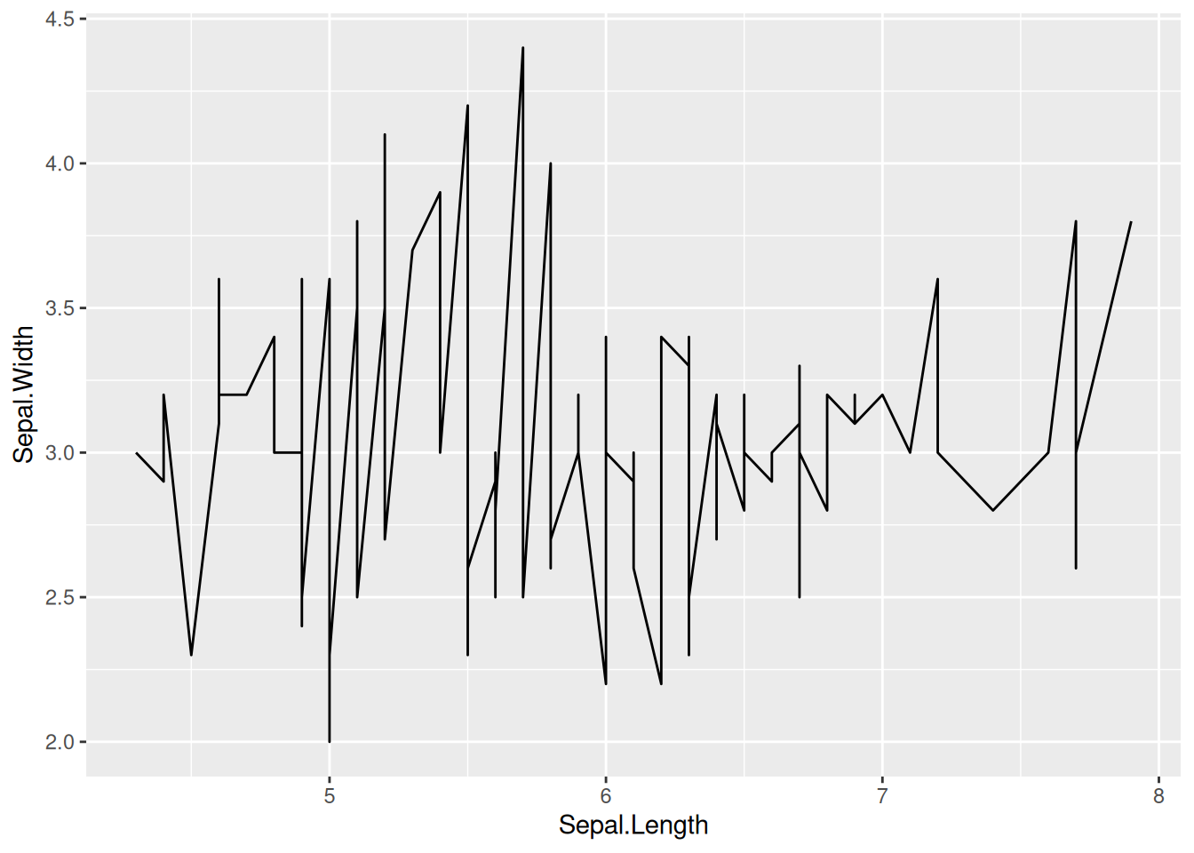
This plot is a basic form of a line plot, which can be drawn by calling geom_line() in ggplot.
2. Change line style
# Change line style
p <- ggplot(data, aes(x = Sepal.Length, y = Sepal.Width)) +
  geom_line(orientation = "x", linewidth = 1, color = "blue", linetype = 2)

p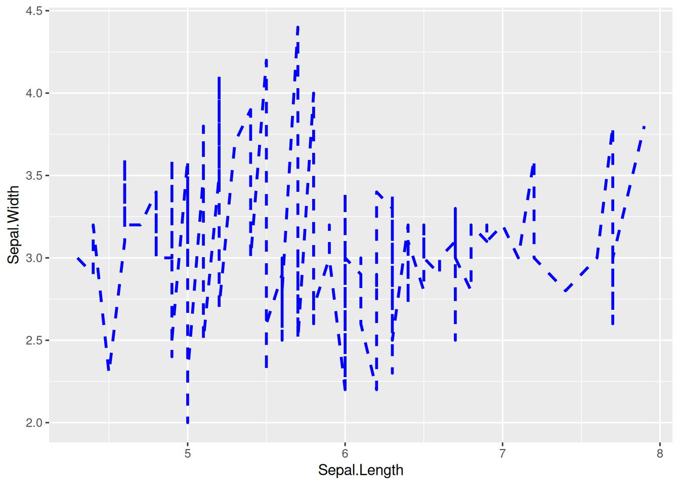
The line style of this graph can be changed by setting linewidth, color, and linetype.
Tip
Key parameter: geom_line
-
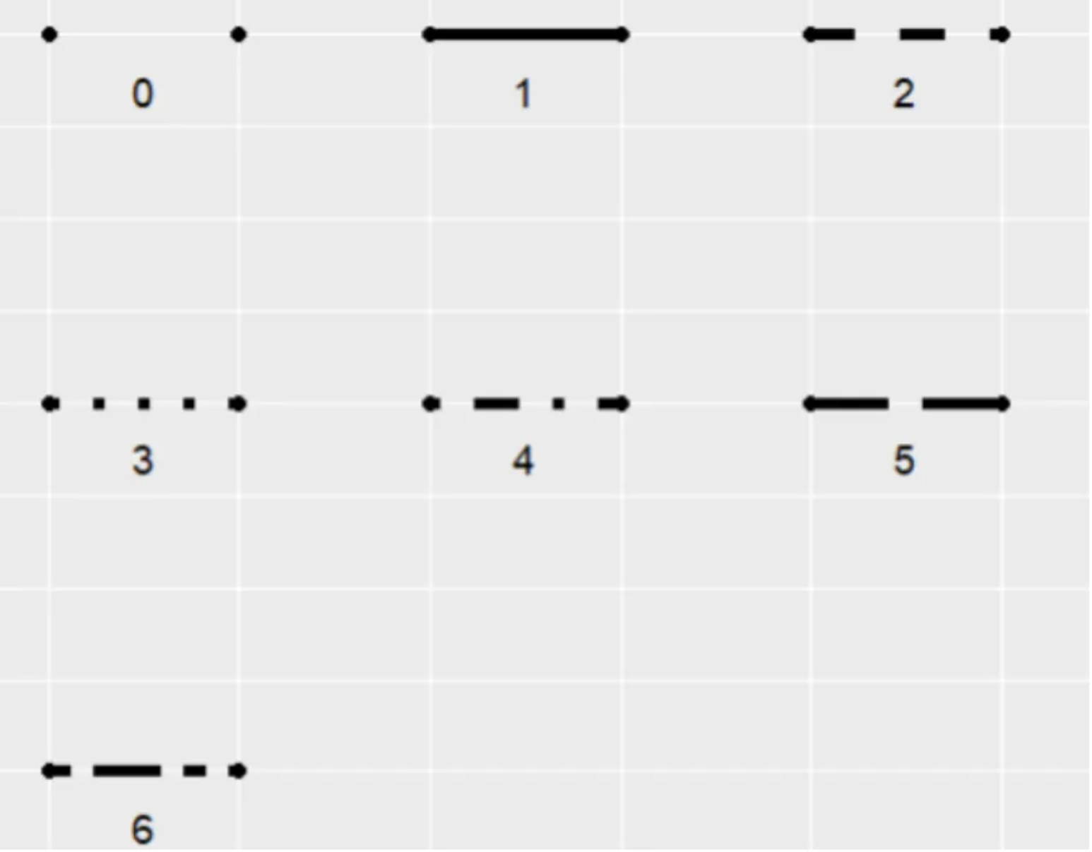
linetype: Indicates the line type, with options ranging from 0 to 6 (where 0 = blank, 1 = solid, 2 = dashed, 3 = dotted, 4 = dotdash, 5 = longdash, 6 = twodash). See the image below for specific shapes:
orientation: The orientation of the line segment, with options “x” and “y”.orientation="x"draws the line with x as the independent variable and y as the dependent variable.linewidth: The thickness of the line segment.
3. y-axis scale logarithmic
# y-axis scale logarithmic
p <- ggplot(data_create, aes(x = x, y = y)) +
  geom_line() +
  scale_y_log10(breaks = c(1, 5, 10, 15, 20, 50, 100), limits = c(1, 100))

p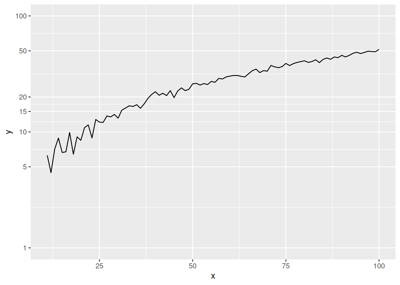
This graph shows that the y-axis scale is not evenly spaced, but rather logarithmized, which magnifies the lower part of the curve.
Tip
Key parameter: scale_y_log10
breaks: A set of numerical vectors can be used to represent the position of the y-axis ticks.limits: A set of numerical vectors of length 2 can be used to represent the range of the y-axis ticks.
# Before y-axis logarithmic conversion (for comparison)
p <- ggplot(data_create, aes(x = x, y = y)) +
  geom_line()

p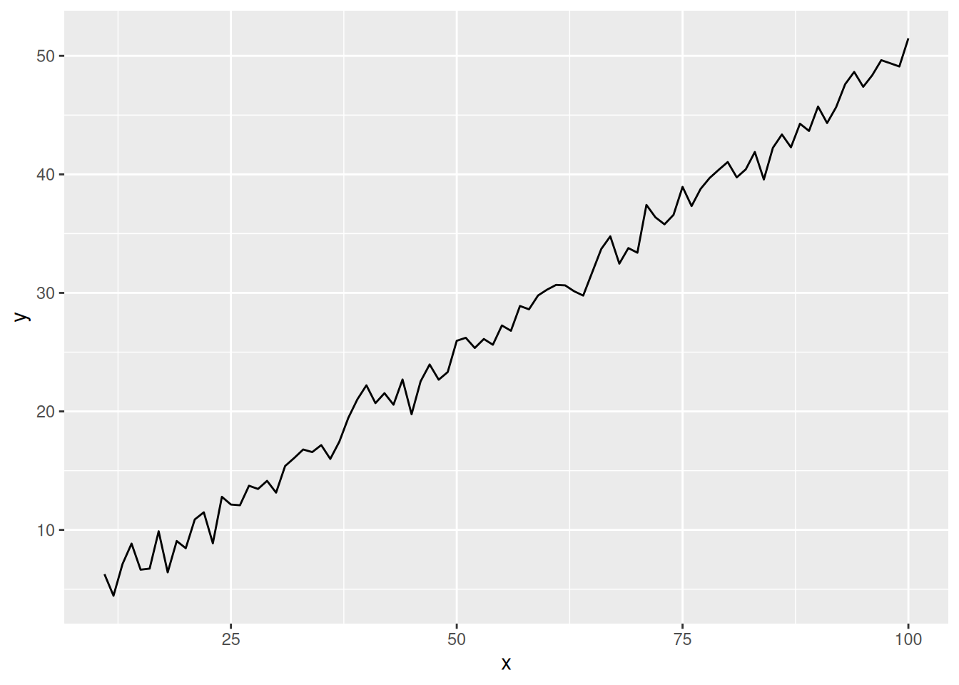
This graph is without y-axis logarithmic transformation (for comparison), and you can see that the scale is evenly distributed.
4. Multi-class data plotting
# Multi-class data plotting
p <- ggplot(data[data$Species != "versicolor", ], aes(x = Sepal.Length, y = Sepal.Width)) +
  geom_line(aes(color = Species)) # Mapping species variables to color features

p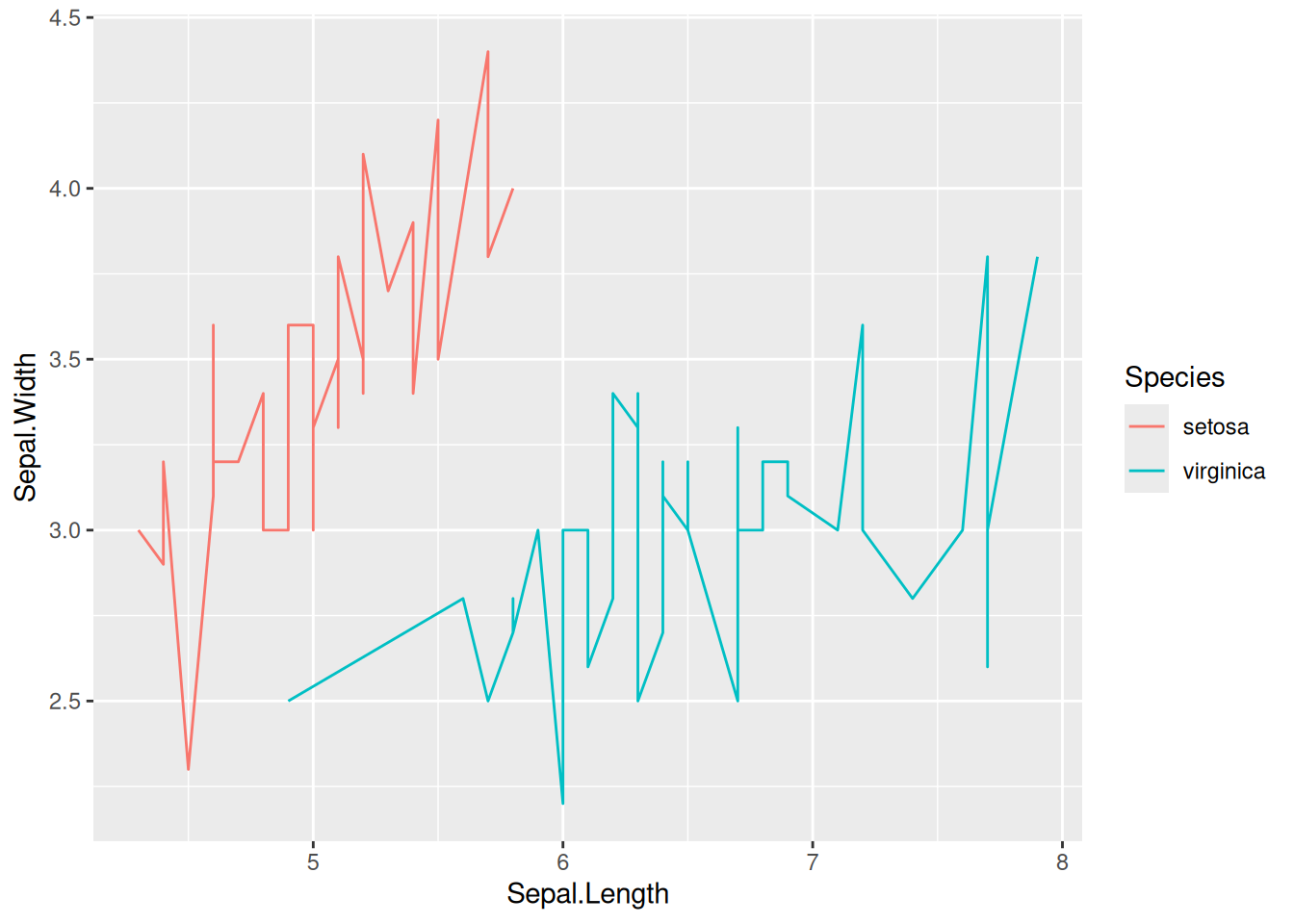
This graph was created using two species from the iris dataset.
5. Color Selection
5.1 Use the viridis package
# Multi-class data plotting
# Plotting multiple types of data using the `viridis` package
p <- ggplot(data[data$Species != "versicolor", ], aes(x = Sepal.Length, y = Sepal.Width)) +
  geom_line(aes(color = Species)) +
  scale_color_viridis(discrete = TRUE)

p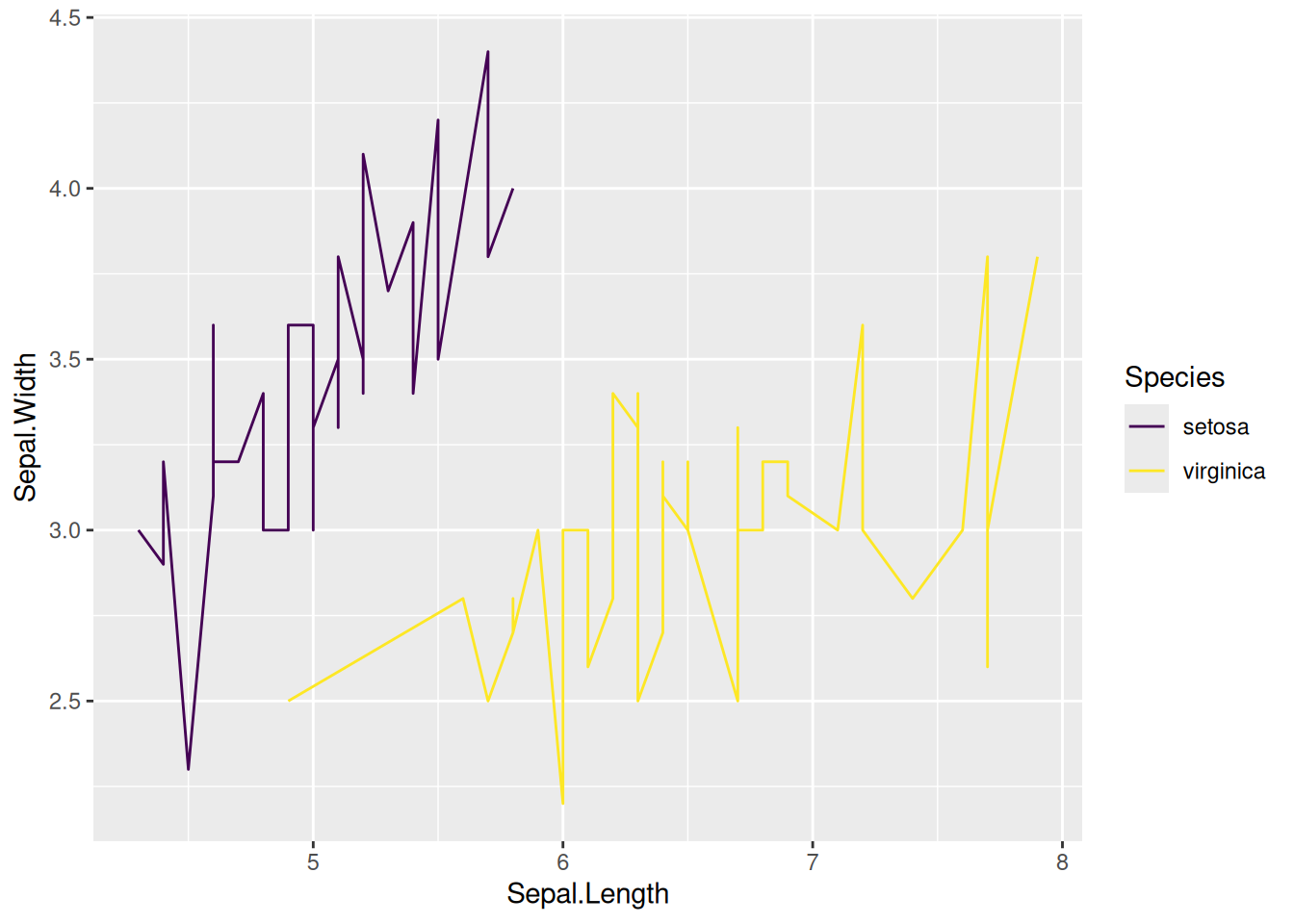
This graph uses the scale_color_viridis function from the viridis package to select appropriate colors.
5.2 Custom colors
# Customize colors using `scale_color_manual()`.
p <- ggplot(data[data$Species != "versicolor", ], aes(x = Sepal.Length, y = Sepal.Width)) +
  geom_line(aes(color = Species)) +
  scale_color_manual(values = c("red","blue"))

p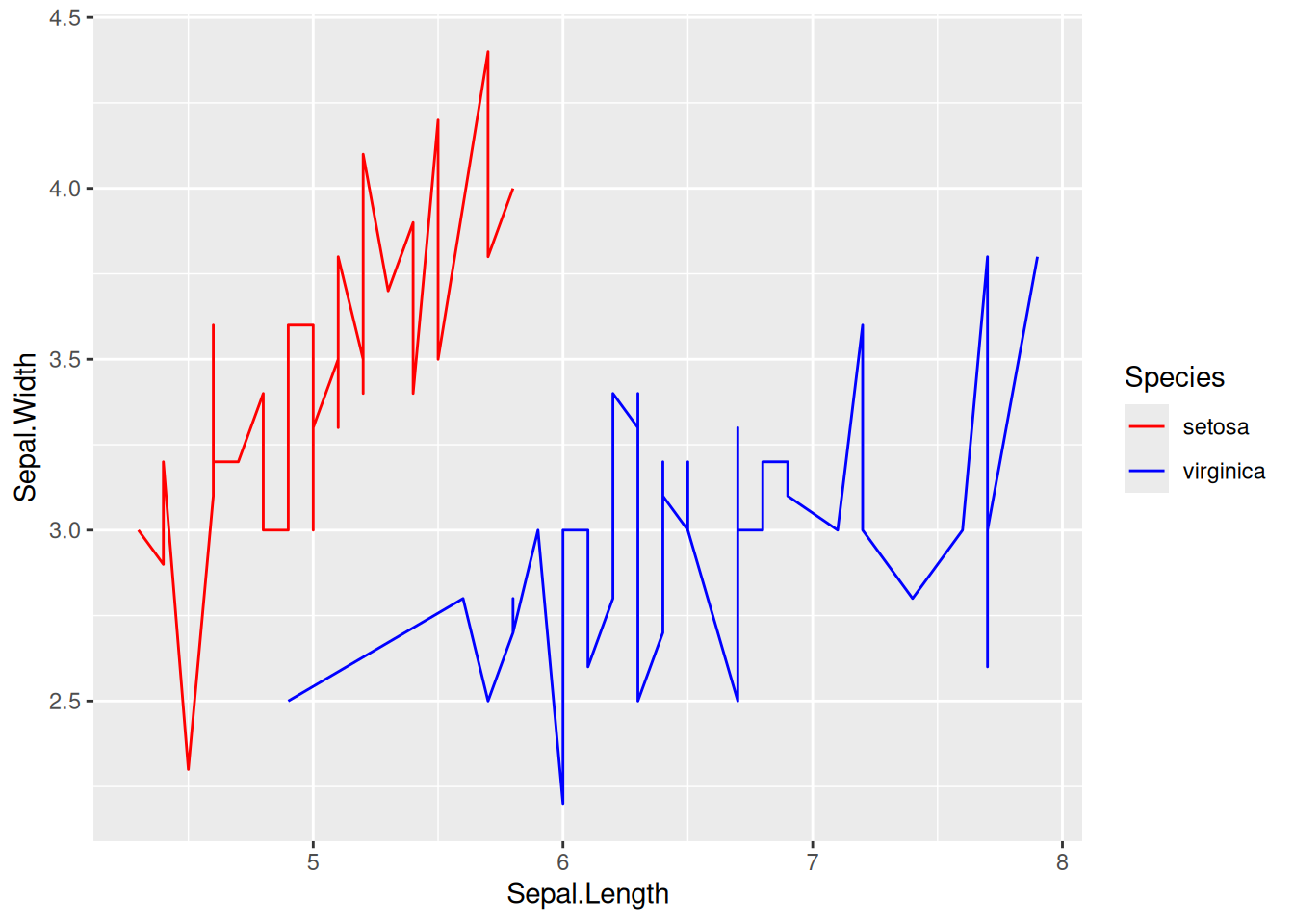
This graph uses scale_color_manual() to customize the polyline to red and blue.
6. Connect the line segments in the scatter plot
6.1 Basic plot + line styles
# Basic plot + line styles
p <- ggplot(data[data$Species == "setosa", ], aes(x = Sepal.Width, y = Sepal.Length)) +
  geom_point(shape = 17, size = 1.5, color = "blue") +
  geom_line(size = 1, color = "black", linetype = 2)

p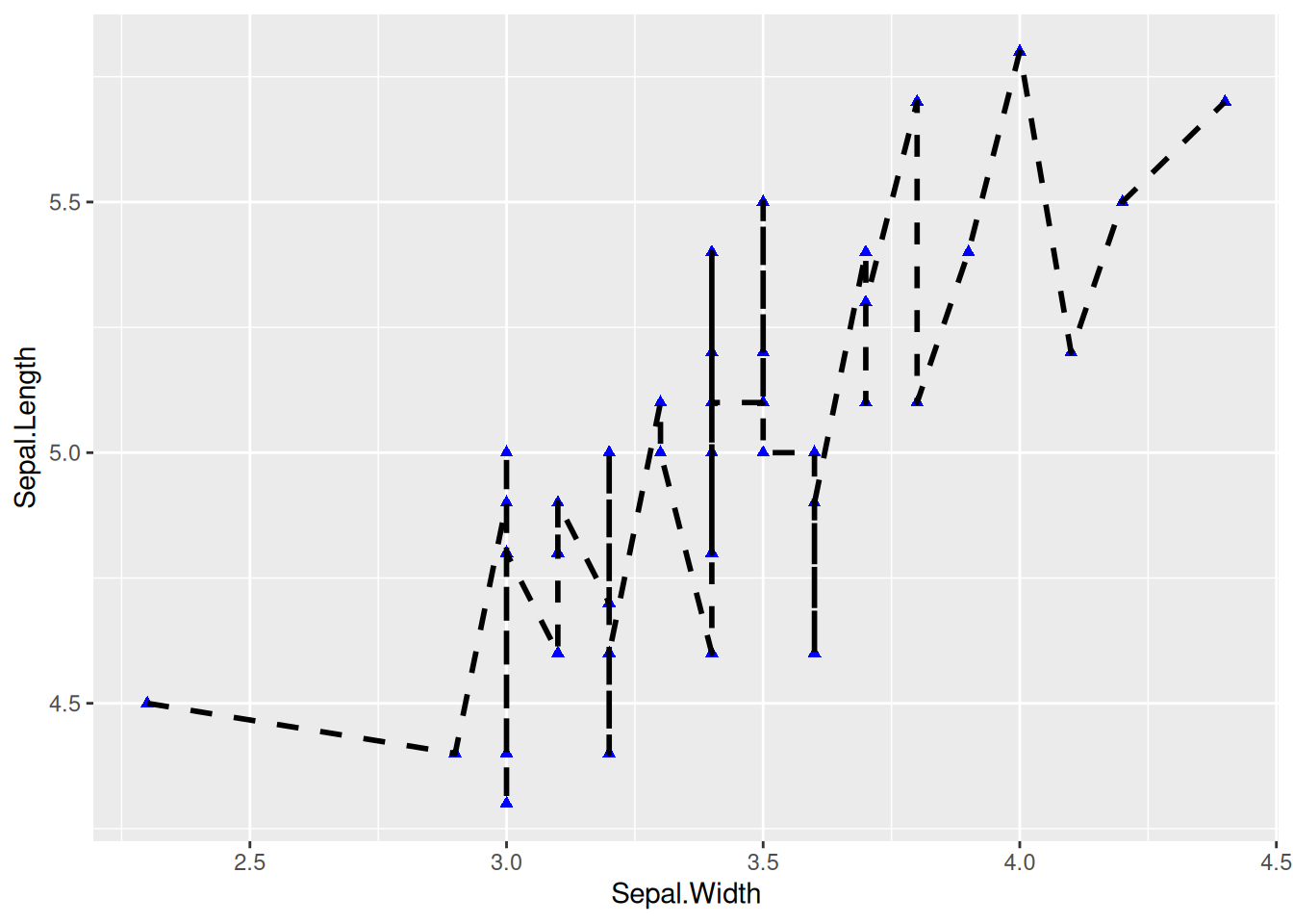
This is a basic connected scatter plot, using geom_point() to draw points and geom_line() to draw line segments.
6.2 Connect according to time sequence
# Connect according to time sequence
p <- ggplot(data_economics, aes(x = psavert, y = uempmed)) +
  geom_point(shape = 17, size = 1.5, color = "blue") +
  geom_text(
    label = data_economics$date, nudge_x = 0,
    nudge_y = -0.1, size = 5
  ) +
# Use `geom_segment()` to draw a line segment.
  geom_segment(
    aes(
      xend = c(tail(psavert, n = 24), NA),
      yend = c(tail(uempmed, n = 24), NA)
    ),
    linewidth = 1
  )

p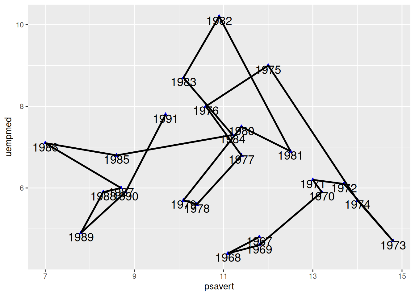
This graph uses geom_segment() to connect points according to time sequence, which is quite different from the graph drawn by geom_line().
Tip
Key parameters: geom_segment
xend/yend: Corresponding to x and y, that is, (x,y) points to (xend,yend) to draw a line segment. In the code, c(tail(psavert, n=24),NA) takes the last 24 values of the psavert column and adds NA. This makes the preceding point point to the next point to draw a line segment, and the last point points to NA, so no line segment is drawn.
6.3 Timing connection + arrow
# Timing connection + arrow
p <- ggplot(data_economics, aes(x = psavert, y = uempmed)) +
  geom_point(shape = 17, size = 1.5, color = "blue") +
  geom_text(
    label = data_economics$date, nudge_x = 0,
    nudge_y = -0.1, size = 5
  ) +
# Use `geom_segment()` to draw a line segment.
  geom_segment(
    aes(
      xend = c(tail(psavert, n = 24), NA),
      yend = c(tail(uempmed, n = 24), NA)
    ),
    linewidth = 1, arrow = arrow(length = unit(0.5, "cm"))
  )

p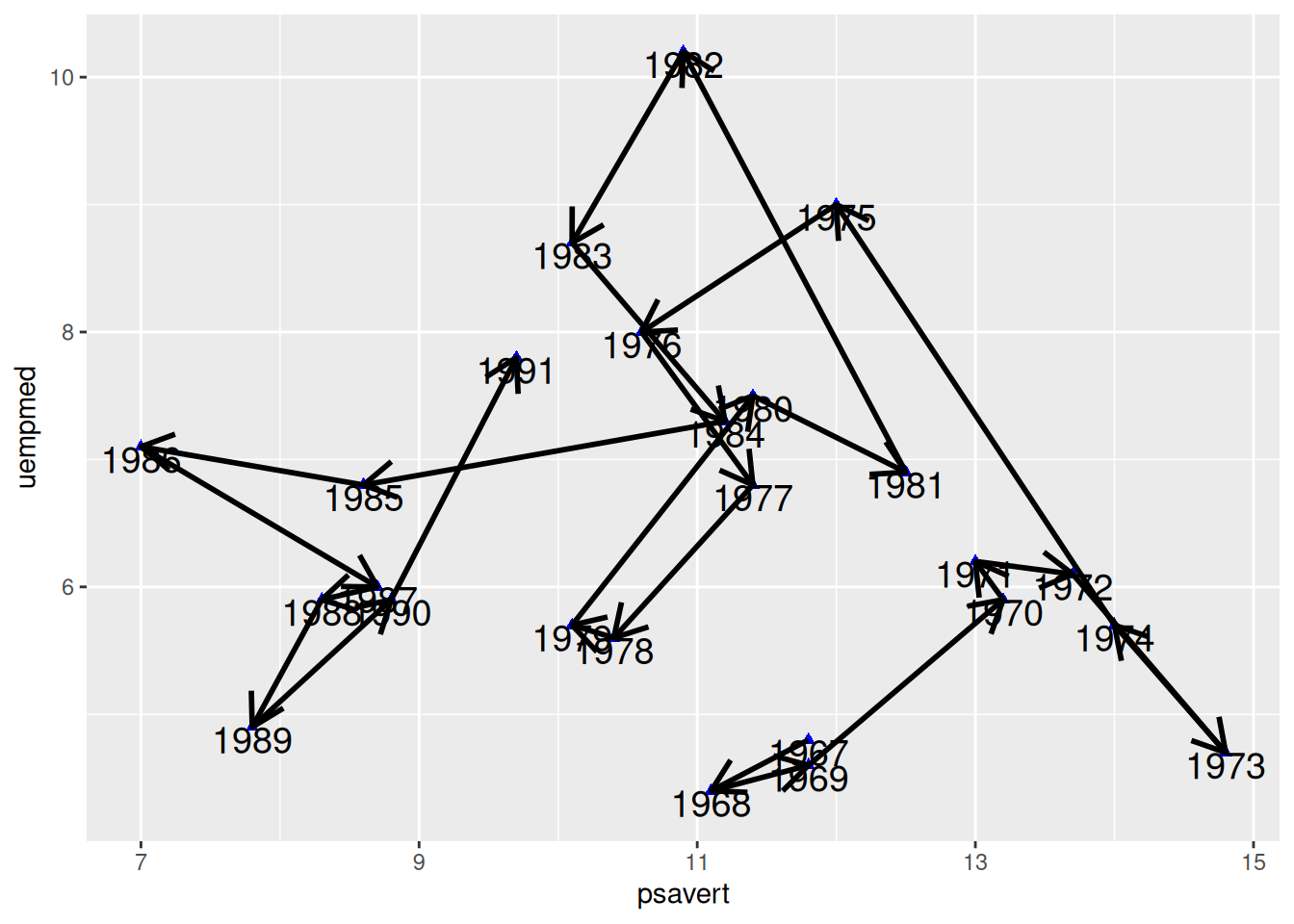
This graph adds arrows to each connection line, making the temporal characteristics of the connected scatter plot more apparent.
7. Plotting the regression curve
7.1 Regression curve
## Regression curve
p <- ggplot(data, aes(x = Sepal.Width, y = Sepal.Length)) +
  geom_point(shape = 16, size = 1.5, color = "blue") +
  labs(x = "Width", y = "Length") +
  geom_smooth(method = "lm", formula = y ~ x, se = F, color = "red") # Plotting the linear regression curve

p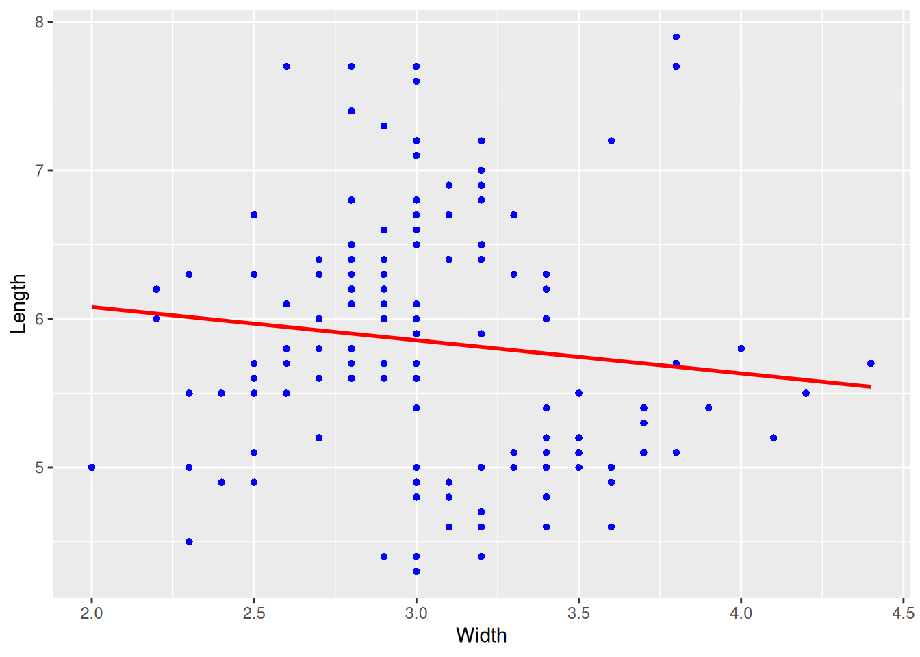
This graph is a regression curve plotted based on a scatter plot.
7.2 Regression curve + confidence interval
# Regression curve + confidence interval
p <- ggplot(data, aes(x = Sepal.Width, y = Sepal.Length)) +
  geom_point(shape = 16, size = 1.5, color = "blue") +
  labs(x = "Width", y = "Length") +
  geom_smooth(method = "lm", formula = y ~ x, se = T, color = "red") # Plotting the linear regression curve

p
This plot adds a confidence interval (i.e., parameter se=TRUE) to the regression curve.
7.3 Add regression curve labels
# Add regression curve labels using `stat_poly_eq()`
p <- ggplot(data, aes(x = Sepal.Width, y = Sepal.Length)) +
  geom_point(shape = 16, size = 1.5, color = "blue") +
  labs(x = "Width", y = "Length") +
  geom_smooth(method = "lm", formula = y ~ x, se = T, color = "red") + # Plotting the linear regression curve
  stat_poly_eq(use_label("eq","R2","P"),formula = y~x,size = 4,method = "lm")

p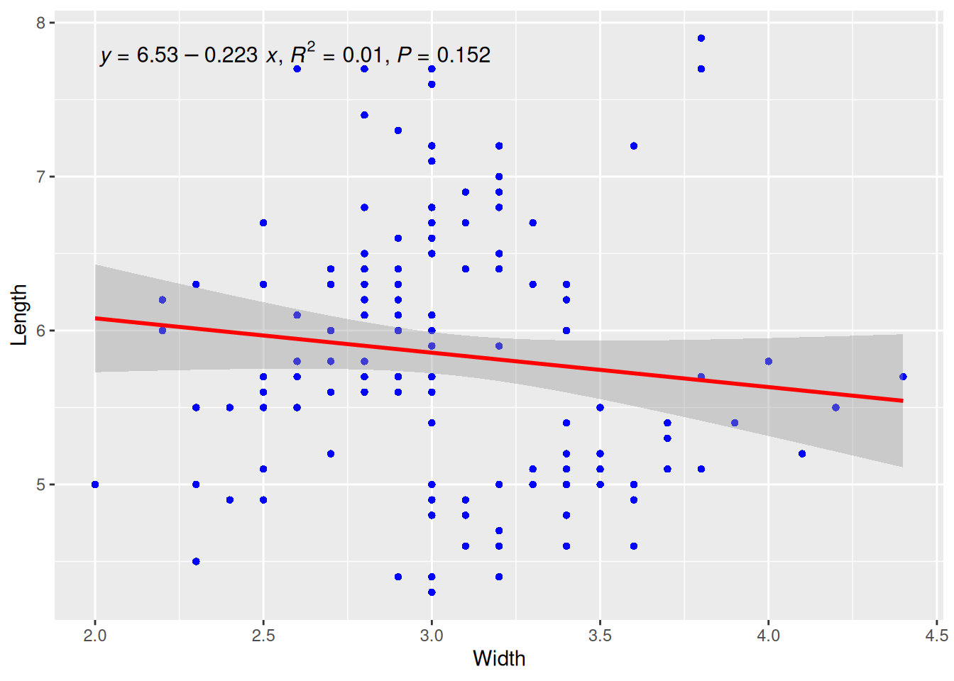
This plot uses the stat_poly_eq() function from the ggpmisc package to add the regression curve equation, R-squared, and p-value.
8. Notes and separators
# Notes and separators
p <- ggplot(data = economics[1:60, c(1, 4)], aes(x = date, y = psavert)) +
  geom_line() +
  xlab("") +
  scale_x_date(date_breaks = "3 months", date_labels = "%Y-%m") +
# Text Annotation
  annotate(
    geom = "text", x = as.Date("1969-01-01"), y = 14.5,
    label = "the enconomics of USA"
  ) +
# Adjust the text angle on the x-axis
  theme(axis.text.x = element_text(angle = 60, hjust = 1)) +
# Note
  annotate(geom = "point", x = as.Date("1971-06-01"), y = 14.7, size = 5, shape = 21, fill = "transparent") +
# Draw horizontal dividing lines
  geom_hline(yintercept = 14, color = "orange")

p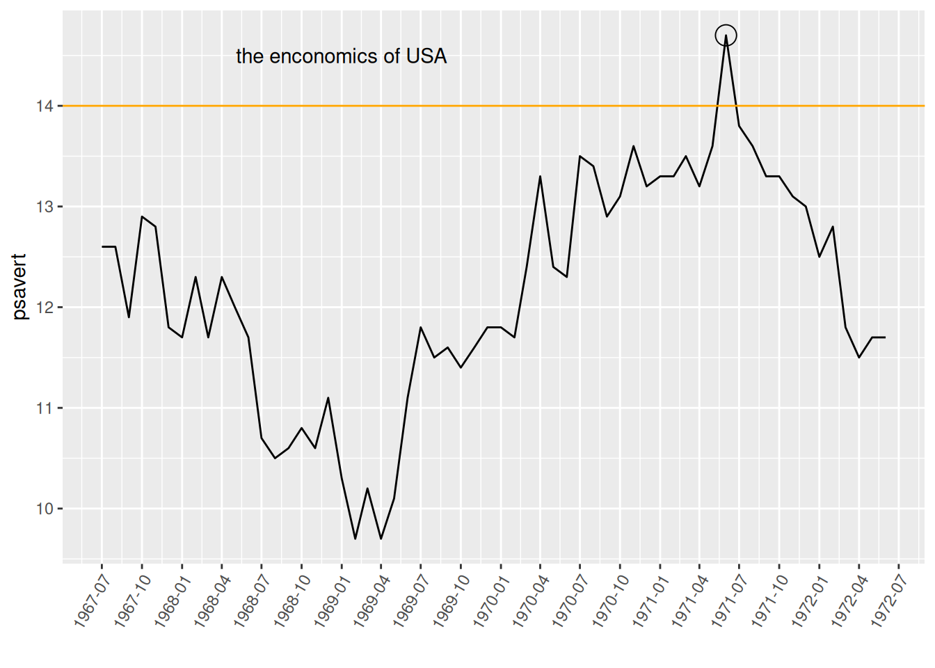
This graph uses annotate to add annotations for points and text, and geom_hline to draw horizontal dividing lines.
9. Multi-subgraph arrangement
For arranging multiple subgraphs, the patchwork package is required.
# Multiple subgraph arrangements (requires the `patchwork` package)
data_double <- economics[1:60, c(1, 4, 5)]

p <- ggplot(data_double, aes(x = date, y = psavert)) +
  geom_line() +
  xlab("")

p1 <- ggplot(data_double, aes(x = date, y = uempmed)) +
  geom_line() +
  xlab("")

p + p1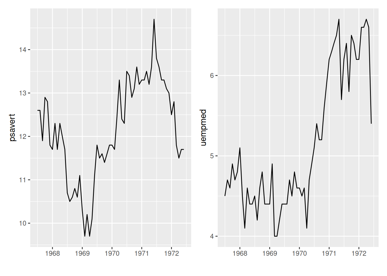
This diagram displays two sub-diagrams in one image, and the arrangement of the images uses the patchwork package.
10. Dual y-axis
# Dual y-axis
data_double <- economics[1:60, c(1, 4, 5)]

p <- ggplot(data_double, aes(x = date)) +
  geom_line(aes(y = psavert), color = "red") +
  geom_line(aes(y = uempmed * 3), color = "blue") + # To accommodate the range of the left y-axis, the values on the right y-axis need to be increased by a corresponding factor.
  xlab("") +
  scale_y_continuous(
    name = "psavert",
    sec.axis = sec_axis(transform = ~ . / 3, name = "uempmed") # The scale of the coordinate axes should be reduced by the corresponding factor.
  ) +
  theme(
    axis.title.y = element_text(color = "red", size = 13),
    axis.title.y.right = element_text(color = "blue", size = 13),
    legend.position = "none"
  )

p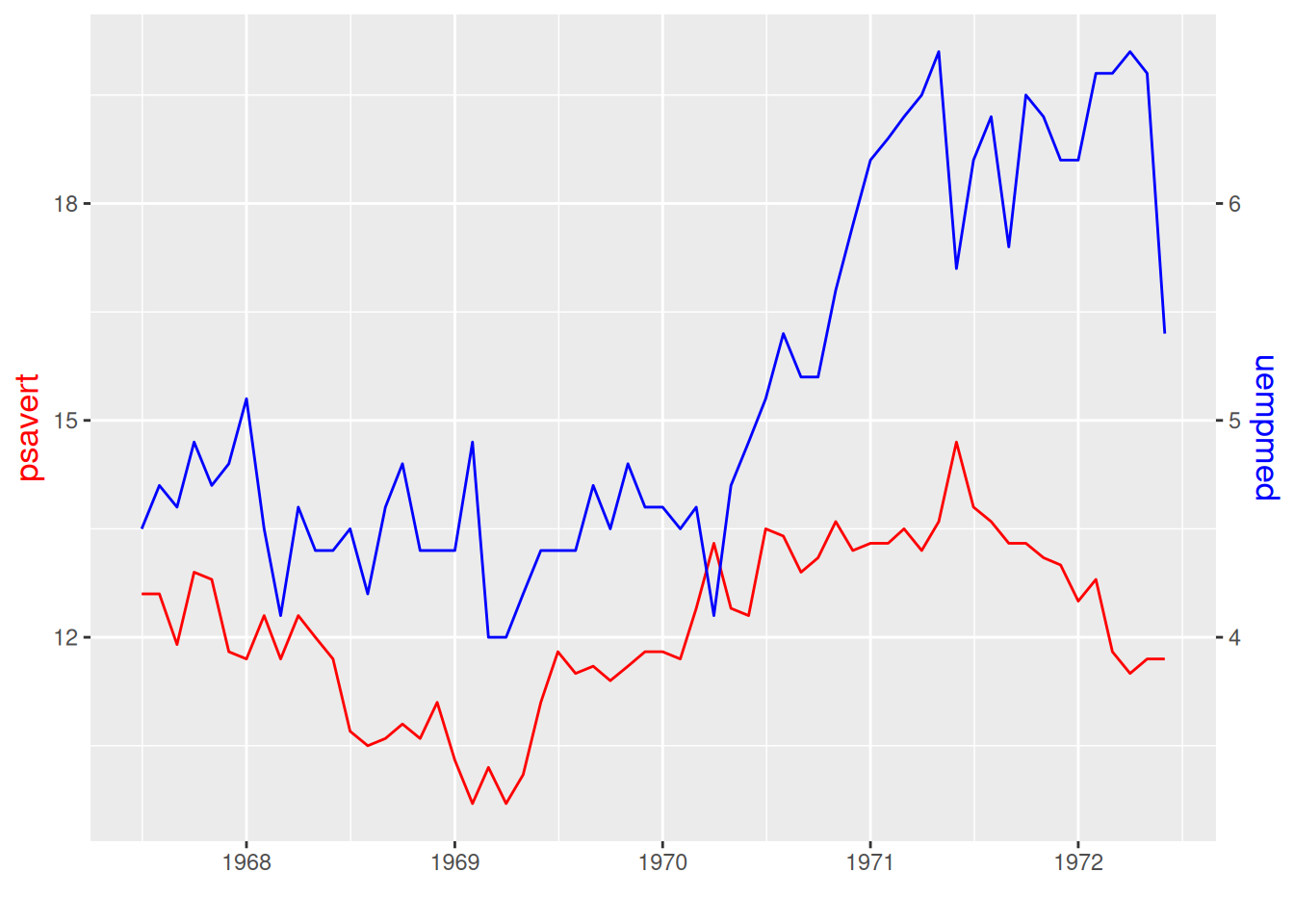
This graph has two different y-axis, and the scales on them can be different.
11. Line chart + histogram
# Line chart + histogram
data_double <- economics[1:60, c(1, 4, 5)]

p <- ggplot(data_double, aes(x = date)) +
  geom_bar(aes(y = psavert), stat = "identity", fill = "#69b3a2") + # Drawing a bar chart
  geom_line(aes(y = uempmed * 3), color = "blue") + # Draw a line graph
  xlab("") +
  scale_y_continuous(
    name = "psavert",
    sec.axis = sec_axis(transform = ~ . / 3, name = "uempmed")
  ) +
  theme(
    axis.title.y = element_text(color = "#69b3a2", size = 13),
    axis.title.y.right = element_text(color = "blue", size = 13),
    legend.position = "none"
  )

p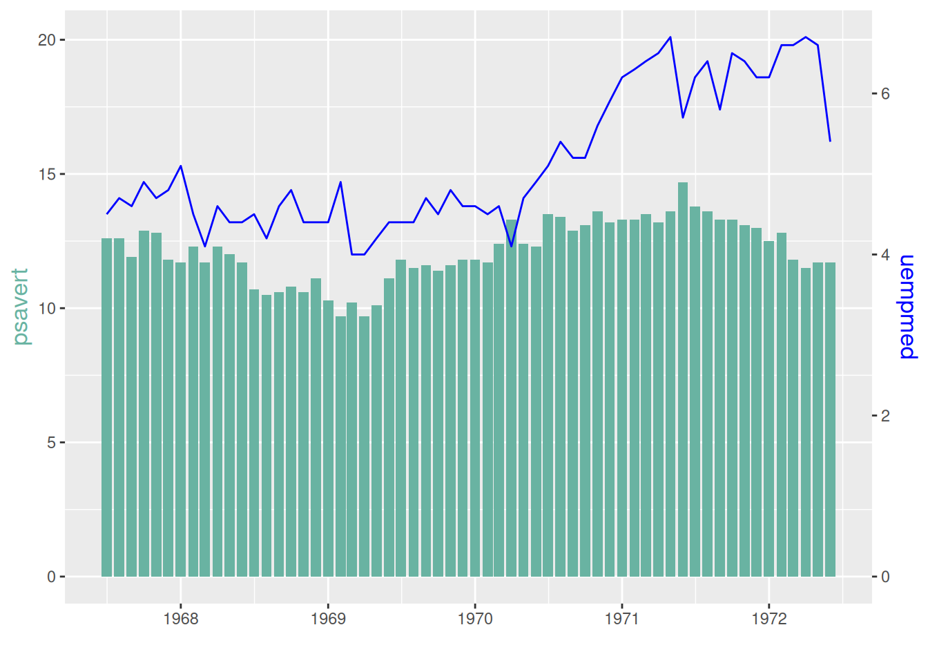
The left y-axis of this graph is the histogram coordinate axis, and the right y-axis is the line graph coordinate axis.
12. Emphasis on specific line segments
A portion of the glucose observation data was selected and plotted in three stages, serving as the raw data to emphasize the line segment.
# Emphasize specific line segments (requires the gghighlight package)
p <- ggplot(data_glucose) +
  geom_line(aes(V3, V2, color = group)) +
  gghighlight(max(V2) > 125, label_key = group) +
  xlab("Observation time") +
  ylab("Value of glucose")

p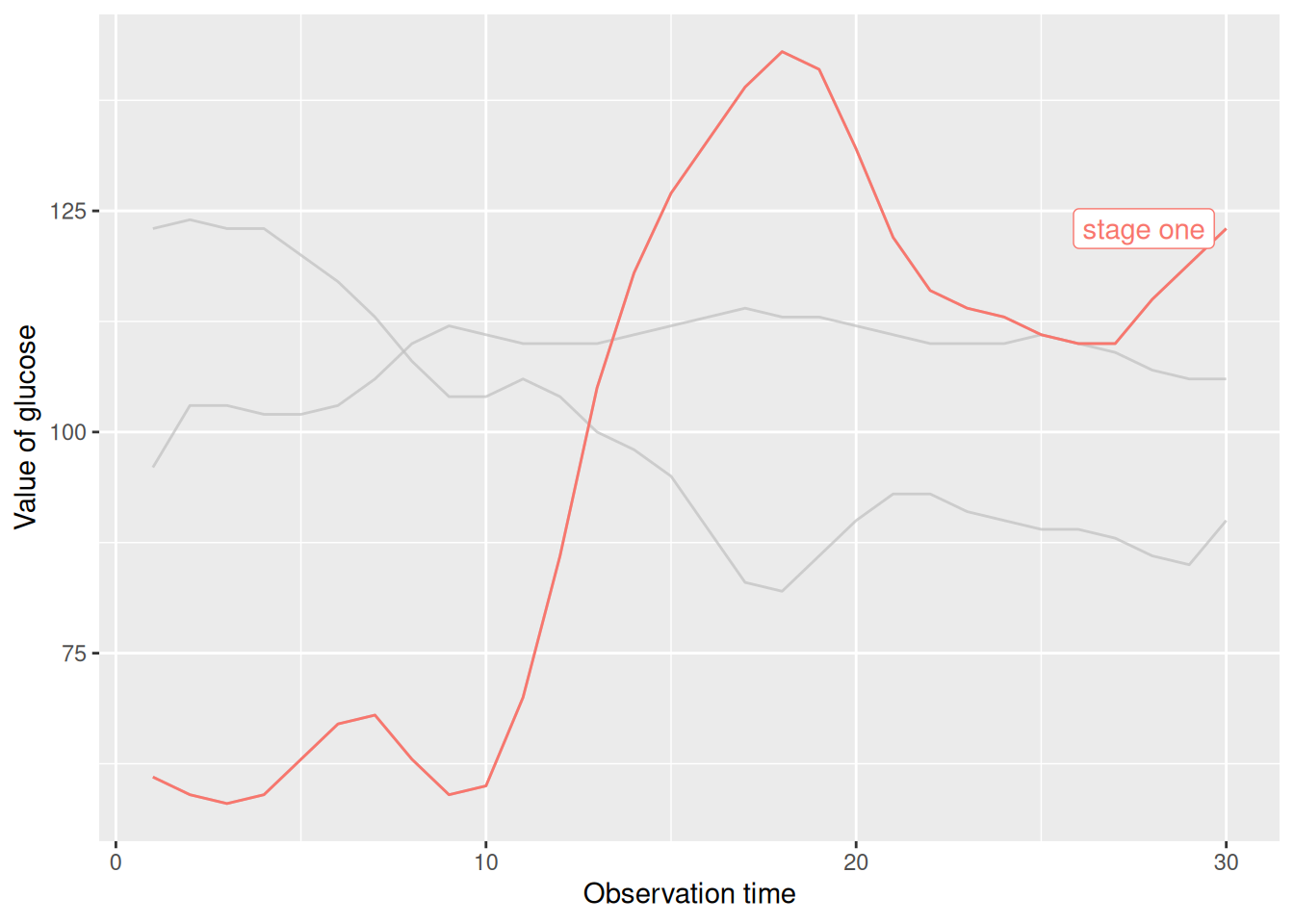
This chart highlights the broken line in the first stage using filtering criteria.
De-emphasize specific line segments.
# Fading out specific line segments using the unhighlighted_params parameter
p <- ggplot(data_glucose) +
  geom_line(aes(V3, V2, color = group), linewidth = 1) +
  gghighlight(max(V2) > 125, label_key = group,
    unhighlighted_params = list(
      linewidth = 0.3,
      colour = alpha("blue", 0.7),
      linetype = "dashed"
    )
  ) +
  xlab("Observation time") +
  ylab("Value of glucose")

p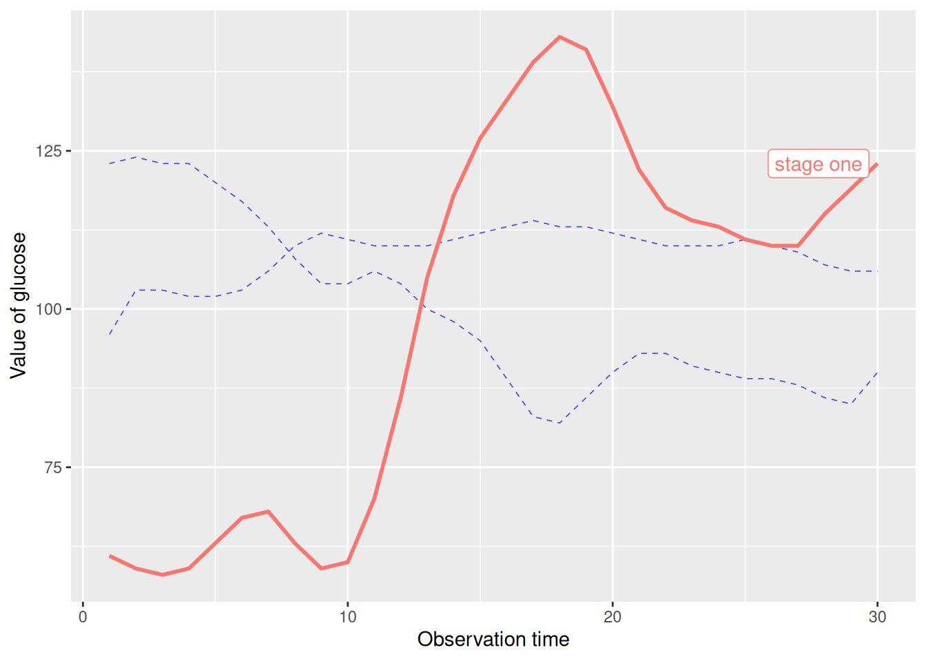
This graph uses the unhighlighted_params parameter to modify the faded line format.
Applications
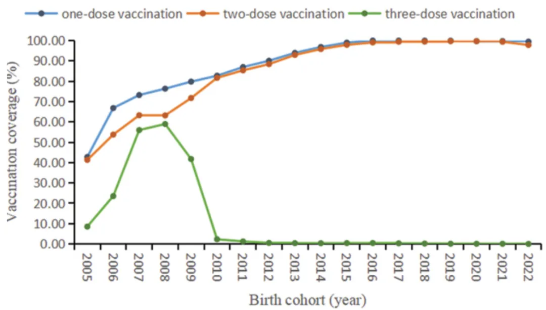
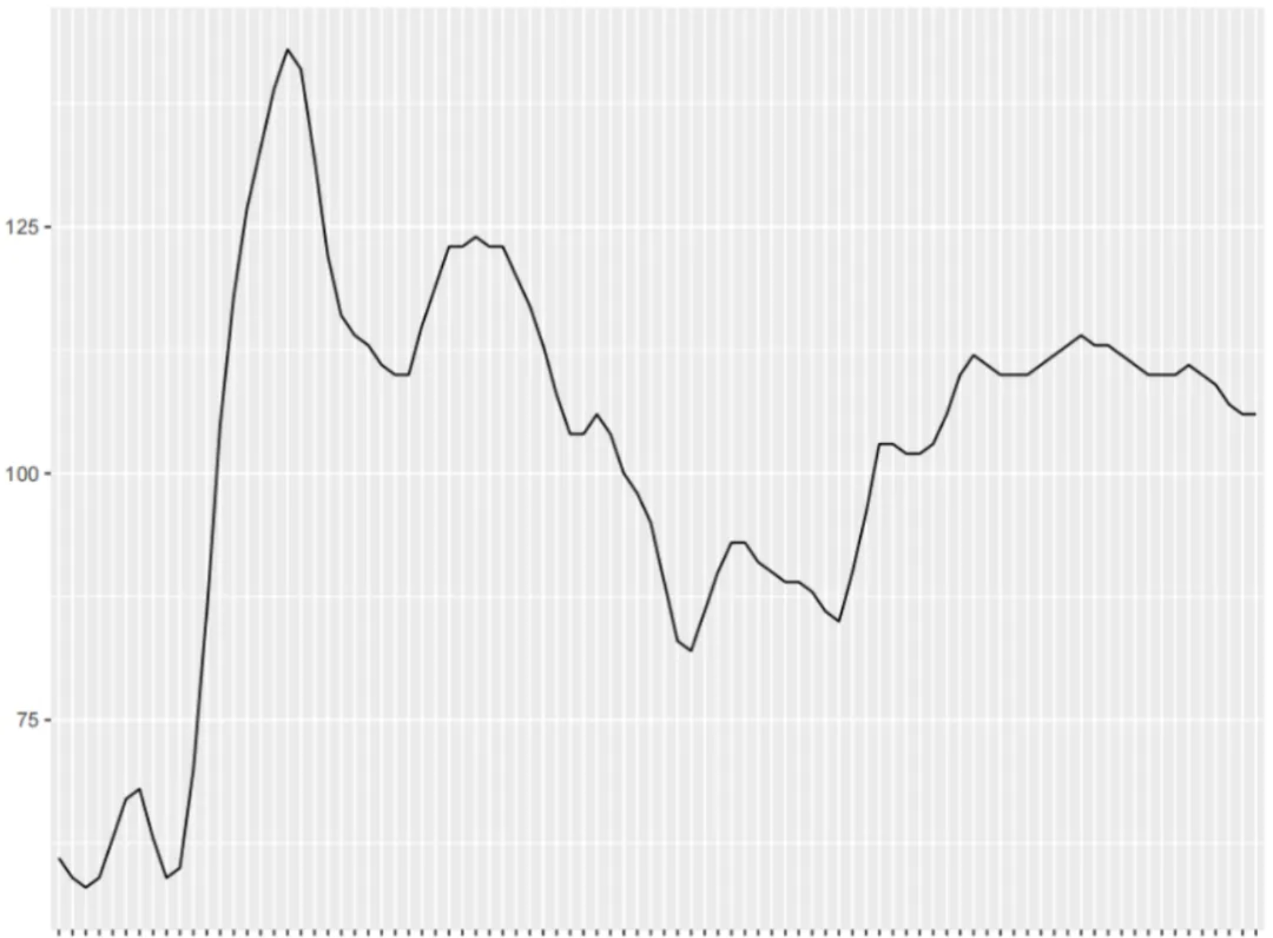
The figure shows the coverage of different doses of mumps-containing vaccine in the birth cohorts from 2005 to 2022. [1]
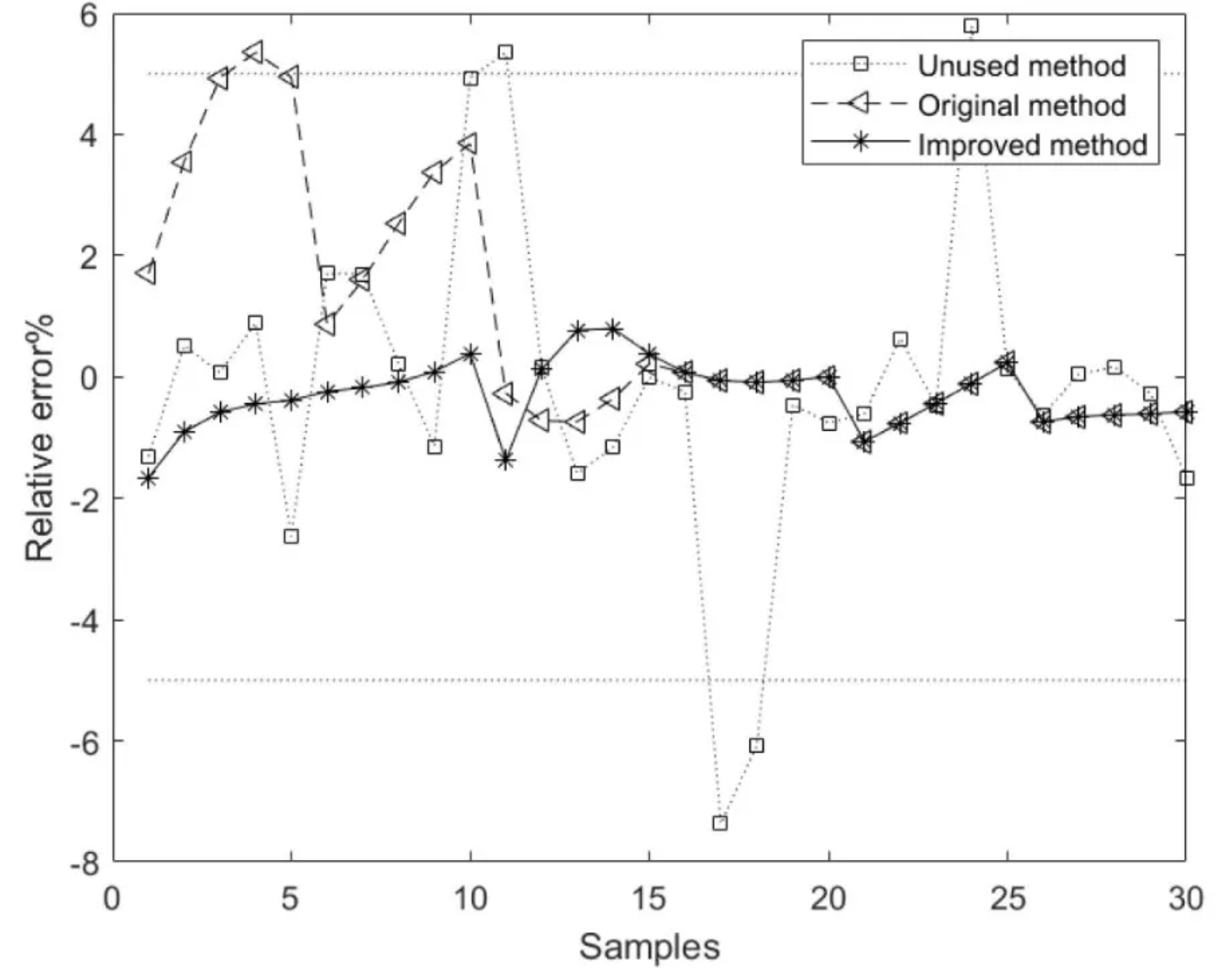
The figure shows the relative error curves for the model methods based on the unused, original, and improved methods, where the average relative error of the component content model based on the improved method is better than that of the models based on the unused and original methods. [2]
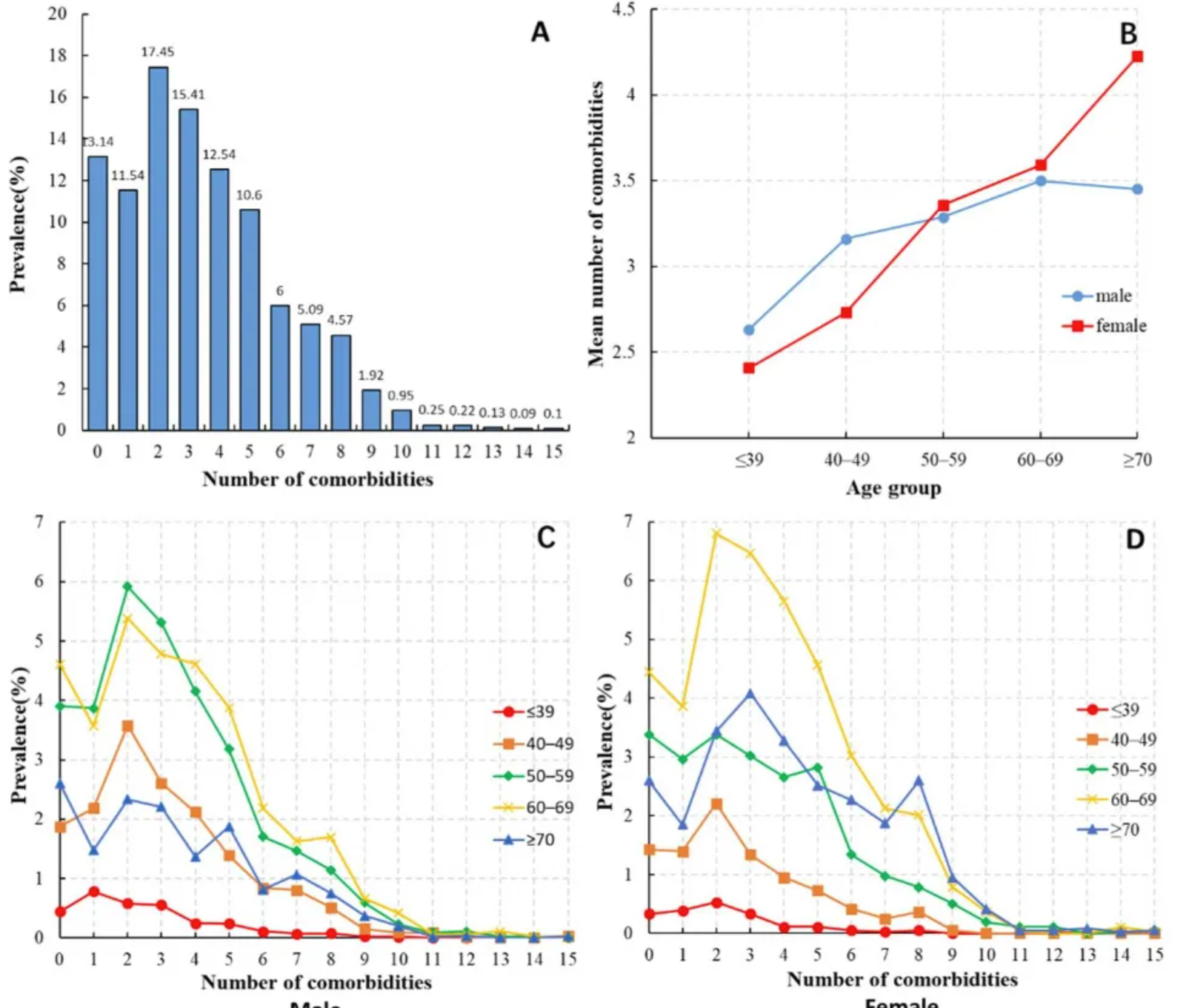
The figure shows: (A) Distribution of the number of comorbidities in HCC patients; (B) Average number of comorbidities in HCC patients of different ages and sexes; (C) Distribution of the number of comorbidities in male HCC patients of different age groups; (D) Distribution of the number of comorbidities in female HCC patients of different age groups. [3]
Reference
[1] FU C, XU W, ZHENG W, et al. Epidemiological characteristics and interrupted time series analysis of mumps in Quzhou City, 2005-2023[J]. Hum Vaccin Immunother, 2024,20(1): 2411828.
[2] LU R, LIU H, YANG H, et al. Multi-Delay Identification of Rare Earth Extraction Process Based on Improved Time-Correlation Analysis[J]. Sensors (Basel), 2023,23(3).
[3] MU X M, WANG W, JIANG Y Y, et al. Patterns of Comorbidity in Hepatocellular Carcinoma: A Network Perspective[J]. Int J Environ Res Public Health, 2020,17(9).