# Installing packages
if (!requireNamespace("ggplot2", quietly = TRUE)) {
  install.packages("ggplot2")
}
if (!requireNamespace("dplyr", quietly = TRUE)) {
  install.packages("dplyr")
}
if (!requireNamespace("ggfortify", quietly = TRUE)) {
  install.packages("ggfortify")
}
if (!requireNamespace("FactoMineR", quietly = TRUE)) {
  install.packages("FactoMineR")
}
if (!requireNamespace("factoextra", quietly = TRUE)) {
  install.packages("factoextra")
}

# Load packages
library(ggplot2)
library(ggfortify)
library(FactoMineR)
library(factoextra)
library(dplyr)PCA Plot
Example
Principal component analysis (PCA) is a commonly used dimensionality reduction technique for high-dimensional data analysis. Its main principle is to transform the data by identifying the two principal component directions with the largest variance. This linear transformation projects the high-dimensional data into a low-dimensional space while preserving the data’s key features. This article demonstrates how to perform PCA analysis in R and visualize it using the Iris dataset.
Setup
System Requirements: Cross-platform (Linux/MacOS/Windows)
Programming language: R
Dependent packages:
ggplot2,dplyr,ggfortify,FactoMineR,factoextra
sessioninfo::session_info("attached")─ Session info ───────────────────────────────────────────────────────────────
setting value
version R version 4.6.0 (2026-04-24)
os Ubuntu 24.04.4 LTS
system x86_64, linux-gnu
ui X11
language (EN)
collate C.UTF-8
ctype C.UTF-8
tz UTC
date 2026-05-09
pandoc 3.1.3 @ /usr/bin/ (via rmarkdown)
quarto 1.9.37 @ /usr/local/bin/quarto
─ Packages ───────────────────────────────────────────────────────────────────
package * version date (UTC) lib source
dplyr * 1.2.1 2026-04-03 [1] RSPM
factoextra * 2.0.0 2026-03-03 [1] RSPM
FactoMineR * 2.14 2026-04-08 [1] RSPM
ggfortify * 0.4.19 2025-07-27 [1] RSPM
ggplot2 * 4.0.3.9000 2026-05-04 [1] Github (tidyverse/ggplot2@6870419)
[1] /home/runner/work/_temp/Library
[2] /opt/R/4.6.0/lib/R/site-library
[3] /opt/R/4.6.0/lib/R/library
* ── Packages attached to the search path.
──────────────────────────────────────────────────────────────────────────────Data Preparation
Use the iris dataset in R’s own dataset iris for demonstration
data("iris")
head(iris)
Sepal.Length Sepal.Width Petal.Length Petal.Width Species
1 5.1 3.5 1.4 0.2 setosa
2 4.9 3.0 1.4 0.2 setosa
3 4.7 3.2 1.3 0.2 setosa
4 4.6 3.1 1.5 0.2 setosa
5 5.0 3.6 1.4 0.2 setosa
6 5.4 3.9 1.7 0.4 setosaVisualization
PCA analysis
We first perform PCA analysis on the data. It should be noted that the data needs to be analyzed after standardization. The parameter scale in the function prcomp() provides us with the option of automatic standardization:
iris.pca <- prcomp(iris[, -5], scale = TRUE)
summary(iris.pca)
Importance of components:
PC1 PC2 PC3 PC4
Standard deviation 1.7084 0.9560 0.38309 0.14393
Proportion of Variance 0.7296 0.2285 0.03669 0.00518
Cumulative Proportion 0.7296 0.9581 0.99482 1.000001. Variance Explanation and Variable Contribution Visualization
As you can see in summary(iris.pca), we’ve extracted multiple principal components, PCs, from the dataset, describing the data from a new “perspective.” We can use fviz_eig() to draw the following histogram to show the proportion of data variance explained by each principal component. Meanwhile, fviz_pca_var() plots the variable contribution graph, showing the relationship between the original variables (i.e., petal length, width, and other raw features) and the top two principal components. The length of the arrow indicates the variable contribution (specified by col.var = "contrib"):
fviz_eig(iris.pca,
         addlabels = TRUE,
         ylim = c(0, 85),
         main = "PCA variance explained proportion",
         xlab = "PC",
         ylab = "Percentage of variance explained")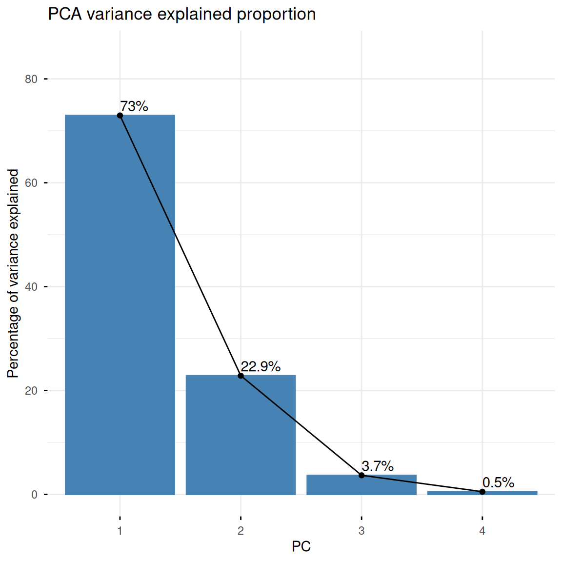
fviz_pca_var(iris.pca,
             col.var = "contrib",
             gradient.cols = c("#00AFBB", "#E7B800", "#FC4E07"),
             repel = TRUE,
             title = "Variable contribution plot")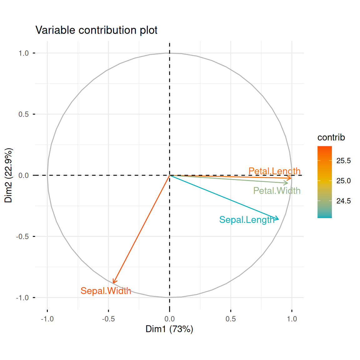
2. Distribution of samples in principal component space
Now that we’ve transformed the data, we can plot the distribution of the samples in this new principal component space. If the principal components explain a high degree of variance, we’ll see that different iris species are far apart in principal component space, while irises of the same species are close together. fviz_pca_ind() can create a scatter plot of the data along PC1 and PC2, coloring them by iris species and adding confidence ellipses.
fviz_pca_ind(iris.pca,
             col.ind = iris$Species,
             geom.ind = "point",
             palette = c("#00AFBB", "#E7B800", "#FC4E07"),
             addEllipses = TRUE,
             ellipse.type = "confidence",
             legend.title = "Species",
             # repel = TRUE,
             title = "Sample PCA score plot")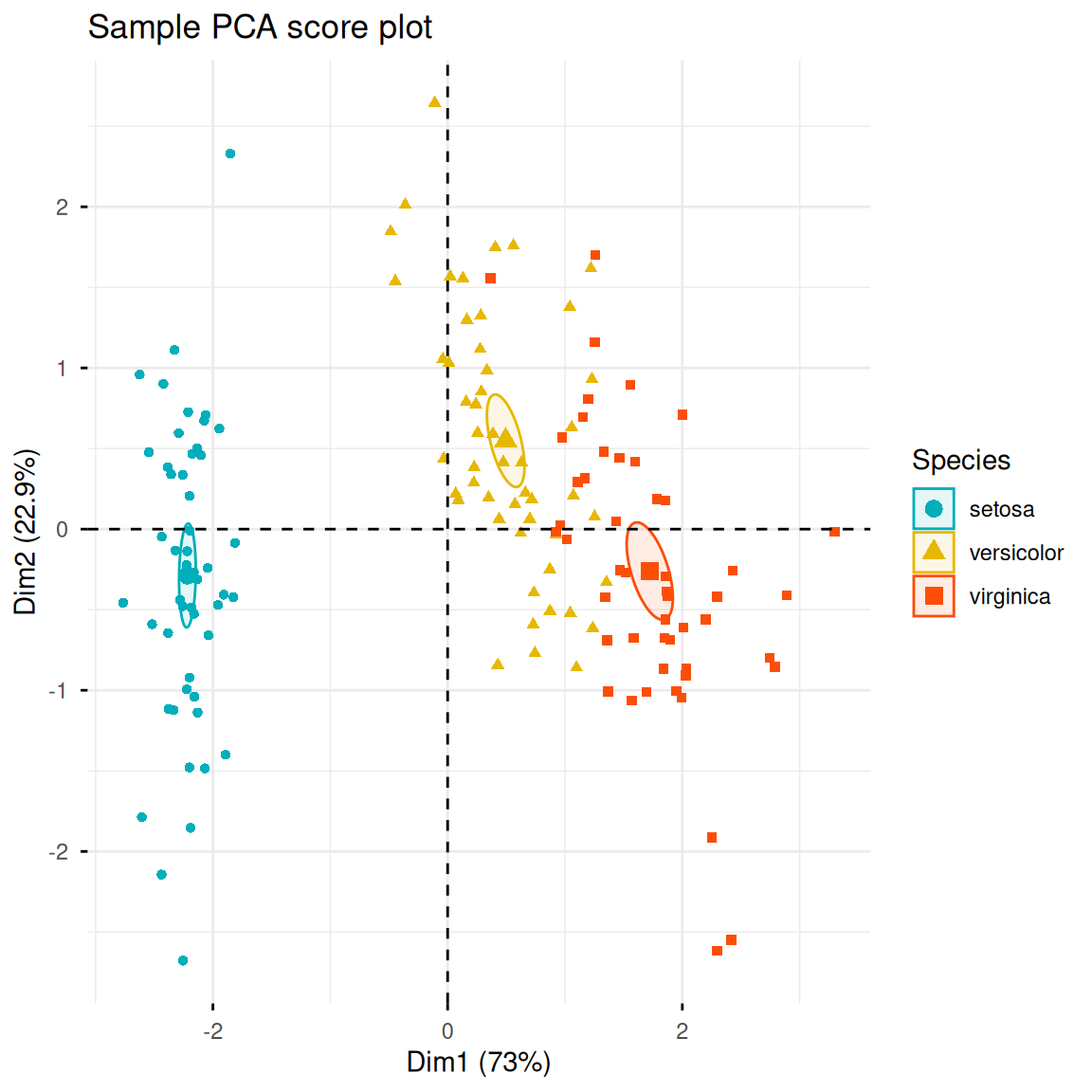
Tip
Parameter Description:
-
col.ind: Categorical variable for input data -
geom.ind: Select the type of scatter plot to draw. The default is labeled scatter plots. Entering “point” will cause the scatter plots to be labeled without labels. -
palette: Color vector to apply to the categorical variable -
addEllipses: Whether to add ellipses -
ellipse.type: Ellipse calculation method. Acceptable values include “convex”, “confidence”, “t”, “norm”, and “euclid”. -
legend.title: Legend title -
repel: Whether to use extended lines to mark data points -
title: Image title
Similar to fviz_pca_ind(), fviz_pca_biplot() can add original variable information based on sample scatter plots.
fviz_pca_biplot(iris.pca,
                col.ind = iris$Species,
                palette = c("#00AFBB", "#E7B800", "#FC4E07"),
                addEllipses = TRUE,
                geom.ind = "point",
                ellipse.type = "confidence",
                legend.title = "Species",
                # repel = TRUE,
                title = "PCA biplot")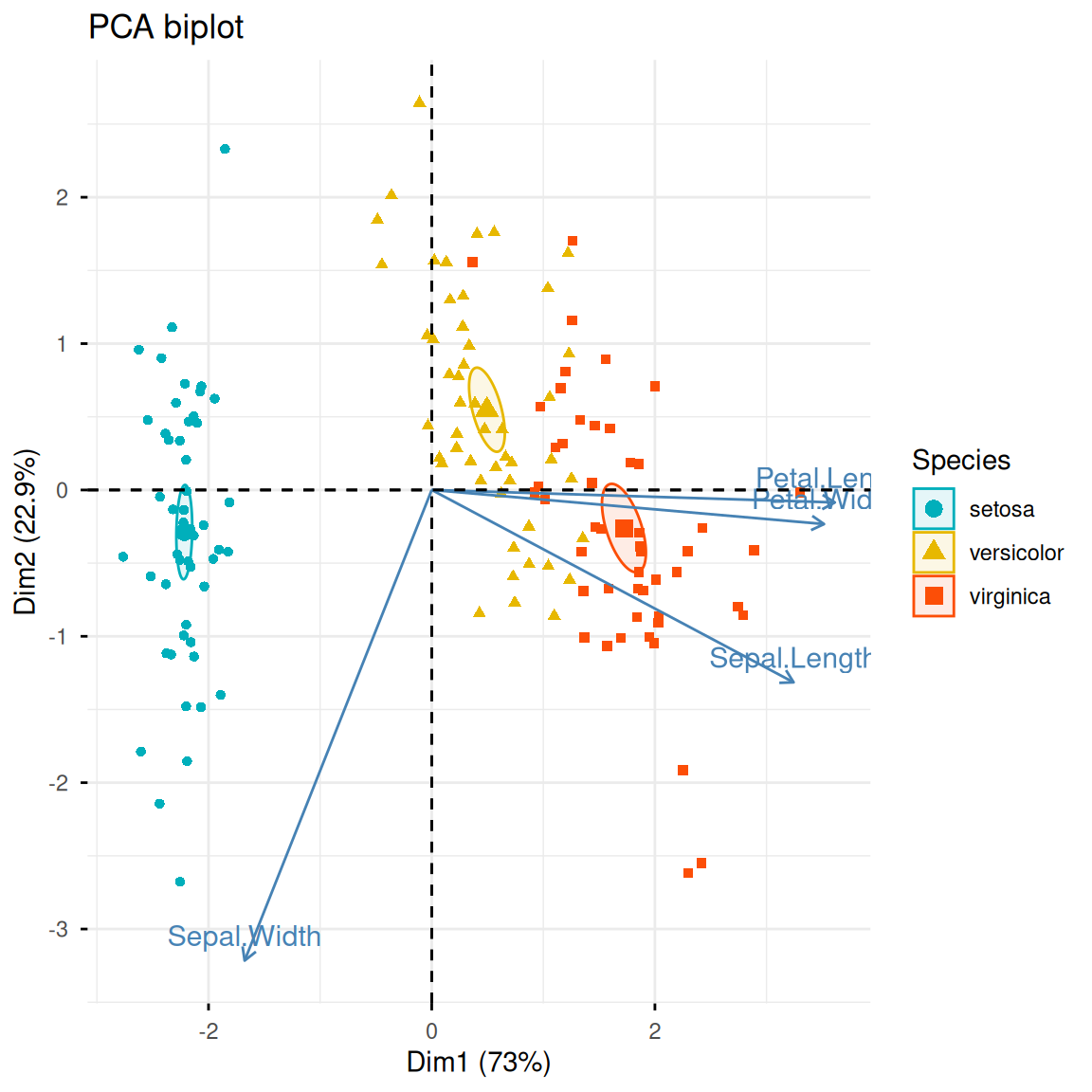
In addition, we can also use ggplot2 to customize the PCA sample graph:
pca_scores <- as.data.frame(iris.pca$x)
pca_scores$Species <- iris$Species
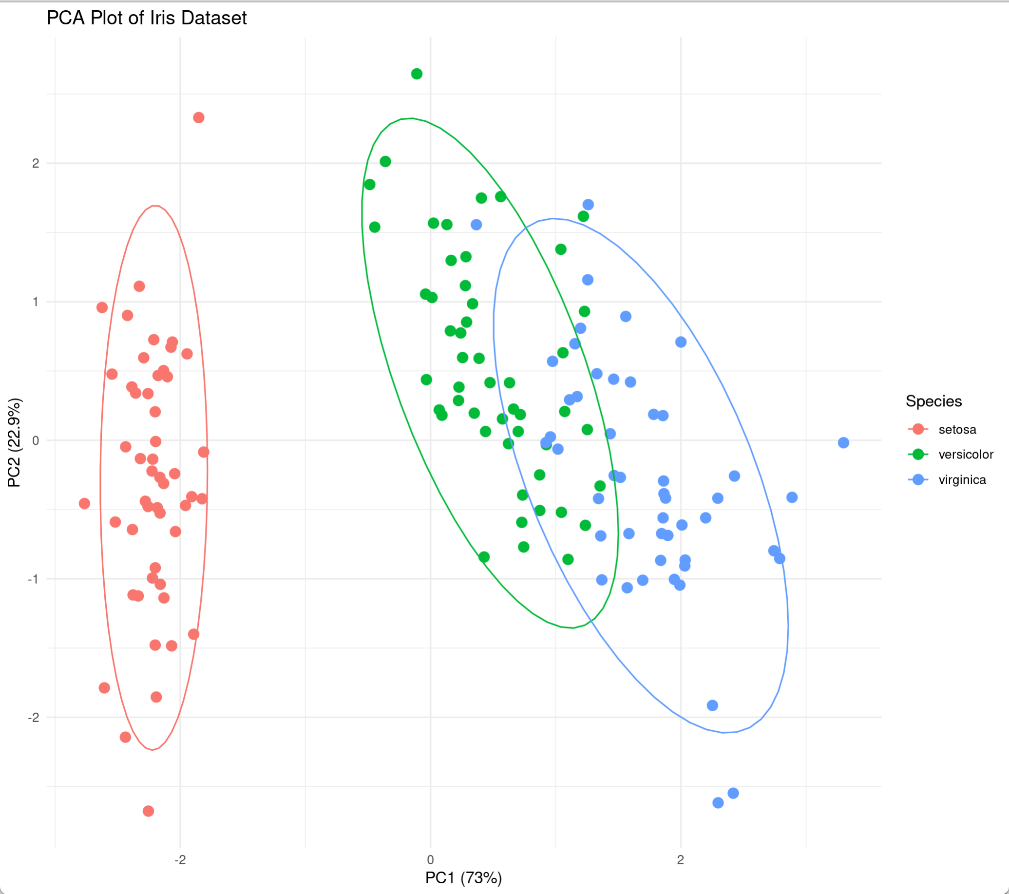
ggplot(pca_scores, aes(x = PC1, y = PC2, color = Species)) +
geom_point(size = 3, alpha = 0.8) +
stat_ellipse(level = 0.95, linewidth = 1) +
scale_color_manual(values = c("#00AFBB", "#E7B800", "#FC4E07")) +
labs(title = "PCA analysis of the iris data set",
x = paste0("PC1 (", round(summary(iris.pca)$importance[2,1]*100, 1), "%)"),
y = paste0("PC2 (", round(summary(iris.pca)$importance[2,2]*100, 1), "%)"),
caption = "Confidence level: 95%") +
theme_minimal(base_size = 12) +
theme(legend.position = "bottom")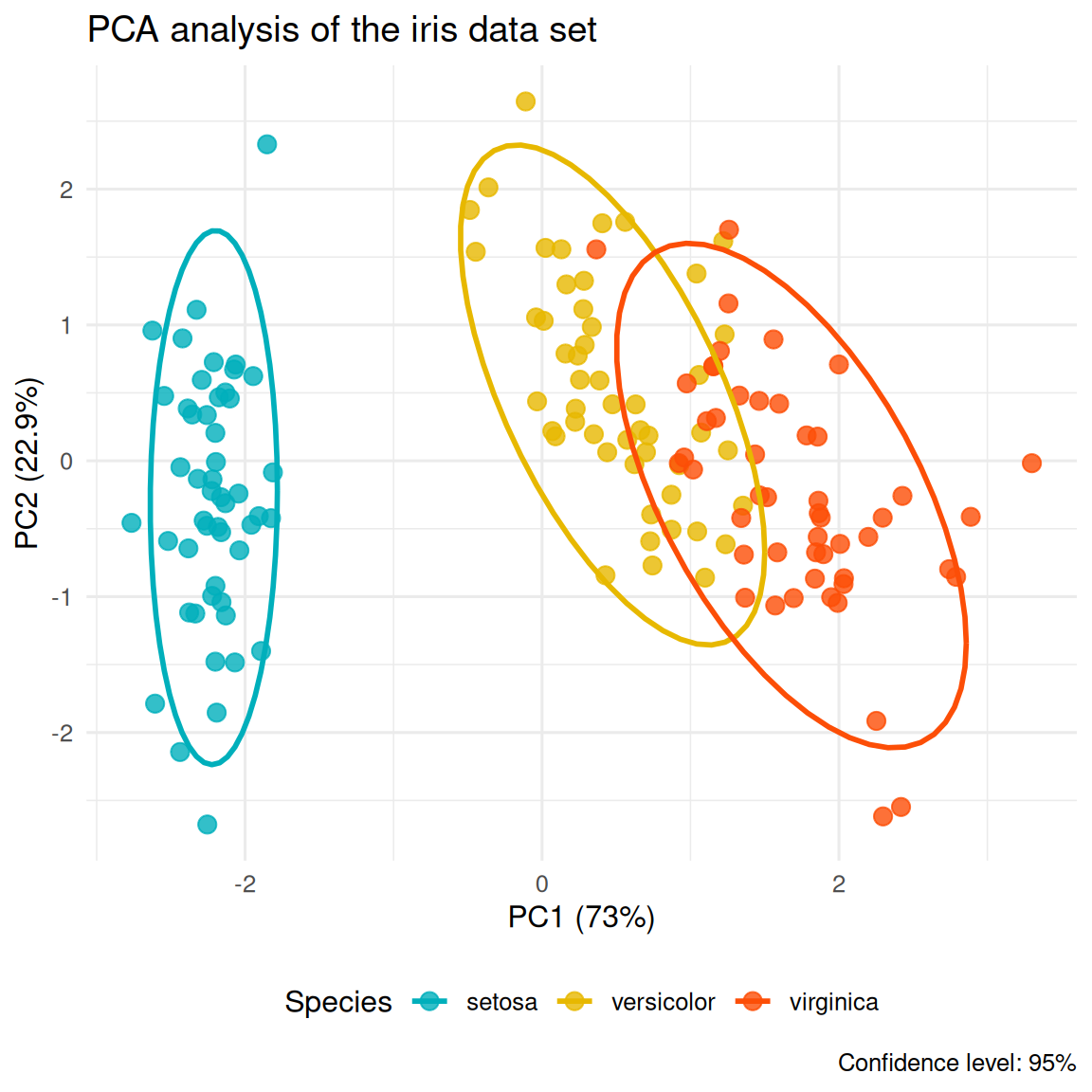
3. PCA analysis using FactoMineR
FactoMineR is an R package designed for multidimensional data analysis and exploration. It also provides a convenient PCA analysis function, PCA(). The following is a simple demonstration of its use and visualization:
res.pca <- PCA(iris[, -5], scale.unit = TRUE, graph = FALSE)
fviz_pca_ind(res.pca,
             label = "none",
             habillage = iris$Species,
             addEllipses = TRUE,
             ellipse.level = 0.95,
             title = "FactoMineR PCA results")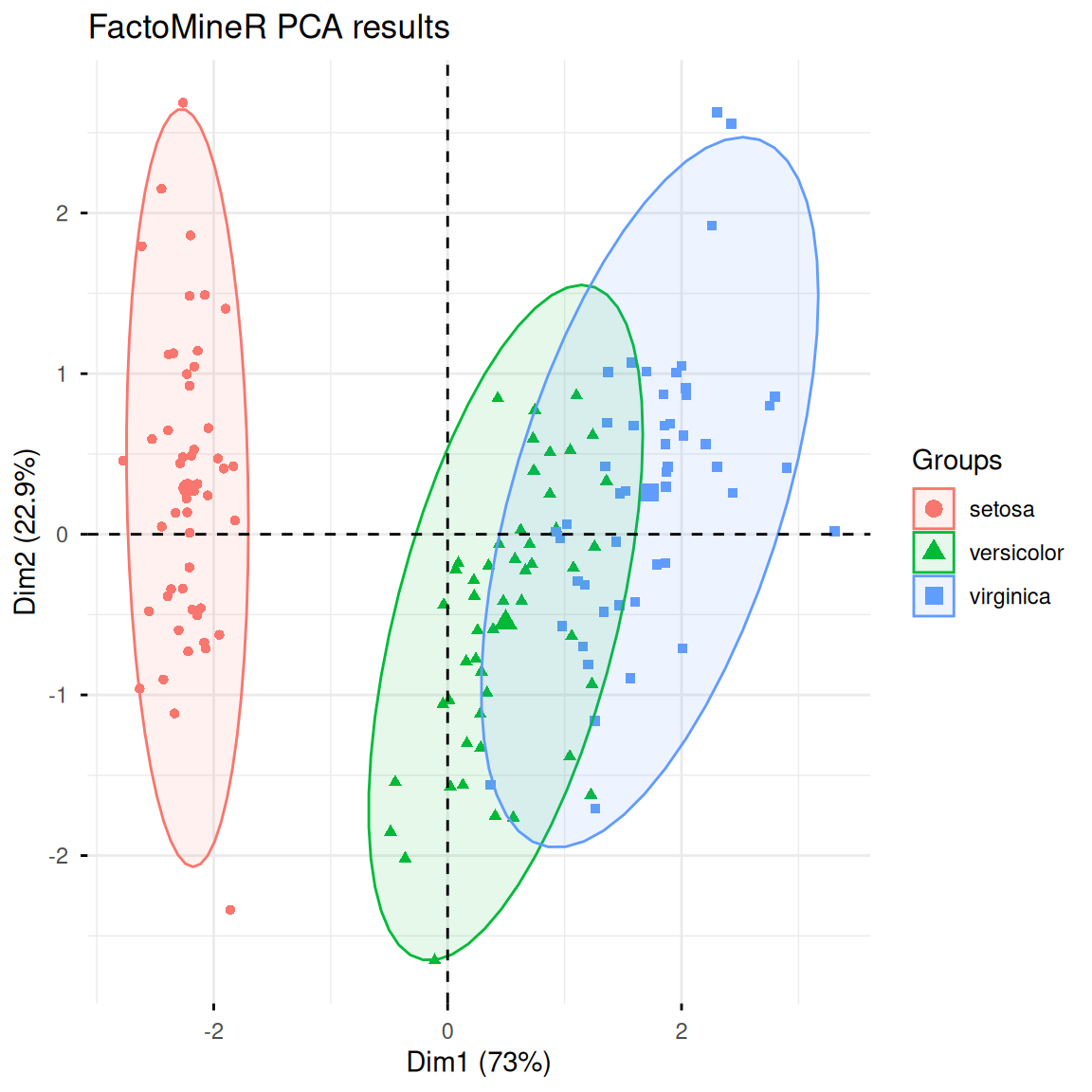
Application
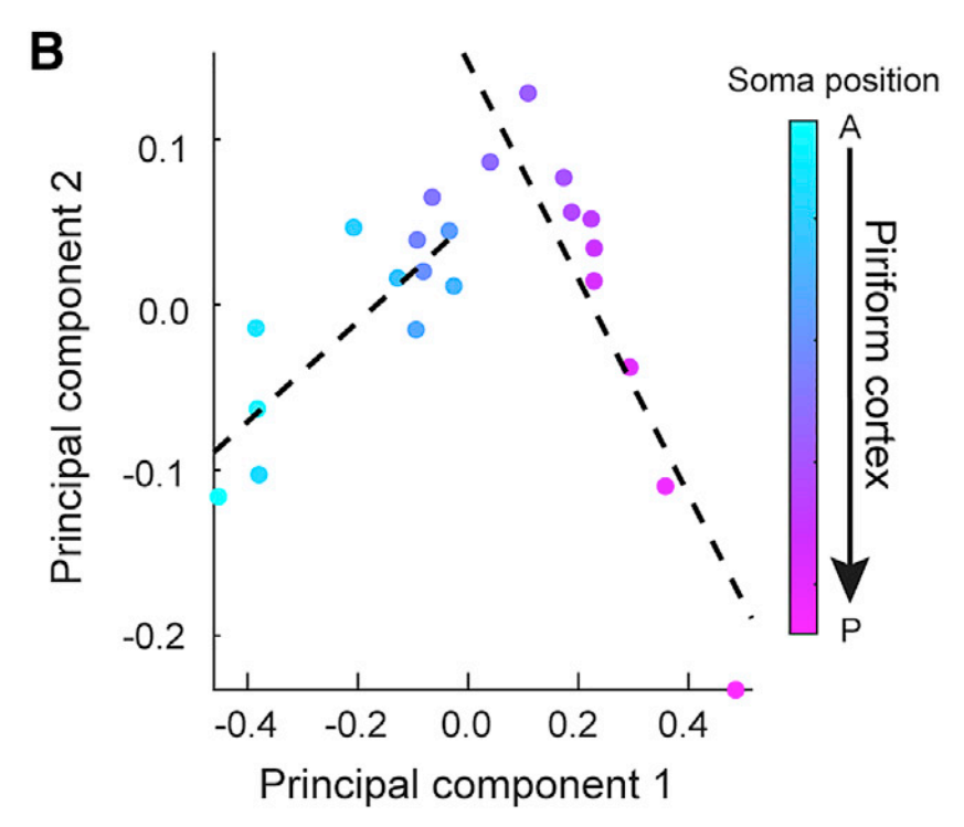
The figure shows the first two principal components of the mean projection strength of piriform cortex output neurons to AON, CoA, LENT, and OT. Each dot represents a slice. [1]
Reference
[1] Chen Y, Chen X, Baserdem B. et al. High-throughput sequencing of single neuron projections reveals spatial organization in the olfactory cortex. Cell. 2022 Oct 27;185(22):4117-4134.e28.