# Install packages
if (!requireNamespace("dplyr", quietly = TRUE)) {
  install.packages("dplyr")
}
if (!requireNamespace("ggbiplot", quietly = TRUE)) {
  install.packages("ggbiplot")
}

# Load packages
library(ggbiplot)
library(dplyr)Biplot
Example
A biplot is a visualization tool used to present the results of principal component analysis (PCA). It simultaneously displays the positions of both samples and variables in a dataset within the principal component space. In a two-dimensional biplot, samples are typically represented as points, while variables are represented as arrows. The direction and length of the arrows represent the contribution and correlation of the variables to the principal components, respectively.
Setup
System Requirements: Cross-platform (Linux/MacOS/Windows)
Programming Language: R
Dependencies:
dplyr,ggbiplot
sessioninfo::session_info("attached")─ Session info ───────────────────────────────────────────────────────────────
setting value
version R version 4.6.0 (2026-04-24)
os Ubuntu 24.04.4 LTS
system x86_64, linux-gnu
ui X11
language (EN)
collate C.UTF-8
ctype C.UTF-8
tz UTC
date 2026-05-09
pandoc 3.1.3 @ /usr/bin/ (via rmarkdown)
quarto 1.9.37 @ /usr/local/bin/quarto
─ Packages ───────────────────────────────────────────────────────────────────
package * version date (UTC) lib source
dplyr * 1.2.1 2026-04-03 [1] RSPM
ggbiplot * 0.6.2 2024-01-08 [1] RSPM
ggplot2 * 4.0.3.9000 2026-05-04 [1] Github (tidyverse/ggplot2@6870419)
[1] /home/runner/work/_temp/Library
[2] /opt/R/4.6.0/lib/R/site-library
[3] /opt/R/4.6.0/lib/R/library
* ── Packages attached to the search path.
──────────────────────────────────────────────────────────────────────────────Data Preparation
The data comes from the iris dataset that comes with R.
data("iris")
head(iris)
Sepal.Length Sepal.Width Petal.Length Petal.Width Species
1 5.1 3.5 1.4 0.2 setosa
2 4.9 3.0 1.4 0.2 setosa
3 4.7 3.2 1.3 0.2 setosa
4 4.6 3.1 1.5 0.2 setosa
5 5.0 3.6 1.4 0.2 setosa
6 5.4 3.9 1.7 0.4 setosaVisualization
Principal component analysis is performed using the prcomp function.
iris.pca <- prcomp (~ Sepal.Length + Sepal.Width + Petal.Length + Petal.Width,
                    data=iris,
                    scale. = TRUE)
summary(iris.pca)
Importance of components:
PC1 PC2 PC3 PC4
Standard deviation 1.7084 0.9560 0.38309 0.14393
Proportion of Variance 0.7296 0.2285 0.03669 0.00518
Cumulative Proportion 0.7296 0.9581 0.99482 1.000001. Basic Plot
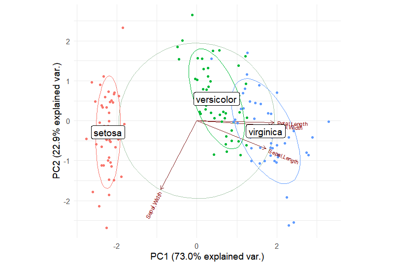
Use ggbipolot to draw the loading plot of PCA results.
iris.gg <-
  ggbiplot(iris.pca, obs.scale = 1, var.scale = 1,
           groups = iris$Species, point.size=2,
           varname.size = 3,
           varname.color = "black",
           varname.adjust = 1.2,
           ellipse = TRUE,
           circle = TRUE) +
  labs(fill = "Species", color = "Species") +
  theme_minimal(base_size = 14) +
  theme(legend.direction = 'horizontal', legend.position = 'top')

iris.gg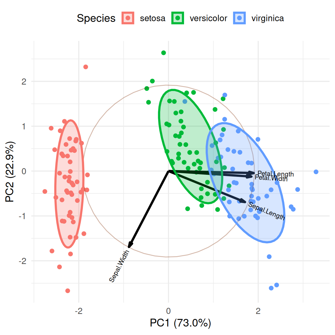
Note: The figure title is the gene name, the horizontal axis is PC1, and the vertical axis is PC2. The arrows in the figure indicate the length of the vectors, which represents the contribution to the variance. The direction indicates the correlation with the principal component. The colors represent the different iris species.
We can see that PC1 and PC2 clearly separate the three groups of samples. The vectors Petal.Length and Petal.width are nearly parallel to the x-axis, indicating that the variance in PC1 is primarily contributed by these variables, while the variance in PC2 is primarily contributed by Sepal.Width. An angle between the vectors greater than 90° indicates a negative correlation, while an angle less than 90° indicates a positive correlation.
2. Add cluster labels
We can calculate the cluster centers and add labels to more intuitively display the names of different categories.
group.labs <-
  iris.gg$data %>%
  dplyr::summarise(xvar = mean(xvar),
            yvar = mean(yvar), .by = groups)
group.labs
groups xvar yvar
1 setosa -2.2099215 -0.2870013
2 versicolor 0.4931384 0.5465027
3 virginica 1.7167831 -0.2595014iris.gg + geom_label(data = group.labs,
aes(x = xvar, y=yvar, label=groups),
size = 5) +
theme(legend.position = "none")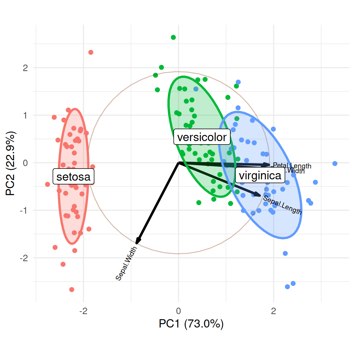
3. Use sample names instead of points
In order to show the position of different samples in PCA analysis, we can display them by setting labels.
ggbiplot(iris.pca, obs.scale = 1,
         var.scale = 1,
         groups = iris$Species,
         labels = rownames(iris),
         point.size=2,
         varname.size = 3,
         varname.color = "black",
         varname.adjust = 1.2,
         ellipse = TRUE,
         circle = TRUE) +
  labs(fill = "Species", color = "Species") +
  theme_minimal(base_size = 14) +
  theme(legend.direction = 'horizontal', legend.position = 'top')
Application
1. Metagenomic principal component analysis loading plot
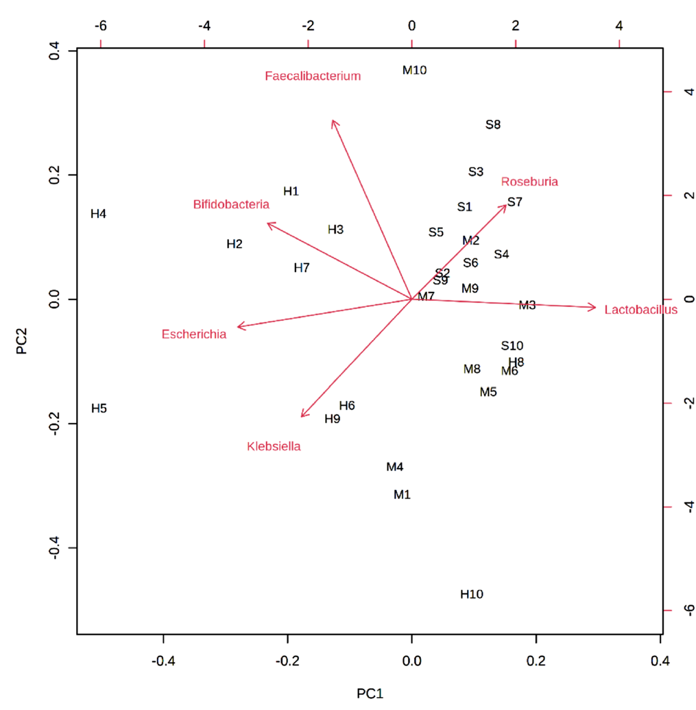
Arrows represent bacterial species, and letters represent samples. The closer the distance between the bacterial species and the sample, the higher the correlation. In the figure, the bacterial species closest to H1, H2, H3, H4, and H7 is Bifidobacteria, indicating that this species is the dominant species in the control group. [1]
2. Transcriptome principal component analysis loading plot
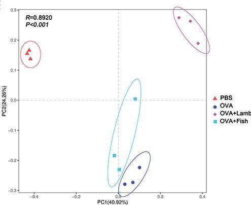
There were significant differences among the four groups, with the contribution values of PC1 and PC2 being 40.92% and 24.26%, respectively. In PC2, the control group (PBS) and the asthma + mutton group (OVA + Lamb) were positively distributed, the asthma + fish group (OVA + fish) and the asthma group (OVA) were mainly negatively distributed. There were significant differences between the control group and the other three groups, and the asthma + mutton group (OVA + Lamb) and the asthma + fish group (OVA + Fish) were significantly separated.[2]
Reference
[1] Balasubramaniam C, Mallappa RH, Singh DK, et al. Gut bacterial profile in Indian children of varying nutritional status: a comparative pilot study. Eur J Nutr. 2021;60(7):3971-3985. doi:10.1007/s00394-021-02571-7.
[2] Zheng HC, Wang YA, Liu ZR, et al. Consumption of Lamb Meat or Basa Fish Shapes the Gut Microbiota and Aggravates Pulmonary Inflammation in Asthmatic Mice. J Asthma Allergy. 2020;13:509-520. Published 2020 Oct 19. doi:10.2147/JAA.S266584.