# Install packages
if (!requireNamespace("data.table", quietly = TRUE)) {
  install.packages("data.table")
}
if (!requireNamespace("jsonlite", quietly = TRUE)) {
  install.packages("jsonlite")
}
if (!requireNamespace("ggplot2", quietly = TRUE)) {
  install.packages("ggplot2")
}
if (!requireNamespace("dplyr", quietly = TRUE)) {
  install.packages("dplyr")
}
if (!requireNamespace("tidyr", quietly = TRUE)) {
  install.packages("tidyr")
}
if (!requireNamespace("scales", quietly = TRUE)) {
  install.packages("scales")
}

# Load packages
library(data.table)
library(jsonlite)
library(ggplot2)
library(dplyr)
library(tidyr)
library(scales)Percentsge Stacked Bar Chart
Note
Hiplot website
This page is the tutorial for source code version of the Hiplot Percentsge Stacked Bar Chart plugin. You can also use the Hiplot website to achieve no code ploting. For more information please see the following link:
https://hiplot.cn/basic/stacked-percentage-bar-chart?lang=en
Setup
System Requirements: Cross-platform (Linux/MacOS/Windows)
Programming language: R
Dependent packages:
data.table;jsonlite;ggplot2;dplyr;tidyr;scales
sessioninfo::session_info("attached")─ Session info ───────────────────────────────────────────────────────────────
setting value
version R version 4.6.0 (2026-04-24)
os Ubuntu 24.04.4 LTS
system x86_64, linux-gnu
ui X11
language (EN)
collate C.UTF-8
ctype C.UTF-8
tz UTC
date 2026-05-09
pandoc 3.1.3 @ /usr/bin/ (via rmarkdown)
quarto 1.9.37 @ /usr/local/bin/quarto
─ Packages ───────────────────────────────────────────────────────────────────
package * version date (UTC) lib source
data.table * 1.18.4 2026-05-06 [1] RSPM
dplyr * 1.2.1 2026-04-03 [1] RSPM
ggplot2 * 4.0.3.9000 2026-05-04 [1] Github (tidyverse/ggplot2@6870419)
jsonlite * 2.0.0 2025-03-27 [1] RSPM
scales * 1.4.0 2025-04-24 [1] RSPM
tidyr * 1.3.2 2025-12-19 [1] RSPM
[1] /home/runner/work/_temp/Library
[2] /opt/R/4.6.0/lib/R/site-library
[3] /opt/R/4.6.0/lib/R/library
* ── Packages attached to the search path.
──────────────────────────────────────────────────────────────────────────────Data Preparation
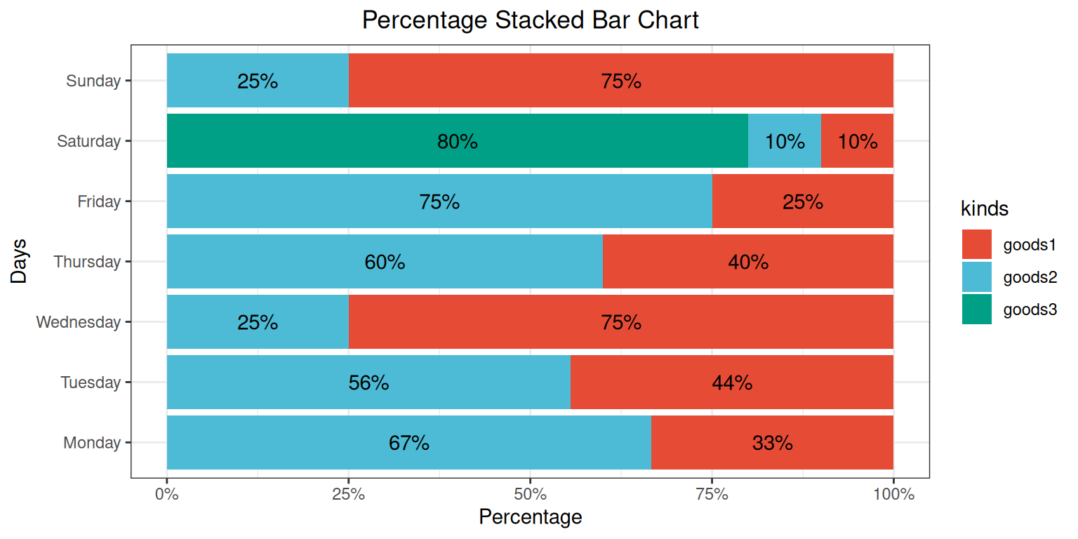
The case data represents the sales percentage of three different products in a shopping mall over the course of one week.
# Load data
data <- data.table::fread(jsonlite::read_json("https://hiplot.cn/ui/basic/stacked-percentage-bar-chart/data.json")$exampleData$textarea[[1]])
data <- as.data.frame(data)

# convert data structure
data$total <- rowSums(data[, -1])
data_long <- gather(data, kinds, value, -days, -total)
data_long <- data_long %>%
  group_by(days) %>%
  mutate(percent = value / total * 100)
data_long[["days"]] <- factor(data_long[["days"]], levels = data[["days"]])

# View data
head(data)
days goods1 goods2 goods3 total
1 Monday 150 300 0 450
2 Tuesday 200 250 0 450
3 Wednesday 300 100 0 400
4 Thursday 200 300 0 500
5 Friday 100 300 0 400
6 Saturday 50 50 400 500Visualization
# Percentsge Stacked Bar Chart
p <- ggplot(data_long, aes(x = percent, y = days, fill = kinds)) +
  geom_bar(stat = "identity", position = "stack") +
  geom_text(aes(label = ifelse(percent != 0, paste0(round(percent), "%"), "")),
            position = position_stack(vjust = 0.5)) +
  labs(title = "Percentage Stacked Bar Chart", x = "Percentage", y = "Days") +
  scale_x_continuous(labels = percent_format(scale = 1)) +
  theme_bw() +
  theme(plot.title = element_text(hjust = 0.5)) +
  scale_fill_manual(values = c("#E64B35FF","#4DBBD5FF","#00A087FF"))

p