# Installing packages
if (!requireNamespace("umap", quietly = TRUE)) {
  install.packages("umap")
}
if (!requireNamespace("ggplot2", quietly = TRUE)) {
  install.packages("ggplot2")
}
if (!requireNamespace("patchwork", quietly = TRUE)) {
  install.packages("patchwork")
}
if (!requireNamespace("RColorBrewer", quietly = TRUE)) {
  install.packages("RColorBrewer")
}
if (!requireNamespace("Seurat", quietly = TRUE)) {
  install.packages("Seurat")
}
if (!requireNamespace("SeuratData", quietly = TRUE)) {
  remotes::install_github('satijalab/seurat-data')
}
if (!requireNamespace("dplyr", quietly = TRUE)) {
  install.packages("dplyr")
}
if (!requireNamespace("mlbench", quietly = TRUE)) {
  install.packages("mlbench")
}

# Load packages
library(umap)
library(ggplot2)
library(patchwork)
library(RColorBrewer)
library(Seurat)
library(SeuratData)
library(dplyr)
library(mlbench)UMAP Plot
Example
UMAP (Uniform Manifold Approximation and Projection) is a powerful nonlinear dimensionality reduction technique primarily used for processing high-dimensional data. The core of the UMAP algorithm is to preserve both the local and global structure of the data. It constructs a proximity graph between data points and leverages the graph’s topology for manifold approximation and optimization. It effectively maps high-dimensional data into a low-dimensional space for visualization and further analysis. In bioinformatics, it is well-suited for processing high-dimensional data such as gene expression and microbiome data. Below, we demonstrate the application of UMAP in binary classification clinical data and single-cell sequencing data, respectively.
Setup
System Requirements: Cross-platform (Linux/MacOS/Windows)
Programming language: R
Dependent packages:
umap,ggplot2,patchwork,RColorBrewer,Seurat,SeuratData,dplyr,mlbench
sessioninfo::session_info("attached")─ Session info ───────────────────────────────────────────────────────────────
setting value
version R version 4.6.0 (2026-04-24)
os Ubuntu 24.04.4 LTS
system x86_64, linux-gnu
ui X11
language (EN)
collate C.UTF-8
ctype C.UTF-8
tz UTC
date 2026-05-09
pandoc 3.1.3 @ /usr/bin/ (via rmarkdown)
quarto 1.9.37 @ /usr/local/bin/quarto
──────────────────────────────────────────────────────────────────────────────Data Preparation
1. Clinical phenotype data: Wisconsin Breast Cancer Dataset
The BreastCancer dataset in the mlbench package is used. This data was originally collected by Dr. William H. Wolberg at the Wisconsin State Hospital and contains measurements of tumor features collected from breast cancer patients, such as the radius, texture, and symmetry of the tumor, as well as corresponding benign (benign) or malignant (malignant) labels. To facilitate analysis, the following simple preprocessing is performed on the data:
data(BreastCancer)
wdbc_data <- BreastCancer[, -1]  # Remove the ID column
wdbc_data <- na.omit(wdbc_data)
features <- wdbc_data[, 1:9]  # Using the first 9 features
features <- as.data.frame(lapply(features, function(x) as.numeric(as.character(x))))
diagnosis <- wdbc_data$Class
head(features)
2. Single-cell sequencing data: IFNB dataset
IFNB is based on a PBMC dataset. PBMC (Peripheral Blood Mononuclear Cells) is a scRNA-seq dataset of peripheral blood mononuclear cells provided by 10x Genomics. It contains annotated B cells, T cells, NK cells, monocytes, and more. IFNB includes two PBMC datasets: one from an interferon-stimulated group and one from a control group.
Single-cell sequencing data, due to its high dimensionality and sparseness, is well-suited for UMAP dimensionality reduction. Below, we will use the IFNB single-cell RNA-seq dataset as an example to demonstrate UMAP dimensionality reduction in single-cell analysis. This dataset can be loaded using SeuratData.
RunUMAP() is the UMAP dimensionality reduction function provided by Seurat. The following code provides a brief description of single-cell data preprocessing prior to UMAP. For detailed principles and instructions, please refer to professional single-cell data analysis tutorials and will not be elaborated here.
# InstallData("ifnb")
# ifnb <- LoadData("ifnb") # Seurat V4

data("ifnb")
ifnb <- UpdateSeuratObject(ifnb) # Seurat V5

ifnb <- NormalizeData(ifnb) # Perform Log2(x+1) transformation on the data
ifnb <- FindVariableFeatures(ifnb) # Extract the feature with the largest variance for dimensionality reduction
ifnb <- ScaleData(ifnb) # Data Scaling
ifnb <- RunPCA(ifnb) # PCA pre-dimensionality reduction
ifnb <- RunUMAP(ifnb, dims = 1:20) # UMAP Dimensionality Reduction
Visualization
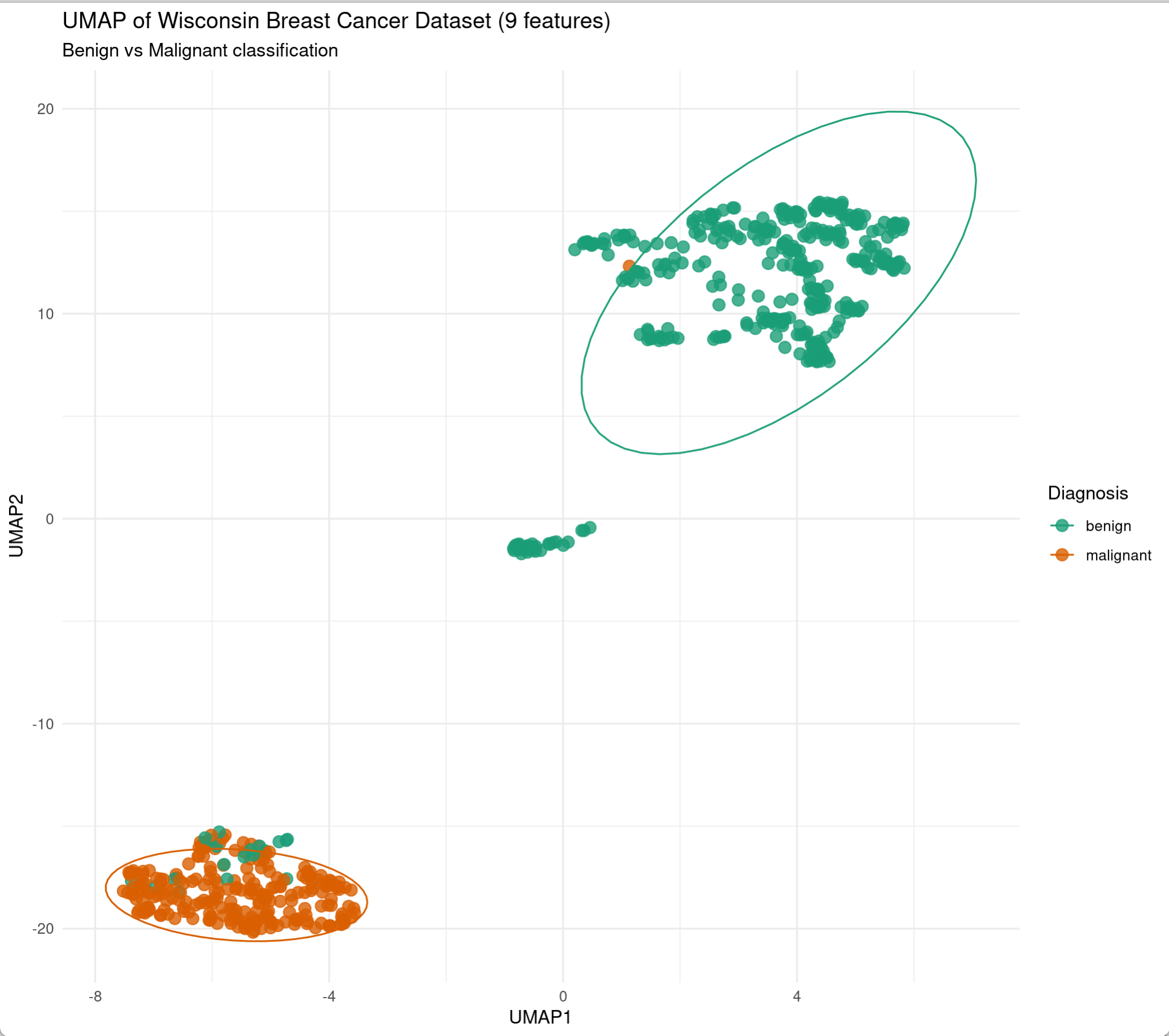
1. UMAP visualization of clinical phenotype data
umap is an R package for UMAP dimensionality reduction, which provides a convenient umap() function for dimensionality reduction and parameter adjustment.
set.seed(123)
wdbc_umap <- umap(features,
                 n_neighbors = 15,
                 min_dist = 0.2,
                 metric = "euclidean")

ggplot(data.frame(wdbc_umap$layout, Diagnosis = diagnosis),
       aes(X1, X2, color = Diagnosis)) +
  geom_point(size = 3, alpha = 0.8) +
  stat_ellipse(level = 0.9) +
  theme_minimal() +
  labs(title = "UMAP of Wisconsin Breast Cancer Dataset",
       x = "UMAP1", y = "UMAP2",
       subtitle = "n_neighbors=15, min_dist=0.2") +
  scale_color_manual(values = c("benign" = "#1b9e77", "malignant" = "#d95f02"))
Tip
Parameter Description:
n_neighbors: Controls the granularity of local structure. Smaller values capture finer local structure but may overfit noise; larger values preserve more global structure but may blur local details. Default is 15.min_dist: Controls the minimum distance between embedded points in the manifold space. Smaller values make data points closer together and local structure clearer; larger values make points more dispersed and global structure more apparent.metric: Defines the distance metric. Options include"euclidean","cosine","manhattan", and"pearson".
Parameter sensitivity analysis
We can try adjusting different parameters in UMAP to adjust the dimensionality reduction effect. The following shows a comparison of UMAP results obtained using three different parameter combinations.
# Defining parameter combinations
params <- list(
  list(n_neighbors=5, min_dist=0.1, label="Aggressive"),
  list(n_neighbors=15, min_dist=0.2, label="Default"),
  list(n_neighbors=50, min_dist=0.5, label="Conservative")
)

# Generate UMAP and plot
plots <- list()
for (i in seq_along(params)) {
  set.seed(123)
  umap_res <- umap::umap(features,
                  n_neighbors = params[[i]]$n_neighbors,
                  min_dist = params[[i]]$min_dist)

  df <- data.frame(umap_res$layout, Diagnosis = diagnosis)

  plots[[i]] <- ggplot(df, aes(X1, X2, color = Diagnosis)) +
    geom_point(size = 2, alpha = 0.7) +
    labs(title = paste("Params:", params[[i]]$label),
         subtitle = sprintf("n_neighbors=%d, min_dist=%.1f",
                          params[[i]]$n_neighbors, params[[i]]$min_dist),
         x = "UMAP1", y = "UMAP2") +
    theme_minimal(base_size = 10) +
    scale_color_manual(values = c("benign" = "#1b9e77", "malignant" = "#d95f02"))
}

# Using patchwork for typesetting
(plots[[1]] / plots[[2]] / plots[[3]])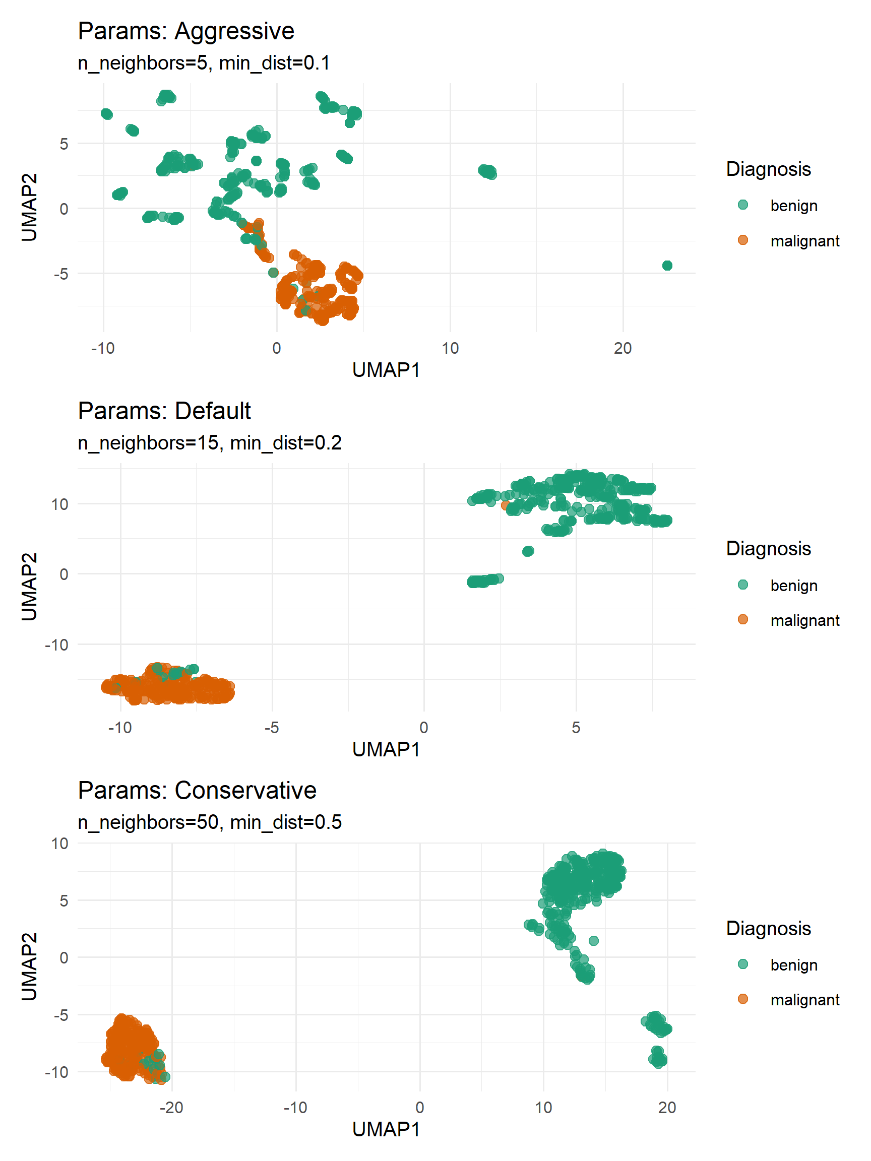
2. Seurat UMAP visualization
Seurat provides the UMAP dimensionality reduction visualization interface function DimPlot() , which allows users to quickly visualize single-cell data. Below are the results of coloring cells by cell type and treatment group in the same dimensionality reduction space obtained above.
(Note: The code above does not perform cell clustering; the classification results are based on the pre-defined annotations in the dataset.)
plots <- list()
group_ident <- c('seurat_annotations', 'stim')
for (i in seq_along(group_ident)) {
  p <- DimPlot(ifnb, reduction = 'umap', group.by = group_ident[i])
  plots[[i]] <- p
}

(plots[[1]] / plots[[2]])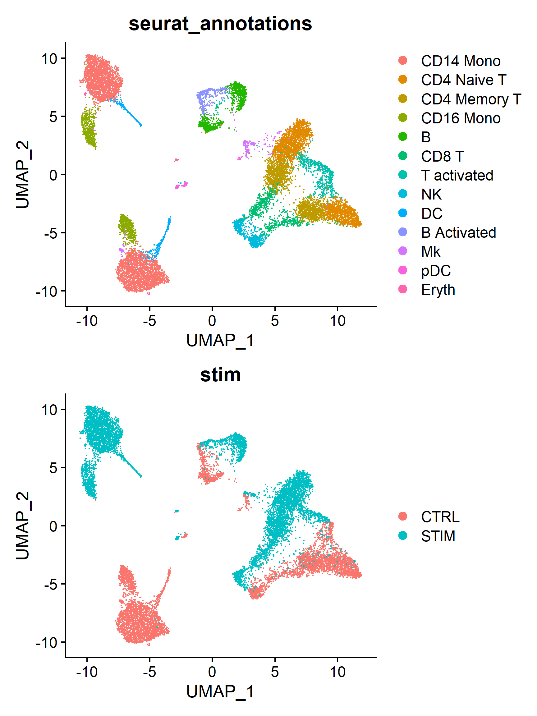
3. ggplot2 custom UMAP visualization
In addition to using interface functions, we can also use ggplot2 to customize the UMAP graph.
# Extract UMAP coordinates and metadata
umap_df <- Embeddings(ifnb, "umap") %>% as.data.frame() %>% mutate(CellType = ifnb$seurat_annotations, Treatment = ifnb$stim)
head(umap_df)

custom_colors <- c(
  "#8DD3C7", "#FFFFB3", "#BEBADA", "#FB8072", "#80B1D3",
  "#FDB462", "#B3DE69", "#FCCDE5", "#D9D9D9", "#BC80BD",
  "#CCEBC5", "#FFED6F", "#A6CEE3")

ggplot(umap_df, aes(UMAP_1, UMAP_2, color = CellType)) +
      geom_point(size = 1.5, alpha = 0.8) +
      theme_minimal() + labs(title = "IFNB UMAP", x = "UMAP1", y = "UMAP2") +
      scale_color_manual(values = custom_colors)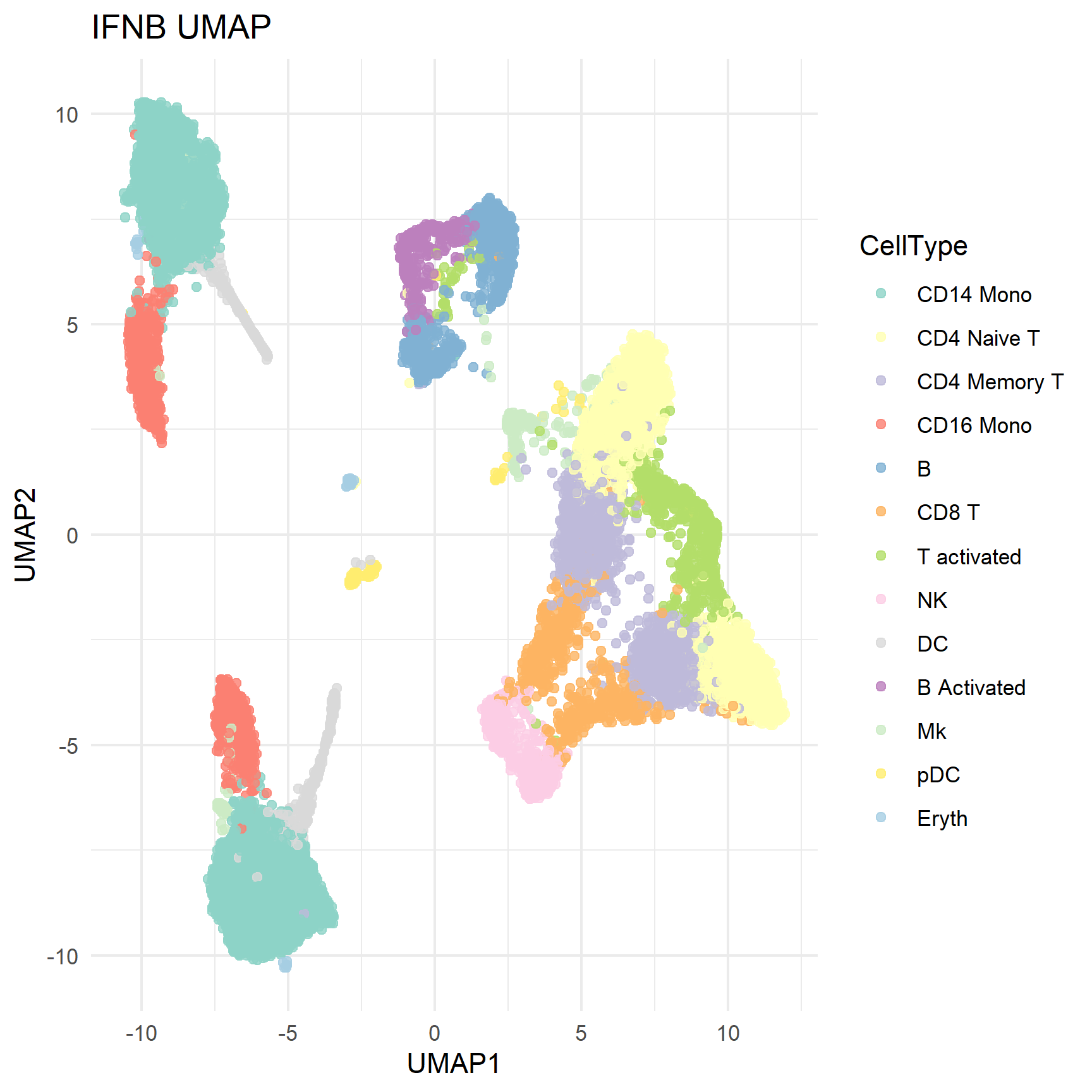
Application
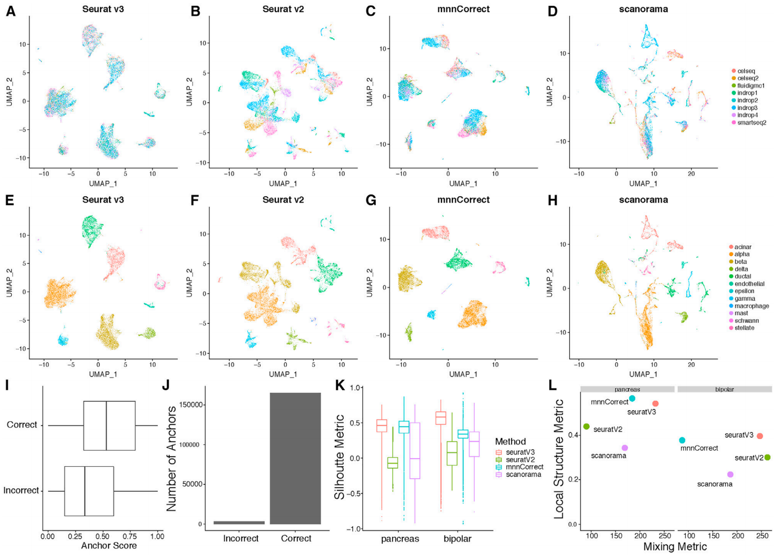
Figures A-H show UMAP images of eight pancreatic islet cell datasets. [1]
Reference
[1] Stuart T, Butler A, Hoffman P, et al. Comprehensive Integration of Single-Cell Data. Cell. 2019;177(7):1888-1902.e21.