# Install packages
if (!requireNamespace("RIdeogram", quietly = TRUE)) {
  install.packages("RIdeogram")
}

# Load packages
library(RIdeogram)Chromosome Plot
An chromosome plot (ideogram) is a graphical tool used to visualize chromosome structure and various genomic features on chromosomes. It typically represents each chromosome individually, drawing the length and structures such as the centromere to scale. Additionally, it can annotate multiple types of information on the chromosomes, including gene density, genetic variations, expression levels, repetitive sequences, and functional markers.
Chromosome plot can take linear or circular forms (such as Circos plots). Among these, linear ideograms are more suitable for displaying the linear structure of chromosomes and local data variations, making them particularly useful for studies such as genome-wide scans, population comparisons, and genetic mapping. Their visual representation not only facilitates an intuitive understanding of data distribution along chromosomes but also allows for the overlay of multiple layers of information, such as heatmaps, markers, lines, and color blocks.
Example

The image shows a chromosome ideogram with dual-line labels, plotted using the built-in Liriodendron data from the RIdeogram package. Each chromosome is drawn to scale, with the color in the center representing genomic heatmap data (here, Fst values reflecting the degree of population differentiation). The upper and lower lines on both sides represent the Pi values (nucleotide diversity) of two populations (CE and CW) across different chromosomal regions.
Setup
System Requirements: Cross-platform (Linux/MacOS/Windows)
Programming language: R
Dependent packages:
RIdeogram
sessioninfo::session_info("attached")─ Session info ───────────────────────────────────────────────────────────────
setting value
version R version 4.6.0 (2026-04-24)
os Ubuntu 24.04.4 LTS
system x86_64, linux-gnu
ui X11
language (EN)
collate C.UTF-8
ctype C.UTF-8
tz UTC
date 2026-05-09
pandoc 3.1.3 @ /usr/bin/ (via rmarkdown)
quarto 1.9.37 @ /usr/local/bin/quarto
─ Packages ───────────────────────────────────────────────────────────────────
package * version date (UTC) lib source
RIdeogram * 0.2.2 2020-01-20 [1] RSPM
[1] /home/runner/work/_temp/Library
[2] /opt/R/4.6.0/lib/R/site-library
[3] /opt/R/4.6.0/lib/R/library
* ── Packages attached to the search path.
──────────────────────────────────────────────────────────────────────────────Data Preparation
Use the built-in data from the RIDeogram package.
data(human_karyotype, package="RIdeogram")
data(gene_density, package="RIdeogram")
data(Random_RNAs_500, package="RIdeogram")
You can use the head() function to view the basic format of each data:
head(human_karyotype) Chr Start End CE_start CE_end
1 1 0 248956422 122026459 124932724
2 2 0 242193529 92188145 94090557
3 3 0 198295559 90772458 93655574
4 4 0 190214555 49712061 51743951
5 5 0 181538259 46485900 50059807
6 6 0 170805979 58553888 59829934human_karyotype karyotype data contains five columns: the first column is the chromosome ID, the second and third columns are the chromosome start and end positions, and the fourth and fifth columns are the centromere start and end positions. Note: If there is no centromere information, only the first three columns can be retained.
head(gene_density) Chr Start End Value
1 1 1 1000000 65
2 1 1000001 2000000 76
3 1 2000001 3000000 35
4 1 3000001 4000000 30
5 1 4000001 5000000 10
6 1 5000001 6000000 10gene_density data is used to draw heat maps. It contains chromosome ID, start and end positions. The fourth column is a numerical value (such as the number of genes, SNP density, etc.) used for heat mapping on chromosomes.
head(Random_RNAs_500) Type Shape Chr Start End color
1 tRNA circle 6 69204486 69204568 6a3d9a
2 rRNA box 3 68882967 68883091 33a02c
3 rRNA box 5 55777469 55777587 33a02c
4 rRNA box 21 25202207 25202315 33a02c
5 miRNA triangle 1 86357632 86357687 ff7f00
6 miRNA triangle 11 74399237 74399333 ff7f00Random_RNAs_500 data is label information (track), with six columns including: label type (such as tRNA, rRNA, miRNA, etc.), shape (optional: circle, box or triangle), chromosome, start and end positions, and label color.
Visualization
1. Basic Chromosome Plot
After running, you can find an SVG file and a PNG file in the working directory.
# Basic Chromosome Plot
ideogram(karyotype = human_karyotype)
convertSVG("chromosome.svg", device = "png")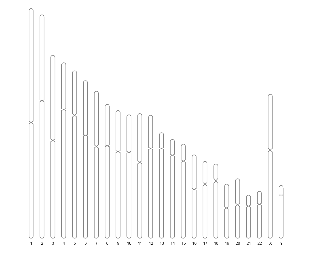
2. Chromosome plot with heatmap
Use the overlaid parameter to map the whole genome data onto the chromosome map, visualizing the gene density of the entire human genome.
# Chromosome plot with heatmap
ideogram(karyotype = human_karyotype, overlaid = gene_density)
convertSVG("chromosome.svg", device = "png")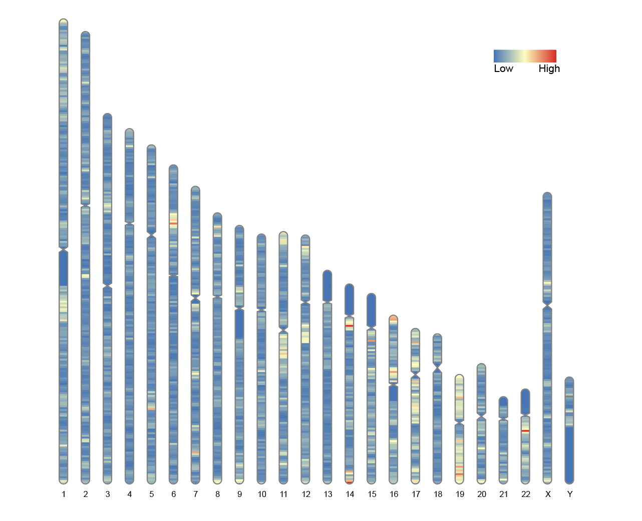
3. Track Label
Map some genome-wide data as tracks on the side of the chromosome map.
# Track Label
ideogram(karyotype = human_karyotype, label = Random_RNAs_500, label_type = "marker")
convertSVG("chromosome.svg", device = "png")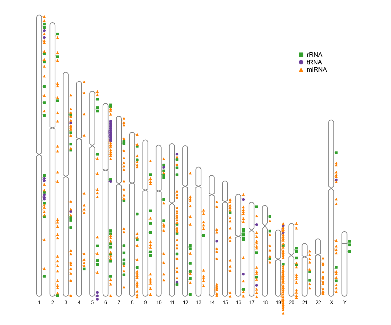
4. Plot heatmap and trajectory labels simultaneously
Simultaneously map the overlaid heatmap and track labels on chromosome representations.
# Plot heatmap and trajectory labels simultaneously
ideogram(karyotype = human_karyotype, overlaid = gene_density, label = Random_RNAs_500, label_type = "marker")
convertSVG("chromosome.svg", device = "png")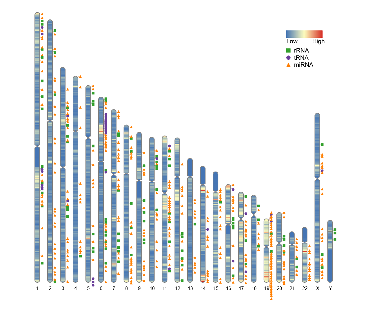
5. Custom heatmap colors
To change the colors of the heatmap, modify the colorset1 parameter (default is colorset1 = c("#4575b4", "#ffffbf", "#d73027")). You can use built-in color names, colors(), or hexadecimal color codes in the format "#rrggbb" or "#rrggbbaa".
# Custom heatmap colors
ideogram(karyotype = human_karyotype, overlaid = gene_density, label = Random_RNAs_500, label_type = "marker", colorset1 = c("#fc8d59", "#ffffbf", "#91bfdb"))
convertSVG("chromosome.svg", device = "png")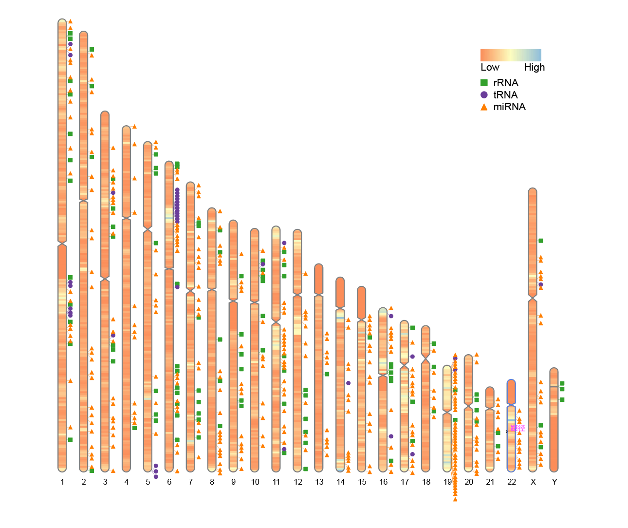
6. Chromosome plot without centromere information
If the species under study lacks clear centromere location information, a chromosome map can still be drawn. In this case, the karyotype file only needs to contain three columns: chromosome number, start position, and end position. The fourth and fifth columns containing the centromere start and end coordinates are unnecessary.
To simulate this situation, the last two columns of the human_karyotype data frame included with RIdeogram can be deleted:
# Chromosome plot without centromere information
human_karyotype <- human_karyotype[,1:3]
ideogram(karyotype = human_karyotype, overlaid = gene_density, label = Random_RNAs_500, label_type = "marker")
convertSVG("chromosome.svg", device = "png")
Even if centromere information is missing, RIdeogram can still be plotted, but the centromere region will not be marked in the plot.
7. Width setting when only part of the chromosome is used
In some cases, such as analyzing only a subset of chromosomes (e.g., the first 10 chromosomes), the default plot width may appear too scattered or leave too much white space. In this case, it is recommended to optimize the plot layout by adjusting the width parameter.
To simulate this situation, you can retain the first 10 chromosomes from the human_karyotype data and compare the results of plotting with the default width and the adjusted width:
Before modification:
# Before modification:
human_karyotype <- human_karyotype[1:10,]
ideogram(karyotype = human_karyotype, overlaid = gene_density, label = Random_RNAs_500, label_type = "marker")
convertSVG("chromosome.svg", device = "png")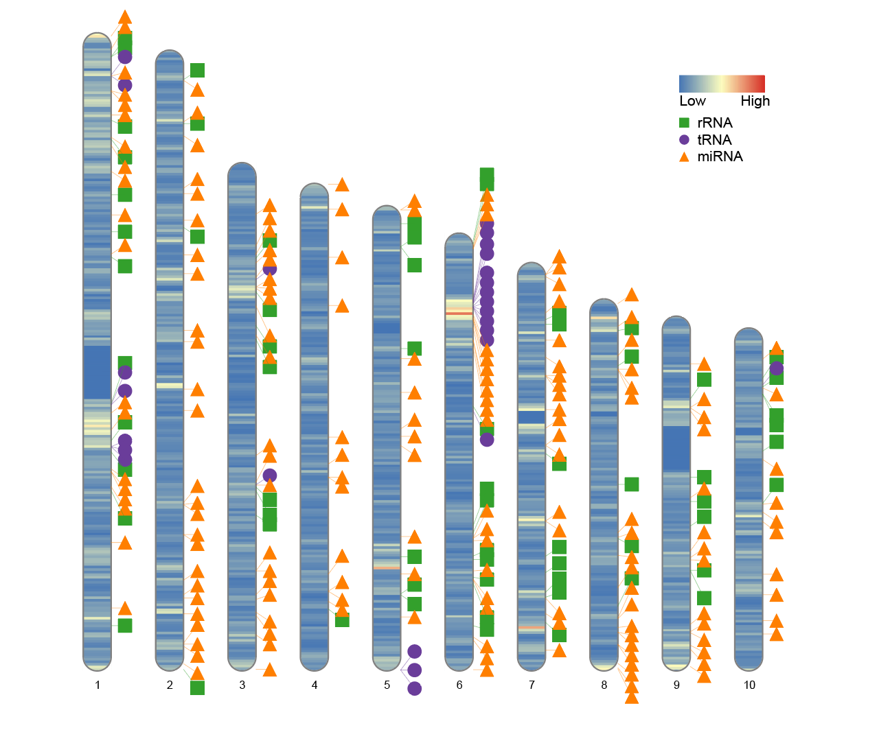
After modification:
# After modification
human_karyotype <- human_karyotype[1:10,]
ideogram(karyotype = human_karyotype, overlaid = gene_density, label = Random_RNAs_500, label_type = "marker", width = 100)
convertSVG("chromosome.svg", device = "png")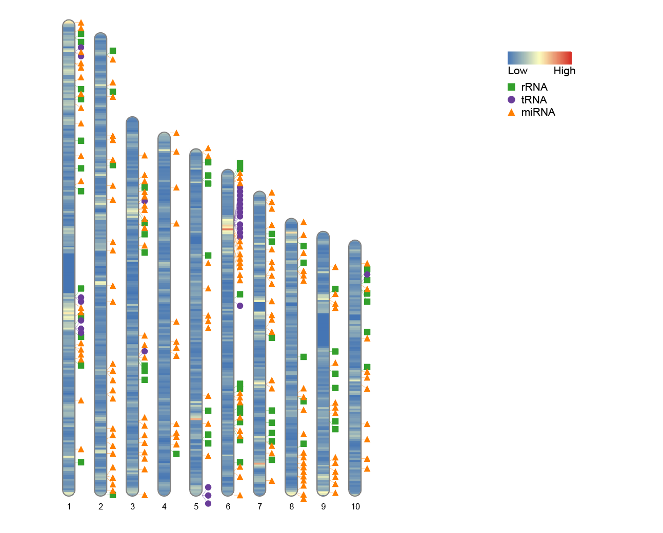
8. Adjust the legend position
If you wish to reposition the legend, you can do so by modifying the Lx and Ly parameters. These parameters control the position of the legend’s top-left corner relative to the image edge. The default values are Lx = 160 and Ly = 35, respectively.
-
Lx: The distance from the top-left corner of the legend to the left edge of the image. -
Ly: The distance from the top-left corner of the legend to the top edge of the image.
By adjusting these parameters, you can prevent the legend from overlapping the main image or position it more appropriately for your layout.
# Adjust the legend position
ideogram(karyotype = human_karyotype, overlaid = gene_density, label = Random_RNAs_500, label_type = "marker", width = 100, Lx = 80, Ly = 25)
convertSVG("chromosome.svg", device = "png")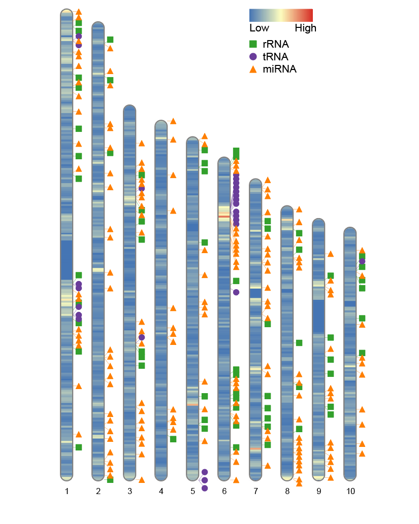
9. Different label types
RIdeogram supports multiple label types, and you can choose different ways to display data according to your visualization needs. Currently supported label types include:
-
"marker"(marker point) -
"heatmap"(heat map) -
"line"(polyline) -
"polygon"(polygon)
9.1 Heatmap Label
# Heatmap Label
data(human_karyotype, package="RIdeogram")
ideogram(karyotype = human_karyotype, overlaid = gene_density, label = LTR_density, label_type = "heatmap", colorset1 = c("#f7f7f7", "#e34a33"), colorset2 = c("#f7f7f7", "#2c7fb8"))
convertSVG("chromosome.svg", device = "png")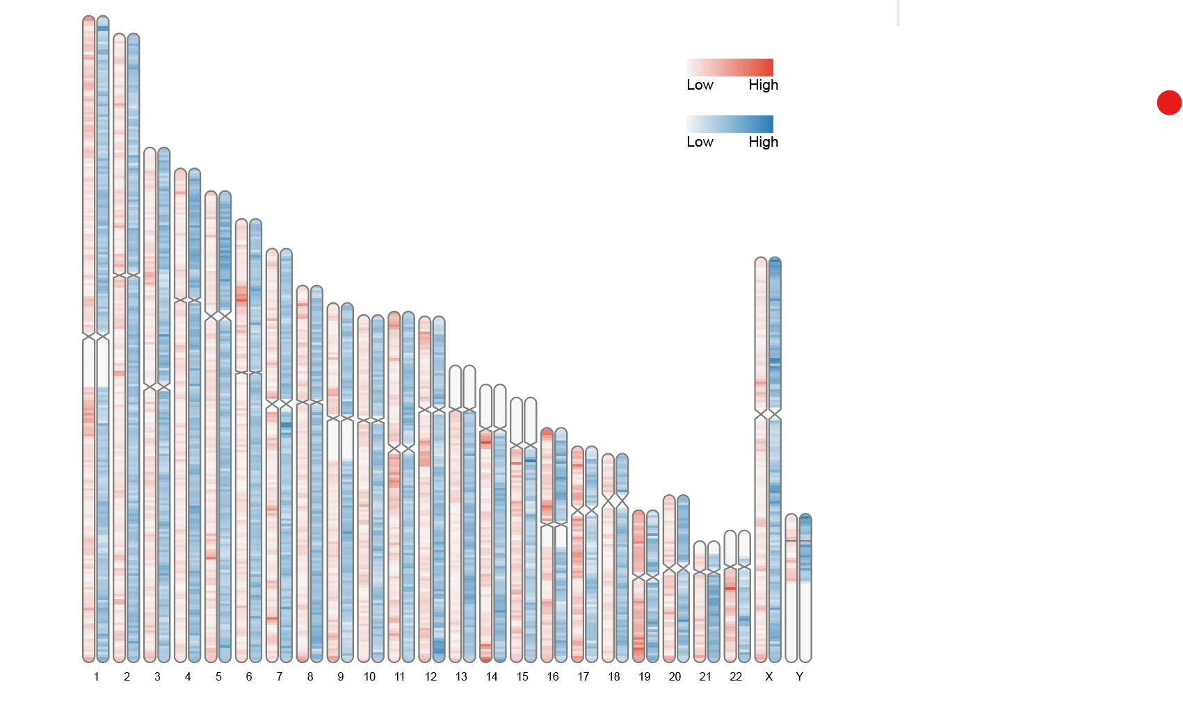
This graph uses human chromosome data built into RIdeogram to show the distribution of two features (gene density and LTR element density) across chromosomes. Different color shades represent different ranges of values, helping to visualize density differences across regions of the genome.
9.2 Single line label
# Single line label
data(liriodendron_karyotype, package="RIdeogram")
data(Fst_between_CE_and_CW, package="RIdeogram")
data(Pi_for_CE, package="RIdeogram")
ideogram(karyotype = liriodendron_karyotype, overlaid = Fst_between_CE_and_CW, label = Pi_for_CE, label_type = "line", colorset1 = c("#e5f5f9", "#99d8c9", "#2ca25f"))
convertSVG("chromosome.svg", device = "png")
This figure shows the continuous change trend of a single indicator (Pi value) on the chromosome. The fluctuation of the broken line can intuitively reflect the distribution pattern of genetic diversity in different segments.
9.3 Double line label
# Double line label
data(liriodendron_karyotype, package="RIdeogram")
data(Fst_between_CE_and_CW, package="RIdeogram")
data(Pi_for_CE_and_CW, package="RIdeogram")
ideogram(karyotype = liriodendron_karyotype, overlaid = Fst_between_CE_and_CW, label = Pi_for_CE_and_CW, label_type = "line", colorset1 = c("#e5f5f9", "#99d8c9", "#2ca25f"))
convertSVG("chromosome.svg", device = "png")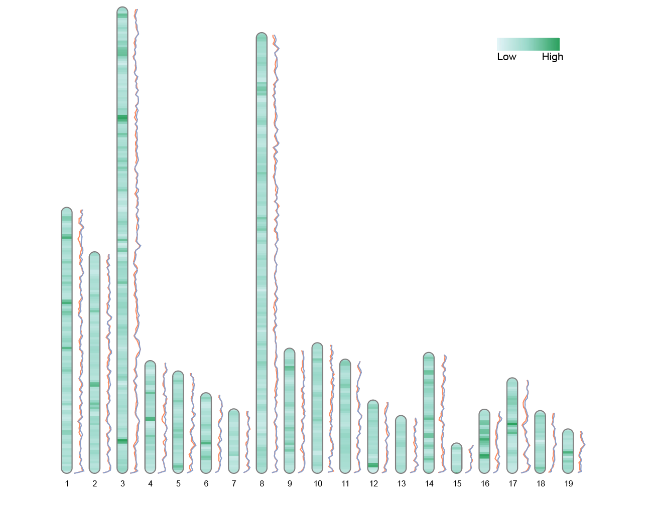
This figure shows the comparison of Pi values of two populations (CE and CW) on chromosomes. The double-line parallel depiction helps to discover the differences in diversity between the two groups in certain chromosome segments.
9.4 Single polygon label
# Single polygon label
data(liriodendron_karyotype, package="RIdeogram")
data(Fst_between_CE_and_CW, package="RIdeogram")
data(Pi_for_CE, package="RIdeogram")
ideogram(karyotype = liriodendron_karyotype, overlaid = Fst_between_CE_and_CW, label = Pi_for_CE, label_type = "polygon", colorset1 = c("#e5f5f9", "#99d8c9", "#2ca25f"))
convertSVG("chromosome.svg", device = "png")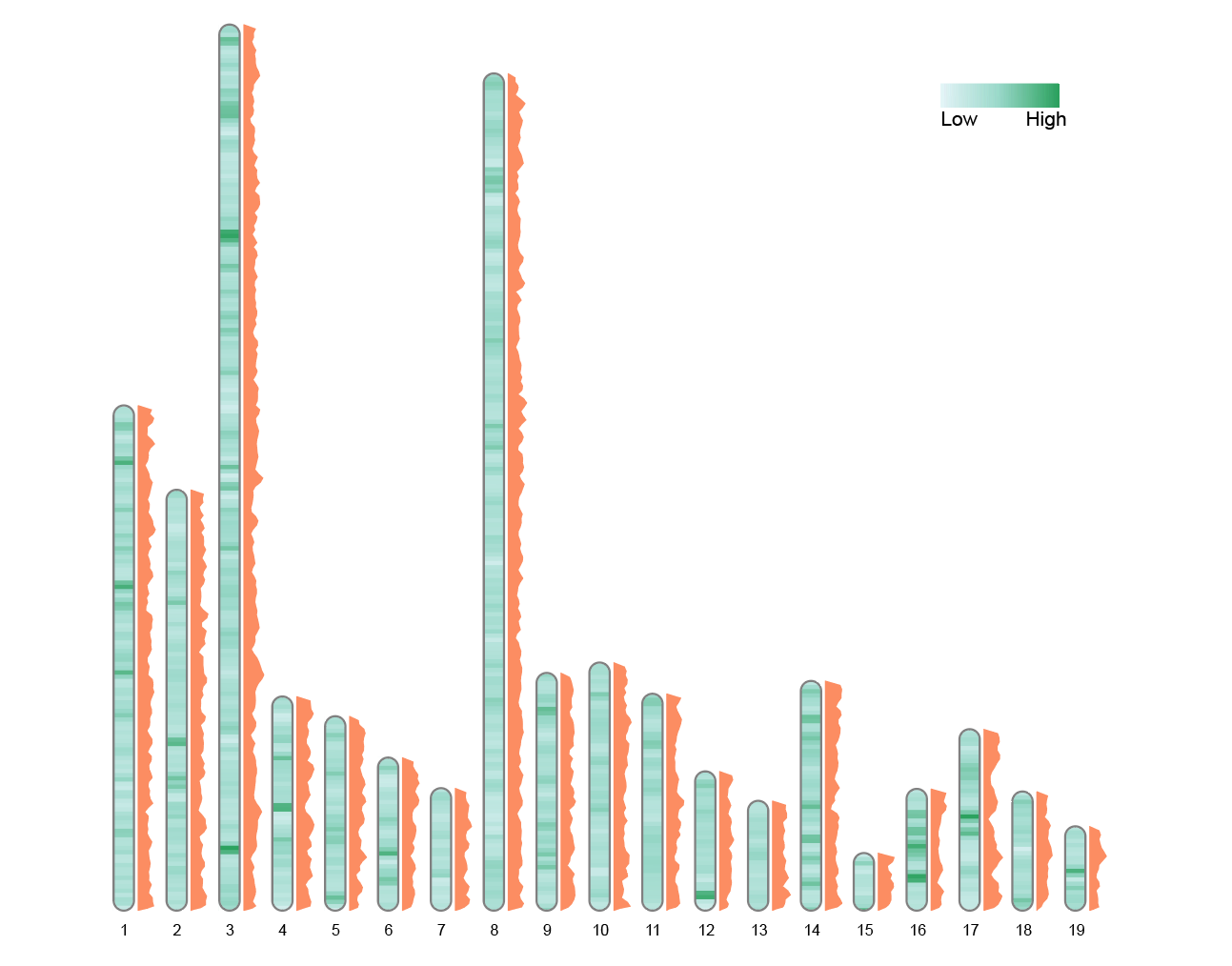
This graph displays the variation of a single indicator in polygonal form. The change in area more significantly reflects the size of the value, making it suitable for emphasizing local significant areas.
9.5 Double polygon label
# Double polygon label
data(liriodendron_karyotype, package="RIdeogram")
data(Fst_between_CE_and_CW, package="RIdeogram")
data(Pi_for_CE_and_CW, package="RIdeogram")
ideogram(karyotype = liriodendron_karyotype, overlaid = Fst_between_CE_and_CW, label = Pi_for_CE_and_CW, label_type = "polygon", colorset1 = c("#e5f5f9", "#99d8c9", "#2ca25f"))
convertSVG("chromosome.svg", device = "png")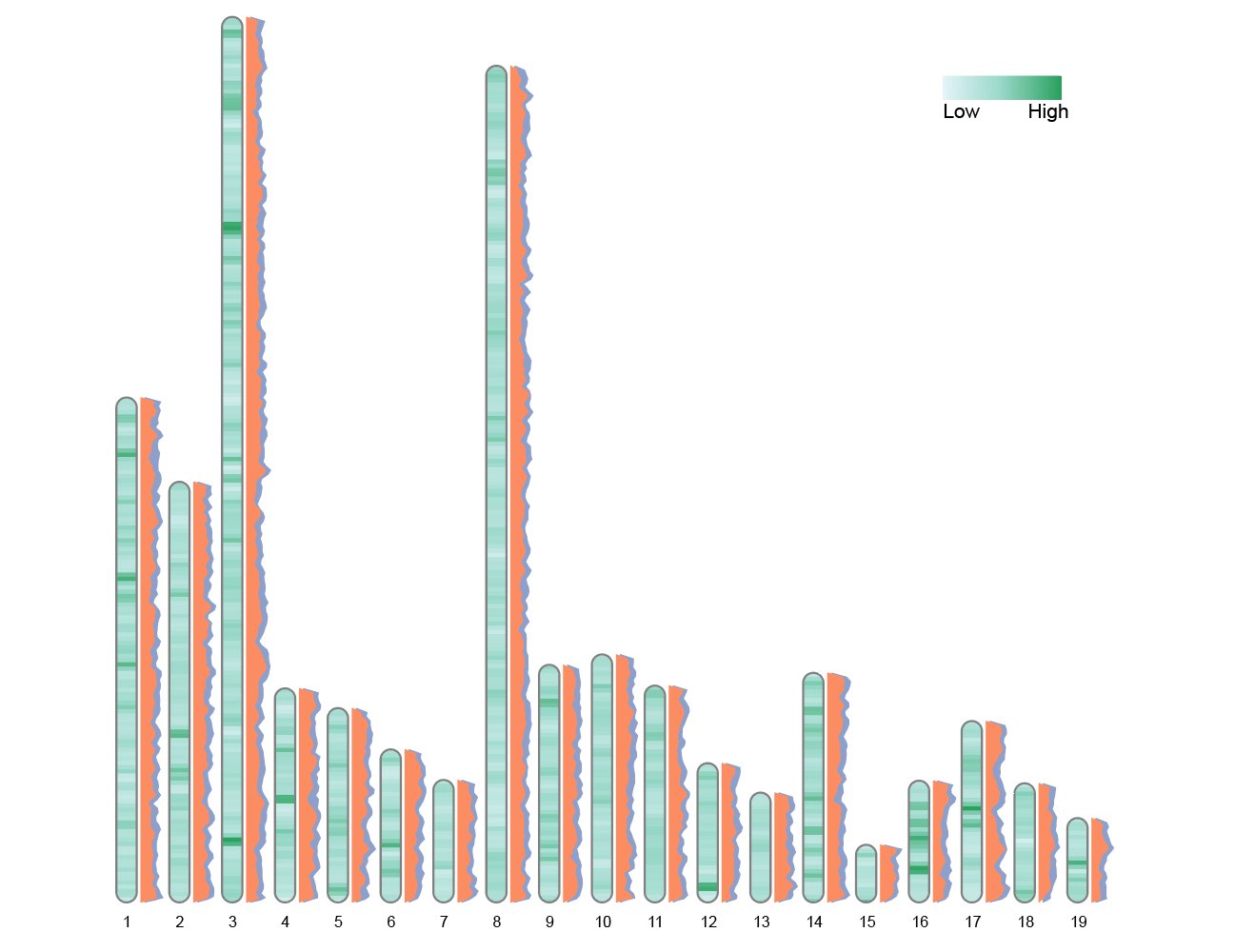
The second polygon label is automatically offset horizontally by 0.2 chromosome widths to improve readability. This graph uses two sets of polygons to simultaneously display the differences in metrics between the two populations on the chromosome. The overlapping areas or spacing allow for intuitive comparison of the numerical distribution and trends of each segment.
10. Output image files in different formats
In addition to the png format, other formats can also be generated using the device parameter:
convertSVG("chromosome.svg", device = "tiff", dpi = 600)Without device, there are some quick functions to convert SVG images to other formats:
svg2png("chromosome.svg")
svg2pdf("chromosome.svg")
svg2jpg("chromosome.svg")
svg2tiff("chromosome.svg")
Application
Reference
[1] RIdeogram: drawing SVG graphics to visualize and map genome-wide data on idiograms https://cran.r-project.org/web/packages/RIdeogram/vignettes/RIdeogram.html [2] Hao Z, Lv D, Ge Y, Shi J, Weijers D, Yu G, Chen J. 2020. RIdeogram: drawing SVG graphics to visualize and map genome-wide data on the idiograms. PeerJ Comput. Sci. 6:e251 http://doi.org/10.7717/peerj-cs.251