# Install packages
if (!requireNamespace("data.table", quietly = TRUE)) {
  install.packages("data.table")
}
if (!requireNamespace("jsonlite", quietly = TRUE)) {
  install.packages("jsonlite")
}
if (!requireNamespace("ggpubr", quietly = TRUE)) {
  install.packages("ggpubr")
}
if (!requireNamespace("ggthemes", quietly = TRUE)) {
  install.packages("ggthemes")
}

# Load packages
library(data.table)
library(jsonlite)
library(ggpubr)
library(ggthemes)Boxplot
Note
Hiplot website
This page is the tutorial for source code version of the Hiplot Boxplot plugin. You can also use the Hiplot website to achieve no code ploting. For more information please see the following link:
The box plot is a method of visualizing the distribution characteristics of a set of data by means of a quartile graph.
Setup
System Requirements: Cross-platform (Linux/MacOS/Windows)
Programming language: R
Dependent packages:
data.table;jsonlite;ggpubr;ggthemes
sessioninfo::session_info("attached")─ Session info ───────────────────────────────────────────────────────────────
setting value
version R version 4.6.0 (2026-04-24)
os Ubuntu 24.04.4 LTS
system x86_64, linux-gnu
ui X11
language (EN)
collate C.UTF-8
ctype C.UTF-8
tz UTC
date 2026-05-09
pandoc 3.1.3 @ /usr/bin/ (via rmarkdown)
quarto 1.9.37 @ /usr/local/bin/quarto
─ Packages ───────────────────────────────────────────────────────────────────
package * version date (UTC) lib source
data.table * 1.18.4 2026-05-06 [1] RSPM
ggplot2 * 4.0.3.9000 2026-05-04 [1] Github (tidyverse/ggplot2@6870419)
ggpubr * 0.6.3 2026-02-24 [1] RSPM
ggthemes * 5.2.0 2025-11-30 [1] RSPM
jsonlite * 2.0.0 2025-03-27 [1] RSPM
[1] /home/runner/work/_temp/Library
[2] /opt/R/4.6.0/lib/R/site-library
[3] /opt/R/4.6.0/lib/R/library
* ── Packages attached to the search path.
──────────────────────────────────────────────────────────────────────────────Data Preparation
The loaded data is data set (data on treatment outcomes of different treatment regimens).
# Load data
data <- data.table::fread(jsonlite::read_json("https://hiplot.cn/ui/basic/boxplot/data.json")$exampleData$textarea[[1]])
data <- as.data.frame(data)

# convert data structure
groups <- unique(data[, 2])
my_comparisons <- combn(groups, 2, simplify = FALSE)
my_comparisons <- lapply(my_comparisons, as.character)

# View data
head(data)
Value Group1 Group2
1 4.2 low treat1
2 11.5 low treat1
3 7.3 low treat1
4 5.8 low treat1
5 6.4 low treat1
6 10.0 low treat1Visualization
# Boxplot
p <- ggboxplot(data, x = "Group1", y = "Value", notch = F, facet.by = "Group2",
               add = "point", color = "Group1", xlab = "Group2", ylab = "Value",
               palette = c("#e04d39","#5bbad6","#1e9f86"),
               title = "Box Plot") +
  stat_compare_means(comparisons = my_comparisons, label = "p.format",
                     method = "t.test") +
  scale_y_continuous(expand = expansion(mult = c(0.1, 0.1))) +
  theme_stata() +
  theme(text = element_text(family = "Arial"),
        plot.title = element_text(size = 12,hjust = 0.5),
        axis.title = element_text(size = 12),
        axis.text = element_text(size = 10),
        axis.text.x = element_text(angle = 0, hjust = 0.5,vjust = 1),
        legend.position = "right",
        legend.direction = "vertical",
        legend.title = element_text(size = 10),
        legend.text = element_text(size = 10))

p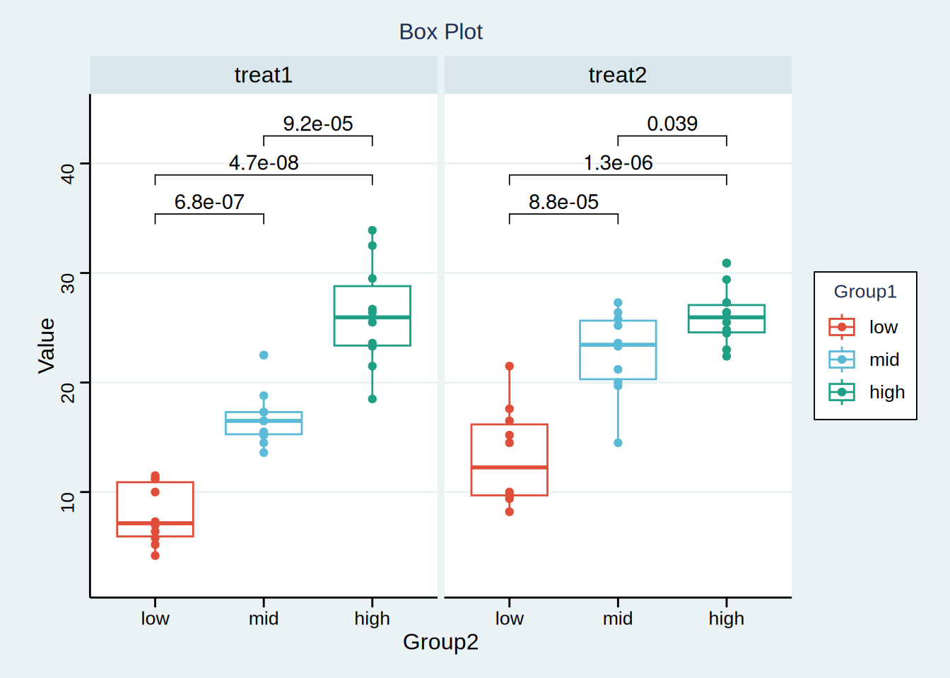
The abscissa represents several different sets of data, and the ordinate represents the quartile of each set of data respectively. The upper, middle and lower horizontal lines of the box represent the upper, median and lower quartile respectively; The values represented by the upper and lower line segments respectively exponential the maximum and minimum values of the data, and the points outside the box represent outliers. The above figure indicates the P value between two variables. It can be considered that in treatment plan 1, there is a significant difference in efficacy between the middle-dose group and the low-dose group, and so on.