# Install packages
if (!requireNamespace("gapminder", quietly = TRUE)) {
  install.packages("gapminder")
}
if (!requireNamespace("ggplot2", quietly = TRUE)) {
  install.packages("ggplot2")
}
if (!requireNamespace("gganimate", quietly = TRUE)) {
  install.packages("gganimate")
}
if (!requireNamespace("gifski", quietly = TRUE)) {
  install.packages("gifski")
}
if (!requireNamespace("Cairo", quietly = TRUE)) {
  install.packages("Cairo")
}
if (!requireNamespace("babynames", quietly = TRUE)) {
  install.packages("babynames")
}
if (!requireNamespace("hrbrthemes", quietly = TRUE)) {
  install.packages("hrbrthemes")
}
if (!requireNamespace("dplyr", quietly = TRUE)) {
  install.packages("dplyr")
}
if (!requireNamespace("viridis", quietly = TRUE)) {
  install.packages("viridis")
}
if (!requireNamespace("tidyr", quietly = TRUE)) {
  install.packages("tidyr")
}

# Load packages
library(gapminder)
library(ggplot2)
library(gganimate)
library(gifski)
library(Cairo)
library(babynames)
library(hrbrthemes)
library(dplyr)
library(viridis)
library(tidyr)Animation
Setup
System Requirements: Cross-platform (Linux/MacOS/Windows)
Programming Language: R
Dependencies:
gapminder;ggplot2;gganimate;gifski;Cairo;babynames;hrbrthemes;dplyr;viridis;tidyr;
sessioninfo::session_info("attached")─ Session info ───────────────────────────────────────────────────────────────
setting value
version R version 4.6.0 (2026-04-24)
os Ubuntu 24.04.4 LTS
system x86_64, linux-gnu
ui X11
language (EN)
collate C.UTF-8
ctype C.UTF-8
tz UTC
date 2026-05-09
pandoc 3.1.3 @ /usr/bin/ (via rmarkdown)
quarto 1.9.37 @ /usr/local/bin/quarto
─ Packages ───────────────────────────────────────────────────────────────────
package * version date (UTC) lib source
babynames * 1.0.1 2021-04-12 [1] RSPM
Cairo * 1.7-0 2025-10-29 [1] RSPM
dplyr * 1.2.1 2026-04-03 [1] RSPM
gapminder * 1.0.1 2025-06-12 [1] RSPM
gganimate * 1.0.11 2025-09-04 [1] RSPM
ggplot2 * 4.0.3.9000 2026-05-04 [1] Github (tidyverse/ggplot2@6870419)
gifski * 1.32.0-2 2025-03-18 [1] RSPM
hrbrthemes * 0.9.2 2026-05-04 [1] Github (hrbrmstr/hrbrthemes@45ac19c)
tidyr * 1.3.2 2025-12-19 [1] RSPM
viridis * 0.6.5 2024-01-29 [1] RSPM
viridisLite * 0.4.3 2026-02-04 [1] RSPM
[1] /home/runner/work/_temp/Library
[2] /opt/R/4.6.0/lib/R/site-library
[3] /opt/R/4.6.0/lib/R/library
* ── Packages attached to the search path.
──────────────────────────────────────────────────────────────────────────────Data Preparation
The main methods for plotting are the built-in datasets in R and COVID-19 infection data.
# data_gapminder
data_gapminder <- gapminder

# data_babynames
data_babynames <- babynames

# data_covi19
data_covi19 <- readr::read_csv("https://bizard-1301043367.cos.ap-guangzhou.myqcloud.com/data_covi19.csv")
data_covi19$date <- c(6:12)
data_covi19 <- gather(data_covi19, key = "area", value = "cases", 2:7)

# data_covi19_bar
data_covi19_bar_10 <- filter(data_covi19, date == 10)
data_covi19_bar_10$frame <- rep("a",6)

data_covi19_bar_12 <- filter(data_covi19, date == 12)
data_covi19_bar_12$frame <- rep("b",6)

data_covi19_bar <- rbind(data_covi19_bar_10,data_covi19_bar_12)
Visualization
1. Scattered bubble animation
1.1 Taking the gapminder dataset as an example
# Scattered bubble animation----
p <- ggplot(data_gapminder, aes(gdpPercap, lifeExp, size = pop, color = continent)) +
  geom_point() +
  scale_x_log10() +
  theme_bw() +
  # Drawing animation
  labs(title = 'Year: {frame_time}', x = 'GDP per capita', y = 'life expectancy') +
  transition_time(year) +
  ease_aes('linear')

animate(p, renderer = gifski_renderer())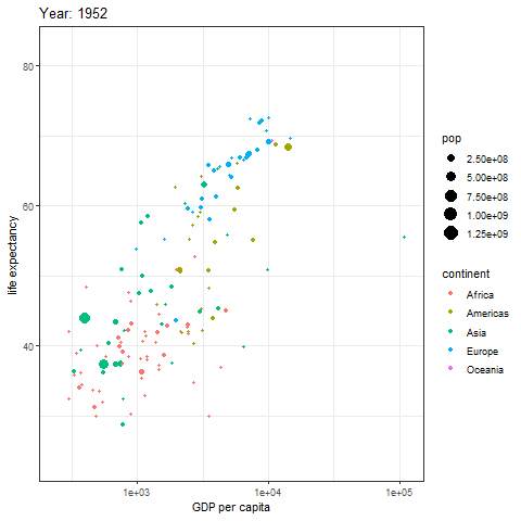
The image above is a scatter plot animation showing the relationship between life expectancy and GDP in capital cities of various regions over time. The size of the scatter points represents population, and the color represents the region.
1.2 Grouped Scatter Bubble Animation
In addition to displaying groups on one chart, they can also be drawn separately.
# Grouped Scatter Bubble Animation
p <- ggplot(data_gapminder, aes(gdpPercap, lifeExp, size = pop, colour = country)) +
  geom_point(alpha = 0.7, show.legend = FALSE) +
  scale_colour_manual(values = country_colors) +
  scale_size(range = c(2, 12)) +
  scale_x_log10() +
  facet_wrap(~continent) +  # facet by continent
  # Drawing animation diagrams
  labs(title = 'Year: {frame_time}', x = 'GDP per capita', y = 'life expectancy') +
  transition_time(year) +
  ease_aes('linear')

animate(p, renderer = gifski_renderer())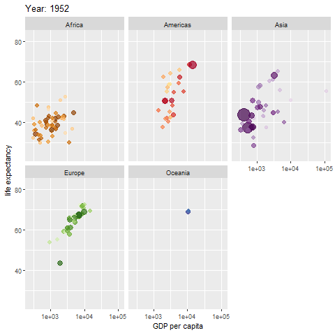
The map above shows different regions separately.
2. Interval transition bar chart
Interval transition bar charts can achieve transition animations between two sets of data.
# Interval transition bar chart----
a <- data.frame(group=c("A","B","C"), values=c(3,2,4), frame=rep('a',3))
b <- data.frame(group=c("A","B","C"), values=c(5,3,7), frame=rep('b',3))
data <- rbind(a,b)


# Interval transition animation
p <- ggplot(data, aes(x=group, y=values, fill=group)) +
  geom_bar(stat='identity') +
  theme_bw() +
# Drawing animation
  transition_states(
    frame,  # frame as the basis for interval
    transition_length = 2,
    state_length = 1
  ) +
  ease_aes('sine-in-out')

animate(p, renderer = gifski_renderer())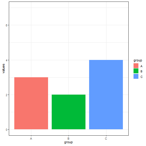
Implement a transition animation between two sets of data.
Using COVID-19 infection data as an example.
# Using COVID-19 infection data as an example
## Filtering data
data_covi19_bar <- subset(data_covi19_bar, cases > 50000)

p <- ggplot(data_covi19_bar, aes(x=area, y=cases, fill=area)) +
  geom_bar(stat='identity') +
  theme_bw() +
# Drawing animation
  transition_states(
    frame,
    transition_length = 2,
    state_length = 1
  ) +
  ease_aes('sine-in-out')

animate(p, renderer = gifski_renderer())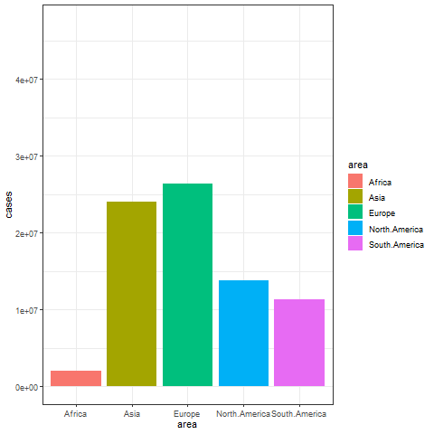
The image above shows a transitional animation of the number of new infections in various regions in October and December 2020.
3. Dynamic line chart
Taking the babynames dataset as an example
# Dynamic line chart----
don <- data_babynames %>%
  filter(name %in% c("Ashley", "Patricia", "Helen")) %>%
  filter(sex=="F")


# plot
don %>%
  ggplot( aes(x=year, y=n, group=name, color=name)) +
  geom_line() +
  geom_point() +
  scale_color_viridis(discrete = TRUE) +
  ggtitle("Dynamic line graphs of the number of newborns in each year using the three names") +
  theme_ipsum() +
  ylab("Number of babies born") +
  transition_reveal(year) # Using time as the basis for animation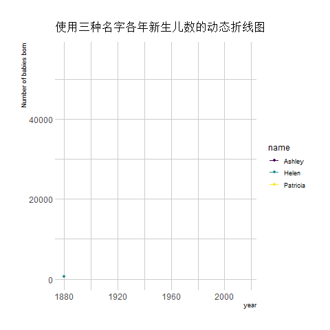
The image above shows an animation illustrating the changing number of newborns using any of the three names from year to year.
Taking COVID-19 infection data as an example
## Taking COVID-19 infection data as an example
data_covi19 %>%
  ggplot( aes(x=date, y=cases, group=area, color=area)) +
  geom_line() +
  geom_point() +
  scale_color_viridis(discrete = TRUE) +
  ggtitle("Number of new COVID-19 infections in various regions in the second half of 2020") +
  theme_ipsum() +
  ylab("cases") +
  xlab("month") +
  transition_reveal(date) # Using time as the basis for animation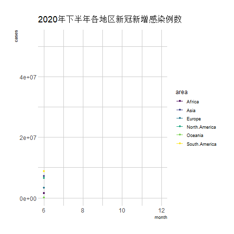
The above chart is a line graph showing the number of new COVID-19 infections in various regions during the second half of 2020, with the horizontal axis representing the months.
Applications
Animated graphics can be applied to various Shiny websites to achieve dynamic data updates and real-time display.
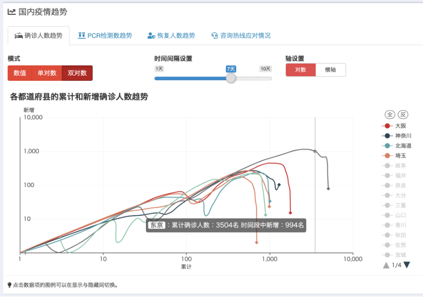
The image above shows the Shiny web tool, which displays real-time updates on the COVID-19 situation in Japan during the pandemic. GitHub - swsoyee/2019-ncov-japan: 🦠 Interactive dashboard for real-time recording of COVID-19 outbreak in Japan
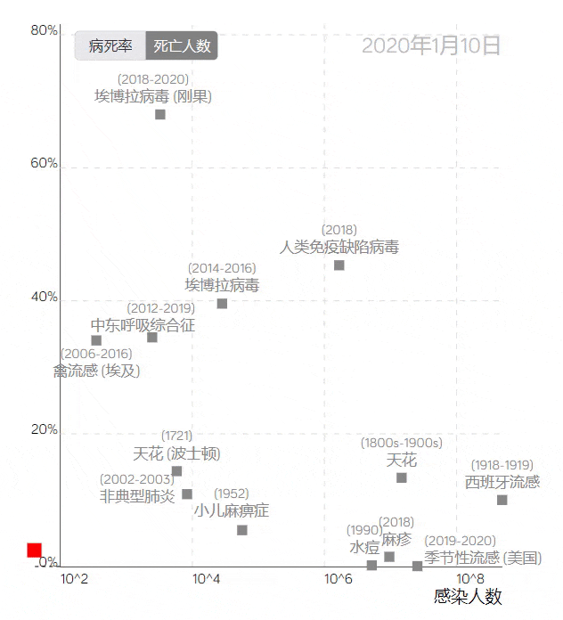
The COVID-19 trajectory map developed by the Visualization and Visual Analytics Laboratory at Peking University.
The trajectory line in the image above, based on the case fatality rate and the number of infections, uses red squares to represent COVID-19. Placing it among data from other infectious diseases provides a visual profile of the epidemic’s development, clearly reflecting the differences between COVID-19 and other large-scale epidemics.
Reference
[1] Bryan J (2023). gapminder: Data from Gapminder. R package version 1.0.0, https://CRAN.R-project.org/package=gapminder.
[2] Bryan J (2023). gapminder: Data from Gapminder. R package version 1.0.0, https://CRAN.R-project.org/package=gapminder.
[3] H. Wickham. ggplot2: Elegant Graphics for Data Analysis. Springer-Verlag New York, 2016. Pedersen T, Robinson D (2024). gganimate: A Grammar of Animated Graphics. R package version 1.0.9, https://CRAN.R-project.org/package=gganimate.
[4] Ooms J, Kornel Lesiński, Authors of the dependency Rust crates (2024). gifski: Highest Quality GIF Encoder. R package version 1.32.0-1, https://CRAN.R-project.org/package=gifski.
[5] Urbanek S, Horner J (2023). Cairo: R Graphics Device using Cairo Graphics Library for Creating High-Quality Bitmap (PNG, JPEG, TIFF), Vector (PDF, SVG, PostScript) and Display (X11 and Win32) Output. R package version 1.6-2, https://CRAN.R-project.org/package=Cairo.
[6] Wickham H (2021). babynames: US Baby Names 1880-2017. R package version 1.0.1, https://CRAN.R-project.org/package=babynames.
[7] Rudis B (2024). hrbrthemes: Additional Themes, Theme Components and Utilities for ‘ggplot2’. R package version 0.8.7, https://CRAN.R-project.org/package=hrbrthemes.
[8] Wickham H, François R, Henry L, Müller K, Vaughan D (2023). dplyr: A Grammar of Data Manipulation. R package version 1.1.4, https://CRAN.R-project.org/package=dplyr.
[9] Simon Garnier, Noam Ross, Robert Rudis, Antônio P. Camargo, Marco Sciaini, and Cédric Scherer (2024). viridis(Lite) - Colorblind-Friendly Color Maps for R. viridis package version 0.6.5. Wickham H, Vaughan D, Girlich M (2024). tidyr: Tidy Messy Data. R package version 1.3.1, https://CRAN.R-project.org/package=tidyr.