# Install packages
if (!requireNamespace("data.table", quietly = TRUE)) {
  install.packages("data.table")
}
if (!requireNamespace("jsonlite", quietly = TRUE)) {
  install.packages("jsonlite")
}
if (!requireNamespace("ggradar", quietly = TRUE)) {
  remotes::install_github("ricardo-bion/ggradar", dependencies = TRUE)
}
if (!requireNamespace("dplyr", quietly = TRUE)) {
  install.packages("dplyr")
}
if (!requireNamespace("scales", quietly = TRUE)) {
  install.packages("scales")
}
if (!requireNamespace("tibble", quietly = TRUE)) {
  install.packages("tibble")
}
if (!requireNamespace("ggplot2", quietly = TRUE)) {
  install.packages("ggplot2")
}

# Load packages
library(data.table)
library(jsonlite)
library(ggradar)
library(dplyr)
library(scales)
library(tibble)
library(ggplot2)Radar
Note
Hiplot website
This page is the tutorial for source code version of the Hiplot Radar plugin. You can also use the Hiplot website to achieve no code ploting. For more information please see the following link:
Radar chart displays multivariable data in the form of two-dimensional charts representing three or more quantitative variables on the axis starting from the same point, so as to visually express the comparison of a research object in multiple parameters.
Setup
System Requirements: Cross-platform (Linux/MacOS/Windows)
Programming language: R
Dependent packages:
data.table;jsonlite;ggradar;dplyr;scales;tibble;ggplot2
sessioninfo::session_info("attached")─ Session info ───────────────────────────────────────────────────────────────
setting value
version R version 4.6.0 (2026-04-24)
os Ubuntu 24.04.4 LTS
system x86_64, linux-gnu
ui X11
language (EN)
collate C.UTF-8
ctype C.UTF-8
tz UTC
date 2026-05-09
pandoc 3.1.3 @ /usr/bin/ (via rmarkdown)
quarto 1.9.37 @ /usr/local/bin/quarto
─ Packages ───────────────────────────────────────────────────────────────────
package * version date (UTC) lib source
data.table * 1.18.4 2026-05-06 [1] RSPM
dplyr * 1.2.1 2026-04-03 [1] RSPM
ggplot2 * 4.0.3.9000 2026-05-04 [1] Github (tidyverse/ggplot2@6870419)
ggradar * 0.2 2026-05-04 [1] Github (ricardo-bion/ggradar@f99517a)
jsonlite * 2.0.0 2025-03-27 [1] RSPM
scales * 1.4.0 2025-04-24 [1] RSPM
tibble * 3.3.1 2026-01-11 [1] RSPM
[1] /home/runner/work/_temp/Library
[2] /opt/R/4.6.0/lib/R/site-library
[3] /opt/R/4.6.0/lib/R/library
* ── Packages attached to the search path.
──────────────────────────────────────────────────────────────────────────────Data Preparation
The loaded data is data set (expression levels of 5 genes in 4 diseases).
# Load data
data <- data.table::fread(jsonlite::read_json("https://hiplot.cn/ui/basic/radar/data.json")$exampleData$textarea[[1]])
data <- as.data.frame(data)

# Convert data structure
data <- as.data.frame(t(data))
colnames(data) <- data[1, ]
data <- data[-1, ]
for (i in seq_len(ncol(data))) {
  data[, i] <- as.numeric(data[, i])
}
data_radar <- data %>%
  rownames_to_column(var = "sample")
data_radar <- data_radar %>% mutate_at(vars(-sample), rescale)

# View data
head(data)
value1 value2 value3 value4 value5
S1 6 160 110 3.90 2.620
S2 6 160 110 3.90 2.875
S3 4 108 93 3.85 2.320
S4 6 258 110 3.08 3.215Visualization
# Radar
p <- ggradar(data_radar, gridline.max.linetype = 1, group.point.size = 4,
             group.line.width = 1, font.radar = "Arial", fill.alpha = 0.5,
             gridline.min.colour = "grey", gridline.mid.colour = "#007A87",
             gridline.max.colour = "grey") +
  ggtitle("Radar Plot") +
  scale_color_manual(values = c("#E64B35FF","#4DBBD5FF","#00A087FF","#3C5488FF")) +
  theme(text = element_text(family = "Arial"),
        plot.title = element_text(size = 12,hjust = 0.5),
        axis.title = element_blank(),
        axis.text = element_text(size = 10),
        axis.text.x = element_blank(),
        axis.title.y=element_blank(),
        axis.ticks.y=element_blank(),
        legend.position = "right",
        legend.direction = "vertical",
        legend.title = element_text(size = 10),
        legend.text = element_text(size = 10))

p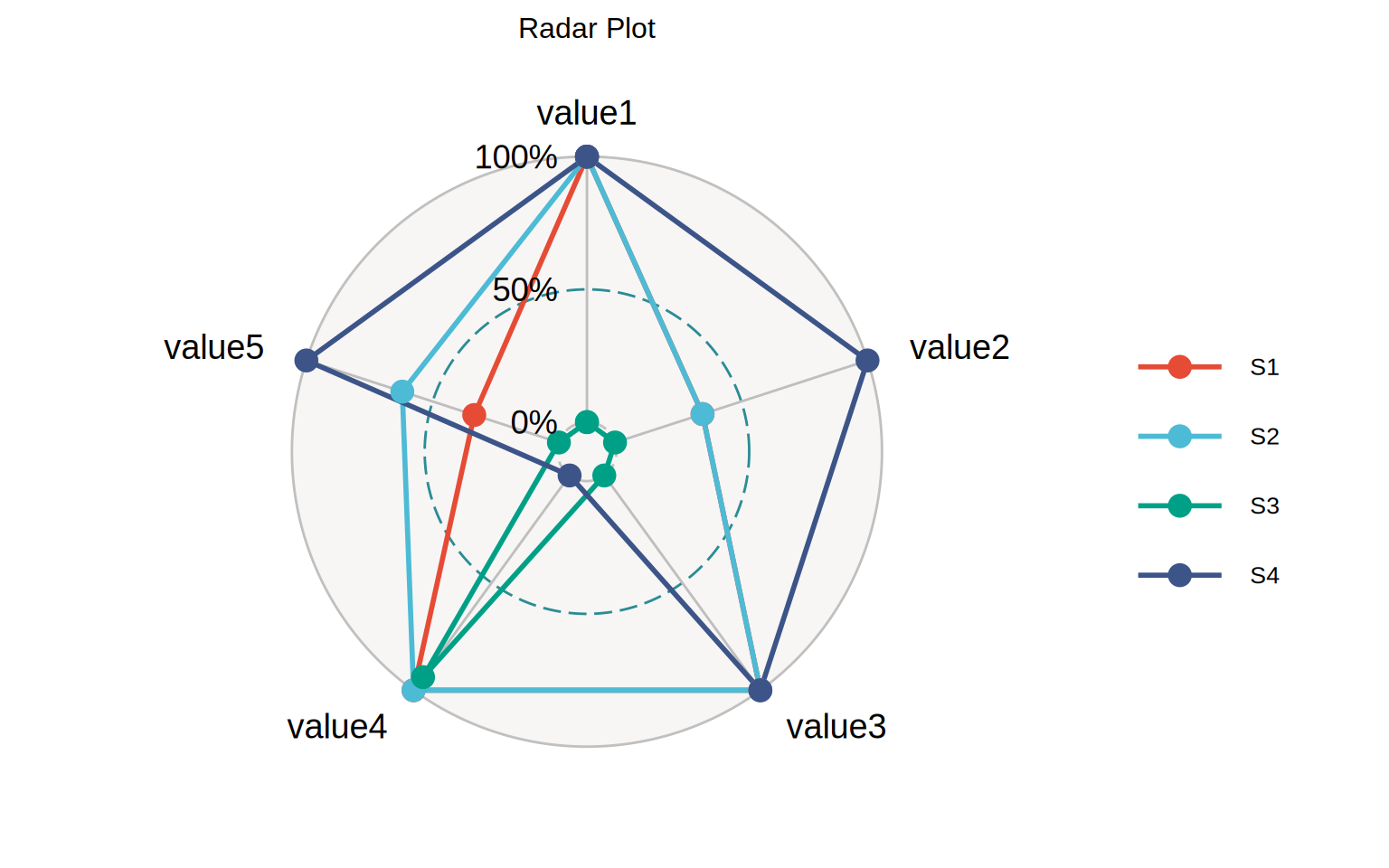
Each color of the radar map represents a disease, and the position of each point represents different gene expression. The higher the gene expression value, the farther away it is from the center of the circle, and vice versa.