# Install packages
if (!requireNamespace("CMplot", quietly = TRUE)) {
  install.packages("CMplot")
}

# Library packages
library(CMplot)GWAS Circos Plot
The visualization of Genome-Wide Association Study (GWAS) results mainly includes SNP circular plots displayed by chromosome positions, SNP density plots, Manhattan plots for significance screening, QQ plots comparing the distribution of observed p-values with expected p-values, etc., which are used to screen candidate variant genes at the genome-wide level.
Example
Setup
System Requirements: Cross-platform (Linux/MacOS/Windows)
Programming language: R
Dependent packages:
CMplot
sessioninfo::session_info("attached")─ Session info ───────────────────────────────────────────────────────────────
setting value
version R version 4.6.0 (2026-04-24)
os Ubuntu 24.04.4 LTS
system x86_64, linux-gnu
ui X11
language (EN)
collate C.UTF-8
ctype C.UTF-8
tz UTC
date 2026-05-09
pandoc 3.1.3 @ /usr/bin/ (via rmarkdown)
quarto 1.9.37 @ /usr/local/bin/quarto
─ Packages ───────────────────────────────────────────────────────────────────
package * version date (UTC) lib source
CMplot * 4.5.1 2024-01-19 [1] RSPM
[1] /home/runner/work/_temp/Library
[2] /opt/R/4.6.0/lib/R/site-library
[3] /opt/R/4.6.0/lib/R/library
* ── Packages attached to the search path.
──────────────────────────────────────────────────────────────────────────────Data Preparation
The sample data includes 60K liquid chip raw variation information data of Pig.
# Example data
data(pig60K)
data <- pig60K

# Data preview
head(data, 5)
SNP Chromosome Position trait1 trait2 trait3
1 ALGA0000009 1 52297 0.7738187 0.5119432 0.5119432
2 ALGA0000014 1 79763 0.7738187 0.5119432 0.5119432
3 ALGA0000021 1 209568 0.7583016 0.9840529 0.9840529
4 ALGA0000022 1 292758 0.7200305 0.4888714 0.4888714
5 ALGA0000046 1 747831 0.9736840 0.2209684 0.2209684Visualization
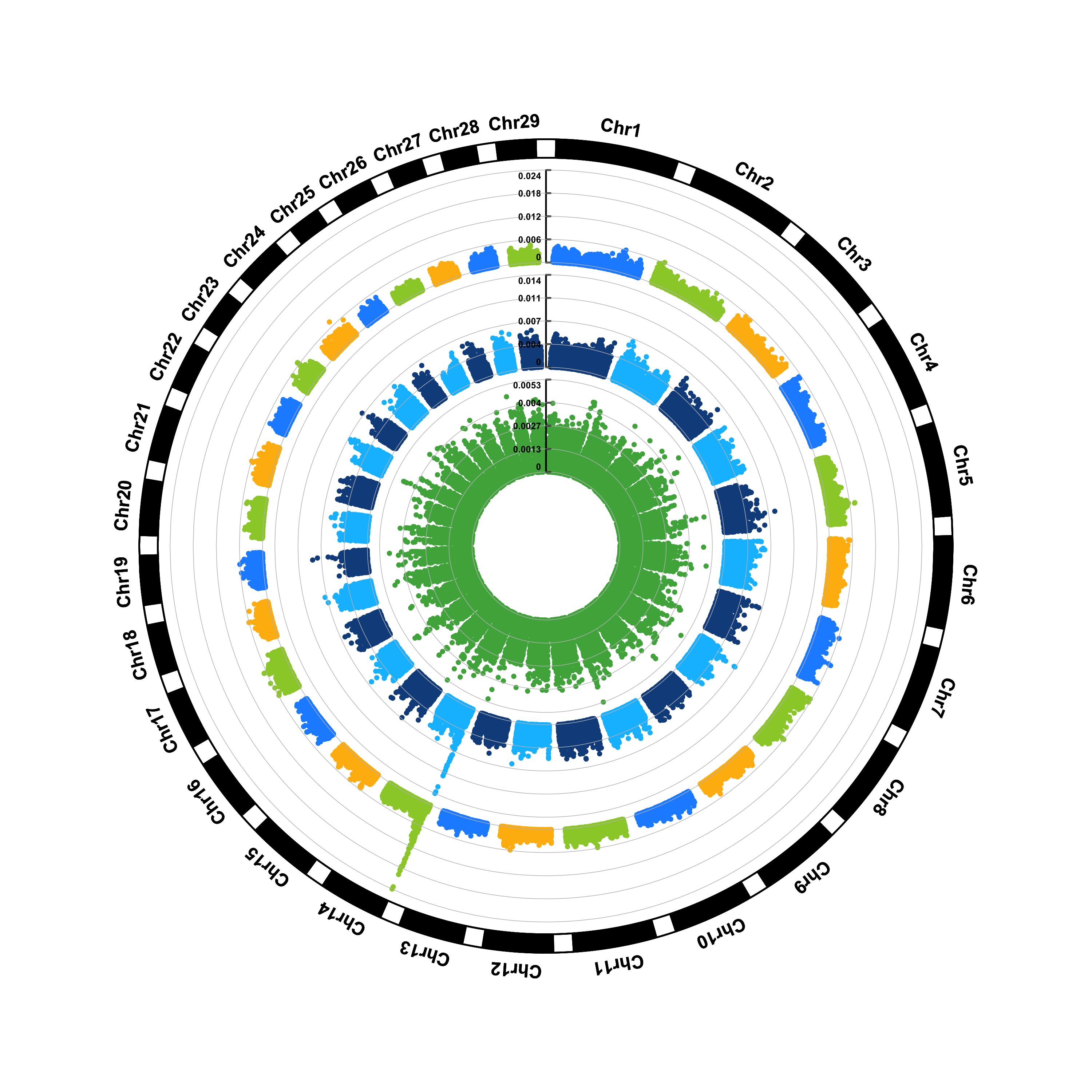
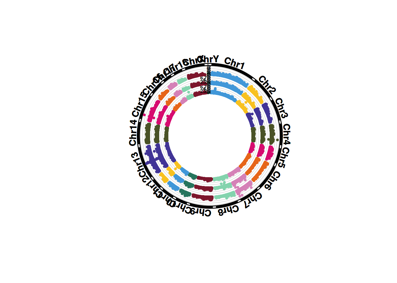
1. SNP screening genome circular map
Genome circular maps can display more chromosomes and traits under the same proportion, and have a great advantage when comparing multiple traits.
# SNP screening genome circular map
CMplot(
  data,
  type = "p",
  plot.type = "c",
  chr.labels = paste("Chr", c(1:18, "X", "Y"), sep = ""),
  r = 8,
  cir.axis = TRUE,
  outward = TRUE,
  cir.axis.col = "black",
  cir.chr.h = 2,
  chr.den.col = "black",
  file.output = FALSE,
  verbose = FALSE,
  mar = c(0,0,0,0)
)
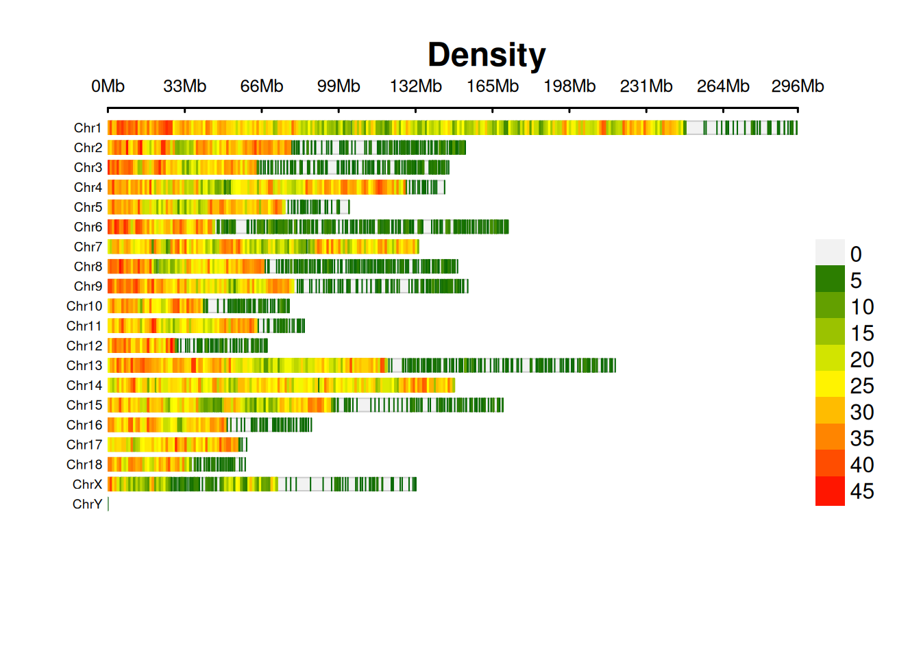
2. SNP Chromosome Density Map
The SNP chromosome density map shows the distribution of SNP density on each chromosome.
# SNP Chromosome Density Map
CMplot(
  data,
  plot.type = "d",
  bin.size = 1e6,
  chr.den.col = c("darkgreen", "yellow", "red"),
  main = "Density",
  file.output = FALSE,
  verbose = FALSE
)
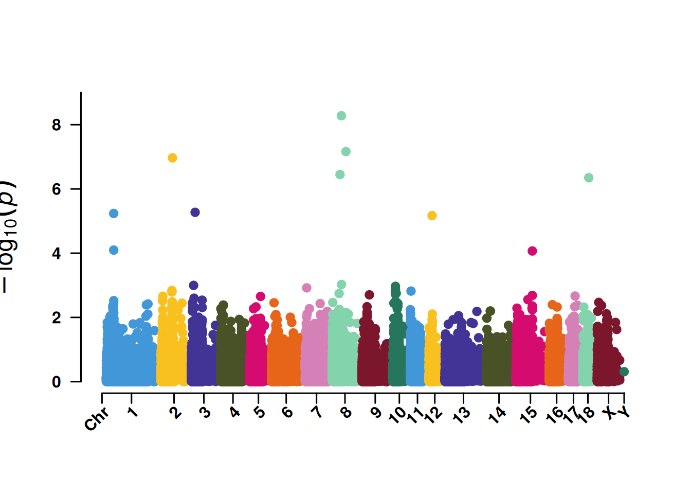
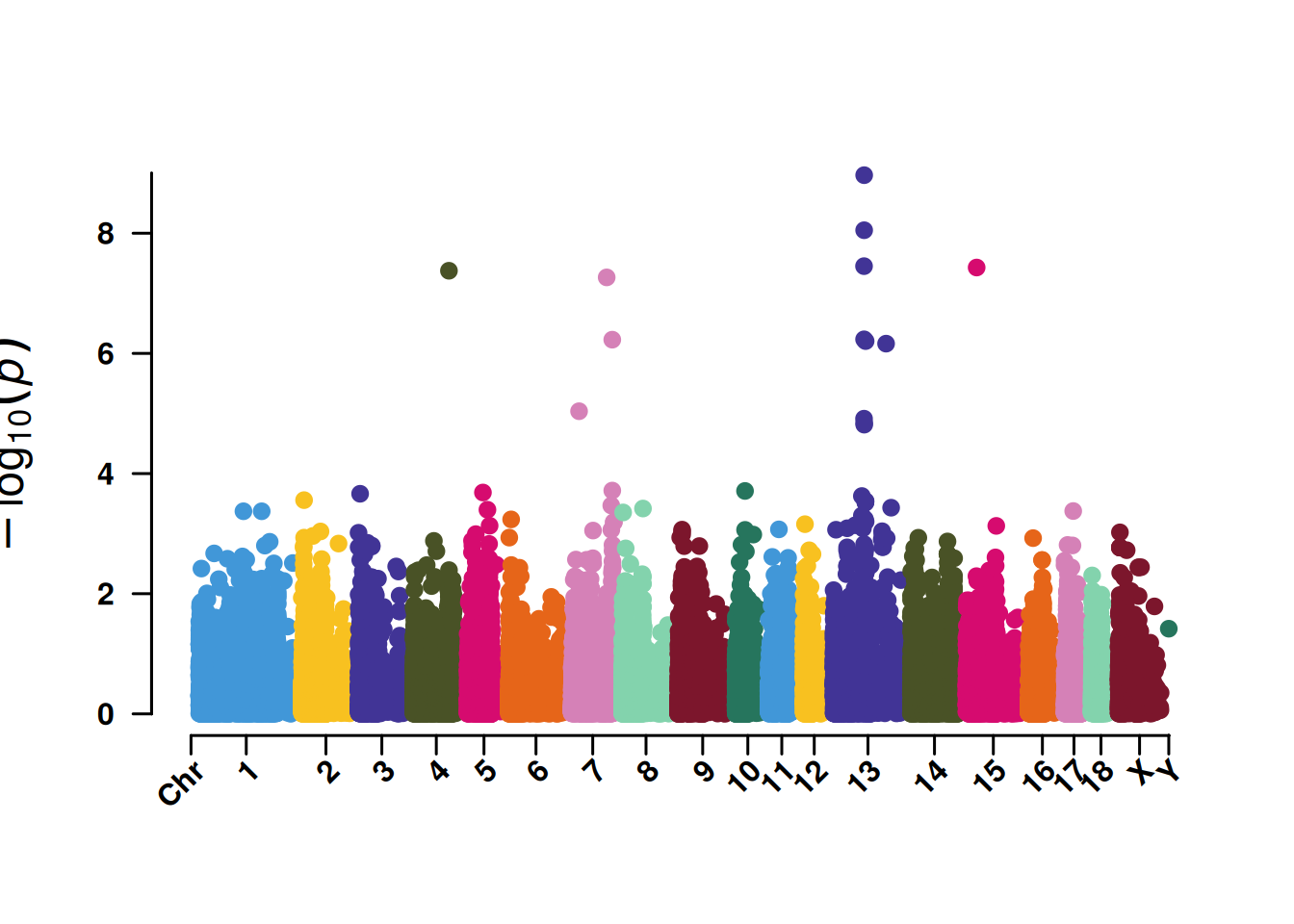
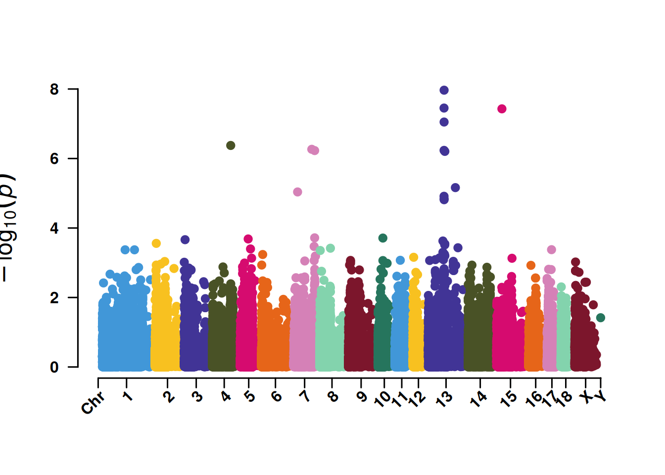
3. Manhattan plot for SNP screening
The Manhattan plot for SNP screening is convenient for displaying the significance of SNPs at 5% or 1%, and it also helps identify the concentration effect of key chromosomes.
# Manhattan plot for SNP screening
CMplot(
  data,
  type = "p",
  plot.type = "m",
  LOG10 = TRUE,
  threshold = NULL,
  file.output = FALSE,
  verbose = FALSE,
  chr.labels.angle = 45
)
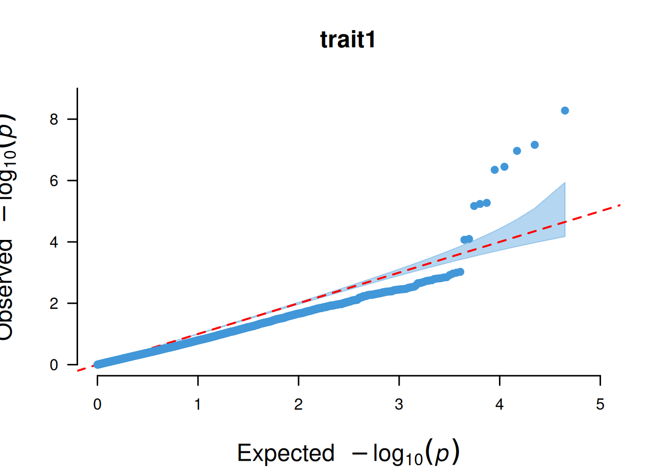
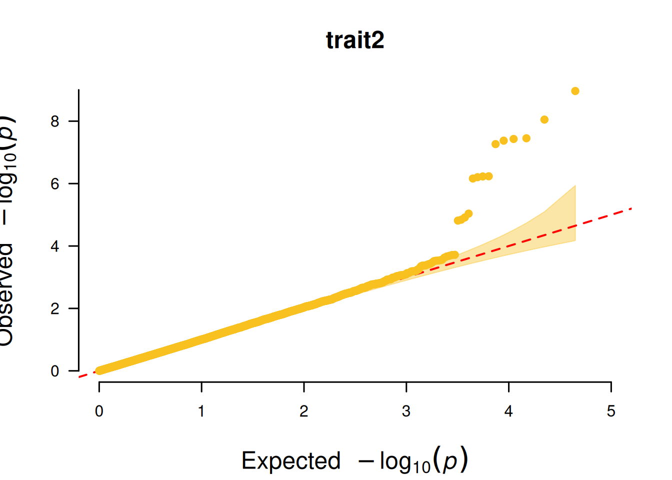
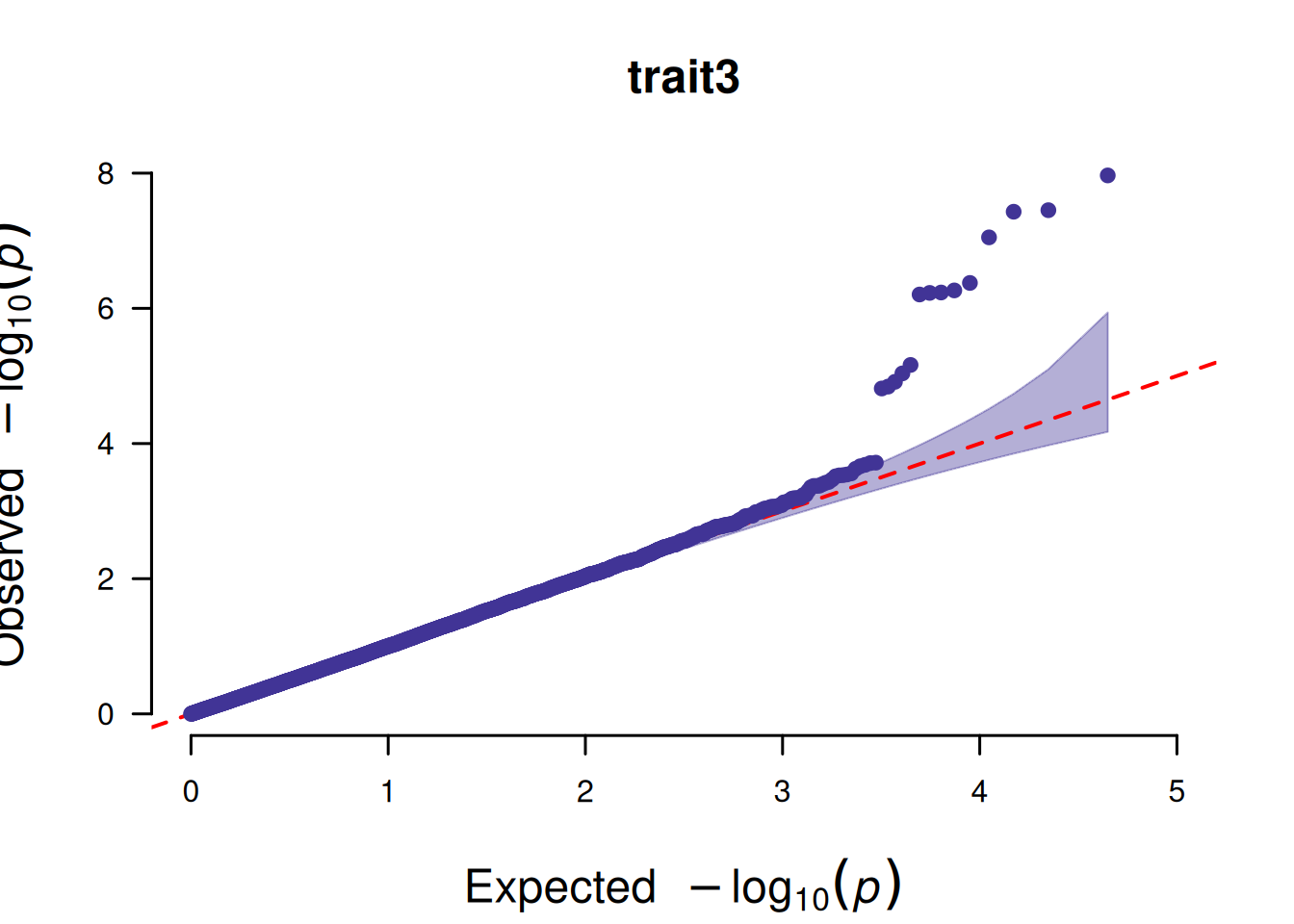
4. QQ plot based on SNP
The core function of the QQ plot based on SNPs is to test whether the P-value distribution of SNPs in GWAS analysis conforms to the “expected distribution under the no-association hypothesis”, so as to judge the reliability of the analysis results.
# QQ plot based on SNP
CMplot(
  data,
  plot.type = "q",
  box = FALSE,
  conf.int = TRUE,
  conf.int.col = NULL,
  threshold.col = "red",
  threshold.lty = 2,
  file.output = FALSE,
  verbose = FALSE
)