# Install packages
if (!requireNamespace("ggplot2", quietly = TRUE)) {
  install.packages("ggplot2")
}
if (!requireNamespace("dplyr", quietly = TRUE)) {
  install.packages("dplyr")
}
if (!requireNamespace("tidyverse", quietly = TRUE)) {
  install.packages("tidyverse")
}
if (!requireNamespace("viridis", quietly = TRUE)) {
  install.packages("viridis")
}
if (!requireNamespace("hrbrthemes", quietly = TRUE)) {
  install.packages("hrbrthemes")
}
if (!requireNamespace("babynames", quietly = TRUE)) {
  install.packages("babynames")
}
if (!requireNamespace("plotly", quietly = TRUE)) {
  install.packages("plotly")
}

# Load packages
library(ggplot2)
library(dplyr)
library(tidyverse)
library(viridis)
library(hrbrthemes)
library(babynames)
library(plotly)Stacked Area Chart
Stacked area charts are similar to basic area charts, except that each dataset in the chart starts from the previous dataset and is used to show the trend line of how the size of each value changes over time or category, demonstrating the relationship between the part and the whole.
Example
Setup
System Requirements: Cross-platform (Linux/MacOS/Windows)
Programming Language: R
Dependencies:
ggplot2;dplyr;tidyverse;viridis;hrbrthemes;babynames;plotly
sessioninfo::session_info("attached")─ Session info ───────────────────────────────────────────────────────────────
setting value
version R version 4.6.0 (2026-04-24)
os Ubuntu 24.04.4 LTS
system x86_64, linux-gnu
ui X11
language (EN)
collate C.UTF-8
ctype C.UTF-8
tz UTC
date 2026-05-09
pandoc 3.1.3 @ /usr/bin/ (via rmarkdown)
quarto 1.9.37 @ /usr/local/bin/quarto
─ Packages ───────────────────────────────────────────────────────────────────
package * version date (UTC) lib source
babynames * 1.0.1 2021-04-12 [1] RSPM
dplyr * 1.2.1 2026-04-03 [1] RSPM
forcats * 1.0.1 2025-09-25 [1] RSPM
ggplot2 * 4.0.3.9000 2026-05-04 [1] Github (tidyverse/ggplot2@6870419)
hrbrthemes * 0.9.2 2026-05-04 [1] Github (hrbrmstr/hrbrthemes@45ac19c)
lubridate * 1.9.5 2026-02-04 [1] RSPM
plotly * 4.12.0 2026-01-24 [1] RSPM
purrr * 1.2.2 2026-04-10 [1] RSPM
readr * 2.2.0 2026-02-19 [1] RSPM
stringr * 1.6.0 2025-11-04 [1] RSPM
tibble * 3.3.1 2026-01-11 [1] RSPM
tidyr * 1.3.2 2025-12-19 [1] RSPM
tidyverse * 2.0.0 2023-02-22 [1] RSPM
viridis * 0.6.5 2024-01-29 [1] RSPM
viridisLite * 0.4.3 2026-02-04 [1] RSPM
[1] /home/runner/work/_temp/Library
[2] /opt/R/4.6.0/lib/R/site-library
[3] /opt/R/4.6.0/lib/R/library
* ── Packages attached to the search path.
──────────────────────────────────────────────────────────────────────────────Data Preparation
The plotting primarily utilizes the datasets included in the R package and COVID-19 infection data. The data_covi19 COVID-19 infection data comes from the GISAID database.
# data_WorldPhones
data_WorldPhones <- as.data.frame(WorldPhones)
data_WorldPhones <- rownames_to_column(data_WorldPhones,"year")
data_WorldPhones <- data_WorldPhones %>%
  gather(key = "area",value = "Phones",-"year" )
data_WorldPhones$year <- as.numeric(data_WorldPhones$year)

# data_USPersonalExpenditure
data_USPersonalExpenditure <- USPersonalExpenditure
data_USPersonalExpenditure <- as.data.frame(data_USPersonalExpenditure)
data_USPersonalExpenditure <- rownames_to_column(data_USPersonalExpenditure,"type")
data_USPersonalExpenditure <- data_USPersonalExpenditure %>%
  gather(key = "year",value = "expense",-"type" )
data_USPersonalExpenditure$year <- as.numeric(data_USPersonalExpenditure$year)

# data_baby
data_baby <- babynames %>%
  filter(name %in% c("Ashley", "Amanda", "Jessica", "Patricia", "Linda", "Deborah",   "Dorothy", "Betty", "Helen")) %>%
  filter(sex=="F")

# data_covi19
data_covi19 <- readr::read_csv("https://bizard-1301043367.cos.ap-guangzhou.myqcloud.com/data_covi19.csv")
data_covi19$date <- c(6:12)
data_covi19 <- gather(data_covi19, key = "area", value = "cases", 2:7)
Visualization
1. Basic stacked area diagram
Taking the WorldPhones dataset as an example
# Basic stacked area diagram----
options(scipen = 20) # Do not use scientific notation
p <- ggplot(data_WorldPhones, aes(x=year, y=Phones, fill=area)) +
  geom_area()+
  scale_y_continuous(limits = c(0, 150000),
                     breaks = seq(0, 150000,50000))

p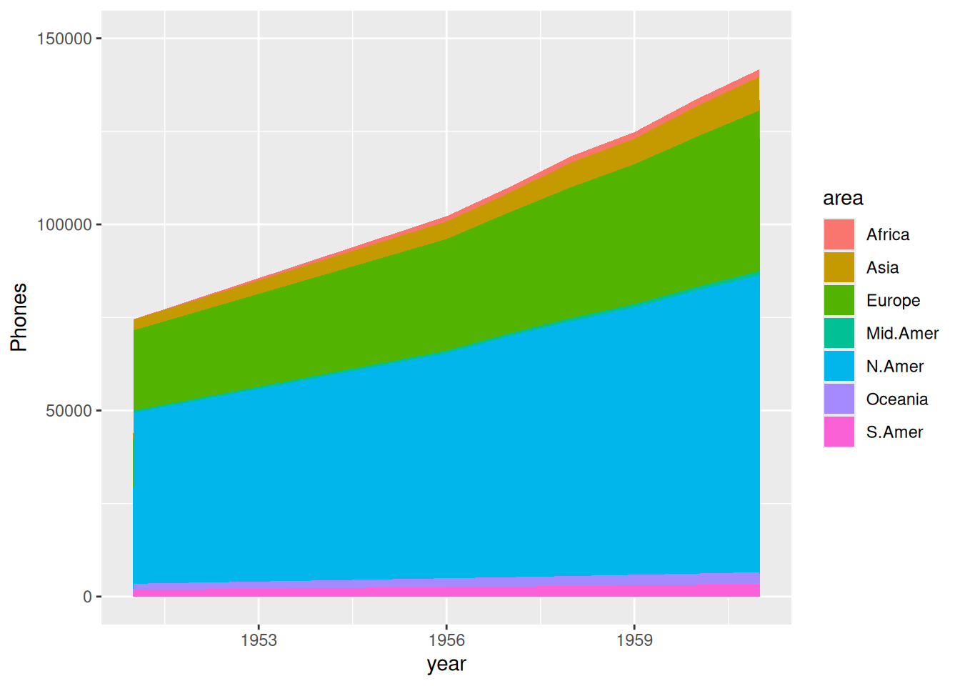
The image above shows the accumulated area of total phone calls in each region over the years.
This is an example using data on COVID-19 infections in various regions globally during the second half of 2020.
p <- ggplot(data_covi19, aes(x=date , y=cases, fill=area)) +
  geom_area() +
  scale_y_continuous() +
  theme(plot.title = element_text(hjust = 0.5)) +
  labs(x="month") +
  ggtitle("Number of COVID-19 infections in various regions in the second half of 2020")

p
The horizontal axis of the graph above represents the month, and the vertical axis represents the number of COVID-19 infections.
2. proportional stacked area diagram
Take the USPersonalExpenditure dataset as an example.
# Calculate data percentage
data_USPersonalExpenditure1 <- data_USPersonalExpenditure  %>%
  group_by(year, type) %>%
  summarise(n = sum(expense)) %>%
  mutate(percentage = n / sum(n))

# plot
p <- ggplot(data_USPersonalExpenditure1, aes(x=year, y=percentage, fill=type)) +
  geom_area(alpha=0.8 , size=0.1, colour="black")

p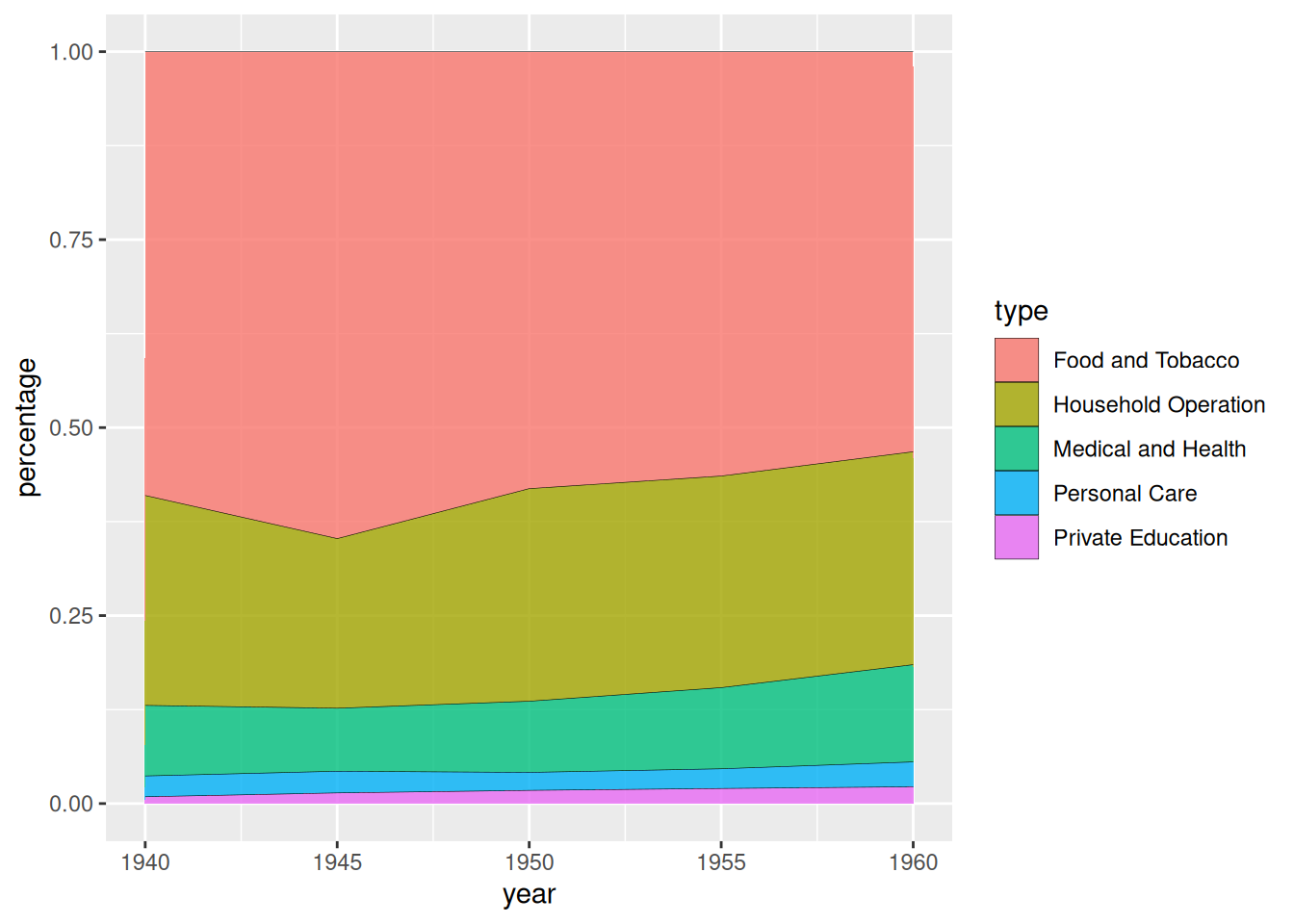
USPersonalExpenditure dataset as an exampleThe chart above shows the stacked area of US personal spending across different consumption categories over the years.
This is illustrated by data on COVID-19 infections in various regions globally during the second half of 2020.
# Calculate data percentage
data_covi19_percent <- data_covi19  %>%
  group_by(date, area) %>%
  summarise(n = sum(cases)) %>%
  mutate(percentage = n / sum(n))

# plot
p <- ggplot(data_covi19_percent, aes(x=date, y=percentage, fill=area)) +
  geom_area(alpha=0.8 , size=0.1, colour="black") +
  theme(plot.title = element_text(hjust = 0.5)) +
  labs(x="month") +
  ggtitle("Stacked chart of percentage of COVID-19 infections in various regions during the second half of 2020")

p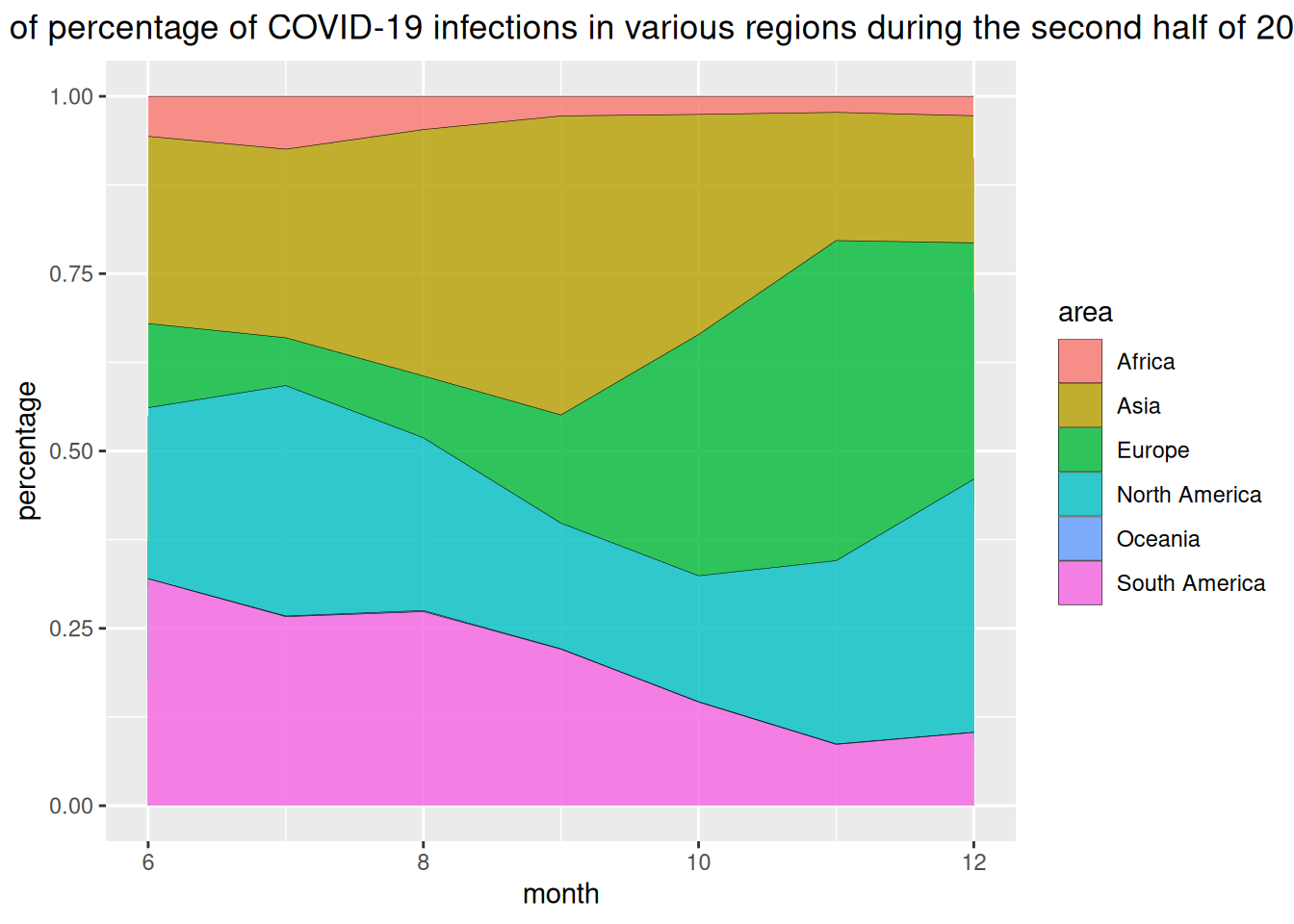
The horizontal axis of the chart above represents the month, and the vertical axis represents the percentage of COVID-19 infections in each region.
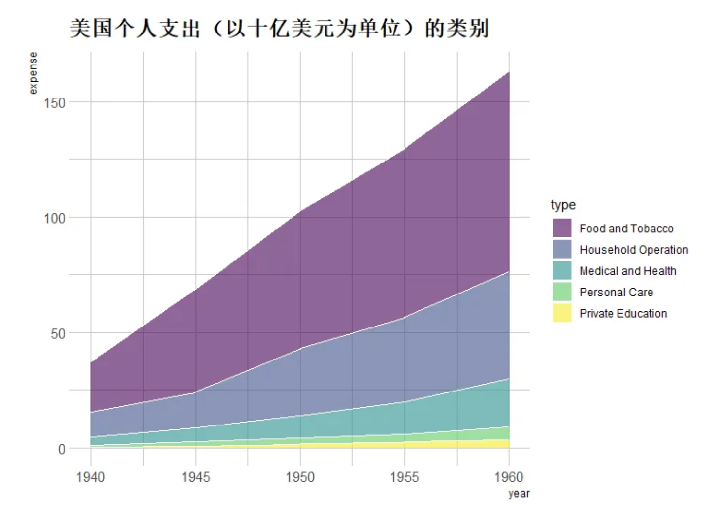
3. Customization
# Customization----
p <- ggplot(data_USPersonalExpenditure, aes(x=year, y=expense, fill=type)) +
  geom_area(alpha=0.6 , size=.5, colour="white") +
  scale_fill_viridis(discrete = T) + # Use color levels
  theme_ipsum() +
  ggtitle("Categories of U.S. personal spending (in billions of dollars)") # Set title

p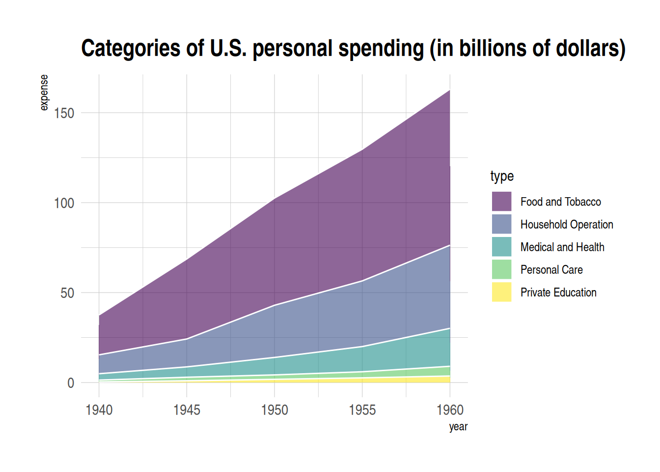
4. Interactive stacked area map
Using the plotly package, we can create interactive stacked area plots.
Let’s take the babynames dataset as an example.
# Interactive stacked area plot (plotly)----
# plot
p1 <- data_baby %>%
  ggplot( aes(x=year, y=n, fill=name, text=name)) +
  geom_area( ) +
  scale_fill_viridis(discrete = TRUE) +
  theme(legend.position="none") +
  ggtitle("Popularity of American Names over the Past Thirty Years") +
  theme_ipsum() +
  theme(legend.position="none")

# Convert into interactive graphics
p_inter1 <- ggplotly(p1, tooltip="text")
p_inter1
Interactive stacked area map
The image above is an interactive stackable bar chart, which allows users to view groups, zoom in and out, and perform other functions.
Applications
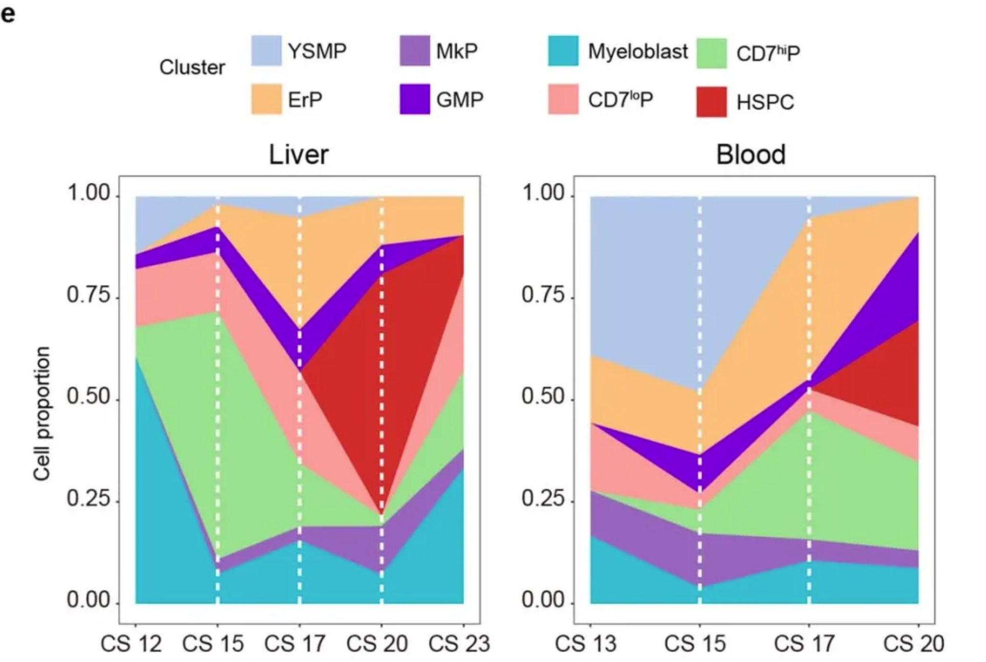
Variations in the proportions of different bone marrow progenitor cell populations in the liver (CS12 to CS23, 6 biologically independent embryonic samples and 259 cells) and in the blood (CS13 to CS20, 5 biologically independent embryonic samples and 131 cells). [1]
Reference
[1] Bian, Z., Gong, Y., Huang, T. et al. Deciphering human macrophage development at single-cell resolution. Nature 582, 571–576 (2020). https://doi.org/10.1038/s41586-020-2316-7
[2] H. Wickham. ggplot2: Elegant Graphics for Data Analysis. Springer-Verlag New York, 2016.
[3] Wickham H, François R, Henry L, Müller K, Vaughan D (2023). dplyr: A Grammar of Data Manipulation. R package version 1.1.4, https://CRAN.R-project.org/package=dplyr.
[4] Wickham H, Averick M, Bryan J, Chang W, McGowan LD, François R, Grolemund G, Hayes A, Henry L, Hester J, Kuhn M, Pedersen TL, Miller E, Bache SM, Müller K, Ooms J, Robinson D, Seidel DP, Spinu V, Takahashi K, Vaughan D, Wilke C, Woo K, Yutani H (2019). “Welcome to the tidyverse.” Journal of Open Source Software, 4(43), 1686. doi:10.21105/joss.01686 https://doi.org/10.21105/joss.01686.
[5] Simon Garnier, Noam Ross, Robert Rudis, Antônio P. Camargo, Marco Sciaini, and Cédric Scherer (2024). viridis(Lite) - Colorblind-Friendly Color Maps for R. viridis package version 0.6.5.
[6] C. Sievert. Interactive Web-Based Data Visualization with R, plotly, and shiny. Chapman and Hall/CRC Florida, 2020.
[7] Wickham H (2021). babynames: US Baby Names 1880-2017. R package version 1.0.1, https://CRAN.R-project.org/package=babynames.
[8] Rudis B (2024). hrbrthemes: Additional Themes, Theme Components and Utilities for ‘ggplot2’. R package version 0.8.7, https://CRAN.R-project.org/package=hrbrthemes.