# Install packages
if (!requireNamespace("ggplot2", quietly = TRUE)) {
  install.packages("ggplot2")
}
if (!requireNamespace("dplyr", quietly = TRUE)) {
  install.packages("dplyr")
}
if (!requireNamespace("scales", quietly = TRUE)) {
  install.packages("scales")
}
if (!requireNamespace("ggforce", quietly = TRUE)) {
  install.packages("ggforce")
}

# Load packages
library(ggplot2)
library(dplyr)
library(scales)
library(ggforce)Radial Column Chart
Example
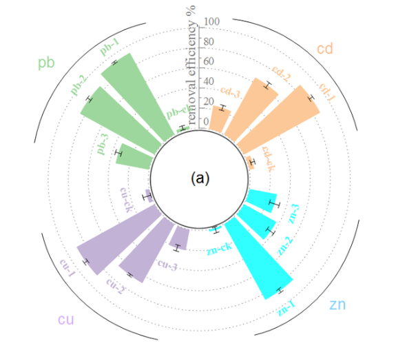
The proportion of threatened species in each tetrapod taxonomic group is presented in a circular layout, with a blue baseline indicating the best estimate and grey grid lines assisting in the reading of the percentage.
Setup
System Requirements: Cross-platform (Linux/MacOS/Windows)
Programming language: R
Dependent packages:
ggplot2,dplyr,scales,ggforce
sessioninfo::session_info("attached")─ Session info ───────────────────────────────────────────────────────────────
setting value
version R version 4.6.0 (2026-04-24)
os Ubuntu 24.04.4 LTS
system x86_64, linux-gnu
ui X11
language (EN)
collate C.UTF-8
ctype C.UTF-8
tz UTC
date 2026-05-09
pandoc 3.1.3 @ /usr/bin/ (via rmarkdown)
quarto 1.9.37 @ /usr/local/bin/quarto
─ Packages ───────────────────────────────────────────────────────────────────
package * version date (UTC) lib source
dplyr * 1.2.1 2026-04-03 [1] RSPM
ggforce * 0.5.0 2025-06-18 [1] RSPM
ggplot2 * 4.0.3.9000 2026-05-04 [1] Github (tidyverse/ggplot2@6870419)
scales * 1.4.0 2025-04-24 [1] RSPM
[1] /home/runner/work/_temp/Library
[2] /opt/R/4.6.0/lib/R/site-library
[3] /opt/R/4.6.0/lib/R/library
* ── Packages attached to the search path.
──────────────────────────────────────────────────────────────────────────────Data Preparation
- Must include R built-in datasets (such as iris and penguins) and biomedical datasets (such as omics data, survival information, clinical indicators, etc.).
- Biomedical datasets must be uploaded to Bizard Tencent Cloud to obtain links for embedding in tutorials. Data from public datasets is preferred; if provided by individuals/organizations, they must ensure that the data is publicly available. The dataset size must be less than 1MB.
# Data reading and processing code can be displayed freely------
# Generate simulated clinical data
set.seed(123)
n <- 12  # Sample size

df <- data.frame(
  id = 1:n,
  patient = paste0("P-", sprintf("%02d", 1:n)),
  value = c(rnorm(6, 80, 15), rnorm(6, 120, 20)),  # Control group and treatment group
  group = rep(c("Control", "Treatment"), each = 6)
) %>%
  mutate(
    angle = 90 - 360 * (id - 0.5)/n,
    hjust = ifelse(angle < -90, 1, 0),
    angle = ifelse(angle < -90, angle + 180, angle)
  )

# Adding built-in datasets
data("iris")
Visualization
1. Simple ring layout
# Basic histogram
p1 <- ggplot(df, aes(x = factor(id), y = value)) +
  geom_col(aes(fill = group), width = 0.8, alpha = 0.8) +
  coord_radial(inner.radius = 0.3) +
  scale_fill_manual(values = c("#1E88E5", "#D81B60")) +
  theme_void() +
  labs(title = "Comparison of indicators between the treatment group and the control group")
p1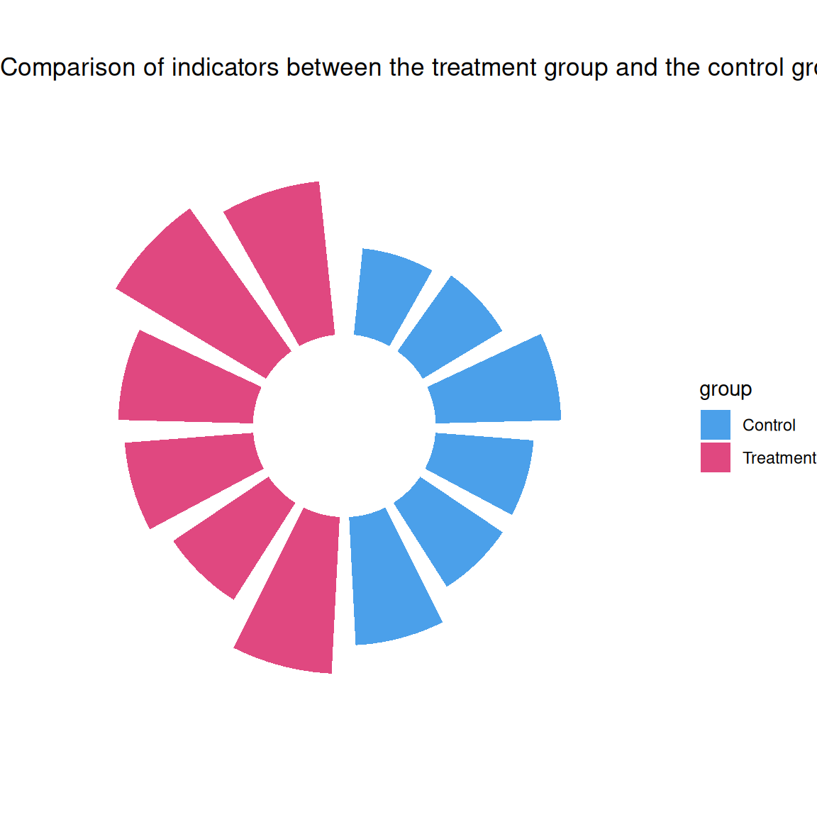
Supplement the important parameters that can be extended by the basic code and provide corresponding drawing codes, for example:
Tip
Key Parameters:
coord_radial(inner.radius=0.3): Controls the center whitespace ratiowidth=0.8: Recommended column width range is 0.5-1.0alpha=0.8: Sets the color transparency
p2 <- ggplot(df, aes(x = factor(id))) +
  geom_col(aes(y = value, fill = group), width = 0.85) +
  geom_text(aes(y = value + 15, label = patient, angle = angle),
            size = 3, hjust = 0.3) +
  coord_radial(start = -0.05 * pi) +
  scale_fill_manual(values = c("#004D40", "#FFA000")) +
  theme_void() +
  labs(fill = "Experimental groups")

p2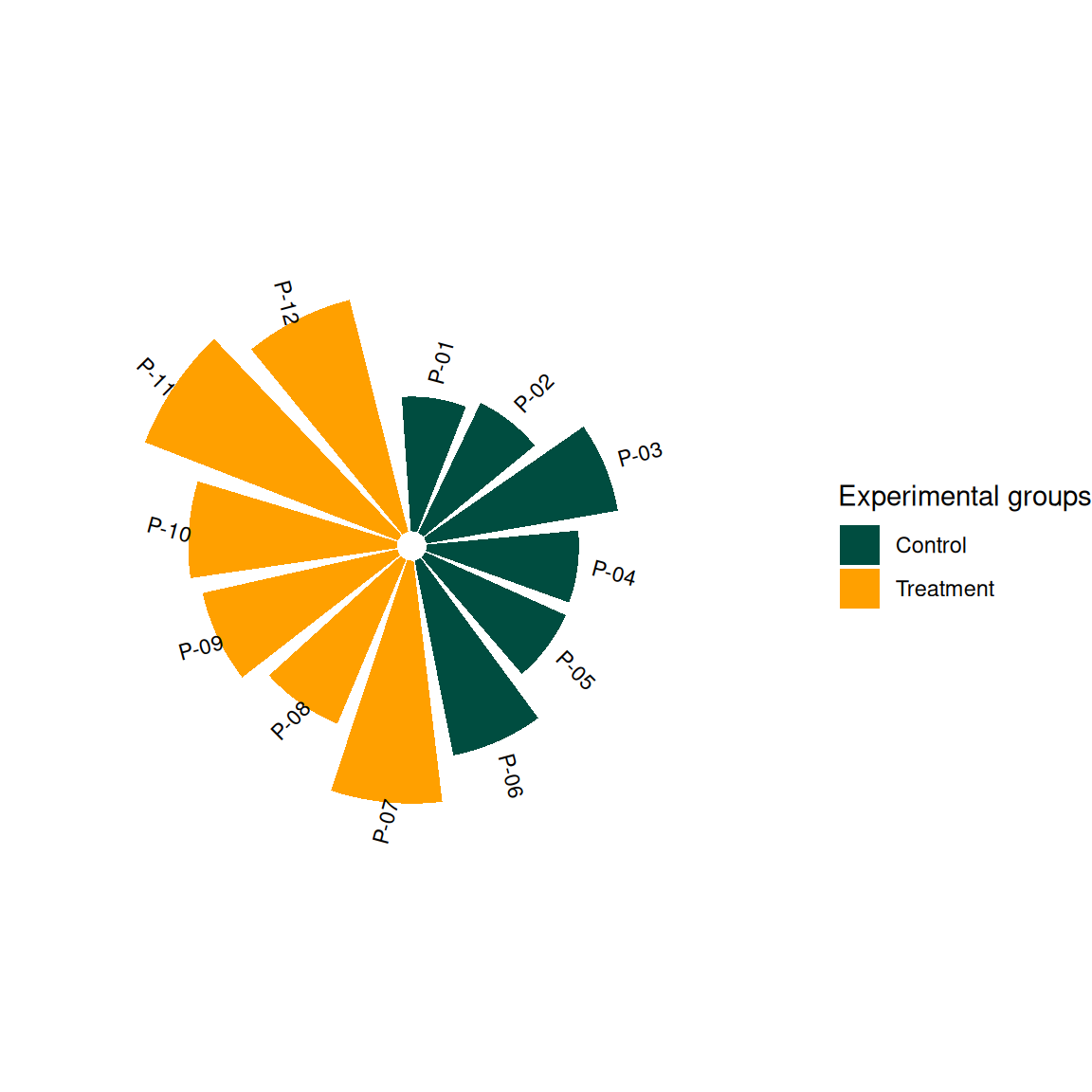
2. More advanced charts
p1 <- ggplot(df) +
  geom_col(aes(x = id, y = value, fill = group), width = 0.85) +
  geom_hline(yintercept = c(50, 100, 150),
             color = "grey80", linetype = "dashed") +
  geom_segment(aes(x = 0.5, xend = n+0.5, y = 100, yend = 100),
               color = "#283593", linewidth = 0.8) +
  geom_text(aes(x = id, y = value + 20, label = patient, angle = angle),
            size = 3, hjust = 0.3) +
  coord_radial(inner.radius = 0.25) +
  scale_fill_brewer(palette = "Set2") +
  theme_void() +
  labs(caption = "The dotted line represents the reference interval of clinical indicators") +
  theme(legend.position = "bottom")

p1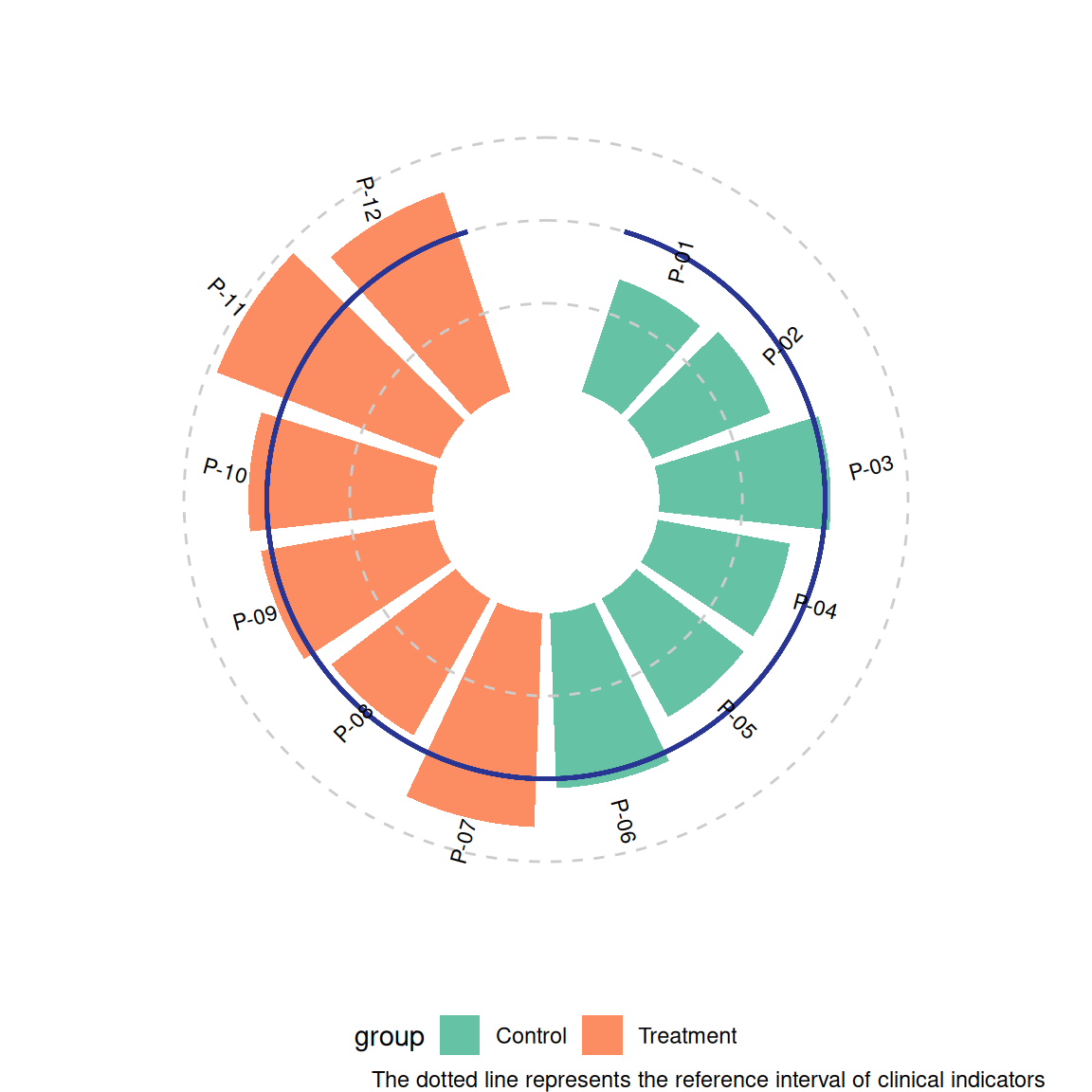
# Generate the main drawing object
p1 <-  ggplot(df) +
  geom_col(aes(x = id, y = value, fill = group),
           width = 0.85, alpha = 0.8) +

  # ========== Core coordinate axis system ==========
# Main Y axis (along the 0 degree direction)
geom_segment(aes(x = 0.5, xend = 0.5, y = 0, yend = max(df$value) * 1.1),
             color = "grey40", linewidth = 0.6,
             arrow = arrow(length = unit(0.2, "cm"))) +

  # Y-axis scale lines (radial)
  do.call(c, lapply(c(50, 100, 150), function(yval) {
    geom_segment(aes(x = 0.5 - 0.05, xend = 0.5 + 0.05,
                     y = yval, yend = yval),
                 color = "grey50", linewidth = 0.4)
  })) +  # Merge elements in a list

  # Y-axis tick labels (along the axis direction)
  do.call(c, lapply(c(50, 100, 150), function(yval) {
    geom_text(aes(x = 0.5 + 0.1, y = yval,
                  label = yval, angle = -90),
              color = "grey30", size = 3.5, hjust = 0)
  })) +  # Merge elements in a list

  # Other horizontal lines and data labels
  geom_hline(yintercept = c(50, 100, 150),
             color = "grey80", linetype = "dashed") +
  geom_segment(aes(x = 0.5, xend = 0.5, y = 100, yend = 100),
               color = "#283593", linewidth = 0.8) + # Modify the end coordinates to adapt to polar coordinates
  geom_text(aes(x = id, y = value + 20, label = patient, angle = angle),
            size = 3, hjust = 0.3) +

  # ========== Coordinate system settings ==========
coord_radial(inner.radius = 0.35,
             start = -0.1 * pi) +

  # ========== Visual Mapping ==========
scale_fill_viridis_d(option = "C", begin = 0.2) +
  theme_void() +
  labs(caption = "The dotted line represents the reference interval of clinical indicators") +
  theme(plot.margin = margin(2, 2, 2, 2, "cm"),
        legend.position = "bottom")

p1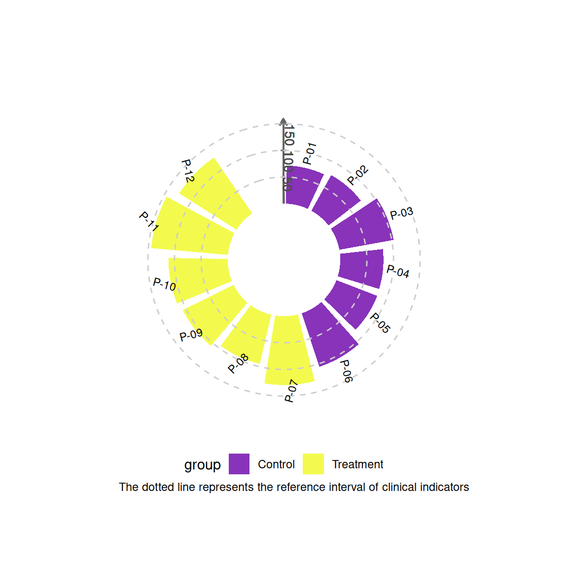
Application
Show the practical application of visualization charts in biomedical literature. If basic charts/advanced charts are widely used in various types of biomedical literature, you can choose to display them separately.
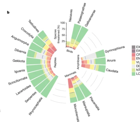
This radial bar chart uses a circular layout to visually display the status of tetrapod conservation.
Reference
[1] Cox N, Young BE, & Xie Y. A global reptile assessment highlights shared conservation needs of tetrapods. Nature. 2022 May;605(7909):285-290. https://doi.org/10.1038/s41586-022-04664-7
[2] Costa, A. M., Machado, J. T., & Quelhas, M. D. (2011). Histogram-based DNA analysis for the visualization of chromosome, genome, and species information. Bioinformatics, 27(9), 1207–1214. https://doi.org/10.1093/bioinformatics/btr131