# Install packages
if (!requireNamespace("data.table", quietly = TRUE)) {
  install.packages("data.table")
}
if (!requireNamespace("jsonlite", quietly = TRUE)) {
  install.packages("jsonlite")
}
if (!requireNamespace("gmodels", quietly = TRUE)) {
  install.packages("gmodels")
}
if (!requireNamespace("ggpubr", quietly = TRUE)) {
  install.packages("ggpubr")
}
if (!requireNamespace("ggplot2", quietly = TRUE)) {
  install.packages("ggplot2")
}

# Load packages
library(data.table)
library(jsonlite)
library(gmodels)
library(ggpubr)
library(ggplot2)PCA
Note
Hiplot website
This page is the tutorial for source code version of the Hiplot PCA plugin. You can also use the Hiplot website to achieve no code ploting. For more information please see the following link:
Principal component analysis (PCA) is a data processing method with “dimension reduction” as the core, replacing multi-index data with a few comprehensive indicators (PCA), and restoring the most essential characteristics of data.
Setup
System Requirements: Cross-platform (Linux/MacOS/Windows)
Programming language: R
Dependent packages:
data.table;jsonlite;gmodels,ggpubr,ggplot2
sessioninfo::session_info("attached")─ Session info ───────────────────────────────────────────────────────────────
setting value
version R version 4.6.0 (2026-04-24)
os Ubuntu 24.04.4 LTS
system x86_64, linux-gnu
ui X11
language (EN)
collate C.UTF-8
ctype C.UTF-8
tz UTC
date 2026-05-09
pandoc 3.1.3 @ /usr/bin/ (via rmarkdown)
quarto 1.9.37 @ /usr/local/bin/quarto
─ Packages ───────────────────────────────────────────────────────────────────
package * version date (UTC) lib source
data.table * 1.18.4 2026-05-06 [1] RSPM
ggplot2 * 4.0.3.9000 2026-05-04 [1] Github (tidyverse/ggplot2@6870419)
ggpubr * 0.6.3 2026-02-24 [1] RSPM
gmodels * 2.19.1 2024-03-06 [1] RSPM
jsonlite * 2.0.0 2025-03-27 [1] RSPM
[1] /home/runner/work/_temp/Library
[2] /opt/R/4.6.0/lib/R/site-library
[3] /opt/R/4.6.0/lib/R/library
* ── Packages attached to the search path.
──────────────────────────────────────────────────────────────────────────────Data Preparation
The loaded data are set (gene name and corresponding gene expression value) and sample information (sample name and grouping).
# Load data
data <- data.table::fread(jsonlite::read_json("https://hiplot.cn/ui/basic/pca/data.json")$exampleData[[1]]$textarea[[1]])
data <- as.data.frame(data)
group <- data.table::fread(jsonlite::read_json("https://hiplot.cn/ui/basic/pca/data.json")$exampleData[[1]]$textarea[[2]])
group <- as.data.frame(group)

# Convert data structure
rownames(data) <- data[, 1]
data <- as.matrix(data[, -1])
pca_info <- fast.prcomp(data)
## Create configuration
conf <- list(
  dataArg = list(
    list(list(value = "group")),  # Color by group
    list(list(value = ""))         # No shape group
  ),
  general = list(
    title = "Principal Component Analysis",
    palette = "Set1"
  )
)
## Perform PCA - Note: data must be transposed because PCA analyzes samples (columns)
pca_info <- prcomp(t(data), scale. = TRUE)
## Prepare plot data
axis <- sapply(conf$dataArg[[1]], function(x) x$value)
## Process color grouping
if (is.null(axis[1]) || axis[1] == "") {
  colorBy <- rep('ALL', ncol(data))
} else {
  ## Ensure sample order matches
  colorBy <- group[match(colnames(data), group$sample), axis[1]]
}
colorBy <- factor(colorBy, levels = unique(colorBy))
## Create PCA data frame
pca_data <- data.frame(
  sample = rownames(pca_info$x),
  PC1 = pca_info$x[, 1],
  PC2 = pca_info$x[, 2],
  colorBy = colorBy
)
## Calculate explained variance
variance_explained <- round(pca_info$sdev^2 / sum(pca_info$sdev^2) * 100, 1)

# View data
str(data)
num [1:9, 1:6] 6.6 5.76 9.56 8.4 8.42 ...
- attr(*, "dimnames")=List of 2
..$ : chr [1:9] "GBP4" "BCAT1" "CMPK2" "STOX2" ...
..$ : chr [1:6] "M1" "M2" "M3" "M8" ...str(group)'data.frame': 6 obs. of 2 variables:
$ sample: chr "M1" "M2" "M3" "M8" ...
$ group : chr "G1" "G1" "G1" "G2" ...head(pca_data) sample PC1 PC2 colorBy
M1 M1 0.8626164 2.17168331 G1
M2 M2 2.1114348 0.50696347 G1
M3 M3 2.9706882 -1.81112892 G1
M8 M8 -3.0779404 -0.85045239 G2
M9 M9 -2.5038211 0.08748266 G2
M10 M10 -0.3629779 -0.10454813 G2Visualization
# PCA
p <- ggplot(pca_data, aes(x = PC1, y = PC2, color = colorBy)) +
  geom_point(size = 4, alpha = 0.8) +
  geom_hline(yintercept = 0, linetype = "dashed", color = "gray70") +
  geom_vline(xintercept = 0, linetype = "dashed", color = "gray70") +
  stat_ellipse(level = 0.95, show.legend = FALSE) +
  ggtitle(conf$general$title) +
  labs(
    x = paste0("PC1 (", variance_explained[1], "%)"),
    y = paste0("PC2 (", variance_explained[2], "%)"),
    color = axis[1]
  ) +

  # Custom color scheme
  scale_color_brewer(palette = conf$general$palette) +

  # Add sample labels
  geom_text(aes(label = sample),
            hjust = 0.5, vjust = -1, size = 3.5, show.legend = FALSE) +

  # Theme settings
  theme_bw(base_size = 12) +
  theme(
    plot.title = element_text(hjust = 0.5, face = "bold", size = 16),
    axis.title = element_text(size = 14, face = "bold"),
    axis.text = element_text(size = 12),
    legend.title = element_text(size = 12, face = "bold"),
    legend.text = element_text(size = 11),
    legend.position = "right",
    panel.grid.major = element_line(color = "grey90", linewidth = 0.3),
    panel.grid.minor = element_blank(),
    panel.border = element_rect(fill = NA, color = "grey50", linewidth = 0.5),
    aspect.ratio = 1
  )

# Display plot
p
Too few points to calculate an ellipse
Too few points to calculate an ellipseWarning: Removed 2 rows containing missing values or values outside the scale range
(`geom_path()`).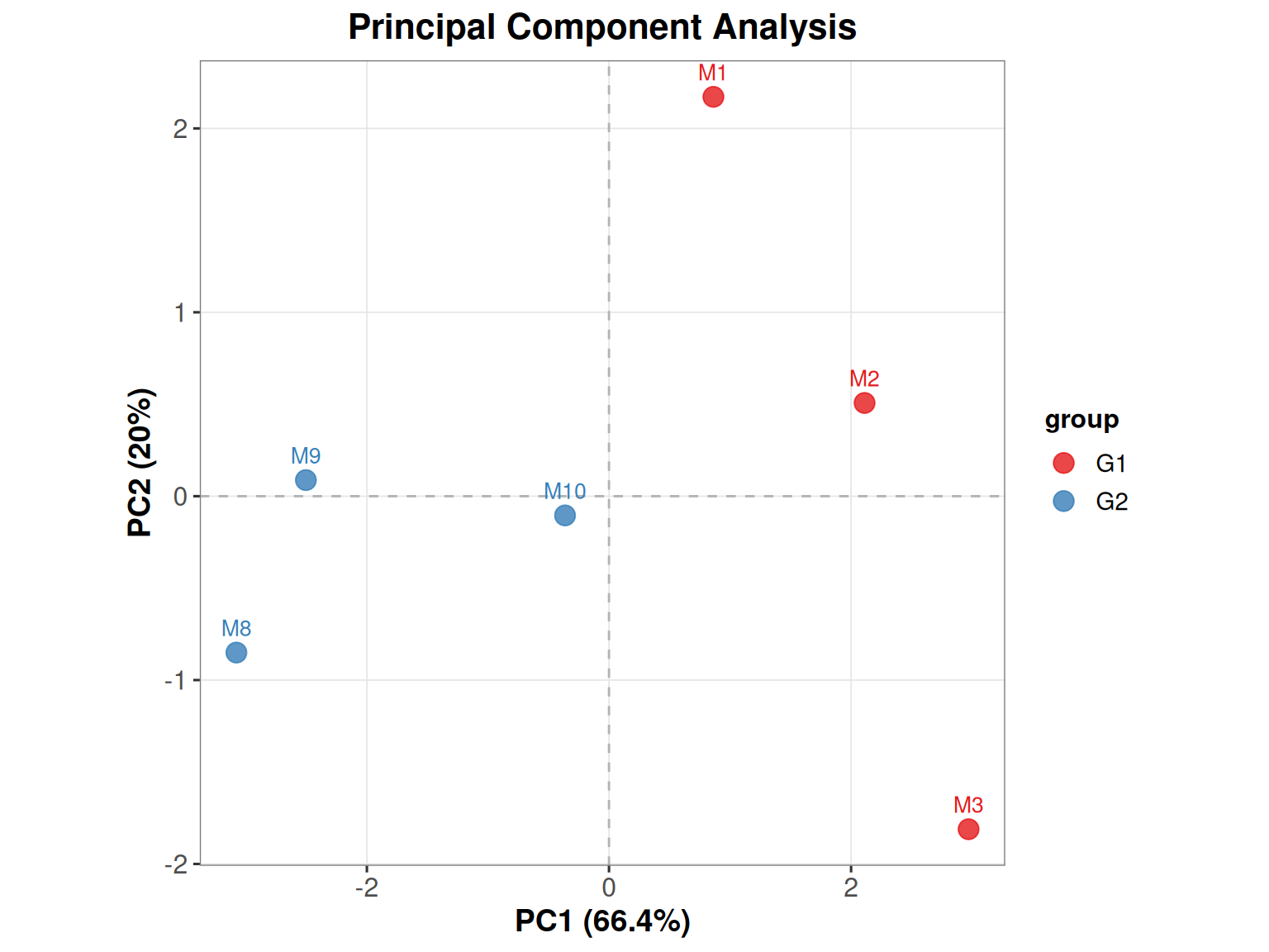
Different colors represent different samples, which can explain the relationship between principal components and original variables. For example, M1 has a greater contribution to PC1, while M8 has a greater negative correlation with PC1.