import matplotlib.pyplot as plt
import seaborn as sns
import pandas as pd
import numpy as np
from scipy import statsScatter Plot (Python)
A scatter plot displays values for two continuous variables as a collection of points. In biomedical research, scatter plots are widely used for visualizing correlations between gene expression levels, comparing biomarkers, and exploring relationships in multi-omics datasets. Python’s matplotlib and seaborn libraries provide flexible and publication-quality scatter plot capabilities.
Example

Setup
- System Requirements: Cross-platform (Linux/MacOS/Windows)
- Programming Language: Python
- Dependencies:
matplotlib,seaborn,pandas,numpy,scipy
Data Preparation
We use the classic iris dataset and simulated gene expression data for demonstration.
iris = sns.load_dataset("iris")

np.random.seed(42)
n = 200
gene_data = pd.DataFrame({
    'GeneA': np.random.normal(5, 2, n),
    'GeneB': np.random.normal(5, 2, n),
    'Group': np.random.choice(['Tumor', 'Normal'], n)
})
gene_data.loc[gene_data['Group'] == 'Tumor', 'GeneA'] += 2
gene_data.loc[gene_data['Group'] == 'Tumor', 'GeneB'] += 1.5
Visualization
Basic Scatter Plot
fig, ax = plt.subplots(figsize=(8, 6))
for species in iris['species'].unique():
    subset = iris[iris['species'] == species]
    ax.scatter(subset['sepal_length'], subset['sepal_width'],
               label=species, alpha=0.7, edgecolors='white', linewidth=0.5)
ax.set_xlabel('Sepal Length (cm)')
ax.set_ylabel('Sepal Width (cm)')
ax.set_title('Iris Scatter Plot')
ax.legend(title='Species')
ax.spines[['top', 'right']].set_visible(False)
plt.tight_layout()
plt.show()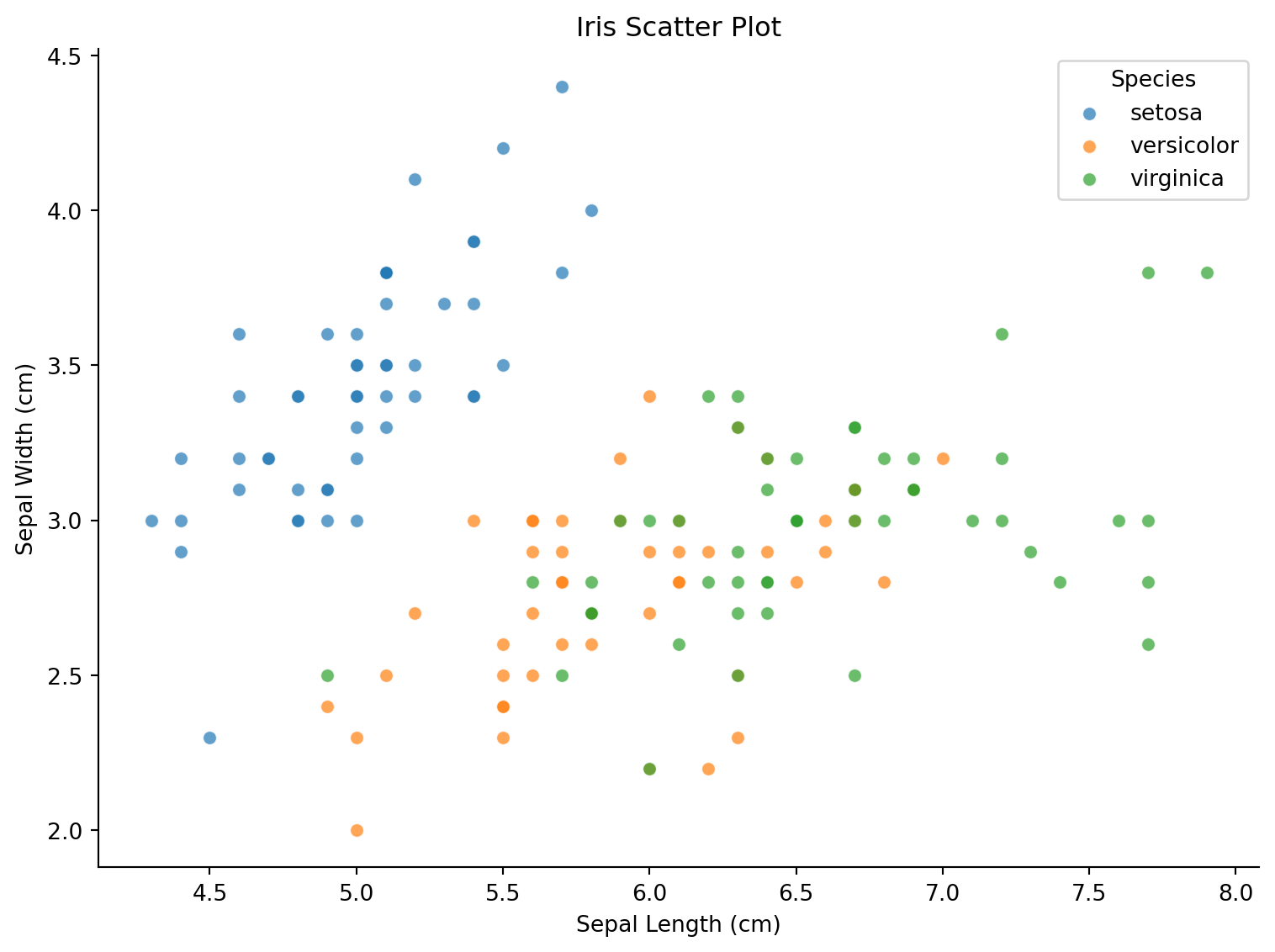
Scatter Plot with Regression Line
fig, ax = plt.subplots(figsize=(8, 6))
colors = {'Tumor': '#e63946', 'Normal': '#457b9d'}
for group in ['Tumor', 'Normal']:
    subset = gene_data[gene_data['Group'] == group]
    ax.scatter(subset['GeneA'], subset['GeneB'], c=colors[group],
               label=group, alpha=0.6, edgecolors='white', linewidth=0.5)
    slope, intercept, r, p, se = stats.linregress(subset['GeneA'], subset['GeneB'])
    x_line = np.linspace(subset['GeneA'].min(), subset['GeneA'].max(), 100)
    ax.plot(x_line, slope * x_line + intercept, color=colors[group],
            linestyle='--', linewidth=1.5)
ax.set_xlabel('Gene A Expression')
ax.set_ylabel('Gene B Expression')
ax.set_title('Gene Expression Correlation by Group')
ax.legend()
ax.spines[['top', 'right']].set_visible(False)
plt.tight_layout()
plt.show()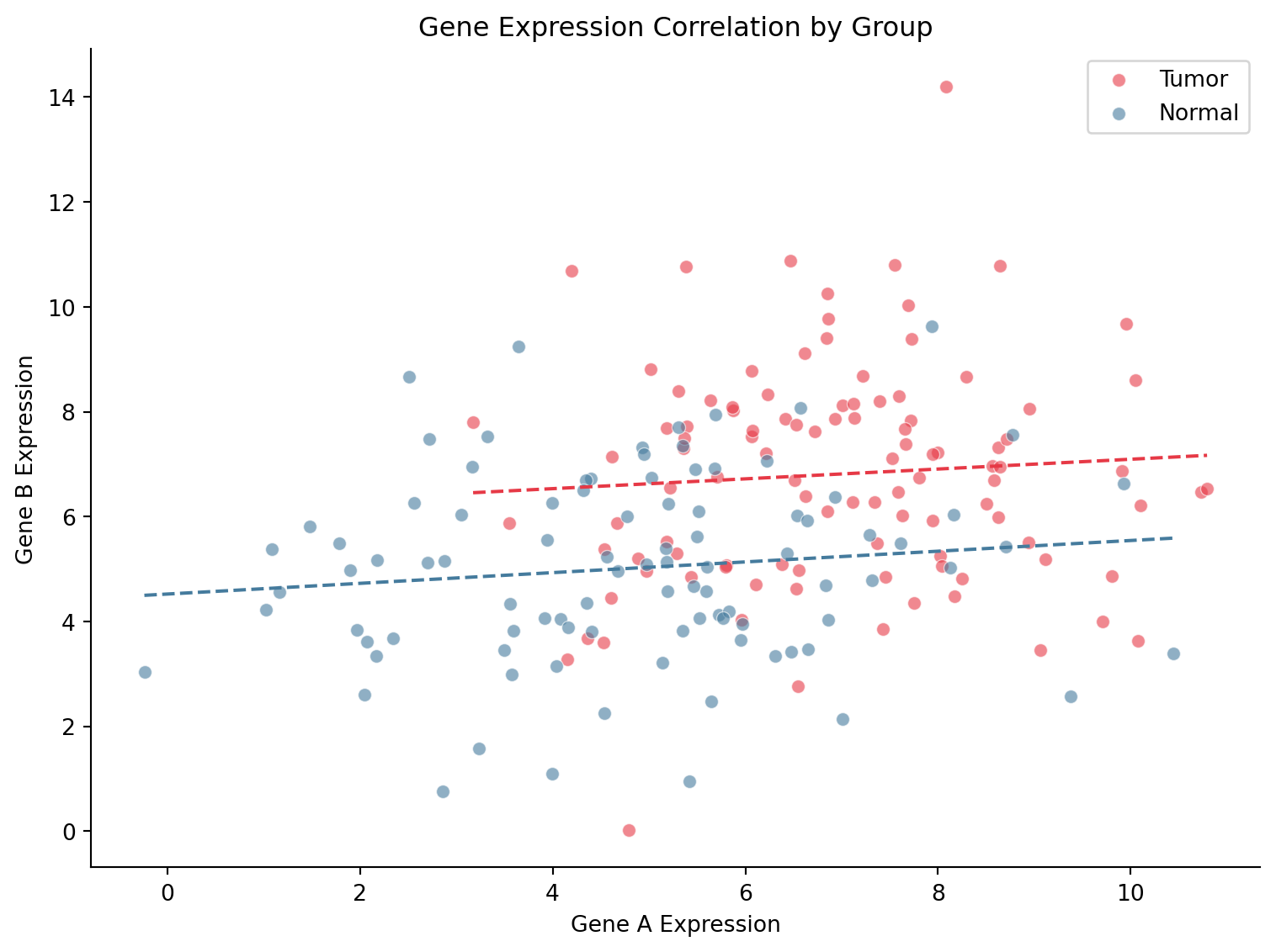
Seaborn Joint Plot
g = sns.jointplot(data=gene_data, x='GeneA', y='GeneB', hue='Group',
                  palette={'Tumor': '#e63946', 'Normal': '#457b9d'},
                  kind='scatter', alpha=0.6, marginal_kws=dict(fill=True, alpha=0.4))
g.set_axis_labels('Gene A Expression', 'Gene B Expression')
plt.suptitle('Joint Distribution of Gene Expression', y=1.02)
plt.tight_layout()
plt.show()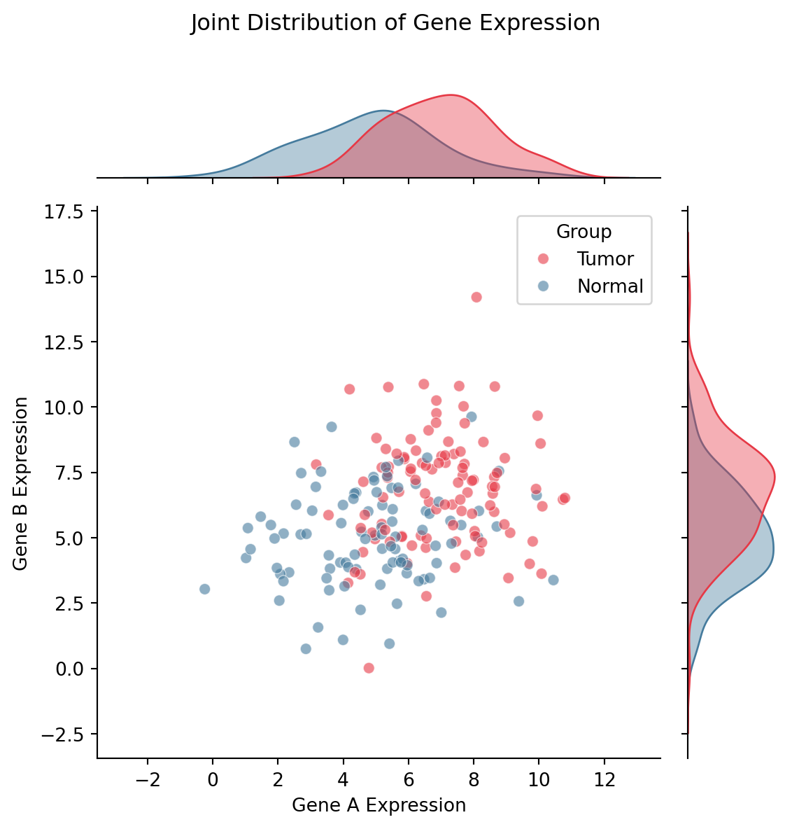
References
- Hunter, J. D. (2007). Matplotlib: A 2D graphics environment. Computing in Science & Engineering, 9(3), 90-95.
- Waskom, M. L. (2021). seaborn: statistical data visualization. Journal of Open Source Software, 6(60), 3021.