import matplotlib.pyplot as plt
import seaborn as sns
import pandas as pd
import numpy as np
from scipy.cluster.hierarchy import linkageHeatmap (Python)
A heatmap is a data visualization technique that uses color to represent values in a matrix. In biomedical research, heatmaps are essential for visualizing gene expression profiles, correlation matrices, methylation data, and drug response panels. Python’s seaborn and matplotlib libraries offer powerful heatmap capabilities with built-in clustering support.
Example

Setup
- System Requirements: Cross-platform (Linux/MacOS/Windows)
- Programming Language: Python
- Dependencies:
matplotlib,seaborn,pandas,numpy,scipy
Data Preparation
np.random.seed(42)
n_genes = 30
n_samples = 12
gene_names = [f'Gene_{i+1}' for i in range(n_genes)]
sample_names = [f'Sample_{i+1}' for i in range(n_samples)]
groups = ['Tumor'] * 6 + ['Normal'] * 6

expr_matrix = np.random.randn(n_genes, n_samples)
expr_matrix[:10, :6] += 2.5
expr_matrix[10:20, 6:] += 2.0

expr_df = pd.DataFrame(expr_matrix, index=gene_names, columns=sample_names)
Visualization
Basic Heatmap
fig, ax = plt.subplots(figsize=(10, 8))
sns.heatmap(expr_df, cmap='RdBu_r', center=0, xticklabels=True,
            yticklabels=True, linewidths=0.5, ax=ax)
ax.set_title('Gene Expression Heatmap')
ax.set_xlabel('Samples')
ax.set_ylabel('Genes')
plt.tight_layout()
plt.show()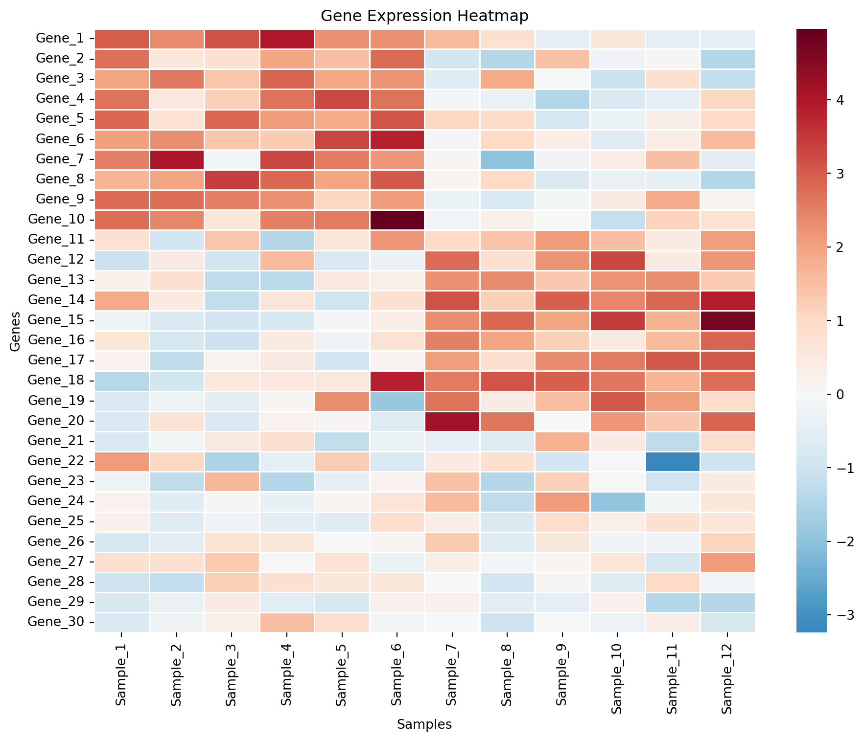
Clustered Heatmap
col_colors = ['#e63946' if g == 'Tumor' else '#457b9d' for g in groups]
g = sns.clustermap(expr_df, cmap='RdBu_r', center=0, figsize=(10, 10),
                   col_colors=col_colors, method='ward',
                   linewidths=0.3, dendrogram_ratio=0.15)
g.ax_heatmap.set_xlabel('Samples')
g.ax_heatmap.set_ylabel('Genes')
plt.suptitle('Clustered Gene Expression Heatmap', y=1.02)
plt.show()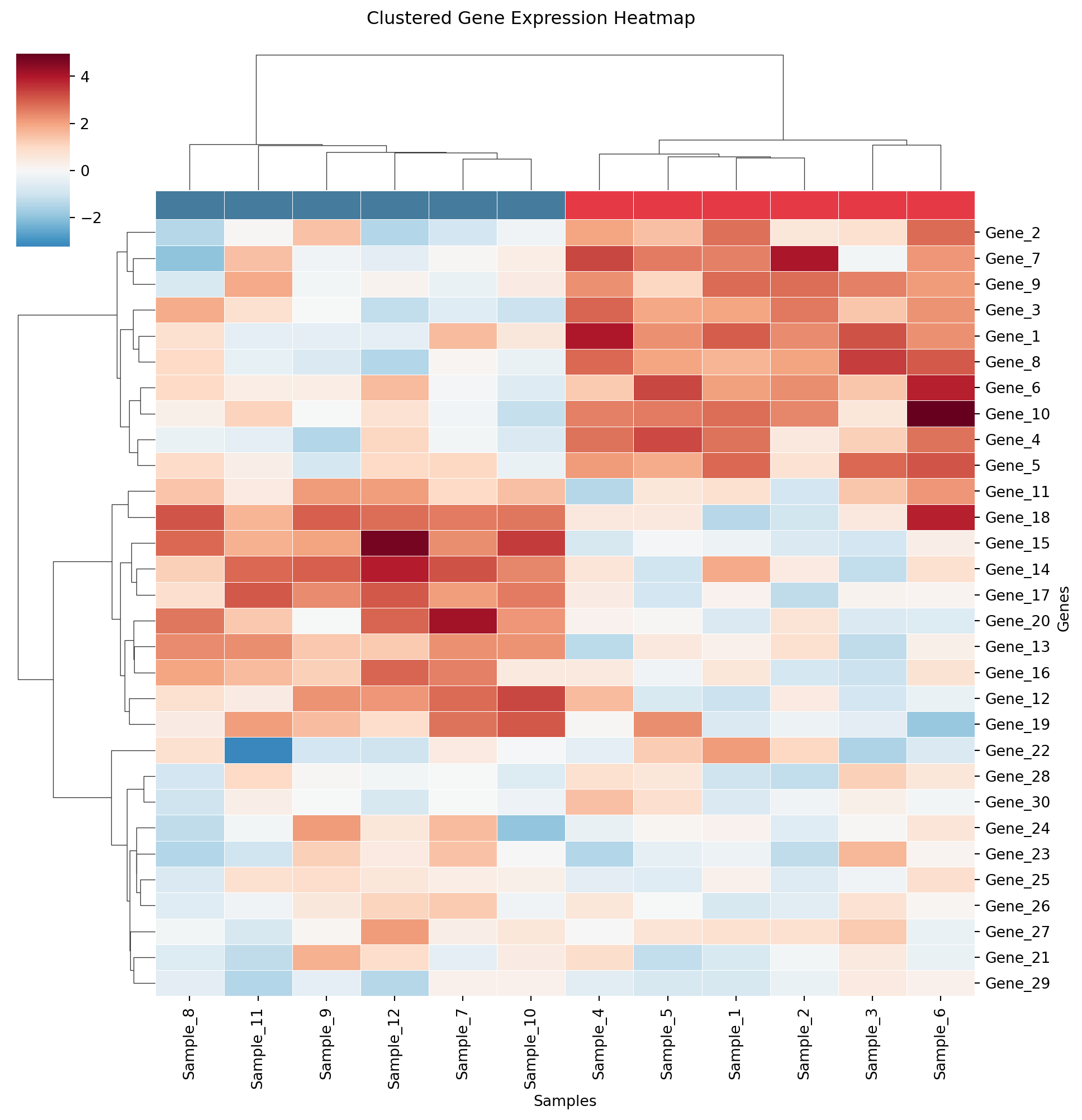
Correlation Matrix Heatmap
corr = expr_df.T.corr()
mask = np.triu(np.ones_like(corr, dtype=bool), k=1)

fig, ax = plt.subplots(figsize=(10, 8))
sns.heatmap(corr, mask=mask, cmap='coolwarm', center=0, square=True,
            linewidths=0.5, annot=False, fmt='.2f',
            cbar_kws={'shrink': 0.8, 'label': 'Pearson r'}, ax=ax)
ax.set_title('Gene-Gene Correlation Matrix')
plt.tight_layout()
plt.show()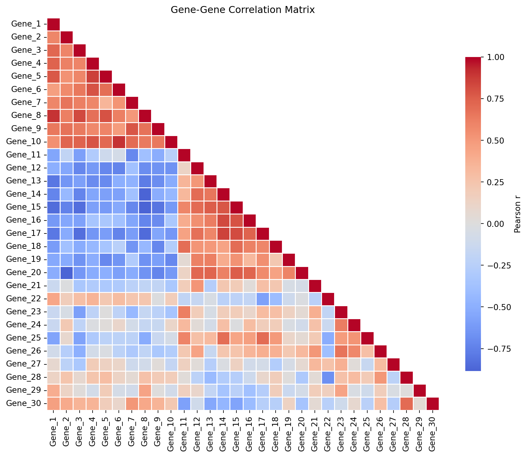
References
- Wilkinson, L., & Friendly, M. (2009). The history of the cluster heat map. The American Statistician, 63(2), 179-184.
- Waskom, M. L. (2021). seaborn: statistical data visualization. JOSS, 6(60), 3021.