# Installing packages
if (!requireNamespace("meta", quietly = TRUE)) {
  install.packages("meta")
}
if (!requireNamespace("metafor", quietly = TRUE)) {
  install.packages("metafor")
}
if (!requireNamespace("ggplot2", quietly = TRUE)) {
  install.packages("ggplot2")
}
if (!requireNamespace("dplyr", quietly = TRUE)) {
  install.packages("dplyr")
}
if (!requireNamespace("tidyr", quietly = TRUE)) {
  install.packages("tidyr")
}
if (!requireNamespace("grid", quietly = TRUE)) {
  install.packages("grid")
}
if (!requireNamespace("forestplot", quietly = TRUE)) {
  install.packages("forestplot")
}

# Load packages
library(meta)
library(metafor)
library(ggplot2)
library(dplyr)
library(tidyr)
library(grid)
library(forestplot)Meta-Analysis Forest Plot
Example
A forest plot is a commonly used graphical representation in meta-analysis to visualize the results of individual studies. It displays the observed effect size, confidence interval, and weight of each study, allowing for clear comparison of results across the research.
Setup
System Requirements: Cross-platform (Linux/MacOS/Windows)
Programming language: R
Dependent packages:
meta,metafor,ggplot2,dplyr,tidyr,grid,forestplot
sessioninfo::session_info("attached")─ Session info ───────────────────────────────────────────────────────────────
setting value
version R version 4.6.0 (2026-04-24)
os Ubuntu 24.04.4 LTS
system x86_64, linux-gnu
ui X11
language (EN)
collate C.UTF-8
ctype C.UTF-8
tz UTC
date 2026-05-09
pandoc 3.1.3 @ /usr/bin/ (via rmarkdown)
quarto 1.9.37 @ /usr/local/bin/quarto
─ Packages ───────────────────────────────────────────────────────────────────
package * version date (UTC) lib source
abind * 1.4-8 2024-09-12 [1] RSPM
checkmate * 2.3.4 2026-02-03 [1] RSPM
dplyr * 1.2.1 2026-04-03 [1] RSPM
forestplot * 3.2.0 2026-03-04 [1] RSPM
ggplot2 * 4.0.3.9000 2026-05-04 [1] Github (tidyverse/ggplot2@6870419)
Matrix * 1.7-5 2026-03-21 [3] CRAN (R 4.6.0)
meta * 8.3-0 2026-04-02 [1] RSPM
metabook * 0.2-0 2026-03-13 [1] RSPM
metadat * 1.6-0 2026-04-29 [1] RSPM
metafor * 5.0-1 2026-04-26 [1] RSPM
numDeriv * 2016.8-1.1 2019-06-06 [1] RSPM
tidyr * 1.3.2 2025-12-19 [1] RSPM
[1] /home/runner/work/_temp/Library
[2] /opt/R/4.6.0/lib/R/site-library
[3] /opt/R/4.6.0/lib/R/library
* ── Packages attached to the search path.
──────────────────────────────────────────────────────────────────────────────Data Preparation
# Generate simulated data
set.seed(2023)
n_studies <- 15
meta_data <- tibble(
  `Study Name` = paste("Study", LETTERS[1:n_studies]),
  `Odds Ratio` = exp(rnorm(n_studies, mean = 0.2, sd = 0.4)),
  `Lower 95% CI` = exp(rnorm(n_studies, mean = 0.1, sd = 0.35)),
  `Upper 95% CI` = exp(rnorm(n_studies, mean = 0.3, sd = 0.45)),
  `Weight (%)` = runif(n_studies, 0.5, 3),
  `Treatment Group` = sample(c("DrugA", "DrugB"), n_studies, replace = TRUE)
) %>%
  mutate(
    across(c(`Odds Ratio`, `Lower 95% CI`, `Upper 95% CI`), ~round(., 2)),
    `Weight (%)` = round(`Weight (%)`/sum(`Weight (%)`)*100, 1),
    `Study Name` = factor(`Study Name`, levels = rev(`Study Name`))
  )

# View the final merged dataset
head(meta_data)
# A tibble: 6 × 6
`Study Name` `Odds Ratio` `Lower 95% CI` `Upper 95% CI` `Weight (%)`
<fct> <dbl> <dbl> <dbl> <dbl>
1 Study A 1.18 1.41 1.19 7.5
2 Study B 0.82 1.36 2.4 3.3
3 Study C 0.58 1.29 0.94 9.3
4 Study D 1.13 1.51 1.32 9.2
5 Study E 0.95 1.35 1.01 8.3
6 Study F 1.89 0.96 1.11 3.4
# ℹ 1 more variable: `Treatment Group` <chr>Visualization
1. Basic Plot
# Basic forest plot
p <-
  ggplot(meta_data, aes(x = `Odds Ratio`, y = `Study Name`)) +
  geom_vline(xintercept = 1, linetype = "dashed", color = "grey50") +
  geom_errorbarh(aes(xmin = `Lower 95% CI`, xmax = `Upper 95% CI`),
                 height = 0.15, color = "#2c7fb8", linewidth = 0.8) +
  geom_point(aes(size = `Weight (%)`), shape = 18, color = "#d95f00") +
  scale_x_continuous(trans = "log",
                     breaks = c(0.25, 0.5, 1, 2, 4),
                     limits = c(0.2, 5)) +
  labs(x = "Odds Ratio (95% CI)",
       y = "",
       title = "Meta-Analysis Forest Plot",
       subtitle = "Random Effects Model") +
  theme_minimal(base_size = 12) +
  theme(
    panel.grid.major.y = element_blank(),
    panel.grid.minor.x = element_blank(),
    plot.title = element_text(face = "bold", hjust = 0.5),
    plot.subtitle = element_text(hjust = 0.5, color = "grey50"),
    legend.position = "bottom"
  )
p
# Data Preparation ---------------------------------------------------------------
dataset <- data.frame(
Study_Name = c("ART","WBC","CPR","DTA","EPC","FFT","GEO","HBC","PTT","JOK"),
Odds_Ratio = c(0.9, 2, 0.3, 0.4, 0.5, 1.3, 2.5, 1.6, 1.9, 1.1),
Lower_95_CI = c(0.75, 1.79, 0.18, 0.2, 0.38, 1.15, 2.41, 1.41, 1.66, 0.97),
Upper_95_CI = c(1.05, 2.21, 0.42, 0.6, 0.62, 1.45, 2.59, 1.79, 2.14, 1.23),
Effect_Type = factor(c('Not sig.', 'Risk', 'Protective', 'Protective', 'Protective',
                       'Risk', 'Risk', 'Risk', 'Risk', 'Not sig.'),
                     levels = c("Risk", "Protective", "Not sig.")),
Sample_Size = c(450, 420, 390, 400, 470, 390, 400, 388, 480, 460)
) %>%
mutate(
  log_OR = log(Odds_Ratio),
  log_Lower = log(Lower_95_CI),
  log_Upper = log(Upper_95_CI),
  Study_Name = factor(Study_Name, levels = rev(Study_Name)))


x_limits <- c(-3.9, 2)  # Data coordinate range (left boundary to log(5)≈1.6)
get_npc <- function(x) {
(x - x_limits[1]) / diff(x_limits)  # Standardized coordinate transformation
}


column_system <- list(
study = list(
  data_x = -3.8,
  npc_x = get_npc(-3.8),
  label = "Study",
  width = 1.2
),
events = list(
  data_x = -3.5,
  npc_x = get_npc(-3.5),
  label = "Events\n(Case/Control)",
  width = 1.8
),
or = list(
  data_x = -3.1,
  npc_x = get_npc(-3.1),
  label = "Odds Ratio\n(95% CI)",
  width = 2.2
),
p = list(
  data_x = -2.7,
  npc_x = get_npc(-2.7),
  label = "P Value",
  width = 1.2
),
sample = list(
  data_x = -2.4,
  npc_x = get_npc(-2.4),
  label = "Sample\nSize",
  width = 1.2
)
)


ggplot(dataset, aes(y = Study_Name)) +

annotation_custom(
  grob = textGrob(
    label = sapply(column_system, function(x) x$label),
    x = unit(sapply(column_system, function(x) x$npc_x), "npc"),
    y = unit(1.06, "npc"),
    hjust = 0.5,
    vjust = 0,
    gp = gpar(
      fontface = "bold",
      fontsize = 12,
      lineheight = 0.8,
      col = "black"
    )
  )
) +


# Study Name (right aligned)
geom_text(
  aes(x = column_system$study$data_x, label = Study_Name),
  size = 3.5,
  hjust = 1,
  nudge_x = -0.05  # Fine-tune the position
) +

# Event rate (right aligned)
geom_text(
  aes(x = column_system$events$data_x,
      label = c("17/13", "23/18", "30/25", "10/8", "31/25",
                "17/13", "23/18", "24/20", "17/12", "2.00/1.90")),
  size = 3.5,
  hjust = 1
) +

# OR value (right aligned)
geom_text(
  aes(x = column_system$or$data_x,
      label = sprintf("%.2f (%.2f-%.2f)", Odds_Ratio, Lower_95_CI, Upper_95_CI)),
  size = 3.5,
  hjust = 1
) +

# P value (right aligned)
geom_text(
  aes(x = column_system$p$data_x,
      label = c("<0.001", "<0.001", "0.075", "<0.001", "<0.001",
                "<0.001", "<0.001", "<0.001", "<0.001", "0.650")),
  size = 3.5,
  color = "#d95f02",
  hjust = 1
) +

# Sample size (right aligned)
geom_text(
  aes(x = column_system$sample$data_x, label = Sample_Size),
  size = 3.5,
  fontface = "bold",
  hjust = 1
) +


geom_vline(
  xintercept = 0,
  linetype = "solid",
  color = "black",
  linewidth = 0.8
) +
geom_errorbarh(
  aes(xmin = log_Lower, xmax = log_Upper),
  height = 0.15,
  color = "grey40",
  linewidth = 0.8
) +
geom_point(
  aes(x = log_OR, size = Sample_Size, fill = Effect_Type),
  shape = 21,
  color = "white",
  stroke = 1
) +


scale_x_continuous(
  name = "Odds Ratio (log scale)",
  breaks = log(c(0.25, 0.5, 1, 2, 4)),
  labels = c(0.25, 0.5, 1, 2, 4),
  limits = x_limits,
  expand = expansion(add = c(0.1, 0.2))
) +
scale_size_continuous(
  range = c(4, 10),
  breaks = c(300, 400, 500),
  guide = guide_legend(
    title.position = "top",
    title = "Sample Size",
    nrow = 1,
    override.aes = list(shape = 21, fill = "grey50")
  )
) +
scale_fill_manual(
  values = c(
    Risk = "#d95f02",
    Protective = "#1b9e77",
    "Not sig." = "#7570b3"
  ),
  guide = guide_legend(
    title = NULL,
    nrow = 1,
    override.aes = list(size = 5)
  )
) +


labs(title = "Multivariable Analysis of Clinical Factors") +
theme_minimal(base_size = 12) +
theme(
  panel.grid.major.y = element_blank(),
  panel.grid.minor.y = element_blank(),
  axis.title.y = element_blank(),
  axis.text.y = element_blank(),
  axis.ticks.y = element_blank(),
  axis.title.x = element_text(
    color = "grey30",
    margin = margin(t = 10)
  ),
  axis.text.x = element_text(color = "grey30"),
  plot.title = element_text(
    hjust = 0.5,
    face = "bold",
    size = 16,
    margin = margin(b = 20)
  ),
  legend.position = "bottom",
  legend.box = "horizontal",
  legend.spacing.x = unit(0.8, "cm"),
  legend.title = element_text(size = 11),
  legend.text = element_text(size = 10),
  plot.margin = margin(t = 80, b = 20, l = 30, r = 30),
  plot.background = element_rect(
    fill = "#f0f8ff",
    color = NA,
    linewidth = 0.5
  )
) +
coord_cartesian(clip = "off")
2. Existing R packages for plotting
# Forest Plot
test_data <- data.frame(id = 1:4,
                        coef1 = c(1, 1.59, 1.3, 1.24),
                        coef2 = c(1, 1.7, 1.4, 1.04),
                        low1 = c(1, 1.3, 1.1, 0.99),
                        low2 = c(1, 1.6, 1.2, 0.7),
                        high1 = c(1, 1.94, 1.6, 1.55),
                        high2 = c(1, 1.8, 1.55, 1.33))

# Convert into dplyr formatted data
out_data <- test_data |>
  pivot_longer(cols = everything() & -id) |>
  mutate(group = gsub("(.+)([12])$", "\\2", name),
         name = gsub("(.+)([12])$", "\\1", name)) |>
  pivot_wider() |>
  group_by(id) |>
  mutate(col1 = lapply(id, \(x) ifelse(x < 4,
                                       paste("Category", id),
                                       expression(Category >= 4))),
         col2 = lapply(1:n(), \(i) substitute(expression(bar(x) == val),
                                              list(val = mean(coef) |> round(2)))),
         col2 = if_else(id == 1,
                        rep("ref", n()) |> as.list(),
                        col2)) |>
  group_by(group)

out_data |>
  forestplot(mean = coef,
             lower = low,
             upper = high,
             labeltext = c(col1, col2),
             title = "Cool study",
             zero = c(0.98, 1.02),
             grid = structure(c(2^-.5, 2^.5),
                              gp = gpar(col = "steelblue", lty = 2)
             ),
             boxsize = 0.25,
             xlab = "The estimates",
             new_page = TRUE,
             legend = c("Treatment", "Placebo"),
             legend_args = fpLegend(
               pos = list("topright"),
               title = "Group",
               r = unit(.1, "snpc"),
               gp = gpar(col = "#CCCCCC", lwd = 1.5)
             )) |>
  fp_set_style(box = c("royalblue", "gold"),
               line = c("darkblue", "orange"),
               summary = c("darkblue", "red"))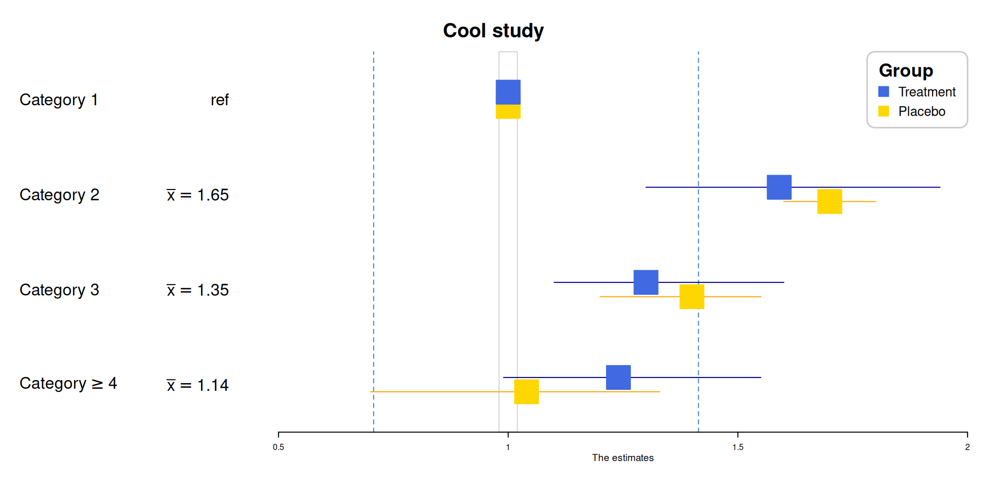
Application
1. Visualization of Meta-analysis Results
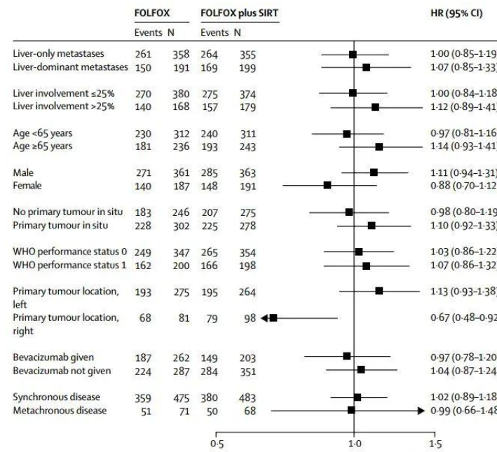
A forest plot, by definition, is generally a rectangular coordinate system with an invalid line perpendicular to the X-axis (usually coordinate X = 1 or 0) as the center. It uses several line segments parallel to the X-axis to represent the effect size of each study and its 95% confidence interval, and uses a diamond to represent the combined effect size and confidence interval of multiple studies. It is the most commonly used comprehensive expression form of results in meta-analysis.
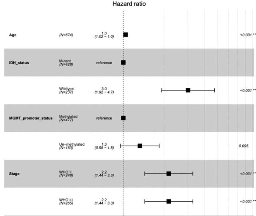
2. Results of multivariate regression analysis
The forest plot is a very flexible visualization tool that can be used not only to display the results of meta-analysis, but also to display the results of univariate or multivariate regression analysis.
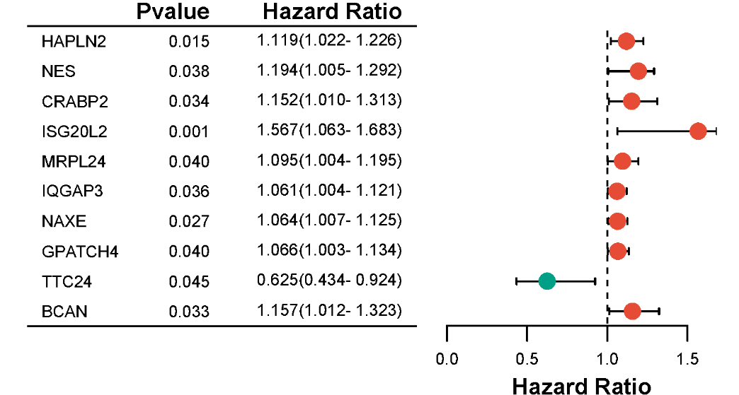
3. Visualization of Gene Association Studies

Forest map made by the TwoSampleMR package.
Reference
[1] Lewis, S., & Clarke, M. (2001). Forest Plots: Trying to See the Wood and the Trees. BMJ, 322(7300), 1479–1480.DOI: 10.1136/bmj.322.7300.1479.
[2] Higgins, J. P. T., Thomas, J., Chandler, J., et al. (2022). Cochrane Handbook for Systematic Reviews of Interventions (Version 6.3).
[3] Gordon, M., & Lumley, T. (2023). forestplot: Advanced Forest Plot Using ‘grid’ Graphics (R package version 3.1.1).
[4] Moher, D., Hopewell, S., Schulz, K. F., et al. (2010). CONSORT 2010 Statement: Updated Guidelines for Reporting Parallel Group Randomized Trials. Annals of Internal Medicine, 152(11), 726–732.DOI: 10.7326/0003-4819-152-11-201006010-00232.
[5] Murrell, P. (2018). R Graphics (3rd ed.). Chapman & Hall/CRC.ISBN: 978-1439888417