#Example Code-----
# Installing necessary packages
if (!requireNamespace("readr", quietly = TRUE)) {
  install.packages("readr")
}
if (!requireNamespace("ggplot2", quietly = TRUE)) {
  install.packages("ggplot2")
}
if (!requireNamespace("tidyverse", quietly = TRUE)) {
  install.packages("tidyverse")
}

# Loading the libraries
library(readr)
library(ggplot2)
library(tidyverse)Contribution_guidance
Example guide for a visualization tutorial
Example
【Figure. Example Plot】
Show the title/diagram notes for the above example diagrams and interpret the meaning of the example diagram xy axes or other identifiers.
Setup
System Requirements: Cross-platform (Linux/MacOS/Windows)
Programming Language: R
Dependencies: (Populate R packages or other resources that the visualization tutorial depends on)
Data Preparation
- R built-in datasets (e.g. iris, penguins) and biomedical related datasets (e.g. histology data, survival information, clinical indicators, etc.) need to be included.
- Biomedical related datasets need to be uploaded to the Bizard Tencent Cloud in order to get a link to the insertion tutorial, data from public datasets is best, and if provided by an individual/organization needs to ensure that the data can be made public. The size of the dataset should be less than 1MB.
# Data reading and processing codes can be freely chosen to be displayed or not------
# Read the TSV data
data <- readr::read_tsv("https://bizard-1301043367.cos.ap-guangzhou.myqcloud.com/TCGA-LIHC.htseq_counts.tsv.gz")

# Filter and reshape data for the first gene TSPAN6 (Ensembl ID: ENSG00000000003.13)
data1 <- data %>%
  filter(Ensembl_ID == "ENSG00000000003.13") %>%
  pivot_longer(
    cols = -Ensembl_ID,
    names_to = "sample",
    values_to = "expression"
  ) %>%
  mutate(var = "var1")  # Add a column to differentiate the variables

# Filter and reshape data for the second gene SCYL3 (Ensembl ID: ENSG00000000457.12)
data2 <- data %>%
  filter(Ensembl_ID == "ENSG00000000457.12") %>%
  pivot_longer(
    cols = -Ensembl_ID,
    names_to = "sample",
    values_to = "expression"
  ) %>%
  mutate(var = "var2")  # Add a column to differentiate the variables

# Combine the two datasets
data12 <- bind_rows(data1, data2)

# View the final combined dataset
head(data12)
# A tibble: 6 × 4
Ensembl_ID sample expression var
<chr> <chr> <dbl> <chr>
1 ENSG00000000003.13 TCGA-DD-A4NG-01A 12.8 var1
2 ENSG00000000003.13 TCGA-G3-AAV4-01A 9.72 var1
3 ENSG00000000003.13 TCGA-2Y-A9H1-01A 11.3 var1
4 ENSG00000000003.13 TCGA-CC-A3M9-01A 11.6 var1
5 ENSG00000000003.13 TCGA-K7-AAU7-01A 11.5 var1
6 ENSG00000000003.13 TCGA-BC-A10W-01A 12.0 var1 Visualization
1. Basic Plot
Use the base functions to draw graphical annotations and profiles of images. e.g.@fig-BasicHist illustrates the distribution of expression levels for the TSPAN6 gene across different samples.
# Basic Drawing Code Example-----
#| label: fig-BasicHist
#| fig-cap: "Basic Histogram"
#| out.width: "95%"
#| warning: false

# Basic Histogram
p1 <- ggplot(data1, aes(x = expression)) +
  geom_histogram() +
  labs(x = "Gene Expression", y = "Count")

p1
`stat_bin()` using `bins = 30`. Pick better value `binwidth`.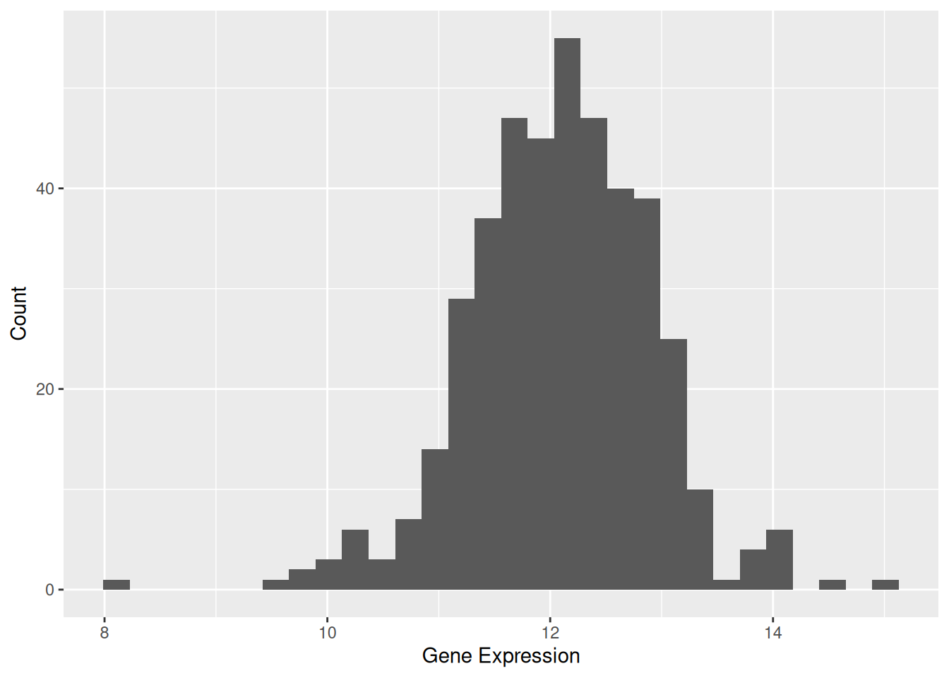
Supplement the base code with important parameters that can be extended and provide the corresponding plotting code.
Tip
Key Parameters: binwidth / bins
The binwidth or bins parameter determines how much data each bin will contain. Modifying these values can significantly affect the appearance of the histogram and the information conveyed.
# Code example (with supplementary parameter `bins`)-----
#| label: fig-bins
#| fig-cap: "Key Parameters: `binwidth` / `bins`"
#| fig.width: 8
#| fig.heright: 2
#| out.width: "95%"
#| warning: false

p2_1 <- ggplot(data1, aes(x = expression)) +
  geom_histogram(bins = 30, fill = "skyblue", color = "white") +
  ggtitle("Bins = 30") +
  labs(x = "Gene Expression", y = "Count")

p2_2 <- ggplot(data1, aes(x = expression)) +
  geom_histogram(bins = 50, fill = "skyblue", color = "white") +
  ggtitle("Bins = 50") +
  labs(x = "Gene Expression", y = "Count")

cowplot::plot_grid(p2_1, p2_2)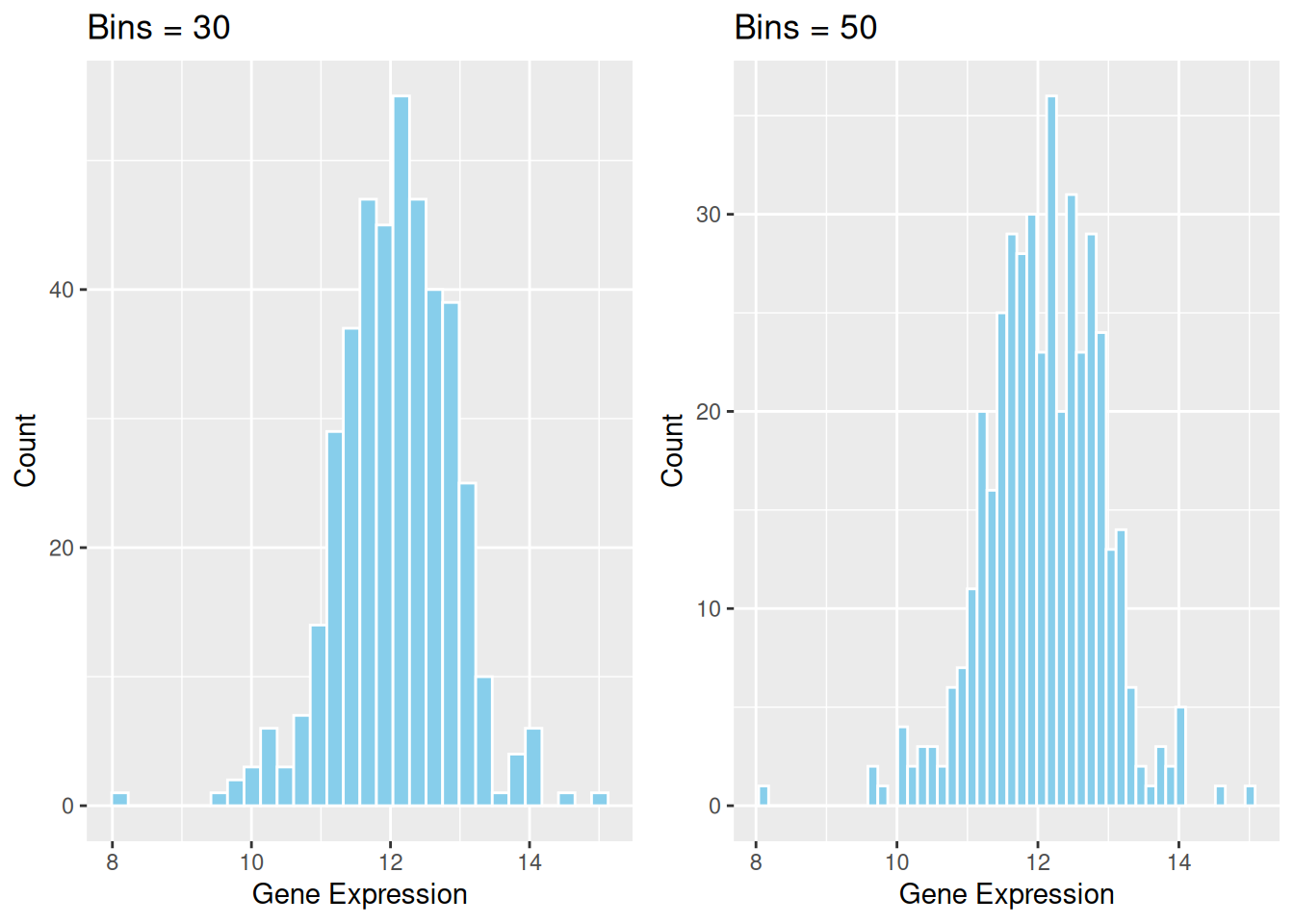
2. More Advanced Plots (e.g.Histogram with Density Curve)
Introduces complex types of visualization, such as using functions that contain more custom parameters, using multiple base chart overlays, adding statistical tests, and more.
e.g. The density curve provides a smooth representation of the data distribution. Unlike the histogram, which depends on the number of bins, the density curve uses kernel density estimation (KDE) to smooth the distribution. This allows a clearer understanding of the overall trend and shape of the data.
# Advanced Drawing Code Example-----
#| label: fig-DensityCurve
#| fig-cap: "Histogram with Density Curve"
#| out.width: "95%"
#| warning: false

p1 <- ggplot(data1, aes(x = expression)) +
  geom_histogram(aes(y = after_stat(density)), bins = 30, fill = "skyblue", color = "white") +
  geom_density(alpha = 0.2, fill = "#FF6666") +
  labs(x = "Gene Expression", y = "Density")

p1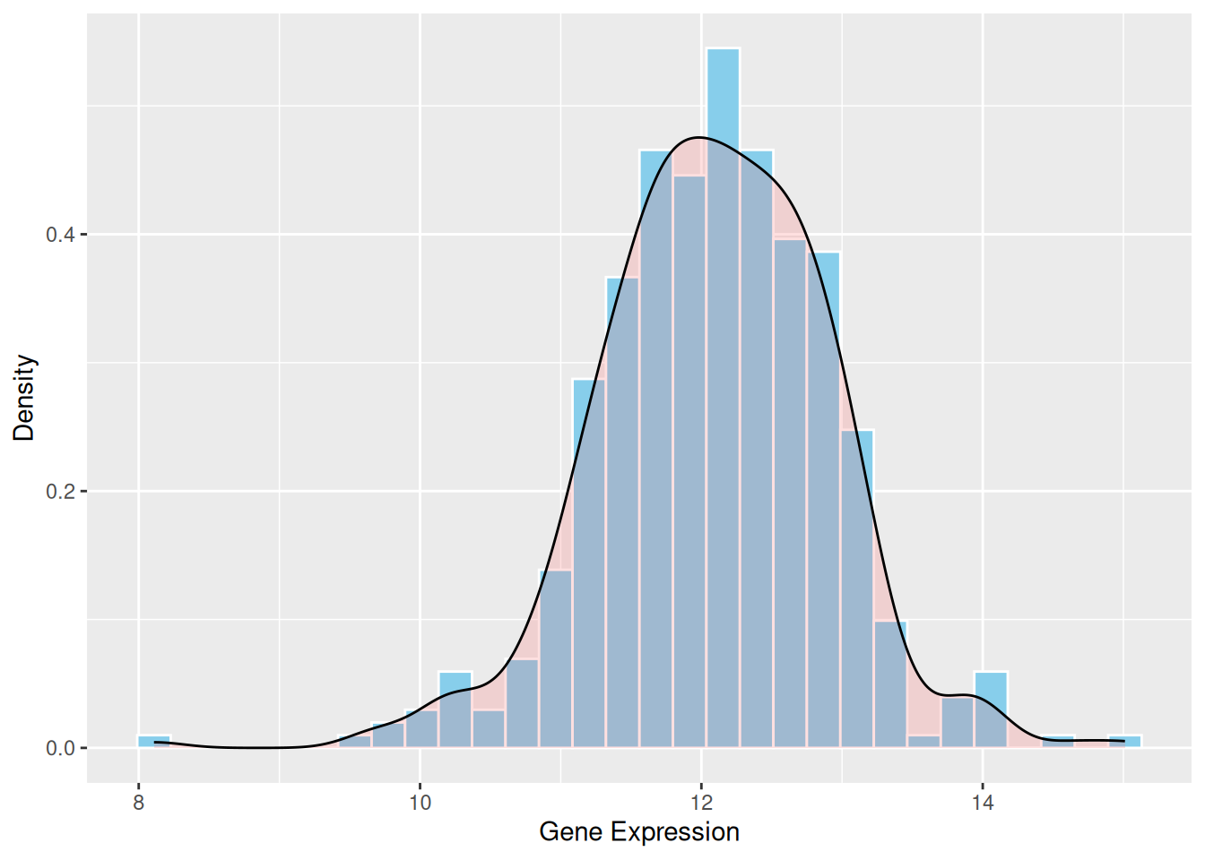
Optionally you can add a detailed description of the parameters using callout-tip if you need it.
Applications
Demonstrate the practical application of visualization charts in the biomedical literature, with the option to show basic/advanced charts separately if they are widely used in various types of biomedical literature.
e.g.
1. Applications of Basic Histogram
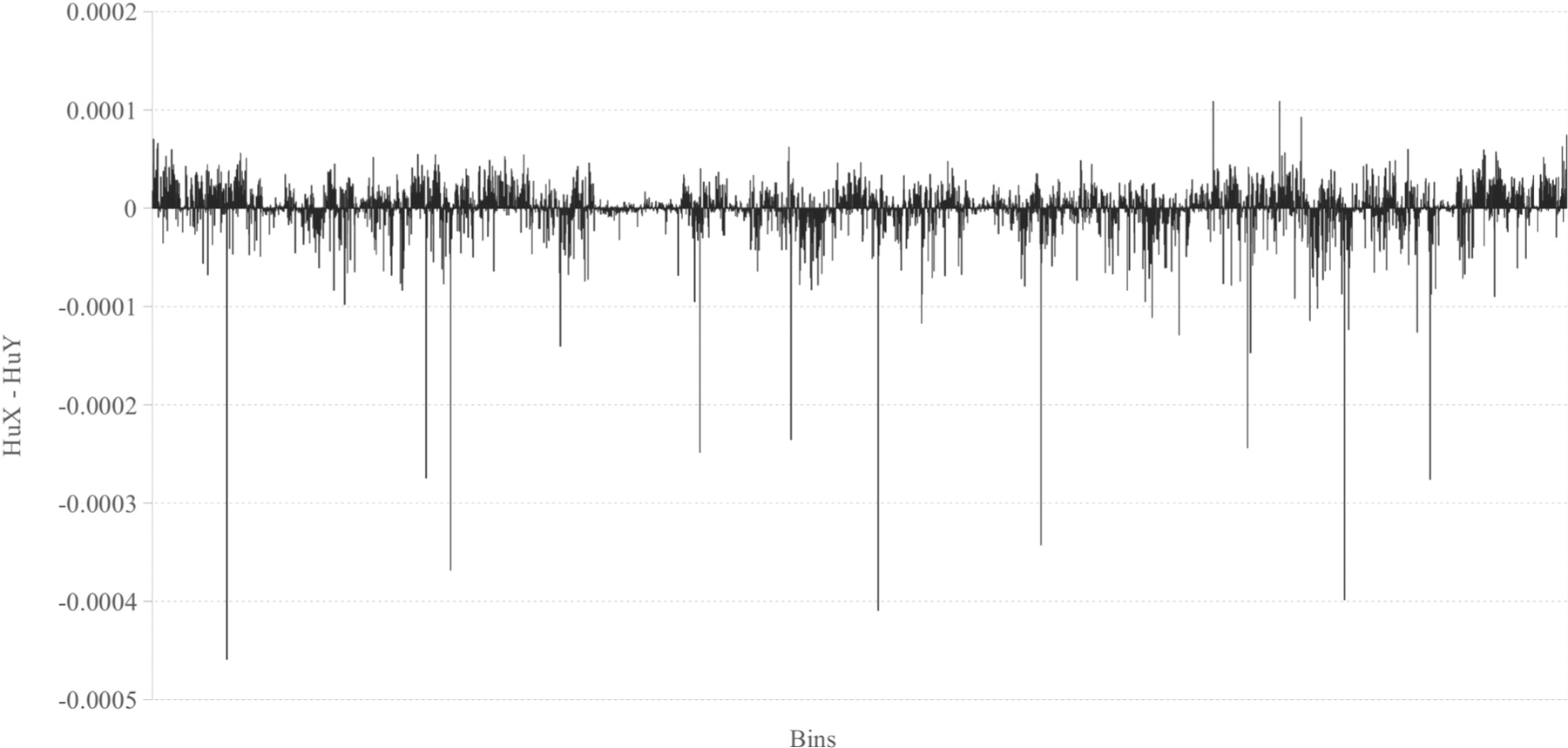
Figure 9 shows the differences between the relative frequencies of human X and human Y chromosome’s histograms for n = 6. [1]
Additional image figure notes and source documentation information are required. A code reproduction of the figure may be added at the author’s discretion.
Reference
e.g. 1. Costa, A. M., Machado, J. T., & Quelhas, M. D. (2011). Histogram-based DNA analysis for the visualization of chromosome, genome, and species information. Bioinformatics, 27(9), 1207–1214. https://doi.org/10.1093/bioinformatics/btr131
Contributors
- Editor: Yours name.
- Reviewers: Reviewers name.