# 安装包
if (!requireNamespace("ggplot2", quietly = TRUE)) {
  install.packages("ggplot2")
}
if (!requireNamespace("tidyr", quietly = TRUE)) {
  install.packages("tidyr")
}
if (!requireNamespace("palmerpenguins", quietly = TRUE)) {
  install.packages("palmerpenguins")
}
if (!requireNamespace("cowplot", quietly = TRUE)) {
  install.packages("cowplot")
}
if (!requireNamespace("hrbrthemes", quietly = TRUE)) {
  install.packages("hrbrthemes")
}
if (!requireNamespace("ggalt", quietly = TRUE)) {
  install.packages("ggalt")
}
if (!requireNamespace("rstatix", quietly = TRUE)) {
  install.packages("rstatix")
}
if (!requireNamespace("ggpubr", quietly = TRUE)) {
  install.packages("ggpubr")
}

# 加载包
library(ggplot2)
library(tidyr)
library(palmerpenguins)
library(cowplot)
library(hrbrthemes)
library(ggalt)
library(rstatix)
library(ggpubr)棒棒糖图
棒棒糖图(Lollipop plot)是条形图和散点图的变体,由一条线段和一个点组成,其在清晰展示数据的同时,减少了图形量。同时,棒棒糖图能够帮助将数值与类别对齐,非常适合比较多个类别的值之间的差异。
示例
环境配置
系统要求: 跨平台(Linux/MacOS/Windows)
编程语言:R
依赖包:
ggplot2;tidyr;palmerpenguins;cowplot;hrbrthemes;ggalt;rstatix;ggpubr
sessioninfo::session_info("attached")─ Session info ───────────────────────────────────────────────────────────────
setting value
version R version 4.6.0 (2026-04-24)
os Ubuntu 24.04.4 LTS
system x86_64, linux-gnu
ui X11
language (EN)
collate C.UTF-8
ctype C.UTF-8
tz UTC
date 2026-05-09
pandoc 3.1.3 @ /usr/bin/ (via rmarkdown)
quarto 1.9.37 @ /usr/local/bin/quarto
─ Packages ───────────────────────────────────────────────────────────────────
package * version date (UTC) lib source
cowplot * 1.2.0 2025-07-07 [1] RSPM
ggalt * 0.6.1 2026-05-04 [1] Github (hrbrmstr/ggalt@8941f8c)
ggplot2 * 4.0.3.9000 2026-05-04 [1] Github (tidyverse/ggplot2@6870419)
ggpubr * 0.6.3 2026-02-24 [1] RSPM
hrbrthemes * 0.9.2 2026-05-04 [1] Github (hrbrmstr/hrbrthemes@45ac19c)
palmerpenguins * 0.1.1 2022-08-15 [1] RSPM
rstatix * 0.7.3 2025-10-18 [1] RSPM
tidyr * 1.3.2 2025-12-19 [1] RSPM
[1] /home/runner/work/_temp/Library
[2] /opt/R/4.6.0/lib/R/site-library
[3] /opt/R/4.6.0/lib/R/library
* ── Packages attached to the search path.
──────────────────────────────────────────────────────────────────────────────数据准备
主要利用R自带数据集以及TCGA数据库中的数据进行绘图
data_TCGA <- read.csv("https://bizard-1301043367.cos.ap-guangzhou.myqcloud.com/TCGA-BRCA.htseq_counts_processed.csv")

data_TCGA1 <- data_TCGA[1:25,] %>%
  gather(key = "sample",value = "gene_expression",3:1219)

data_tcga_mean <- aggregate(data_TCGA1$gene_expression,
                            by=list(data_TCGA1$gene_name), mean) #均值
colnames(data_tcga_mean) <- c("gene","expression")

data_tcga_sd <- aggregate(data_TCGA1$gene_expression,
                          by=list(data_TCGA1$gene_name), sd)
colnames(data_tcga_sd) <- c("gene","sd")

data_tcga <- merge(data_tcga_mean, data_tcga_sd, by="gene")

data_penguins <- penguins

data_penguins_mean <- aggregate(data_penguins$flipper_length_mm,
                                by=list(data_penguins$species,data_penguins$sex),
                                mean)
colnames(data_penguins_mean) <- c("species","sex","flipper_length")

##将长格式数据转化为宽格式
data_penguins_mean <- spread(data_penguins_mean, key="sex", value="flipper_length")

row_mean = apply(data_penguins_mean[,2:3],1,mean)

data_penguins_mean$mean <- row_mean
可视化
1. 基础棒棒糖图
棒棒糖图由点和线组成,柱形图和散点图的数据输入均可用棒棒糖图进行绘制。
以TCGA数据为例(类似于条形图)
# `TCGA`数据集
p <- ggplot(data_tcga, aes(x=gene, y=expression)) +
  geom_point() +
  geom_segment( aes(x=gene, xend=gene, y=0, yend=expression)) +
  theme(axis.text.x = element_text(angle = 30,vjust = 0.85,hjust = 0.85))

p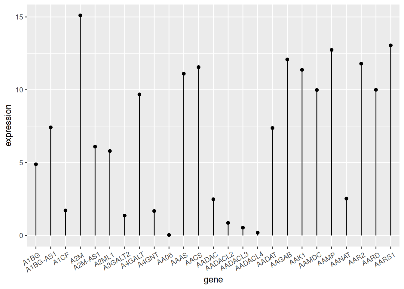
TCGA数据
上图展示了不同基因的表达情况。
以penguin数据集为例(类似于散点图)。
# `penguin`数据集
p <- ggplot(data_penguins, aes(x=bill_length_mm, y=bill_depth_mm)) +
  geom_point() +
  geom_segment( aes(x=0, xend=bill_length_mm, y=bill_depth_mm, yend=bill_depth_mm))
  ##x=0,直线从y轴发起;y=0,直线从x轴发起;均等于0,直线从原点发起

p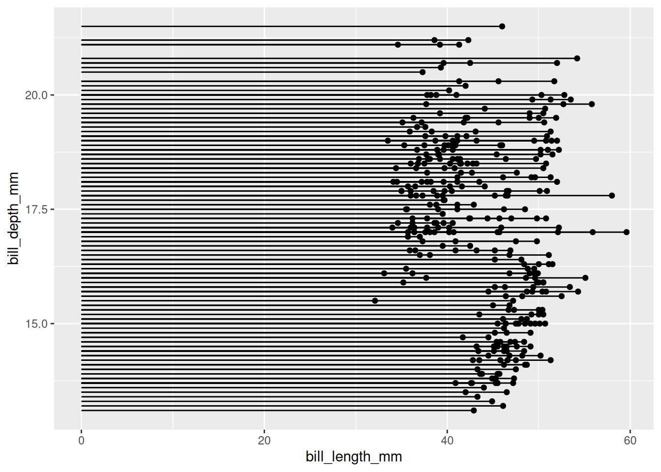
penguin数据集
上图展示了企鹅喙长度与深度的分布关系。
2. 自定义外观
颜色与样式
# 圆点
p1 <- ggplot(data_tcga, aes(x=gene, y=expression)) +
  geom_segment( aes(x=gene, xend=gene, y=0, yend=expression)) +
  geom_point( size=5, color="red",  #圈
              fill=alpha("orange"), #填充
              alpha=0.7, shape=21, stroke=2) +
  labs(title = "圆点外观")+
  theme(plot.title = element_text(hjust = 0.5),
        axis.text.x = element_text(angle = 60,vjust = 0.85,hjust = 0.75))

# 茎
p2 <- ggplot(data_tcga, aes(x=gene, y=expression)) +
  geom_point() +
  geom_segment( aes(x=gene, xend=gene, y=0, yend=expression),
                size=1, color="blue", linetype="dotdash" )+
  labs(title = "茎外观")+
  theme(plot.title = element_text(hjust = 0.5),
        axis.text.x = element_text(angle = 60,vjust = 0.85,hjust = 0.75))

# theme
p3 <- ggplot(data_tcga, aes(x=gene, y=expression)) +
  geom_point(color="orange", size=4) +
  geom_segment( aes(x=gene, xend=gene, y=0, yend=expression),color="grey") +
  theme_light() +
  theme(
    panel.grid.major.x = element_blank(),
    panel.border = element_blank(),
    axis.ticks.x = element_blank(),
    plot.title = element_text(hjust = 0.5),
    axis.text.x = element_text(angle = 60,vjust = 0.85,hjust = 0.75)#标题居中
  ) +
  xlab("gene") +
  ylab("expression")+
  labs(title = "主题")

plot_grid(p1,p2,p3, labels = LETTERS[1:3], ncol = 2)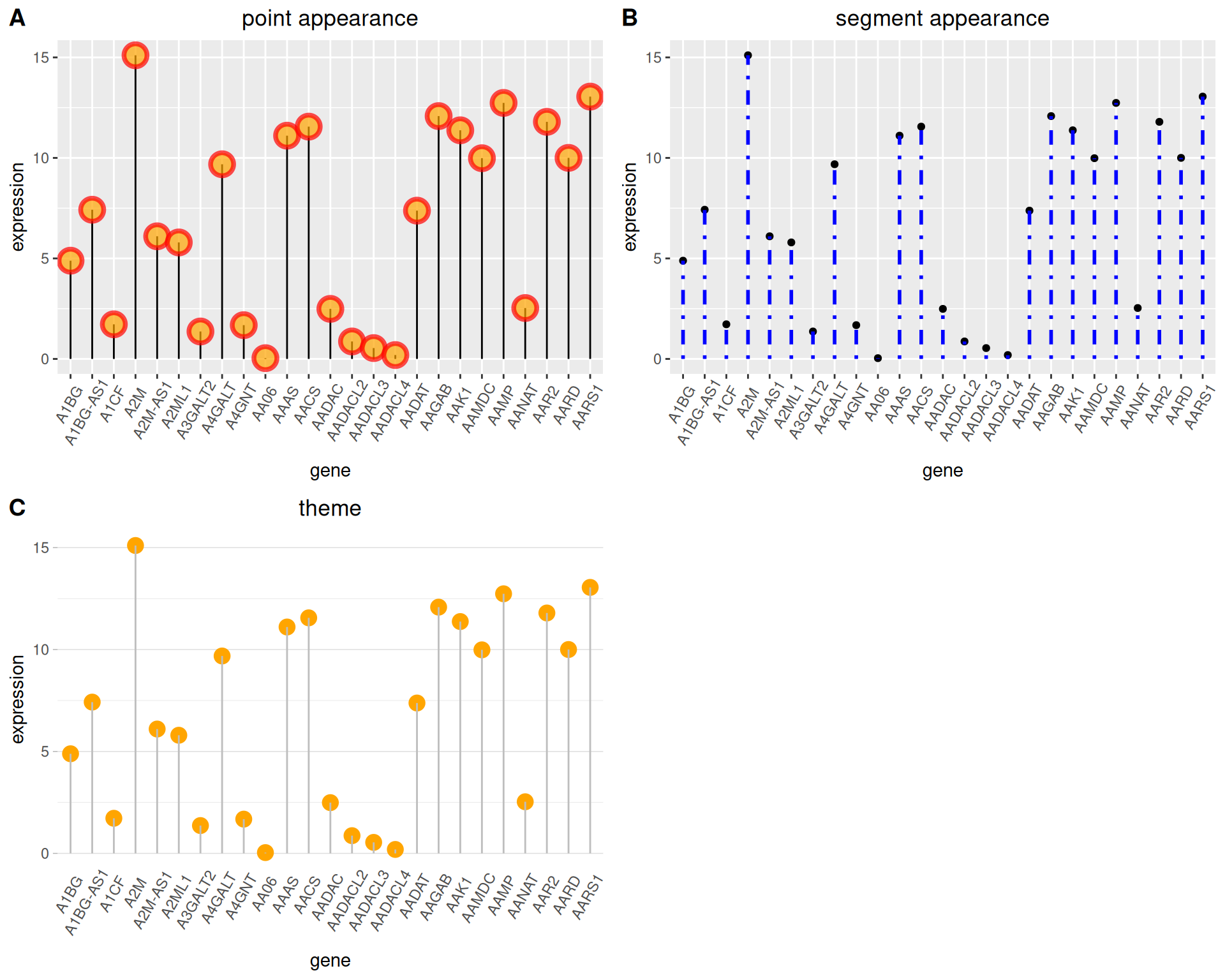
翻转与基线
##翻转
p4 <- ggplot(data_tcga, aes(x=gene, y=expression)) +
  geom_point(color="orange", size=4) +
  geom_segment( aes(x=gene, xend=gene, y=0, yend=expression),color="grey") +
  theme_light() +
  labs(title = "翻转棒棒糖图")+
  theme(
    plot.title = element_text(hjust = 0.5), #标题居中
    panel.grid.major.x = element_blank(),
    panel.border = element_blank(),
    axis.ticks.x = element_blank()
  ) +
  xlab("gene") +
  ylab("expression") +
  coord_flip() #万能翻转

##更改基线
p5 <- ggplot(data_tcga, aes(x=gene, y=expression)) +
  geom_point(color="orange", size=4) +
  geom_segment( aes(x=gene, xend=gene, y=5, ##数值即为基线位置
                    yend=expression),color="grey") +
  theme_light() +
  theme(
    panel.grid.major.x = element_blank(),
    panel.border = element_blank(),
    axis.ticks.x = element_blank(),
    plot.title = element_text(hjust = 0.5),#标题居中
    axis.text.x = element_text(angle = 60,vjust = 0.85,hjust = 0.75)
  ) +
  xlab("gene") +
  ylab("expression")+
  labs(title = "更改基线")

plot_grid(p4,p5, labels = LETTERS[1:2], ncol = 2)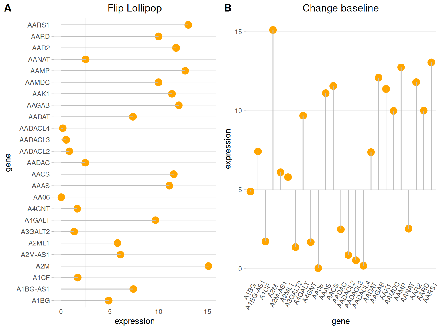
3. 高亮显示
在需要特定高亮显示某些数据时,可以利用ifelse函数筛选高亮数据。
以TCGA数据为例
#高亮显示----
p6 <-
##绘图+高亮
  ggplot(data_tcga, aes(x=gene, y=expression)) +
  geom_segment(
    aes(x=gene, xend=gene, y=0, yend=expression),
    color=ifelse(data_tcga$gene %in% c("A4GALT","A1CF"), "orange", "grey"),
    size=ifelse(data_tcga$gene %in% c("A4GALT","A1CF"), 1.3, 0.7)
     ##用ifelse语句筛选高亮组
  ) +
  geom_point(
    color=ifelse(data_tcga$gene %in% c("A4GALT","A1CF"), "orange", "grey"),
    size=ifelse(data_tcga$gene %in% c("A4GALT","A1CF"), 5, 2)
  ) +
  theme_ipsum() +
  coord_flip() +
  theme(
    legend.position="none"
  ) +
  xlab("gene") +
  ylab("expression") +

##设置标签
  annotate("text", x=grep("A4GALT", data_tcga$gene), #添加文字标签
           y=data_tcga$expression[which(data_tcga$gene=="A4GALT")]*1.05, #确定标签位置
           label=data_tcga$expression[which(data_tcga$gene=="A4GALT")] %>% round(2),
           color="orange", size=4 , angle=0, fontface="bold", hjust=0) +
  annotate("text", x=grep("A1CF", data_tcga$gene), #添加文字标签
           y=data_tcga$expression[which(data_tcga$gene=="A1CF")]*1.2, #确定标签位置
           label=data_tcga$expression[which(data_tcga$gene=="A1CF")] %>% round(2),
           color="orange", size=4 , angle=0, fontface="bold", hjust=0)

p6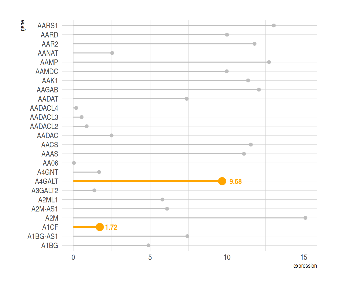
对指定数据高亮显示,同时利用annotate()函数添加标签。
4. 颜色区分
同样的,可以使用ifelse函数分类数据,用不同的颜色表示不同来源的数据,
以penguin数据集为例
data_penguins1 <- na.omit(data_penguins)
data_penguins1$number <- c(1:333)
data_penguins1$number <- as.character(data_penguins1$number)
data_penguins1 <- data_penguins1[1:20,]

p <- ggplot(data_penguins1, aes(x=number, y=flipper_length_mm)) +
  geom_segment(
    aes(x=number, xend=number, y=0, yend=flipper_length_mm),
    color=ifelse(data_penguins1$sex == "female","#FFB6C1", "#4169E1"),alpha=0.5 ,
    size=ifelse(data_penguins1$sex == "female", 1.3, 1.3))+
  geom_point(
    color=ifelse(data_penguins1$sex == "female", "#FFB6C1", "#4169E1"),
    size=ifelse(data_penguins1$sex == "female", 5, 5)
  ) +
  theme_ipsum() +
  theme(
    legend.position="none"
  ) +
  xlab("") +
  ylab("flipper length")
p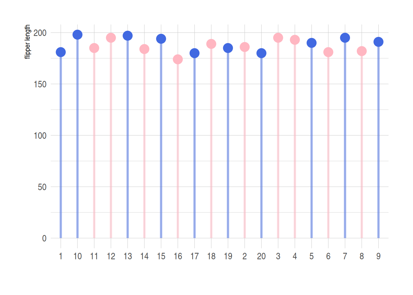
利用ifelse函数实现不同数据的分类处理,上图蓝色代表male,粉色代表female
5. 哑铃图(克利夫兰点图)
不同于普通棒棒糖图,哑铃图适合多组两个数据的比较,同时还可以添加中位数、均数等。
以pinguin数据集为例
p <- ggplot(aes(x=female,xend=male,y=species),data=data_penguins_mean) +
  geom_dumbbell(colour_x = "#FFB6C1",
                colour_xend = "#4169E1",
                size_x = 2,size_xend = 1,
                size=1,color="gray",
                dot_guide = T)+ #添加虚线
  geom_point(aes(x=female,y=species,size=female),#size=female 外环大小表示数据大小
             alpha=0.5,color="#FFB6C1")+
  geom_point(aes(x=male,y=species,size=male),
             alpha=0.5,color="#4169E1")+
  theme_light()+
  theme(panel.grid.minor.x =element_blank(),
        panel.grid = element_blank(),
        legend.title = element_blank()
  )+
  xlab("flipper length") +
  annotate("text", x=200, y=3.5, label="female",color="#FFB6C1",size=7) +
  annotate("text", x=205, y=3.5, label="VS",color="black") +
  annotate("text", x=210, y=3.5, label="male",color="#4169E1",size=7)

p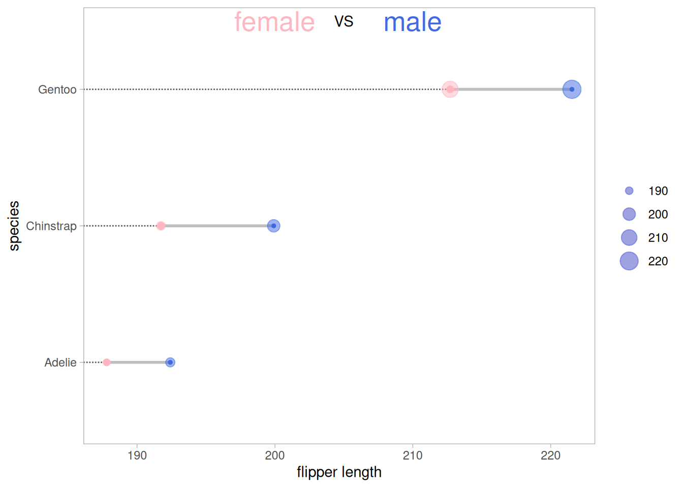
上图展示了三种不同品种的企鹅不同性别的翅膀长度均值的比较,其中外圈的大小表示数据的大小。
5.1 添加均值
利用geom_point在原图基础上添加均值点
##添加均值
p <- ggplot(aes(x=female,xend=male,y=species),data=data_penguins_mean)+
  geom_dumbbell(colour_x = "#FFB6C1",
                colour_xend = "#4169E1",
                size_x = 2,size_xend = 2,
                size=1,color="gray")+
  geom_point(aes(x=female,y=species,size=female),#size=female 外环大小表示数据大小
             alpha=0.7,color="#FFB6C1")+
  geom_point(aes(x=male,y=species,size=male),
             alpha=0.7,color="#4169E1")+
  geom_point(aes(x=mean,y=species,size=mean),
             alpha=0.5,color="orange")+ #添加均值
  theme_light()+
  theme(panel.grid.minor.x =element_blank(),
        panel.grid = element_blank(),
        legend.title = element_blank()
  )+
  xlab("flipper length") +
  annotate("text", x=200, y=3.5, label="female",color="#FFB6C1",size=7) +
  annotate("text", x=205, y=3.5, label="VS",color="black") +
  annotate("text", x=210, y=3.5, label="male",color="#4169E1",size=7)

p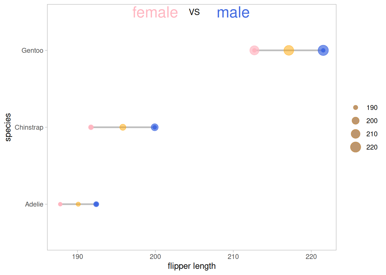
在原数据的基础上增加均值点(还可以根据需要添加中位数、极差、数据量等)
5.2 添加差异分析
##添加差异分析
p_val1_sex <- data_penguins %>%
  group_by(species) %>%
  wilcox_test(formula = flipper_length_mm~sex)%>%
  add_significance(p.col = 'p',cutpoints = c(0,0.001,0.01,0.05,1),symbols = c('***','**','*','ns'))

p_val1_species <- data_penguins %>%
  wilcox_test(formula = flipper_length_mm~species) %>%
  add_significance(p.col = 'p',cutpoints = c(0,0.001,0.01,0.05,1),symbols = c('***','**','*','ns'))

p <- ggplot(aes(x=female,xend=male,y=species),data=data_penguins_mean)+
  geom_dumbbell(colour_x = "#FFB6C1",
                colour_xend = "#4169E1",
                size_x = 2,size_xend = 2,
                size=1,color="gray")+
  geom_point(aes(x=female,y=species,size=female),#size=female 外环大小表示数据大小
             alpha=0.7,color="#FFB6C1")+
  geom_point(aes(x=male,y=species,size=male),
             alpha=0.7,color="#4169E1")+
  geom_point(aes(x=mean,y=species,size=mean),
             alpha=0.5,color="orange")+ #添加均值
  theme_light()+
  theme(panel.grid.minor.x =element_blank(),
        panel.grid = element_blank(),
        legend.title = element_blank()
  )+
  xlab("flipper length") +
  annotate("text", x=201.5, y=3.5, label="female",color="#FFB6C1") +
  annotate("text", x=205, y=3.5, label="VS",color="black") +
  annotate("text", x=208, y=3.5, label="male",color="#4169E1") +
##差异标签
##species
  annotate("text", y=1,x=216,
           label=paste("Adelie&Chinstra p=",
                       p_val1_species$p[which(p_val1_species$group1=="Adelie"& p_val1_species$group2=="Chinstrap")],
                       " ",
                       p_val1_species$p.signif[which(p_val1_species$group1=="Adelie"& p_val1_species$group2=="Chinstrap")])) +
  annotate("text", y=0.8,x=216,
           label=paste("Adelie&Gentoo p=",
                       p_val1_species$p[which(p_val1_species$group1=="Adelie"& p_val1_species$group2=="Gentoo")],
                       " ",
                       p_val1_species$p.signif[which(p_val1_species$group1=="Adelie"& p_val1_species$group2=="Gentoo")])) +
  annotate("text", y=0.6,x=216,
           label=paste("Chinstrap&Gentoo p=",
                       p_val1_species$p[which(p_val1_species$group1=="Chinstrap"& p_val1_species$group2=="Gentoo")],
                       " ",
                       p_val1_species$p.signif[which(p_val1_species$group1=="Chinstrap"& p_val1_species$group2=="Gentoo")])) +

##sex
  annotate("text", y=grep("Gentoo", data_penguins_mean$species)+0.15, #添加文字标签
           x=data_penguins_mean$mean[which(data_penguins_mean$species=="Gentoo")],
           #确定标签位置
           label=p_val1_sex$p.adj.signif[which(p_val1_sex$species=="Gentoo")]) +
  annotate("text", y=grep("Chinstrap", data_penguins_mean$species)+0.15, #添加文字标签
           x=data_penguins_mean$mean[which(data_penguins_mean$species=="Chinstrap")],
           #确定标签位置
           label=p_val1_sex$p.adj.signif[which(p_val1_sex$species=="Chinstrap")]) +
  annotate("text", y=grep("Adelie", data_penguins_mean$species)+0.15, #添加文字标签
           x=data_penguins_mean$mean[which(data_penguins_mean$species=="Adelie")],
           #确定标签位置
           label=p_val1_sex$p.adj.signif[which(p_val1_sex$species=="Adelie")])

p
对原数据企鹅种类和企鹅性别对翅膀长度的影响进行差异分析,其结果均具有显著性。
应用场景
1. 棒棒糖图
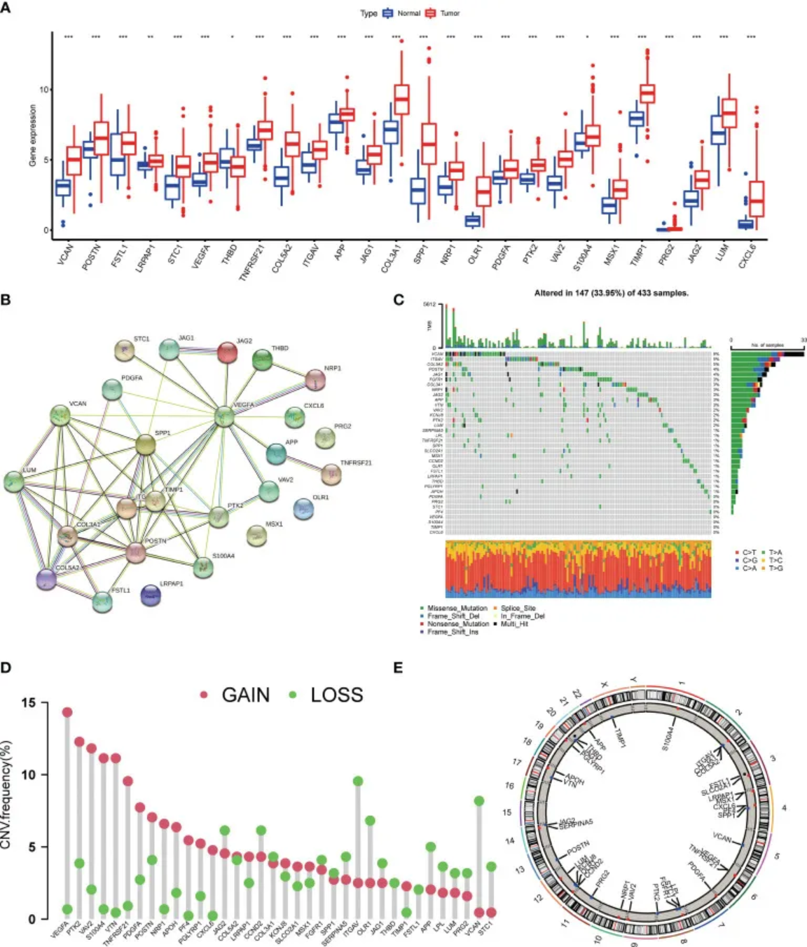
D图展示了AAGs(血管生成相关基因)中拷贝数变异缺失、增加和未发生变异的频率。 [1]
2. 哑铃图
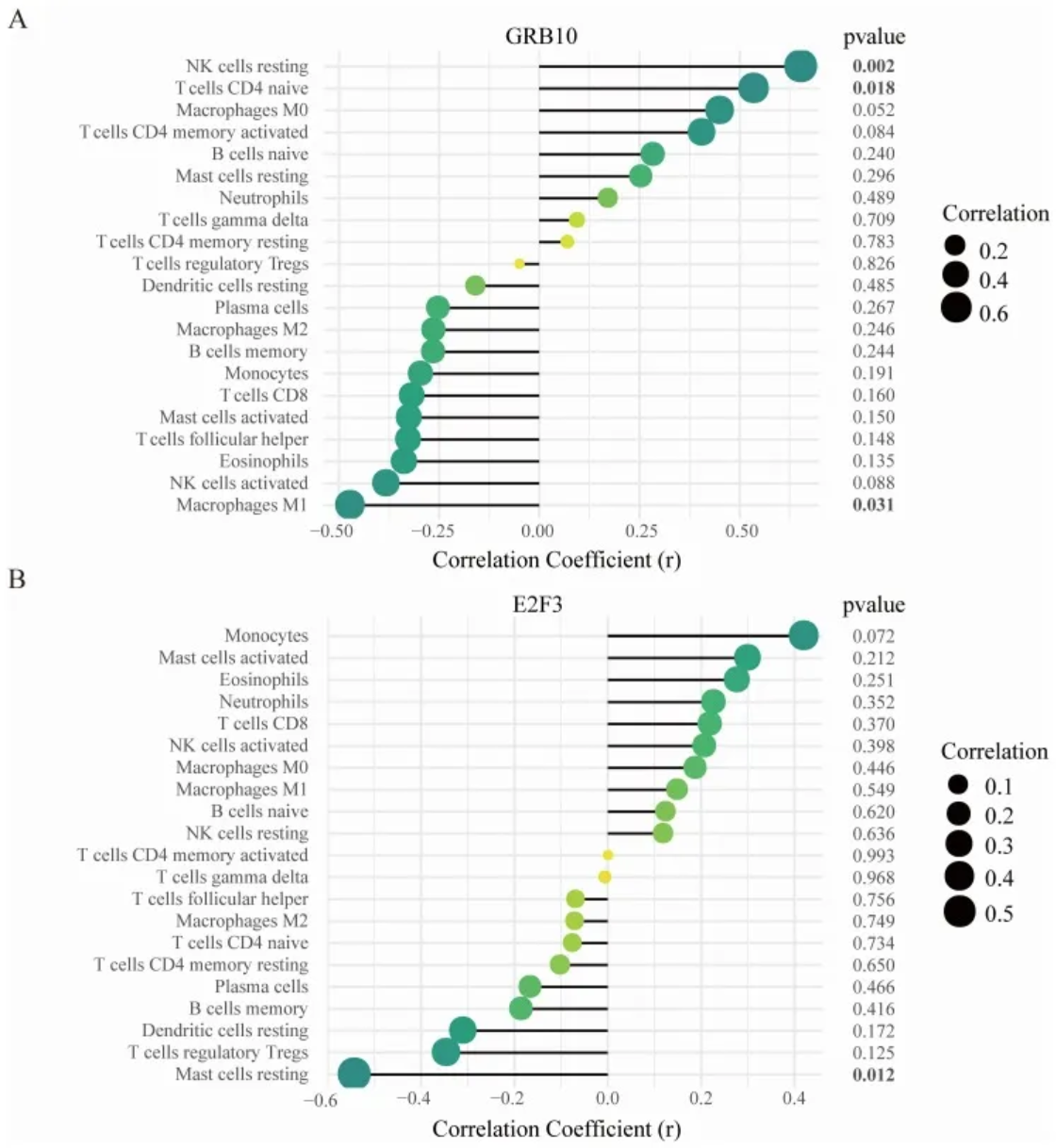
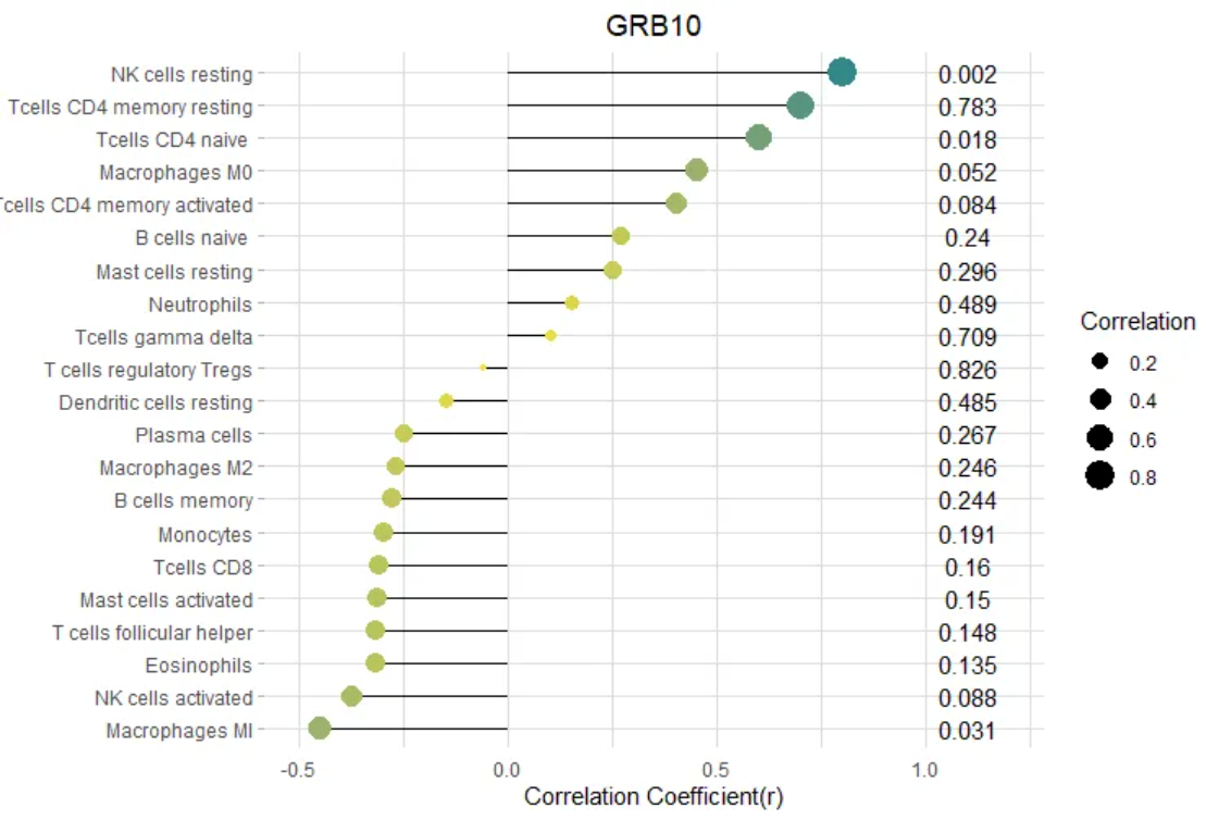
(A)GRB10与渗透免疫细胞之间的相关性;(B)E2F3与渗透免疫细胞之间的相关性。
点的大小代表基因与免疫细胞之间相关性的强度;点越大,相关性越强,点越小,相关性越弱。点的颜色代表p值,颜色越绿,p值越低,颜色越黄,p值越大。[2]
参考文献
[1] Qing X, Xu W, Liu S, Chen Z, Ye C, Zhang Y. Molecular Characteristics, Clinical Significance, and Cancer Immune Interactions of Angiogenesis-Associated Genes in Gastric Cancer. Front Immunol. 2022 Feb 22;13:843077. doi: 10.3389/fimmu.2022.843077. PMID: 35273618; PMCID: PMC8901990.
[2] Deng YJ, Ren EH, Yuan WH, Zhang GZ, Wu ZL, Xie QQ. GRB10 and E2F3 as Diagnostic Markers of Osteoarthritis and Their Correlation with Immune Infiltration. Diagnostics (Basel). 2020 Mar 22;10(3):171. doi: 10.3390/diagnostics10030171. PMID: 32235747; PMCID: PMC7151213.
[3] H. Wickham. ggplot2: Elegant Graphics for Data Analysis. Springer-Verlag New York, 2016.
[4] Wickham H, Vaughan D, Girlich M (2024). tidyr: Tidy Messy Data. R package version 1.3.1, https://CRAN.R-project.org/package=tidyr.
[5] Horst AM, Hill AP, Gorman KB (2020). palmerpenguins: Palmer Archipelago (Antarctica) penguin data. R package version
[6] Wilke C (2024). cowplot: Streamlined Plot Theme and Plot Annotations for ‘ggplot2’. R package version 1.1.3, https://CRAN.R-project.org/package=cowplot.
[7] Rudis B (2024). hrbrthemes: Additional Themes, Theme Components and Utilities for ‘ggplot2’. R package version 0.8.7, https://CRAN.R-project.org/package=hrbrthemes.
[8] Rudis B, Bolker B, Schulz J (2017). ggalt: Extra Coordinate Systems, ‘Geoms’, Statistical Transformations, Scales and Fonts for ‘ggplot2’. R package version 0.4.0, https://CRAN.R-project.org/package=ggalt.
[9] Kassambara A (2023). rstatix: Pipe-Friendly Framework for Basic Statistical Tests. R package version 0.7.2, https://CRAN.R-project.org/package=rstatix.
[10] Kassambara A (2023). ggpubr: ‘ggplot2’ Based Publication Ready Plots. R package version 0.6.0, https://CRAN.R-project.org/package=ggpubr.